vivo X5Pro Review
Introduction
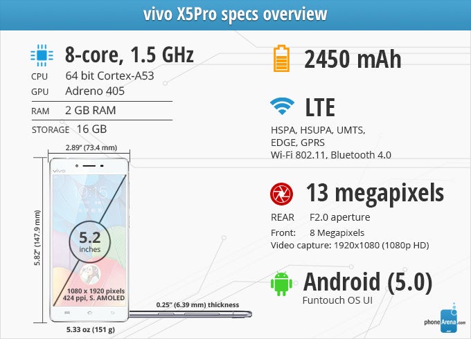
vivo is a smartphone manufacturer, which became famous at the end of 2014, when it released the "thinnest smartphone in the world" – the vivo X5 Max. Its profile measured at just 0.187 inches (4.75 mm) and with such a slender body, some hardware corner-cutting had to be done – most prominently, in the battery department, which ended up with a 2,000 mAh juicer. So, the company released a more "normal" version of the handset – the vivo X5Pro, which is slightly thicker, at 0.253 inches (6.44 mm), with a smaller 5.2" display and a larger 2,450 mAh battery.
On the hardware end of things, the vivo X5Pro is a midranger, priced somewhere around the $550 mark – if you manage to grab a hold of one that is, as online retailers that stock it are still fairly hard to sniff out. With a glass-and-metal build, the phone does offer the looks, but for the price, we'd also expect it to deliver a pretty solid performance.
In the box:
- vivo X5Pro
- In-ear headset
- Wall charger
- USB Data cable
- SIM Ejector tool
- Quick start guide
- Plastic clear cover-type case
Design
Hand me that iPhone. What do you mean it's a vivo?
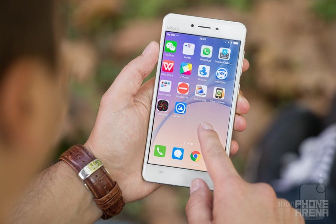
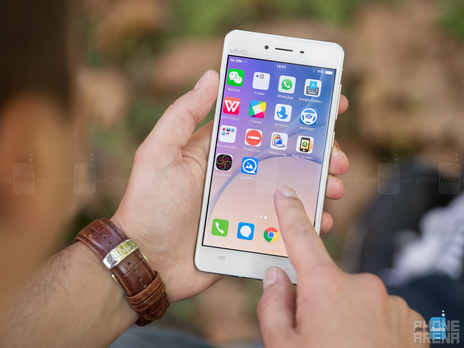
No exaggeration here, whenever you look at the vivo lying on a table, you can easily mistake it for an iPhone 6. Its display is larger, sure, but its general proportions, shape, and openings for the earpiece, frontal camera, and proximity sensor are placed very similarly to how they are on Apple's handset. Upon closer inspection, however, we can see some differences – there are three capactive navigation buttons at the bottom, reflecting light with their beautiful silver finish. The name of the smartphone's manufacturer can also be found above the top-left of the display, written in the same silver paint.
Upon inspecting the phone's frame, one can find the volume rocker, power button, and SIM card tray on the right, headphone jack on the top, and the USB port on the bottom, surrounded by two symmetrical grilles – one for the speaker and one for the mic.
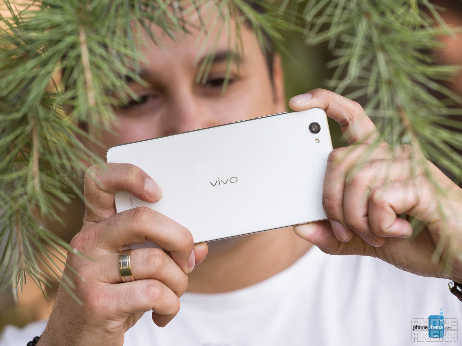
On the back, we have another glass slab, making the phone a glass-and-metal sandwich. Decoration-wise, it's pretty minimal – the vivo logo in the center, the usual "Designed by..." text at the bottom, and the camera can be found in the top-left – much like the phone from which vivo drew design inspirations from. The sensor's ring still protrudes, similar to the archetype, but a bit less so.
In terms of feel – the phone is thin enough to feel comfortable to hold. It's not too light, nor too heavy, so it doesn't feel awkwardly burdensome to carry around. Still, a 5.2" display is fairly big, so some single-handed operations are a bit awkward and dangerous to perform, but users that have owned a handset of the same caliber before will have no trouble here. The metal frame feels cool to the touch and the hardware buttons are fairly clicky, but are uncomfortably thin and have short travel. All in all, some gripes aside, we'd say that vivo pulled off the glass-and-metal combo pretty well.
Display
I'm blue, da-ba-dee da-ba-dae
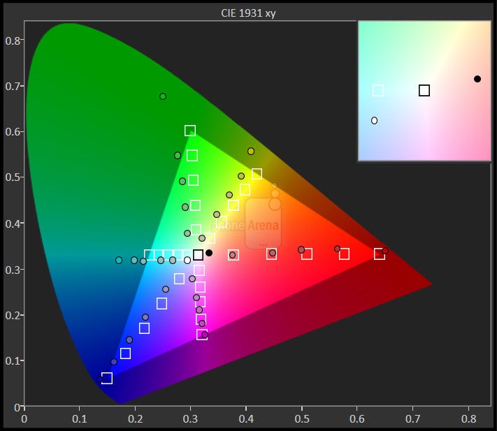
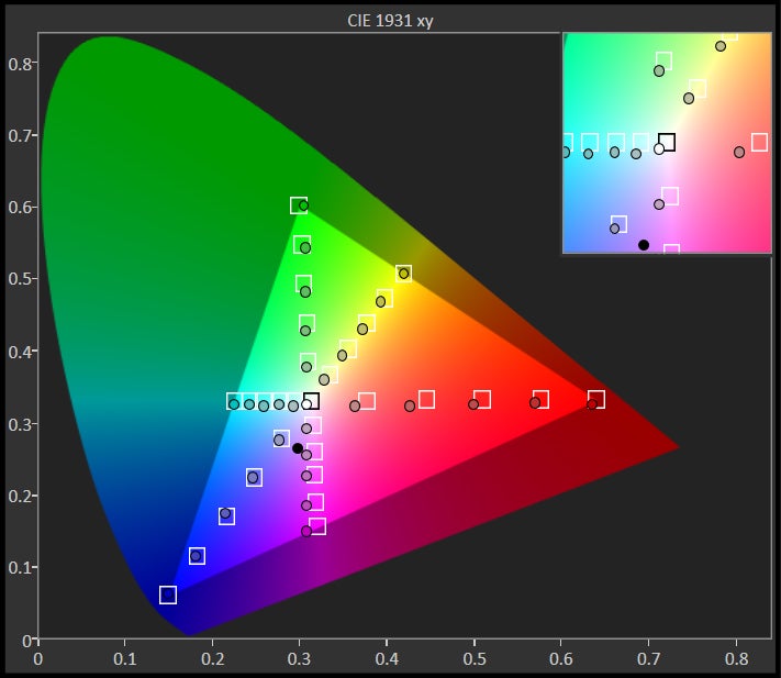
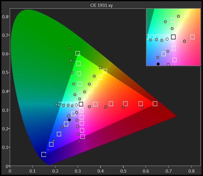
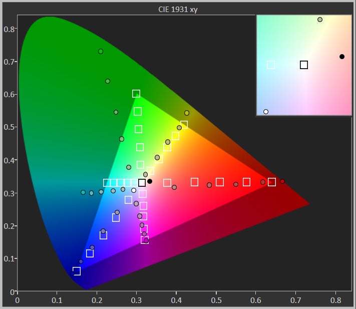
The vivo X5Pro rocks a Super AMOLED display and, needless to say, we were greeted by vivid, popping colors as soon as it was on. It is also a bit bluish – color temperature measures at 7,677 K – quite a ways away from the reference value of 6,500 K. In real life, this didn't bother us too much, or at least not as much as the saturated, sometimes inaccurate colors.
The display has a 1080 x 1920 pixel resolution stretched across its 5.2-inch diagonal. This all results in a 424 pixel-per-inch density, or in other words – it's pretty crisp. We enjoyed the details on-screen and spent quite some time gawking at the beautiful stock wallpapers. Additionally, the viewing angles are pretty generous – no doubt, courtesy of the AMOLED tech.
The display's brightness measures at 318 nits when set at maximum. That's by no means impressive, but the screen is still usable outdoors. Even on a sunny day, we could make out the icons on our homescreen or set up a camera shot without much trouble making out what's on the viewfinder. When the skies are cloudy, the display provides enough visibility for effortless use. At minimum, the brightness goes down to 3 nits, making for comfortable reading in the dark.
At the phone's price-point, though, we can't help but feel that vivo could've tried to do better with the display. Its drawbacks are not too major, but there are many other smartphones around the same tier, which offer much better quality either in terms of color reproduction, temperature, or maximum brightness.
Interface and Functionality
Lollipop, the iOS flavor
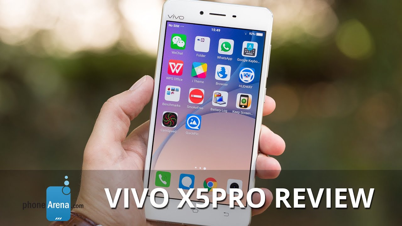
OK, we will often give “inspirations” and “tributes” a pass, so long as the product in question has its own personality hidden somewhere behind the features that have been copied off of competitors. The Funtouch OS UI, which vivo installs on its phones, is an elaborate Android 5 Lollipop re-skin and is, undoubtedly, a full-on iOS-wannabe. It's all there – the lack of an app drawer, the icon wiggle in homescreen edit mode, the Spotlight search-like function, which appears when you swipe down on any homescreen, the slimmed-down notifications menu, the lever-type toggles in Settings, the control center that you bring out by swiping up from the bottom, all to some of the proprietary apps being named i Music, i Theme, and i Manager.
It's not all iOS, though. Buried within the options we can also see Smart Keep Bright (a.k.a. keep the screen on while the user is looking at it – like Samsung's Smart Stay), Air operation (unlock screen by waving hand above frontal camera), and Smart Wake options, which will let you unlock the phone and launch any app by drawing a symbol on the screen. So, a mixture of useful features, which we've seen on Samsung and Oppo smartphones before. But how is the user experience?
Borrowed design aside, the interface works good – it's fairly smooth and it's functionality is reliable. However, we have mixed feelings about a Control Center-style menu being utilized on an Android handset. This little tray comes out with a swipe-in from the bottom of the screen, and houses all your recently used apps, brightness slider, and quick toggles for Wi-Fi, Bluetooth, Flashlight, et cetera. Pulling it up from the bottom feels awkward on Android, especially with the capacitive home key being right where you should start the thumb motion from. Thankfully, the phone is programmed to expect accidental touches of said button – if you tap on home by accident, just continue swiping up, the phone will wait out the full gesture and then perform the proper action. The pop-out animation is rarely smooth, though, and leaves a bad impression. When the phone is held in landscape, the Control Center still comes out from the same spot, so the user needs to remember to pull it in from the side. If there is one thing we enjoy about this tray, it's the animation, with which recent apps are discarded – the user needs to touch and drag up on the icon of the unwanted app. As a result, we are treated to a smooth and always funny animation of the app “flying” off the tray and falling somewhere behind it.
The i Manager app is an extensive guard app for the phone. It will bar apps from auto-starting processes in the background, unless they are specifically white-listed by the user. Fear not, the i Manager will ask whether you wish to white-list an app as soon as you install it, so it's hard to block apps accidentally. In here, you can also monitor all app permissions, revoke ones that you've previously granted, or have an app always ask when it needs a specific permission – quite handy for keeping a close eye on untrusted apps.
Of course, there is also a theme app – i Theme – which allows users to mix and match downloaded themes to create one that is truly to their taste. One can also download various lockscreens, which includes both pictures and effects. It is here where we believe we found the ultimate annoy-your-colleagues tool – there is a “piano” lockscreen, which only lets you unlock the smartphone after you drag your finger across a full octave of the on-screen piano. Download this feature and you are sure to soon find out how often you unlock your phone – by the screams and bad looks of the ones around you.
Connecting the phone to a PC via USB for some heavy media transfers proved to be a daunting task. Despite the fact that we downloaded and installed the “vivo Mobile Assistant” software and followed all instructions, all it managed to assist us with was to confirm that it “can't find device”. To this day, we still try.
All that said, Funtouch OS performs decently stable and, aside from its animations often chopping up, hasn't given us a hard time for regular use. If one is to commit to using the software and learning its intricacies, it could make for a solid daily driver.
Processor and Memory
Nothing “pro” about it
It's a bit weird that a phone with the “pro” moniker would carry a purely midrange hardware setup under it's hood, but hey – it's here and it's real. The vivo X5Pro has a 64-bit, octa-core Qualcomm Snapdragon 615 SoC, coupled with 2 GB of RAM. It's not a hardware powerhouse, but works well and should be enough for casual users. The interface does start choking up in occasions where heavier processing is required – for example, when uploading 52 pictures to Google Drive, the process of choosing and naming a location folder was severely laggy. Phone calls, chats, Internet browsing, a bunch of light mainstream apps – the phone can easily deal with those. Heavy gaming and some of the more finicky photo-editing apps? We wouldn't rely on the hardware for smooth performance in those situations, nor the 2,450 mAh battery to take it for long.
The phone comes in just one storage option – 16 GB, 11 GB of which are available to the user. Expansion via a microSD of up to 128 GB is available, should you feel the need for it, though be warned that the phone's tray accepts either two SIMs or a SIM + microSD card combo.
Internet and Connectivity
We found that the stock browser wasn't really good with heavy websites – being prone to choppy animations and laggy input response. Using Google's Chrome, however, gave us smoother, more satisfying results. In addition, the phone's fairly large and crisp display lends itself to some pleasurable browsing.
As previously mentioned, the X5Pro supports dual-SIM so long as you don't occupy one of the SIM slots with a microSD card. It also offers LTE connectivity over frequencies 900 (band 8), 1800 (band 9), 2100 (band 1), and 2600 (band 7) MHz – none of these are currently supported by US carriers. And of course, its other connectivity features include aGPS with Glonass, Bluetooth 4.0, and 802.11 b/g/n Wi-Fi.
Camera
Uninspiring
As far as picture quality goes, we'd say it's uninspiring. When you have favorable lighting, the photos are pretty good, no details are lost, and colors are accurate. The sensor tends to have an issue with more challenging lighting, however – contrasting bright and dark spots within a composition will often confuse the camera, causing its focus to fluctuate. It also has a hard time picking the right exposure, which often results in dark photos. More often than not, the user must tap to focus on the viewfinder in order to pick the right exposure setting. There's still a neat feature to be found here, though – by tapping and holding on the screen, the user can set the focus point for the shot, then drag their finger away to set the exposure point. So, you are not limited to having the exposure set by the lighting on the item you are focusing on.
Unfortunately, at the slightest sign of a drop in lighting, the accurate colors start washing away, becoming dull and gray-ish, and the snapper starts losing focus very often. This can be seen in photos 3 and 4 – in the first shot, the dog is in the shadow, just a couple of feet away from the sun's light. As a result, its fur color is dull and subdued, with an ashy tan at spots. Moving it just a step to the left and taking another photo, we are treated to an entirely different color representation – the fur pops out in vivid, warm, orange-red. The effect can be better observed in photos 7 and 8 – what is already a challenging shot, taken on a rainy day with lots of dirt in the background (photo 7), became an unusable mess when we came back to take the picture at dusk (photo 8).
At this point, one may think that HDR could be a remedy for some of our pains. Unfortunately, it seems that the camera doesn't achieve the HDR effect by taking a few snaps at different exposure levels, and then mixing them together – the way that the technique is supposed to be done – but by simply applying a filter over the shot. The same HDR filter that one can find on apps like Instagram or Snapseed, only with no user-accessible controls. This is most recognizable on photo 6 – anyone who has spent a modest amount of time tweaking the HDR filters on aforementioned apps will instantly recognize the tell-tale images of those puffy white spots, which can be seen all over the red part of the traffic sign.
The phone's panorama feature won't make you lose your breath either. It does a full 360-degree turn but stitching is very evident and images come out unclear. Unfortunately it will often suffer from the camera's poor exposure settings and we also found it to drop details quite a bit.
In a nutshell? The camera is just south of “decent” - maybe good for some outdoor shots, but don't bring it in the house and expect reliable performance. The sun is already near the horizon? Time to put the X5Pro in your pocket and rely on your friends to take some good shots of that party.
Multimedia
Consuming media on the vivo X5Pro is a generally pleasing experience – the vivid colors pop and make clips that much more lively while the high pixel density of the screen promises a crisp image – so long as the media you are watching is detailed enough, of course.
The X5Pro's speaker won't be blowing off any hats soon, but it's not too bad either. It has a pronounced high range and lacks bass, so don't expect to listen to music on it unless hard-pressed by a lack of external speakers or headphones. Still, it sounds loud and clear enough for regular viewing of YouTube clips and the likes.
Call Quality
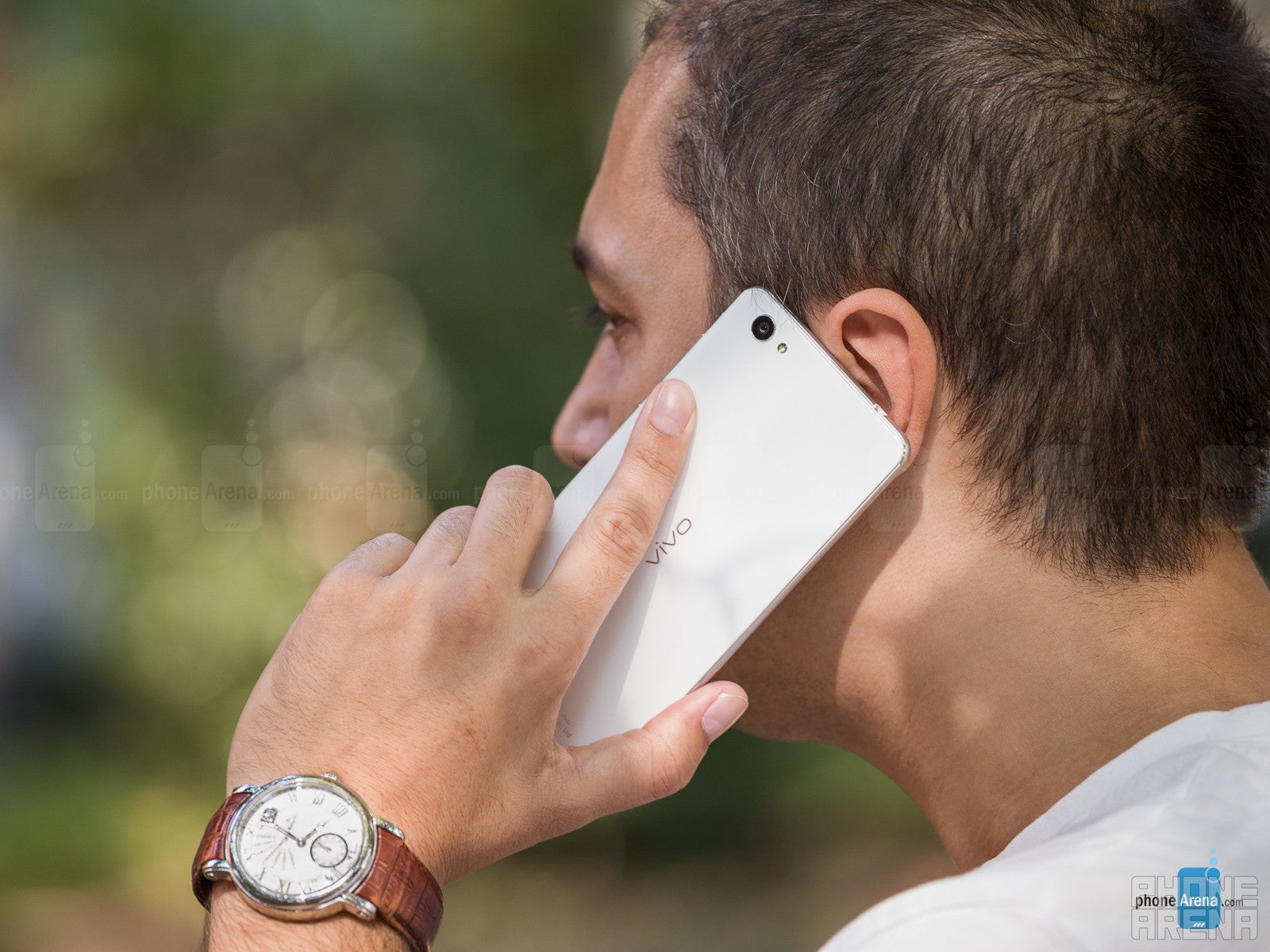
The other party will be treated to a similar loud and meaty audio, but a much clearer one – while still lacking in high frequencies, it sounds much more articulate, so the other side can catch your words much easier.
Battery life
Keep it in your pocket
Unfortunately, it's a complete slowpoke when it comes to charging the battery back up – it takes it 3 hours to go from 0% to 100%, and we were surprised how much of a noticeable inconvenience this is – nowadays, grabbing some juice from various outlets throughout the day when one has a few minutes is a common thing. Well, with the X5Pro, it felt like plugging it in for half an hour barely even made any noteworthy difference, so at some point, we just stopped doing it.
Conclusion
It's not an easy task to draw a final line on the vivo X5Pro – on one side, its hardware is underwhelming, and its interface is an iOS knock-off no matter how one looks at it. On the other, however, it performs reliably, has a set of useful features, looks good, and feels nice in the hand. Remembering the $530+ price-tag, the disappointing camera, the limited LTE bands it supports, and the fact that the handset is not fit for heavy usage – in neither the hardware, nor battery life department – draws a clearer picture.
If you are a casual user who wants a handset that looks good and is a bit more exotic than what everyone can find in the brick-and-mortar stores nearby – you will probably enjoy the vivo X5Pro, as it checks enough of the boxes for a daily communications device. If you care about mobile photography, however, and generally want a more solid and well-equipped experience, going for something more established like the LG G4 or HTC One M9 (both of which are similarly, or even better-priced) will prove to be a much better choice.
If you are a hardcore user, you may enjoy owning this phone for experimentation purposes, but we can't imagine heavy consumers to pick the vivo X5Pro as a daily driver – it just doesn't pack the needed hardware prowess. Plus, we don't like knock-offs.








Things that are NOT allowed: