Nothing Phone (2a) Plus review: why, though?

Nothing Phone (2a) Plus Intro
Nothing launched the mid-range Phone (2a) earlier this year. But already, there's a replacement — or an upgrade. That's right, instead of a flagship Nothing Phone (3) (that'll take until 2025), we now have a Phone (2a) Plus.
What's the difference, what's new with the Nothing Phone (2a) Plus?
Surprisingly — not much. Same shape and size, same design — now with metallic accents. The Glyph is the same, and the camera is mostly the same. OK, so what's new? Well, the processor is new — Nothing noted that the Phone (2a) has been its most successful launch to date, but some fans wanted just a bit more juice out of it. That's why the Phone (2a) Plus comes with a new, exclusive, MediaTek Dimensity 7350 Pro — 10% faster CPU, 30% faster GPU than the Dimensity 7200 Pro inside the Phone (2a).
Surprisingly — not much. Same shape and size, same design — now with metallic accents. The Glyph is the same, and the camera is mostly the same. OK, so what's new? Well, the processor is new — Nothing noted that the Phone (2a) has been its most successful launch to date, but some fans wanted just a bit more juice out of it. That's why the Phone (2a) Plus comes with a new, exclusive, MediaTek Dimensity 7350 Pro — 10% faster CPU, 30% faster GPU than the Dimensity 7200 Pro inside the Phone (2a).
That also means a slight price increase. In the US, you can join the Nothing Beta Program and get the Phone (2a) Plus for $399 — a $50 increase over its predecessor.
Table of Contents:
Nothing Phone (2a) Plus Specs
The new processor
The Nothing Phone (2a) Plus is very much a rerun of the Phone (2a), with a couple upgrades. A unique new processor and a selfie camera nudge. Here's a list of the core specs, but you can view the full Nothing Phone (2a) Plus specs here.
| Specs | PHONENAME |
|---|---|
| Size and Weight | 6.37 x 3.00 x 0.33 in (161.7 x 76.3 x 8.5 mm) 6.70 oz (190.0 g) |
| Display | 6.7", 2412 x 1080 120 Hz, OLED, 1,300 nits peak |
| Processor | MediaTek Dimensity 7350 Pro (4 nm) Octa-core, 3 GHz |
| Software | Nothing OS 2.6 / Android 14 |
| Cameras | 50 MP main 50 MP ultra-wide 50 MP selfie |
| Battery Size | 5,000 mAh |
| Charging Speeds | 50 W wired charge |
| Prices | 12 GB / 256 GB - $399 |
Nothing Phone (2a) Plus Design and Display
Just as before, only shiny this time
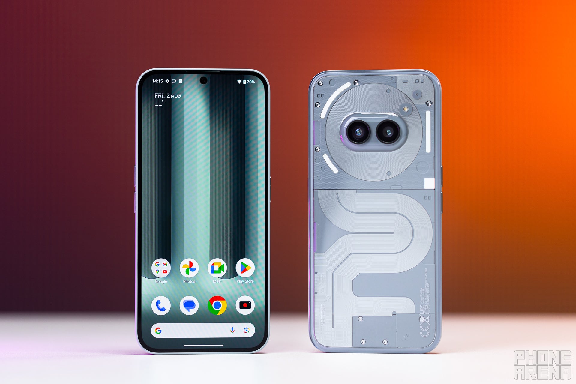
Nothing didn't venture to change a lot about the Phone (2a) — apparently, it was perfectly good the way it was. Design-wise, it has the same shape and size, the patterns laid under the transparent back are also the same.
Now, the colors are slightly shifted — with metallic accents in the back and buttons. The phone comes in two colors — black and silver — but in both of them, the metallic parts are a shiny gray, so don't worry — you won't miss them.
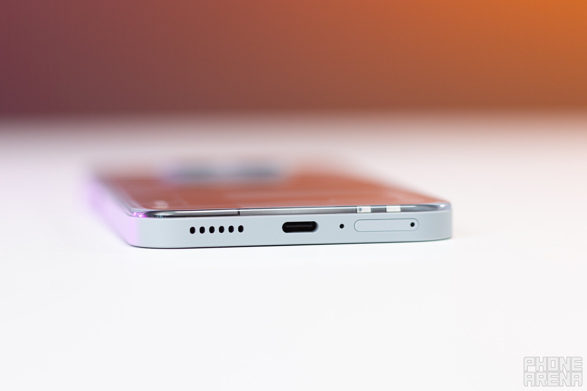
So, the Nothing Phone (2a) Plus is still fairly big — about the size of an iPhone Pro Max — but it's pretty easy to handle. The plastic frame has a grippy silk finish, the rear panel (transparent plastic) is beveled at the edges, and the device is comparatively light. It's rated IP54, meaning it's protected against dust and water splashes, but prevent long exposures.
The buttons feel a bit shallow, but they do have a pronounced click and not much room to wobble.

The box is pretty minimalist — both inside and out. You get the phone, a charging / data cable, and tiny info cards. Not even a case — something that budget manufacturers are typically happy to throw your way.
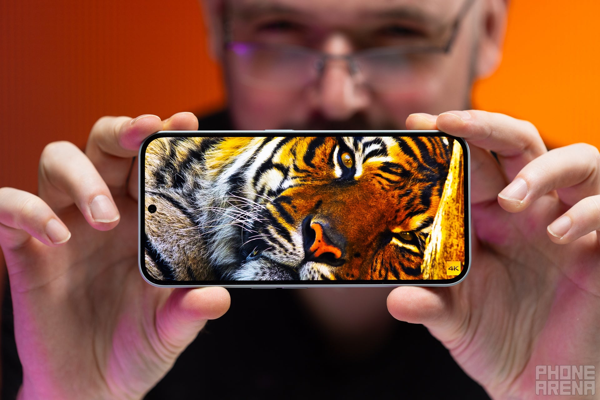
The OLED screen on the front is quite spatious — 6.7 inches in diagonal, 20:9 aspect ratio. It's got a 1080 x 2412 pixel resolution, which comes to about 394 pixels per inch density — pretty sharp. It has a 120 Hz refresh rate and 1,300 nits peak brightness — pretty high-class for a midrange phone. And it does give off that impression, with fairly thin bezels around the screen, and pretty, vibrant colors.
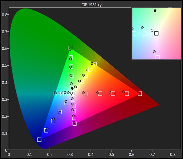
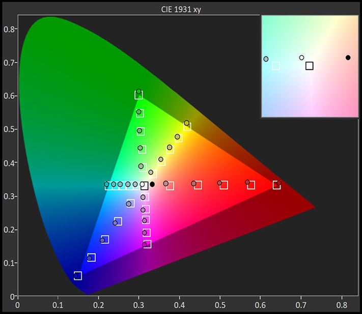
Pretty good color accuracy from the Nothing Phone (2a) Plus panel — about the same you can get on a Pixel 8a or Samsung Galaxy A55. Its top brightness is also north of 1,000 nits, which ensures that it will be visible in daylight. It's not amazing, but you will be able to read a text or see the name of a caller under direct sunlight.
Yes, the phone specs say 1,300 nits peak brightness — that only measures part of the display, for a fraction of time. It's a number that represents the screen's HDR capabilities. Our benchmark measures full screen brightness, so it gives you a more accurate idea of actual visibility.
A minimum of 2 nits is pretty good, but some that are more sensitive to light prefer 1 nit or lower for bedside viewing.
The Nothing Phone (2a) Plus has an optical fingerprint scanner under the screen — same as the Phone (2a). It's fairly fast and accurate, we've no complaints there.
Nothing Phone (2a) Plus Camera
50 MP all around

Again, Nothing didn't change much between the Phone (2a) and Phone (2a) Plus here. The only difference is that the selfie camera has also been updated to a 50 MP sensor (from 32 MP before). So, the Nothing Phone (2a) Plus now has 50 MP cameras all over — wide, ultra-wide, and selfie.
How do they perform?
Our camera benchmark measures everything about the camera's performance — from viewfinder experience, to stabilization, sharpening, and zoom quality. Of course, we don't expect a $400 phone like the Nothing Phone (2a) Plus to touch the top score, achieved by some flagships. But at 121 overall camera score, it treks behind other devices in the class — the Pixel 8a got 133, the Galaxy A55 - 132.
So, while the Nothing Phone (2a) Plus is stylish, unique, and has a cult following — we wouldn't recommend it specifically for its camera performance. That said, it's not "bad" — here are some samples:
The photos look OK. The HDR algorithm is working hard to keep high dynamics at bay — but we can still spot some HDR auras in more challenging shots. Colors are fairly accurate, but boosted in many cases, so the photos come out more saturated. There isn't too much sharpening going on, kudos for that, but we can spot the noise reduction smudging up fine details from time to time.
At night, the sharpening and noise reduction kick into overdrive, and lines and details become a bit more jagged — kind of video-gamish.
Taking a non-blurry selfie with the front camera is often a challenge, even during the day — hold that phone steady, even before and after pressing the shutter button!
There's no zoom camera on the Nothing Phone (2a) Plus, but it does allow you to dial magnification up to 10x. At 2x, it looks kind of fine — you can definitely begin to see the noise reducer washing out lines and indentations. At 10x, the photos become way too blurry to share.
You can definitely use that 2x step for Portrait Mode photos, though its bokeh doesn't look amazing — separating the subject from background is a challenge, and the blur itself looks kind of fake.
Nothing Phone (2a) Plus Performance & Benchmarks
The main reason for its existence

The Nothing Phone (2a) Plus exists primarily because of the hardware upgrade it brings along. That being the brand-new MediaTek Dimensity 7350 Pro. It's a chipset produced in partnership between Nothing and MediaTek, so it's exclusive to the Phone (2a) Plus. It offers 30% improvement in GPU speed and a 10% bump in CPU performance. Let's see if the benchmarks will corroborate that:
Well, we can see a slight improvement, but not 10% and 30% — at least not in these super-demanding benchmarks. It gets beat by the Exynos 1480 in the Galaxy A55, but not in GPU performance. And the Tensor G3 in the Pixel 8a beats both of them.
OK, real-life scenarios with the Nothing Phone (2a) Plus — yes, we can notice stutters. The keyboard can take a beat to pop up after we tap a text field. When scrolling through the photo gallery or fast-sweeping through emails, you will see it stop to take a breather. But, in general, it feels nice to operate — the touch responsiveness seems to be on point. Writing out messages and tapping or swiping through the interface feels quick and accurate.
Games will run, sure, the more demanding ones will default to the lowest settings, but the casual ones run just fine.
Nothing Phone (2a) Plus Software
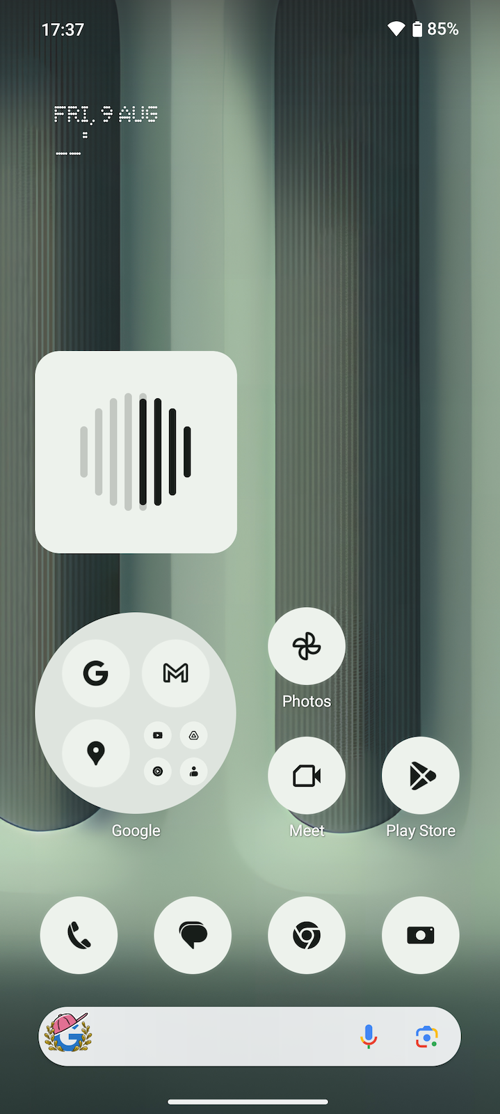
The Nothing Phone (2a) Plus comes with the Nothing 2.6 interface on top of Android 14. The UI is mostly "clean"... actually — very clean. If you choose to, you can go for a full Nothing theme, which transforms all of your icons to monochrome images (no need for an icon pack, the phone will transform any icon).
The star of the show is the new Nothing News widget. It will filter out the top news from 7 selectable categories — business, entertainment, general, health, science, sports, and technology. They will be summarized to 1-minute snippets, read aloud by the voice of Nothing CFO Tim Holbrow (we assume, AI voice modeled on Mr. Holbrow).
So, Nothing isn't heavy on the AI features like Samsung, but we think the News widget is a very smart and useful decision here. You can, also, generate wallpapers by mixing very specific art genres together — no freeform text prompts.
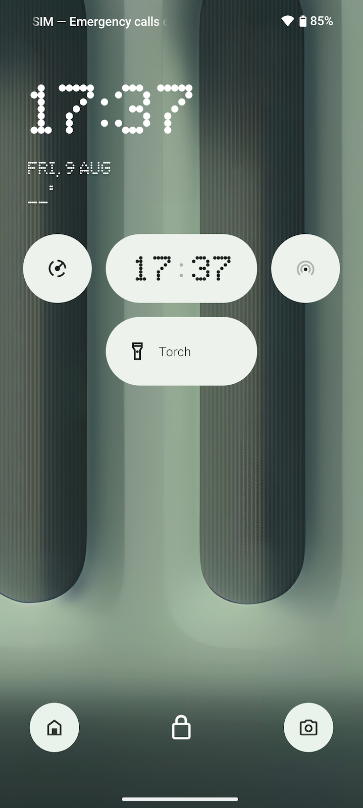
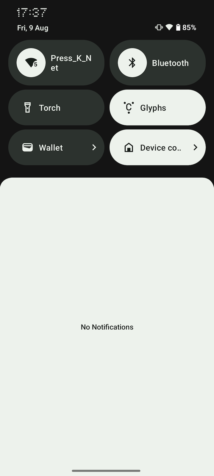
Other things we love about the Nothing UI are still here — large folders that allow you to fit more clickable icons on the homescreen, the ability to turn any quicktoggle (from the drop-down shade) into a widget, or to place it on the lockscreen, and the Glyph — the signature Nothing feature.
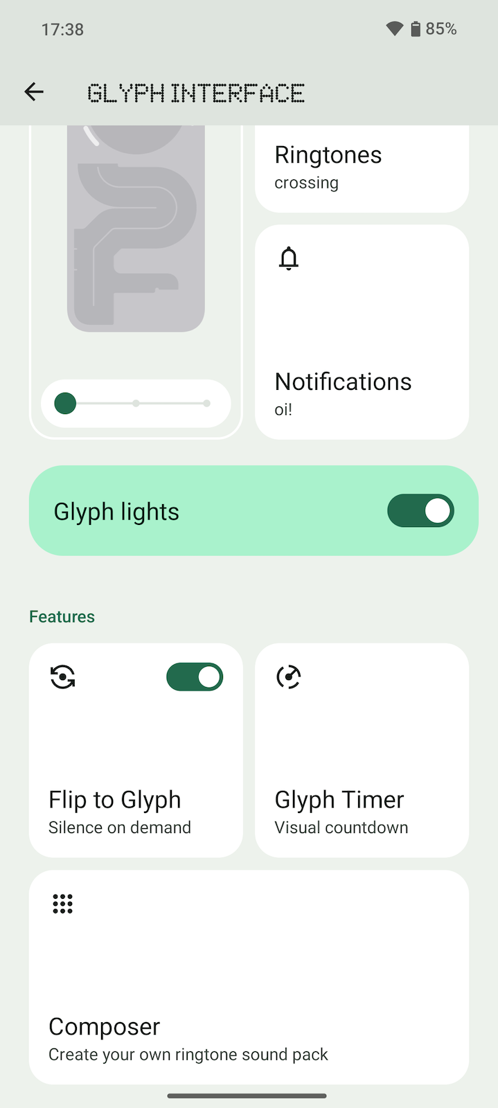
Unfortunately, it's still the same 3-part glyph as on the Phone (2a) — it still has the long strip for Glyph Timer functions, but it's nowhere near as cool and elaborate as the Nothing Phone (2) multi-strip LED lightshow.
Nothing Phone (2a) Plus Battery
Small bump in charging
Again, no big change here. The Phone (2a) Plus has a 5,000 mAh cell, same as the Phone (2a). Nothing stands behind the quality of the battery, saying it will retain 90% of capacity after 1,000 charging cycles. Of course, we assume reasonable conditions are implied — no extreme overheating or... throwing the phone in the fridge.
So, how does the battery perform?
The one upgrade we have here is 50 W charging — that's slightly faster than the 45 W charging that the Phone (2a) was able to take when wired. No wireless charging again. Also, no charger in the box, so if you want to make full use of the phone's top-up speeds, look for a 50 W brick.
The Nothing Phone (2a) Plus lasts quite a while — whether it's web browsing, video binging, or gaming, you can get up to 10 hours of screen-on time, which is a pretty solid result. Admittedly, most phones nowadays are hitting numbers close to that, but that's just evidence that smartphones are getting more and more reliable. In a nutshell: yes, the Nothing Phone (2a) Plus is solid.
That tiny 5 W upgrade gave us huge numbers on our battery charging tests — we assume something else is afoot. In any case, 30 minutes on the wire will give you 70% of battery, which is plenty enough to last a day with the Phone (2a) Plus.
Nothing Phone (2a) Plus Audio Quality and Haptics
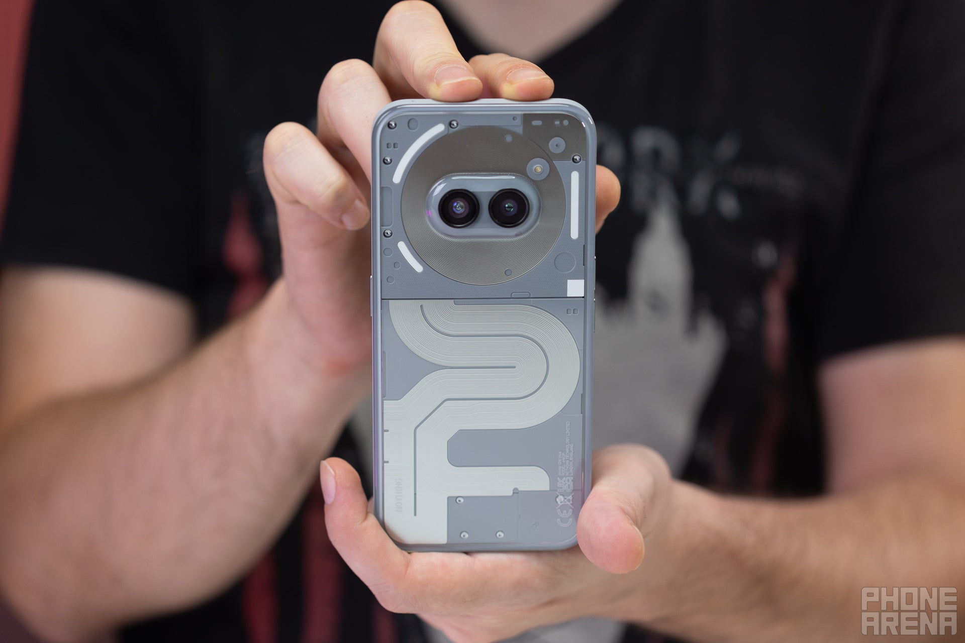
The stereo speakers here sound... OK. They are a bit shouty in the high mids but not shrill. There's some bass, but nothing astounding. They can do well for ringtones or the Glyph composer — Nothing has designed the sounds to match the speakers quite well. And you can watch talking head YouTube videos on it. But they are not amazing for music or movies.
The haptics are pretty pleasing — they are precise tick-type, not quite strong or rattly. Again, they have to be, since Nothing relies so much on the blinking Glyph interface and syncing vibration with sound with light. But they also feel pretty good for tapping on the keyboard or navigating the UI.
Should you buy it?
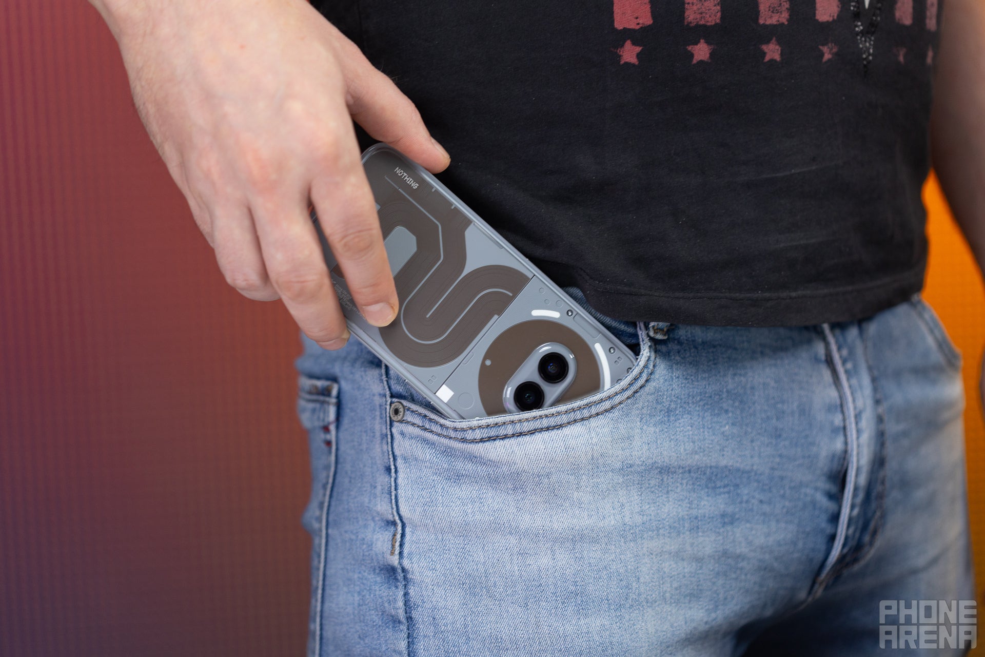
According to Nothing, the Phone (2a) was a hit, but some people wanted some more performance out of it. Does the new Phone (2a) Plus deliver on that end? We... can't say that so — it doesn't immediately wow us or shatter our expectations. Yet, it's more expensive by $50. So, yes, it's a bit hard to call it an undisputed win.
Then, if you want to buy it in the US, you need to register for the Nothing Beta Program — basically, since Nothing phones are not officially sold in the States, you can test one and report back on how it performs on the networks there. GSM networks.
So, yeah, if you are already that much of a fan — we figure you know the answer to that question.
For anyone internationally — like in EMEA or APAC — it's an interesting offer. In its class, it can be outperformed in camera or CPU power. But it can't be out-classed. The Nothing Phone (2a) Plus wears its geeky design choices with pride. The UI is quite excellent, the Glyph interface is dazzling. If you want a phone with a different type of oomph from the Galaxies or a more unique flair than the vanilla-feeling Motorolas — the Nothing Phone (2a) Plus hits that spot quite well. Then again, the same can be said about the "cheaper and slower" Nothing Phone (2a).













Things that are NOT allowed: