i-mate SPL Review

i-mate SPL is designed to prove that a smartphone does not necessarily have to be big and ugly. The slim candy-bar phone combines stylish design a-la RAZR (Motorola) and Windows Mobile 6 Standard smartphone. It is part of a new group of phones – elegant multifunctional devices. The top manufacturers already display such models, but they have no “smart” operating systems. We can mention some of them like Nokia 6300 - the imaging phone, Sony Ericsson W880 - the musical phone and the newly-launched T650. How does SPL cope with its rivals, you will find out later.
The set includes:
The set includes:
- i-mate SPL smartphone
- Charger
- Headset
- mini-USB cable
- Manuals
- CD with software
The first impression SPL gives you, when you know it is a smartphone, is “how really slim it is!” If you set aside (or you do not know) the fact that it is a smartphone, then you will probably regard it as a normal slim phone similar to SLVR. But, provided that it runs Windows Mobile, SPL has almost no rivals. And because it is offered on the market in different colors (blue, pink and black), SPL could be a very nice phone and it has nothing in common with most of the traditional smartphones.
As a mobile phone it is middle-sized, but for a smartphone SPL is small in size. Its weight is only 3.6 oz (102 grams), which is pretty acceptable and it feels light in your pocket. It is comfortable in your hand and certainly does not look cheap thanks to its metal panels.
Model | Dimension (Inches) | Dimension (MM) | Weight (OZ) | Weight (Gramms) |
i-mate SPL | 4.5" x 1.9" x 0.5" | 114.5 x 49 x 12 | 3,6 | 102 |
Motorola Q GSM | 4.6" x 2.5" x 0.5" | 116 x 63 x 11.5 | 4,1 | 115 |
Nokia N95 | 3.9" x 2.1" x 0.8" | 99 x 53 x 21 | 4,2 | 120 |
Nokia 6120 | 4.1" x 1.8" x 0.6" | 105 x 46 x 15 | 3,0 | 84 |
The nice small 2.2” color display has found its place on the front panel. It visualizes up to 65K (65 thousand) colors. The resolution is standard for this class, 240х320 pixels, the contrast is high and the brightness is a little bit over the average and the phone can be used, to some extent, in bright daylight. The colors are a little bit bluish and blue is the prevailing color.
The flat keypad is below the display and it reminds the keypad of the first RAZR phone. It reminds of it not only by its type and material but also by the curves of the lines which separate every key - the lines “curve” at the end, which is very impracticable, but good for the vision. We definitely do not like this keypad because besides it is flat (almost no raise), the keys are too small. The keys work softly when pressed and that gives tactical response, which is very good for that type of keypad. The small size of the keypad and its full flatness, lead to unpleasant, inaccurate and tiring work with it. There is a light blue backlighting, which clearly illuminates the separating lines, but the characters on the keys are not clearly visible.
The camera module is a little raised and located on the back panel (lens and self-portrait mirror) and the loudspeaker is below it. At the opposite end, a little raised pad helps the phone to be stable when placed on any surface.
Under the comparatively solid metal cover the 1100 mAh battery is hidden, which has to be removed to get access to the miniSD slot for memory cards and the seat for sim cards, which has to be pulled out to place the card. Removing the battery is somewhat unpleasant (besides slow) operation. Sometimes it is possible to place it back incorrectly, so that it juts out a little and still, to be in contact.
There is a LED placed in the left upper corner on the front panel.
The flat keypad is below the display and it reminds the keypad of the first RAZR phone. It reminds of it not only by its type and material but also by the curves of the lines which separate every key - the lines “curve” at the end, which is very impracticable, but good for the vision. We definitely do not like this keypad because besides it is flat (almost no raise), the keys are too small. The keys work softly when pressed and that gives tactical response, which is very good for that type of keypad. The small size of the keypad and its full flatness, lead to unpleasant, inaccurate and tiring work with it. There is a light blue backlighting, which clearly illuminates the separating lines, but the characters on the keys are not clearly visible.
The two volume control buttons and a musical shortcut between them are placed on the left side. The camera shutter key is on the right side. You can also find there a miniUSBport for connection with PC, charger and stereo earphones. Our personal preference is for a separate output for earphones - 2.5 or 3.5мм stereo jack.
The camera module is a little raised and located on the back panel (lens and self-portrait mirror) and the loudspeaker is below it. At the opposite end, a little raised pad helps the phone to be stable when placed on any surface.
Under the comparatively solid metal cover the 1100 mAh battery is hidden, which has to be removed to get access to the miniSD slot for memory cards and the seat for sim cards, which has to be pulled out to place the card. Removing the battery is somewhat unpleasant (besides slow) operation. Sometimes it is possible to place it back incorrectly, so that it juts out a little and still, to be in contact.
There is a LED placed in the left upper corner on the front panel.
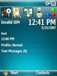
Home screen
SPL is a Windows Mobile 6 smartphone, which means that as a software it will have many similar features with other smartphones using the same operating system.
As a default the home screen shows system information, shortcuts for recently used applications and active stand-by screen that shows other information, for instance, Upcoming events. It can be personalized by themes to look completely different and several Windows variants are a nice example that can be changed from the menu: Settings – Home Screen – Home Screen Layout. The possibilities for personalization are almost endless.
The main menu is shown as a grid of 3x3 icons with shortcuts to numerical keypad. It can be also viewed as a list with 10 options, but in both cases the disadvantage is that if you want to see more options, you have to use the left software “more” key and to go back you have to use the hardware “back” key (arrow), which especially for us is very unhandy. With another WM6 smartphone, that we use (HTC VOX S710), the menu has a scroll option that turns over when the end is reached. Navigating there is very easy, because only the d-pad is used with no other buttons.
To lock the keypad, when you carry the phone in your pocket, you have to hold down the “home” button from the homescreen.
Phonebook:
Searching and dialing a number from the phonebook has never been easier. You can start inputting the number or the name you want from the homescreen (no matter if it is first or last name), but if you press the key for the corresponding character just once, it is as if the system for predictive text input is turned on. For instance, if you want to dial “Neo”, you have to dial 636 (6-MNO, 3-DEF, 6-MNO) and almost immediately the phone will show you all matching names. With “down” button select the contact you wish and dial it with the green receiver.
A long list with many fields is available when you add a new contact. You can find here many phone numbers, addresses and e-mails, etc. But here (like Pocket PC System) you cannot add two phone numbers of the same type – for instance, two mobile phone numbers. You can also attach a personal photo and a music file to each contact, but the displayed photo is so small when you receive a call or when you make a call that it is pointless, though there is plenty of space on the screen for a big photo.
By pressing the green receiver from the homescreen you can see the call history of the phone. You can easily add a number from here as a new contact or as a new number for already saved contact.
Organizer:
In the phone menu you can find your electronic calendar where you can save your appointments. They have options for subject, starting/ending time/all day event, location, notes. You can use options like: reminder (PRIOR NOTICE 1/5/10/15/30 minutes, 1 hour/day/week), recurrence (Once, Every (same-day-of-the-week), Day (same-date) of every month, Every (same date-date-and-month) for every year, sensitivity (normal, personal, private, confidential). You can also add attendees (required or optional) from your contacts where e-mail addresses have been added and where meeting requests will be sent.
Examining the calendar can be done by day/week/month and you can choose starting day for the week and the week duration (5-6-7-day week). The appointments for the day are clearly shown in their time limits, so you can see your free time at a glance. This is one of the new things of WM6 compared to WM5.
In the “Accessories” menu you can find “Calculator”. It does not have a “scientific option”.
File Explorer is the mobile version of Windows Explorer and it helps you to explore the content of the phone memory and the card memory, reaching even to the system folders and files. And you are not limited to use only the phone types of files, but you can see all files. There is no option for selecting several files together (hence you cannot work with them at the same time).
Voice recorder is a tool you can use to record voice notes with no limitation of the time duration, which depends only on the available free memory. Unfortunately, the microphone is not of a very good quality in this mode. You have to record very close to the source, so the recording to be clear later.
Messaging:
Like other Windows Mobile phones, all messages are in a common menu – Messaging. Here you can find all text, multimedia and e-mail messages. When you write a new message you can use the help of the T9 system, but the unhandy keypad has its effect.
Just a few steps away is the option to add your e-mail account (POP3 or IMAP) and to use your e-mail account on your mobile phone. Windows Mobile 6 already supports HTML formatted e-mails. The client is very similar to the Outlook on a computer, you can filter your inbox to see just some results, reply to message or forward it to other person. The support for attachments allows you to download or send one, in addition to the text body. The phone can be set to synchronise with your company Exchange Server.
As standard, Windows Mobile comes preloaded with the mobile version of Live! Messenger (MSN). Windows Live account will be added in Messaging when you add your e-mail account.
Connectivity:
i-mate SPL is a tri-band GSM phone, but there are two versions of the phone on the market – one for the American and another one for the European market. Its bigger problem is the slow Internet connection carried out by 2G GPRS than its faster upgrade (EDGE) or the third generation (UMTS/HSDPA). That means the internet connection will be pretty slow, both for browsing or e-mailing.
Internet Explorer:
As standard, all Windows Mobile phones come with Internet Explorer (Mobile) for internet browsing. Naturally SPL is not an exception.
Internet Explorer has the option „One Column View” for avoiding horizontal scrolling and in this mode everything is arranged one below another and therefore the original vision of the site is not longer preserved. The trouble is that in „Desktop” view, the browser does not render correctly most of the sites and they are again different from the PC view. And you need a lot of scrolling in both directions.
If you do not like this Explorer, you can change it for some of its alternatives. One perspective choice is Deepfish, which is a Microsoft development, but it is still in “Beta” stage and it is available only for a small group of consumers, who managed to register as testers.
Like other Windows Mobile phones, all messages are in a common menu – Messaging. Here you can find all text, multimedia and e-mail messages. When you write a new message you can use the help of the T9 system, but the unhandy keypad has its effect.
Just a few steps away is the option to add your e-mail account (POP3 or IMAP) and to use your e-mail account on your mobile phone. Windows Mobile 6 already supports HTML formatted e-mails. The client is very similar to the Outlook on a computer, you can filter your inbox to see just some results, reply to message or forward it to other person. The support for attachments allows you to download or send one, in addition to the text body. The phone can be set to synchronise with your company Exchange Server.
Connectivity:
i-mate SPL is a tri-band GSM phone, but there are two versions of the phone on the market – one for the American and another one for the European market. Its bigger problem is the slow Internet connection carried out by 2G GPRS than its faster upgrade (EDGE) or the third generation (UMTS/HSDPA). That means the internet connection will be pretty slow, both for browsing or e-mailing.
Internet Explorer:
As standard, all Windows Mobile phones come with Internet Explorer (Mobile) for internet browsing. Naturally SPL is not an exception.
Internet Explorer has the option „One Column View” for avoiding horizontal scrolling and in this mode everything is arranged one below another and therefore the original vision of the site is not longer preserved. The trouble is that in „Desktop” view, the browser does not render correctly most of the sites and they are again different from the PC view. And you need a lot of scrolling in both directions.
If you do not like this Explorer, you can change it for some of its alternatives. One perspective choice is Deepfish, which is a Microsoft development, but it is still in “Beta” stage and it is available only for a small group of consumers, who managed to register as testers.
Camera:
i-mate SPL has a built-in 2 megapixel camera. This is not an impressing resolution, but it is O.K. providing the purpose of the phone. If the quality of the photos is good then their size is good enough for internet purposes.
It is activated for a little more than 3 seconds by pressing its dedicated button. The interface is very simple and impractical, because the viewfinder takes up a little more than half of the screen and the rest is taken up by useless HUGE notices about the chosen resolution and “zoom” (of course digital). By the right software key you can reach the menu with the options:
- Mode
- Photo
- Video
- Portrait
- Self Shutter
- Burst
- PhotoFrame
- Zoom
- Environment
- Auto
- Sunny
- Cloudy
- Office
- Home
- Night
- Common
- Monochrome
- Ancient
- Advanced
- Brightness – 0 to 6
- Contrast – 0 to 6
- Setting
- General
- Store Position (Device/Memory Card)
- Spark Frequency (50/60 Hz)
- Preview after capture
- Photo
- JPEG Quality (Normal/Low/High)
- Photo name prefix
- Video
- Audio Capture (On/Off)
- Video name prefix
- Mode
- Album (shortcut to gallery)
- Exit
As you can see by yourselves, there are a lot of options (including numerous white balance settings and modes), but navigating in that menu is pretty unhandy. It is not optimized as the menu of a cameraphone, which is designed as a device dedicated to photo shooting.
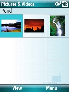
The album
The photos are not too good, but anyway, this is a smartphone with a camera not a phone designed as a cameraphone. Photos taken in a bright daylight look pretty good and they are correctly exposed with vivid colors and nice details.
Indoor pictures taken in a weaker light have noise and the lack of flash is clearly noticeable.
You can examine your pictures in the album, where you can see thumbnails shown as a grid of 3x3 and scroll function. Once you have opened a photo, you can use the zoom or save it as wallpaper on the homescreen and even to edit it using Rotate, Crop, and Auto Correct. The latter is a simple function, which corrects the levels of brightness and contrast, but it is one of the innovations of Sony Ericsson K810 compared to К800, which is a dedicated cameraphone.
Like all the other Windows phones, SPL has a pocket version of Windows Media Player, which is a combined audio and video player. You can activate it directly from its shortcut key on the left side. In library you will find all your music saved in the phone and in the memory card and sorted by Artist, Album and Genre.
During playback of a song the interface is almost empty because it is also used for visualization of video files. The buttons are small, but they only replace the functions of the D-pad. By using its directions you can forward and backward in a certain track, to change tracks, to Play/pause or to control the volume. The player has options for Shuffle/Repeat and it is capable of creating Playlists.
Windows Media Player 10 is capable of playing the following files:
- AUDIO: .MP3, .WMA
- VIDEO: .WMV, .ASF, H.263 - .3GP and .MP4
Unfortunately, watching of videos is a pain for the processor of the phone. It is unoptimized and the SPL is slower than other Windows Mobile phones with the same processor. Playing videos in QVGA resolution, the SPL will skip frames.
Software:
As all other Windows Mobile 6 devices, i-mate SPL comes with Microsoft Office package including the mobile versions of Word, Excel and PowerPoint. Though, it does not have a touch display, the new Office applications enable it to edit files, which is very convenient. For instance, you receive the file by e-mail, edit it and send it back.
The Office applications run very well and it is no problem to visualize complex files, for example, complex excel sheet. It doesn’t show the CPU isn’t powerful enough. It operates well.
As standard, i-mate have added two their applications: 1-View and Backup. There are also three their games besides the standard - Solitaire and Bubble Breaker. Number Place, 3D Bowling and Texas Hold’Em Poker are interesting games and they will help you when you want to pass the time.
Performance:
Counting on 200 MHz CPU, and even using the optimized Windows Mobile version 6, SPL is a clumsy device compared to its rivals. HTC Vox uses the same CPU and the same operating system and operates faster. It is often necessary to wait for a certain menu to load up. If you got used to non-smart phones then you will be bored by the slowness of SPL.
During a call, the phone performed much better. The microphone showed an average level, but clear and realistic voices. The incoming sound quality is also high and its power is a little above the average and again realistic voices. Using the loudspeaker is pointless, because the microphone is unusable at a distance and the speaker on the back panel is not provided for this.
Conclusion:
i-mate SPL copes with the task of a slim smartphone, only 12mm tick and with a metal panel, which helps to its high-class look. Combining its perfect phonebook and organizer together with the perfect sound quality during a call, we can see that SPL is not a bad handset. But its weak points are the weak signal strength and the slow internet connection. If you are really looking for a slim and stylish smartphone, this is a good choice, but if you need a good functionality, a little bit thicker HTC VOX S710 is our preferable choice.





Things that are NOT allowed: