ZTE Axon M Review
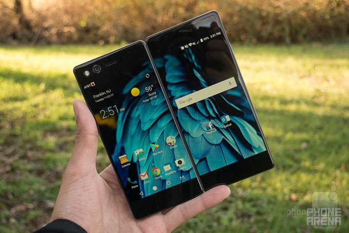
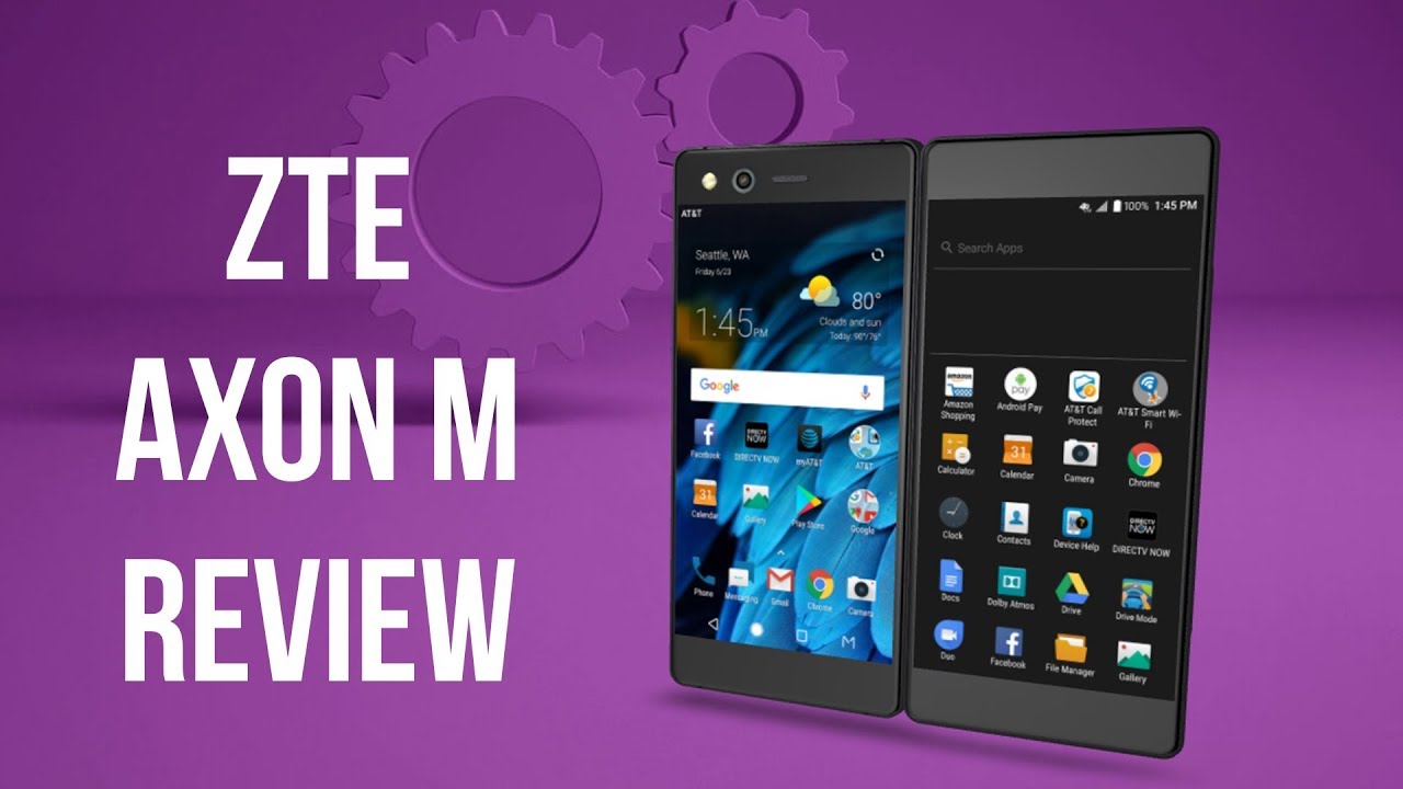
If you've been around PhoneArena for long enough, you may have seen those folding smartphone concepts – most notably the one from Samsung, where a single screen folds down the middle, transforming the device from a mini tablet to a classic smartphone and vice versa. The ZTE Axon M is built around that same idea, but realizes it through a much more straightforward approach. Basically, it’s a foldable dual-screen Android smartphone with two 5.2-inch displays held together by a hinge.
It must be pointed out that the ZTE Axon M is neither a concept, nor a prototype. In fact, you can get one from AT&T today for $725. This also gets you a decent set of specs, including a Snapdragon 821, 4GB of RAM, and 64GB of storage – all packed in a body made of glass and metal. But ultimately, is the Axon M a multimedia and multitasking powerhouse, or is its dual-screen design mostly a gimmick? We used it as a daily driver to find out.
In the box:
- ZTE Axon M
- USB-C to USB-A charging cable and wall adapter
- Micro-USB to USB-C adapter
- SIM tool
- Getting Started guide and Warranty Information
Design
Metal and glass construction help avoid a cheap-ish feel, as does a sturdy-feeling hinge, but general ergonomics are tough to smooth over.
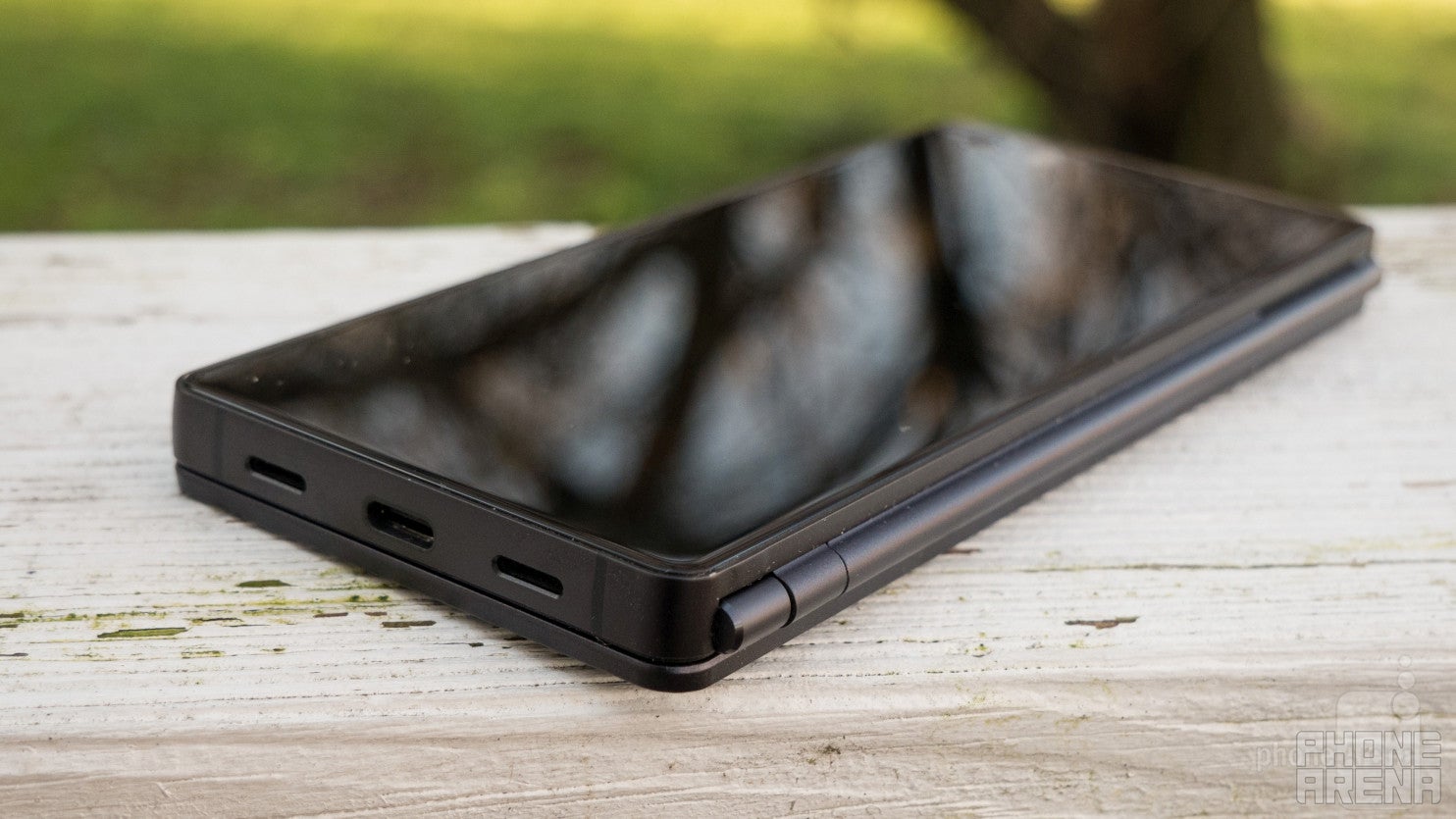
We don’t think the Axon M will be winning any awards for innovative, ground-breaking design, but it certainly is unique; there’s simply nothing else like it on the Western market today. Of course, we remember the ill-fated Kyocera Echo of 2011, but that was a plastic phone from another time. The Axon M endeavors to breathe new life into the form factor, forged from metal and glass, with sharp edges that are quite noticeable in hand. It’s a thick device – half an inch to be exact – and with two screens, it weighs in at 230 grams – 30 grams more than the iPhone 8 Plus.
Holding this phone in any orientation takes quite some getting used to, but the earpiece, flash, and camera (which is for both selfies and regular day-to-day snaps) tell you which side is the front. When using the device as you would a normal phone, the heavy weight is the first thing you’ll notice. However, the first true struggle comes when attempting to unlock the phone. On the left side of the device lies every button it has; the camera/quick launch button, volume rocker, and power button/fingerprint sensor are all in a line since the hinge takes up the entire right side. Alas, this side-mounted fingerprint sensor is not only a small target, but it’s also on the opposite side of your thumb (for right-handed users). This makes an awkward angle for your ring or middle finger’s print to be scanned and led to a lot of missed authorizations.
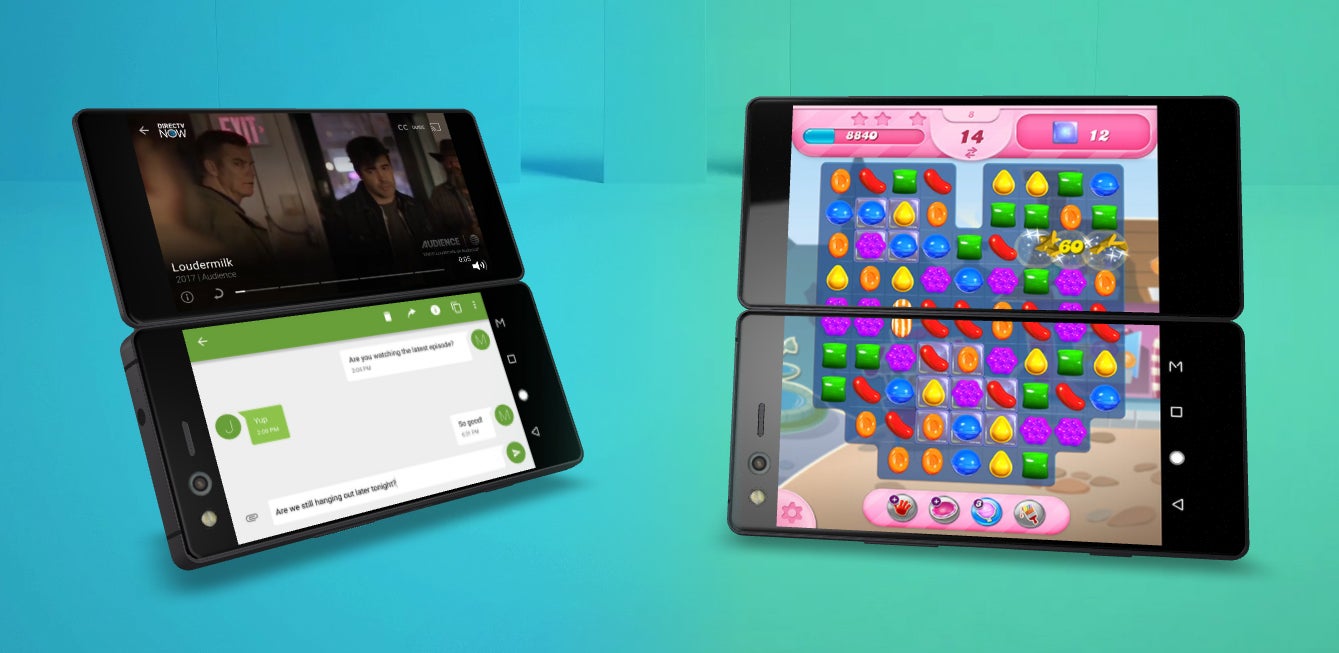
The ZTE Axon M in Dual Mode, where two apps run together, each on its own display, and in Extended Mode, where one app occupies both displays
The ergonomic struggle continues when the phone is unfolded. In landscape position (with the two screens sideways), the bezels provide enough space for us to hold the Axon M comfortably which was ideal for scrolling through Facebook and general web browsing. However, gaming and watching videos were less than ideal experiences when using the two screens as one large display – two of the most desired use-cases for what ZTE calls Extended Mode. Not only are your thumbs inadequately positioned to reach many of the on-screen gaming buttons, not only is there a weird black border down the middle of the screen, but holding the device this way also typically covers the speaker at the bottom – another detriment to your gaming experience. We struggled to find a grip that was comfortable and functional, so ultimately, you’re better off gaming in a single-screen, landscape position as these games were intended to be played.
It's a pity that the ZTE Axon M delivers a poor gaming experience since it could have made a solid gaming device if games were actually optimized for it. Imagine a game shown on one of the screens while the other display acts as a gamepad. Alas, we highly doubt that any of the top developers would adapt any titles specifically for the Axon M. Otherwise, Extended Mode works just fine in situations where you can hold the device with one hand and manipulate it with the other.
The Quick Launch button launches the camera with a double-click, and your chosen video service (YouTube, DirecTV, HBO GO, etc.) with a single-click – a feature referred to as TV Mode. This button protrudes as the volume keys do, but with its lower placement on the left side of the device, we often found ourselves accidentally clicking it when holding the phone in landscape position – single screen or otherwise. Other minor quirks you’ll encounter include a flashlight that will immediately blind you when turning it on.
Display
Two 1080p screens become one, but with a pretty annoying border in between.
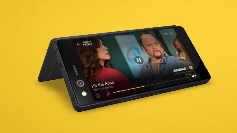
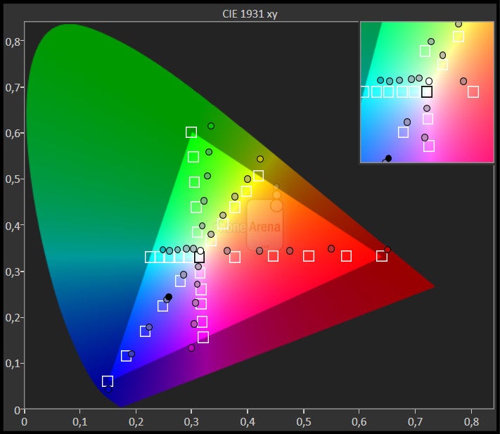
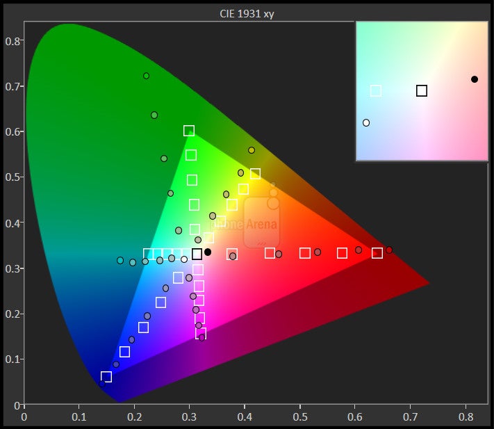
Each 5.2-inch display on the Axon M has a 1080p resolution, but a combined screen of 6.75 inches is created when the device is unfolded. While details were generally well-represented with very good viewing angles to match, the display could lean towards a yellowish hue. Furthermore, our unit seemed to have a slightly dimmer secondary display compared to the main screen.
When watching videos in extended mode, you can’t help but lament the obtrusive black bar placed smack dab in the middle of your content. Otherwise we did enjoy using the screens independently to view separate media or mirror the same content for another viewer.
Interface and Performance
It’s a decently powerful phone, but transitions between screen modes need much refinement.
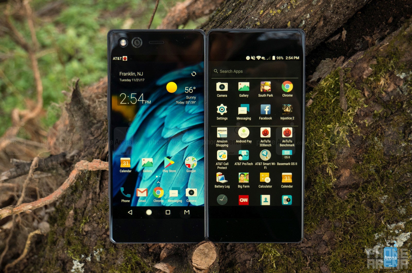
The Axon M’s interface is built on Android 7.1.2, but thankfully ZTE is guaranteeing an update to Oreo 8.0. Overlaid with its own skin and paired with apps from both ZTE and AT&T, the OS isn’t the most beautifully designed – erring more on the side of stock Android, but sometimes with even less color. The messaging app, for instance, takes on a dull green color as its main color scheme, and doesn’t allow for personalized colors for different contacts as Android Messages does.
The most unique aspect of the interface is, of course, using the two screens simultaneously. All available screen modes are activated through the “M” button, which is an additional soft key added to the nav bar. The list of modes includes:
- Single Mode, where only the main screen is activated.
- Dual Mode, which enables the utilization of two independent screens and multiple instances of certain apps, such as Google Docs.
- Extended Mode: as we hinted already in the Design section, it is used to stretch content across both displays, as if the phone had one huge screen only.
- Mirror mode, which duplicates the same content on each screen.
Furtermore, a set of gestures is built into the interface to make toggling and managing apps quicker. While in Dual Mode, you can use a three-finger swipe across both screens to swap an app from one display to the other – a useful and generally swiftly executed task. If, for instance, you’re in Extended Mode and would like to push content to one side to make room for another app, simply swipe one finger to the left across the nav bar. Then, when you’re done multitasking, you can swipe to the right to extend the left-most app once more.
In terms of performance and fluidity, general navigation will serve you decently well – apps typically open quickly, and swapping is just as prompt. Unfortunately, toggling screen modes can often be a stuttery and unresponsive affair. Taking some time to refine the transitions and speed up reaction times when changing modes would have been much appreciated, as there never seems to be an instance when lag and unresponsiveness aren’t a factor.
Camera
20 MP’s capture detail well, but motion blur and poor exposure do their part to obfuscate this fact.
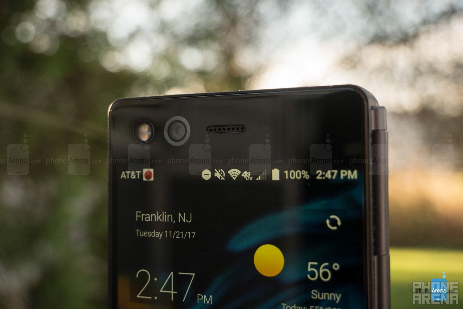
Sitting right up front, to the left of the earpiece, is the 20-megapixel camera and its accompanying dual flash. As mentioned, this is the sole camera, and it is weird how you're required to flip the device around after opening the camera app – even if you’re about to take a selfie. In such an instance, you must open the camera as usual, allow it to activate the rear screen as a viewfinder, tap the front-facing toggle, then turn the device back around to take a selfie with the main screen now acting as the viewfinder. Yes, it’s quite annoying and cumbersome to deal with this configuration when taking any kind of picture.
In terms of image quality, this camera is a letdown. Theoretically, 20 megapixels could capture detail well, but motion blur and insufficient exposure are often a problem, and the fact that the camera lacks OIS doesn't help. 4K Videos captured on the Axon M showed much of the same.

Call Quality
Calls were made and received with no major issues to report. The earpiece is quieter than we’d like but the dual-speaker setup projects speakerphone calls loud and clear. Dolby Atmos Hi-Fi gets louder than you’d need for most situations, but avoids distortion and delivers clarity to match its decibel output.
Battery Life
It’ll get you through a full day’s use, even with mixed screen usage.
Packing a 3180-mAh battery, the Axon M seems to have little issue getting through a full day of mixed use, and faired moderately well in our custom battery-drain test, lasting for almost 7 hours. Recharge times were also pleasing, quick-charging from 0 to 100 in only an hour and 23 minutes. Wireless charging, of course, is a feature missing from this double-sided phone.
Conclusion
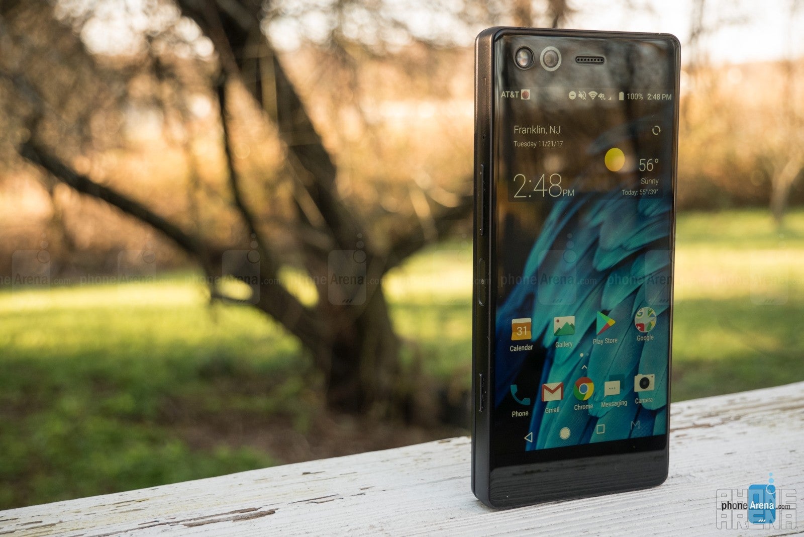
When it comes down to it, this isn’t the worst effort ZTE could have made, although it is a bit half-baked, and the Axon M falls short in key areas. Unfortunately, software is the one of the most deficient areas of the M. Simply stretching and splitting content in accordance with the in-built functionalities of the Android OS leaves the user with a rather slapdash user experience. Games can’t take advantage of the large double screen in any real way, videos are rather unpleasant with the black bar in the middle, and transitions between screen modes are often dreadfully unresponsive. The only actual advantage seems to be in web browsing and multitasking, as landscape mode enables a roomy experience for the former, and the multi-window feature provides the same for the latter. Otherwise you’ll find yourself using the Axon M as a regular phone more often than not. Given the M’s mediocre performance, $725 price tag, and laundry list of quirks, is it really worth dealing with all this to gain the exceedingly minor advantages? In a word, no. ZTE’s expressed intentions to make a second generation of the M; hopefully these issues are better dealt with come round 2.











Things that are NOT allowed: