T-Mobile Shadow Review

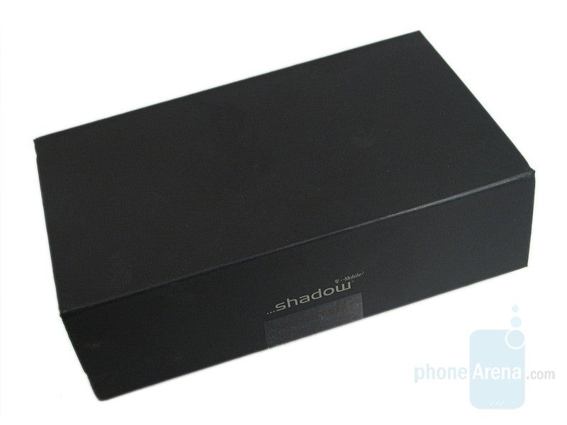
With how competitive the handset market is, each manufacturer have to make sure that theirs sticks out so that they don’t just blend with the rest. Some focus on one main feature, others look towards the design aspect, and then there are those that look towards an all-in-one type handset. With the Shadow, HTC has decided to go with the last option and pack as many features as it could into a stylish slider. So, will this help get your attention or is the Shadow destined to be just another handset that will be tossed to the side? Let’s read on and see how it does.
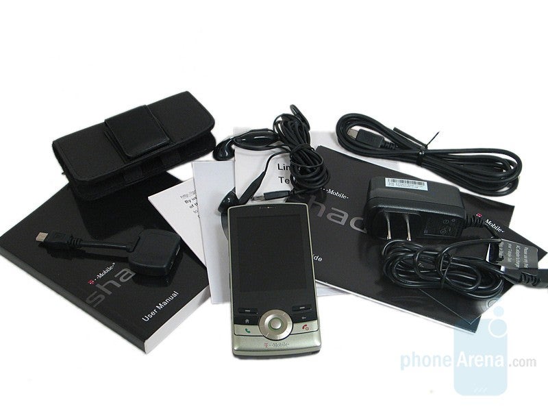
• T-Mobile Shadow handset
• 920 mAH battery
• USB handsets
• USB connection cable
• USB Y splitter
• Charger
• Carrying Case
• Tips and tricks guide
• Start Guide
• User Manual
• Software CD
• 920 mAH battery
• USB handsets
• USB connection cable
• USB Y splitter
• Charger
• Carrying Case
• Tips and tricks guide
• Start Guide
• User Manual
• Software CD
Design
The Shadow has really nothing that sticks out but comes off elegant and attractive instead of boring, despite its rather ugly Sage color. The other color variant is called Copper and is a darker variant. The upper portion is made up of hard plastic while the bottom is a soft touch rubber. While it does feel sturdy and we didn’t experience any play, the material used felt a bit cheap.
The 2.6 inch TFT display, which has a resolution of 240 x 320 with 65k colors, takes up the majority of the front. The picture looks great, colors are realistic and rich. This would be worthless if it is washed it out in bright environments but the Shadow’s display is very legible unless the Sun is shining directly at it. Below the display are the call buttons, a D-pad, soft touch buttons, and navigation buttons. While the D-pad can be used as a traditional one, there’s also the option of turning it, just like the iPod except it’s physical instead of digital.
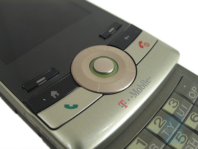
Call buttons, D-pad and softkeys
The side keys keeps with the Shadow’s design, they don’t just out but are easy to find. On the left, are the volume rocker, microSD slot, and miniUSB port. The right holds the camera shortcut and function key, pressing it once opens the messaging menu while holding it opens the voice command function. The buttons are very easy to press despite being somewhat slippery but the covers to the connectors are a bit challenging to open.
PhoneArena's Video Review of T-Mobile Shadow:
Interface
TheShadow runs on Microsoft Windows Mobile 6 Standard edition (WM6S fromhere on in) which provides plenty of functionality. The home screenuses a T-Mobile layout but there are seven other ones that can bechosen, including the classic ones. The main functions, such as imageviewer, calendar, internet access, and media player, are all accessiblefrom the main screen while other ones need to be opened through theprograms menu. It has the traditional layout, a 3x3 grid (with scroll), on the otherhand.
Bringing up the contacts can be done in one of threeways. The most obvious is of course by opening the contact list. Asimpler method is to just type in the name on the home screen. the lastway is to punch in the number and the name will be matched up.
The phonebook, organizer, and messaging system are all of the same ones that are found in this OS, so we will not discuss them in this review. They are close to excellent.
Media
Musicand videos can be played through Windows Media Player that is suppliedand it should be no surprise that controls are exactly the same as inother WM6S handsets. Sound quality is very good considering thespeaker's tiny size and there’s just enough bass to make the musicenjoyable and volume is not an issue. Sadly, there is no 3.5mm adapterso unless one is purchased separately, USB headphones can be the onlyones used. There is an A2DP profileso that Bluetooth headphone set laying around can also be used.
Camera
TheShadow’s 2.0 megapixel camera interface has different layout than thatseen in other HTC handsets. The main settings, such as timer andquality, are accessed through the menu while the more advanced optionsare a little bit deeper.
Upto this point, the Shadow has shown itself as a very capable handsetbut from here it starts to go downhill. The first thing we weredisappointed by was the photo quality. While photos did come out clear,they just seemed bland and the colors were washed out.
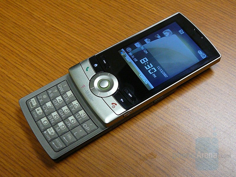
With a 200MHz processor and 128MB of RAM, the Shadow’s performance left much to be desired. There was no in-between ground as it was either very sluggish or, on the rare occasion, quite responsive. At one point, we activated the silent mode and it look about 3-4 seconds before the handset responded.
Reception is pretty good and we managed to get signal in most places, even those unexpected spots. It did tend to fluctuate wildly at times, where one minute we had full signal and the next we found only two bars.
Sound quality was more than disappointing, it was painful too. With the volume turned all the way up, the other person’s voice sounded artificial and had a very high tone. Once the volume was reduced, the high pitch wasn’t an issue but the voice still seemed digital making it sound very artificial. The loud speaker didn’t suffer from the high pitched tone but sound quality didn’t improve either. It seemed as this was only a one way problem and the other party had no complaints with our voices. They came through clear without being too loud or unnatural.
At least the battery life won’t let you down. After 5 days of use, it was still had a 50% charge. From full charge, the battery lasted an astonishing 9 hours and 37 minutes during our talk-time tests.
Conclusion
The T-Mobile Shadow manages to make itself stand out in a crowdedmarket all while not diminishing its features. Sadly, its sluggishperformance and average incoming sound quality cripple it slightly anddisappointed us. Still, it manages to be a good alternative to the moreknown handsets in its class by providing elegant looks, a great batterylife, and the functionality you would expect from it.







Things that are NOT allowed: