Sony Xperia M Review

Introduction
Can we have an Android device that is both compact, powerful and looks good? With high-end devices growing larger every year, the niche for a compact Android phone remains open and while the Sony Xperia M does not have the latest cream of the crop specs, it fits right in the compact paradigm with a good design and a modest 4-inch screen.
By specs, the Xperia M is a true mid-ranger that comes in both single and dual SIM versions (we have the single-SIM one for review), and its affordable nature has put a mark on its camera and display quality. Is it the mark of the devil, or can it still be taken seriously? Let’s find out.
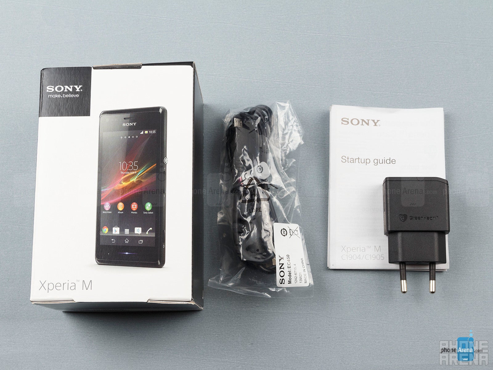
- User manual
- USB cable
- Wall charger
- Headphones
Design
The Sony Xperia M is a looker, and that’s a bit of a rarity for an affordable device. Sure, it’s made out of plastic, and yes, it’s a bit screaky when you hold it tight, but on the other hand its nice soft touch plastic arced shell and the meticulously crafted buttons all speak of attention to detail that’s admirable.
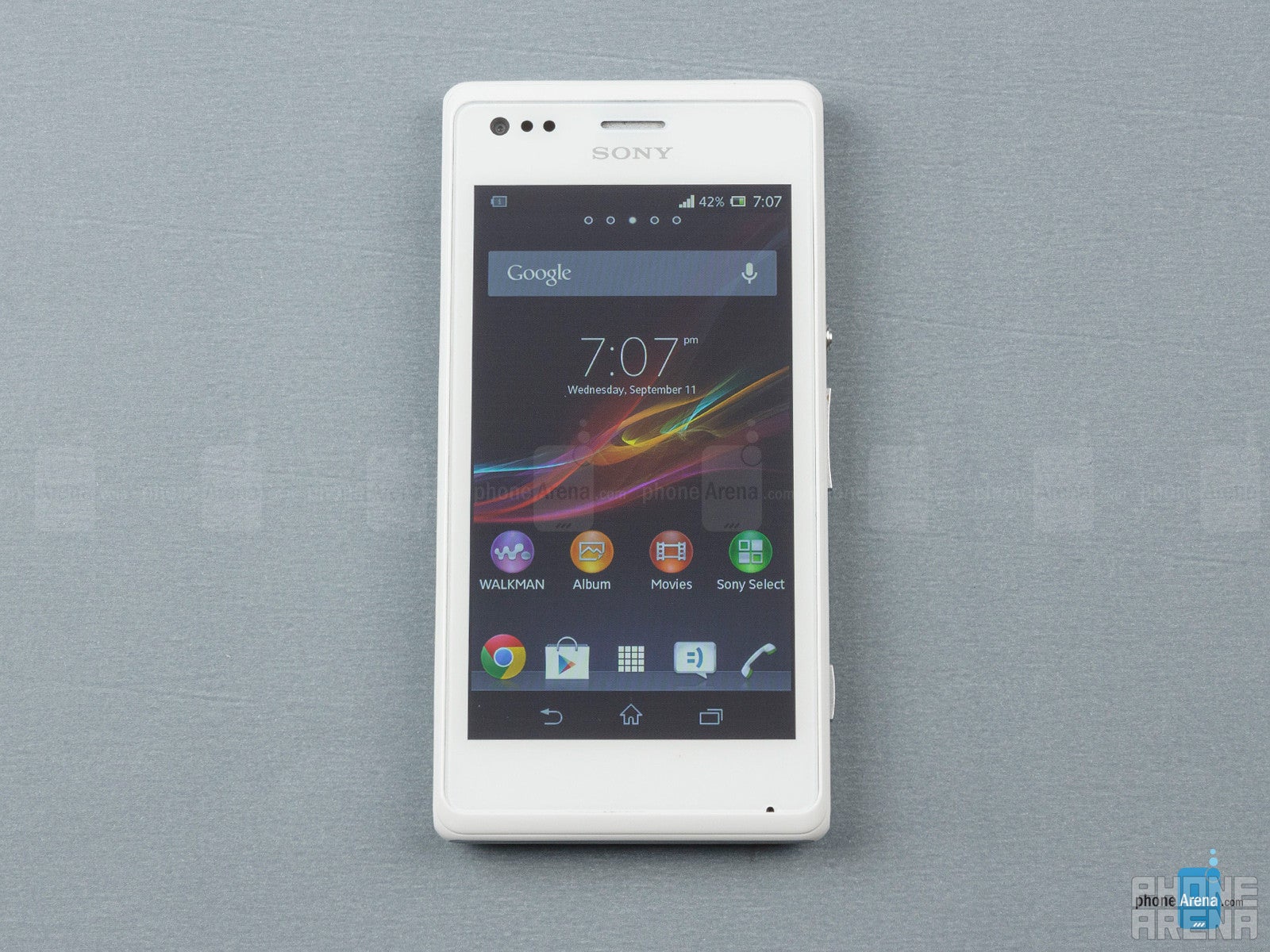
The Xperia M features no buttons on the front - Sony uses on-screen virtual buttons for Android navigation, and there’s a single stylish line-shaped LED notification light. All physical button are on the right side. There’s the signature Sony round metal power key, stylish and with nice travel to it. The volume rocker is also conveniently located on the side and its arc shape makes it easy to find and press. Finally, there’s a dedicated camera shutter key on the bottom.
Display
The phone features a modest 4-inch LCD screen with a resolution of 480 x 854 pixels. It’s sharp enough to avoid nasty pixelization, and pixel density is good at 245ppi. We also ought to mention that 4 inches is a small display size, but it’s even smaller here since the Xperia M uses on-screen buttons that take up valuable screen space.
Putting its size aside, what we really care about is to understand how good this screen is. We’d say that it’s average - not great, but not too bad either. The biggest issue with it is that the screen is a bit dim and hard to read outdoors, and has poor viewing angles that introduce noticeable color aberrations when you tilt the device ever so slightly. Everything else is fine - color fidelity is generally accurate, just a bit on the cold side and the display is scratch resistant.
Interface and Functionality
The Xperia M runs on Android 4.1 Jelly Bean with Sony’s own skin on top. Our experience is very positive with this Android skin, and we love the work Sony has done on enriching the stock look, feel and even functionality. Still, it feels like Sony could have released this with at least the newer Android 4.2.
The lock screen features shortcuts to the camera and music apps. A quick and intuitive up or down swipe gesture unlocks it with a neat shade-like animation. This kind of animations appear throughout. Sony’s UI comes with a selection of great high-resolution wallpapers and colorful themes so you don’t have to go far to start customizing the looks of a handset. The overall looks with silvery gray accents strike the right balance - not too serious, but nor are they childish and cartoony like the ones in say Samsung and LG devices.
Once you’ve unlocked the device, you get a multi-panel home screen. Swipe down for a notification shade with five toggles for quick access to settings like Wi-Fi and Bluetooth. We wish there was a brightness slider, but it’s missing. Adding shortcuts and changing wallpapers happens as you long press an empty space on the home screen. From there you get a convenient card-like live preview of the changes you make to appearance.
Sony’s skin is all about the little things. Having the option to arrange your app drawer by most used items is great, the transition animations are neat, and Sony has bundled in a bunch of ‘Small Apps’ that work on top of your existing applications. These include a calculator, voice recorder, timer, and a notes app, so you can jot down notes while you’re watching a video for instance.
The phonebook is also custom made and it comes with four tabs that you can conveniently swipe between. When receiving a call, you can also reject it with a custom text message, useful when you’re say in a meeting and cannot reply right away.
The Sony Xperia M is not the perfect device for texters. Sony’s messaging application is a fairly simple and well done app, but the on-screen keyboard will make you break a sweat as it’s hard to hit the right letters in portrait mode - we mistyped way too often, and could not get used to it even after a week of daily use. Typing in landscape mode is a bit easier as the keys are larger, but still not perfect.
Processor and Memory
The Xperia M works like a charm with no lag and a buttery smooth performance throughout. And that’s no surprise - it features a fairly snappy for its class Qualcomm Snapdragon S4 Plus chip, the same that you’d find on Windows Phone rivals like the Lumia 720 for instance. It is the Qualcomm MSM8227 system chip with a 1GHz dual-core Krait processor. The chip is manufactured on 28nm LP process, and features Adreno 305 graphics. Additionally, there’s 1GB of RAM, more than the average for this class, and this vast amount of memory allows for quick multitasking.
The handset might not have the largest display out there, but it handles most games and even the latest graphical masterpieces like Real Racing 3. It’s a fairly good performer for its class, here’s how it did in benchmarks.
| Quadrant Standard | AnTuTu | GFXBench | Vellamo (HTML5 / Metal) | |
| Sony Xperia M | 4254 | 11629 | 2918 / 26 fps | 1772 / 427 |
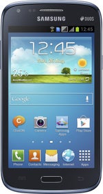
| Samsung Galaxy Core | 3054 | 7470 | 1028 / 9.1 fps | 1328 / 421 |
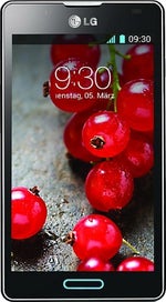
| LG Optimus L7 II | 2823 | 6674 |
One of Xperia M’s bigger flaws is the fact that it comes with merely 4GB of internal storage, of which only 2GB are available to the end user. Luckily, that storage allowance is expandable via microSD cards of up to 32GB.
Internet and Connectivity
You can easily access the web via browsers like the built-in mobile Chrome, or any of other alternatives like say Firefox and Opera from the Play Store. Browsing is zippy on Chrome, and scrolling around and zooming in and out happens almost without a stutter. The handset supports 3G connectivity with downlink speeds of up to 21.1Mbps.
It also comes with dual-channel Wi-Fi a/b/g/n, GPS and Bluetooth 4.0.
The Xperia M features NFC connectivity that is well integrated with other Sony products like its TVs for instance. You can easily share images wirelessly by just tapping a Sony TV remote to send the images to the large screen. Similarly, you can share music, photos and other media by simply tapping the phone and another NFC enabled handset or notebook. Screen mirroring to a TV is also very easy with DLNA support and the built-in “Throw” app.
Camera
The Xperia M comes with a 5-megapixel main auto-focus camera with a single LED flash and a basic front-facing VGA shooter.
Sony brings its own custom camera interface. Firing up the camera is fast and takes around a second. You are then taken into a simple and straightforward interface with large separate buttons for image stills and video recording. There are no built-in different shooting modes - you can shoot auto or dig into settings to manually adjust things like ISO, exposure and white balance. The camera does support HDR, though.
The camera takes pretty good images outdoors when light is plenty, but it does not stand out in its class. The capture pictures have very low level of detail (noise is visible even when the sun shines bright) and the tonality is a bit oversaturated, but are nonetheless usable for casual share-the-moment social use and people tend to like those popping colors.
Indoors where light gets scarce noise becomes a bigger issue, and the camera is not that usable. The LED flash is very weak and is not capable of lighting up scenes properly.
Video recording quality is definitely usable, but does not impress with anything. The handset records up to 720p video at 30 frames per second. Colors are lively, but it lacks detail and exposure compensation is a bit off at times. The continuous auto-focus works but is a bit slow. When it comes to sound recording, we have a very regular quality microphone capable of capturing sounds in the middle, but distorting higher and lower volumes.
The front camera is a very basic VGA unit, but we still like the fact that it’s there - it’s definitely useful for video conferencing.
Multimedia
Sony might never go back to its Walkman fame days, but the built-in Walkman music player in concert with the great sound pumping from the rear speaker make the Xperia M a great device for listening to music. The Walkman app is a great, polished application that breaks down your music collection by songs, albums, artists, playlists and favorites. It comes with an equalizer and some neat presets for clearer sound.
Now, for video, the 4-inch screen might be on the small side if you plan on watching longer clips or full-featured movies, but the device is definitely fit for checking out shorter clips. The built-in video player reproduced all popular formats at around native resolution with ease, and for more exotic codecs you can always turn to the Google Play store.
The image gallery has also been customized the Sony and categorizes your apps neatly by date or albums. We like all media app looks - all fit the streamlined Sony design and are clean, not cluttered.
Call Quality
Battery life
The 1750mAh battery on the Xperia M lasts us two days with average use, and even a bit more if we were more frugal with calls and gaming. Official quoted talk time stands at the average 9 hours on 3G. The battery is also user replaceable and that’s a plus.
Conclusion
The Sony Xperia M is a phone with good looks, streamlined user interface that we actually like, and a powerful chip for its class. Not a bad combination, is it? It has its downsides - we wish the screen was a bit better, but our biggest complaint right now is price. The handset sells for prices of between $200 and $250 off contract, and that is a bit steeper than we’d like for such a device.
On Android, its biggest rival would be the larger, but cheaper 4.5-inch Samsung Galaxy Core. Even the similar yet larger 4.3” Sony Xperia L sells for around the same price.
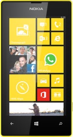
If you are willing to experiment with a different platform, the Windows Phone 8-based Nokia Lumia 520 brings a very identical package at around half the price and looks like a much better deal.
All in all, we like where Sony is headed with the Xperia M, an affordable device with good looks and solid hardware like this one could become the staple in its smartphone lineup, but it needs to come down in price first.
Software version on the reviewed unit:
Android 4.1.2 Jelly Bean
Baseband version: 2.11.J.1.18_8x30_M:172136.41.21.000327_A:172136.41.21.002465
Kernel version: 3.4.0
Build date: Thu Jun 20 15:24:21 CST 2013
Build number: 15.1.A.1.9





Things that are NOT allowed: