Sony Xperia 10 and 10 Plus Review
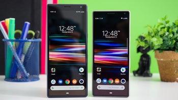
Review index
Historically, Sony has been conservative with its smartphone design, but it has always had this penchant for experimentation as far as its displays are concerned. The Xperia Premium line of devices is a testament to that — being the first and only 4K-screen phones made by a major manufacturer.
Which is why it wasn’t very surprising when the company launched its new, extra-tall line of handsets — the flagship Xperia 1 and the mid-range Xperia 10 and Xperia 10 Plus. Yes, the 21:9 display aspect ratio is shocking in itself, but we figured that if anyone were to do it, chances were high it would be Sony.
While the Xperia 1 is still taking its time to land, we did get the new midrangers to play with. So, here is our review of the Sony Xperia 10 and Sony Xperia 10 Plus.
Design
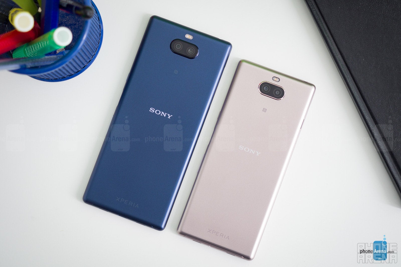
Both phones feel super comfortable to hold, especially the small-sized Xperia 10. It’s very narrow and fits really well in the hand, while the screen still gives off the illusion that it fits a lot of content — vertically, at least. Whether that space is used well or not will depend hugely on the app you are staring at, but more on that later.
The Xperia 10 and Xperia 10 Plus are polycarbonate phones, covered in what Sony calls "metallic finish". It's matte and it collects some fingerprint grease, but it's still grippy. Feels better than regular plastic and certainly less slippery or greasy than a glass back.
While the fingerprint scanner is OK, the hardware buttons are simply bad. They sit almost flush with the phone, making it very hard to find them by touch and even harder to press them in. We’re not sure what happened there, but hardware buttons should not be that hard to operate, ever.
Display
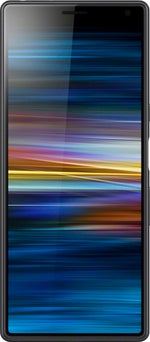
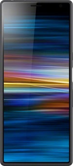
Both the Sony Xperia 10 and Xperia 10 Plus have 1080 x 2520-pixel screens. Stretched across a 6-inch and a 6.5-inch diagonal, you get a PPI density of 457 and 422, respectively. In other words, both screens look sharp, no worries there.
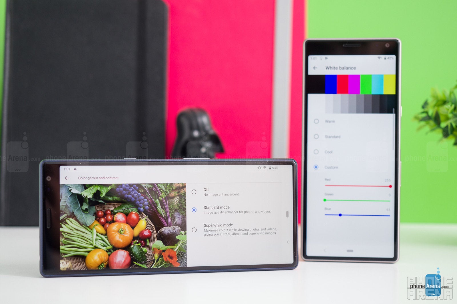
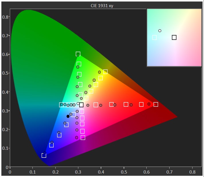
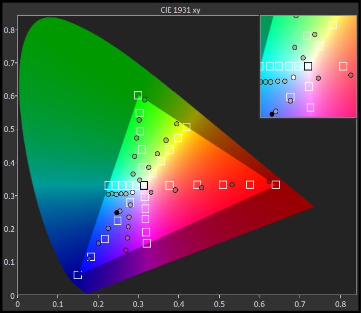
When it comes to color and white balance, they can be quite off-putting. In our case, the Xperia 10 has a very noticeable green cast, while the Xperia 10 Plus is bluish out of the box. Both remain quite cold-looking, even after fiddling with the custom RGB sliders under Advanced Settings to the best of our ability.
The panels are bright, but their glass is quite reflective. We found them usable under direct sunlight, but squinting is required. So, not your go-to Summer vacation handset, we’d say.
Using a phone with a 21:9 aspect ratio
We figure it’s pretty hard to justify why anyone would decide to make a phone with a 21:9 display. Yeah, marketing talk says that this is the cinematic ratio and that full-blown movies will fill all the corners of your phone’s display. But we dare to argue that anyone watching a film on a 6-inch screen is probably not prioritizing a cinematic experience. The Xperia 10’s screen is pretty much as narrow as the one on an iPhone X. It’s just a tad longer.
When not using the phone as a media player, there are other apps to consider. And will they fit nicely in this fresh and unique aspect ratio? Well... it depends.
Most text- or card-based apps, like Facebook, Instagram, Reddit, and many chat apps have no issue with the new aspect ratio. They also benefit from it by being able to fit more posts vertically — not by a whole lot, certainly, but it gives you that sense of spaciousness when you can see deep into the next post without having scrolled down yet. Split screen also benefits from the new super-tall ratio, giving the apps just a bit more room to play in.
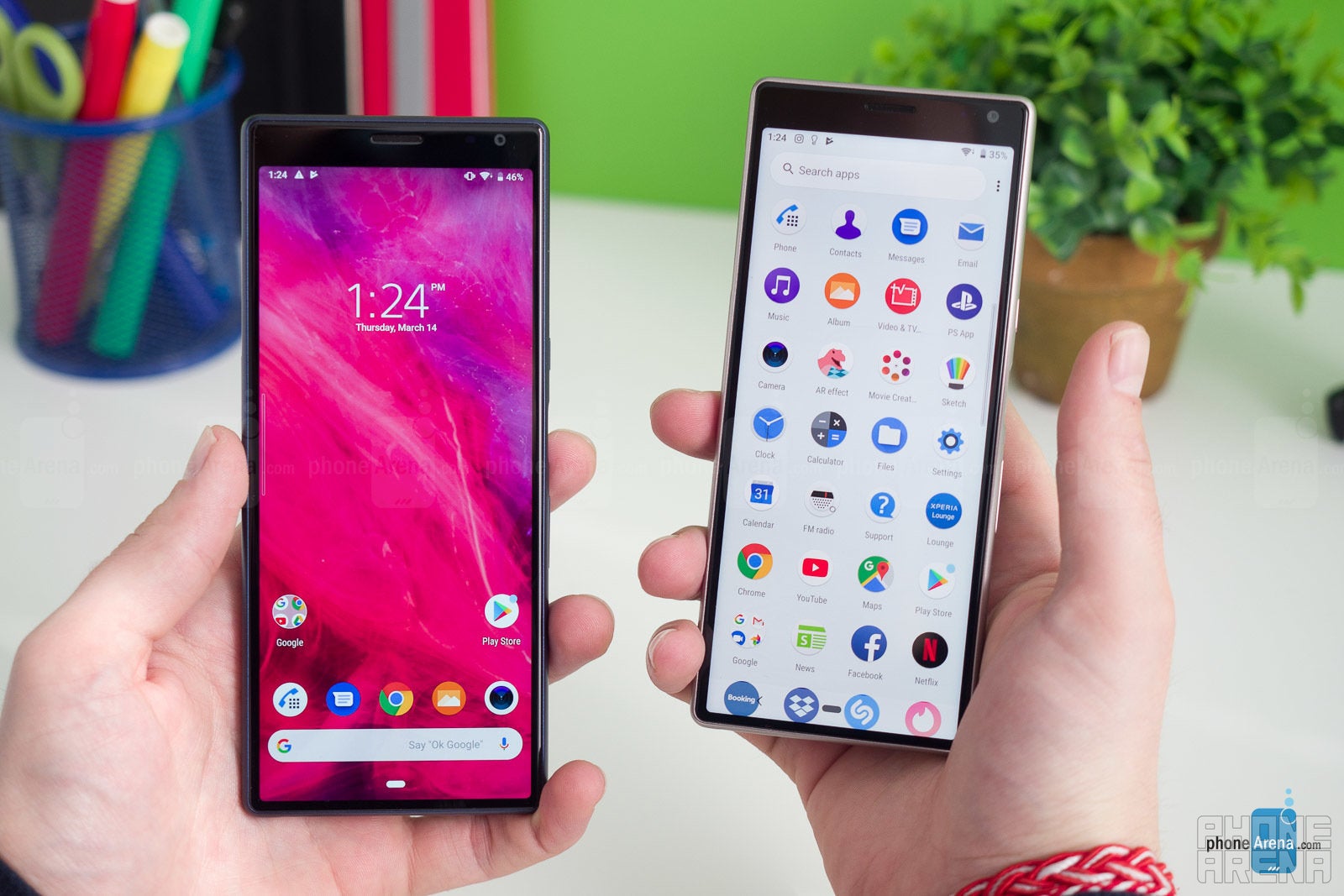
Of course, it’s up to the developers to fix these issues. But we are concerned that, considering the (lack of) hotness level of Sony phones right now, that may take some time. So, we suggest you check if the new Xperias support your favorite apps/games before buying one.
Another grievance we have with the aspect ratio — under normal use, it’s pretty hard to reach up the screen when holding the phone with just one hand. Even the Xperia 10, which feels super-comfy to handle otherwise, will give you a challenge when you want to reach elements at the top of the screen. Sony’s solution for this is the Edge Sense panel, inherited from the Xperia XZ3. More on that in the software section below.
Despite our complaints, the tall screens do manage to accomplish two major goals — they do fit a lot of vertical content when browsing the web and social media, and they do look kind of cool.
Interface and software
Sony’s approach to user interface has always been something along the lines of “let’s not mess Android up too much”. Their re-skins are light and generally follow the core Android look and feel. There are a bunch of Sony-made apps that come with the Xperias, like the News app, PS app, Xperia Lounge, and an automatic Movie Creator, which may all feel a bit like bloat but are nothing too offensive. Besides, most of them can be uninstalled.
The one notable proprietary feature that Sony puts on the new Xperias is the so-called Side Sense. Much like the Edge Panels on a Samsung Galaxy phone, it’s a tiny transparent “handlebar”, resting on the very edge (left or right) of your screen. Unlike on a Samsung, however, you need to double-tap it (instead of swipe) to get a drawer with your favorite apps, as well as often-used functions and shortcuts. It certainly helps with one-handed use of the tall phones, but it does require some getting used to. For the life of us, we don’t know why we need to double-tap the very end of the display, instead of just swiping inwards to pull the panel out. We assume Sony wanted to avoid being called a “Samsung copycat” for an Edge-panel lookalike, so the end user now gets to suffer a more cumbersome experience. This is why we can’t have nice things, people!
Hardware and performance
The Sony Xperia 10 and Xperia 10 Plus are powered by slightly different processors — a Qualcomm Snapdragon 630 in the small model and Snapdragon 636 in the Plus variant. Going by specs alone, it says the Snapdragon 630 is clocked at 2.2 GHz, while the 636 only ticks at 1.8 GHz. You might wonder — why is the bigger phone slower?
Fret not, the Snapdragon 636 is actually a newer-generation version of the old 630. It’s 40% more efficient, according to Qualcomm. In real life use, we saw small differences in performance, if any. The Xperia 10 Plus is sometimes slightly faster than its sibling, but not to a huge extent.
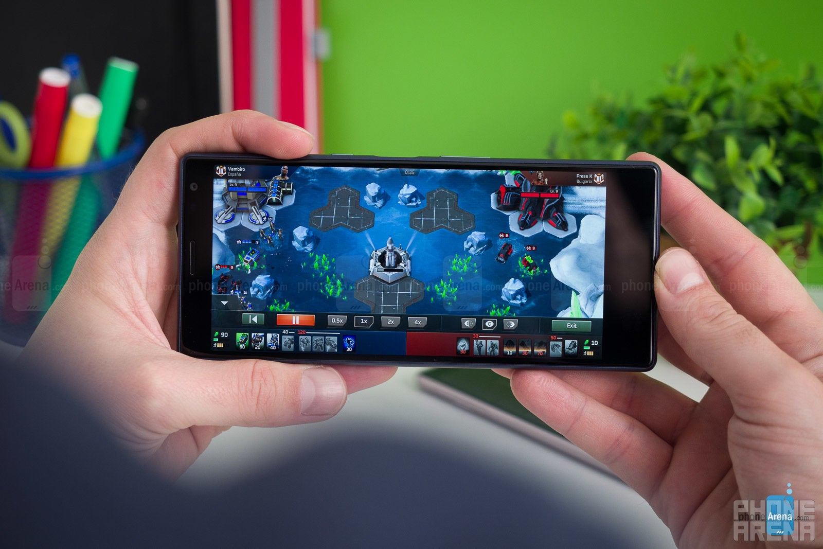
Neither of these is a gamer’s handset for sure, but one that can serve you well in your day-to-day tasks, if you don’t mind some stutters along the way.
Camera
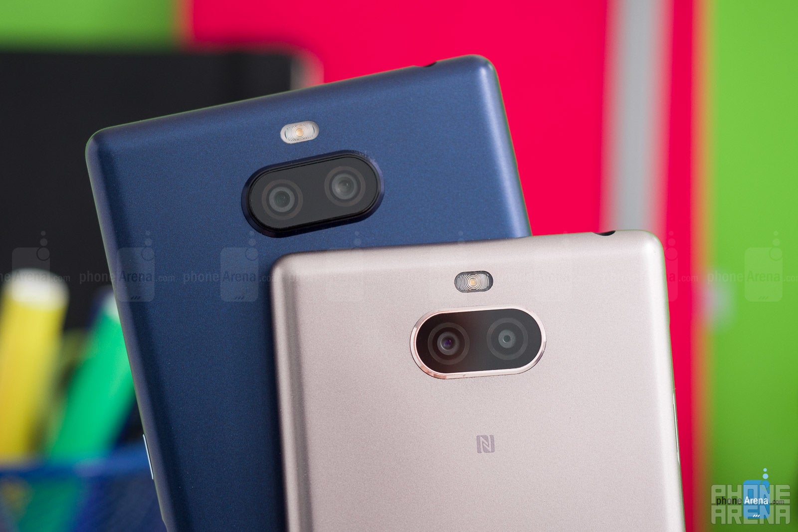
Surprisingly, we’ve got two very different cameras on the two models. Not just in specs, but in performance, too. So, the Xperia 10 has a 13 MP sensor with an F2.0 aperture lens for its main camera and a 5 MP assistant, which is there to help with depth perception. The Xperia 10 Plus, on the other hand, has a 12 MP sensor with a larger, F1.8 aperture lens, and a secondary camera that is actually user accessible — an 8 MP shooter with a telephoto lens for your portrait shots.
In terms of image quality, both cameras are very different, though we can’t say either one of them is particularly good.
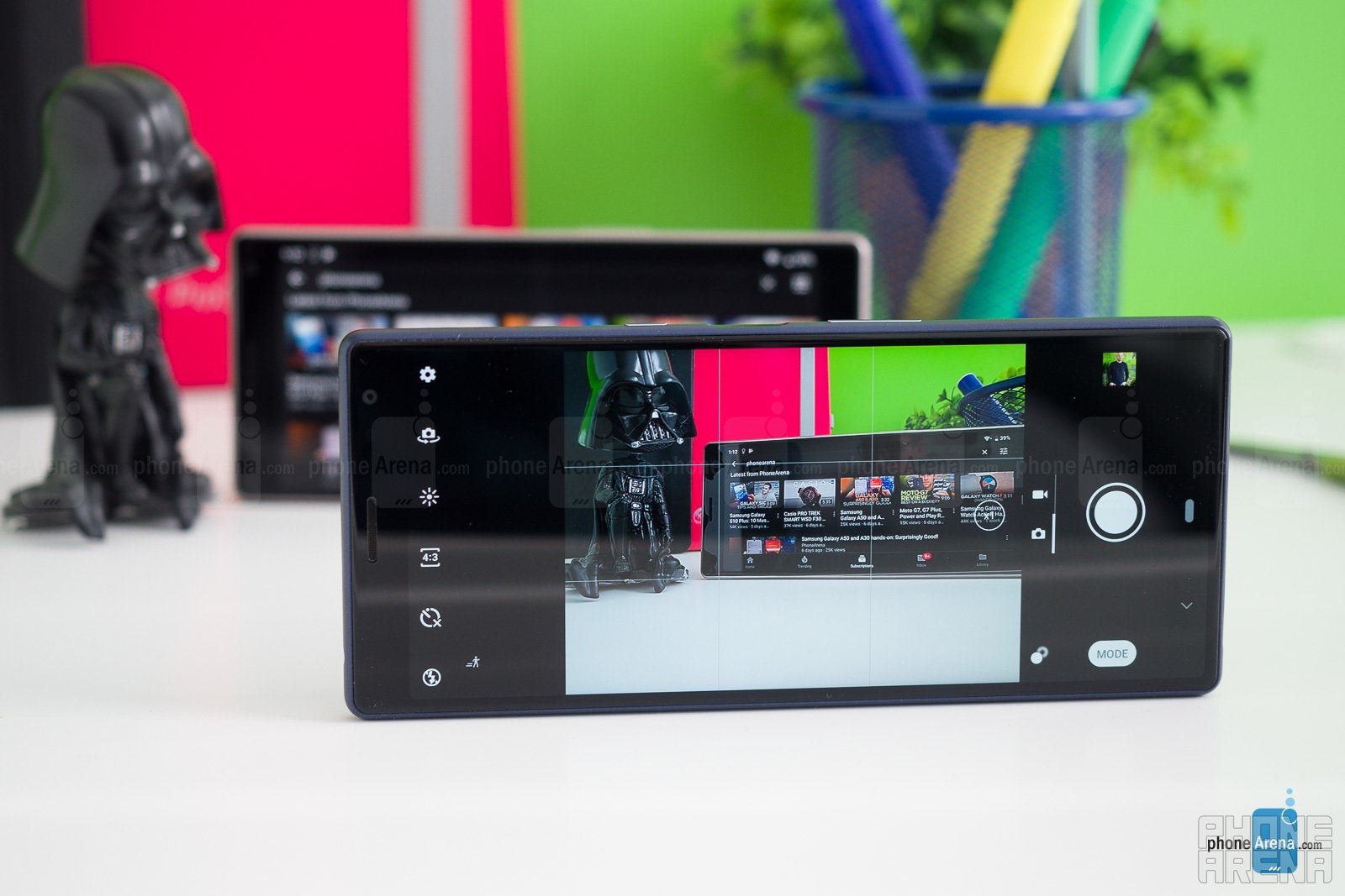
Indoors, under artificial lighting, the camera starts to slump. Colors start getting oversaturated left and right and the lack of any sort of stabilization means you will often end up with a blurry shot, as the shutter time is boosted to let more light in.
On the Xperia 10 Plus, we have a slightly wider aperture, giving it a nicer-looking bokeh in the background, when you’re doing a closeup shot. It’s on par with the regular Xperia 10 in terms of color reproduction and has a slightly better dynamic range. On the flip side, the Xpeira 10 Plus captures slightly softer detail than the regular 10. Indoors, under artificial lights, it performs much better than its smaller sibling, without oversaturating the colors or overblowing the highlights. Though it still suffers from the lack of stabilization, it is generally the better camera of the two here.
However, on both phones, getting Bokeh Mode to work right is super finnicky. The handset will constantly whine at you and zig-zag between the rules "move closer to object", "move away from object" even if you feel like you're doing everything right. We assume the Xperias are having trouble separating subject from background and would hope that this gets an update that fine-tunes the feature. Otherwise, it'll probably remain unused.
In terms of video, both phones produce clips with good detail and accurate, if sometimes saturated, colors. Sometimes, the limited dynamic range rears its head and makes objects that are in shadows too dark — something to keep in mind when you are panning from one object to another. The sound is clear but lacking in bass. There isn’t much stabilization going on, so be sure to keep those hands steady. They have continuous autofocus, but it takes a while for it to kick in, which can be a problem in dynamic situations.


Multimedia, sound, call quality
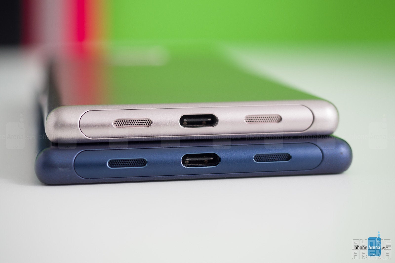
As previously stated, the 21:9 displays were specifically made for watching movies. And yes, we have to admit that having the video fill up the screen entirely, with no black bars or letterboxing, is nice. Unfortunately, neither the Xperia 10 nor the Xperia 10 Plus has stereo speakers. Instead, you are stuck with the bottom-firing mono driver. It doesn’t sound bad — we’ve definitely heard fuller- and meatier-sounding phone speakers — but it is none the less rich and loud-ish without distorting.
Battery life
On our battery life test, the Xperia 10 hit 7 hours and 36 minutes, and the Xperia 10 Plus lasted for a bit longer, clocking in at 8 hours and 15 minutes. Both results are OK in our eyes — nothing mind-blowing, but you can still rely on the phones to last a full day and have enough juice to make it to the nightstand. That has been our real-life experience with them as well.
Conclusion
The Xperia 10 duo is certainly a unique-looking offering this year. We are not sure if any other manufacturer would be bold enough to try the 21:9 ratio any time soon, so, for the time being, you can be sure that these extra-long slabs will look special when you put them on the coffee table.
But, are the looks worth it or is this a case of form over function? That's still up in the air. We found it inconveniently annoying that the screens didn't show our favorite games just right. But, on the other hand, we had a blast with the extra vertical room that 21:9 was giving us. We did get used to one-handed operation with the help of Side Sense, too. It's not ideal, but it can work.
But we'd also recommend you take a look at another group of devices in the segment — the Moto G7 variants, which we recently reviewed. With a similarly clean, close to stock-Android UI, an acceptable camera, performance that stuttered less, and better battery life, the Moto G7 still costs $300, which is $50 below the starting price of the Xperia 10.
If you are planning on getting the $430 Xperia 10 Plus for its telephoto camera alone — we'd say hold out. The Portrait Mode just doesn't perform too well on this phone and, unless fixed via an update, you will probably drop it in about a week. Also, as an alternative — we can't help but mention that if you hold out and save up an extra $120, you can actually get the OnePlus 6T at $550, which has top-of-the-line hardware and is much better across the board. There's very little reason not to.







Things that are NOT allowed: