Youth oriented, the Z200 didn't turn out to be a hit maybe be because its design and solutions were way too futuristic and unique, such as you haven't met in other phones. Therefore its descendant the Z300 gets more held back, classic and stylish design while keeping the strong sides of a phone from this class exchangeable panels and a round external display, looking like an analog clock. Being an entry-level phone it is offered at a low price and it can be purchased from Cingular as a GoPhone at the moment without any commitment, which is comfortable if you frequently change carriers (due to traveling for example) and do not want to be attached.
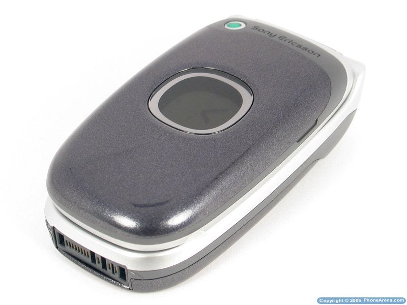
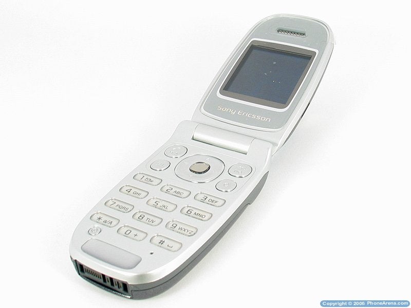
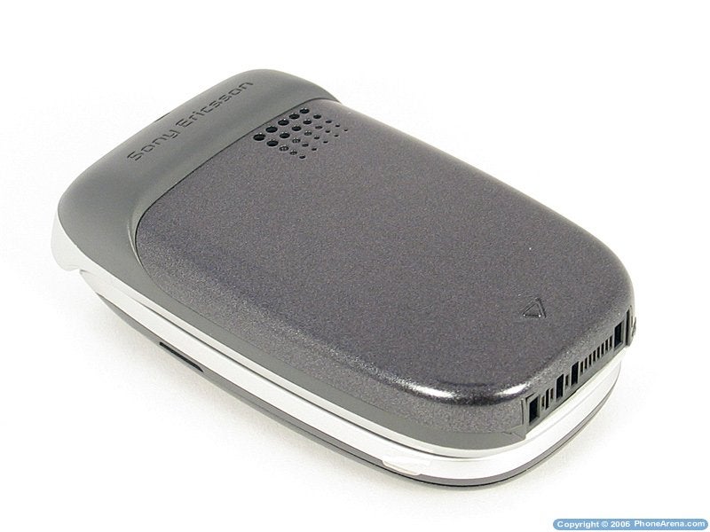
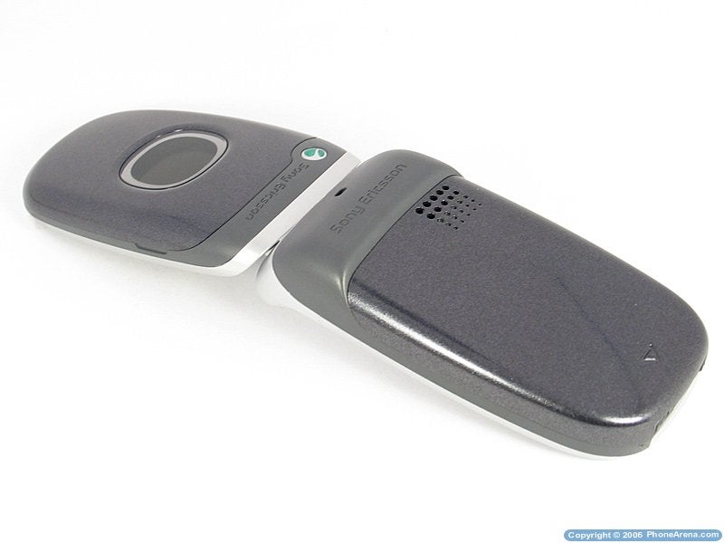
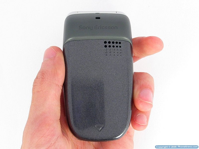
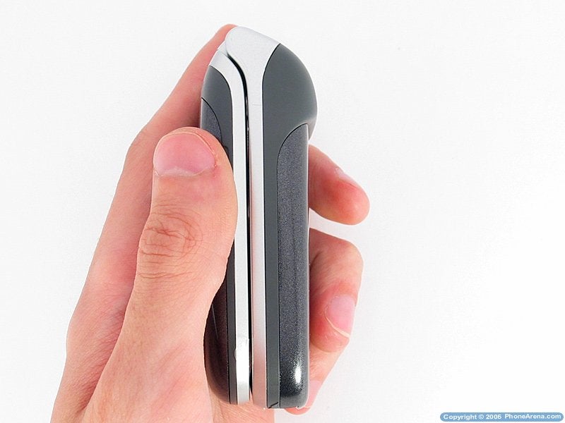
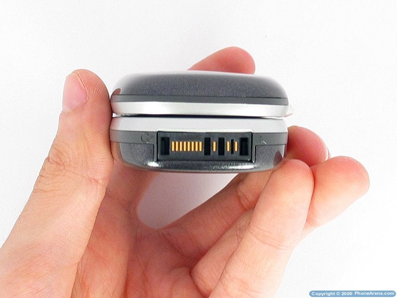
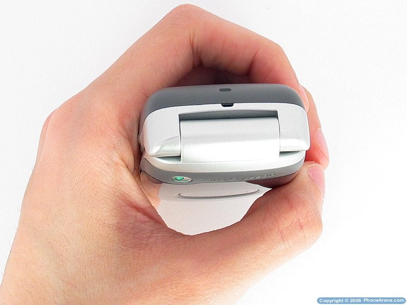
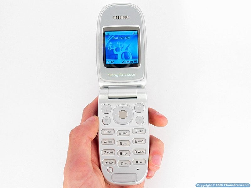
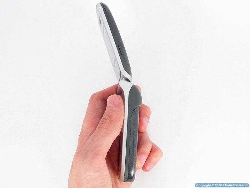
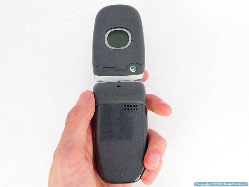
The Z300 is a classic clamshell without any whatsoever surprises. No extras are presented either, such as special mechanisms to open it for example, but at least the antenna is internal, which helps for the overall relatively small measurements of the phone. Made entirely out of plastic elements it has three color levels: the internal part, the hinge and a thin margin around the display are made of silver shiny plastic; the battery cover and the main part of the front panel (the exchangeable) are made of dark grey shiny metallic plastic; and the rest of the phone, which is the frame is out of smoked plastic without a shine, and that way in the upper part of the phone are gathered 3 different colors (without counting the logo of the manufacturer), which is not that esthetically good.
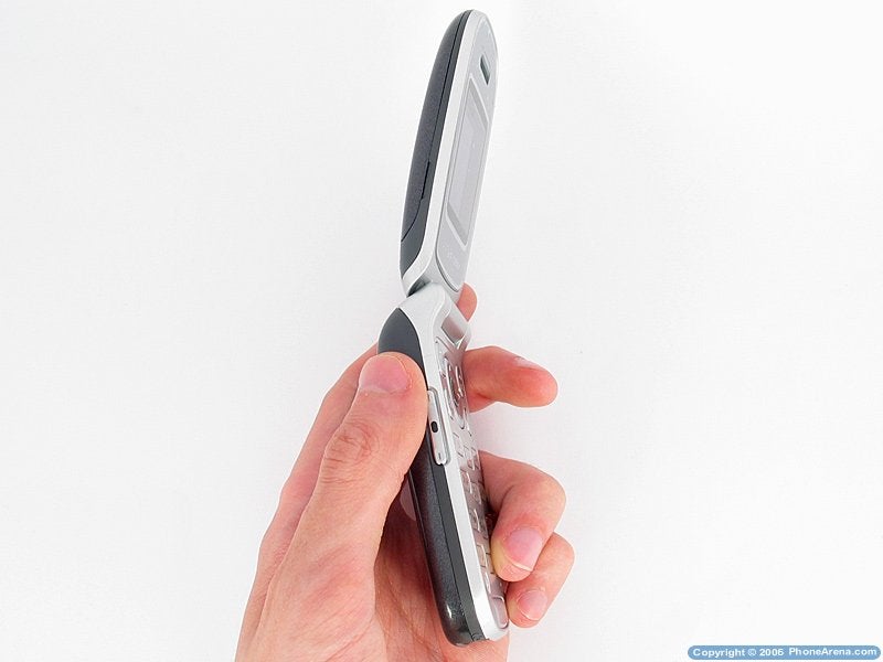
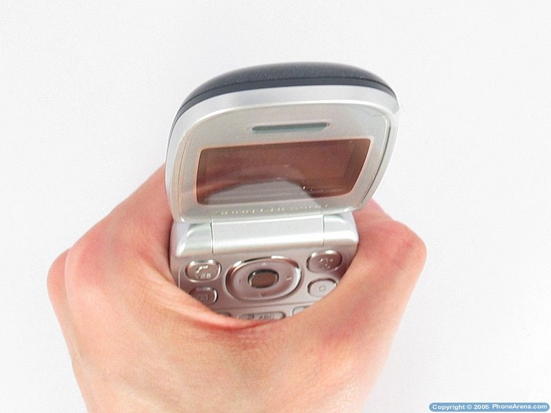
Rounded and having small measurements and internal antenna, the Z300 is easy to handle while closed, but opened it definitely is not one of the most stable phones and you might have problems with the movements of the unstable upper panel. It is strangely heavy and the phone tilts when left lying opened on its back, leaning towards the upper panel, which is quite rear and not very pleasant. No problems carrying it, but since it is relatively thick it cannot be comfortably placed in a narrow pocket, like jeans for example the little weight makes it comfortable to carry in a shirt pocket. To open it with one hand requires not little effort and overall this operation is hard to accomplish. The phone is not very stable, such as when pressed on the battery cover makes an irritating squeak and the plastic gives in as well. The upper shell has an unpleasant fitting when closed in horizontal direction which is visible, and when opened it is not quite stable and makes an irritating noise when starting to close.
It would be good if the phone had fewer colors. The manufacturer decided to do that, since the smoked grey is neutral among the different colors of the panel (which in this case is exchangeable), but it would better if it was in the same color range as the rest of the housing, which is not exchangeable the silver one.
|
|
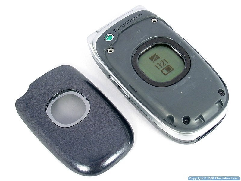
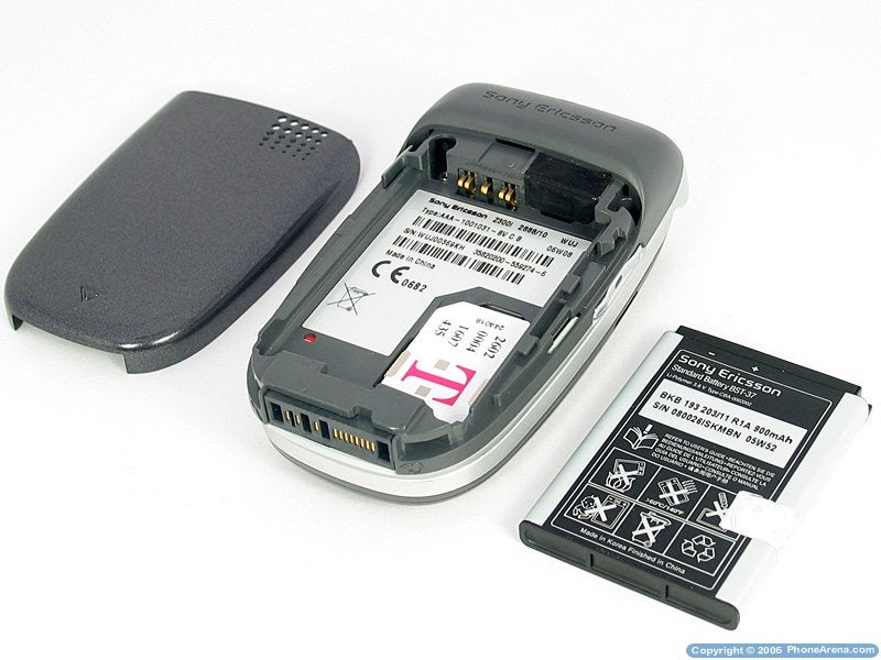
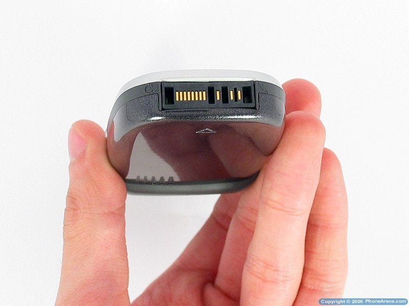
 Z300 with the cover removed Z300 with the cover removed |
|
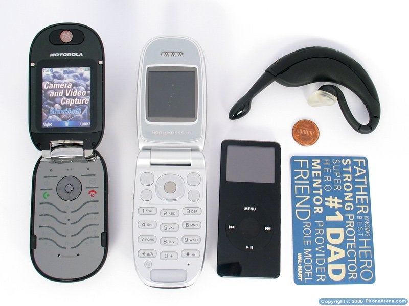
|  PEBL; Z300; iPod NANO (left-to-right) PEBL; Z300; iPod NANO (left-to-right) |
| |
|  PEBL; Z300; iPod NANO (left-to-right) PEBL; Z300; iPod NANO (left-to-right) |
| |
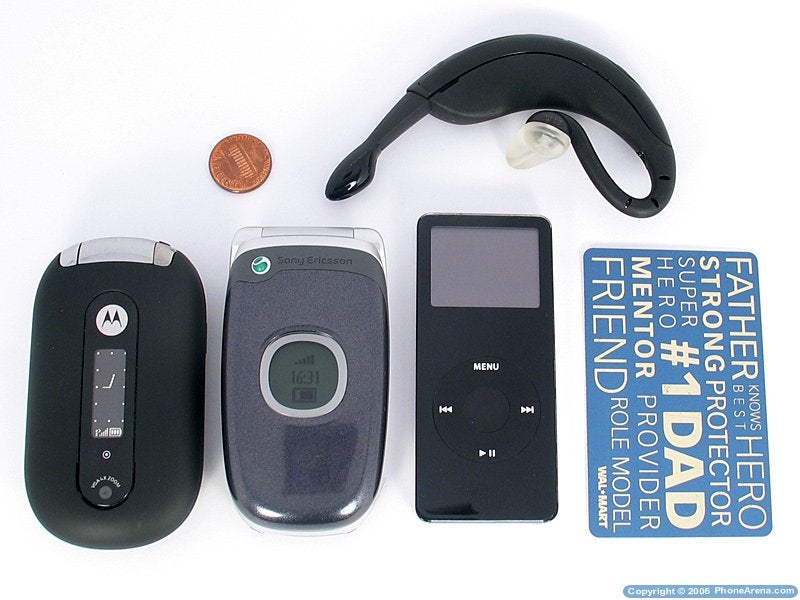
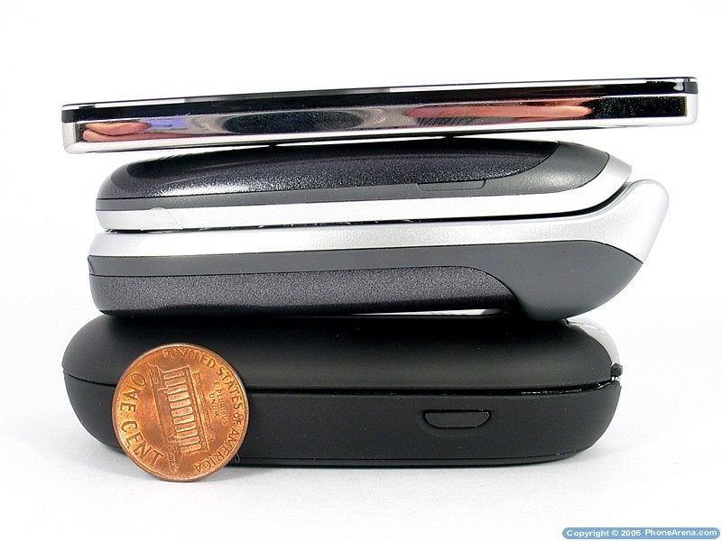
|  PEBL; Z300; iPod NANO (bottom-top) PEBL; Z300; iPod NANO (bottom-top) |
|
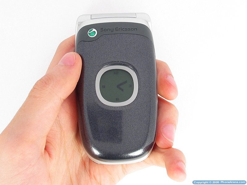
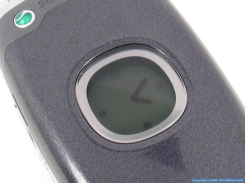
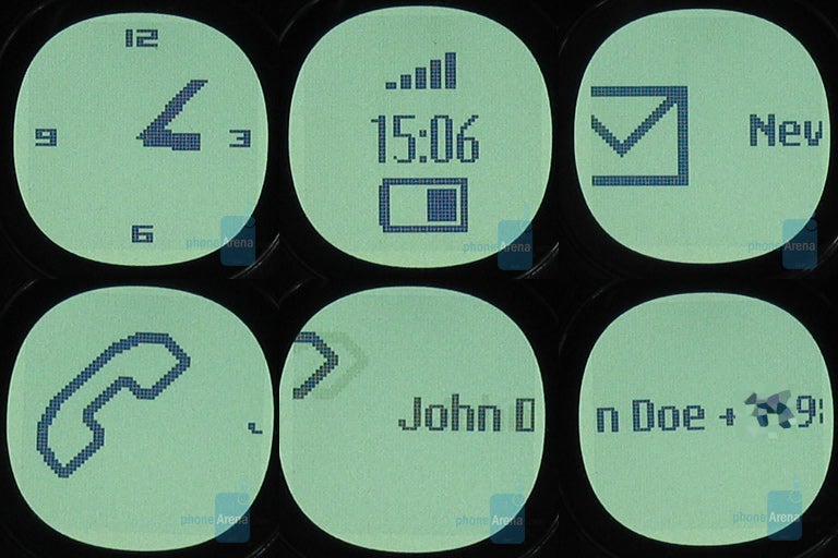
The phone has an external round display, which is grayscale unit with white under light. It has two options to look like an analog clock, or like a digital one, such as while in digital mode it shows indicators for signal strength and battery life. On an incoming call it shows the number that is calling you, and if it is stored in the memory, the name as well. The uncomfortable part to that is the name and number are on one row which scrolls from left to right. That way you can see the number and you have to wait until it shows the name again stored with it. It would be more comfortable if it only showed the name. Suprisingly, when the shell is opened, the display is blank.
|
|  Stand-by Stand-by |
| |
|  Different notifications Different notifications |
| |
|  When opened When opened |
|
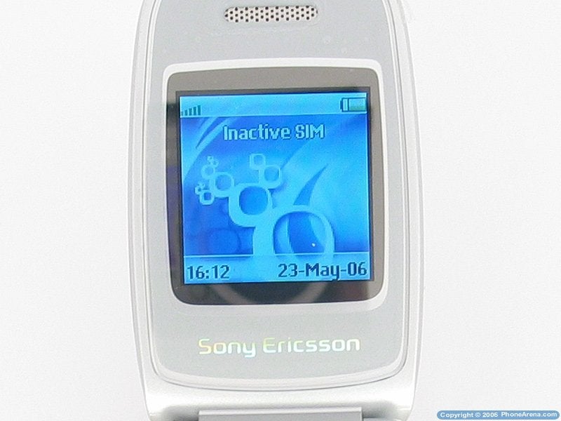
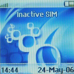
The main display is relatively small, 128x128 pixels STN type showing 65 K colors, with this being an improvement compared to the predecessor, which display only showed 4 K colors with the same resolution. Even with the good sounding of 65 K colors the display looks primeval for today's standards and having that look backed up by the small size. Again, one needs to keep in mind that the model is from the low class and after all is decent, but definitely not the best, since in this price category can be found models with far bigger displays.
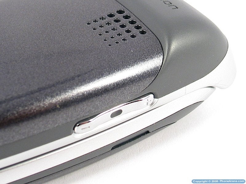
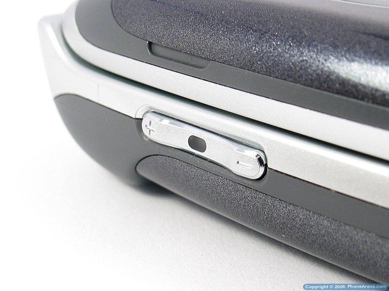
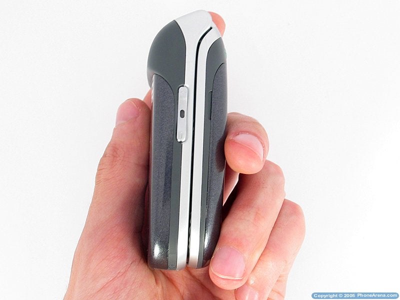
When closed it gives you access to two keys the ones on the side, which are for the sound. Access is a strong statement, since they are hard to reach if you are using the phone with one hand, regardless whether it is the right or the left one. By pressing on then in standby the display lights up, and the clock changes from analog to digital. On an incoming call by pressing down it switches to silent mode and up rejects the call. While opened in a waiting mode they practically have no purpose since they only show status with other models of the firm the meaningful information which is shown is battery life, while it is not shown here and it only shows the model and the time/date. In the menus is used as navigation up/down, which is done with the 4-way button, and when on a call adjusts the level of the sound.
|
|
 the keys on the left side the keys on the left side |
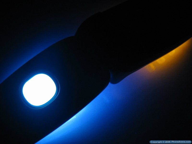
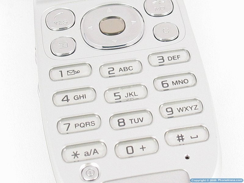
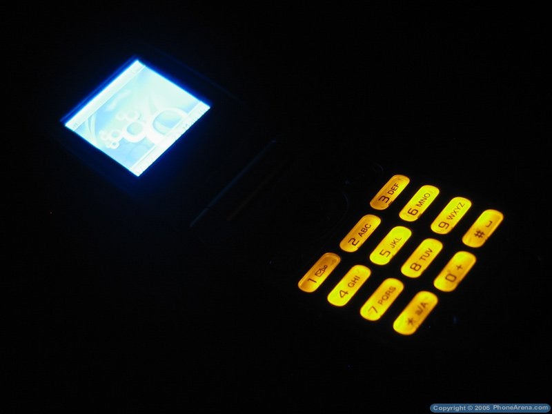
Opened, the phone has the standard numeric keypad, a 4-way button with one in the middle for selection, answer/reject keys and edit/clear ones all in grey and rounded. The numeric keypad is ugly light up and in an uneven (shaded towards the ends) orange light, which reminds us of the models from the past century, manufactured by the not existing anymore company Siemens Mobile. Although this is a good decision, if compared to the rest of the buttons there is not lighting at all and using them in a dark environment requires luck entirely. In addition to that, against all logic, the answer & reject keys are on the very top, while with almost every other phone they are right above the keypad, and the system ones are left above them. This for me especially resulted in a large number of mistakes while using the phone, but maybe after longer time of using the phone one can get used to it. The good side of this part of the keypad is that it is raised which allows for the keys to be identified the numeric keypad is not raised and it is hard to dial without looking at it. The last ones mentioned make definitely unpleasant noises when pressed, while hard and not especially pleasant.
Sadly there are no service lights at all on the phone, to show visually missed events, and checking those requires looking at the screen. For our joy grayscale displays (like the external) are easy to read at almost every light situation, but after all one simple LED light would have done a good job.
Interface:
Unexpectedly, the interface of the phone is the same as the one of the Z200, which is an almost 3 years old model. After it Sony Ericsson has a few generations newer interfaces used in the series K700, K750, etc. The main menu is presented by a 3x3 icons grid, such as every one of them is linked to the appropriate key for example pressing the key 1 enters the menu, located at the upper left. By pressing 2 one enters the menu in the middle of the first row, etc.
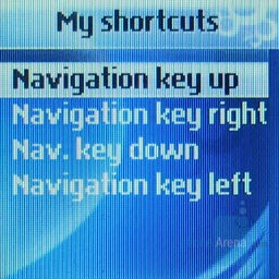
The sub-menus (in a list form) have shortcut keys as well, but sadly are not numerated, and with more options you have to judge visually which quite often is not accurate and you end up entering another sub-menu. The functionality in standby regime of the 4-way button can be adjusted as well. Overall the menu is easy to understand and hardly anything can get you confused, and the moving through it is relatively fast, and even the built-in games load very fast.
Phonebook:
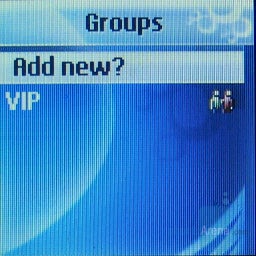
The phone book can store up to 250 numbers and by default everything is saved to the SIM card. To save to the phone either the card should be full or one must enter manually a position number greater then the limitation of the card (250 in our case). Every contact can hold one number and there are no extra fields to be filled. Groups of contacts can be created which cannot be personalized at all, but are used to send messaged to many people at once.
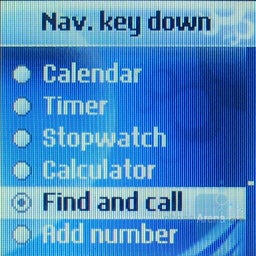
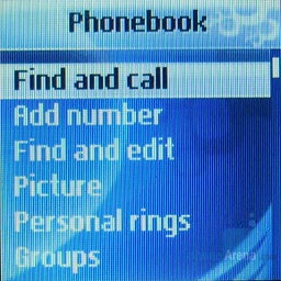
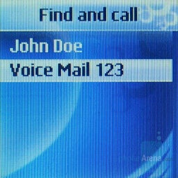
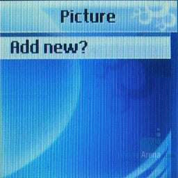
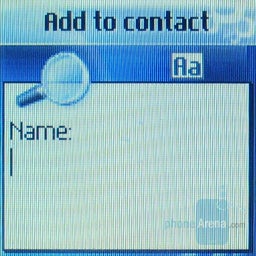
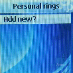
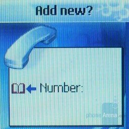
To every contact a personal picture and melody can be assigned for the pictures the phone pulls up a search engine and that's the way to choose the contact. Strangely it is not the same with the melodies, where the number needs to be manually keyed in, but pressing left opens up the phonebook, where you can choose one of the contacts in the phone. It would be good if the two menus were the same, since they have similar functions. Email information can be stored as well but it is not related to a contact, but only a name and operates as a note. The search is performed from submenus find and call and find and edit and there one can search by a word different then the first one; within the already loaded results from the search, one can jump across them by pressing different letters. Overall the phone book is a little bit confusing in the beginning, regardless of the few options it offers, but it is useful and has pleasant extras such as personal picture/melody.
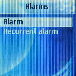
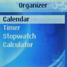
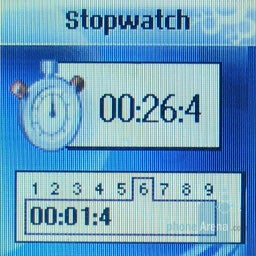
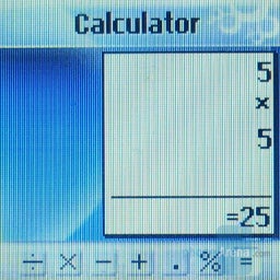
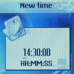
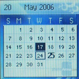
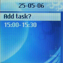
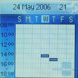
PIM:The alarm is strangely located in a separate menu related to the organizer, which includes calendar, calculator, timer and stopwatch, which can trace of up to 9 times simultaneously, and at the end they are all easy to look at. The alarm is quite simplified in a way that the only setting is the time for the alarm to go off; its signal may be changed from the settings of the phone. The calculator and the timer are nothing special as well, which can surprise you. The calendar can be looked at in a day/week/month format and has the option of adding events with a starting/ending time and a reminder for them, which is simple, yet comfortable.
|
|  Alarm menu Alarm menu |
| |
|  Organizer Organizer |
| |
|  Stopwatch Stopwatch |
| |
|  Calculator Calculator |
|
|
|  Timer Timer |
| |
|  Month view Month view |
| |
|  Adding a task Adding a task |
| |
|  Week view Week view |
|
Messaging:
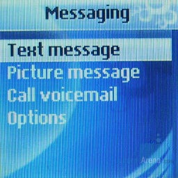
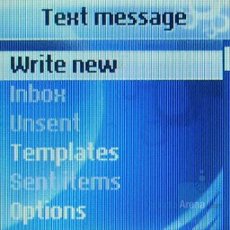
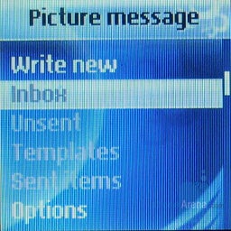
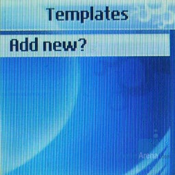
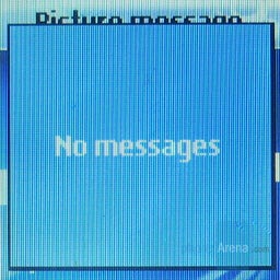
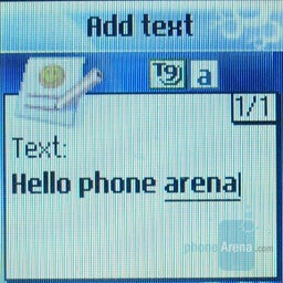
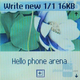
With messages it is all simple, and besides text MMS can be sent/received, which contains pictures and sounds. There is an option of saving templates since the phone doesn't contain any. Strangely, when you enter the SMS menu, templates is white and pressing on it gives it the option of adding such, since there is none. With the MMS menu, templates is grey and when pressed it shows a message No messages, but it doesn't give you the option to create one! To do that you need to start typing a message, to enter whatever it is you want and use the red headphone after you save it (in the unsent folder) you can save it as a template quite an uncomfortable manipulation! T9 is used for faster text input.
| | | |
|
|  Strange menu error Strange menu error |
| |
|  T9 text entering T9 text entering |
| |
|  Creating a MMS Creating a MMS |
| |
Multimedia:
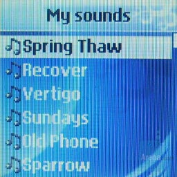
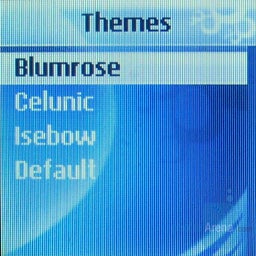
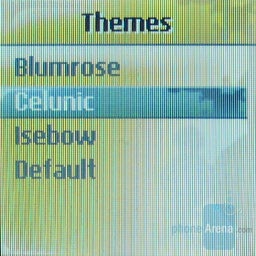
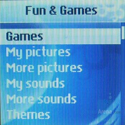
The multimedia options of the phone are expressed through showing pictures, playing polyphonic melodies (such as an incoming call sound) and theme adjustment of the appearance. The last ones are pleasant and change the wallpaper, as well as the background pictures in the menus all this is familiar from the phones of Sony Ericsson starting with T68 (2001) up to today. It has a built in composer for monophonic melodies, in which I don't see a point. It has 3 games, which are know again from the older phones from this brand the good part is that they load momentarily.
The Internet browse is primeval WAP 1.2.1, and the loading is done through a GPRS connection.
Performance:
Overall the phone works fast – the menus are quite fast and there is no obnoxious waiting while using the phone. The display lights up fast on opening or at pressing a key, when the light has turned off, and the phone is ready for use. The sound through the speaker is loud and clear, but sadly there is no speakerphone for a conversation from a distance. The melodies are pleasant for the class and their count is not little, they are relatively loud, but you may miss a call in a noisy environment, since the vibration is not very strong.
The strength of the signal is under the medium and at places it loses the network, which is definitely uncomfortable and may lead to missing calls. The battery holds a lot, since it doesn't support much. With light usage it held for 4 days and it could go longer. The charging takes less than 2 hours.
Conclusion:
The Z300 is trying to bring style, by rounded shapes in the design and a clamshell form with a comfortable round external display, in the lower class of telephones, but it fails because of the horrible keypad, which besides being badly light up is uncomfortable. The mediocre interface is comfortable to use, even with some strange and uncomfortable sides and menus. Having in mind the good battery life and the low price, it is a good phone, only if sold without commitment.
As always, if you are interested in becoming part of our review team, drop me an email at: kidoborg@phonearena.com








Things that are NOT allowed: