Sony Ericsson Yendo Preview

This is a dual-band GSM phone. It can be used in Europe and Asia only.
The American version can be used with AT&T and T-Mobile USA.
The American version can be used with AT&T and T-Mobile USA.
Introduction:
Design:
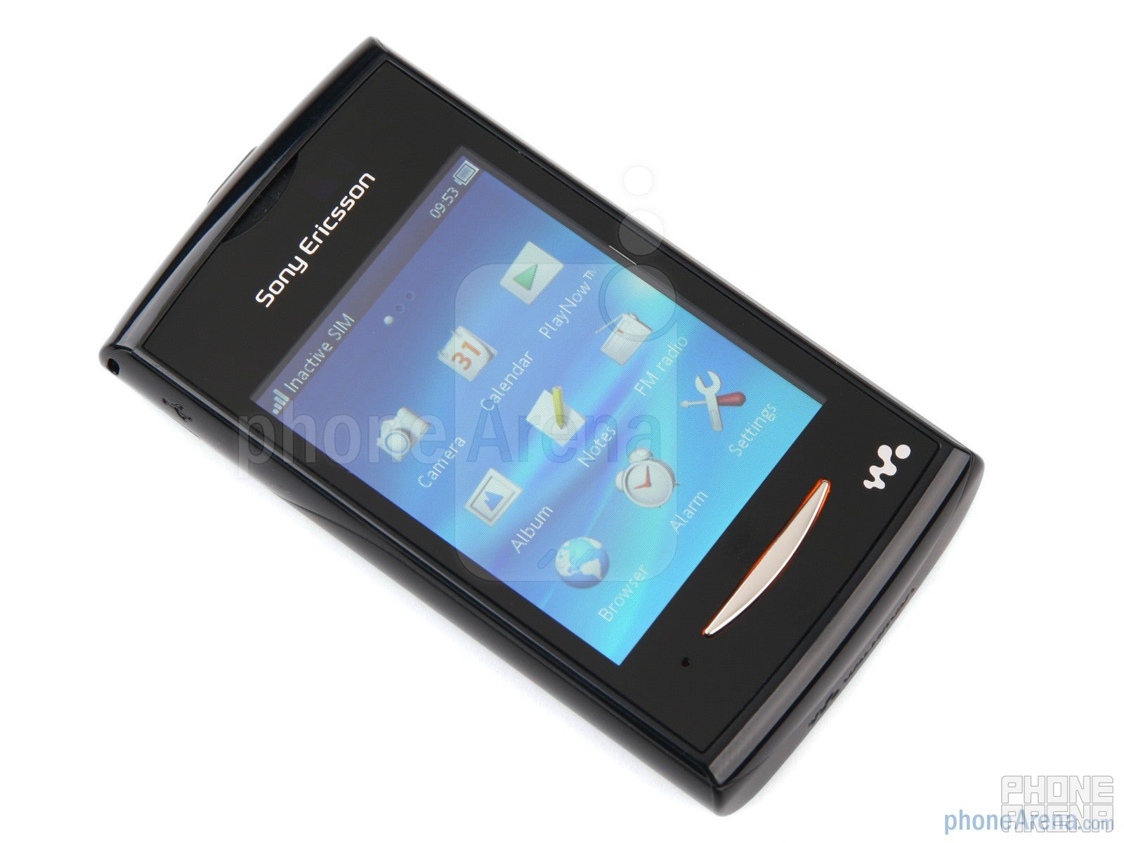
The Sony Ericsson Yendo is a compact touchscreen handset. Made entirely of plastic, with a soft-touch matte coating on the back, the Yendo feels fine in the hand, thanks to its stable build quality. Of course, some metal elements would have made wonders for it, but it's not to say that it's unsatisfying.
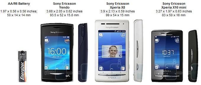
You can compare the Sony Ericsson Yendo with many other phones using our Size Visualization Tool.
Interaction with the phone will be accomplished through the 2.6” capacitive TFT display that sits in the central front area. It's resolution is 240x320 pixels, while the colors are 262k. Image quality is good, but not great, due to the relatively low resolution, however we found the screen's viewing angles to be quite good.
Below the screen there's only a back key, while on the left side you'll find a microUSB port. On the upper right is the volume rocker, while on the top are the power/lock key and 3.5mm headset jack.
On the back side, there's a 2MP camera with no flash. Removing the back panel gives you access to the battery and microSD card slot. In order to reach the SIM slot, you need to remove the battery.
On the whole, we like the Yendo's look and feel. It's not remarkable, but good enough for an inexpensive feature phone. It's worth noting that we had the black version, which is naturally more boring than the colorful ones that will be available. Other color variants will include blue, green, orange, pink, purple, red and silver.
Sony Ericsson Yendo 360 Degrees View:
Interface and Features:
As we mentioned earlier, the Sony Ericsson Yendo is not a smartphone. It is powered by a feature phone platform, which is customized with the UI we saw on the X10 mini and X8. The concept is basically the same, of course with a few exceptions caused by the very fact that we're dealing with a non-smart platform here. For example, the widgets you can place on the homescreen are pretty basic - you can add notes for instance, which you can then scroll through easily. The music player can also be visualized as a widget.
There arefour shortcutsin the four corners of the screen that lead you to the Walkman player, messaging, dialer and phonebook. The main menu is divided into three pages and grants you access to all of your apps. Of course, the basics are covered here given the presence of a calendar, notes, calculator, voice recorder, and email. As a whole, the interface is pretty straightforward and easy to use, though we cannot guarantee how smooth it will work in the final product, since our prototype was very laggy.
Out prototype unit's 2-megapixel shooter's interface was very basic. We only had two keys – a shutter and a still/video switch. This is only a preview, so we'd not draw conclusions about the camera quality just yet. Still, here are some test samples we made to give you a rough idea of what to expect.
Um, yeah, better wait for a final unit...
Do not expect anything groundbreaking from the Walkman music player. Its interface is in line with the rest of the UI, and it allows for most basic options (at least in our unit) for filtering and playback. The phone is also equipped with TrackID and a voice recorder.
Those of you who fancy the idea of surfing the waves of the internet on the Yendo better look elsewhere, at least judging by what we experienced. Data connectivity options are limited to EDGE, and the browser itself is more of a check box feature, so loading pages can take forever, while scrolling is also very slow. Not that we would expect a smartphone experience out of the Yendo, of course.
Never mind that, the Sony Ericsson Yendo does feature Bluetooth with A2DP profile support so that you can pair your favorite handsfree. That is in case you have a favorite handsfree; if you don't, you can just pair any handsfree you have.
Expectations:
We want to make one thing clear – we are not thrilled with the Sony Ericsson Yendo. Aside from the nice and compact design, there was nothing to really attract us (at least, in a positive manner). It has the potential to become a fairly successful budget touchscreen phone, but for this to happen, Sony Ericsson needs to deal with the issues we witnessed in our prototype – most notably, the overwhelming lag.
Of course, we should not forget that pretty much all is subject to change, since we are yet to experience the final offering by the company, and after all, who knows – it might end up with a pretty decent price tag for a handset with a capacitive screen. Here's for the Yendo's unpredictable future!
Sony Ericsson Yendo Video Preview:


Things that are NOT allowed: