Sony Ericsson W595 Review

Introduction:
Tired of listening to music alone? You wish to share this experience with friends? According to Sony Ericsson, their new music slider is the perfect opportunity for this.
The W595 is the successor of one of the most successful devices of the Walkman series, the 580, which is being offered at a low price and wide variety of color solutions. The W595 is 3G, its camera supports higher resolution and more features, it’s equipped with stereo speakers and the interesting “share jack”; thanks to which you can plug in two headsets simultaneously, so you can listen to music with a friend.
The package includes:
- Sony Ericsson W595
- 2 GB Memory Stick Micro
- Charger
- User Manual
- Data cable
- Adaptеr with 3.5mm “shared jack’ + headphones
- Software CD
Design:
Take the W580, round it off a bit, and you’ll get the W595. Yes, both models have almost equal dimensions, but look totally different, and thanks to the rounded shapes the new one gives the impression of being something monolithic, when it’s closed.
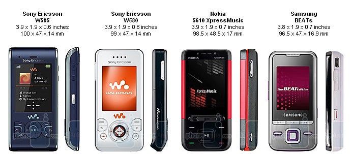
You can compare Sony Ericsson W595 with many other phones using our Size Visualization Tool.
The display is 2.2-inch, supports up to 262k colors and as most modern phones do, it also offers a very good image quality. Fortunately, it is still usable when exposed to sunlight. The brightness is automatically adjusted, thanks to the small ambient light sensor, placed above the display.
The slider is stable, without any clearances, and its opening is up to the mark. Sadly, we can’t say the same for the D-pad, the functional keys and the send and end ones. They are all situated on a tiny bit of space and are awfully hard to press. From the start we even thought that it’d take us some time to get used to it, but after a couple of days they were as annoying as in the beginning. It’s a bit of consolation that you can use the music player without them, taking advantage of the ShakeMe function- more on that later.
The keyboard buttons look as if they have been cut from the surrounding material and are also quite small and hard. It’s a good thing that they didn’t cause us so much trouble. However, if you’re keen on writing messages, there will be some hard times to come.
On the right side you’ll find the volume rocker and the music player shortcut. They totally contrast from the rest of the keys, moving nice and sensible. On the opposite side is only the charger connector, since Sony Ericsson still refuses to switch to the more and more popular miniUSB standard. The speakers, which are supposed to produce loud enough music sound for you to enjoy, are located on the top and the bottom sides.
The back side reveals the 3.2MP camera without a flash. Unfortunately, you’ll have to remove the battery lid in order to reach the M2 card slot. That’s going to be really hard, considering that it’s very thin which can cause some small cracks on it, as we experienced.
Like the W580, the W595 comes with great variety of color solutions with some interesting names: Cosmopolitan White (the one we’re using), Active Blue (the one from our preview), Jungle Grey, Lava Black and Ruby Black. An additional extra is the variety of themes for the back side of the slider. As a whole, the phone is lovely and the white version is suitably feminine.
Sony Ericsson W595 Video Review:
Software and Features:
You probably want to know if there are any improvements in the W595’s interface, in contrast to the other Walkmans. The short answer is “No”. The long one is “No there are not, except for a few cosmetic changes – fond de teint and lipstick, in order to attract the younger users.” Even though we’ve been in the business for a long time and extras like animated standby screen don’t impress us much, it’s worth noting the variety that SE has put in the interface appearance. There are a few cool details that you wouldn’t find in the products of the rival companies. For example, you can bring the rock’n’roll king to the screen through the standby application, and even make him move using the accelerometer. The other one is a kind of a “step counter”, showing you the number of steps you’ve made during the day, which can be interesting especially if you are into sports. The built-in themes are quite various and beautiful, and some of them are even combined with light effects. For instance, the “falling of a spot” (directed again with the accelerometer) in our favorite Plaste theme is preceded with a blinking wave through all keys. While these don’t add anything but eyecandy, in an increasingly crowded market of similar feature sets SE has still managed to find a differentiator from their competition.
The main menu has different views– grid, single icons or rotating, according to the chosen theme. Regardless of your choice you’ll experience a bit of a slow-down, which is going to show up whatever you do with the phone.
You can store up to 1000 contacts in the phonebook, with possibilities for multiple numbers, e-mail, additional information, personal ringtone and birthday. Unfortunately, you won’t be able to search by last name. The option to filter the phonebook by dialing numbers at the standby screen is nice. The search is being conducted through the phone numbers, as well as through the names. For example, if you have dialed 636 (6 – MNO, 3 – DEF) you’ll find Neo.
All organizer functions are gathered in a single menu and should be able to satisfy anyone’s needs. You have a calendar at your disposal (with a day, week and month type of view), in which you can write down appointments, birthdays, holidays or other events. Besides the calendar, you’ll find also alarms, to-do’s, notes, timer, stopwatch, calculator and many other applications with various functionalities like a currency converter and a world clock.
The options for writing messages and e-mails are top-notch, as you may take advantage of automatic settings for the more popular electronic mails, which can be of great comfort. Unfortunately, as we already mentioned before, the keyboard isn’t particularly handy for writing.
The W595 can be used all over the world ( it has quad-band GSM: 850/900/1800/1900 MHz), but the 3G is only suitable for Europe and Asia, where you’ll be able to enjoy high-speed internet, thanks to the HSDPA 3.6 Mbit/s.
The browser opens our web page flawlessly, which is a serious challenge even for some of the modern internet-oriented smartphones. You can experience web browsing like on a computer, and due to the zoom in/out option and the pan view the whole navigation is really easy and intuitive. These functions have their convenient shortcuts on the keyboard, and with the accelerometer it’s fairly easy to switch between portrait and horizontal image. As a whole, the browser is one of the best we’ve seen among the non-smart phones, and should do you a great job.
It’s interesting that you can make video calls, although there isn’t a camera on the front side. How it’s done? It’s easy, you just turn the main camera towards you and… that’s really funny. We thought that the main idea of video calling is to see each other with the person you’re talking to. If your opinion is the same, you can try talking in front of the mirror and enjoy the reflection…odd, isn’t it?
Camera and Multimedia:
As we mentioned earlier, the W595’s camera has a resolution of 3.2MP with no autofocus or a flash. The interface is a lighter version of the newer Cyber-shot phones. You can choose between several modes (panorama, frames, image sequence, night), self-timer, white balance and a few effects.
Since there isn’t a built-in GPS, the information of the GSM cells to which you’re connected is used for geotagging.
The quality of the pictures cannot stand a chance against the new 8-megapixel monsters, but it’s also worse than the better 3MP cameraphones. This is more or less normal for a music phone however, unpretending in this aspect. When shooting outdoors the colors are too saturated (especially the reds), and details are almost missing; you’ll find that in places some of the objects look as if they were painted by a first-grader. Our indoor results were even worse, and the lack of a flash can single-handedly make you give up shooting in the dark. As a whole, stick to the old Tibetan saying: “Thou should buy a cameraphone, if thou want high-quality pictures…”
You can also record videos with QVGA resolution and 15 fps. The quality is satisfying, as long as you shoot during the day.
The other multimedia features are all gathered in the well-known flash menu. In contrast to the previous models with the ShakeMe function, here it not only serves you to change the current track, but also lets you turn the volume up and down. To do this, you just need to keep the Walkman button pressed and lean the phone towards you or in the opposite direction. Unfortunately you are unable to stop the sound with a motion, as you can do it in Samsung’s rival BEATs.
There’s an equalizer, but it only works only when the headphones are plugged in. Moreover, it lacks the nice pictures and an option to save the customized settings, as found on the W902 and W980. We didn’t experience any trouble visualizing the album covers, but they were so tiny that we don’t think someone’s going to pay close attention to them.
Even though the W595 has two pretty large speakers, their power is not that impressive. In comparison with other mid-range phones, like Samsung’s Soulb for example, the W595 is quieter and the sound is a bit hollow. The headphones deliver some decent power, but as we turned the volume to the max the sound was rather sharp and annoying. The problem can be resolved by slightly turning the volume down or turning on Mega Bass from the equalizer. The interesting possibility to listen to music with someone else through the “shared jack” leads to turning the volume down, but the overall quality stays the same which makes it usable.
The FM radio with RDS is present and you can save up to 20 stations. We’re still waiting for the day when it won’t be necessary to use the headphones as an antenna. One of Walkman’s key features – TrackID - is available from here and via the Entertainment menu. It “guesses” the songs correctly as always.
We are not charmed by the video support either. You can’t play MPEG4/H.264 videos, and the H.263 ones offer considerably lower quality. The good news is that there’s an integrated YouTube player with a user-friendly interface, through which you’ll be able to go through the largest internet site for clips.
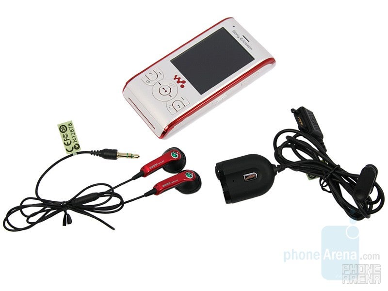
Another wise Tibetan saying says: “Thou can live well, but even then thou may need to call someone…” For instance, you may want to invite a friend over, in order to listen to your favorite band’s new album têt-a-têt via the “shared jack”.
You won’t experience any dialing problems with the W595. From our side there was a slight background noise and the voices were sharp, but completely real and understandable. Despite our voice being heard as a bit monotonous at the other end of the line, the collocutor had no complains. Unfortunately, the loudspeaker sounded like a badly synchronized radio station – you’ll need a lot of practice to develop the skills, needed to catch the word among all the crackling and noise.
The battery life is of great significance for any music phone and should let the user listen to music long enough. According to SE the W595 should last up to 9 hours of talk time, 385 hours of standby and 25 hours as a music player, which is a serious achievement.
Conclusion:
In movies you’ll often encounter the “sequel syndrome” – no matter how many episodes come out from a series, neither of them is able to surpass the original. It’s the same with Sony Ericsson’s W595.
We didn’t like the W580 much, because at the time it was released its features were already outdated. A year later Sony Ericsson release a product that wouldn’t be any different from its predecessor, if it wasn’t the 3G support and the really nice browser. The W595 looks good, even better than the previous model, but its keyboard is so unhandy that it can easily withhold you from writing messages. The camera is higher resolution, but the pictures are no good, and the music quality is just OK but nothing more.
In other words, if you buy the W595 at the higher price (about $380, compared with $240 for the W580 without a contract), you’ll get the same dated features, only slightly refreshed. This doesn’t sound really cool, right? As a whole, Sony Ericsson will have to do a little better in order to win the mid-range-music-slider competition. The main opponent for the W595 is Nokia’s 5610 XpressMusic, which is clearly better when it comes to multimedia. Take into consideration the upcoming Samsung BEATs, and it’s clear that the rivalry is going to get even more spirited.




Things that are NOT allowed: