Sony Ericsson G900 Preview

During the MWC 2008 show in Barcelona, Sony Ericsson announced three new classes for its devices: camera-oriented phones now will belong the the "C", "X" comes for "ultimate user xperience" and "G" - the line of the phone we will present here. G-series are advertised as easy to use phones, for the averagecustomer, yet with enough organizer options. They are touted for theoption to draw something in a note and send it to another person – for example a St.Valentine’s card to your beloved, or reminder memos one would usuallyput on the refrigerator. Overall, these devices should be accepted as phones intended for the normal user and the smart phone OS is only integrated here, in order for the touch-screen to be controlled (SE already has experience in this field) and to manage the extended organizer options.
Subject to this preview is the current flagship model of the G series – G900.
Design:
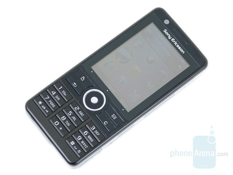
There is nothing impressive about the appearance of the phone - a standard, slim candybar with dimensions of 4.2 x 1.9 x 0.5 inch (106 x 49 x 13) and weighing at 3.5 oz (99g), which reminds us to a great extend to the old M600 (without QWERTY keyboard). In other words, this is a clean, pocket friendly phone, it is not ugly, but it would have been nice if there was some bling-bling added (transparent materials, extraordinary colors, big golden dice etc.).
The 2.4” TFT display occupies the top half of the front face; it has a 240x320 pixel resolution and supports up to 262k colors. The video calling camera is positioned over it and the functionality buttons are below.
Here are situated the 5-way D-pad and two couples of keys: notes and messaging shortcuts in the upper row and back and clear keys below. The two shortcuts hint about the key features of the phone (notes with option for drawing, etc) but are something some won’t really use often. Those two keys are where ordinary the soft keys are situated. As such are actually missing in this model, it is taking some time to get used to the fact that one must press the bottom part of the touch screen. Below it there are three dots, trying to remind you of this fact.
Somewhat forgotten by the manufacturer in its last devices, the back button is back, which will be a nice surprise for the hardcore fans of the brand. The numeric keypad is also old fashioned – three columns of standard keys with a lot of space between them.
In the silver trim on the right side, are located three keys: volume rocker, locking key and camera shutter. The keyboard/display lock is one of the few things, which remind us that the phone is not a regular candybar, but it disposes of a touchscreen. The charger connector and the M2 Memory Card slot are on the left, but in order to get access to the latter you need to remove the entire back lid. This is quite strange, since in the lower-level G700, which has the same size, it is brought to the outside.
As expected, the 5-megapixel camera is on the back. It has autofocus as it suits a hi-end model, but unfortunately just a regular LED flash instead of Xenon or ‘photo flash’.
Software and Features:
You already know that Sony Ericsson G900 runs on Symbian OS v9.1, UIQ 3.0 and is equipped with a touchscreen! This sounds so good!
The big question is – „Why do I need the touchscreen?” On one hand the screen is very well calibrated, the stylus is comfortable, and the virtual keyboard can be used even only with fingers. On the other the interface is user friendly without the necessity to use it. It’s just that in 99% of the time you don’t need it (unless you use handwriting recognition or if you don’t want to draw). According to us the touchscreen is implemented to attract more customers (the die hard fans of „touch”) , and is made simpler in order for the phone to be user friendly.
The phone definitely takes advantage of the functionality of the OS, but the interface is personalized in such a way that it’s easy to access by the average user. At the homescreen for example, we have the standby applications (similar to widgets), which are there to make your life easier: shortcuts, favorite contacts, calendar appointments, new message - these all are listed by default, but with a few clicks you can add others such as alarm, music, bookmarks, and worldclock.
Sony Ericsson tries to personalize the Symbian UIQ interface for these phones in a way that it resembles more the non-smart models, instead of the smart ones. The media menu included in the new SE models (К850, W910, W890 and others) is present here as well. In one menu (with flash-based interface) here is the photo gallery (with options for tagging, slideshow), the feature rich music player and the one for video.
As we already mentioned the phone has a 5-megapixel camera with autofocus. It lets you manage the focusing area by tapping anywhere on the screen.It has lots of options, available in a list with large, easy to touch icons. Only the lack of things such as “best pic” makes it different form the Cyber-Shot models.
Unfortunately G900 is tri-band (900/1800/1900MHz) GSM, single-band UMTS and is not HSDPA capable, but it has WiFi. We can't give you a subjective opinion on the browser since it is not the final version, but it looks quite promising.
G900 definitely is a model that we are eagerly expecting. Sony Ericsson has done a really good job offering a product that will be attractive for wide range of consumers. It has something for the touchscreen and the Symbian fans, but it is most desirable for the average person who has always wanted the functions of a smartphone integrated in a normal device.
Expect our full review when final, commercial samples are released.
Sony Ericsson G900 Video Review:



Things that are NOT allowed: