Samsung SGH-G800 Review

As we’ve said in many of our reviews, nowadays the multimedia functionality in the phones has a great role. It is of such importance, that most people first ask about the camera resolution and then check if the phone will be compatible with their network.
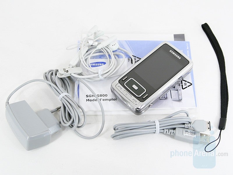
The G800 is definitely not among the smallest phones on the market: even closed it is a solid device almost as big a stand-alone pocket camera and it highly resembles one by its look. With its serious weight it is almost as heavy too, which combined with the chromed frame makes it feel as a nice high-end phone instead of a plastic toy. For this also helps that the lens-cover and a detail on the battery cover are made of brushed aluminum.
| Model | Dimension (Inches) | Dimension (mm) | Weight (oz) | Weight (Gramms) |
 Samsung G800 Samsung G800 | 3.97" x 2.00" x 0.74" | 101 x 51 x 18.8 | 4.90 | 139 |
 Samsung G600 Samsung G600 | 3.97" x 1.85" x 0.58" | 101 x 47.8 x 14.9 | 2.99 | 85 |
 LG Viewty LG Viewty | 4.07" x 2.14" x 0.58" | 103.5 x 54.4 x 14.8 | 3.95 | 112 |
 Sony Ericsson K850 Sony Ericsson K850 | 4.01" x 1.88" x 0.66" | 102 x 48 x 17 | 4.16 | 118 |
 Nokia N95 Nokia N95 | 3.89" x 2.08" x 0.82" | 99 x 53 x 21 | 4.23 | 120 |
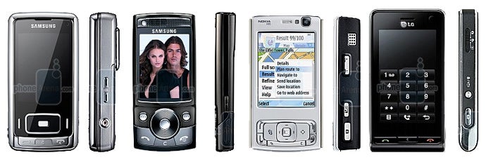
Positioning the G800 not only as high-tech cameraphone but also as high-end device, Samsung has made it with untypical for the brand design. Instead of curved forms everything is rectangular with just slightly rounded corners and as the colors used are the classical shining metallic silver and black, the G800 looks very classy.
Although the spring-assisted sliding is not as smooth as it was with the pre-production unit we’ve used and still there is no “jut” for your finger, the open/close actions doesn’t require any effort. By doing this, the numeric keyboard is revealed, glowing in white. It has the same brushed pattern as the back side and is flat, with rubber lines between the separate buttons. Although pressing and tactile feedback are excellent for a flat keyboard, it’s hard to distinguish one button from the other by touching, because the separators almost do not protrude from the surface which comes as a surprise to us – there was no such problem with the pre-production unit for our preview and its keyboard was excellent.
Moving upwards to the other slider we first note the send/end and clear keys on the chrome-surface. Although flat, they are convenient to use and having in mind that most people will use the opening/closing of the slider to answer/reject, it is not of great matter. Like the numeric keys, both are illuminated in white (instead of, respectively green and red) in order to give a classical monochrome look of the phone.
We cannot miss the fact that the rest of the hardware keys are not illuminated at all. Not being a problem during the day, this creates a notch of inconvenience at night. In such situation you will have to “Find” the buttons by touch and while the soft keys are very easy to feel, it is not so with the directions of the D-pad. Still, considering there isn’t a whole yard between the illuminated display and the keys, one won’t really get lost when “searching” the buttons but it is still not convenient. Nowadays, in 2007, we see how the manufacturers illuminate even the side keys (Nokia) and leaving the navigational ones dark is a compromise and a drawback for the device.
On the opposite side are the universal Samsung connector and the microSD memory slot. They are both protected with covers matching the design of the sides. While there is nothing on the bottom, the top houses the openings for the stereo speakers.
While the lens-cover at the back is closed, there are only the labels for the brand and the camera. Slide it opened and below are the Xenon flash and the 3-times zoom-lens, which doesn’t retract (the lenses move inside the phone’s body). In the final version of the phone, the color is dark grey, so the text labels about the camera are easily noted. We are happy to see that the lens cover mechanism has been adjusted and now it is very easy to open and close it, no matter if you press the middle or any of the two sides.
Samsung G800 Video Review
Like other Samsung phones in the past few years, the G800 runs on a variant of the manufacturer’s operating system. Although personalized and different from the interface of the rest of the Samsung phones, G800 resembles that of the Ultra II series to some extent.
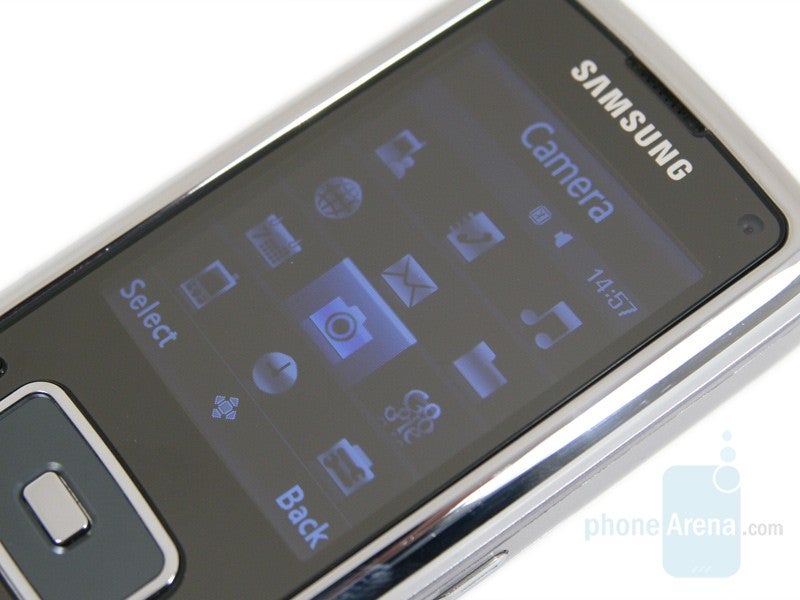
The main menu is either a grid of 3x4 icons with a large banner at the top or a list. Its look cannot be personalized due to the lack of both themes and color schemes. This is perfect example of how Samsung targets its phones to different customers. They guess that the users of the stylish G800 won’t need such things, while the G600 targets a larger audience and has excellent themes, including the option to create one on the phone. The sub-menus are visualized as list and as in other models, option to display even the next step (when you select a field with sub-option) is available. Typical for a modern Samsung, the menu has “memory” and will select the last used option by default.
As in the G600, F700, F500 and a few other recent models, real phone profiles are now available with the G800. In addition to the Normal and Silent, it has one for Driving, Meeting, Outdoor and Offline which will turn the phone functions off. Each of them personalizes the phone sounds for incoming call, messages and the phone operation and features fields for Call alert type, Tone and volume for each of the three.
As we’ve used to see when it comes to Samsung, the phone is different than others as a whole, but uses software modules from different models. For example the Phonebook is the one from the U700 Ultra 12.1, which is actually the most advanced one we’ve seen in a non-smart phone from the brand. It is also available on the F700 but with optimized interface to match the touch-sensitive screen.
The phonebook is displayed as a vertical list, and when a contact is selected its number and a small image (if one is attached) show up. Searching for a contact is performed by a first name only, which is an unpleasant problem of most non-smart phones. The contacts can be sorted in groups that allow for common image and ringtone. Pressing right (on the D-pad) will list them with the number of contacts stored in each.
As the F700, the organizer here is also one we’ve seen in the U700. The Calendar and the Alarm field are as separate icons in the main menu, while the others are combined in a sub-menu. The Calendar can be previewed for month/week/day and has settings for Starting day and Default view. An entry can be added as Appointment/Anniversary/Holiday/Important/Private. The fields allow for Title, Description, start/end time/date, Location, Alarm (before XXX min/hour/day) with repeat option.
The Samsung G800 has 150MB of internal memory, which will be enough for most users, considering that bigger files like multimedia (photos, music and videos) should be stored on a memory card, as the phone has microSDHC (High-capacity) slot.
Templates can be saved for text/multimedia messages, but there are none predefined. T9 predictive text system helps for faster text input. It is the most widely used system of this type.
Connectivity:
Samsung SGH-G800 is a tri-band (900/1800/1900 MHz) GSM phone with 2100 MHz UMTS/HSDPA 3.6mbps support, which means it is targeted for the European/Asian market only. If you plan on using it in America, keep in mind that only the 1900MHz GSM band is supported. We think that Samsung should look at the competition and take Sony Ericsson K850 as example: with its quad-band GSM and tri-band UMTS/HSDPA receiver, it is usable all around the world.
For wired connection to a computer, the phone comes with USB cable in the box. Once the device is connected, it asks you to choose one of three modes: PC Studio, Media player, Mass storage. The last one is most convenient for data transfer, while the first is used for synchronization with the software from the phone package.
Internet:
As other contemporary models, the G800 is equipped with a full HTML Internet browser (Access Powered) that renders the pages as on a computer, if you’ve chosen “Desktop view”. Complicated page like PhoneArena and YouTube opened without any problem but as the resolution of the display is the standard 240x320, lots of scrolling is required in both directions. We’d like to see more features integrated into such browsers, like the “minimap” when scrolling, or the option to fit the whole page on the screen and then zoom to particular area – features we’ve seen in rival models.
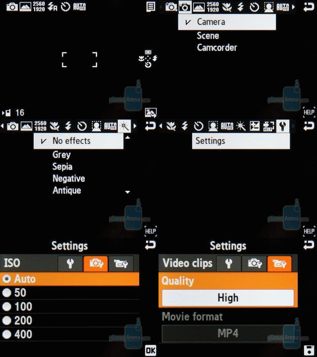
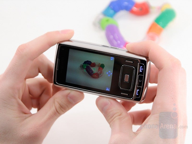
Samsung advertises the G800 as high-end cameraphone not only because of its hardware, but also because of its enhanced camera interface with lots of options. The easiest way to start it is by opening the lens cover and then the landscape viewfinder will occupy the whole 2.4 inch display in three seconds. By default the interface is almost empty and on the right are the icons for the two soft keys and the four directions of the D-pad. The latter acts as shortcuts to often used options: Viewfinder, Flash, Selftimer and Macro modes options.
The left (bottom) soft key is a shortcut to the gallery and the right (top) one opens the options. In a long horizontal list there are lots of fields including Scenes, Resolution, White Balance, Effects and other. We aren’t impressed by the interface’s look: its icons are small and as they are monochrome, it will be hard to get the idea of each. We think that the interface of Sony Ericsson K850 looks way more advanced, with better icons and even color images.
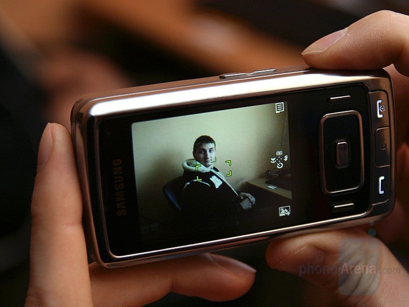
The last field here is a link to the Settings menu where in addition to the standard options, like quality (compression) for the images, the ISO level (Auto/50/100/200/400), digital anti-shake system (on/off) and digital zoom (on/off), there are a few other settings. The phone supports Wide dynamic range which can be turned on or off. It isn’t anything special and actually increases the brightness in the dark areas of the images, although once the photos are on a computer, better results can be achieved with many programs. In addition there are a few level settings for the Contrast, Saturation and Sharpness of the photos.
The key feature of the G800’s camera is based on its hardware, instead of software, and is something only a few phones can show off with – optical zoom. The Sasmsung's top-end phone can zoom in the image up to three times (3x) before capturing it, which means it will make distant objects appear bigger in the image without losing quality (which happens when digital zoom is used). As most pocket cameras have this optical zoom, it is proved that it is a good thing and each cameraphone should have it. The time to zoom for Wide end (no zoom) to Tele end (3x) and vice verse is only 3.5-4 seconds, which is a good result for a phone and won’t make you wonder if you should wait to zoom or just try to go closer.
After all, it's the camera quality which is the mostimportant. If a phone offers lots of options but produces low-quality images,it won't be worth getting it as a cameraphone. On the other hand, if itproduces great images, we may forgive the lack of some more-advanced options.In the case with the G800, we are left with mixed feelings, due to the resultsfrom the different tests we’ve put it through.
In a well lit environment, the pictures are with very goodquality for a cameraphone (when we compare it with rival models) although theyare mediocre for the standard of stand-alone cameras. Next to the competition,the G800 offers well exposed images (most of the time) with realistic colors,with very slight affinity to the yellow. The detail is on par with the bestcameraphones and so is the noise level.
It isn’t so when the light decreases. The noise levelincreases significantly, the colors get artificial and unsaturated, and thedetail is exchanged for blurry image, due to the noise reduction system. If youare shooting night scenes (where illuminated objects are captured at longexposure) the results are far from good, with artificial colors and very lowdetail. But the big disappointment is when you rely on the flash: Samsung toutsthat it is of Xenon type but its performance is very weak and can be comparedto a strong LED. Our comparison clearly shows that it is very weak next to the K850 and N82, which also use flashes ofthis type.
If you are shooting mainly during the day, the G800 willgive you very good results. But because of the inadequate performance in lowlight, the overall rating is “average”.
Expect our 5-megapixel cameraphone comparison soon!
Samsung has decided to keep the G800 camera-oriented and haven’t done their best with the video-recording capabilities. A direct link to the camcorder is missing in the main menu or the camera standby screen and it is activated by the camera options list. The maximum resolution is QVGA 320x240 which is four times smaller than the VGA offered in phones such as the N95, Viewty and even Samsung’s own G600. Still, it should be enough for Internet usage, if the quality is good and it is OK even indoors with average light. Unfortunately, as with almost any phone, the sound is very poor with strong background noise. An extra is that the optical zoom can be used also during recording.
Multimedia:
For sound playback, one can use the built-in speakers, the wired headphones from the box or one using Bluetooth technology. The speakers are situated on the top part of the phone and are not what we expected them to be – the sound is weak and the quality is the average expected from a phone. As the two are situated almost exactly next to each other, there isn’t any help of the “stereo” as such affect cannot be created.
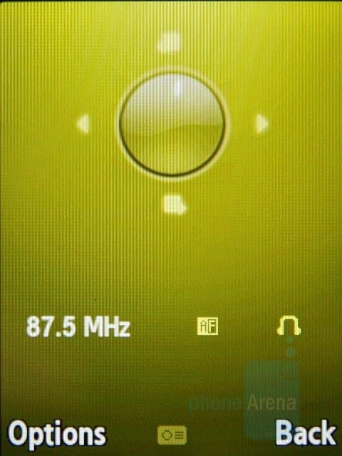
When the wire headphones are plugged in, they would also act as an antenna for the FM radio. It is very similar to the one of the G600 but lacks the option to record the sound to MP3 file. It can automatically scan the whole frequency range and save all stations that are detected. Unfortunately, names cannot be added and you will have to choose by the frequency. The speakerphone can be used to play the music through. Like the music player, the Radio can play at background level while you do something else on the phone and the homescreen will show shortcuts to its functions.

Similar to other Samsung phones, the Video Player doesn’t have its own icon in the main menu and is launched once a video file is chosen in the File manager. When playing a video, most users will turn the Fullscreen mode on, to enjoy it on the whole display, in landscape orientation. A video encoded in MPEG4 H.263 with QVGA resolution (which is logical for such screen) played smoothly without any problem.
The reactions of the G800 are neither fast nor slow, while movingthrough the menus. Still, we'd like to see something better,considering the high class of the phone.
Samsung rates its battery for almost 9 hours of contious talk time andup to 15 days of standby. In real world, the G800 really gives goodresults and could be used for a few days without recharging, unlikesome of its rivals which must be charged every single day.
We are pleased with the call quality of the G800, and it is animportant part of the overall impression a phone leaves. Both incomingand outgoing sound is clear and realistic, but your voice will soundslightly sharp sometimes. The strength of the outgoing sound isexcellent, and the only negative thing is the incoming sound volume,which is just on the average.
Conclusion:
As every single phone, the G800 also has its strong and its weak sides. The first impression it gives is excellent, a solid slider with stylish design and high-quality build. But beside the look, people are interested in the functionality, and here the G800 isn't what we would like it to be. We are disappointed that some of its features are stripped down compared to the less expensive G600, including having a standard video recorder, instead of a high-resolution one, which should be present in a phone advertised for its camera. But the biggest drawback is the camera quality - once again it is the flash that is responsible for the inadequate performance. If Samsung included a strong Xenon one as in the K850 and the N82, the G800 would probably be the best cameraphone on the market. As this is not the actual situation, the design is the phone's main selling point.



Things that are NOT allowed:
To help keep our community safe and free from spam, we apply temporary limits to newly created accounts: