Samsung SGH-F400 Preview

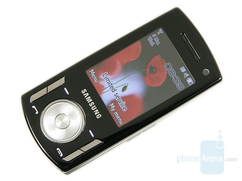
Samsung SGH-F400 has attracted people’s attention, by using a Bang & Olufsen branded speaker, which puts the tri-band GSM dual-slider model in the music-phone class.
Currently, all versions (globally) ofthe phone are prototypes and that’s why we are previewing it instead ofgiving you an in depth review. For our full detailed testing, we alwaysuse only final versions of the product, to make sure the results areimpartial.
Design:
Samsung F400 offers a massive, typical for a slider, design. It wouldn’t catch the eye easily, but let’s not forget that it is a music oriented device and not fashion inspired. If you are still not sure if that is so, just push the slider down and let the large Bang&Olufsen speaker speak for itself.
The front is quite unusual, since it’s not the 2.2” TFT display that attracts the attention, but the buttons under it. Here we have the Answer/End keys and the D-pad, which we’ve seen in the SGH-U700 and Juke. This circular key can be pressed in the four directions and in the middle, as a standard 5-way key. But its top is spinning, acting as a scroll. Going higher, over the screen are positioned the front speaker and the camera for video calling.
Top
On the left side are the volume keys and the microSD card slot, and on the right, we find the camera and music player shortcut. The connector/charging slot is right next to them.
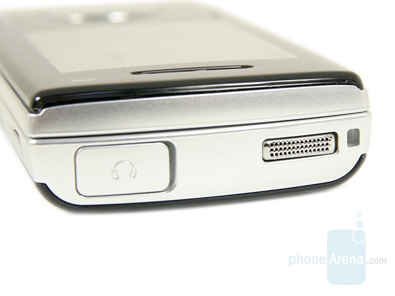
On the top side, there is an opening, which looks like a speaker, but actually it is left there in order to make the phone sound better when the phone is closed. Right next to it, under a cap, is hidden the 3.5 mm jack.
The only thing seen on the bottom is the microphone.
Interface:
If you have experience with the interface of some of the latest models of the manufacturer then, you won’t be surprised when working with SGH-F400. Since the phone is music oriented, there is a new media menu added. It opens automatically when you slide the phone down. The menu offers 3 shortcuts to the FM Radio, the Music player and to the My files menu. This is the music mode of the F400 and in order to exit and use it for anything else, you have to close the slider.
The Media Player sorts the multimedia files by a few criteria, similar to other music players of modern phones, like the Walkman of Sony Ericsson for example. The user can create playlists, add music from the memory to it and reorder the added tracks. When a track is played, the interface displays the Album Cover, the track information and the d-pad keys' function. From the menu you can rate the track, transmit the music to Bluetooth accessory and turn the shuffle and repeat on/off. The player also offers the convenient option to play in the background, which lets you perform other operations with the phone while listening to the music. However, it is better to use the headphones, since the speaker sound quality is not very good when the slider is closed. There is a fade out effect added when stopping the music and a software equalizer, with a few presets to choose from.
The camera interface is similar to the one seen in the G800, but some options have been removed, because of the lower class of the camera.
Expect our full review when final, commercial samples are released.
Samsung SGH-F400 Video Preview:
Samsung SGH-F400 360 Degrees View:






Things that are NOT allowed: