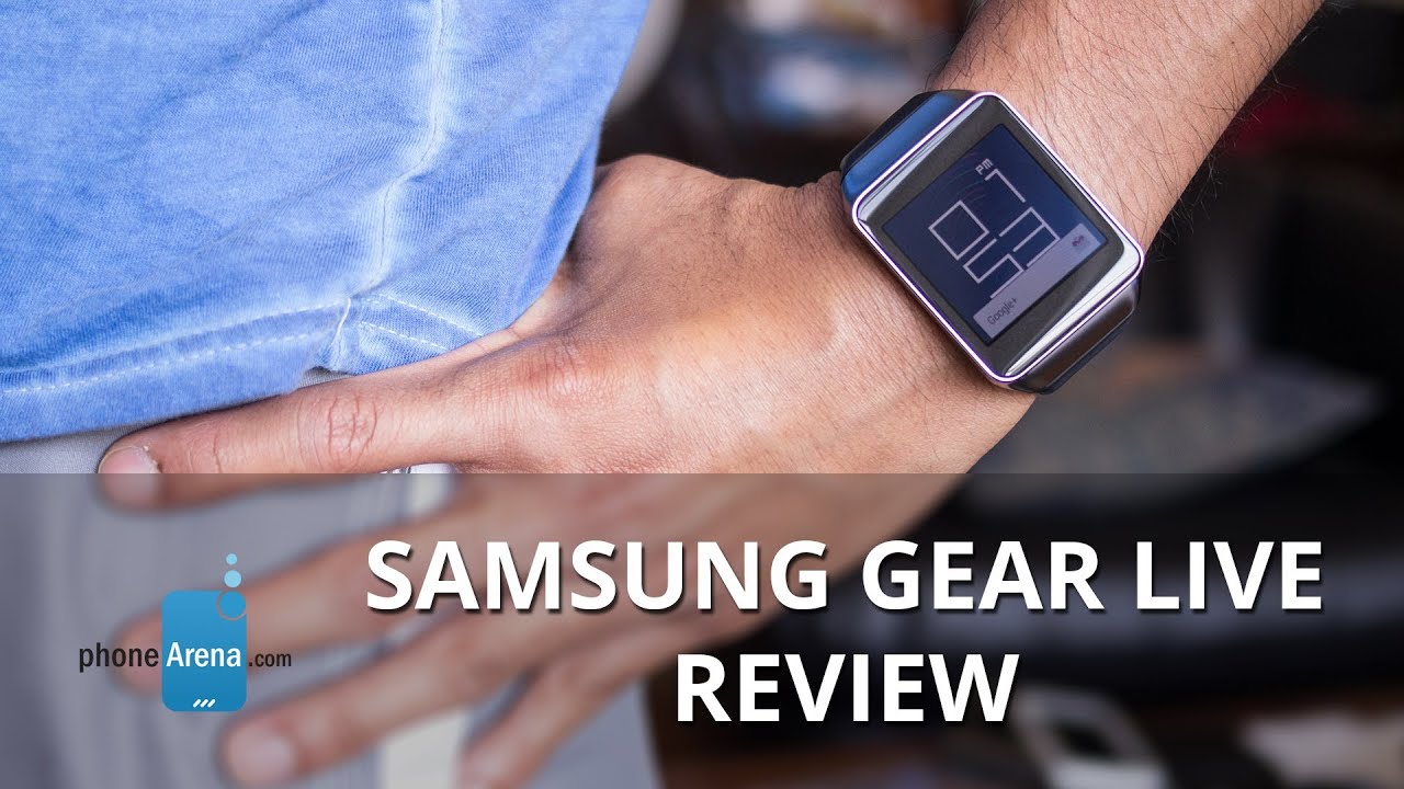
Samsung Gear Live Review

Introduction
If there’s one company ahead of the game when it comes to smartwatches, it has to be none other than Samsung. They’ve already introduced and released the 2nd generation line of smartwatches this year already - the Tizen powered Gear line, which was an unexpected change of scenery because the first-generation Galaxy Gear smartwatch was Android-based. Well folks, the Samsung Gear Live is aiming to shine some light onto Google’s new Android Wear platform.
For Samsung, they’re no strangers in this new consumer technology segment, but rather, it’s going to be Google who will face stiff criticism, or adorned with copious adulation, from hungry consumers looking for the perfect smartwatch platform. We’re curious to see how the new Gear Live smartwatch can one-up the impending wave of Google Wear smartwatches we’ll begin to see saturate the market.
The package contains:
- microUSB wall charger
- proprietary charging cradle
- Quick reference manual
- Health & safety and warranty guide
Design
Using the same recipe, the Samsung Gear Live lives up to being a sophisticated looking timepiece.
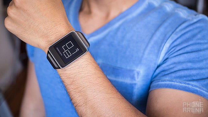
Upon looking at the Samsung Gear Live for the first time, there’s no arguing that Samsung doesn’t stray from the recipe it has when it comes down to designing smartwatches. In fact, the Gear Live looks eerily similar to the Gear 2. From its overall shape, choice of materials, and comfort, it mirrors exactly Samsung’s previous effort. Of course, it’s not a bad thing per se, as the watch boasts a moderate level of sophistication – one that elevates its charm well over the other Android Wear smartwatch, the LG G Watch.
Adorned with the same stainless steel metallic frame as its cousin, the Gear Live’s design is both premium and sophisticated. Unlike the somewhat toyish design of its rival in the LG G Watch, Sammy’s effort radiates with authority thanks to its sophistication – one that makes us want to actually wear a smartwatch in the first place. From the front, it looks squarish in nature, but the subtle curves around the base helps to break it up. Better yet, it feels very comfortable to wear, thanks in part to how it contours perfectly to our wrist when it’s worn.
As for the band itself, Samsung ditches the adjustable clasp we’ve been seeing of late, but instead, goes for a simpler snap-on one – similar to the band on the Gear Fit. Frankly speaking, this change doesn’t compromise its premium design in any way, as it can be removed quickly and easily in favor of the many third-party wrist straps that are currently available to the Gear 2. The one included with the Gear Live sports a matte finish, which is a fitting match to the watch’s elegant design.
In making for a minimalist design, Samsung places only a single button on the right side of the Gear Live – where the small notch for the microphone also sits nearby. Essentially, its sole function is to “turn on” the display, which is none other than waking it up from its “dimmed” status. Rounding things out, the underside of the Gear Live features the same heart rate sensor, and gold colored pins used to charge the watch with the included snap-on proprietary charging cradle. Unfortunately, the microUSB port has yet to be somehow incorporated into the body of the watch.
Worth mentioning, too, is that the Samsung Gear Live is IP67 certified to be dust and water resistant – so there’s no concern if you happen to wash your hands or shower with it on. One less thing to worry about, right? All in all, the design isn’t original to say the least, more so when it follows exactly to what we already have with the Gear 2, but despite that, it’s significantly better looking than the LG G Watch. Although it’s more likely to attract buyers with its design, the Moto 360 is looking to steal some of its thunder down the road – albeit, Samsung has it for the near term.
Display
Sharp, vivid, and iridescent, the 1.63-inch Super AMOLED display is a highlighting element of the watch.
Not surprisingly, the Samsung Gear Live is packing a 1.63-inch 320 x 320 Super AMOLED display, just like the Gear 2. Ultimately, there’s nothing really new here in this department – it has an overall sharp and detailed look. In the dark, it emits an iridescent glow that makes it come to life for all to see and drool over. Pairing that with its saturated color reproduction, it’s the right combination to draw bystanders into its mesmerizing glow.
However, it’s still prone to being almost unviewable when we’re looking at it in direct sunlight. Sure, pumping its brightness to the max helps to make it visible in the shade outside, but it’s still something that requires us to cover just to make out details in the display. Aside from that, it’s pretty responsive to various touches and gestures. At the end of the day, the display has the looks to match its stunning design, but there’s no overcoming its shortcomings outdoors.
Interface and Functionality
It’s like they took Google Now for Android smartphones, but packaged it to fit on our wrist. It’s a good start, but it lacks depth to make it functional.
Samsung said goodbye to Google’s Android when they released the 2nd generation line of Gear smartwatches, but that didn’t mean Android was totally out of the equation for good. During the most recent Google I/O, Android Wear was ceremoniously unveiled and previewed – where it’s anticipated to be the dominant force in the wearable space. Obviously, there’s a lot in stake here, as we have yet to have a single platform that has proven to be versatile and encompassing to be worthy of consumer demands. Knowing that Google is taking the helm here with Android Wear, it’s almost certain to see the same meticulous direction we’ve seen with its smartphone OS.
Utilizing Google’s new Material Design language, Android Wear mostly relies on floating cards that move and hover smoothly over a textured background. To the effect, the presentation and layout of Android Wear is best described as to what we currently have with Google Now for Android smartphones. In true fashion, the homescreen is merely a clock of some kind, which can be changed into others through the settings. Android for phones in general is known to offer deep personalization, but at the moment, here we’re limited to only changing the clock in the homescreen – and that’s all. Hopefully, we’ll see it extended to more things as the platform matures. There are also no manufacturer personalizations, so what you see on the Gear Live is what you will also find on the LG G Watch or any other Android Wear-based watch.
With the display being “always-on”, where the screen is dimmed to show us the time (and notifications too), tapping anywhere on the display brings it to life. This feature, of course, means that it’s constantly consuming power, but there’s a setting that allows us to completely turn off the display to preserve battery. Swiping down from the homescreen enables us to cycle through the various “cards”, where swiping left/right on each corresponding one provides us with additional functionality into those cards. Honestly, there’s a low learning curve with the platform, but knowing that it’s uniform throughout all Android Wear smartwatches, it makes for an easy transition when jumping from one watch to another.
So, what can we say about the overall look, feel, and operation of Google’s new Android Wear Platform? It’s intuitive and easy to learn, but we’re hoping to see more personalization offered down the road. At the core of it all, we find it to be nothing more than employing the design language and operation of Google Now for Android smartphones, but for the smartwatch form-factor. There’s little doubt that Google will have an aggressive approach to its maturity, but in its current form, Samsung’s Tizen-based smartwatch platform is more functionally complete.
Notifications
At the core of it, we feel as though Android Wear is nothing more than Google Now on your wrist – so it acts as a hub for various notifications. From the usual weather related and traffic cards we already see with Google Now for smartphones, it doesn’t really sway too much from what we’ve been exposed to with Google’s self-aware service. Indeed, it’s a more discrete way of viewing notifications, but that’s basically the extent of its functionality, seeing that anything more generally requires us to “open on phone”.
Don’t get us wrong, it comes in handy, but nine out of ten times, the additional functions beyond viewing the actual notification usually requires us to access them on our phone. For example, the “open on phone” option loads the corresponding app upon unlocking our smartphone, which shows us that the smartphone is still needed to do most things – like e.g. replying to various messages.
Okay Google
We’ve been yearning for it since we were first introduced to the concept with the Moto X, but we now finally have a smartwatch platform that can access various Google Now functions via voice – only when the watch is actively on, meaning it can’t be in its dimmed status. Now, it’s a mostly spot-on process getting it to recognize the “okay Google” command, but noisy environments naturally doesn’t help the process. As an alternative, we can initiate the voice service by tapping once anywhere on the homescreen.
Having the power of Google Now on our wrist gives us a little bit more control in receiving and accessing information that’s most pertinent to us. Basically, its functions extend to placing phone calls, making conversions, asking for the weather, driving directions, setting reminders/alarms, and much more. You can even ask trivia questions like, “how tall is Michael Jordan?” Seeing that there’s no built-in speaker, we’re only presented with a card for us to read.
Come to think of it, this feature is without question one of the platform’s most essential and useful things. No longer do we need to use our phones to access some of these functions, as Google Wear is a presentable alternative that gets the job done in an equally similar fashion.
Google Fit
Cashing on the whole wearable fitness craze, Google has incorporated its own health-wellness service into the Google Wear platform. Regrettably, though, its infancy is really showing at the onset, as the app lacks meaningful data to make us want to strive to do better in our routine. Instead, the service allows the watch to track how many steps we take throughout the course of a day – where it breaks down into a graph view.
In comparison to other dedicated steps-tracking apps, like S Health, Google Fit just doesn’t fill the void that hardcore fitness buffs want in a health-wellness service. At the moment, it does nothing more than just tracking our steps and showing us our results, but it doesn’t do more to use the data it obtains to coach us. Again, as the platform develops, we’re hoping to gain more functionality here.
Heart Rate Monitor
One key feature of the Galaxy Gear is its built-in heart rate sensor, which is one feature more than the LG G Watch. As we’ve come to learn, this addition does nothing more than to add to the watch’s geek cred. Yeah, it’s nice to have the ability to measure and track our heart rate over a period of time, but again, the data doesn’t do anything to motivate us. In addition, the data it accumulates is only beneficial if you’re measuring under the same conditions, each and every time – like when you’re at rest. We won’t deny that we appreciate the added feature, but until it’s able to track our heart rate on a real-time basis, such like when we’re running, it’s hardly something we find worth using on a daily basis.
Other Apps
Being powered by Google Now, Google Wear offers us access to several things we’re familiar experiencing with the service on a smartphone. For example, we can receive driving directions, weather information, reminders, and even our flight boarding pass – all through the smartwatch! We can even preview most of our emails directly through the smartwatch, instead of our phone. Needless to say, it’s wonderful that we have this discrete way of previewing them, which is what we’d want to have in a smartwatch platform. However, for those hoping to get more work done, advanced functions are accessed via the smartphone.
Processor and Memory
There’s barely any hint of stutter or lag in this.
Powered by a 1.2GHz Qualcomm Snapdragon 400 processor with 512MB of RAM, the Samsung Gear Live remains responsive with its performance. The more we think about it, we have yet to come across an instance where its performance stutters. All of this top-notch performance helps to deliver an intuitive experience!
Even though it’s stuffed with 4GB of internal storage, it doesn’t really have any bearing on us because it’s not something we can access upfront. Instead, it’s basically used by the platform to store various data and system updates, as well as third party apps.
Connectivity
Relying on Bluetooth 4.0 LE connectivity to interact with an Android powered smartphone (an HTC One M8 in our case), the Samsung Galaxy Gear is able to establish the connection for approximately 25 feet indoors. In order to initially pair it, we’re required to download the Android Wear app from the Google Play Store, which does nothing more than initializing the connection and being a hub to browse for certain compatible Android Wear apps.
Multimedia
Okay, so the only multimedia function that we have access to on the watch is controlling music – and that’s all folks! After selecting a song to play, whether through Android Wear’s “okay Google” function, or merely selecting it through our connected smartphone, the smartwatch is transformed into nothing more than a controller. Not only do we have access to the pause/play function directly from the card, but swiping over gives us forward and reverse functions as well. And that, folks, pretty much sums up the extent of its multimedia offering at the moment.
Call Quality
When an incoming call is being received, we’re given the choice of accepting or rejecting it. Now, seeing that the Samsung Gear Live doesn’t feature its own built-in speaker, we’re left to using our connected smartphone for all of our chatting. One would think that the smartwatch’s microphone could be used for the occasion, but it’s not.
Battery
It’s a battery hog, as we’re given at the most a day of usage.
Right from the onset, one of our primary concerns about this “always-on” smartwatch is that the display is constantly active – therefore, consuming more battery in the process. Unfortunately, the Gear Live’s 300 mAh battery is only enough to get us through a single day of normal usage. In some instances, we found it being less due to our constant interaction. Also, the fact that it has a proprietary cradle for charging, it means that it’ll be tougher finding a replacement right away in the event it’s misplaced.
Conclusion
Although it’s still regarded as a new technology segment, Samsung is a player in the space that has experience in making smartwatches. Seriously, it really shows in the Gear Live’s sophisticated design – one that’s remarkably more preferred over LG’s offering. Despite the obvious Samsung affiliation, the design is where we find its sole distinction. As a timepiece, we really can’t complain of the job that Samsung has done – even though its design is a recycled one.
On the flip side, it’s success in the mainstream hinges mainly on Google’s Android Wear platform. A new endeavor for the search giant, it has its practicalities and usefulness in an assortment of areas. For one, its “always on” Google Now integration is something we’ve yearned for since first being exposed to it on the Moto X – so it’s finally nice to see the function available through a smartwatch. However, the platform still needs much work before it’s in tip-top shape for being the perfect smartphone companion. In comparison, Samsung’s Tizen-powered smartwatches seem to have a slight advantage in terms of the features set over Android Wear – more so when it comes to those fitness oriented services.
Right out of the gate, the Samsung Gear Live is undoubtedly the smartwatch to pick if you’re intent on being an Android Wear early adopter. Well, that’s unless you can wait around for the highly anticipated Moto 360, which is gunning to be THE Android Wear smartwatch to own. Still, pricing is a matter that favors Samsung’s toy, as its $200 cost isn’t astronomically or outrageously expensive to own. Ultimately, though, we’ll simply say that it’s a solid effort on Samsung’s part, but Google will really need to expand on the platform’s features set for it to be a versatile smartwatch platform.
So unless you’re really adamant on having a companion to your Android device that’ll sit on your wrist in the near term, we suggest waiting until the platform receives a good dose of work to give us an all-encompassing experience. If not, you won’t be too upset with Sammy’s work – that’s if you’re jittery and want to be an early adopter.
Software version of the review unit:
Software Version: 4.4W
Build Number: KMV78V


Things that are NOT allowed: