Samsung Gear 2 Review
Update: You can now read our Galaxy Watch review!
A little over a year ago, an unknown company called Pebble, put itself on the map after it managed to deliver on its crowd-funded campaign on Kickstarter, and released what was one of the very first modern and actually successful smartwatches. The company was overwhelmed by the demand, and that's as good an indicator as any to a big-shot incumbent that the age of the wearables is drawing near.
The response was super-quick – Samsung announced its fancy-looking Galaxy Gear smartwatch alongside its Galaxy Note 3 in September last year, and yet consumers were seemingly unmoved. Despite the parts that Samsung had gotten right – a color display instead of monochrome, for one – it was undeniable that the Gear felt rushed, and lacked the breadth of functional applications of the Pebble. It was also expensive, and very picky about the devices it could pair up with (read: Galaxy Note 3 only at launch).
Today, we'll be taking a look at the follow-up – the Gear 2 – in an attempt to assess whether Samsung learned from the whole experience. At $299, it is still one of the most expensive smartwatches out there, but a precursory look does indicate that Samsung has improved its wearable in several key areas.
So, has the Gear 2 become a functional enough device as to rank high on your list next time you go smartwatch shopping? Let's find out.
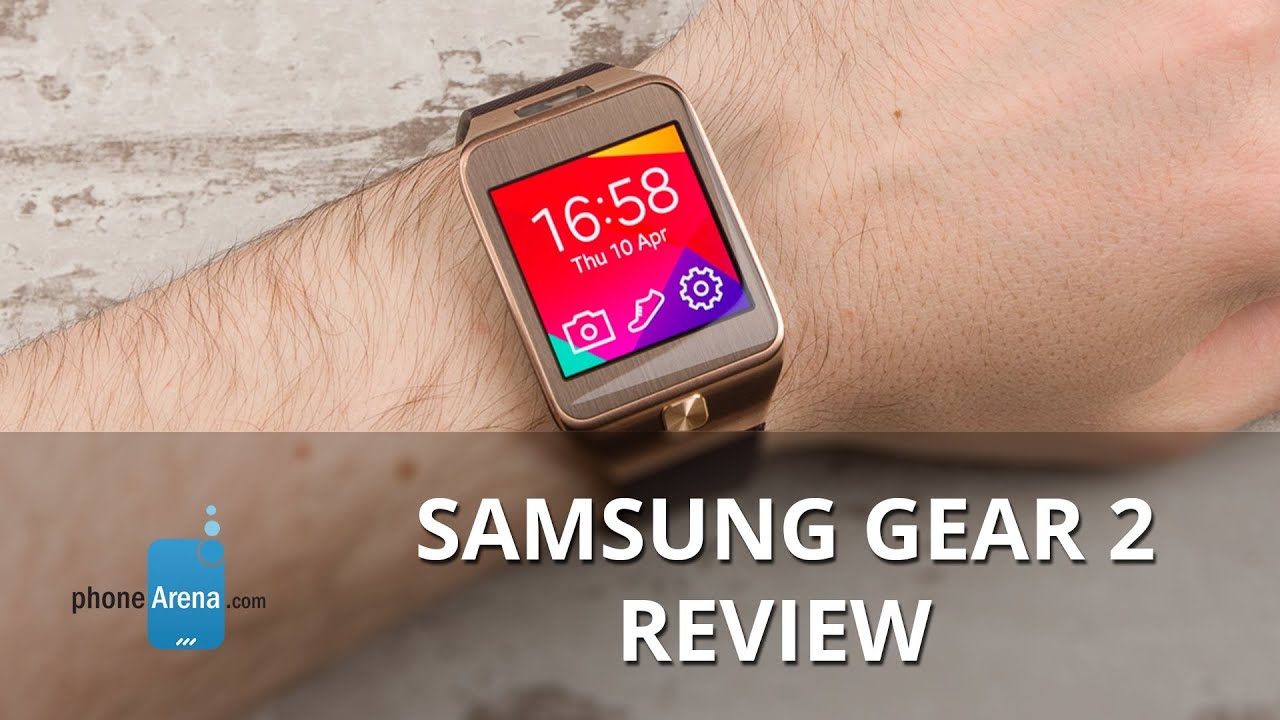
While the Gear 2 by no means introduces a plot twist with its design language compared with the original Galaxy Gear, quite a bit has changed, and exclusively for the better. The face of the watch looks much sleeker and cleaner, unencumbered by the four screws that kept the original together. The power/home button has also been moved to the front, and is now much larger, and significantly easier to operate. As before, the viewable part of the face is all glass and metal, and holds a 1.63-inch 320x320-pixel AMOLED display, which is both detailed enough and can get sufficiently bright for use even under direct sunlight.
But the improvements in design didn't stop there. The camera, for example, no longer protrudes from the strap, and, alongside the new IR blaster, is now neatly nestled at the end of the physical body of the Gear 2, immediately before the strap. Speaking of the body and strap, those have both seen some slim-sizing – the body itself is still plastic, but it's also thinner and IP67 dust- and water-resistant (and houses a heart rate monitor on the bottom), while the strap comes with a much smaller and classier-looking clasp. Moreover, the strap can now be replaced with any standard 22mm one.
Samsung has narrowed the number of color options down to three – charcoal black, gold brown, and wild orange.
Introduction
A little over a year ago, an unknown company called Pebble, put itself on the map after it managed to deliver on its crowd-funded campaign on Kickstarter, and released what was one of the very first modern and actually successful smartwatches. The company was overwhelmed by the demand, and that's as good an indicator as any to a big-shot incumbent that the age of the wearables is drawing near.
The response was super-quick – Samsung announced its fancy-looking Galaxy Gear smartwatch alongside its Galaxy Note 3 in September last year, and yet consumers were seemingly unmoved. Despite the parts that Samsung had gotten right – a color display instead of monochrome, for one – it was undeniable that the Gear felt rushed, and lacked the breadth of functional applications of the Pebble. It was also expensive, and very picky about the devices it could pair up with (read: Galaxy Note 3 only at launch).
Today, we'll be taking a look at the follow-up – the Gear 2 – in an attempt to assess whether Samsung learned from the whole experience. At $299, it is still one of the most expensive smartwatches out there, but a precursory look does indicate that Samsung has improved its wearable in several key areas.
So, has the Gear 2 become a functional enough device as to rank high on your list next time you go smartwatch shopping? Let's find out.
Design
While the Gear 2 by no means introduces a plot twist with its design language compared with the original Galaxy Gear, quite a bit has changed, and exclusively for the better. The face of the watch looks much sleeker and cleaner, unencumbered by the four screws that kept the original together. The power/home button has also been moved to the front, and is now much larger, and significantly easier to operate. As before, the viewable part of the face is all glass and metal, and holds a 1.63-inch 320x320-pixel AMOLED display, which is both detailed enough and can get sufficiently bright for use even under direct sunlight.
But the improvements in design didn't stop there. The camera, for example, no longer protrudes from the strap, and, alongside the new IR blaster, is now neatly nestled at the end of the physical body of the Gear 2, immediately before the strap. Speaking of the body and strap, those have both seen some slim-sizing – the body itself is still plastic, but it's also thinner and IP67 dust- and water-resistant (and houses a heart rate monitor on the bottom), while the strap comes with a much smaller and classier-looking clasp. Moreover, the strap can now be replaced with any standard 22mm one.
Samsung has narrowed the number of color options down to three – charcoal black, gold brown, and wild orange.
Interface
Oh, boy, do we have a lot to talk about. Ladies and gentlemen, say goodbye to Android. That's right, the Gear 2 does not make use of Google's OS – it's got a Tizen heart instead. Google never really did intend, nor did it modify the existing Android code, for use on wearables with tiny displays, at least until recently, when the Android Wear project was announced. What Samsung did with the Galaxy Gear last year is modify the Android OS on its own, optimizing it for its watch. This likely steered Samsung towards Tizen, a platform it has far more control over. In any case, virtually nothing about the Tizen-based software looks or functions differently from the Android OS-based one in the first generation Gear. That said, a lot has been added on top of the previous platform.
But let's first talk about the user experience using the Gear 2. Well, it's actually exceedingly simplistic in nature, and in a good way. Unlike your non-smart watch, the display doesn't work all the time. However, by default, the display is set to wake up whenever it detects motion in an effort to try and guess motion reminiscent to when you raise your wrist to check the time as you would with a normal watch. Unfortunately, in our opinion, it is too sensitive, so the display constantly powers on. This not only drains the battery unnecessarily, but can also be annoying and distracting. That's why, after a while, we decided to keep the auto-waking up feature off, so we have to press the home button every time we want to see the time, just as on a phone.
The homescreen houses the time and date, along with quick access to the camera, pedometer, and options. Samsung provides you with a few choices here, and you can instead have the weather show up, or even set up a fitness-centric homescreen which constantly updates itself with the number of steps you've traveled.
Navigating your Gear 2 is simple – you just swipe left and right to access the different screens like you would on your smartphone. Whenever you need to quit an app or go back a step, you simply swipe from the top, and that's about it. The physical Home button also works like its Android counterparts – a click will transport you directly to your chosen homescreen, unless you're inside an app where it simply works like a back button.
The UI has been updated with the option to have a proper background image, instead of just having a pick of several primary colors and a few secondaries. What's more, apps are now arranged in a 2x2 grid for each homescreen and you can rearrange them, which makes navigation that much easier – gone are the days of endless scrolling about.
So let's talk functionality. The Messages app, as you can imagine, allows you to read the full SMS text messages that you have received on your smartphone, and you can even use a number of pre-set templates with short answers, or even create your own. A dedicated E-mail app synchronizes with the built-in Samsung mailbox on your device, allowing you to read the full contents of an e-mail, instead of just serving as a “You've got mail!” type notification. You can, again, reply with pre-set answers, but nothing more.
The Notifications app contains each and every incoming and stored notification. They are not just snippets, and all the information from the notification you receive on your device is usually available right from your Gear 2. What's more, thanks to a feature called Smart Relay, you can easily transition between the tiny notification window on the Gear 2 directly to your full-sized device exactly where you left off.
You also get Dialer and Contact apps built-in, and they both are well-implemented for the small screen, and work well. For example, the Dialer will quickly recognize the number you're typing if you have it stored on your smartphone, and you can also use the numeric keypad to search and dial names directly, in T9-like fashion. As for the Contacts app, you can easily navigate through your many contacts thanks to the alphabetical slider on the right.
The rest of the built-in apps include the likes of S Voice for voice commands, a timer, a stopwatch, voice memos, and a weather app, which were also present on the original Gear. The new ones here are the Schedule app, which works in unison with your Samsung device's built-in calendar, and the WatchON Remote, which uses the built-in IR blaster to control your TV and set top box.
Also new are the Heart Rate app (which works in unison with the heart rate monitor on the back), allowing you to take measurements of your heart beat. Unfortunately, for it to work properly, you need to have the Gear 2 hugging your wrist bone, but not too tight, nor too loose. Even then, however, it usually takes over 10 seconds for an actual reading, and those can be quite erratic, too. There's also a new Exercise app, which essentially uses the pedometer and your profile's stats (age, height, weight, gender) to provide approximations of the distance and the speed at which you're moving, along with a calorie counter.
Want some extra apps specifically created for the Gear 2? There are some – like Evernote, Feedly, Banjo, along with several watch faces – but the list is really, really short, and a big portion of it isn't free. Maps or turn-by-turn navigation remain a mirage. Thankfully, apps that worked with the Galaxy Gear, work with the Gear 2 as well. However, the small app ecosystem size continues to be by far the biggest issue we have with Samsung's smartwatches.
The Gear 2 is designed to be paired with your phone and not used as a standalone device. However, you cannot pair it with just any Android device. Instead, the smartwatch is only compatible with Samsung devices only, though the list has now grown to 18 different models, including the Galaxy S4 and S5, and even the Note 2 and 3. Although the list is generous compared to the first-gen Gear, it cannot be compared with the Pebble watch, which works with both Android and iOS devices.
The Gear 2 pairs via Bluetooth 4.0 LE, but it is not as easy as pairing a Bluetooth headset for example. It requires you to download the Gear Manager app on your phone/tablet off the Samsung app store, and go through a few prompts. The rest is, for all intents and purposes, a completely automated process, but a bit time consuming.
The Gear 2 also ups the ante in the performance department, with a speedier, dual-core Samsung Exynos 3250 chip clocked at 1GHz, and 512MB of RAM. This is a sizable upgrade from the single core 800MHz processor on the original Galaxy Gear, allowing it to push through the fancier graphics and new interface at even faster speeds than its predecessor.
Essentially, you're getting slightly better response times with the added benefit of all the extra functionality. We've experienced no scenarios where lag or hang-ups reared their ugly heads above the surface, and that's definitely a big plus.
Lastly, there's 2.91GB of free storage available to you, which you can use for loading music, third party apps, watch faces or for photos you have taken with the built-in camera.
The UI has been updated with the option to have a proper background image, instead of just having a pick of several primary colors and a few secondaries. What's more, apps are now arranged in a 2x2 grid for each homescreen and you can rearrange them, which makes navigation that much easier – gone are the days of endless scrolling about.
Functionality
So let's talk functionality. The Messages app, as you can imagine, allows you to read the full SMS text messages that you have received on your smartphone, and you can even use a number of pre-set templates with short answers, or even create your own. A dedicated E-mail app synchronizes with the built-in Samsung mailbox on your device, allowing you to read the full contents of an e-mail, instead of just serving as a “You've got mail!” type notification. You can, again, reply with pre-set answers, but nothing more.
The Notifications app contains each and every incoming and stored notification. They are not just snippets, and all the information from the notification you receive on your device is usually available right from your Gear 2. What's more, thanks to a feature called Smart Relay, you can easily transition between the tiny notification window on the Gear 2 directly to your full-sized device exactly where you left off.
You also get Dialer and Contact apps built-in, and they both are well-implemented for the small screen, and work well. For example, the Dialer will quickly recognize the number you're typing if you have it stored on your smartphone, and you can also use the numeric keypad to search and dial names directly, in T9-like fashion. As for the Contacts app, you can easily navigate through your many contacts thanks to the alphabetical slider on the right.
The rest of the built-in apps include the likes of S Voice for voice commands, a timer, a stopwatch, voice memos, and a weather app, which were also present on the original Gear. The new ones here are the Schedule app, which works in unison with your Samsung device's built-in calendar, and the WatchON Remote, which uses the built-in IR blaster to control your TV and set top box.
Also new are the Heart Rate app (which works in unison with the heart rate monitor on the back), allowing you to take measurements of your heart beat. Unfortunately, for it to work properly, you need to have the Gear 2 hugging your wrist bone, but not too tight, nor too loose. Even then, however, it usually takes over 10 seconds for an actual reading, and those can be quite erratic, too. There's also a new Exercise app, which essentially uses the pedometer and your profile's stats (age, height, weight, gender) to provide approximations of the distance and the speed at which you're moving, along with a calorie counter.
Want some extra apps specifically created for the Gear 2? There are some – like Evernote, Feedly, Banjo, along with several watch faces – but the list is really, really short, and a big portion of it isn't free. Maps or turn-by-turn navigation remain a mirage. Thankfully, apps that worked with the Galaxy Gear, work with the Gear 2 as well. However, the small app ecosystem size continues to be by far the biggest issue we have with Samsung's smartwatches.
Pairing with a phone
The Gear 2 is designed to be paired with your phone and not used as a standalone device. However, you cannot pair it with just any Android device. Instead, the smartwatch is only compatible with Samsung devices only, though the list has now grown to 18 different models, including the Galaxy S4 and S5, and even the Note 2 and 3. Although the list is generous compared to the first-gen Gear, it cannot be compared with the Pebble watch, which works with both Android and iOS devices.
The Gear 2 pairs via Bluetooth 4.0 LE, but it is not as easy as pairing a Bluetooth headset for example. It requires you to download the Gear Manager app on your phone/tablet off the Samsung app store, and go through a few prompts. The rest is, for all intents and purposes, a completely automated process, but a bit time consuming.
Processor and memory
The Gear 2 also ups the ante in the performance department, with a speedier, dual-core Samsung Exynos 3250 chip clocked at 1GHz, and 512MB of RAM. This is a sizable upgrade from the single core 800MHz processor on the original Galaxy Gear, allowing it to push through the fancier graphics and new interface at even faster speeds than its predecessor.
Essentially, you're getting slightly better response times with the added benefit of all the extra functionality. We've experienced no scenarios where lag or hang-ups reared their ugly heads above the surface, and that's definitely a big plus.
Lastly, there's 2.91GB of free storage available to you, which you can use for loading music, third party apps, watch faces or for photos you have taken with the built-in camera.
Camera
In typical Samsung fashion, no part of the package is left untouched, and this extends to the camera. The upgraded 2-megapixel auto focus shooter can take 1920x1080 snaps, and shoot video in 720p.
Yet despite its undeniable spy appeal, the camera is hardly the work of a miracle. That said, it's adequate considering it's strapped onto a smartwatch of all things, but really nothing beyond that – even your smartphone's front-facing cam likely produces better results.
As for video, 720p is the name of the game. There's an enforced cap of 15 seconds of footage, likely to conserve space. The quality is, once again, poor by today's smartphone standards, but you can produce workable clips when light is abundant.

Multimedia
For all intents and purposes, there are exactly three multimedia apps to be found on the Gear 2 – a Gallery app and a music player, plus a separate media controller.
Starting from the top down, the Gallery is as simple as it gets. You basically can scroll through all your photos and videos, four at a time. The feature-set is pretty basic – you can delete and share, or set the image as a background for the watch.
The music player is a tad fancier, and reminds us a lot of the built-in solutions that usually come with smartphones. It's still bare, but all the essentials are still there – navigation and volume controls, and even a miniaturized and navigable playlist. In any case, it lets you play music that you have loaded on the Gear 2 via your computer. That said, keep in mind that you cannot connect a pair of headphones directly to the smartwatch, so you're left with the on-board loudspeaker.
Тhe media controller app, however, is way more reasonable – it allows you to easily control the volume or switch the tracks currently playing on your paired Samsung device without having to take it out of your pocket.
Call quality
You can dial contacts and even hold a call via the Gear 2, though it obviously still needs its trusty Samsung smartphone sidekick to do the actual placing of the call - the Gear is just used as the loudspeaker and microphone.
If you do decide to take calls this way, prepare yourself for a disappointment. The speaker does alright, though it's still very weak, so noisy areas render this option unfeasible. The tiny microphone, on the other hand, really disappointed us. Put into words, just imagine that you're within a giant steel tube, inside a giant bathroom, because that's the way the other side will hear you. There's echo, there's distortion, there are bassy and grow-ly voices, and zero of your voice's actual tonality.
Battery
300 mAh cell is what powers the Gear 2, but don't sell it short just yet. Depending on your usage habits, it's actually capable of holding its ground for up to 4 or 5 days. If you like playing with your smartwatch, however, the very maximum you should expect is 3 days.
When the battery is out, you can juice it up through a pocket-able charging dock that Samsung provides, which snaps onto the back of the watch and connects to a power source via micro USB.
Conclusion
Samsung has carried out a number of improvements with the Gear 2, and pretty much all of them were for the better. We definitely like the design more, as the watch is both less bulky and lighter, but also less sporty with its looks. With the exception of the orange-colored version, you can easily slap the Gear 2 even for a fancier occasion (though, you'll still want your Tag for the rare gala). Samsung has also bumped up the specs of a few internals, and the watch generally performs very well in terms of responsiveness and speed. But like with its predecessor, the Gear 2's Achilies' heel is its poor app ecosystem, and its incompatibility with devices other than Samsung's very own. This situation is even more inadmissible some 6 months later.
The other major source of displeasure is the price tag on the Gear 2. At $299, this thing ain't cheap. Competitors like the far more functional (but arguably “less cool”) Pebble Steel sell for $229, while the original (which is a functional equivalent) costs just $150. Even Sony's new SmartWatch 2 costs only $145 on Amazon right now, and despite its faults, at least you have access to some high-demand apps like Facebook and Twitter, and it is arguably as good looking.
In the end, we found that the type of functionality that we could see ourselves rely on daily is virtually non-existent – the Gear 2 is an extension of your smartphone at the very, very best. At worst, it's nothing more than a watch for techies, and an expensive one at that.

![T-Mobile extends another peace offering to customers after uproar over rate increase [UPDATED]](https://m-cdn.phonearena.com/images/article/168576-wide-two_350/T-Mobile-extends-another-peace-offering-to-customers-after-uproar-over-rate-increase-UPDATED.jpg)




Things that are NOT allowed: