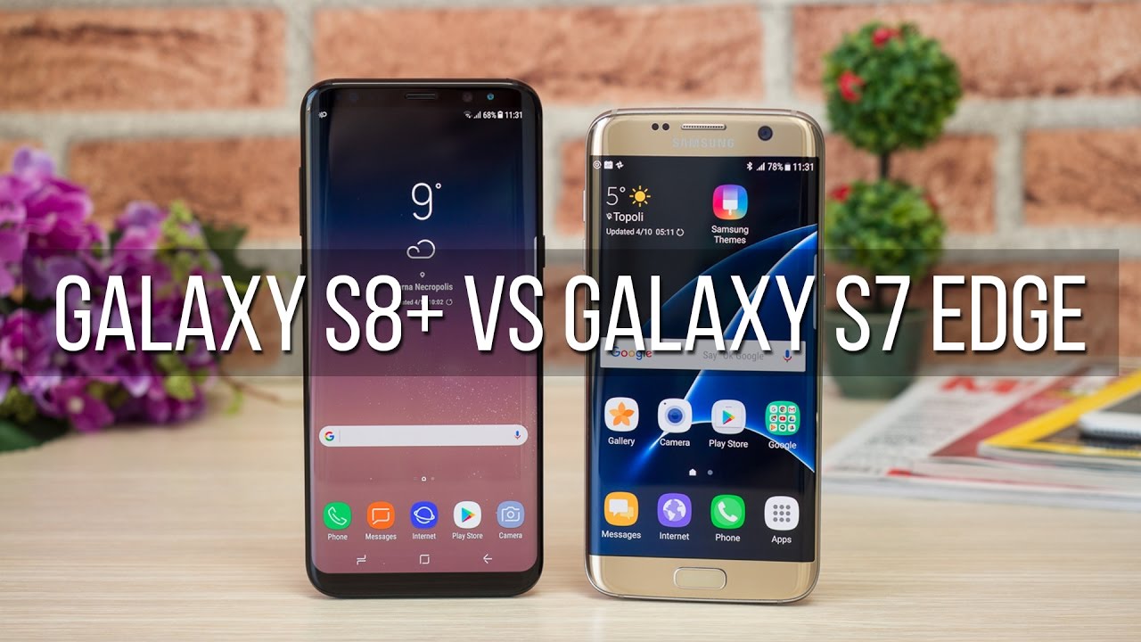
Samsung Galaxy S8+ vs S7 Edge
Introduction
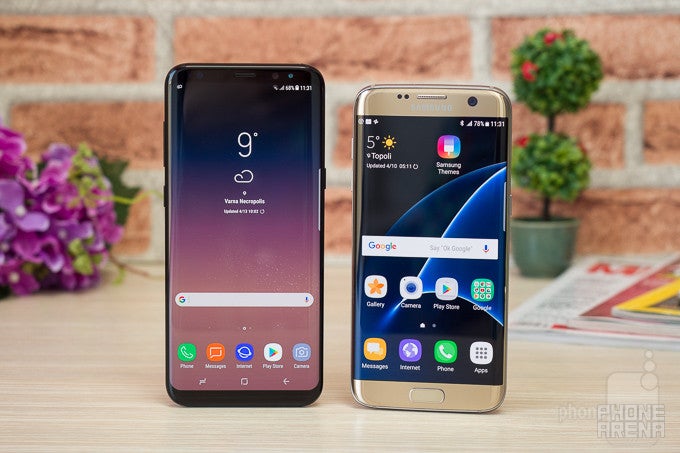
The Galaxy S7 Edge was one of the most successful Samsung phones. Its striking curved screen that gave the impression of the screen just flowing along the phone’s sides and its beautiful glass and metal construction were really something special.
It’s 2017, though, and Samsung is ready to take things one step further towards that unachievable perfection with the Galaxy S8 series, and today we compare the larger Galaxy S8+ against its last year equivalent, the Galaxy S7 Edge.
It does not take much to understand what makes the Galaxy S8+ special. The moment you see that nearly bezel-less screen, your most likely reaction will be a simple ‘wow!’. I have seen a lot of smartphones throughout the past years, but it’s been a long while since a single feature has made such a huge impact on me.
The Galaxy S8+ also brings the usual upgrades: a faster processor, a slightly better camera, a different user interface, a new Bixby assistant, and - finally - a USB-C port for syncing and charging. It’s also a much more expensive phone than the Galaxy S7 Edge. So let’s see if it’s worth your hard-earned cash.
Design
Surprisingly comfortable in the hand, despite the large screen.
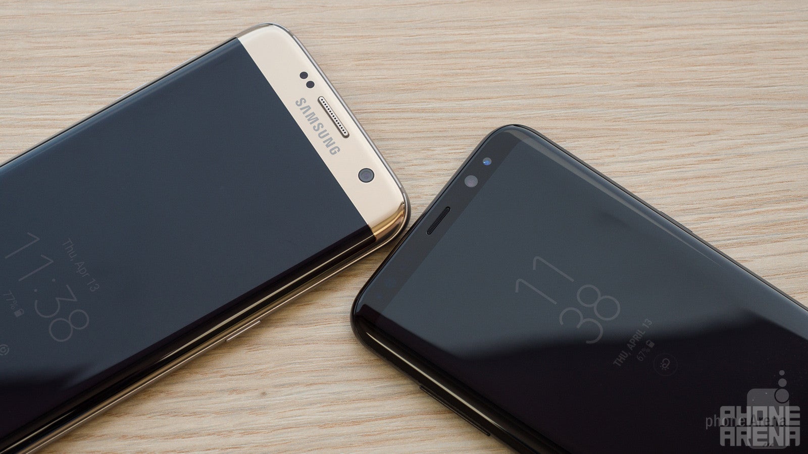
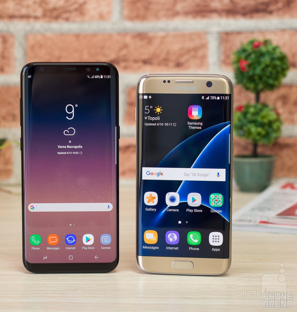
Samsung kicked off a new design era way back in early 2015 when it launched the glass and metal Galaxy S6 and S6 Edge. The Edge model turned out surprisingly popular. The Galaxy S7 Edge in 2016 refined that design and today, in 2017, Samsung has fully embraced curved ‘edge’ screens on all its Galaxy S8 models. The edge is the new standard, so much so that it’s no longer in the name of the phone. It’s understood.
What the Galaxy S8+ is compared to the S7 Edge is refined: the seam between front and back was a bit sharp on the S7 Edge, and it’s much smoother on the S8+. The in-hand feel is more comfortable. The phone is taller - noticeably - but it is almost as narrow, and I - usually in pain when dealing with large phones - found it surprisingly easy to handle such a phone.
The back, however, is still a fingerprint magnet (particularly noticeable on the black version). Another thing on the back of the phone is the camera which is now almost completely flat with the surface: there is a very slight ridge that will help you determine where the fingerprint scanner ends and the camera begins.
And yes, the fingerprint scanner is on the back, and sure, it’s right next to the camera in what is not the most convenient place ever. However, you get used to it after a while. The slight ridge on the back helps you find the finger scanner without looking and while it’s never exactly convenient, it’s also not a deal breaker per se.
The USB-C port on the S8+ finally replaces the microUSB used on the S7 Edge. It’s just more convenient to have a cable that fits both ways and that most modern electronics use. In a typical Samsung move, the speaker on the bottom and the USB-C port are misaligned. We can live with that, of course, but we just find it strange that Samsung cannot get such tiny design details right.
A cool feature that both the S8+ and S7 Edge share is water resistance: both can be submerged in water up to 5 feet deep for as long as 30 minutes without suffering any damage. Cool!
Display
17% more screen space on the S8+, but it feels like more. And a Super AMOLED with colors looking even better than before.
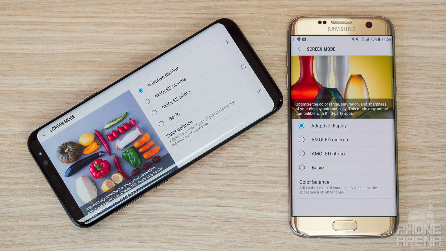
Let’s talk about the elephant in the room: the new display. The Galaxy S8+ sports a 6.2-inch screen with a Quad HD+ resolution (1440 x 2960 pixels), while the S7 Edge has got a 5.5-inch display with a Quad HD res (1440 x 2560 px). With Nougat, you can choose the resolution on Samsung’s flagship phones, and interestingly, the S8+ defaults to Full HD+ resolution (you can change this from Settings > Display > Screen resoluton).
Let’s make one thing clear: the display on the S8+ is taller and has a totally different aspect ratio than the S7 Edge. It’s 18.5:9 (S8+) vs 16:9 (S7 Edge). This makes a direct comparison of screen diagonal sizes (6.2” vs 5.5”) irrelevant and misguiding. The more accurate way to calculate how much bigger the screen on the S8+ is is to actually look at the real area that it provides compared against the area of the S7 Edge. Here are the numbers: the S8+ display has an area of 97.2mm2, while the S7 Edge screen area stands at 83.4mm2, which means that the S8+ has a screen that is nearly 17% larger than the S7 Edge.
Let’s also keep in mind one more thing: the screen is curved towards the edges, which makes it susceptible to shattering if dropped. And repairs will cost you a fortune, so keep that in mind and be careful with your phone. On a positive note, the S8+ has Gorilla Glass 5 protection glass while the S7 Edge had GG4. The newer GG5 survives 80% of drops from a little over 5 feet height (1.6 meters), while GG4 survives 80% of drops from a little over 3 feet.
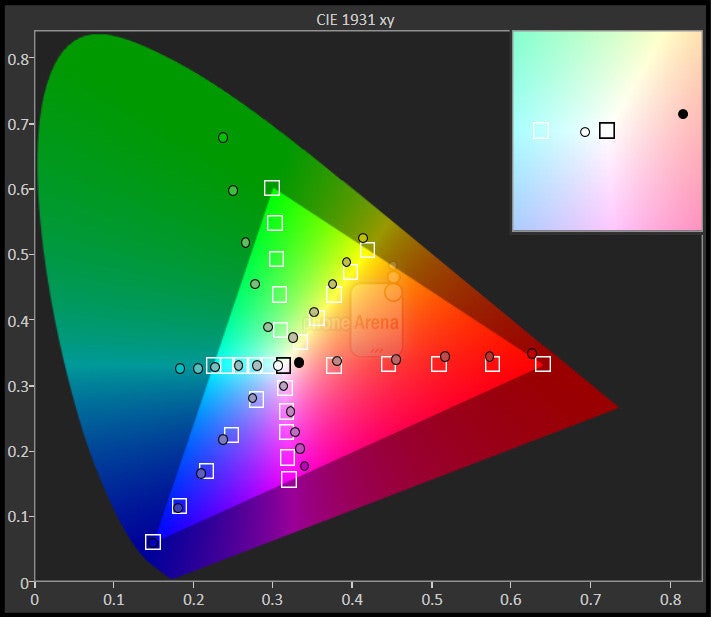
Enough with the warnings, let’s look at the actual colors on these screens. Here is a spoiler: both have great looking colors, but the S8+ is a little brighter and a little better balanced. Samsung supports various color modes (go to Settings > Display > Screen Modes to switch). The default on both is Adaptive mode with punchy and oversaturated colors.
Interface and Functionality
New user interface with (a bit too) clean looks. Quite a few apps are not yet optimized for the new, taller S8+ screen.
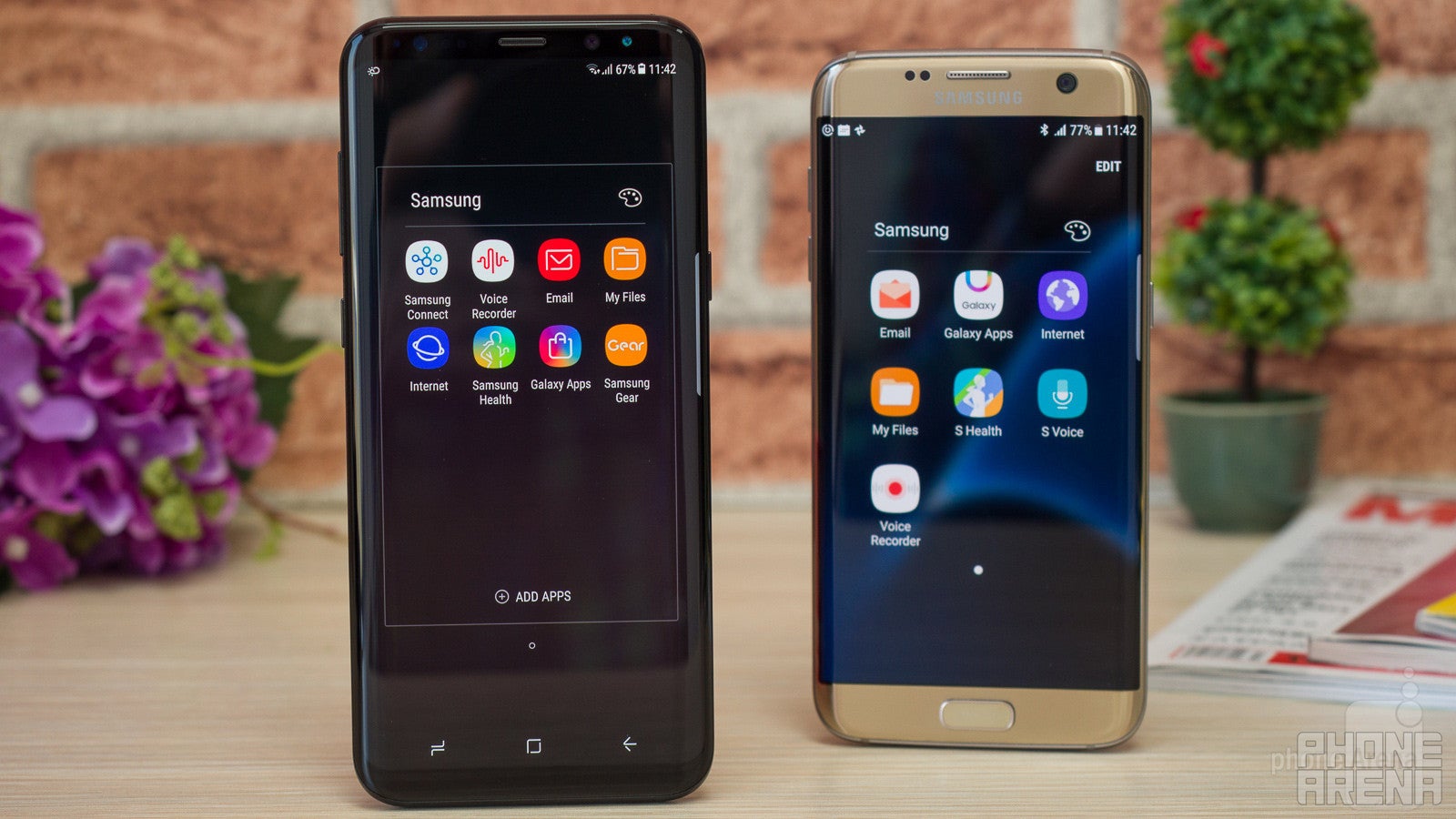
The Galaxy S7 Edge has just recently been updated to Android 7.0 Nougat and with it has received a visual overhaul with more organized menus and less clutter. The Galaxy S8+, on the other hand, features an even newer interface with new icons and a few tweaks and gestures that make a lot of sense.
The thing you notice first are the redesigned icons that look simplistic, even a bit too simple. You can now launch the app drawer with a simple swipe up or down on any place in the front panel. The front button is gone too, so popular features like the Quick Launch shortcut for the camera on the S8+ is replaced by a double click on the power/lock key on the side. The taller display means that it’s hard to reach the very top to swipe down and get the notification drawer, but luckily Samsung now supports swiping on the fingerprint reader on the back (a single swipe allows you to drop down the shade).
The new Bixby assistant on the Galaxy S8+ is a thing that holds more promise for the future, meaning that currently we could not test its full capabilities. In the near future, it is expected to allow you to just press the dedicated Bixby key on the side and speak with the assistant right away, without even waking your phone first. In the future, Bixby is also expected to know the context of an app and be able to do stuff related to the app, a thing that will definitely make it more useful than current-gen voice assistants.
The keyboard typing experience is similarly great on both phones: with clearly separated button keys, typing is fast and accurate. The big advantage of having the tall screen on the S8+ is that when you type, you can still see a ton of context, despite the keyboard taking up some space.
Processor, Performance and Memory
A new 10nm chip runs well in daily tasks, but we still see a very slight stutter here and there, just like on the S7 Edge.
The Galaxy S8+ has got a brand new chip under the hood. Or we should say chips: in the United States, the phone is coming with the latest and greatest Snapdragon 835 by Qualcomm, while in other parts of the world it has the comparably powerful Exynos 8895 on board (we have the Exynos model for this comparison). Both are made on the new 10nm manufacturing process, which is more power-efficient than the 14nm one used on the Snapdragon 820 in the Galaxy S7 Edge.
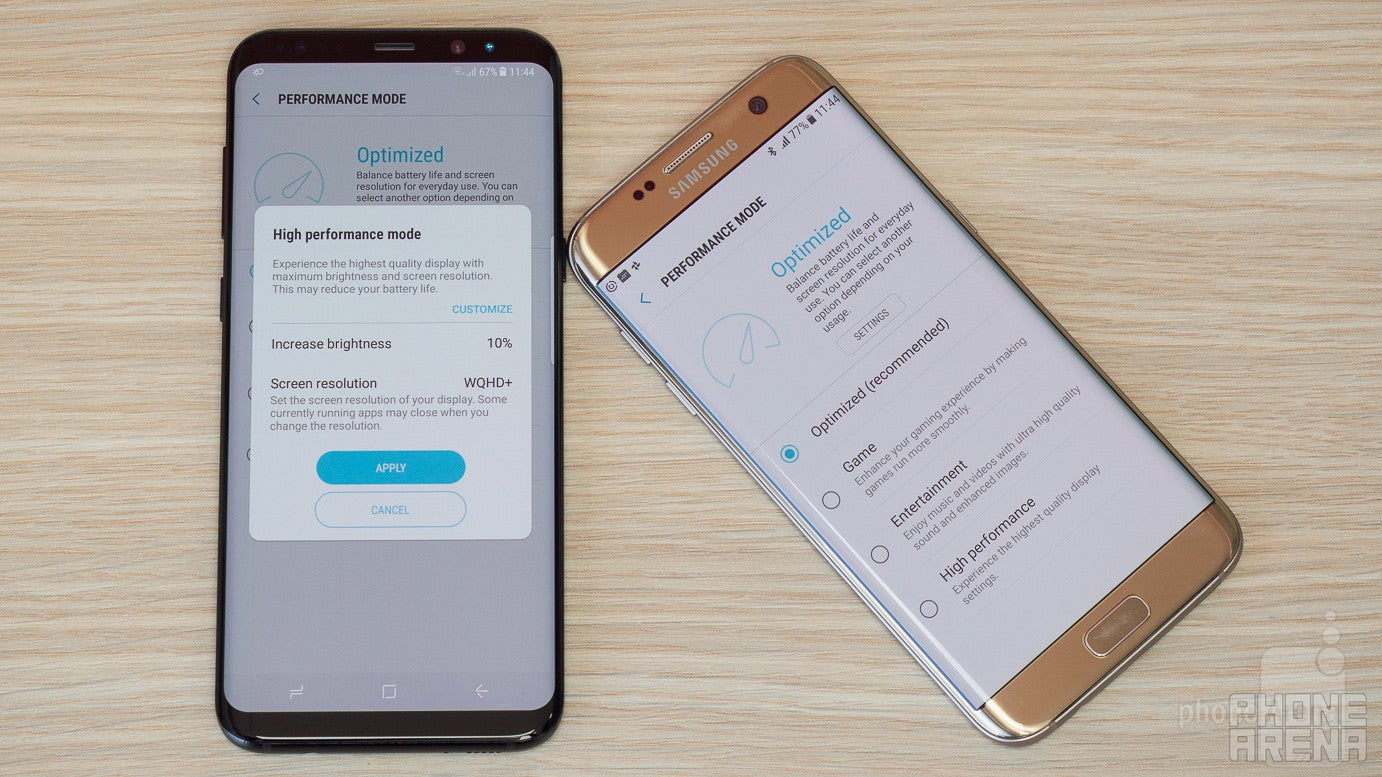
In reality, the Galaxy S8+ feels a bit faster and less jerky than the S7 Edge, the newer phone runs a bit more fluidly. At the same time, we do notice that split-second slow-down so typical of Samsung phones even on the S8+. It’s very minimal, but not unnoticeable, especially if you come from a phone like the Google Pixel or Apple iPhone.
In performance benchmarks, you can see that the Galaxy S8+ is consistently faster than last year’s S7 Edge. We would not say that it’s a big difference, but it’s there nonetheless.
Both the S8+ and the S7 Edge support the Vulkan API for more advanced games and better performance, which is nice.
We are very happy that the Galaxy S8+ ships with 64 GB of on-board storage. Both the S7 Edge and the S8+ support microSD cards for expandable memory, but having more native storage definitely gives you more freedom. This is not something that you feel on day one, but after a few months of usage when videos, games and photos pile up, you notice those differences.
Internet and Connectivity
Full 4G LTE support and great browsing experience with the taller screen.
Both being flagship phones, we are not surprised to see them choke full of 4G LTE bands. In the United States, you can expect to see specific models that will cater to the major carriers and you will get full LTE compatibility on Verizon Wireless, AT&T, Sprint and T-Mobile.
The browsing experience, however, is better on the S8+: the extra screen space comes in handy with large chunks of text.
You have NFC on board on both phones, and both also support Samsung Pay for wireless payments. Dual-band Wi-Fi is also on board on both, a useful feature in congested urban areas where a single-channel Wi-Fi receiver would often result in reduced download and upload speeds. Both also share the following connectivity options: USB Type-C 3.1 and GPS.
Camera
The S8+ features brighter camera with more detail and more balanced color that does even better in low light than the S7 Edge.
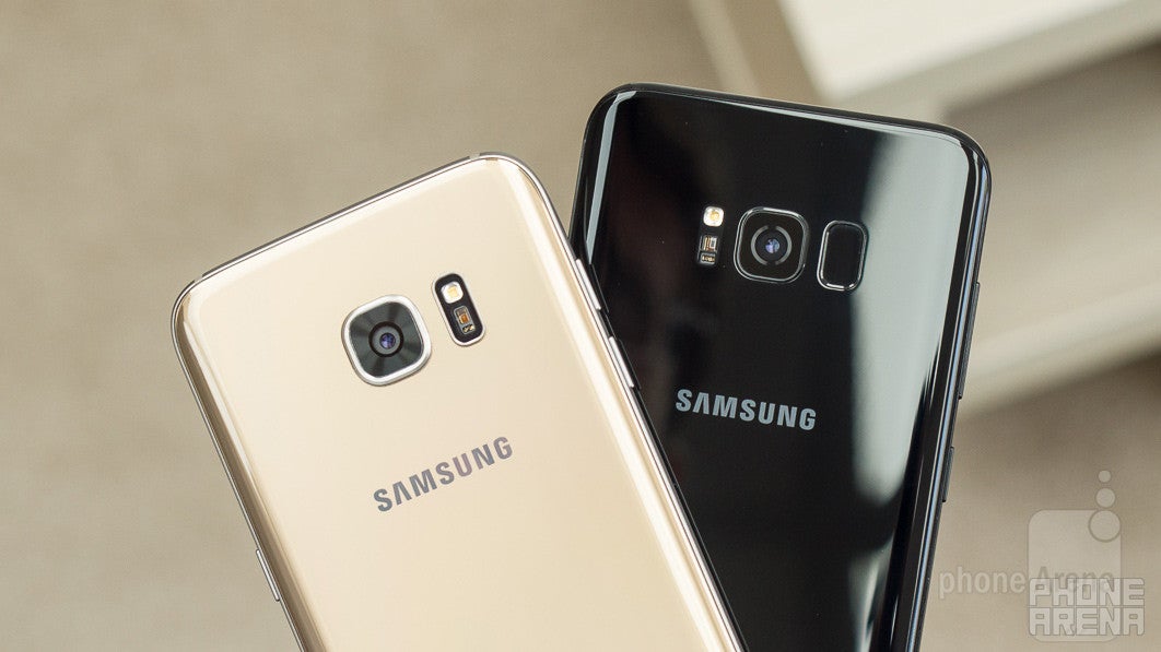
On paper, the Galaxy S8+ seems to have the same camera as the S7 Edge: both feature a 12-megapixel sensor with dual pixel auto-focus (currently, the fastest focusing system around) and both record 4K video. Up front, the S8+ introduces a slightly higher-res, 8-megapixel front camera (up from 5MP on the S7 Edge).
We have the same camera app on the S8+ and the S7 Edge: it’s a very clean app with only the essential settings in sight. Swipe left for filters and right for different shooting modes (go into Pro mode and in Settings, where the resolution is, you can select to save a DNG file along with the regular JPG if you want). Since you have no physical button up front, the double click Quick Launch shortcut for the camera now requires you to double press the power key on the right side on the S8+, but still works fast.
Image Quality
Both phones produce detailed, yet somewhat oversharpened photographs. In most cases, images look extremely similar to one another; there are only rare cases where we notice the Galaxy S8 getting a better feel of the scene and coming up with slightly clearer details and more realistic-looking colors. At the end of the day, there really isn't anything significant to separate these two awesome shooters.
Selfies with the front camera have improved. With a higher resolution, they now have more definition, and just look better. The viewing angle of the camera is wide, but not as wide as on the S7 Edge. We like this: the S7 Edge felt too wide for images when it’s only you in the frame, while the S8+ is more versatile and you can shoot both groups of people and just yourself with better composition.
Video quality
Both phones support 4K video and all of the things that we have said about photos apply here, but to a lesser extent: the S8+ has a little less contrast and saturation, and a bit more detail, keeping things at a slightly better balance.
We did not notice any improvement in video stabilization, which is not to say that the stabilization is bad. Quite the contrary, both phones support OIS and they do also add an extra layer of software stabilization to get smoother looking footage.
Focus is super fast on both phones, and this is definitely of huge importance for video.
Sound quality
You have a single bottom firing loudspeaker on both phones and we’re happy to see that Samsung has made some slight improvements with the S8+. Sound through it is louder and a bit fuller, with more definition. That’s great news for those who watch a lot of video on Facebook and/or YouTube without bothering to put headphones on.
Call Quality
We had no considerable issues with call quality on either phone. Both the S8+ and S7 Edge are decent.
Both phones also support voice over LTE (or VoLTE). Carriers that offer this feature will be able to deliver much cleaner and more pleasing audio via the earpiece.
Battery life
Very good battery performance, but turn Always On display off if you want to get the most out of the battery.
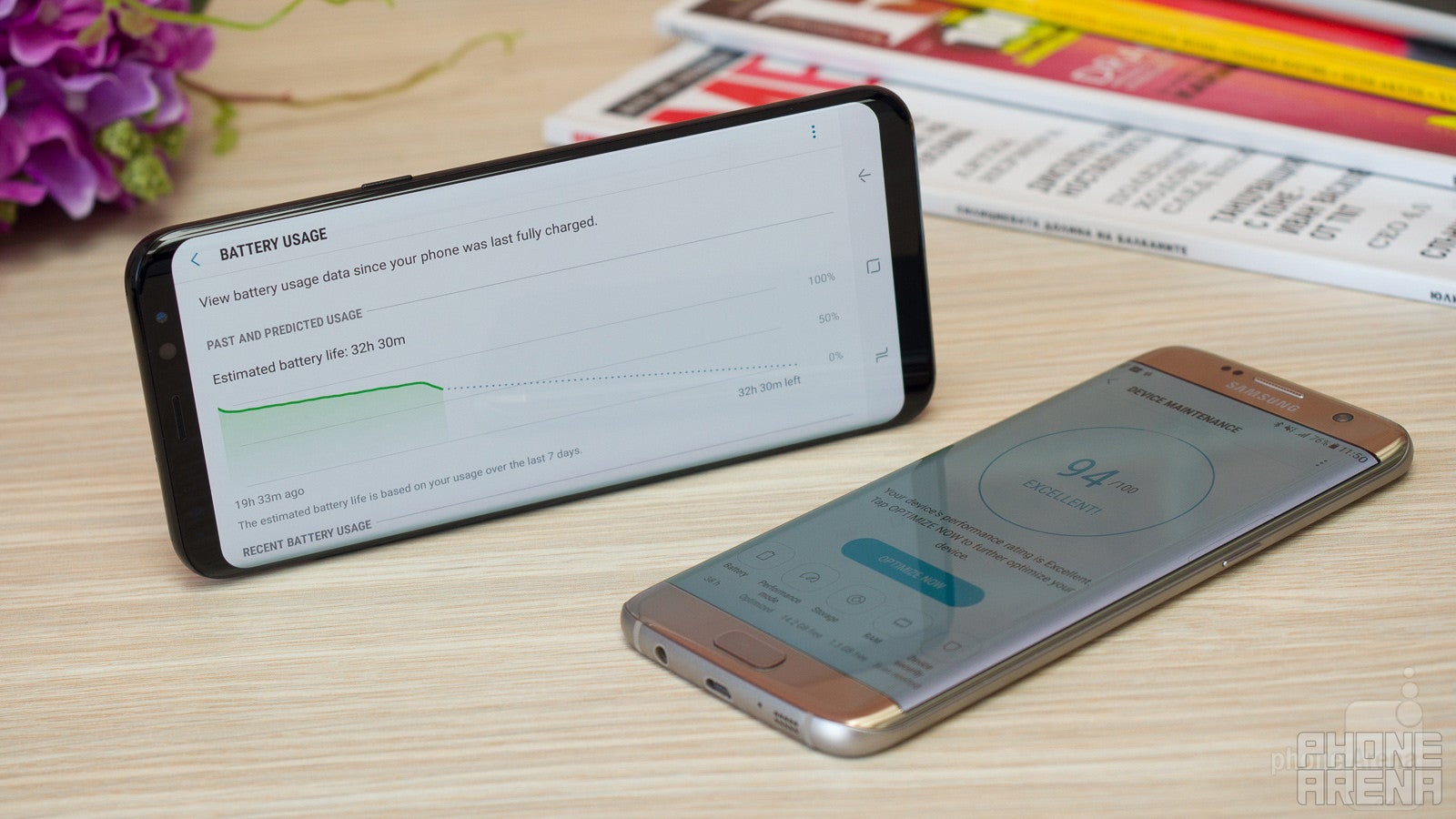
To find out about the Galaxy S8+ battery life, we put it through our standard test that allows us to compare all phones on equal grounds: with the screen set to the same level (200 nits of brightness, comfortable for typical indoor use). Luckily, the Galaxy S8+ does very well in this test and even though it is not the number one battery performer, it is certainly above the average for flagships these days. Note that we have tested using the Full HD+ resolution that our phone came set to by default (1080 x 2220 pixels).
The Galaxy S8+ battery life test result stands at exactly 8 hours. Compare this with the 7 hours and 18 minutes that the already good Galaxy S7 Edge scored, and you see that Samsung has managed to improve on their last year's phone. The S8+ also bests the Google Pixel XL, the OnePlus 3T, but falls a bit short of the battery life on the iPhone 7 Plus.
In a nutshell, the Galaxy S8+ and its 3,500 mAh battery turn out to be a very good combo (that lasted even longer than the S7 Edge with its slightly bigger, 3,600 mAh cell). Despite fears that a 3,500 mAh cell might not be sufficient to guarantee a solid battery showing, we see that Samsung has managed to do quite well.
Another important aspect of battery usage is the time it takes to fully recharge a battery from 0 to 100%. The Galaxy S8+ supports Samsung's Fast Adaptive Charging and it is able to fully recharge its battery in just 1 hour and 40 minutes, exactly as long as the S7 Edge. This is not the fastest we have seen, but it is not too far off. The Galaxy S8+ also supports fast wireless charging, which is a neat feature.
Conclusion
It’s time for a wrap-up: with every aspect of the S8+ and S7 Edge compared and thoroughly examined, is it worth getting the S8+?
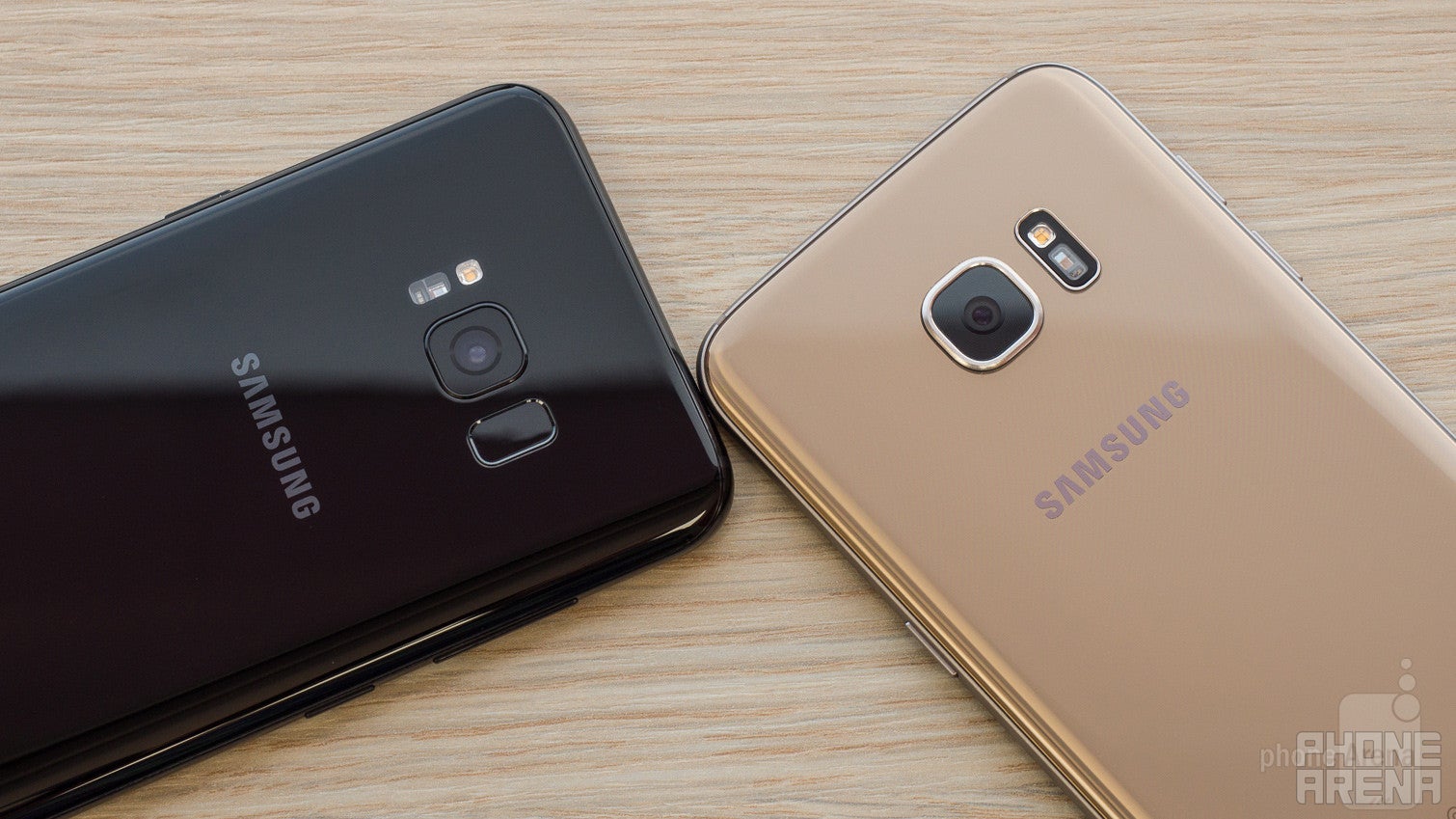
If you don’t care about price, it’s a resounding yes for us. The bezel-less screen is the big feature and it looks futuristic, cool and useful. The slightly improved camera and battery performance are also something to keep in mind. Not much else has changed: the performance is faster, but we still see the occasional stutter, recharge times are not much faster, nor are there many other flashy new features. Bixby is a thing of the future that we could not fully test just yet, so we reserve judgment for the moment.
Looking at the price on a global scale, though, we see that the S8+ carries a full retail price of €900 vs €550 for the S7 Edge, and that is a much bigger difference in price than what we have in the United States. Considering this international pricing, a year after its launch, the S7 Edge represents a great value for the money. Unless you really care about the undeniably cool new Infinity Display, the S7 Edge is still an excellent phone, so we see no pressing reasons to upgrade..
In a nutshell, the Galaxy S8+ has our irrational sympathy: it’s good looking and futuristic, but if you are looking for the best value for the money, the S7 Edge is still worth getting.
Samsung Galaxy S8+
Pros
- Incredible bezel-less screen
- Liberating 64 GB of storage + microSD
- Slightly better battery life
Samsung Galaxy S7 edge
Pros
- Very good price
- Good battery life
- Still a top performer








Things that are NOT allowed: