Samsung Galaxy S8+ vs Galaxy Note 5
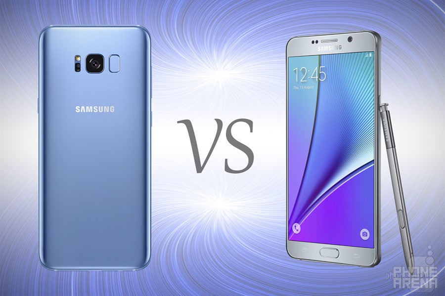
Introduction
For the third time in a row now, Samsung is putting out a shiny jewel of a flagship smartphone — a glass-and-metal sandwich with curvy sides, vibrant colors, and very reflective finishes. We are talking about the Galaxy S8 and its bigger variant — the Galaxy S8+ — of course. The latter is a phablet that sounds massive on paper — it has a 6.22-inch display, after all — but if you've been following the S8 announcements, you know that the phone's body size is impressively compact for the screen size.
But the Plus phones are not the only top-tier phablets Samsung has on the production line. There's also the Note family, which may have a tiny black spot on its reputation left by the Note 7, but there's still the perfectly good Note 5 out there — both on store shelves and in users' hands. So, with no other immediate relative, we have to ask — how does the 18-month-old Note 5 fare against the brand-new, futuristic-looking Galaxy S8+?
Design
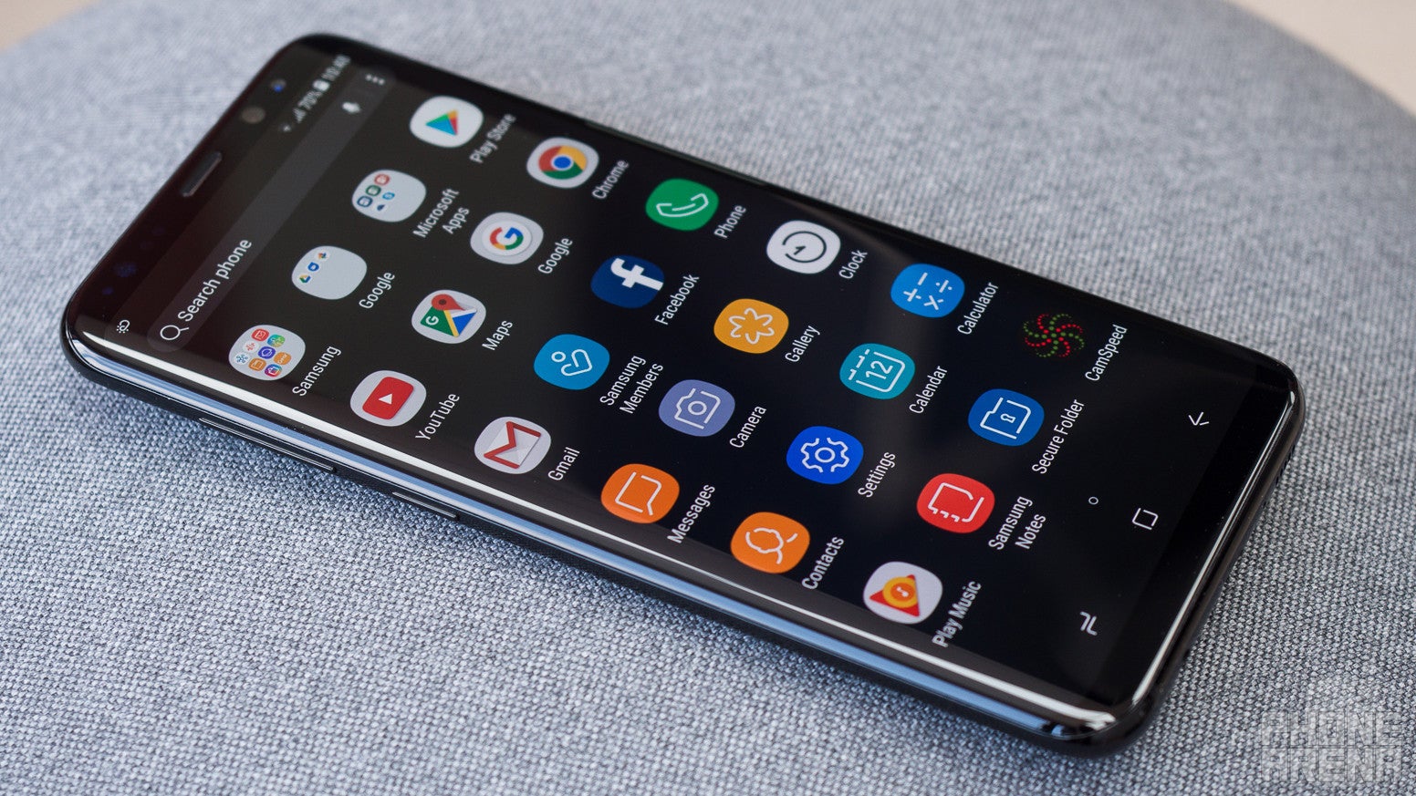
As we previously touched upon, the glass-on-metal build has been a mainstay in Samsung's design booklet for the past 2 years. So, even with the Galaxy Note 5, you get that shiny, premium look, and cool touch of metal as you press the phone's frame against your palm.
Obviously, the Galaxy S8+ has the most contemporary — or even futuristic — looks. With a dual-curved glass and an outstanding screen-to-body ratio, it's a jewel that looks fresh and desirable. But traditionalists may frown at the fact that Sammy's new flagships don't come in a flat screen variant. Sure, it looks lovely, but there are many out there who prefer a no-curve option. The Note 5 delivers just that — a nice, flat display. And, despite the fact that it's an 18-month-old design, its bezels are still pretty thin, even by today's standards.
Both devices' backs are curved to increase comfort in the palm, though, the Galaxy S8+ does feel thinner, more elegant, and more comfortable to hold. The new phablet also has a completely flush camera module, while the Note 5 still sports the camera hump, in case this bothers you.
The fingerprint scanner's position is also a noteworthy point here. With the S8, it was moved to the back, while on the Note 5, it's embedded in the physical home button on the front. Its positioning will definitely change the way you handle your phone in certain situations, so it's something to keep in mind.
The Galaxy S8+ has the more futuristic looks and a richer choice of colors, but the Note 5 isn't exactly obsolete. In fact, some might prefer its more conventional looks and handling.
Display
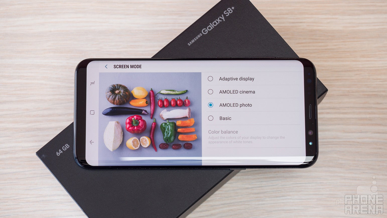
Samsung's Super AMOLED displays have been on top of the curve for a couple of years now. The Galaxy S8+ certainly has one of the best-looking screens ever put on a smartphone, but the Note 5 doesn't lag behind by much.
The stylus-equipped Note has a 5.7-inch display with a 1440 x 2560 pixel resolution. Needless to say, this makes for an incredibly crisp display with a pixel-per-inch density of 518. The freshly released S8+ rocks an Edge display, curved at both sides, with a diagonal of 6.2 inches. Its resolution is higher, with a total of 1440 x 2960 pixels glowing underneath its glass panel, making up for a 529 ppi density.
It's worth noting that there's a difference in display ratios — the Galaxy Note 5 sports the orthodox 16:9 ratio. It's basically the standard for most media you'd watch on your smartphone, and all games and apps are optimized for it since the majority of smartphones out there employ it. The Galaxy S8+ has an elongated screen, making the phone appear "tall" and giving it a ratio of 18.5:9.
Does this mean that the S8+ will distort your media and apps? Somewhat. Most apps adopt the new ratio just fine, but a lot of the games out there force the display in 16:9 mode, which puts two black bars on both sides of the screen, effectively wasting the real estate. When viewing video content, you have a button, which lets you choose between three scaling modes — original, stretch to fit, and crop to fit. So, you won't have your videos cropped unless you choose to, but you will have to get used to the black bars until the 2:1 ratio gets more widely adopted (if it does for video).
We do expect games and apps that don't shake hands with the widescreen ratio to be quickly fixed, since both Samsung and LG have pushed for its adoption with their highest class of devices. Developers will be hard-pressed not to update their apps accordingly.
The S8+'s tall screen excels when using the device in split screen mode, as there is more room for content from both visible apps. It's also great when browsing the web or reading any form of text. It feels much more spacious and creates the illusion that you are just holding a screen in your hand.
Interface and Functionality

Over the past 3 years, Samsung has done a great deal to fix the incoherent mess that was the TouchWiz interface — an Android re-skin that had buckets of features just poured into it with no rhyme or reason to how they were to be accessed, set-up, or how they interact with the rest of the operating system in general. The company's efforts to fix the clutter are definitely present on the Galaxy Note 5, but reach their absolute peak on the Galaxy S8+.
First things first, the new interface is now simply called "Samsung Experience" — cue your favorite Jimi Hendrix song here. It is very sleek-looking, with modern wireframe icons, new gesture controls that line up more with Nougat's new functions (in-app shortcuts, swipe up for app drawer), a very well tidied up Settings menu, and a very streamlined experience overall. Sammy has a lot to be proud of here, and giving the interface such a slightly pompous name does seem justified.
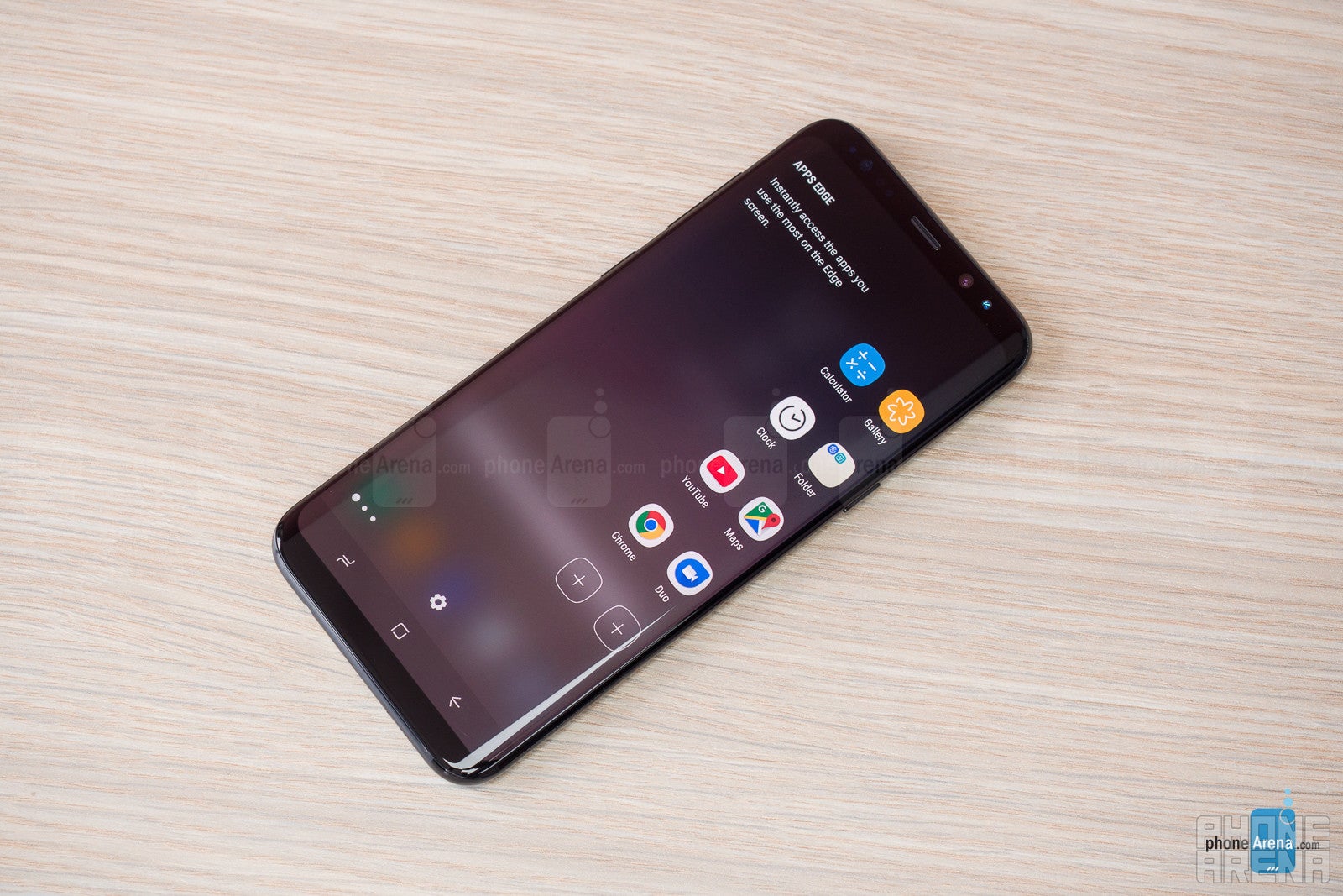
The edge panel
But the Note 5 isn't lagging behind in the software department. The phablet was recently updated to Android 7 Nougat and received a lot of the features of the more modern Sammy phones. The blue light filter is now here, the GIF recording feature is available from the S Pen's action menu, and the organized settings menu has also made its way to this phone. Even more advanced features, such as the resolution picker and the new power-saving modes are present on the Note 5. Its homescreen and app drawer are stuck somewhere between the old looks and the new style that the company is going for, but the smart features that we like the new interface for (such as moving multiple app shortcuts in bulk) are still present.
Still, Sammy refuses to call the UI on the old S Pen-wielding phablet "Samsung Experience". We wouldn't say this really matters, though. It's a pleasure to use and we are glad that the company has kept the Note 5 up to date in terms of software (one has to wonder if it would've done so if the Note 7 didn't suffer an untimely death).
Basically, there are three major things you will be missing out on if you go with the Note 5 — the Always On screen, the Bixby assistant, and the new homescreen style with the wireframe icons and swipe-up app drawer. The last point is a bit canceled out by the fact that the Samsung Theme Store exists. What the Note 5 has going for it is the S Pen and the software suite surrounding it — avid note-takers and sketch-makers will certainly appreciate it.
Processor and Memory
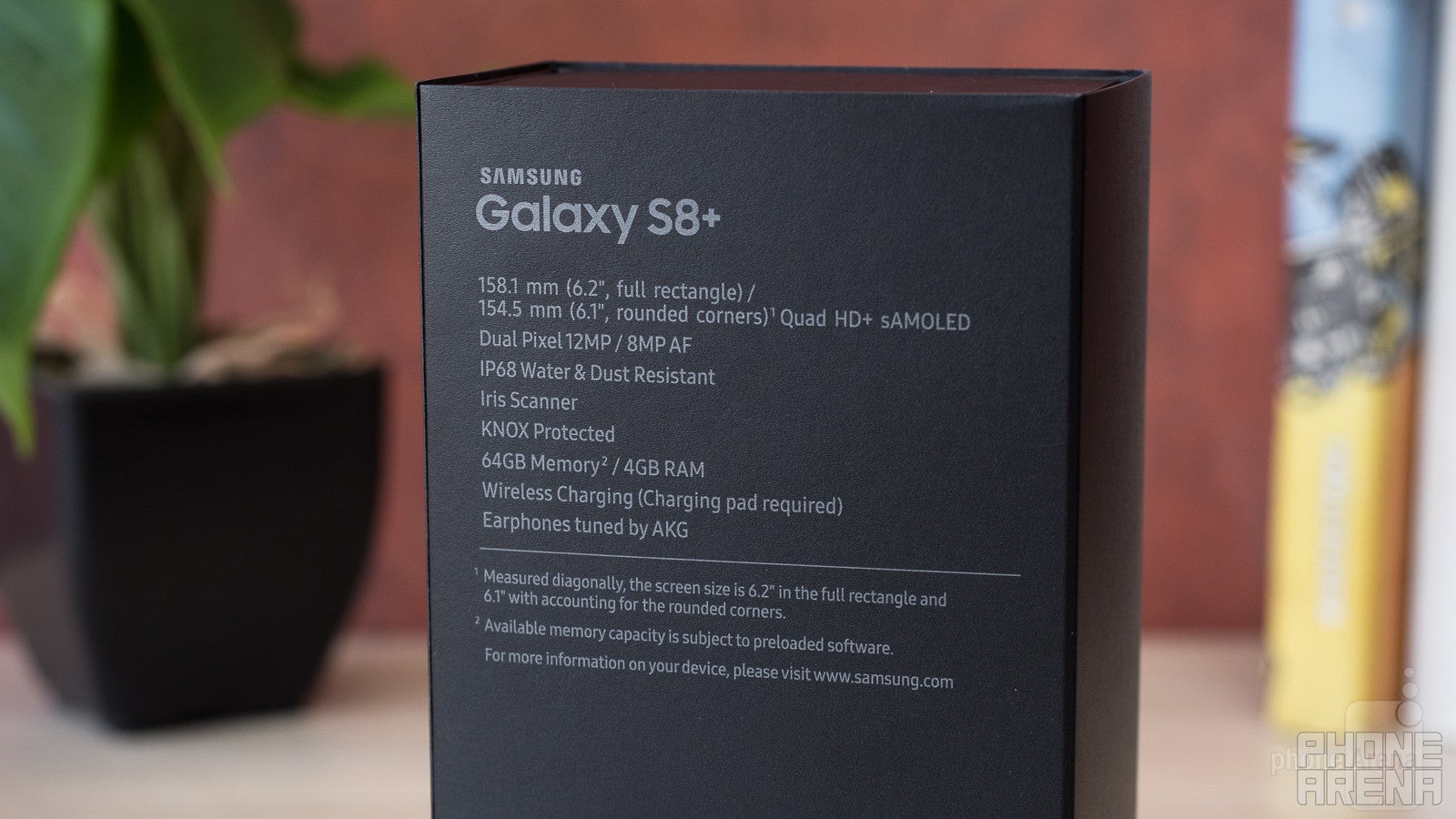
A new smartphone is always going to overshadow an 18-month-old model when it comes to hardware. That's the way the cookie crumbles, but does it mean that the Note 5 is obsolete? Let's take a look.
The new Galaxy S8+ comes in two flavors, depending on which region you buy it from — either a Snapdragon 835 (US version) or Exynos 8895 (International). The former is a 2.45 GHz, octa-core demon of a SoC, built on a 10 nm process. In other words, it's capable of balancing high performance with lower energy consumption than the last generation of chips, which were built on the 14 nm process. The Exynos 8895 is pretty much the same (on paper), though, it's clocked just slightly higher, maxing out at 2.5 GHz.
The Galaxy Note 5 doesn't do the whole split personality thing — back in 2015, due to a certain Snapdragon 810 fiasco, Samsung was forced to only use its homegrown Exynos 7420 for its top-tier devices. It's an octa-core SoC, clocked at 2.1 GHz, and built on the 14 nm process.
Both phones have a generous 4 GB of RAM and both come with 64 GB of built-in storage, but the Note 5 does not have a microSD card slot for memory expansion — something that the Galaxy S8 and S8+ have.
So, how is the performance? Of course, the Galaxy S8+ will outdo the Note 5 in any performance benchmark under the sun — that should be no surprise. But when it comes to actual real-world use, both devices are on point. Yes, the Galaxy S8+ does seem snappier at times and it absolutely has that "future-proof" badge that usually comes with bleeding edge hardware. But, seeing what's out right now, and how well the Note 5 handles it, we have a hard time believing that the old phablet wouldn't be doing a stellar job at graphic-heavy tasks for the foreseeable future as well.
Or, in short, the Galaxy S8+ is what the hardware junkies out there will want to get, sure, but the Note 5's real world performance is nothing to wince at.
Internet and Connectivity

As mentioned, the Galaxy S8+ wins in terms of Internet browsing due to the visual experience that it provides with its elongated display. However, when it comes to speed and efficiency, both phones are perfectly good Internet-browsing machines. They both support LTE and dual-band Wi-Fi over 802.11 a, b, g, n, and ac, and both have hardware that's powerful enough to push you through even the heaviest of webpages.
A plus for the Note 5 here is its S Pen and the way it can mimic a mouse cursor as you hover over the screen with it. It's certainly useful for those sites that don't play well with mobile and is definitely an experience enhancer.
Camera
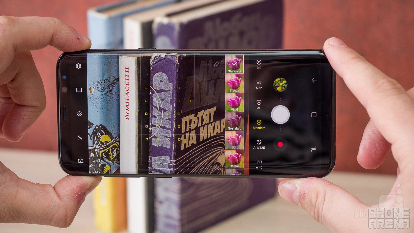
The Note 5's camera is now 2 generations older than the one on the Galaxy S8+ and that may show, but the two snappers are not two universes apart when it comes to quality. The Note 5 sports a 16 MP sensor with 1.12 μm pixels that takes 16:9 photos by default, while the Galaxy S8+ has a 12 MP resolution and shoots in 4:3, but has huge (for a smartphone camera) 1.41 μm pixels. To top it off, the Note 5 has an F1.9 lens aperture, while the Galaxy S8+'s is a bit wider at F1.7. Wider aperture means more light for the sensor (better shots in the dark) and a shallower depth of field (more bokeh, if you will).
That's what the specs speak to us from the paper, but what happens when we take the two cameras for a spin?
Long story short, no matter the lighting conditions, the Galaxy S8+ takes consistently better shots, both in terms of detail and color. Now, don't get us wrong, the Note 5 has a great camera, and if you own one, you probably use it daily and are happy with it. However, when comparing shots side by side, the S8+ is sharper, details are well defined, its colors are punchy and closer to reality, and human skin looks lively. The Note 5 is definitely a step behind when it comes to handling dynamic contrast scenes, with the sky burning out to white, instead of staying blue, and its shots are consistently smudgier in low-light scenarios. To top it off, it has a yellowish tint to it, which makes people in the photos look a bit sickly.
When it comes to video, the results are pretty similar. The Galaxy S8+ produces a much sharper, more detailed, and vibrant image. Its autofocus is also very fast — almost instantaneous. When compared to its shiny new sibling, the Note 5's clips look a bit washed out in terms of colors, and details don't look as crisp. However, rest assured, that if this was your daily driver, you'd still find the camera usable.
All of this is certainly not a surprise. The new camera crushes the 2-year-old one, but we'd still say that the Note 5's snapper has aged rather well. If photography is at the top of your list of priorities, we'd suggest you go for the Galaxy S8+, but if it's not the end-all-be-all of your smartphone needs, then the Note 5 is still in the race.
Multimedia
One of a phablet's main appeals is the huge screen and the ability to enjoy visual media on it that's for sure. Here, both the Note 5 and the Galaxy S8+ excel thanks to their beautiful and super-sharp Super AMOLED displays. Of course, there's the issue with the 18.5:9 ratio on the Galaxy S8+ and the inherent letterboxing when trying to watch conventional 16:9 media.
We were a bit disappointed that there was no significant upgrade to the speaker of the new Galaxies. Granted, there probably isn't much room inside the phone's body for stereo speakers, especially with all the bells and whistles Sammy insisted on putting in there, but sound quality hasn't improved much either. On both the Note 5 and S8+, you get just one bottom-facing boombox, which sounds... just OK.
Call quality
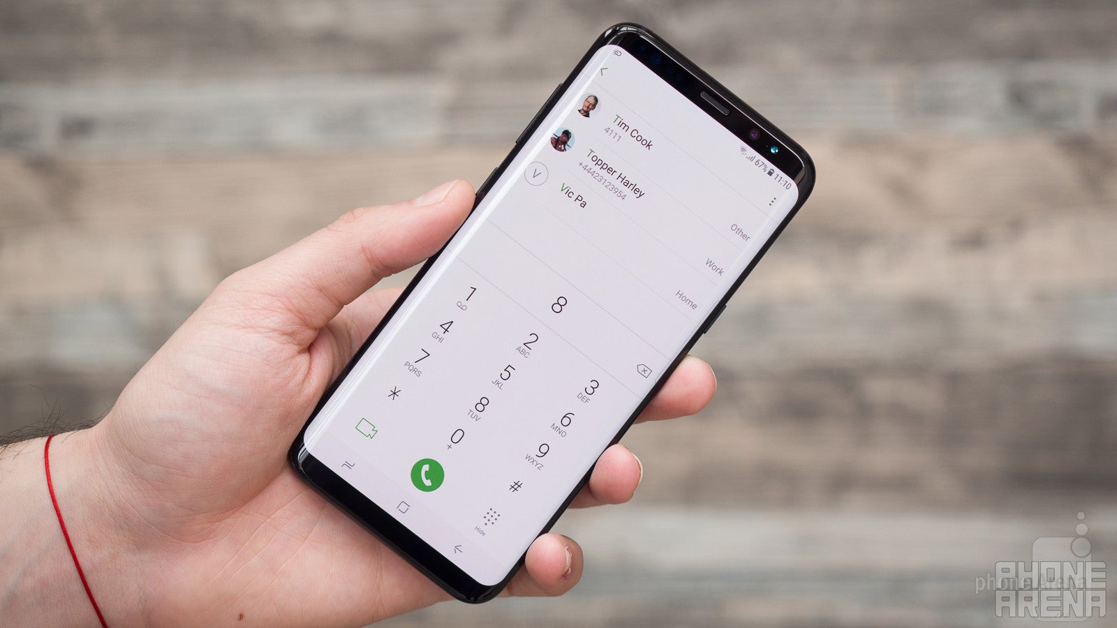
For the past years, the call quality of Samsung phones has been consistently good. Voices through the earpiece sound loud and articulate, and the microphone delivers our message clearly. The Galaxy S8+ has a slightly smaller slit of a speaker grille, which will require you to be a bit more accurate when placing it over your ear, but that's hardly a dealbreaker.
Battery life
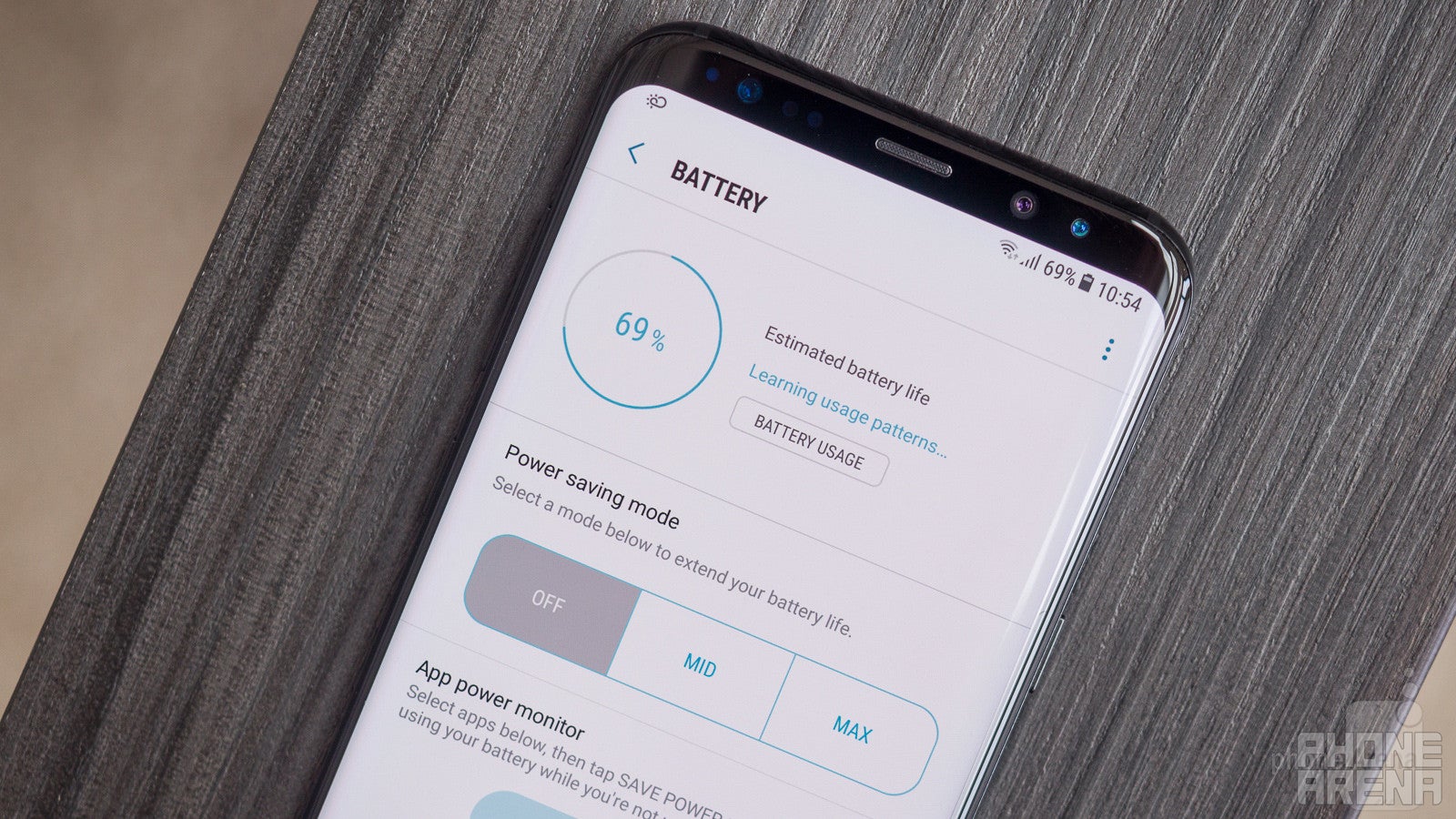
The Note 5 rocks a 3,000 mAh battery, while the Galaxy S8+ has a 3,500 mAh juicebox. Both have large, and very crisp AMOLED screens, and different hardware, so how much stress do they put on their cells?
In our use of both phablets, we've found that they can easily last about a day and a half with medium usage. The Galaxy S8+'s standby time is definitely affected by the Always On display feature, so we'd recommend keeping it off when you need to last longer between charges. With both phones, you can rely on fast charging to give you hours worth of juice in a matter of minutes.
Conclusion
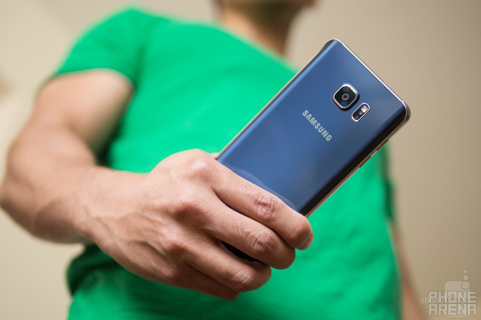
Both the Galaxy S8+ and Galaxy Note 5 were built to be the most advanced and most premium-looking handsets that Samsung is capable of producing at their respective times of release. For that reason, the S8+ is a futuristic-looking piece of mobile technology, which will definitely have lots of users throwing money at it. But it's also the reason why the Galaxy Note 5 has aged very well.
The old phablet still performs well, has a gorgeous-looking screen, a great camera, the latest software, and a UI, which looks and feels modern. It also has the Samsung-made stylus — the S Pen — which is pretty much unrivaled when it comes to smartphone pens.
That said, the Galaxy S8+ outdoes the old phablet in every category — from design to hardware, to future-proofing, and most probably resale value as well.
The reasons you'd want to go with the Note 5 instead of the Galaxy S8+ are: the S Pen stylus, the non-weird 16:9 display ratio, the much more traditional flat screen shape (easier to find and apply screen protectors?), the front-placed fingerprint scanner and physical home button. You will save a few hundred bucks and will get a pretty decent device, despite it being past its prime.
That said, the S8+ has the faster hardware, better camera, waterproofing, microSD card slot, and wins the bling contest without a drop of sweat on its shiny body. Needless to say, if you are a smartphoneacholic, this is the device for you.
Samsung Galaxy S8+
Pros
- Beautiful design
- Tall display is great for text / Internet browsing / split screen
- Has expandable storage
- Water- and dust-proof
Samsung Galaxy Note 5
Pros
- Conventional display (flat, 16:9)
- Cheaper
- S Pen
- Front-facing, hardware home button / fingerprint sensor







Things that are NOT allowed: