Samsung Galaxy S6 vs Google Nexus 6
Introduction
Earning the beloved Nexus moniker isn't something that can be achieved so easily, so when a company is given the opportunity to build one, there's a lot of expectations riding on the back of it. The Google Nexus 6 managed to charm many folks thanks to its phablet-esque size, incredible specs, and the latest iteration of Google's always evolving mobile platform – Android 5.0 Lollipop. In a way, the Nexus 6 was a departure from the more humble-looking Nexus 5, by taking everything to a bigger scale.
Similarly, the Samsung Galaxy S6 follows the same approach by being a significantly different phone than its predecessor in the Galaxy S5. Some folks vouch that it's more of an evolutionary thing, while others deem it more revolutionary, but whatever the case, we can't deny that it's a formidable thing that has jump-started 2015 with a bang. No doubt, they target totally different demographics, but at the end of the day, we can't help to wonder which of the two will have more of the star power to continue being a relevant thing throughout the rest of the year.
Design
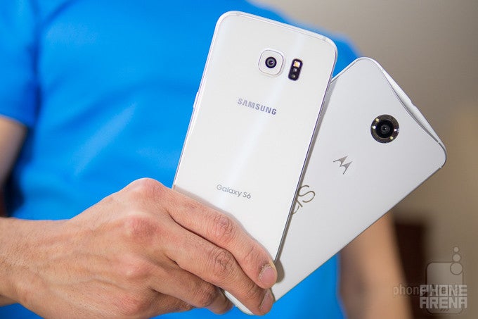
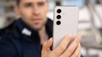
They’re two very differently designed phones catering to different audiences, but the Galaxy S6’s design steals more glances and looks from people with its premium design.
Staring at them longingly, there’s no denying that the two are just two very differently designed phones – crafted to appeal to certain demographics more than other. In terms of aesthetics and appeal, we’d give the Samsung Galaxy S6 the nods on achieving more glances and looks from bystanders, mainly because it has the luxurious qualities that cater to a wider audience.
Brandishing one sharp design, thanks in part to its Corning Gorilla Glass 4 surfaces and metal trim bezel, the entire package is enhanced even further by the way light reflects off the glass, producing this cool shimmering and dazzling effect. Add to that, it’s incredibly skinny, super lightweight, and far more compact, it all translates to an unprecedented change we’re happy to experience from a company that wasn’t all that notable for its smartphone designs.
Conversely, the Google Nexus 6 is pretty much on the other side of the spectrum with its gargantuan size. That alone, will probably keep some folks at bay, but then again, others favor its phablet-esque dimensions. Yes, it’s obnoxiously large, which, surprisingly enough, can catch the attention of some people. However, it’s just a handful to operate – requiring two-handed operation more than anything else. Visually speaking, it’s a bit more contemporary with its design language, comprised out of mostly durable plastic.
Impressively enough, even with its compact stature, Samsung is able to stuff several other goodies into its already tight package – like an improved finger print sensor, wireless charging, IR blaster, and heart rate senor. Meanwhile, the Nexus 6 also boasts wireless charging, in addition to dual front-firing speakers, but that’s all. For having so much real estate to work with, you’d imagine that Motorola would’ve been able to crap a few extra features in the process. Guess not.
Display
Quad-HD resolution is in full effect here, but Sammy’s Super AMOLED panel shows why it’s one of the best out there.
In being true pioneers in the space, it’s wonderful to know that the two handsets tip the scales with their quad-HD resolution displays – something we feel that’s necessary to stand head-above-water over the rest of the high-end crop. For the Galaxy S6, it’s fashioned with an incredibly sharp, 5.1-inch 1440 x 2560 Super AMOLED display, which achieves a higher pixel density count of 577 ppi. The figures alone paint something exquisite with the Galaxy S6, but we can’t neglect the same level of attention paid to the Nexus 6’s 6-inch 1440 x 2560 AMOLED display – one that still pulls in a respectable 493 ppi pixel density.
Seriously, the two panels cram a ton of pixels, giving plenty of detail in everything that’s being displayed. Whether it’s viewing them up close and personal, or from a normal distance, we can’t argue that they deliver sharp visuals that make it easy on eyes to decipher the most miniscule of things. All told, it purely boils down to size preference – where the Nexus 6 carries more real estate, which some can find useful for specific occasions.
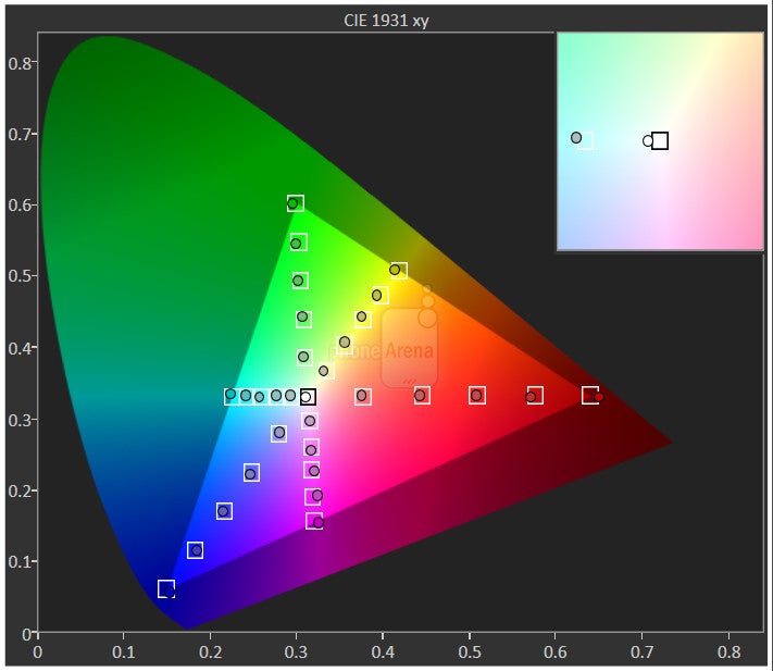
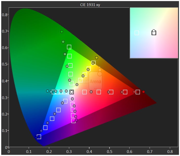
Even though they both rely on AMOLED technology, the S6’s Super AMOLED panel produces higher quality results. To be fair, however, we have to applaud both companies for getting the displays very close to that ideal color temperature reference value of 6500K – giving them a very neutral tone, neither too warm, nor too cold. Still, the S6’s screen drives away with its stronger brightness output of 563 nits, versus the Nexus 6’s poor mark of 270 nits. Naturally, the vast discrepancy between the two becomes apparent outdoors when viewing the displays under the gaze of the sun. The Nexus 6’s display is just unviewable.
Moreover, Sammy has calibrated its display perfectly in Basic mode, so that it’s one of the most color accurate screens out there, which is something noteworthy for AMOLED technology in general. With the Nexus 6, it’s evident that it favors a more saturated color production, made more profound as it doesn’t technically hit each of the target values in the color gamut chart below.
Interface and Functionality
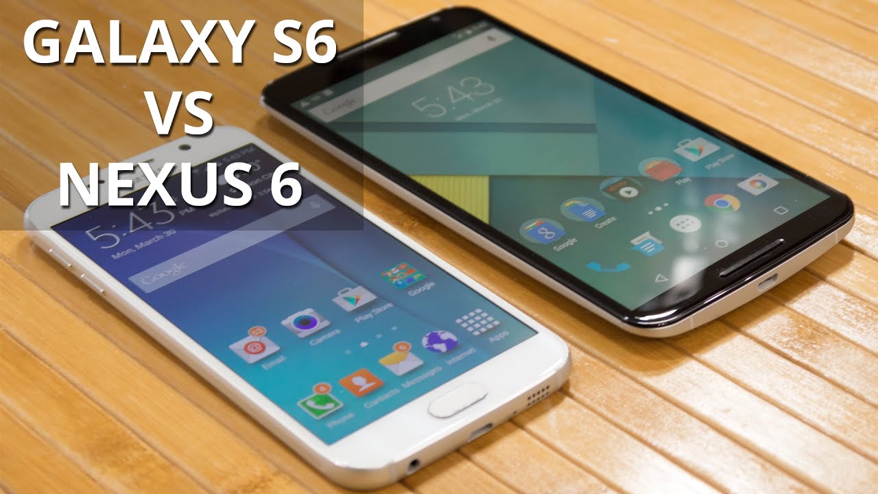
TouchWiz receives a new, more toned down redesign, but it’s still way more cluttered than stock Android.
While Samsung's Galaxy S devices have always shipped with nothing less than the best available at the time in terms of hardware, we've often found ourselves wishing it did more on the software side. Its proprietary TouchWiz layout has often proved sluggish and less responsive than what some competitors had to offer – a sight that the Samsung faithful only tolerated because of the smorgasbord of extra features the platform gave them access to. With the Galaxy S6, however, the company has finally come to sense, and has carried out a number of software optimizations that make the Galaxy S6's software both easier to understand and faster than ever before.
Visuals have never been a strong point for TouchWiz, but with this new version, however, Samsung has added support for third-party themes – allowing users to alter its looks, should they find a more fitting theme. On the software feature side, TouchWiz still adheres to the needs of power users because of its exhaustive set of software features – they include the fingerprint scanner (still embedded in the physical Home button) that is now of the touch, not swipe, type, finally allowing for a hassle-free unlock. In addition, TouchWiz also offers software features like MultiWindow (run two apps simultaneously), and Private and Car modes (hide sensitive content / dashboard with bigger icons and essential apps only).
Despite the overhaul of TouchWiz, it still can’t beat out the Nexus 6’s vanilla Android 5.0 Lollipop experience. Who doesn’t like stock Android? From a visual standpoint, Material Design was born from Google’s vision, adding bright and poppy colors through various layers of the platform. At the same time, the pure nature of the experience extends into the minimalist look it’s sporting.
Unlike TouchWiz, which is rich with secondary features, stock Lollipop is far more straightforward and to the point with its approach. No, we don’t get any enhanced multi-tasking experiences like with TouchWiz, but when things run oh so fluidly, the Recent Apps menu is still effective enough for moving in-and-out of various apps. And then there’s the multi-user feature of stock Lollipop, which strangely has been omitted with TouchWiz – albeit, there are Private and Easy modes that replace it. Still, stock Android 5.0 Lollipop’s multi-user feature is an invaluable tool that provides more organization, allowing folks to have separate accounts to anyone using the phone.
Processor and Memory
So far, the Galaxy S6 has the same finesse of the Nexus 6, but who knows how long it’ll last.
Maybe it’s just the software optimizations and tweaks of stock Lollipop that help things move so swimmingly on the Nexus 6, but even now after several months of usage, the Nexus 6 rarely shows any signs of slowdown or lag with its performance. Under the hood, it’s endowed with a last-generation quad-core 2.7GHz Qualcomm Snapdragon 805 SoC, coupled with an equally beefy 3GB or RAM and the Adreno 420 GPU.
Samsung on the other hand, decided to ditch Qualcomm altogether with its flagship, choosing instead to go all in-house for the Galaxy S6. Rather, the S6 relies on a home-grown Exynos 7420. The 7420 is an octa-core processor, built on a 14nm node, with two clusters made up by four cores arranged in a big.LITTLE configuration and Mali-T760 graphics. We have one group of power-efficient ARM Cortex-A53 CPUs, and another with powerful Cortex-A57 ones. The idea behind the arrangement is simple to understand – the efficient team of cores takes care of most trivial tasks, while the speedy A57 cores kick in when power is required. If maximum performance is what you need, the Exynos 7420 can switch all eight cores on and work them simultaneously.
In the shorter time period we’ve been using the Galaxy S6, we can attest it’s the faster and most responsive Galaxy S smartphone the company has ever produced. Additionally, its response is significantly tighter than previous efforts – allowing all sort of operations to execute in a fluid manner. However, it’s still unknown how long this experience will run smoothly, considering that after months of using both the Galaxy S5 and Note 4, the experience has been marred by bouts of lag.
Meanwhile, if we’re to look strictly at their benchmark performances, it’s quite obvious that the new Exynos chip is far exceeding the older Snapdragon 805. Gaming, too, is superior with the Galaxy S6, as the benchmark scores show, but in all practical sense, the Nexus 6 is still equipped in handling all sorts demanding gaming titles.
At the bare minimum, both handsets start off with 32GB of internal storage – with no means on supplementing that capacity. On top of that, they’re also offered in 64GB, but the Galaxy S6 goes one extra step by dealing a 128GB model as well.
Internet and Connectivity
Smooth browsing is what we've been getting with each and every flagship for the past few years, and Samsung's and Motorola's offerings don't fail to deliver just that. Courtesy of their powerful internals, both devices handle even asset-heavy pages with ease and don't struggle when navigating through them. That said, whereas both devices rely on Chrome for your browsing needs, Samsung's Galaxy S6 comes with its own default solution that is an equally great performer.
Honestly, the only thing separating the experience is the vast size disparity between their displays. With the Nexus 6, naturally, we’re presented with extra real estate that enables pages to be visualized in their entirety – requiring less scrolling or pinch zooming in the process.
On the connectivity front, you'll hardly find much to complain about, regardless of whether you go for the Galaxy S6 or the Nexus 6. Both devices offer support for a wide array of LTE bands, 5GHz Wi-Fi, Bluetooth 4.1, NFC, and DLNA. Still, the Galaxy S6 pulls ahead because of its infrared blaster for control over home electronics, and Samsung Pay – the company's new mobile payments solution that works hand-in-hand with the handset's NFC chip.
The idea behind it is much alike to that of Apple Pay – the company gets retailers and banks involved (but free of charge), and you reap the benefit of never having to pull out your credit card out of your wallet again (much less physically sign any receipts).
Camera
Both take incredible photos, but the S6 has the upper hand in low light conditions.
The 13 MP camera on the Nexus 6 features an f/2.0 aperture lens, optical image stabilization, dual-LED flash ring, 2-megapixel front camera, and up to UHD 4K video recording. The Galaxy S6 answers back with an equally impressive 1/2.6”, 16-megapixel rear camera, which comes with a wider-than-before f/1.9 aperture lens and an optical stabilization gizmo attached to it – with the same UHD 4K recording as its rival.
The snapping app on the Nexus 6 is Google's Camera – one that’s been available for quite some time as a downloadable app in the Play Store. Yet again, we can see Lollipop’s favor of offering a cleaner and simpler UI, since the Camera app’s interface is predominantly reserved for the viewfinder. In terms of shooting modes, we’re given photo sphere, panorama, HDR+ and lens blur. In comparison, the Galaxy S6 camera is more akin to those who want finer controls and a handful of cool modes. One of them in particular, the Pro mode, allows us to adjust relevant parameters such as ISO, white balance, exposure adjustment, and even focus.
Outdoors, both handsets take pretty decent photos, even in not so ideal lighting conditions. Details are abundant, allowing us some elbow room to crop photos later on without losing too much, but what’s notably different about them is how the Nexus 6 seems to cast an overly warm, yellowish hue over the scene, but it manages to slightly do a smidgen better than the Galaxy S6 with dynamic range – where the exposure is balanced throughout the scene. They’re minor, subtle things that may win over some folks, but don’t count out the Galaxy S6 because it’s better at dealing with close-ups and scenery shots too.
Where there’s a big separation between the two is in the low lighting performance of the Galaxy S6, which is a clear step up over its rival. Not only are shots taken by the S6 brighter, enabling details to be drawn out, but it’s also sharper looking with significantly less noise. Too many times, the Nexus 6 produces under-exposed shots that hide any details – while also appearing generally duller tone and quality.
Likewise, it’s the Galaxy S6 that pulls ahead in terms of video recording quality. As we’ve mentioned, both are equipped with UHD 4K recording, in addition to the usual 1080p. What’s most prevalent is how much better the Galaxy S6 is in adjusting focus on the fly – it’s smoother for one, whereas it’s slower with the Nexus 6.
Multimedia
We have no complaints about the multimedia prowess of both phones.
Both galleries offer grid thumbnail views, and allow for rich picture editing from within the apps, as well as sport plenty of sharing options. Best of all, there are enough fun editing tools at their disposal to further enhance the look of photos.
Video playback is excellent on both handset, too, as they support quite a handful of video codecs out of the box. Watching videos isn’t an issue with either of them, thanks in part to their sharp displays, but we have an extra layer of multi-tasking with the S6’s experience – videos can essentially be played in their own windows, which can be placed on top of whatever we’re doing. Then again, some folks will find the Nexus 6 to be more ideal for the situation, thanks in part to its larger screen and dual front-firing speakers.
When it comes to the music players, they come preloaded with the usual Google Play Music app – though, Samsung offers its own TouchWiz music player as well. Yes, we’ll certainly say that the TouchWiz music player is a good alternative, but it’s pretty reserved looking. For only a single speaker, the Galaxy S6 is able to muster up 73.7 dB of audio power, which is a miniscule difference from the Nexus 6’s tally of 75 dB. Between them, we prefer the audio coming out of the Nexus 6, as the Galaxy S6’s quality is thin and subdued.
Call Quality
Quite honestly, neither phone prove to be exorbitantly superior to the other with call quality. The more we think about it, the more we realize that they’re average at best – good enough to handle phone calls, but there are still some distracting qualities. Through the earpiece of the Nexus 6, we can audibly hear some static noise, while the Galaxy S6 emits a slight hiss with voices.
Battery
A big phone requires a big battery, so it makes perfect sense for the Nexus 6 to carry a beefy 3220 mAh one inside of its body – whereas with the smaller sized Galaxy S6, it’s only packing along a 2550 mAh battery. In running our custom script for our battery benchmark test, it reveals that the Nexus 6 is longer-lasting. In fact, it puts up a mark of 7 hours and 53 minutes, but that’s only marginally better than the Galaxy S6’s respectable tally of 7 hours and 14 minutes. One can presume that the considerably larger display of the Nexus 6 is a contributing factor to its battery requirements.
What’s nice, too, is that they’re pretty efficient at charging. The Galaxy S6 needs only 78 minutes to get back to full strength, while the Nexus 6 isn’t too far off at 98 minutes. Even better, they both offer the convenience of wireless charging.
Conclusion
Let’s talk pricing for a moment! With the Nexus 6, it starts off at $699.99 full price, which is undoubtedly on the steep side, but something that’s warranted for something of its caliber and immense size. Conversely, it’s a little confusing regarding the pricing for the Galaxy S6, as various wireless providers and retail partners all have different prices for the 32GB Galaxy S6. Ranging from $599.99 to $684.99, the Galaxy S6 is at the minimum $100 less than the Nexus 6 when it comes to outright pricing.
Quite simply, the two handsets in this comparison are top-notch and phenomenal – so it’s really a tough call to say which is the superior one. For those yearning for a phablet-esque sized thing, it’s a no-brainer decision to go with the Nexus 6, which also packs the beloved stock Android 5.0 Lollipop experience. Another thing to note, it’s going to get updated to the latest version of the platform a lot quicker than the S6.
In contrast, go with the Galaxy S6 if you want that all-around performance and the more premium designed smartphone. Meanwhile, TouchWiz is going to add a lot of depth to the Android experience, though it’s still not as visually pleasing as vanilla Android. Pound for pound, though, the Galaxy S6 is packed full of extra goodies that are not found with the Nexus 6 – giving it that higher degree of value at the same time.
Samsung Galaxy S6
Pros
- Faster chipset
- Lighter, thinner, more compact
- Excellent camera
Google Nexus 6
Pros
- Stock Android 5.0 Lollipop experience
- Larger sized screen
- Longer battery life
- Will receive updates faster









Things that are NOT allowed: