Samsung Galaxy S10e Review
Review index
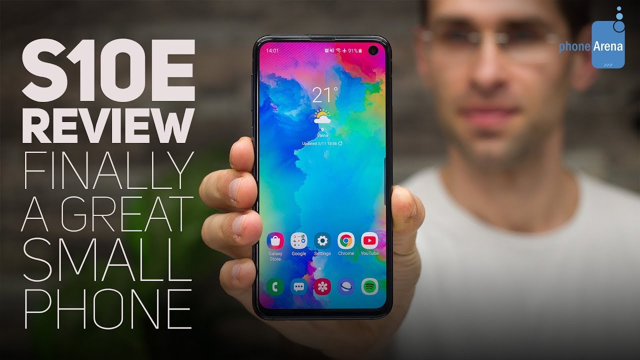
Design and Size | Display | Interface and Functionality | Processor, Performance and Memory | Camera | Sound quality | Call quality | Battery life | Price and Alternatives | ConclusionIn the past couple of years, there was probably no other group of people more neglected by the smartphone industry than those who wanted a phone that is small yet good, not handicapped by sub-par chips and cameras. As phone makers were releasing bigger and faster phones, it seemed like everyone collectively forgot that despite all the benefits of a big screen, a smaller device has its own merits: for starters, it is easier to operate in one hand and much more comfortable to carry in your pocket.
This year, Samsung aims to finally deliver to this neglected crowd with a compact superphone that makes no compromises: it has top-notch specs, camera and performance. This compact superphone is the new Galaxy S10e.
But... is the Galaxy S10e really as good a device as it looks and should those waiting for a great compact phone go out and buy it right now? I am one of those that felt neglected these past few years and I had almost surrendered to the thought that the future belongs to big phones and it is me who should adjust. Thankfully, the S10e is now here in my hands and I can already tell you this much: if you are like me, you will like this phone. You will like it a lot.
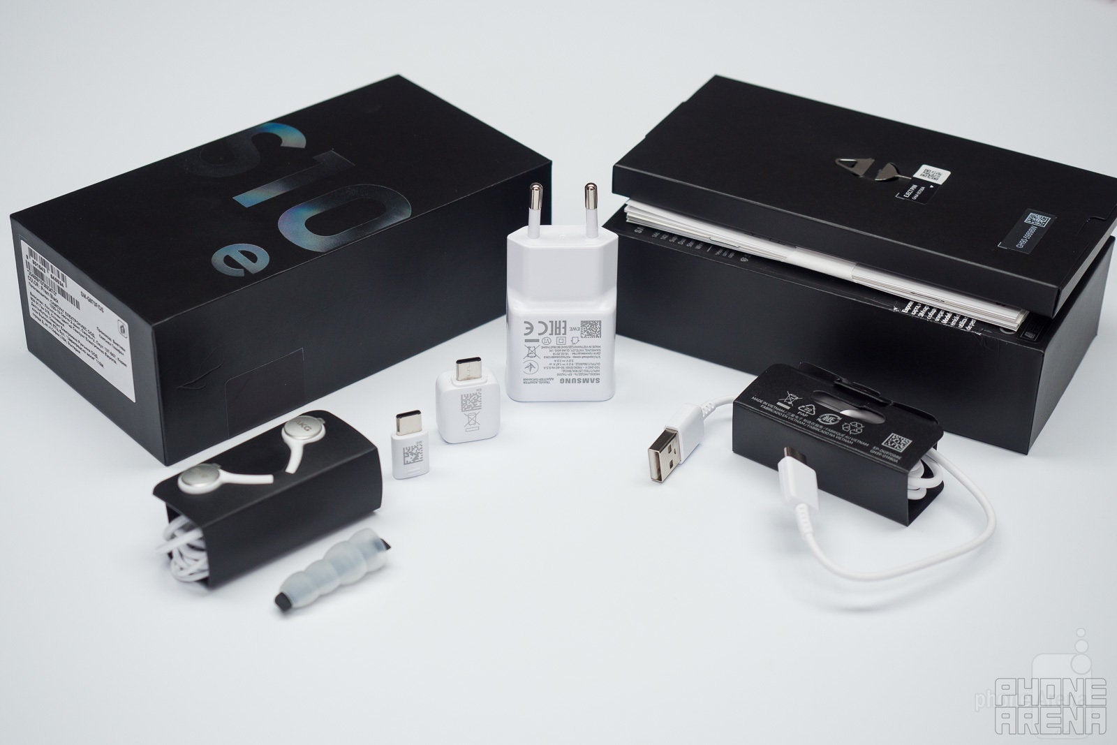
- Phone (duh!)
- AKG-tuned in-ear headphones with extra eartip sizes
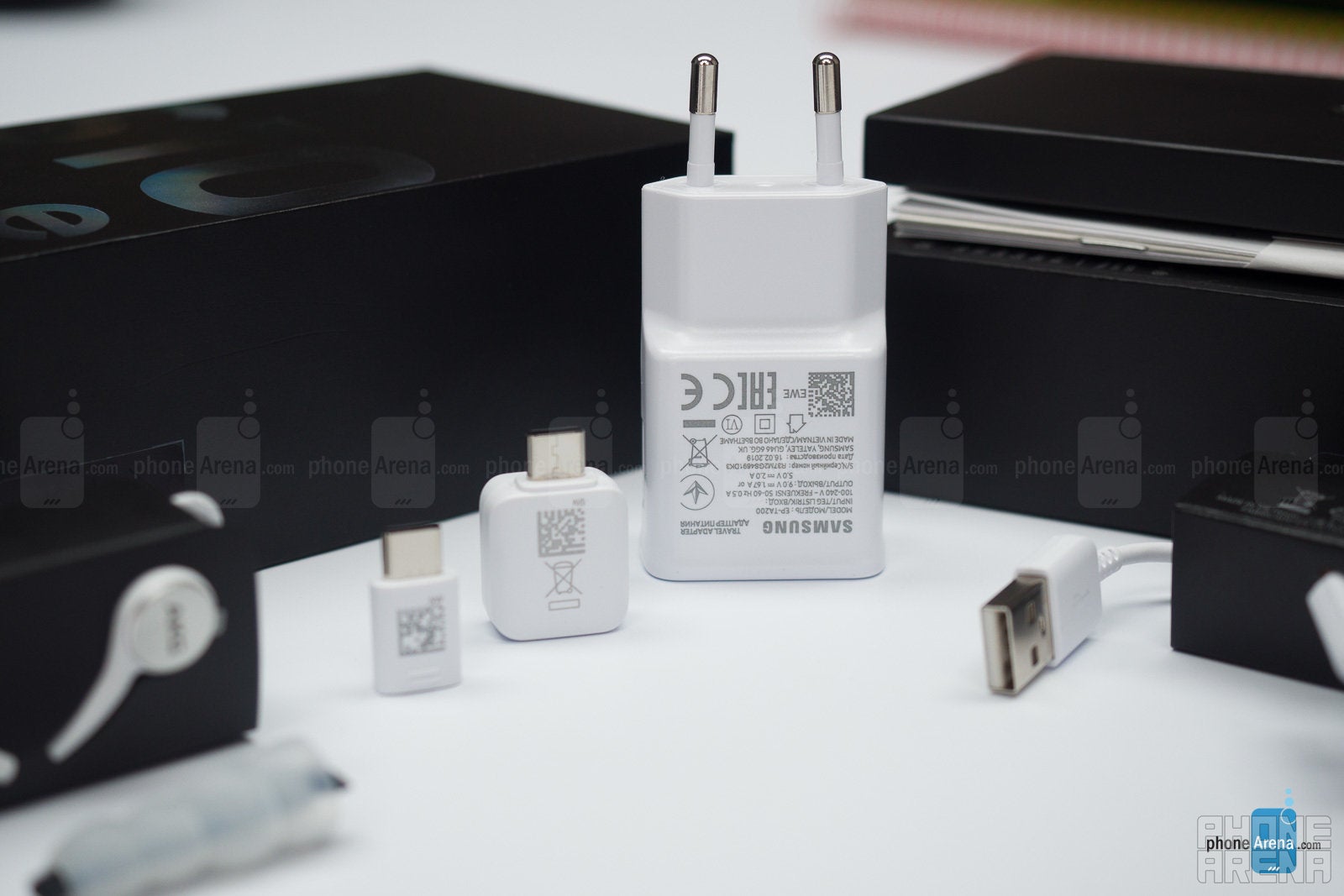
- Samsung Fast Adaptive wall charger (15 watts)
- USB-C to standard USB cable (for easy data transfer between two USB-C phones)
- microUSB to USB-C adapter (so you can use your old cables)
- SIM tool
Design and Size
Premium materials, small size and a punch-hole design
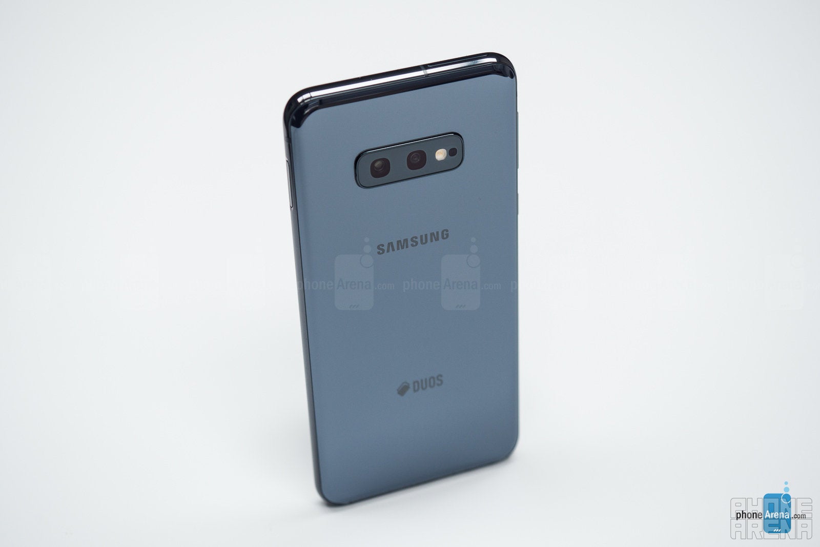
Actually, this new Galaxy is not quite as tiny as an iPhone SE, but it is almost exactly as big as an iPhone XS or a Google Pixel 3. So no, the S10e is definitely not too small for comfortable use.
It also has the design and styling of its more expensive S10 siblings with a similar premium glass-and-metal construction and tiny bezels. One thing that is different is the screen, which is flat while the other S10 phones have their screens curved at the edges. This way, the side bezels are slightly more visible, but you get less accidental touches when using the phone, so we see this more as an advantage rather than a compromise.
What’s also making a comeback is the Bixby button. We still don’t understand why Samsung insists on having a separate Bixby button despite the overwhelming consensus that Bixby is neither as good, nor as fast as the Google Assistant. If you are not using Bixby, though, this time around, you can actually turn this button into something useful: in settings, you can change this button to launch Bixby only with a double click, while a single press could start a custom app and I have set this to open Spotify, for instance.
Display
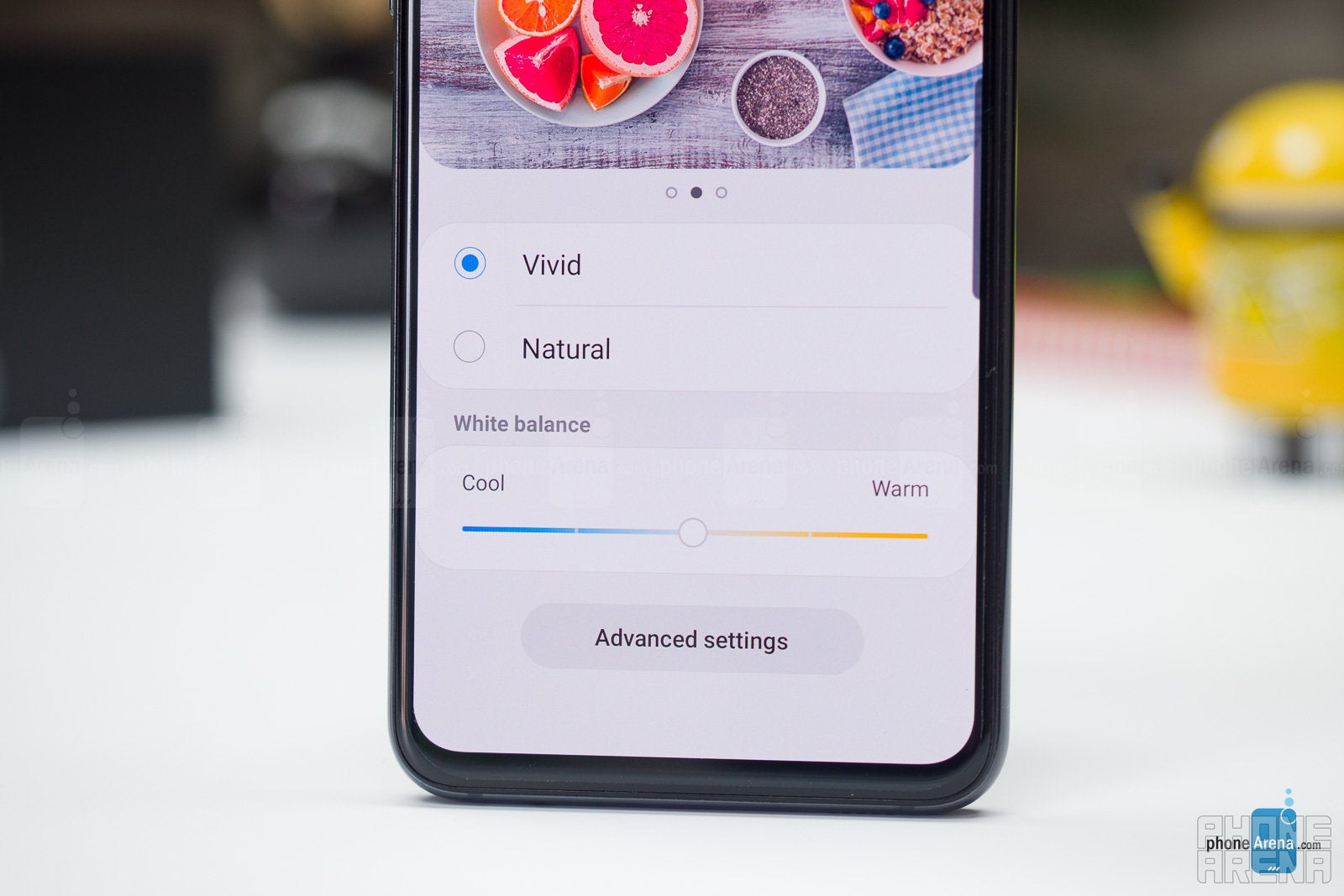
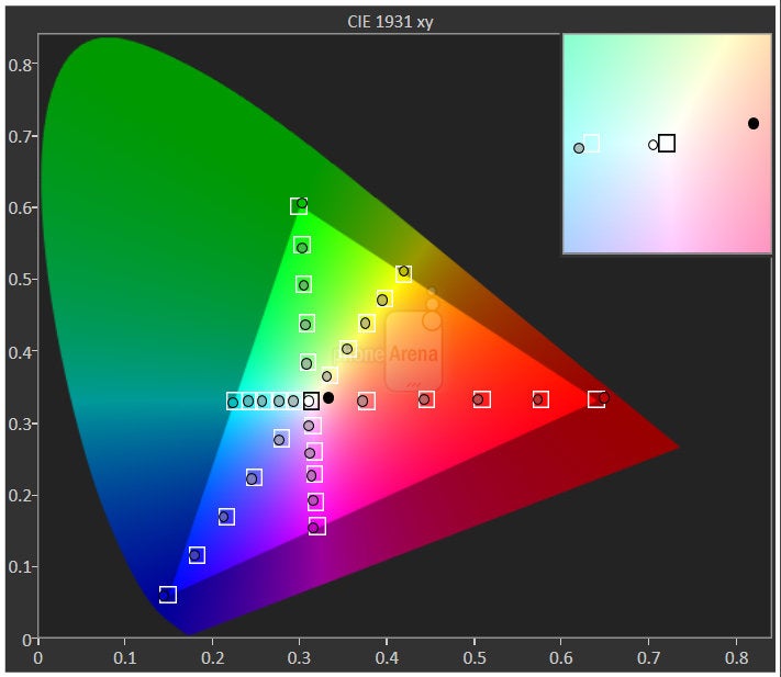
The 5.8” Dynamic AMOLED alone is a good enough reason to buy this. It’s that impressive.
Interface and Functionality
Samsung’s new One UI gets rid of unnecessary clutter and simplifies things
While previous UIs like TouchWiz were known for overwhelming users with technicalities and minutiae, One UI is now clean of clutter and user-friendly with nice little touches like a brightness slider that appears on the bottom of the screen within easy reach and with app navigation also moved to the bottom.
You also have some little tricks that are not available on stock Android like an easy GIF and collage creation in the gallery (simply select two or more images and tap the buttons menu in the top right corner to create a collage). Some things that are available on other skins, however, are missing, and there is still no native screen video recorder, for instance.
You can find more useful tips and tricks in our video here:

Processor, Performance and Memory
Fast, but not smooth. Yep, it’s possible.
If you look at the specs and the amount of horsepower that we have gained over the years, you would think that all flagship phones would be lightning fast, no exceptions, end of discussion.
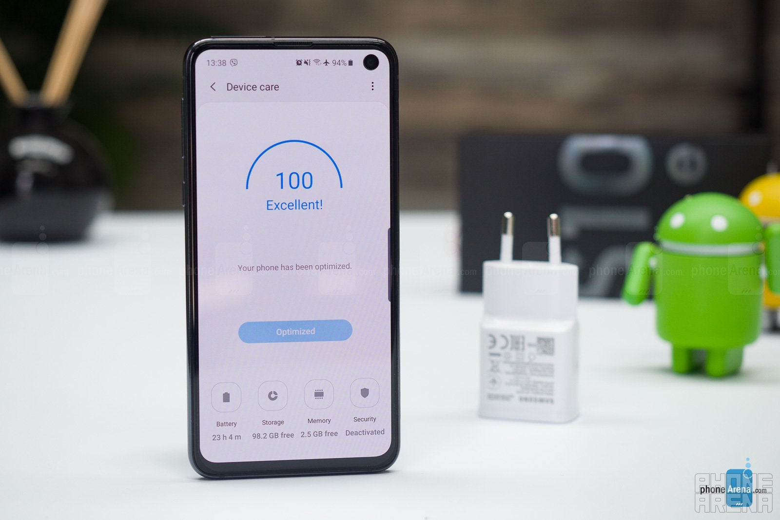
And this has been a recurring theme that Samsung phones have kind of had throughout the years: generally fast performance, but no “flow”. And to illustrate this, we have to bring the comparison that so many Samsung fans do not like: the iPhone. These days, it’s not just the iPhone that has some buttery smooth transitions and animations, but also phones like the Google Pixel series and the OnePlus series are all devices that have that flow. So what about the S10e? What’s changed this year is that the Galaxy S10e is not simply fast: it’s lightning fast. What’s not changed is the smoothness and flow part, which is still not quite there.
While specs don’t always tell the whole story, when it comes to storage, they do and here is that story: you have 128 gigs on-board storage, double that of last year’s Galaxies and double that of iPhone rivals. You might not appreciate this extra storage on day one, or even on month 1, but you probably will in a few month or a year after you buy the phone.
Samsung also keeps the microSD card slot here, which is an easy way to expand the storage even further, should you run out.
Camera
Not the absolute best, but still among the finest
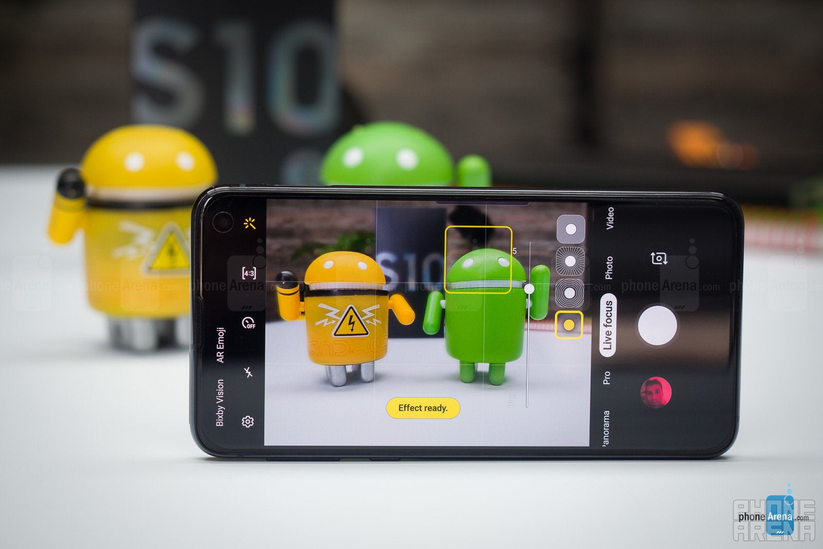
The rear cameras are a regular one (12MP 26mm one with variable f/1.5 or f/2.4 aperture) and an ultra-wide one (16MP at 12mm with fixed f/2.2 aperture), while up front you have a 10 megapixel shooter.
The camera app in One UI is better than on earlier versions with easier swipe navigation between different shooting modes and the settings are better organized. And you can still quick-start it with a double click on the power button.
Image Quality
But does the phone actually shoot good pictures? And is it better than the Galaxy S9?
Day samples - Samsung Galaxy S10e
Night samples - Samsung Galaxy S10e
Video quality
You’ve got to try the new Super Smooth mode!
There are some great new video features on the S10e.
The biggest one is probably the new Super Smooth mode that you enable by tapping the wavy hand icon at the top center in the camera app. This only works for 1080p videos, but it truly makes some magic happen and you get impressively smooth footage, almost as if you were using a gimbal stabilizing device.
Of course, 4K60 and 4K30 modes are both available, and give you much sharper footage with more detail. Focus is very fast, but there is no gradual transition when switching focus points.
Sound quality
Call Quality
When it comes to call quality, we’ve had zero issues with S10e. Voices sound very loud and very clear, with a natural ring to them and the mic also produces a clear and crisp sound for your callers on the other end of the line.
Battery life
Mostly fine
Our real-life experience shows that this phone will definitely last you a full day, even if it’s a longer one, and you should not be worried about the smaller battery size.
We have also run our proprietary battery test here and you can see the results below, you can clearly see that while the S10+ does indeed have the longer battery life, the difference is not all that huge and the S10e actually beats the S10 model:
Samsung also provides a 15-watt fast charger in the box and it fully recharges the phone in less than an hour and a half.
You also have fast wireless charging on board, which is a nice extra (you would need to buy a wireless charger separately, as Samsung does not provide one in the box).
And then the S10e also support reverse charging which allows your phone itself to act as the wireless charger. This could actually prove useful with Samsung’s new Galaxy Watch Active and Galaxy Buds headphones as both of them have small batteries and you can easily charge these up by just placing them on the back of your S10e. You can also use the reverse wireless charging to charge another phone with the S10e, but that would usually not be a good idea as it drains your battery quickly and charges that other phone slowly. It could prove handy for someone who needs just a quick short top-up, but definitely not as a replacement for regular charging.
Price and Alternatives
At a price of $750, the Galaxy S10e is definitely not an affordable phone by any means. It’s merely less expensive than the ultra premium flagships that have flooded the market recently.
If you are looking for a phone at about that price, the obvious alternative would be the iPhone XR. The iPhone is a much bigger phone, and its advantages include the guaranteed timely software updates, the iOS ecosystem which offers a bit more in terms of apps and compatibility with various connected gadgets, and the smoother performance. The Galaxy, on the other hand, has the better display and Android has its perks too.
If you are looking for a great small phone, you have the Pixel 3 and the iPhone XS as other options. The Pixel is still the king of night photography, and we have already touched on iOS and the iPhone.
Conclusion
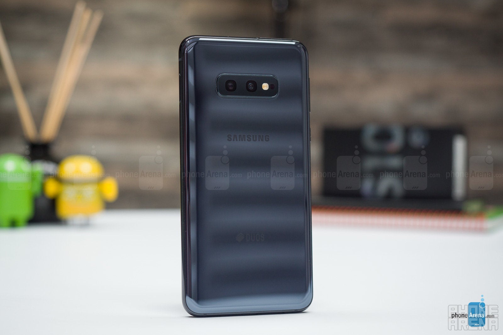
For those who want a compact phone that is great in pretty much every aspect, the Galaxy S10e is a “finally!” moment. Finally, a no-compromise compact Android phone!
Sure, it has its flaws: Bixby, the slightly awkward fingerprint scanner, the not quite perfect gesture navigation, the noisy low-light time camera shots, and a few others, but those feel like the proverbial fly in the ointment. The great screen, the fast speed, the plentiful storage and the cleaner One UI easily make up for that, and the S10e is an easy recommendation on our part.
You can now read:
Follow us on Google News








Things that are NOT allowed:
To help keep our community safe and free from spam, we apply temporary limits to newly created accounts: