Samsung Galaxy Note5 vs Google Nexus 6
Introduction
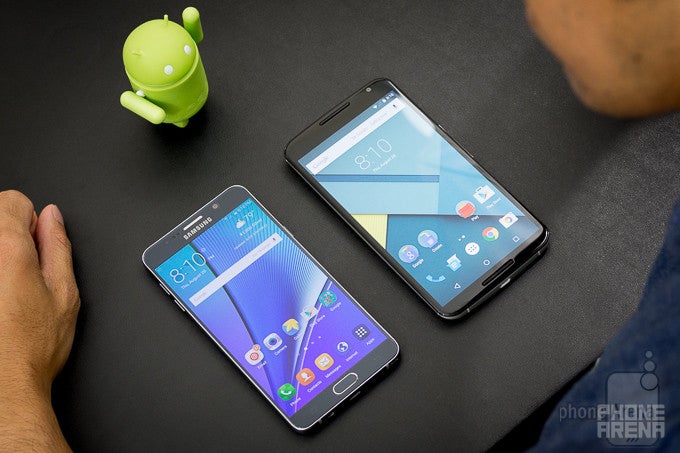
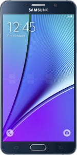
The Samsung Galaxy Note5 is the new kid on the phablet block: a 5.7-inch phone that showcases the best of Samsung’s innovation including the latest Super AMOLED panel and a Samsung Exynos-branded system chip. It’s only natural that it gets compared to the device that Google itself used to debut stock Android 5.0 Lollipop on a phablet - the even bigger Google Nexus 6.
Design
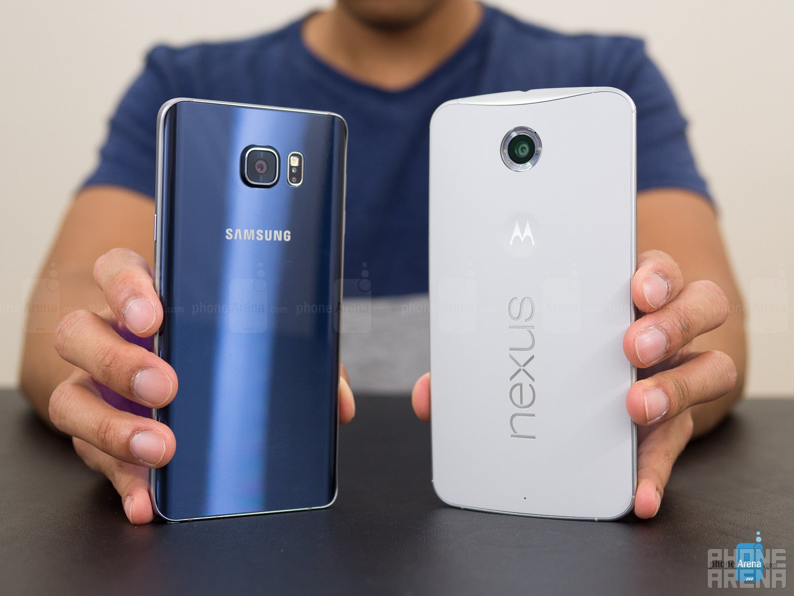
We love the sleek, stylish new design of the Galaxy Note5, which is a huge factor in making the device easier to use. The Nexus 6 is not in the same league - it feels too big, and its plastic back gets messy easily.
The Galaxy Note5 features the new design language that Samsung introduced with the Galaxy S6 earlier this year: a metal frame sandwiched between two pieces of tempered glass, and all of that feels solidly put together, thin, and good-looking, making for a true premium phone. The Google Nexus 6, on the other hand, is much less refined: it features a metal frame and is also put together with no moving parts, but its back is made of plastic that catches fingerprints so easily that the whole phone turns into a gigantic mess after a few minutes of use.
In terms of buttons, there is the signature Samsung physical home key on the Note5 (with integrated touch-type fingerprint reader) with two capacitive keys, and then you have a power/lock key on the right and two volume buttons on the left hand side. The Nexus 6, on the other hand, lacks a fingerprint scanner, and uses on-screen navigation buttons.
Display
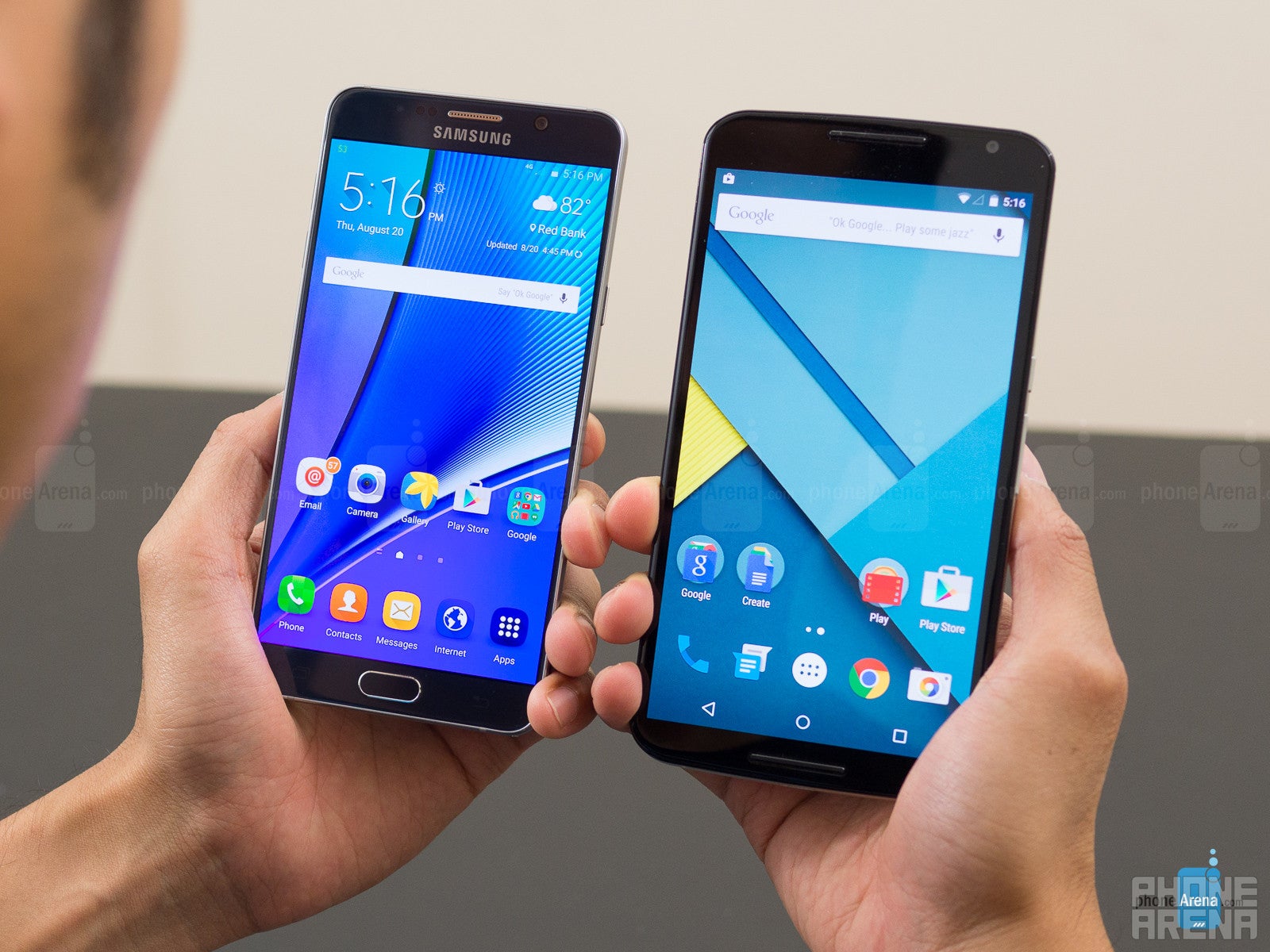
The 5.7-inch Quad HD screen on the Galaxy Note5 shows the best of Super AMOLED: a bright display with a very well calibrated ‘Basic’ mode. The Nexus 6’s 6” Quad HD screen is also AMOLED but pales in comparison.
Samsung has been improving its AMOLED displays at an amazing pace, and while just a year and a half ago there were severe issues with color quality, these days AMOLED screens on top Samsung phones look much, much better.
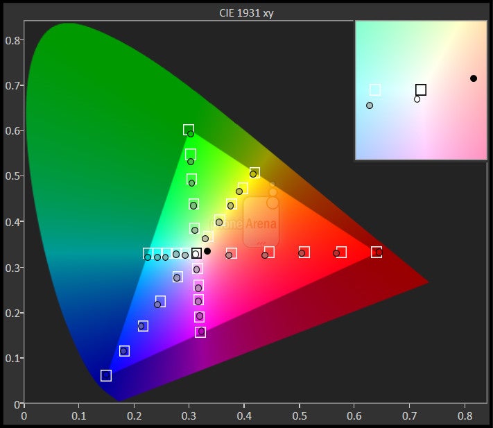
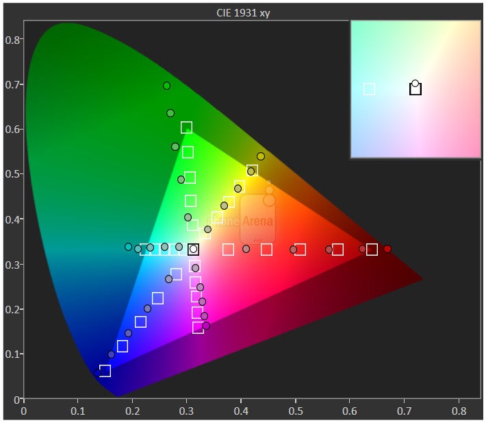
The difference is in color reproduction. The Samsung Galaxy Note5 comes with the option to switch between different screen modes: ‘Adaptive’ is the default mode, but for most accurate color reproduction the ‘Basic’ mode remains the most appropriate choice with its adherence to the sRGB standard. In simple terms, sRGB is the color space of everything on the web and on Android, and that’s why it’s important for phones to support such a calibration profile. Unfortunately, the Nexus 6 does not adhere to this color standard, with colors that look plain weird: oversaturated and unrealistic, something that is especially noticeable when you look at skin tones that look carrot-orange, but it really is an issue that affects all colors. The Note5, on the other hand, has a well-calibrated display with whites that are near the reference 6500K temperature, with accurate colors and gamma just slightly south of the 2.2 reference value at 2.09 (such a lower gamma may result in slightly washed out images). Those values are way off on the Nexus 6, as you can see in the table below.
Interface
The new TouchWiz is cleaner and more refined as Samsung continues on its way to improvement. Stock Android on the Nexus 6 is still subjectively superior in terms of looks, and objectively better thanks to its faster updates.
The Samsung Galaxy Note5 runs on the latest Android 5.1.1 Lollipop with the newest version of TouchWiz on top of it, and this time around, it is a fairly big change for the TouchWiz skin. The Google Nexus 6, in contrast, runs on the latest 5.1 version of Android Lollipop in its pure, stock form. This also happens to be the biggest advantage of any Nexus device - having a pure stock build and the blessing of Google, Nexus phones are always the first to get Android updates with new features and security patches. Samsung has promised to push security updates in a more timely manner, but when it comes to other Android changes, they are likely to come later to the Galaxy series than to Nexus phones.
User interface of the Samsung Galaxy Note5
As to the current state of TouchWiz, the skin now features a slightly changed set of icons - now all icons have rounded corners and non-transparent backgrounds, plus the style is a bit evolved. At the same time, the typical contrasty colors and cartoonish vibe remains. Samsung has now also added captions for everything, and we mean everything: even the toggles have ‘On/Off’ captions in order to ensure that users are not confused by menus. TouchWiz has lots of various options hidden in menus that you can explore, but they no longer feel forcefully and excessively pushed on users. Stock Android 5.1, on the other hand, is a well known platform with the signature flat Material Design and speedy performance.
UI of the Google Nexus 6
The big highlight feature of the Note5 is the S Pen stylus on the bottom, which allows you to interact with your phone in ways not possible on the Nexus 6. Right after you take out the pen, you get a pop up with the Air Command menu showing you shortcuts to different actions that you can do with the pen. You can now quickly open apps from here (you select which apps), and that’s a neat shortcut. We also love the fact that you can just pop out the pen while your device is locked and start writing on the screen without starting any app beforehand. Neat!
Processor and Memory
The Exynos 7420 system chip is a champ: it brings improvement in single-core and multi-core performance, as well as graphics. Yes, it’s also faster than the Nexus 6 in all of those aspects. Yet, stock Android still feels zippier than TouchWiz in daily tasks.
Samsung was the first in the smartphone chip race to get to 14nm manufacturing and it used this advantage fully with its Samsung Galaxy S6, a device that ditched Qualcomm chips used before by Samsung in favor of the new Exynos 7420 system chip. The same chip powers the Galaxy Note5, and it’s an octa-core 64-bit solution that runs at up to 2.1GHz and relies on a big.LITTLE configuration of four high-performance Cortex A57 cores and four power-efficient Cortex A53s. The Google Nexus 6, in comparison, sports the Snapdragon 805, a quad-core 32-bit chip that features four Krait 450 CPU cores running at up to 2.7GHz.
The big highlight of Samsung’s Note5 design is the inclusion of 4GB of LPDRR4 RAM that theoretically should make multitasking easier and more efficient.
Looking at benchmarks, one notices some significant improvements with the Exynos 7420 on the Note5 over the Snapdragon 805 on the Nexus 6: the single-core performance test on GeekBench shows a nearly 40% improvement, and an even higher boost in multi-core scores.
Gamers will be happy to see some improvement in gaming performance on the Note5 with its Mali T760 GPU that outdoes the Adreno 420 in the Nexus 6.
Internet and Connectivity
The large screen on both phones helps a lot with browsing, and surfing is speedy and without any major issues on both. Of course, you have 4G LTE connectivity.
Having a large screen such as the 5.7” one on the Note5 and the 6-inch one on the Nexus 6 definitely works out great for browsing. The vast screen estate allows for pages to load in their entirety and require less scrolling around. Both phones come with Google's mobile Chrome for browsing, but while that's the only pre-installed option on the Nexus 6, the Galaxy Note5 defaults to a custom browser solution that offers a full screen view, and a few other perks. We found no troubles with surfing speeds – everything was moving quickly, pages rendered fast, and zooming in and out of pages happened without a stutter, just as you'd expect.
When it comes to connectivity, both phones are equipped with 4G LTE with a variety of bands, depending on the market. Since both phones are officially sold in the United States and Europe, you should not worry about any inconveniences with unsupported bands – LTE works fine on both phones on the common in the Western world bands.
Camera
The 16-megapixel camera on the Note5 is great: fast to start and fast to focus, it captures detailed images with pleasing colors. The Nexus 6 camera is good but not great - it is slower, detail on it is smudged, and it tends to err with ghostly, cold-looking images.
The Samsung Galaxy Note5 comes with a 16-megapixel rear camera with support for optical image stabilization (OIS) and an LED flash, while up front, there is a 5-megapixel selfie shooter. The Nexus 6, on the other hand, sports a 13-megapixel cam on its back, and a 2-megapixel front-facing shooter. While there may be changes and improvements in software, it is likely that this is the same setup as the one used in the Galaxy S6, which uses the 16-megapixel Sony IMX240 1/2.6” sensor with 1.2 micron pixels and 16:9 native aspect ratio.
Camera UI of the Samsung Galaxy Note5
Camera UI of the Google Nexus 6
When it comes to actual image quality, the Galaxy Note5 lives up to the hype with one of the best cameras around: it captures very detailed and sharp-looking images in all conditions. The Nexus 6 is also not a bad camera, but it lacks the consistency of the Note5 and its images tend to look a bit oversharpened. Color rendition differs on the two: the Galaxy always picks a warmer, slightly more yellowish look, that appears particularly great in sunsets (but is maybe not completely realistic), while the Nexus 6 sometimes errs badly with bluish, cold-looking images. In addition to that, closer inspection reveals that it smudges detail and overall its images look much flatter, lacking in dynamics and liveliness.
What about selfies? The 5-megapixel front camera on the Galaxy Note5 has a wide field of view and can fit in the whole ‘familia’, which we find to be quite the important advantage, while with the Nexus 6’s selfie cam you might find it hard to fit more than a couple of people in a picture. The level of detail and overall color reproduction is also very good on the Note5, while the Nexus 6 has much less detail and selfies with it had varied issues (you can notice the underexposed image we took in the street).
Samsung Galaxy Note5 vs Google Nexus 6 sample images
Turning over to video, one finds that both the Galaxy Note5 and Nexus 6 can record in the very detailed 4K UHD resolution (3840 x 2160 pixels), with some limits to recording times, as the feature uses a lot of system resources and the phones get hotter while recording. Videos look fine on both with the same peculiarities when it comes to color reproduction (preference for warmer colors on the Note5, and colder-looking ones on the Nexus 6). Auto-focusing is particularly fast on the Note5, and the same can be said about stability - videos appear very stable on the Samsung phablet thanks to the combination of optical stabilization and digital video stabilization magic.
Samsung Galaxy Note5 vs Samsung Galaxy Note 4 sample videos
Multimedia
When it comes to media, we look at three main apps and their performance: the video player, gallery, and music player. Since you should be familiar with the stock Android apps for those purposes, we won't spend too much time explaining those, and you can take a look to freshen up your minds about their looks in the screenshots on the right.
When it comes to the newcomer, the Galaxy Note5, it comes with a new version of TouchWiz, but the media apps have remained largely unchanged. The gallery app, for instance, is practically identical to the one on the Galaxy S6, allowing you to switch between a timeline of all of your images, as well as a per-album view, events view, and an automatically generated folders with different categories of images (the phone shows you all your selfies, pictures with other people, and scenery images, for instance). You can also do some basic edits via the gallery apps, and you have the neat search option allowing you to search images by time, categories, events, location, and people. We like the fact that one can use the S Pen to precisely crop and manipulate images.
The video app on the Note5 handles the overwhelming variety of modern codecs with ease, and we had no issues playing back videos in even the demanding Quad HD resolution.
Music players
Then, the music app that many people will spend a lot of time in, is now flatter with more densely packed text, and it comes with an equalizer that allows you to customize the sound to your liking.
Call Quality
The speakerphone on the Nexus 6 is definitely loud, but also a bit squeaky. The Galaxy Note5 is somewhat similar: speakerphone sounds loud but not ideally clear.
Battery life
A smaller battery on the Galaxy Note5 doesn’t hurt battery life: it’s better than the Nexus 6, and also better than most other phones. The Note5 is also the fastest charging phone we’ve tested so far.
Making a thinner and more stylish handset meant that Samsung had to take some shortcuts, and one of them was the battery. The Note5 features a 3000mAh battery, slightly smaller than its predecessor. The Google Nexus 6, on the other hand, features a 3220mAh battery, but do keep in mind that the phone also has a larger screen that consumes more energy.
We’re also happy to see Samsung further improve its quick charge solution: the Note5 is capable of juicing back up from dead to full capacity in just and hour and 21 minutes, faster than the already speedy Nexus 6 (it takes 1 hour and 38 minutes to fully charge a Nexus using a quick charger).
Both phones also support wireless charging right out of the gate, and this is one great convenience: you do need to buy a wireless charger separately, but once you have that, you can just leave your phone there and have a peace of mind that your phone will always be in optimal battery condition.
Conclusion
Looking at the list of features alone (with no regards to price), the Galaxy Note5 looks like the vastly superior device: a much faster and consistently good camera, a significantly better and brighter AMOLED display, the S Pen that is a nice extra, neat wireless charging option, a thinner, better looking design, the presence of a fingerprint scanner and option for future use with Samsung Pay... the list goes on.
Quite importantly: the Note5 is also much more compact at almost the same screen size, and this makes a big difference, as the Nexus 6 just feels inconveniently gigantic - it’s hard to use with a single hand and barely fits in pockets (even when it fits, climbing stairs can be a painful exercise).
However, if one considers price, this difference is indeed reflected in the cost. The Google Nexus 6 has the advantage of having been on the market for nearly a year now, and this has brought a significant price drop: from an initial MSRP of $650, the phone is now officially sold for $500 (full retail price). The Samsung Galaxy Note5 looks like a costly device in comparison: it comes with an MSRP of $750, exactly 50% higher price than the Nexus 6.
Put in simple terms, the Galaxy Note5 is clearly the superior phone in most aspects. But is a 50% difference in price justified? It’s up to your wallet to give a judgment about that.
Samsung Galaxy Note5
Pros
- Stylish design and a compact-for-the-screen-size body
- 'Basic' display mode offers very good colors and calibrationTop-notch performance with Exynos 7420 system chip and 4GB of RAM
- Outstanding camera
- Long-lasting battery
- Fastest charge times we've seen on a phone
- New TouchWiz brings a fresh look
Google Nexus 6
Pros
- Stock Android runs very smoothly
- Guaranteed to get Android updates fast
- Comparatively affordable
- An even larger canvass
- More streamlined user experience
Follow us on Google News















Things that are NOT allowed:
To help keep our community safe and free from spam, we apply temporary limits to newly created accounts: