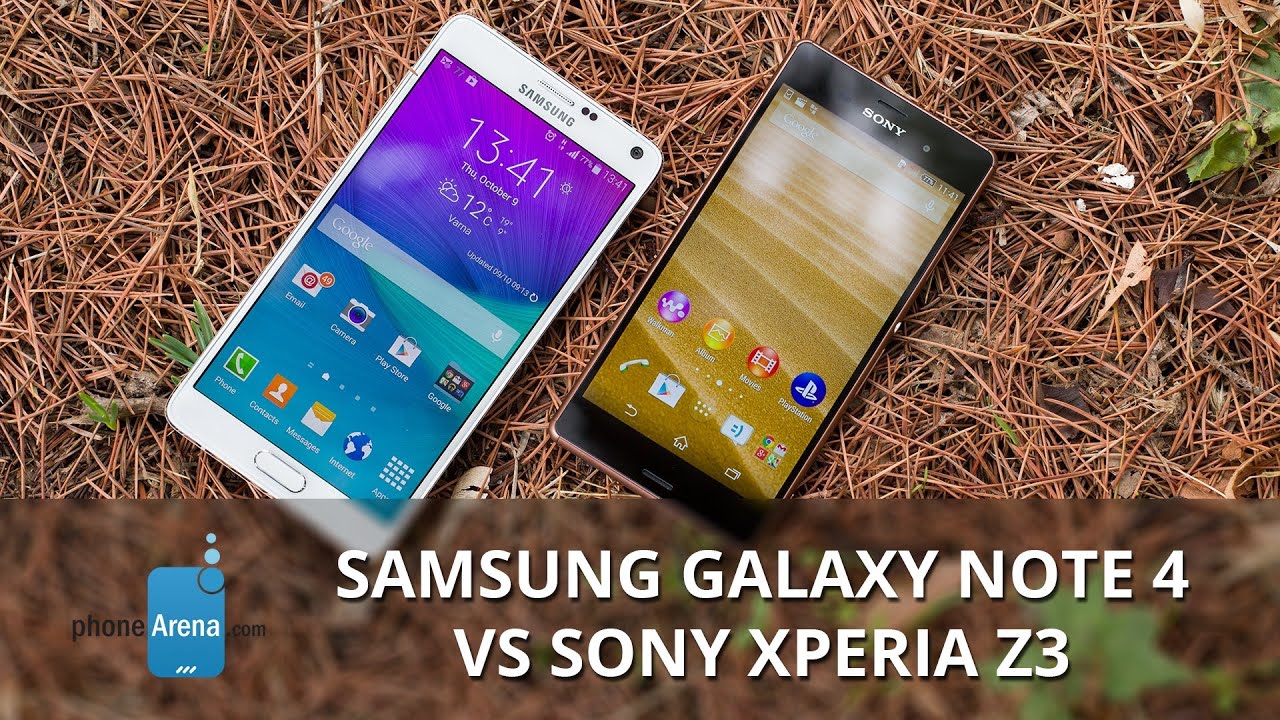
Samsung Galaxy Note 4 vs Sony Xperia Z3
Introduction
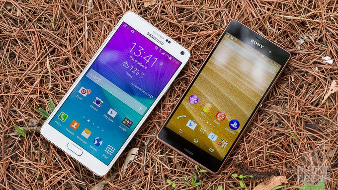
Samsung has never faced as much competition in the Android universe as this year. It now releases the next generation in its pious phablet line – the Galaxy Note 4, but it will be clashing with a lot of new flagships this fall, and the might S Pen sword might not help ward off the enemies. One of those cage matches will be with Sony's fresh Xperia Z3, and it will be one for the books, so let's measure up those two, and see who's boss...
Design
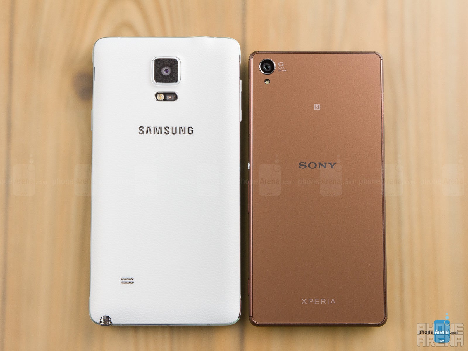
The crusty Note 4 design is no match for the slim and waterproof Xperia.
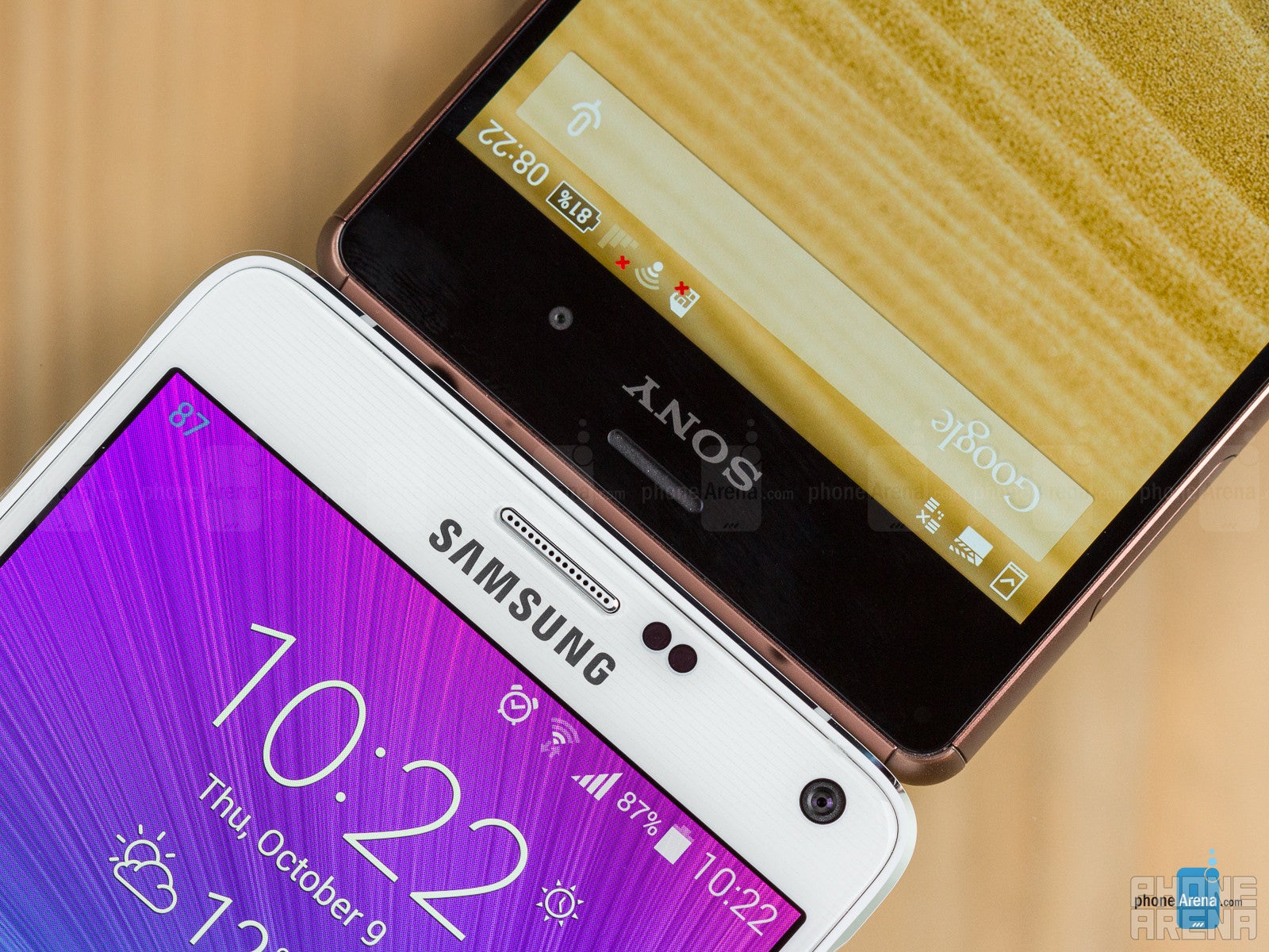
Needless to say, the Z3, with its premium glass and metal design looks much more stylish than the large and clunky Note 4. Moreover, despite its thin and light chassis, Sony's phone is also waterproof, unlike the Note 4, and dons a pair of stereo speakers at the front. Samsung's phone has a removable plastic back cover, which lets you swap the battery if needed, but the Z3 can last, precluding you from having to carry a spare juicer at the camping trip. Samsung has included its fingerprint scanner in the Note 4, which here is even more uncomfortable to use than on the S5, as you'd have to balance the phablet on your pinkie while trying to swipe your thumb over the home key down low. The Z3, on the other side, relies on only old-school pin or gesture lock options.
Display
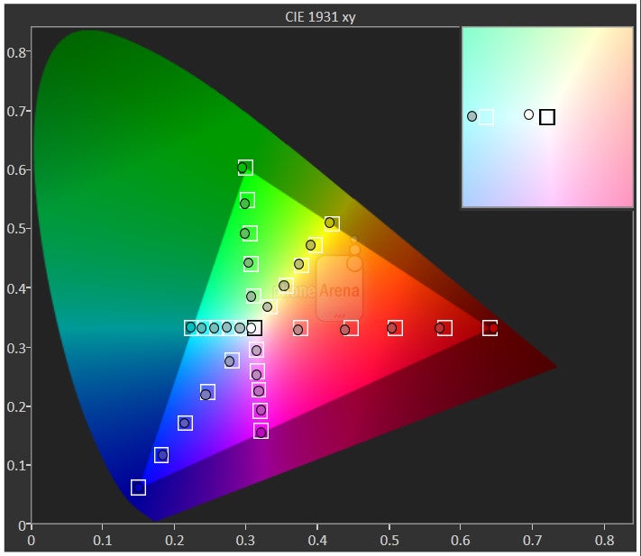
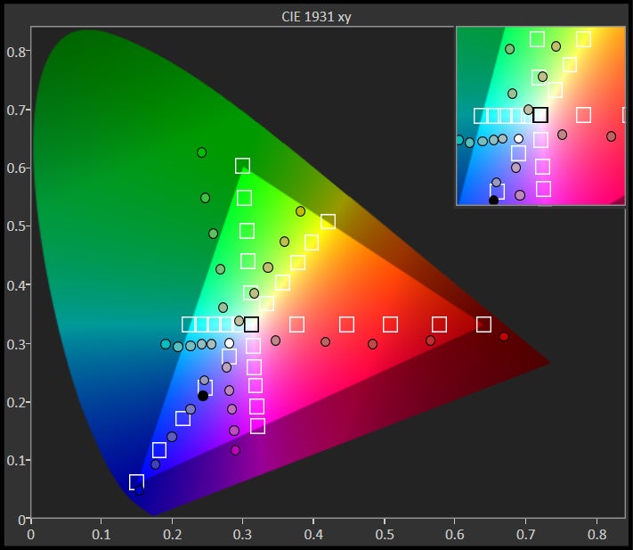
Role swap! The Z3 LCD panel brags extremely cold colors, while the ultra high-res AMOLED display is hue-accurate, go figure.
Samsung pulled out all stops with the Note 4, and included a 1440 x 2560 pixels QHD AMOLED display in its new phablet, making it futureproof for more than one flagship cycle. Thus, despite its hearty 5.7” screen diagonal, the Note 4 returns the whopping 515ppi pixel density. This might seem much higher than the 424ppi of the 5.2” 1080 x 1920 pixels display of the Z3, and yet the difference can't really be told with the naked eye from a normal viewing distance, so the Quad HD specification would serve you for bragging rights only.
Interface
The simple Xperia UI is no functional match for the overarching TouchWiz that is a multitasking king.
Both outfitted with Android 4.4 KitKat, the Note 4 and Z3 sport very different interface overlays. Sony's Xperia UI is much closer to the stock experience look than Samsung's TouchWiz, and has way less added functions than Samsung's monster of an Android coat paint.
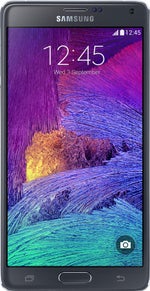
The UI of the Samsung Galaxy Note 4
Sony's Xperia interface is one of the most unintrusive manufacturer overlays. It adds some light multitasking tools like the Small Apps suite, which lets you hover up to five windowed apps, resize and move them around. It also sports the handy double-tap-to-wake function, and that's about it.
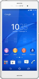
The interface of the Sony Xperia Z3
In contrast, Samsung throws most every option and functionality imaginable in its TouchWiz interface (sadly, no double-tap-to-wake, though). This results in an overbearing UI that often looks ragtag, a mix of old and new, and makes your head spin from the mashup of settings, Samsung apps and services, game demos, and security and enterprise features, all lumped in one. It is very, very functional, though, and where Samsung really shines, is its approach to heavy multitasking on the big-screen handset. Note 4 meets Sony's Small Apps suite with the Pop-up mode that lets you hover multiple windowed apps on top of the interface, and raises it the Split-Window regime. This one allows you to divide the screen in two resizable parts, and run completely separate apps in each. To these, we have to add the improved S Pen stylus software that lets you do the new Smart Select function – you can now freely crop, copy and pick content on any screen, be it in apps, homescreens, or simply text.
Processor and memory
Outfitted with the newest Snapdragon 805, Note 4 doesn't shine in benchmarks next to the Z3, as the Quad HD display resolution takes its toll.
Powered by the newest quad-core Snapdragon 805, clocked at the whopping 2.7 GHz, or a 1.9 GHz octa-core Exynos 5433, depending on the market, the Note 4 is as powerful as these things get. TouchWiz is an extremely heavy interface, but on the Note 4 is moves around with aplomb, barely indicating a stutter here and there. The Xperia Z3, on the other hand, is run by the previous generation Snapdragon processor, the 801AC version, clocked at 2.5 GHz. Actually, the two chipsets are pretty similar in terms of performance, save for the improved graphics and video streaming part in the 805, so we wouldn't complain too much. The Xperia UI is lighter than TouchWiz, yet we noticed some gaps in transitions and redrawing while flicking the interface around – nothing to write home about, though.
Internet and connectivity
Samsung has equipped the Note 4 with two browsers – its own TouchWiz piece, and Google's Chrome, while the Z3 ships with Chrome only. The browsers on both handsets perform admirably while scrolling, panning around, or zooming, but we would give our preference to the TouchWiz renderer. Not only is it extremely fast, but also a joy to use on the big, ultra high-res screen. The S Pen also adds value in browsing, letting you scroll, select, crop, share and annotate with the stylus.
Web browsing on the Samsung Galaxy Note 4
Chrome is the browser of choice for the Sony Xperia Z3
The handset flaunt 4G LTE connectivity, with market-dependent bands support, and 42 Mbps HSPA+ modems. The Snapdragon version of Note 4 dons Cat 6 radio that allows up to 300 Mbps theoretical download speeds, while the Z3 makes do with 150 Mbps maximums. We also get Wi-Fi/ac, Wi-Fi Direct, Bluetooth 4.0 (4.1 for the Note 4), A-GPS, DLNA, and NFC on the phones, while Samsung adds an infrared sensor for controlling your home electronics to the mix. Both handsets offer MHL 3.0 ports for wired connectivity, letting you hook them directly, or through an adapter, to the biggest screen in the house – your TV.
Camera
Galaxy Note 4 shoots a bit more pleasant-looking and detailed photos than the Xperia Z3.
The Note 4 comes with a 16 MP camera sensor, like the Galaxy S5 before it, but for the first time in Samsung's history the module is outfitted with an optical image stabilization system, called Smart OIS. Sony's flagship sports a 20.7 MP 1/2.3” Exmor RS sensor with 1.12 micron pixels, like the Z2, but Sony touts the new 25mm G Lens optics (f2.0), and other improvements under the hood, such as boasting up to 12800 ISO sensitivity. As for the frontal cameras, Samsung added a little more pizzazz this time, placing a 3.7 MP sensor with the whopping f/1.9 aperture, that is capable of wide-angle selfies at up to 120 degrees, while Sony makes do with the usual 2.2 MP front camera. The handsets are very fast to shoot and record a snap, with a slight preference going to the Note 4, but Xperia Z3 has a dedicated shutter button to the scale, so you can take a photo from a locked screen in a second or two.
The camera interface of the Samsung Galaxy Note 4
Camera interface of the Sony Xperia Z3
The Xperia Z3 takes blander-looking, colder photos than the Note 4, which in contrast dials up the color saturation a bit, and shoots with a slightly warm overcast, compared to the scene in front of the lens, but to a pleasant extent. Sony also does some more aggressive post-processing to keep noise in check, resulting in a softer, mushier photos than what the Note 4's camera manages to churn out. Samsung's phone also captures a tad higher amount of detail than what the Z3 musters, especially when you use it in the default mode, which captures 8 MP photos. Indoors, the Xperia phone inserts a bit too much noise in the frame when the light goes down, while Samsung's phablet keeps noise in check, and makes sharper, more distinct snaps. The LED flash of the Note 4 also does a better job at illuminating a small scene, as it is stronger than the one on the Z3, though both splash light evenly on the objects in front.
Sample images
Sample videos
Multimedia
Plus one for video for the Note 4, plus one for music on the Xperia Z3 – that's the multimedia consumption takeaway.
The larger screen of the Note 4 is a bit more welcoming for media consumption like watching movies or browsing photos, though the Z3's 5.2” display isn't far behind. Both galleries offer grid thumbnail views, and allow for rich picture editing from within the apps, as well as sport plenty of sharing options. Video playback is excellent on both handset, too, as they support DivX/Xvid/MKV files out of the box, and the players offer plenty of extras like zooming, previews, and subtitles support. Naturally, if you want to watch 2K movies in their native resolution, Note 4 is your guy, but we doubt you'd find many of those, and will want to load and watch them on your phone.
Gallery apps
When it comes to the music players, we'd have to give one up for the Xperia phone, as it has a much sleeker and more comfortable interface. Both Z3's Walkman player, and Samsung's TouchWiz one have plenty of equalizer and visualization options built in, but the graphical environment on the Sony looks much more stylish than the squarish Samsung UI. The Xperia Z3 also flaunts Sony's Digital sound Enhancement Engine (DSEE), which brags to upconvert crappy tracks to a higher-resolution format - we can attest that there is a slight difference, though not as stark as if the tunes were high quality in the first place. Sony offers two waterproof stereo speakers at the front, which sound clean, but are somewhat muffled, while the Note 4 only offers one speaker at the back, and with average quality at that, though strong enough.
Music player of the Samsung Galaxy Note 4
Music player of the Sony Xperia Z3
Call quality
With a great earpiece and three noise-canceling mics, Note 4 is the voice quality champ here.
Battery
Conclusion
Sony's OmniBalance design language is epitomized in the most stylish Xperia to date with the Z3, while the plasticky nature of Samsung's phablet line barely budges in the Note 4. Samsung's handset is bigger, but comes with a 20% larger, ultra high-res screen, which sports excellent color reproduction, while the Z3 display is very inaccurate in that department.
On the other hand, the more aesthetically pleasing and more compact Z3 is also waterproof, and houses stereo speakers at the front – features that are more useful than the heart rate and UV sensors, or the clunky fingerprint scanner that Samsung included in the Note 4.
Since the camera pictures and video quality are rather comparable between the two flagships, there aren't true advantages of the Note 4's bombastic spec sheet before the Z3, too, despite the higher chipset speed and pixel density on paper.
Follow us on Google News










Things that are NOT allowed:
To help keep our community safe and free from spam, we apply temporary limits to newly created accounts: