RIM BlackBerry Curve Review

Since the release of the BlackBerry Pearl, RIM has started to create phones that apply not only to business but to the mainstream as well and the BlackBerry 8300 Curve is no different. It comes packed with the standard features you expect on a BlackBerry and some that help it compete against other smartphones found on the market today. The Curve joins the Pearl, 8800, and 8700c as the latest Blackberries in AT&T’s lineup.
Package contents
Package contents
- Phone
- Charger
- Manual
- USB cable
- 3.5mm headphones
RIM BlackBerry Curve Video Review:
The Curve has a very elegant design, neither flashy nor boring at the same time. The front and back are made up of a silver plastic. The left, right, and top sides are covered in a black rubber. This doesn’t give a lot of grip but it gives just enough support so it doesn’t slide out of your hand.
With a dimension of 106 x 61 x 15.5 (4.2 x 2.4 x 0.6 inches) and a weight of 110.5g (3.9 oz), the Curve is very comfortable to hold. The front holds a 2.6” inch display with a resolution of 320 x 240, which is the same one used on the 8830 but matches with the Curve much better. It is very legible, even in bright sunlight as the automatic light sensor does well at adjusting the brightness.
Located just below the screen are the trackball, call button, hang-up button, menu button, and back button. Below that is the full QWERTY keyboard. The buttons are small but because they are separated from each other, they are easily distinguishable and also provide feedback when pressed. There were times where we would press the two buttons at once but this didn’t happen often. This is much better than the 8800 or Pearl. With the 8800, the buttons are squeezed so close together that you can end up pressing many at one time. The Pearl uses a QWERTY keyboard but there are two letters assigned to each key.
Just above the display, the speaker and LED indicator are located. The LED informs you whether there is reception. When charging, the LED is glow red to show it is charging and then green once it is completely charged.
One the right side, you will find the shortcut button for the camera and the volume rocker above it. On the left is the voice dialing shortcut (which AT&T changed to Push-to-Talk as the default), miniUSB connection, and 3.5mm audio jack. Located on the top are the hands-free speaker button and the hands-free speaker. Apart from the voice dialing shortcut, the buttons are placed a little deep and it takes some force to press, especially the volume rocker. The two shortcut buttons can be changed to many other applications if you don’t like the defaults.
The back houses a 2MP camera with flash and a mirror. The camera does not have a cover but is embedded a little deeper so that there is no need to worry about scratching the lens. The back comes off to reveal the battery. Below the battery is the location for the SIM card and the microSD card which is very inconvenient as you need to turn the phone off everytime you wish to change it out. It seems odd that RIM chose to place it here since the 8830’s was placed just above the battery. It might be a real deal breaker if you have plenty of cards to switch between.
| Model | Dimension (Inches) | Dimension (mm) | Weight (oz) | Weight (Gramms) |
 BlackBerry Curve BlackBerry Curve | 4.20" x 2.40" x 0.60" | 107 x 61 x 15.5 | 3.90 | 110.5 |
 BlackBerry 8800 BlackBerry 8800 | 4.48" x 2.59" x 0.55" | 114 x 66 x 14 | 4.72 | 134 |
 T-Mobile Dash T-Mobile Dash | 4.39" x 2.46" x 0.50" | 111.5 x 62.5 x 13 | 4.23 | 120 |
 Samsung BlackJack Samsung BlackJack | 4.44" x 2.32" x 0.46" | 113 x 59 x 11.8 | 3.52 | 100 |
With a dimension of 106 x 61 x 15.5 (4.2 x 2.4 x 0.6 inches) and a weight of 110.5g (3.9 oz), the Curve is very comfortable to hold. The front holds a 2.6” inch display with a resolution of 320 x 240, which is the same one used on the 8830 but matches with the Curve much better. It is very legible, even in bright sunlight as the automatic light sensor does well at adjusting the brightness.
Located just below the screen are the trackball, call button, hang-up button, menu button, and back button. Below that is the full QWERTY keyboard. The buttons are small but because they are separated from each other, they are easily distinguishable and also provide feedback when pressed. There were times where we would press the two buttons at once but this didn’t happen often. This is much better than the 8800 or Pearl. With the 8800, the buttons are squeezed so close together that you can end up pressing many at one time. The Pearl uses a QWERTY keyboard but there are two letters assigned to each key.
Just above the display, the speaker and LED indicator are located. The LED informs you whether there is reception. When charging, the LED is glow red to show it is charging and then green once it is completely charged.
One the right side, you will find the shortcut button for the camera and the volume rocker above it. On the left is the voice dialing shortcut (which AT&T changed to Push-to-Talk as the default), miniUSB connection, and 3.5mm audio jack. Located on the top are the hands-free speaker button and the hands-free speaker. Apart from the voice dialing shortcut, the buttons are placed a little deep and it takes some force to press, especially the volume rocker. The two shortcut buttons can be changed to many other applications if you don’t like the defaults.
The back houses a 2MP camera with flash and a mirror. The camera does not have a cover but is embedded a little deeper so that there is no need to worry about scratching the lens. The back comes off to reveal the battery. Below the battery is the location for the SIM card and the microSD card which is very inconvenient as you need to turn the phone off everytime you wish to change it out. It seems odd that RIM chose to place it here since the 8830’s was placed just above the battery. It might be a real deal breaker if you have plenty of cards to switch between.
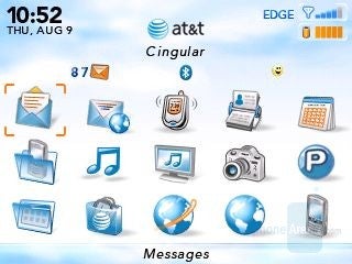
AT&T default theme
The Curve has a very similar interface to other BlackBerries. There are 21 icons in a 5 x 4 style grid style layout on the default profile. AT&T’s default theme is looks very cartoonish and completely ruins the great screen. Luckily, there are other themes that you can change to loaded with the phone or if those don’t work for you, you can download one from AT&T.
At the top, there is a banner that holds the time, date, etc. in the top left hand corner are the time and date. The signal indicator and battery life indicator are on the right hand side. To the left of the signal indicator, there is an indicator that will inform you if you’re on an EDGE or GRPS network. In the center is the AT&T logo and name and the Cingular name is just below it.
All the icons can be moved around to organize them to your liking. To organize them further, custom folders can be made to separate the types of shortcuts.
Phonebook:
The phonebook on the Curve is the standard BlackBerry phonebook. Email addresses and phonebook contacts are combined into one entry so that there is less confusion. There are plenty of fields to enter so that all of the necessary information can be added to the entry (first and last name, title, picture, email, company job title, address, email address, work/home/mobile/pager/fax numbers, web page, category, usernames, and notes.)
Folders can be created to organize users but the purpose is defeated since the username stays in the address book as well as the folder that was created.
Organizer:
The calendar with the Curve is standard but still very informative. Views can be seen in a day/week/month/agenda view. The default view is set to day but it can be changed through the menu. Free time is set to be included by default in the agenda. This just adds to the list and makes it more complicated than it should be. Luckily, this can be turned off.
Adding an appointment is done by going through the menu. The fields are: subject, location, description, if it’s an all day event, start/end time and date, duration, time zone, shown as (free/busy/tentative/out of office), reminder (none/0/5/10/15/30/45 minutes/1/2/3/4/5/6/7/8/9/10/11/12 hours/1/2/3/4/5/6 days/1 week), recurrence (none/daily/weekly/monthly/yearly), mark as private, and notes. For those who travel often, you can set the appointments to different time zones to create less confusion for yourself.
Other standard features are calculator, alarm, task pad, and memo pad. The calculator is a standard calculator and there are no scientific functions available. There is only one alarm that can be set and the available options are: Alarm on/off, time, snooze on/off, alert type (tone, vibrate, vibrate + tone), tune, volume (escalating/high/medium/low), and number of beeps (1/2/3).
The memo pad sounds exactly like what it does, it just stores little notes that you want to have at hand. The task pad is much more useful and almost feels like a second calendar. You can enter task name, status (not started/in progress/completed/waiting/deferred), priority (high/normal/low), due (none/by date), time zone, reminder (none/by date), categories, and notes.
Voice commands are included with the Curve but performance is less than stellar. Using the voice command to call someone worked out well but other commands did not seem to work quite often. Either the command would not be recognized or the wrong program was opened. Searching manually comes out much faster in the end.
Messaging:
The Curve comes with the standard BlackBerry email client. While it sounds that it’s nothing special, the client is just as good as always. POP, IMAP, Exchange, Outlook, and Notes/Domino email accounts are supported. We tested a Comcast account with the Curve and it worked wonderfully. There was a delay with some emails that were received but it was no more than 3 minutes. There was no option to change the reconciliation period but there is the option to reconcile the mailbox yourself. Still, it did not always see all of the emails that were in the mailbox. Also, there were emails that appeared as doubles at times. Not all emails were affected but it did happen quite often. As expected, there was no multi-delete available. The most that could be done is delete anything before a certain date. If you want to delete just certain emails, each one has to be manually deleted.
Two mailboxes are present. One is strictly for emails and the second is for SMS, MMS, and emails. It would be nice to have the second mailbox just for MMS and SMS messages to keep things simpler and more organized.
AutoText is there to help while texting. If some thing like don’t is typed, it will be automatically changed to don’t. Words are automatically put into a list but other words can be added or that current words can be edited.
Connectivity:
The Curve is a quadband phone with EDGE/GPRS. Connections to the computer can be made through either the USB 2.0 connection or Bluetooth. Sadly, there is no Wi-Fi or 3G connection. Currently, RIM 8707g is the only model to feature 3G, but it is offered in Europe only.
Internet:
The Curve comes with BlackBerry’s full HTML browser. Still, there is a lot to desire from the browser. While it does provide you with everything that you need to surf, all of it is provided in one column. Also, if the scroll is moved very quickly, it tends to skip some, if not all, of the page. Browsing is quick, even though it’s on an EDGE network. Myspace.com took 4 seconds to open and another 3 seconds to fully load even though the signal indicator showed 2 bars.
Camera:
Along with the Pearl, the Curve is the only other BlackBerry in AT&T’s lineup that features a camera. Since RIM just recently began to include cameras with BlackBerries, we were pleasantly surprised with the quality. The 2MP camera is not the best, but it does a decent job. Pictures from a distance tend to be a little blurry and come out overexposed in bright situations. It’s odd though, in photos with the object in the distance, objects further away are a little out of focus while everything closer come out more clearly.
RIM did a great job adding a flash and mirror, especially when you consider how some manufacturers tend to put one or the other or neither. The flash does great and it’s very bright. We were able to have some of a completely black room come out and the objects were over 11 feet away. Still, it was too dark to make much out. If you’re planning on using the flash, make sure that the object is no more than 6 feet away. This is exceptional considering it’s an LED flash.
Sadly, the Curve has no video recorder.
Multimedia:
With the move to mainstream, RIM needed to include a media player with the BlackBerries which is very simple and the only options are pause, play, stop, change the volume, repeat, and random. Quality is lacking, however as the sound seems a little washed out when playing through the speaker. You also have the option to use a 3.5mm headphones or Bluetooth which has a stereo profile so you’re not stuck with mono sound. Sound through headphones is better but it it’s lacking as well. If you want a simple media player for those times when you want to pass the time, then you should be happy with this. Otherwise, either look for another phone or get a dedicated MP3 player. Supported formats for audio are MP3, WMA, AAC, AAC+, eAAC+, AMR-NB, and MIDI, and for videos are MPEG4, WMV, and H.263. There is a choice for fullscreen when watching videos but it isn’t much larger than in regular mode.
Media can be stored on the 64MB of built-in memory and can be expanded using a microSD card. Still, it would be nice to see the microSD slot at a little more convenient place than under the battery.
Software:
The Curve can open .Zip archives, internet pages saved in .htm, or .html formats, Word documents (.doc, .dot, .wpd, .txt, vCard file (.vcf), PowerPoint (.ppt), Excel (.xls), Adobe Reader (.pdf), and images in formats of .bmp, .gif, .jpg, .png, .tif, and .wmf files. If the programs on the Curve are lacking, you can find others on the internet by just doing a quick search on Google.
The Curve can open .Zip archives, internet pages saved in .htm, or .html formats, Word documents (.doc, .dot, .wpd, .txt, vCard file (.vcf), PowerPoint (.ppt), Excel (.xls), Adobe Reader (.pdf), and images in formats of .bmp, .gif, .jpg, .png, .tif, and .wmf files. If the programs on the Curve are lacking, you can find others on the internet by just doing a quick search on Google.
Performance:
The Curve did great in our tests. Signal strength was great everywhere we went. Sound quality was strong and clear. Both parties could hear well and clearly.
With the 312MHz processor, navigating through the menu was quick. There were a few times where there was a slight pause when a command was made but it was no longer than 1 second.
Battery life is just amazing. While texting, making calls, browsing, and checking emails, the battery managed to last us 4 days and still has ¼ of the battery left. Talk time is rated at 4 hours but we managed to get 5 hours and 40 minutes out of one charge. We know BlackBerries have good battery lives and the Curve certainly does not disappoint.
Conclusion:
We were very pleased with the Curve as RIM managed to put together a great package together into one phone. While the camera isn’t perfect, RIM did its research to make sure it would not come out useless and the great flash is better than most phones out there.
The email client is great, as expected, and the battery life is great. The QWERTY keyboard, while small, is very comfortable to use, much better than that of the one on the 8830. The media player does a decent job of what it’s meant for. It supports plenty of formats so there shouldn’t be much of a problem playing finding media to play.
Overall, the Curve is a great messaging phone with decent camera and media capabilities. If BlackBerries one of your preferred phones but you missed the camera and media options, then the definitely give the Curve a try. You will not be disappointed.






Things that are NOT allowed: