Nokia N9 Review

Introduction:
The Nokia N9 was hottly anticipated and yet, sadly, this illusive handset won't be widely available to the majority of you readers. Simply put, when we hold the Nokia N9 in our hands, we're holding a piece of history. MeeGo, the culmination of decades of Nokia mobile software development, is now offically canceled So why are we reviewing the Nokia N9?
The hardware, both an evolution of the critically acclaimed Nokia N8 and an insight into what we might expect with the next chapter of Nokias. With its edgy plastic build, 1GHz processor, 3.9" AMOLED screen, 8MP camera and not least of all, MeeGo, the enigmatic Nokia N9 is both a proud tribute to yesterday and an optimistic insight into Nokia's tomorrow.
Design:
Undoubtedly, Nokia has churned out some fantastic hardware in recent years. Take the N8 and E7, respectively at the top of their game when it comes to product design with beautiful annodised alluminum chasis' and confident, bold shapes that just work in the hand, in the pocket and to the eye. We therefore have high expectations from the Nokia N9's AMOLED bevelled glass display,high-grade coloured plastic encasing,not to mention the slab's abundance of personality.
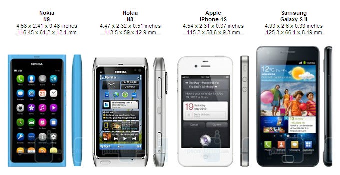
You can compare the Nokia N9 with many other phones using our Size Visualization Tool.
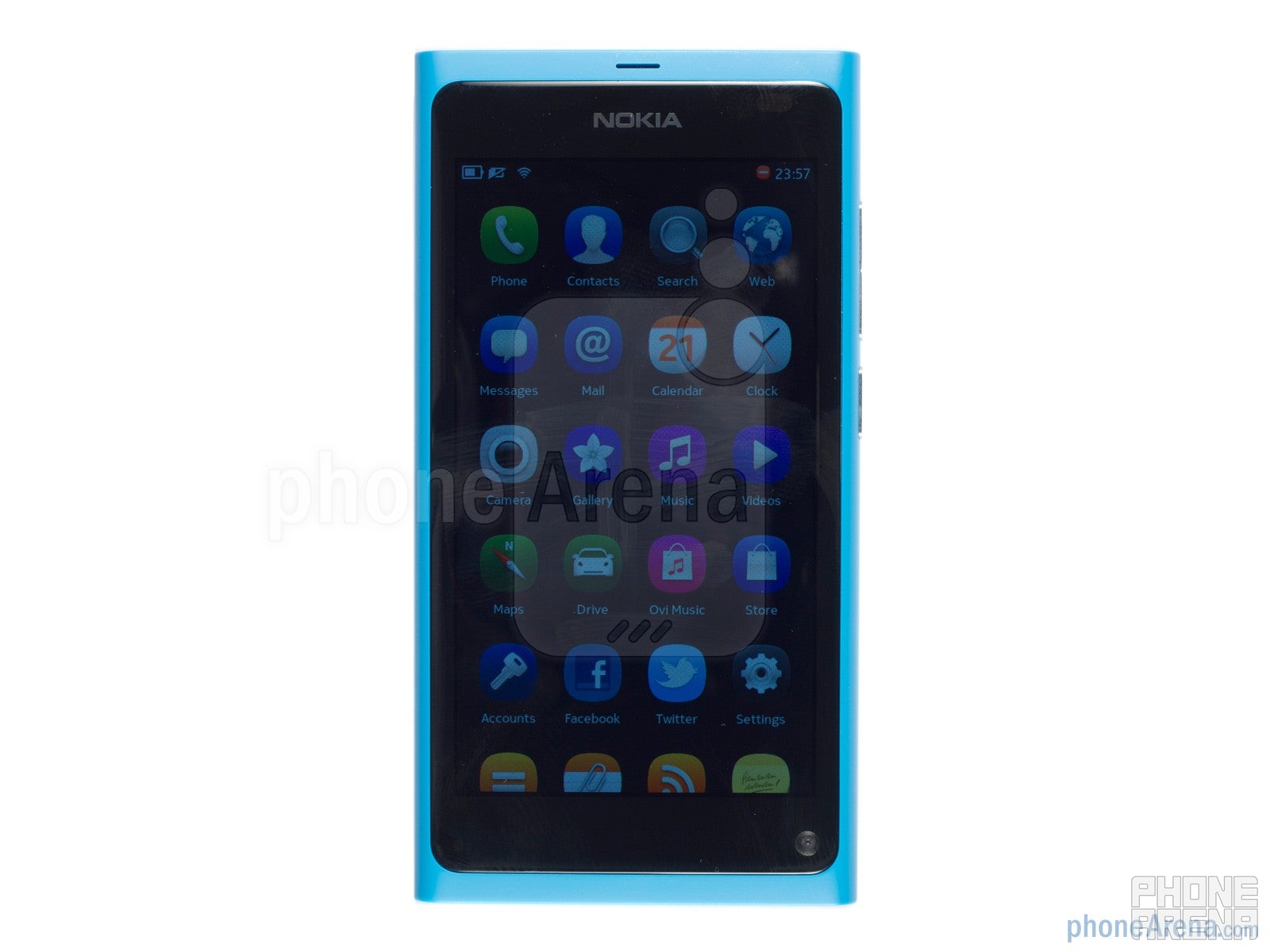
3.9-inch Clear Black AMOLED
Double tap the screen to reveal the wallpaper, our chosen being a beautiful bokehing of light against a dark backdrop. At WVGA resolution, this 3.9" Clear Black AMOLED display delivers a crisp, vibrant image, and accurate colour with the wallpaper looking every bit as evocative as you might hope.
Interacting with the curved glass is a sensory treat, slick, smooth and contoured for an edge to edge recess with every swipe. All in all, a definite highpoint of the Nokia N9. The one criticism we would have relates to viewing angles.Tilt the device a few degrees and a blue hue takes hold, so while detail retains its integrity, color unfortunately doesn't.
The Nokia N9 can be rested flat or stood up in portrait thanks to its dramatic flat top and bottom sides. Pick up the handset and there's no cold, steely reception. Instead, the Nokia N9 greets with a nostalgic, reassuring room temperature warmth. In the face of the plastic casing, the phone feels thoroughly modern and solid. Maserfully crafted, curvaceous, laden with flush elements and a minimalistic, buttonless fascia, the Nokia N9's design comes together harmoniously and with intent.
Hidden on bezel below the screen: the front facing camera (strange, isn't it). On the right side is the volume rocker and lock/power button, at the base, the loudspeaker and on the top-side, the microSIM card slot, the hinged micro USB cover and 3.5mm headphone jack. On the back of the Nokia N9 lies the 8MP camera with dual LED flash. There is no removable battery or expandable memory which is unfortunate, though given the strong design, we can see why Nokia made this decision.
Simple, engaging and playful.Nokia have played to their strengths with their N9's design. Available in three colors, black, cyan and magenta, all finished to the highest degree, if you care about how what you pull out of your pocket looks, then you'll revel in revealing your Nokia N9. From an ergonomic point of view, the handset also feels rich, and sits well in the hand. The bottom right hand corner may be a tad edgy forprolongedcomfort against a palm, however for standard use, this handset is at the top of its game.
Interface:
The beauty of MeeGo is its simplicity. The OS is comprised of 3 screens, a fixed notifications bar at the top and hardly any layers. Screen one is a four column view of your apps. Screen two, multi-tasking, providing thumbnails of open-apps. Finally, the third screen offers a dashboard of Twitter and Facebook feeds while also indicating notifications and weather. Journeying between screens is achieved by a horizontal swipe, with all three screens cycling through a loop, so you always have somewhere to go whichever way you swipe.
Screen one, the apps screen is single layered, so no folders in sight. It looks neat and clean while allowing for basic customization. With a long press, all the app icons gray out, with small crosses appearing next to specific apps. This grayed out screen enables re-ordering or uninstalling of apps
Thesecond screen, multi-tasking displays a thumbnail of each open application. These can be scrolled through, tapped on for quick access or long-pressed for further options. These options allow you to close windows one by one, or close all.
The final screen in MeeGo's minimalistic arsenal involves updates. These include both Twitter and Facebook, with the option of including news articles from the pre-installed AP Mobile news app. There is the option to display either 50, 100, 200 or 500 items with an update interval ranging from 10 minutes through to 24 hours.
The notification band at the top of the display indicates battery, network, Wi-Fi, Facebook chat / Gtalk status and time. This can be expanded by a tap, allowing you to select a profile, choose your chat status and your Wi-Fi connection.
The locking mechanism on the Nokia N9 takes full advantage of the physical convex quality of the screen. It requires a two stage unlock, firstly, a double tap or press of the unlock button. Second, an edge to edge swipe across the sleek fascia, with the tapering edges indicating that at the end of your swipe, you have indeed reached your destination.
All this talk of swiping alludes to the final point to note about MeeGo's UI: managing windows. With any window other than a main screen open, a swipe from bottom edge to top edge, or either horizontal edge across will send the application to the multi-tasking pane, and send you to a main screen. If you wish to close an app completely, simply swipe down.
This step by step explanation goes to indicate the beautiful simplicity of MeeGo, at its heart, it's an operating system that's easy to get to grips with, looks charming and adopts gestures more fundamentally than any other major mobile OS before it, with the exception of perhaps HP WebOS. While it can jitter and slow down, and there are a few kinks to iron out in terms of functionality (swipe up won't close video player), had we not already known MeeGo's future, we would have anticipated it to be very promising.
Functionality:
As far as key phone tools, the dialer and phone functionality works well. Every button, icon and drop down menu is touch optimized and looks charming. Adding a contact is a piece of cake and the Nokia N9 synchronized easily with our Google contacts. Unfortunately, the calendar wasn't so easy to sync, but sill performs well, with a split panel view and attractive UI.
Messaging on the Nokia N9 is a treat. The keyboard offers amongst the best haptic feedback you're going to experience, while the keyboard in landscape is well laid out and easy to get to grips with. The portrait QWERTY is a touch thin for comfortable thumb typing, though we got used to it pretty quickly.
There is support for a range of accounts, with the aforementioned Facebook and Twitter integration also coming in the form of fully functioning apps. There is also support for Skype, Flickr, Picasa, Youtube, and other accounts such as mail for exchange.
There are also a range of other useful applications on the N9, such as notes, document viewer, RSS feeds, AccuWeather and AP Mobile, not to mention some pre-installed games, including trials of Angry Birds, Galaxy on Fire 2, Need for Speed Shift and Real Golf 2011. Finally, MeeGo also sports a useful search function that enables you to trawl the entire phone for whatever it is you're after.

As far as the market experience goes, Ovi Store is sorely lacking. We were able to find a screenhot app and some additional new apps, however this isn't the handset to buy if you're looking for an engaging app experience. In the Nokia N9's defence however, most of what you'll ever need is pre-installed on the device.
Camera:
With Huge shoes to fill, looking at specs alone and the Nokia N9 trails behind its older brother, the N8. The sensor's down from 12MP to 8MP while the Xenon flash has been dropped in favor of a dual LED flash. That said, working in the Nokia N9's favour is the fixed minimum aperture of f2.2 in contrast to the N8's f2.8, and the slightly wider angled 26mm focal length.
Specs aside, and the performance of the Nokia N9 camera is very solid indeed. Detail levels are good, dynamic range is respectable and color is for the most part accurate, though at times the exposure and white balance needs a helping hand. Our only niggle is in relation to the auto-focus and the camera UI. The camera fires very quickly, sometimes before it even get a chance to focus. This is both a blessing and a curse, with quick capture but occasionally soft picture.Touch to focus also proved unreliable, not playing nice in macro and locking occasionally, while the UI is heavily menu driven. We would have liked shortcuts or an HTC style corrections on the fly approach.
We managed to get some cracking atmospheric shots using this phone, with macro shots getting decent depth of field while wider shots absorbed a scene. That the Nokia N9 can handle noise pretty well really helps if you're into your sunsets and nights out.
Sadly, video capture doesn't deliver the quality we would have hoped for. With 720p recording, it's already slightly behind the competition, however, the artifacting, muted colours and shortage of clarity and detail are what stop the Nokia N9's video output from complementing some rather impressive optics. For casual video however, it is passable, and as you can see from the clip, the touch to focus during the video itself tends to work very well indeed.
This firmly places the Nokia N9's camera in the upperechelon of still photo snappers, however if video's your bag, watch our sample before committing your hard earned cash.
Nokia N9 Sample Video:
Nokia N9 Sample Video:
Multimedia:
After you've spent hours creating content, you'll want to consume it, and the Nokia N9 has everything you'll need to do just that.
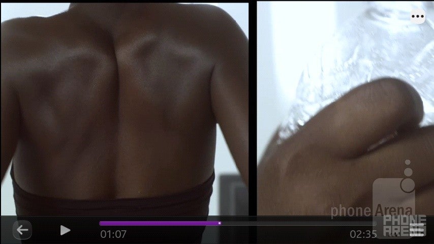
Starting with the music player and Nokia have decided to lock everything into portrait orientation. This works perfectly for one handed usage and keeps in-line with the simplicity of the OS.The main screen offers you a 3x3 grid of recently played album artwork in the upper half, while in the lower half are standard playback options such as artist, album, songs, playlist and ovi music. Playback quality is definitely above average, with impressive volume and clarity. Tracks retained a good amount of bass as well, giving the N9's audio output a nice rounded quality.
Video playback
Connectivity:
The onboard penta-band 3G and quad-band GSM makes the Nokia N9 an ideal phone for traveling – it is even usable in T-Mobile USA's 3G network. The pre-installed Nokia maps with GPS allow for free navigation. The handset also has your usual, Wi-Fi, Bluetooth, not to mention NFC which is something we don't see all that often.
Web browsing is a very positive experience on the Nokia N9 thanks to a zippy browser and intuitive interaction. Multi-touch pinch to zoom works a treat while pages load quickly and are browsable while loading. The browser doesn't support Flash, and this probably has a lot to do with the smoothness of the experience, however you do get HTML 5 support.
The Nokia N9 gives users the ability to easily tether Wi-Fi which we're delighted to see. The GPS also works well, locking on when outdoors in a matter of moments with the AGPS, and from cold in about 30 seconds.
Performance:
The 1GHz TI OMAP 3630 chipset does a respectable job at making sure MeeGo keeps up with everything we throw at it. At times we opened in excess of 17 apps with little in the way of stuttering. At other times however, with 2 or 3 apps open the Nokia N9 hung, froze or took its sweet time to open a new application. Inconsistencies in behaviour remind us that the MeeGo is still in its infancy. This doesn't kill the Nokia N9 experience, but does sully it somewhat, especially when considering the uncertainty behind support for this platform over the coming years.
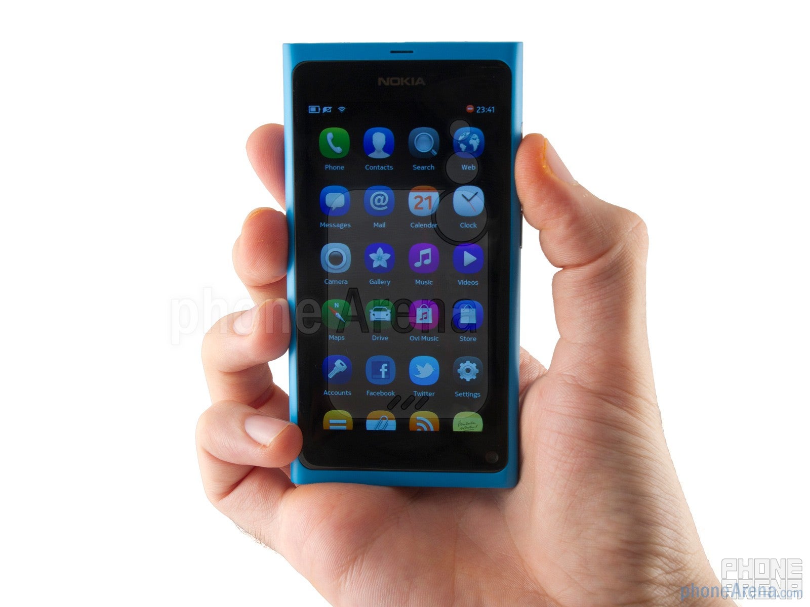
With the non-removable 1450 mAh battery stated to last 11 hours while talking and 16 days standby, the Nokia N9 manages to put other smartphones to shame. While real-world results produced a full day to day with chat logged in, if you need to preserve juice, switching off connections can get the handset through two days - something most smartphones can only dream of.
Conclusion:
Is MeeGo a viable OS? Is the Nokia N9 design up to scratch? Is the new camera good enough? The resounding answer is yes, bittersweet though it may be. MeeGo ordains Nokia's impeccable hardware with a form fitted OS, one that could even challenge the major players on the usability stakes and before we can celebrate, we must commemorate. For any Nokia fans out there considering this, you get our recommendation. However, from a practical stance, for a day to day consumer who wants to buy into an ecosystem rich in apps and development, the grass may well be greener on the other side. If you, like us, have fallen in love with the Nokia hardware, but the N9 won't be available in your market, you may want to consider an upcoming Nokia Windows Phone, which would eventually spor a similar chassis and Microsoft's better-supported OS.
Nokia N9 Video Review:



Things that are NOT allowed: