Nokia Lumia Icon vs Samsung Galaxy S4
Introduction
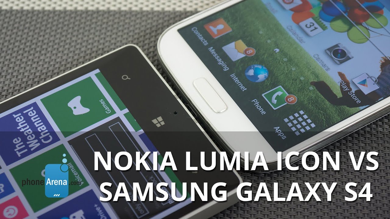
Nearly a year has gone by, and it’s hard to believe that the Samsung Galaxy S4 is still in contention – its heart still beating profusely in light of the heavy competition around. Over on Verizon’s lineup, the Nokia Lumia Icon is giving the carrier a contemporary Windows Phone that customers have been craving, which is a refreshing addition taking into account the rarity of Windows Phones in general.
One new smartphone, another widely regarded as aged, both are no doubt going to compete against one another to earn loyalty amongst Big Red’s customer base. Right off the bat, it’s looking mighty favorable for the Lumia Icon because it’s brand spanking new, but don’t count out Sammy’s flagship from giving it a good run for its money.
Design
There’s a distinctive styling attached to Nokia’s line of Lumia smartphones that make them oh-so appealing from a design standpoint. Of course, the Icon follows all of those design principles to give it the slightly favorable design over the Galaxy S4. For starters, the Icon’s construction, which consists of a polycarbonate body sandwiched together by a metallic frame, radiates a significant amount of sturdiness over the Galaxy S4’s slippery polished polycarbonate casing.
Looking at them at a glance, it’s almost difficult to say which of the two has the smaller frame, but on paper, it’s actually Sammy’s product that’s thinner, lighter, and more compact – though, it isn’t all that much. Taking them both into our hands, we surely appreciate the rounded edges of the Galaxy S4’s sides, as the metallic bezel of the Icon is rather sharp to the touch, which causes it to feel uncomfortable to grasp with a single hand. Even though it has some design elements we’ve seen with previous Lumias, the Icon’s design continues to be more appealing over Sammy’s offering.
Sure, we’re able to access their respective power buttons and volume controls with little fluff, but we like how the set on the Icon are more pronounced to the touch – plus, it’s helpful that it has a dedicated shutter key. They both feature microUSB ports for charging and data connectivity, but it’s only the Galaxy S4 that gives us video-out functionality as well with the aid of an adapter. Finally, we should point out that Sammy’s flagship packs along an IR blaster that allows it to double as a universal remote.
Display
Interestingly enough, they share very similarly spec’d displays that rely on OLED technology. To elaborate more on that, it’s a 5-inch 1080p ClearBlack AMOLED display in the Lumia Icon, and a 5-inch 1080p Super AMOLED display with the Galaxy S4. Knowing that they have the same screen sizes and resolutions, they produce the same level of detail – giving even the most miniscule of text an effective amount of clarity to allow us to make them out in a zoomed out view in their web browsers.
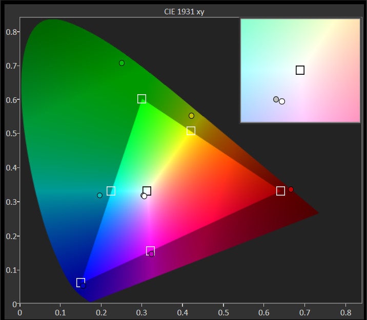
Furthermore, their saturated color productions, in combination with the stellar viewing angles, allow for minimal distortion at various angles. When bright and vivid colors are in abundance, you know for sure that these two displays have the wow factor to keep our eyes affixed to them. Neither are actually great with outdoor visibility, as the two displays barely get close to the 300 nits brightness level.
As we’ve seen, the two displays match one another in several areas, but there’s more tech involved with the Galaxy S4’s display. Specifically, it’s able to track our finger as we’re hovering over it, which works in tandem with the handset’s various Air View functions. Throwing that aside as we look at the big picture, there’s not one display that we greatly prefer over the other.
Interface and Functionality
Something we’ve compared in great detail in past comparisons, we’re yet again faced with the timeless question of which of the two mobile platforms reign supreme – Android or Windows Phone? It’s more of the same here, as Android’s maturity in tandem with Sammy’s diversified secondary features with its TouchWiz Nature UX experience shows its deeper comprehension over what Windows Phone 8 with the GDR 3 update has to bring to the table.
We won’t argue that Windows Phone 8 has an appealing style and presentation, as its homescreen is dazzling with its dynamic Live Tiles, and how the Modern UI is employed in many aspects of the platform’s interface. However, it doesn’t quite match the vast personalization of Android as a whole, but more importantly, the expansive features that Sammy has sprinkled into its TouchWiz experience. When you have secondary features on the Galaxy S4, like Air Gestures, Smart Pause, Smart Scroll, Air View, and the host of S-branded apps, it really puts itself in a higher class.
Wondering why we find the customized experience of the Galaxy S4 superior to that of the Windows Phone 8 experience of the Lumia Icon? We really just need to look at their respective multitasking and notifications systems. By in large, the Galaxy S4’s implementations are more effective in handling the tasks. Not only are notifications aggregated in one, easy to access area, but its Multi-Window feature gives us true multitasking.
Microsoft’s own Bing service offers a small fraction of functionality that Google Now delivers with the Android experience, so when it comes to various organizer functions, we’ll stick with the Galaxy S4. Better yet, the various Air View features of the smartphone is a neat touch that provides pertinent information – such as email, appointment, and text message previews.
When it comes to ease, we prefer the simpler layout of the Lumia Icon’s on-screen keyboard. On the flip side, the Galaxy S4’s keyboard gives us access to several characters and symbols directly from the main layout – though, it can sometimes feel overwhelming to absorb.
Windows Phone 8 has been making considerable strides when it comes to apps that matter to us, but it still doesn’t have the same breath that Android offers its users.
Processor and Memory
Newer technology always has its perks, which is evident here with the Lumia Icon’s quad-core 2.2GHz Qualcomm Snapdragon 800 processor with 2GB of RAM and the Adreno 330 GPU. It’s noticeably snappier with its performance than the S4, powered by the older quad-core 1.9GHz Qualcomm Snapdragon 600 SoC coupled with 2GB of RAM and the Adreno 320 GPU. For basic things, it’s almost hard to determine the faster of the two, but just navigating around their homescreens, we continue to see some slowdown with the Galaxy S4.
Verizon’s version of the Galaxy S4 is available in 16GB and 32GB capacities, while the Lumia Icon is only offered in 32GB. Laying claim to a microSD card slot, it’s a comforting thing to find on Sammy’s product.
Internet and Connectivity
Surfing the web is ideal with the two, as their spacious high resolution displays, speedy 4G LTE speeds, and smooth navigational controls, all come together to give us a satisfying experience. However, the Galaxy S4’s various Air View and Air Gestures with its stock browser provides us with additional interaction.
Camera
You would think that the Lumia Icon would have the upper hand when it comes to shooting modes and controls, but surprisingly enough, the Galaxy S4 is also packing an equally compelling set. To be fair, we do prefer the styling with the Lumia Icon’s camera interface, since its on-screen rotating dial menu pays homage to what we find on regular cameras. Conversely, the S4 sticks to a more straightforward menu approach when it comes to changing settings. However, we really appreciate that all of the Galaxy S4’s shooting modes are baked into its camera app – whereas we have to rely on alternate ‘lenses’ and third party photo apps with the Lumia Icon.
Don’t let the Galaxy S4’s age fool you, just because it’s one great device for snapping photos – more so when lighting is plentiful in the shots. Ultimately, the single factor that differentiates their qualities is the amount of detail that the 20-megapixel PureView camera of the Lumia Icon captures. With its higher resolution 19-megapixel samples, we see that fine details have improved definition. Beyond that, the qualities are nearly identical to one another. Still, we have to give the 13-megapixel camera of the Galaxy S4 some credit, as it matches toe-to-toe with what the Lumia Icon composes with its photos.
As expected, the qualities from both smartphones are diminished when it comes to snapping things under lower lighting situations. Details are softer and grainier, but the Lumia Icon’s camera is adept in brightening up its shots better than the Galaxy S4. In fact, we can see that its shots under low lighting dealing better when it comes to drawing out details – unlike the Galaxy S4’s results, which masks them due to its under exposed results. At further distances, the Lumia Icon’s dual-LED flash maintains a consistent potency when it comes to lighting up the scenery.
It’s also a close race with their 1080p video recording qualities, since they boast several delicious looking visuals – like their smooth recording and sharp looking visuals. Then again, we’d be more inclined to use the Icon’s camera due to its optical image stabilization and its 3x lossless zoom. They in fact are features we wouldn’t necessarily find too often with most smartphones.
Multimedia
Whether it’s the stock Windows Phone or Nokia MixRadio music apps, we’re constantly finding ourselves affixed to its enchanting presentation – more so than the TouchWiz music player in the Galaxy S4. It’s tough initially to decipher, but as we listen more intently, we realize that there’s a slightly stronger volume output with the Lumia Icon’s speaker. Well, it’s still pretty loud with the Galaxy S4.
Our eyes are instantly glued to both displays as we play several different high-definition videos, thanks in part to the mesmerizing saturated colors produced by their displays. The size and resolutions of their screens aid in the process too, but the Galaxy S4’s secondary features, like how it’s optimized for multitasking, really diversifies the viewing experience.
Call Quality
Hands down, the Lumia Icon is the preferred handset to with when it comes to call quality, as voices are clear through the earpiece and speakerphone. As for the Galaxy S4, its voices have some distortion to them, so it’s not quite as perfect as its rival.
Battery
It doesn’t surprise us that the Galaxy S4 barely beats out the Lumia Icon in the battery life department, seeing that it’s packing a 2600 mAh battery inside of its body – as opposed to the smaller 2420 mAh one in its rival. Using our battery benchmark test, the Galaxy S4 achieves a tally of 4 hours, 59 mins, which bests the 4 hours, 50 mins mark inched out by the Icon. Although it’s a small victory for the Galaxy S4, it doesn’t translate a whole lot with real life usage, since they both deliver the average one-day of juice we expect as the bare minimum. Well, we do appreciate that the Lumia Icon features wireless charging – a feature that’s slowly being standardized with high-end smartphones.
Conclusion
There are obvious benefits picking up the handset that’s the newer of the two, so in this particular case, it would be the Nokia Lumia Icon. For starters, it bears newer hardware that’s more befitting of a high-end smartphone – albeit, the Galaxy S4’s hardware is still widely regarded as top notch. Secondly, you get that sense of freshness too with Nokia’s latest Lumia, especially when its design is uncharacteristic of other Lumias.
Now, if we’re to look at their current pricing through Verizon, we begin to see a big discrepancy between them. Almost a year old at this point, the 32GB Galaxy S4’s on-contract price of $149.99 seems out of character in comparison to the $200 price attached to the newer Lumia Icon. Moreover, there’s even a bigger disparity with their off-contract pricing, which is set for $550 for the Icon and $650 for the Galaxy S4. It’s mind boggling to see that the Galaxy S4 is priced higher than the Lumia Icon – so the decision will primarily hinge on whether or not you want to pick them up with or without a contract.
Although there are secondary features offered by the Galaxy S4 that enhances the experience, like its IR blaster that turns it into a remote, some people wouldn’t place them highly on the list of being crucial to a smartphone’s likeability. As the dust settles, we’d give the Lumia Icon the benefit of the doubt at the moment of being the more prized device. Then again, the platform experience will greatly influence the choice of people.







Things that are NOT allowed: