Nokia Lumia Icon vs Apple iPhone 5s
Introduction
When variety is paramount to enticing consumers, Nokia is in a good position of late considering that they’ve been on a steady pace when it comes to handset releases. Not only have they been focusing on GSM smartphones, but they’ve also been mindful about Verizon’s CDMA based network as well. Last year, we witnessed the return of a prize Nokia smartphone in the Lumia 928, but they’ve continued the trend this year with the upcoming availability of the Lumia Icon.
Naturally, it’s going to contend against the most formidable device on the carrier’s lineup – Apple’s prodigy in the iPhone 5s. For Big Red’s customers, this means that they’ll have solid choices when it comes to iOS and Windows Phone devices. As always, the decision is going to be tough, even more when these two prized smartphones have a ton of lovable qualities to them.
Design
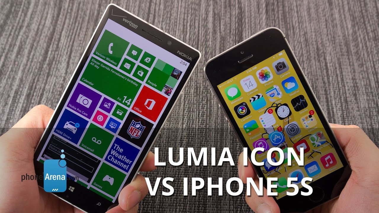
There’s no questioning that a lot of love and care has been put into the design of both smartphones, as they exhibit premium qualities with their constructions to make them solid looking things. Relying on a mostly polycarbonate frame, complemented by a supportive metallic bezel, the Nokia Lumia Icon surely feel likes a sturdy thing. However, the predominately brushed aluminum chassis of the iPhone 5s gives off a slightly more polished feel to its design – thus, coming off as more premium. Minor drops shouldn’t test the constructions of either, but at lengthy heights, we can only imagine the kind of damage metal on concrete can produce.
Visually speaking, it’s really tough to say which of the two we find more appealing. You could argue that the two have generally flat designs – though, there’s a subtle tapered look to the Icon that breaks up its otherwise boxy shape. When it comes to comfort, the iPhone 5s’ form fitting frame combined with its lighter weight, makes it the more ideal device to hold in the hand. Indeed, they both employ metallic bezels around their trims, but for some reason, the Icon feels rather sharp around the edges.
We really can’t complain about the placements of their physical buttons, since they’re in locations we’re commonly familiar seeing them at. For the Lumia Icon, they’re all sitting along the right edge – whereas the iPhone 5s has its power button on the top right corner, and its volume controls on the left edge. Still, we appreciate that we can quickly launch the camera app by pressing down on the dedicated shutter key of the Icon. Nowadays, it’s a process accessing SIM slots on many high-end smartphones, so we like how the SIM slot of the Icon is easily accessible by just prying off the slot with the aid of our fingernail. Continuing to be a rarity amongst smartphones, we can’t deny the usefulness brought on by the iPhone 5s’ Touch ID fingerprint sensor to unlock the smartphone.
Display
In this day and age, there’s no denying the obvious that the iPhone 5s’ 4-inch 640 x 1136 Retina Display is tiny – even more when we compare it to the larger 5-inch 1080p HD OLED panel of the Icon. Doing the math, the Icon’s pixel density of 441 ppi tells us that it’ significantly superior on paper over the 326 ppi tally of the iPhone 5s. Nevertheless, it doesn’t mean a whole lot unless we look at the two display side-by-side very closely, seeing that from a normal viewing distance, we wouldn’t be inclined to say that one is dramatically more detailed than the other.
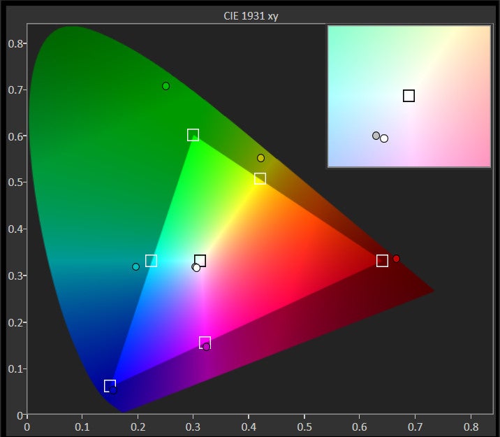
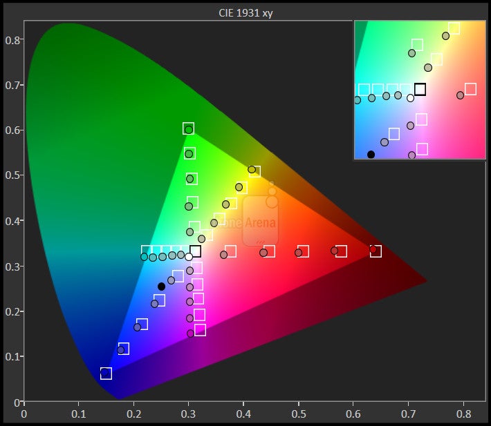
Factoring in that they rely on different display technologies, OLED for the Icon and IPS LCD with the iPhone 5s, they undoubtedly have their respective highlighting attributes. There’s that iridescent glow attached to the OLED panel of the Icon that continues to make our eyes fall in love with it, more so when its saturated color production gives it that wow factor in a dark room. Although we appreciate the intensity of its color production, it’s nowhere as realistic as the colors put out by the iPhone 5s’ IPS LCD display. Moreover, the stronger brightness output of the Retina Display shows its worth outdoors where the sun can be a glaring problem – whereas the significantly weaker brightness output of the Icon’s display makes it challenging to view.
Interface and Functionality
To an extent, a phone’s features set and design can only go as far to influence consumers on a superficial level, but ultimately, it’s the underlying platform experience that will be the determining factor. In this comparison, we have the Windows Phone 8 with the GDR 3 update for the Lumia Icon, and the iOS 7 experience with the iPhone 5s. Each has their own unique way of presenting the experience, so let’s quickly break them down to see how they fare against each other.
When it comes to the design and aesthetics of the platform experience, we like how there’s more of a consistent theme attached to Windows Phone 8. It’s made apparently clear right from the get-go, as it’s Start Screen is filled with several dynamic live tiles that are constantly shifting with content, which is undeniably more appealing than the static look of the iOS 7 home screen. Nonetheless, the new layered and transparent design language brought on by iOS 7 gives Apple’s mobile platform more appeal than ever before.
Multitasking is handled in the same manner with the two, however, the simpler and more accessible notifications panel of iOS 7 makes it light years ahead than Windows Phone 8’s implementation. By swiping down at any moment from the top bezel, we can access all of our notifications with the iPhone 5s, which is more organized than how notifications are delivered through Windows Phone 8’s live tiles.
Looking at their organizer functions, they generally mirror each other with their presentations and functions – albeit, we truly adore that Mobile Office is preloaded with the Lumia Icon. However, Siri’s vast offerings and smarter results blows away anything that Microsoft’s Bing experience has to offer on the Lumia Icon.
Even though the Icon presents us with a more spacious on-screen keyboard, it doesn’t necessarily mean it’s our preferred choice, as both keyboard are responsive and feature killer auto-correct functionality.
Processor and Memory
Speed is never an issue with these two, as their respective processors show us that they’re more than capable of handling even the most intense operations. For the Nokia Lumia Icon, it’s powered by the same processor featured in many of today’s contemporary high-end devices – a blazing quad-core 2.2GHz Qualcomm Snapdragon 800 SoC coupled with 2GB of RAM and the Adreno 330 GPU. On the other side, the iPhone 5s’ 64-bit based dual-core 1.3GHz Apple A7 processor continues to be a rare figure amongst the landscape.
Apple’s pride and joy is available in the usual capacities – 16GB, 32GB, and 64GB. For the same price you’d pay for the 16GB iPhone 5s with a 2-year contract, the Nokia Lumia Icon shows its generosity by giving users a healthy 32GB of storage.
Internet and Connectivity
There’s a lot to like about the web browsing experience with these two smartphones, especially taking into consideration that they offer fast 4G LTE speeds, quick page rendering, and buttery smooth navigational controls. However, the larger and more high-resolution screen of the Lumia Icon makes it the more ideal device for the occasion.
Fortunately, these Verizon specific models are world phones, seeing that they’re meant to work with CDMA and GSM networks. In addition, they feature the latest set of connectivity features that include aGPS with Glonass, Bluetooth 4.0, and dual-band Wi-Fi. It’s worth mentioning that it’s only the Lumia Icon that packs on NFC connectivity and wireless charging.
Camera
The iPhone’s camera app doesn’t make any strides to give users control. On one hand, we appreciate its simple operation and minimal fuss, as it’s all about having a frustration-free experience. And on the other, it would be nice to have some functions and features at our disposal. Fortunately for the Lumia Icon, we get just that with its rich camera app. Not only do we have manual controls to help give us the best composition for our shots, but there are several ‘lenses’ and Nokia-branded photo apps to diversify its arsenal.
Before diving right into their qualities, let’s briefly talk about the camera gear that’s in tow with each. Over on the Lumia Icon, it’s outfitted with a 20-megapixel PureView camera, which features ZEISS optics, a wide-angle f2.4 apertures lens, optical image stabilization, and dual-LED flash. Not to be outdone, the iPhone 5s bears an 8-megapixel iSight camera that pack along a 1/3” backside illuminated sensor, f2.2 aperture lens, and a two-toned LED flash.
Yeah, there’s a huge discrepancy looking at the two cameras on paper – more so when the Icon’s 20-megapixel sensor just makes the 8-megapixel one in the iPhone 5s appear tiny in stature. To tell you the truth, the iPhone 5s does a magnificent job to match the Icon’s outdoor image quality. Heck, it’s almost hard to say which of the two delivers the sharper visuals unless we zoom into the shots through a computer. However, it’s only when we rely on the Icon’s larger 19-megapixel samples that we have a clear indication that it captures the stronger details. Beyond that, we’d be hard-pressed to decide.
Under low lighting situations, we continue to see them paralleling one another, as shots are generally bright in tone to draw out details in the scenery that would otherwise be missed. They’re usable no doubt, but the Icon’s camera is more prone to blurring due to its longer exposure, which isn’t much of an issue with the iPhone 5s. As a whole, we can’t deny the obvious here – it’s that they’re a cut above the rest in this particular area.
At the end of the day, both handsets excel dearly in this specific area. However, the one defining characteristic that gives the Nokia Lumia Icon its slight advantage, is in how its 19-megapixel snapshots meticulously captures the stronger details under bright conditions. Beyond that, we could argue that the two closely match one another.
Shooting high-definition 1080p videos is another specialty with these two, especially when the overall package is just smashing on so many levels. Mimicking the results we already saw with their still image capture, they’re able to produce videos that are rich with detail, balanced colors, and moderate exposure adjustment. However, we’re inclined to give the Icon the advantage primarily due to the additions of having continuous auto-focus and 3x lossless zoom features.
Multimedia
Whether it’s the stock Windows Phone or Nokia MixRadio music apps, we’re constantly finding ourselves affixed to its enchanting presentation – more so than the iOS 7 stock music player. It might be the smaller of the two, but the iPhone 5s’ internal speaker does a great job in nearly matching the output of the Icon. Yet, it’s Nokia’s latest smartphone that churns out the stronger audio from its speaker.
When you have the larger and higher resolution screen, you’re sure to impress folks when it comes watching high definition videos. Of course, the IPS LCD panel of the iPhone 5s is stunning on its own, but the iridescence and glowing aura of the Lumia Icon’s OLED panel is more potent in catching our eyes.
Call Quality
It’s a clear win for the Nokia Lumia Icon when it comes to call quality. In fact, voices on both ends of the line are nearly excellent – with background totally noise silenced. It also helps that its earpiece and speakerphone are both powerful in tone to use when it’s under noisy environments.
Battery
Due to its larger size, the Nokia Lumia Icon boasts the larger battery between the two – a 2420 mAh one that gets us 4 hours, 50 minutes of juice using our battery benchmark test. Certainly smaller, the 1570 mAh battery of the iPhone 5s surprises us by outlasting its rival by drawing out 5 hours, 2 minutes of power from a full charge. So yes, it’s a victory for Apple’s pride a joy, but a small one at that. In our real life experience, we can happily report that the two offer usually a solid one-day of battery life.
Conclusion
Now that we’ve pitted these prized devices in several categories, you’re probably wondering about our verdict. Before diving into that, we have to talk about pricing, since it’s a vital determining factor for a lot of things. Looking at their on-contract pricing, there isn’t anything separating them, as they both wield $200 on-contract prices. Technically though, you’re getting the 16GB version of the iPhone 5s for that price – versus 32GB with the Lumia Icon. Furthermore, if we’re to look at their outright pricing, we save a considerable amount of savings by going with the $550 Nokia Lumia Icon, which looks a lot more forgiving than the $750 figure attached to the 32GB iPhone 5s.
It’s really tough to say which exact one to go with in the end, but you should know that the platform experience should have a lot of weight into the decision. Windows Phone is on that developmental path where it’s gaining a lot of momentum, though functionally, it still pales in comparison to what iOS 7 brings forth on the iPhone 5s. It might not be visually pretty as Windows Phone 8, but iOS 7 sticks it firmly by keeping the experience simple and straightforward – the hallmark characteristics in any successful mobile platform.
Value is something you’ll get by picking up the Nokia Lumia Icon, since it’s packing some wonderful hardware under the hood – plus, it’s the winner too when it comes to taking photos. On the flip side, there’s a premium to pick up the iPhone 5s, which is the likely case we’ve come to expect nowadays. The off-contract price is undoubtedly stiffer, but iOS 7’s maturity shows in its polished apps and diversified ecosystem.











Things that are NOT allowed: