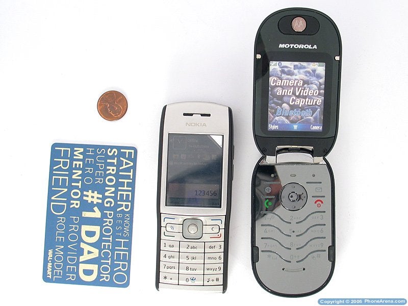
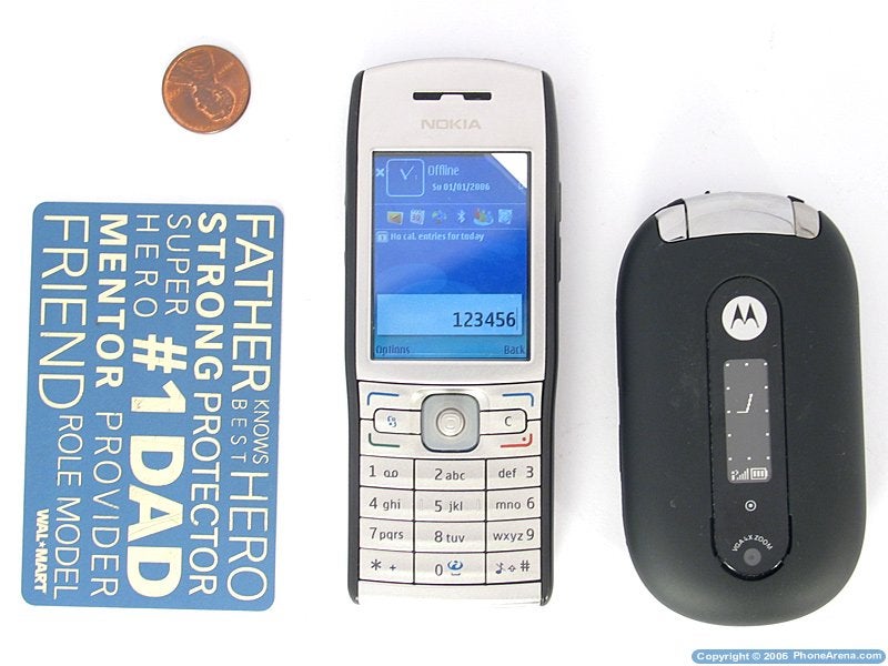
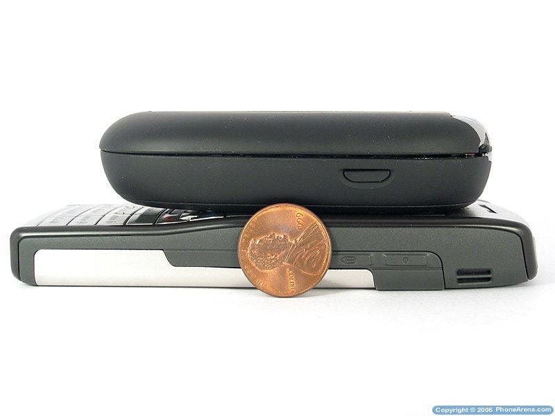
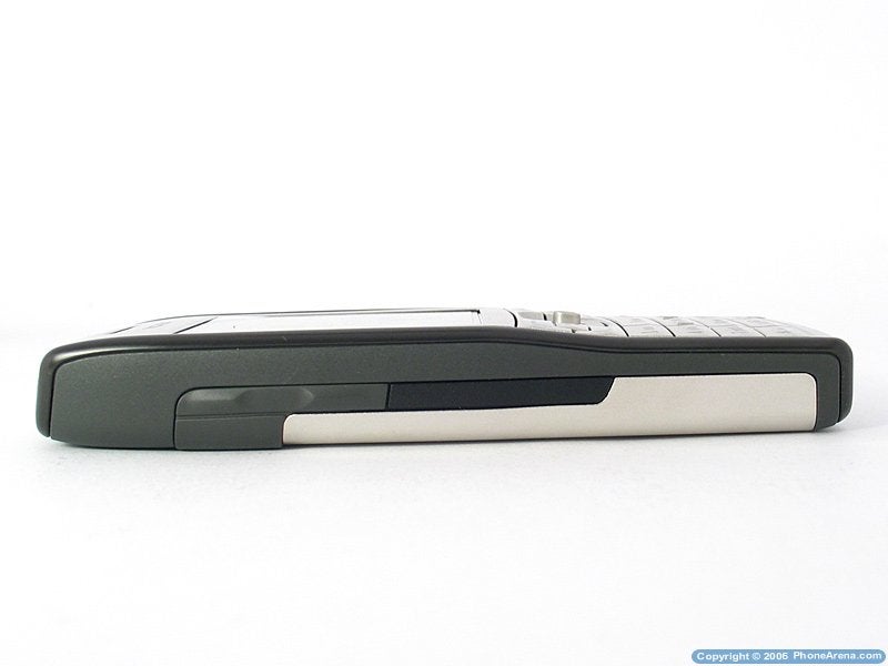
Nokia E50 is the latest model of the Nokia E-series, which is the business-oriented line of the biggest mobile phones manufacturer. Unlike the E61 and E70, the E50 has neither a QWERTY keyboard, nor 16 million color display, but it's the slimmest smartphone produced by Nokia up to now with its 15.5 mm thickness and even being 11 mm thick at the keypad, which is the reason for the good weight distribution so that the phone feels solid in the hand. Design-wise the phone is relatively narrow and thus resembles the legendary 6310 which was the best business phone back then, and that's exactly what E50 is aiming at as the emphasis is laid on design, good phonebook and applications like Office, PDF Reader, Text to Speech and User-independent Voice Recognition.
Design:
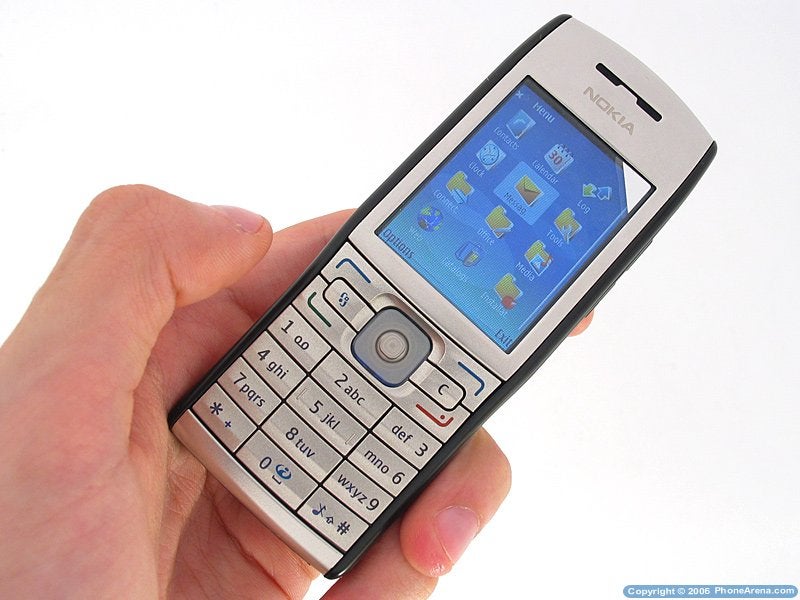
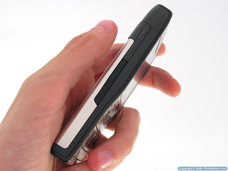
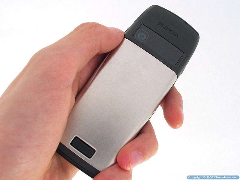
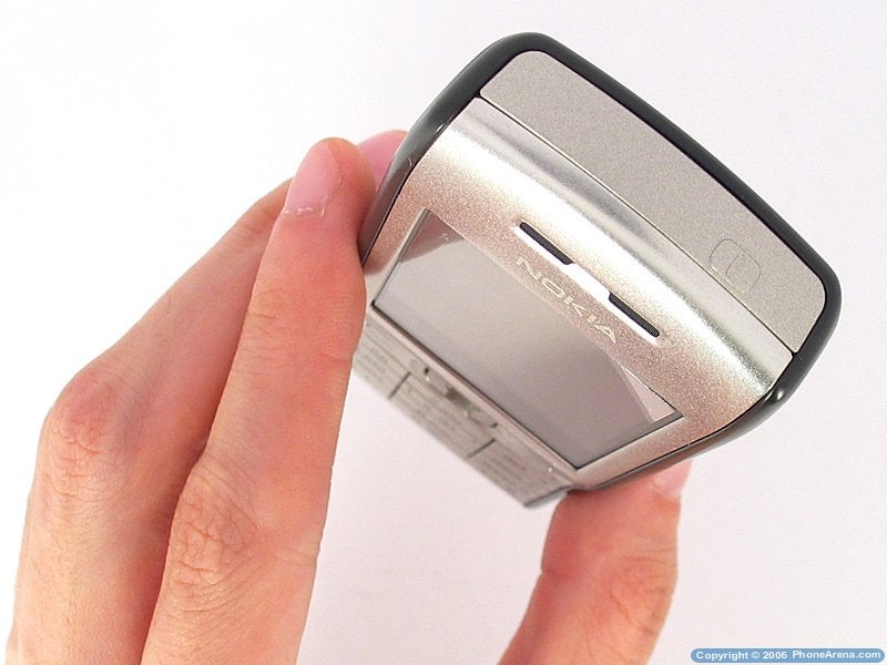
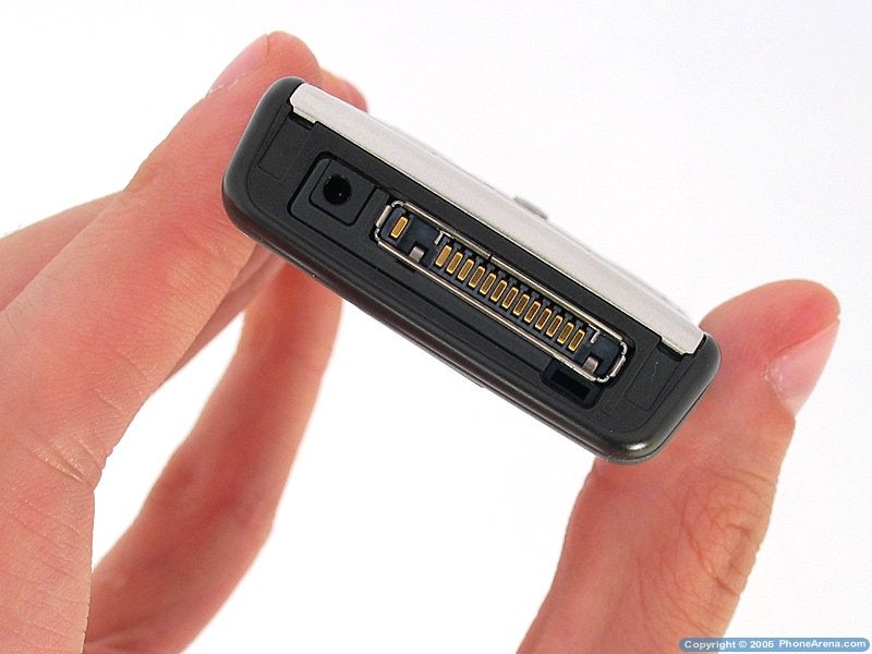
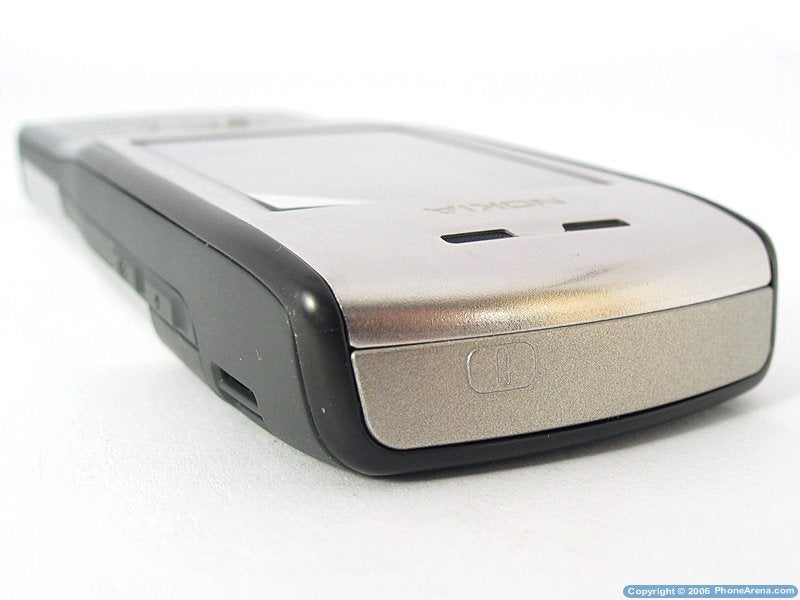
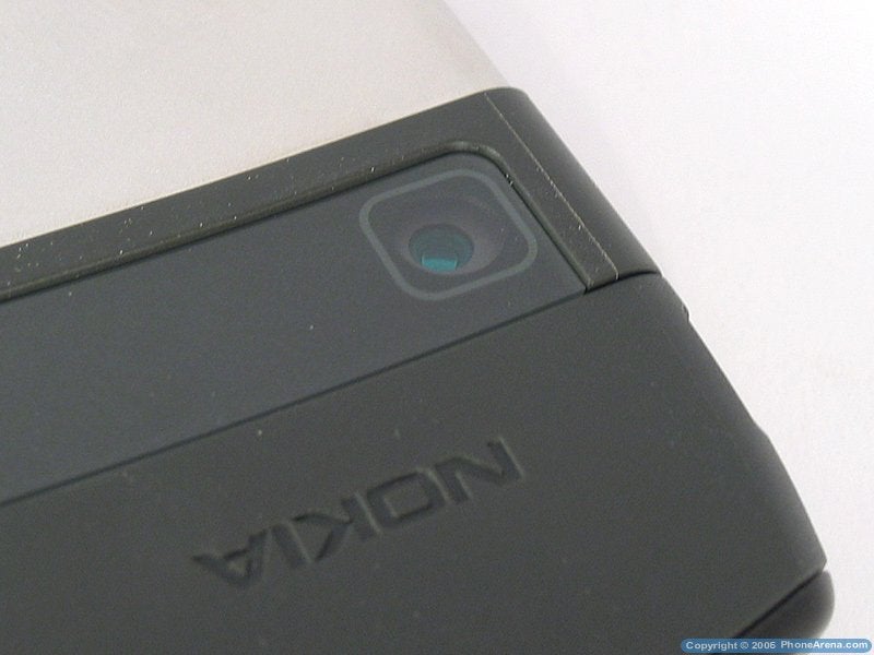
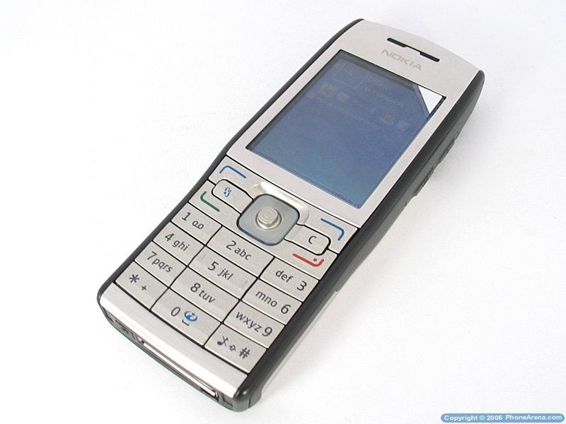
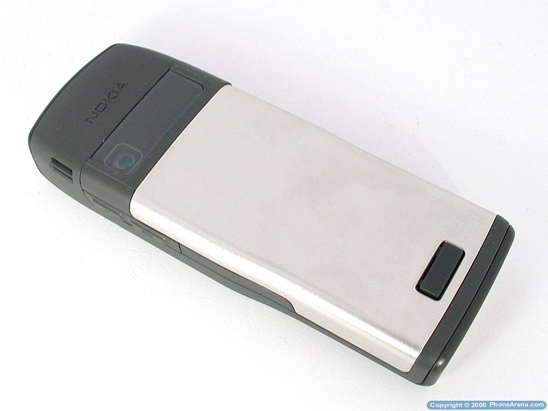
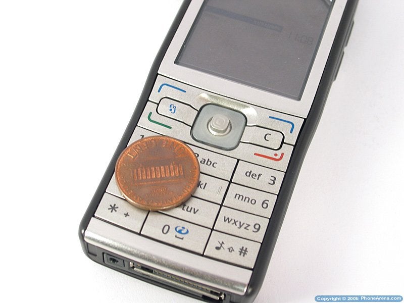
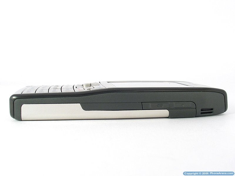
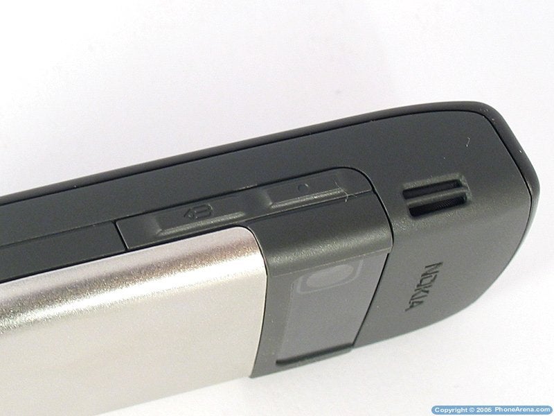
The phone is in a classic candybar design with graceful and stylish outline a large part of the phone is made of metal the surface around the display and the whole battery cover, which takes up most of the back side of the phone.
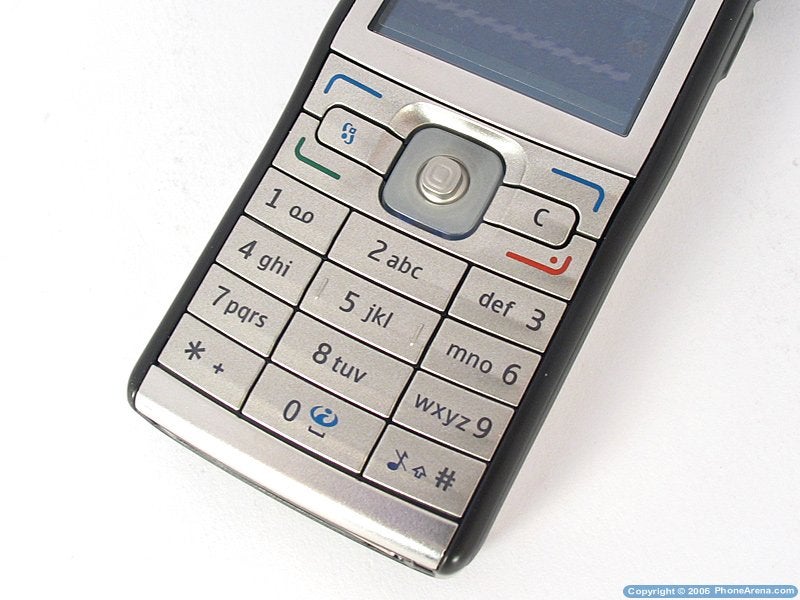
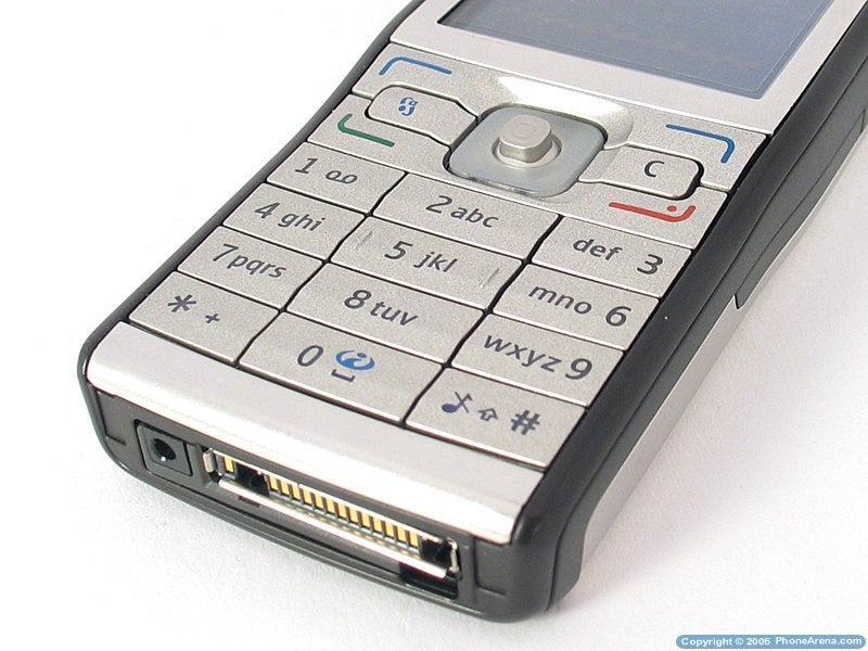
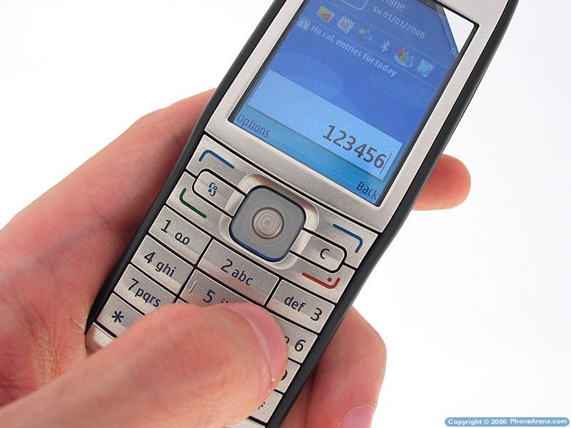
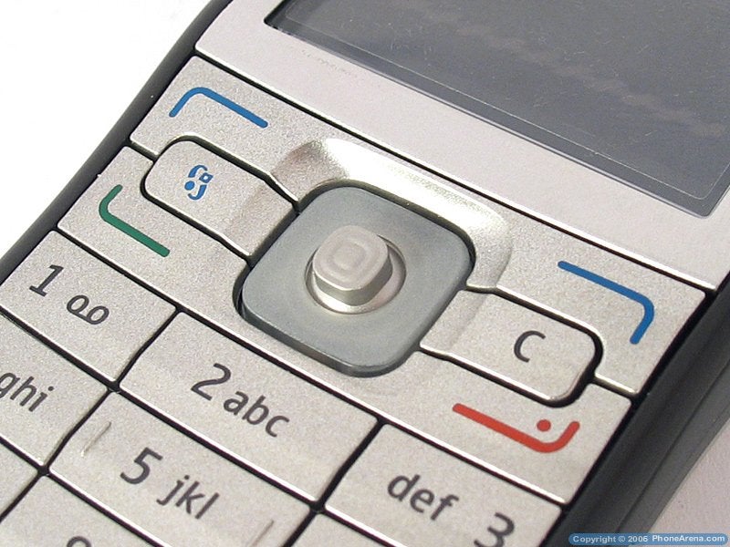
The rest is made of dark grey matte plastic and the keys, despite being plastic, are the same color as the metal parts and suit really well to the whole design of the phone. They are tightly placed next to one another with no space between them and the size of the buttons in the middle column is slightly bigger. Although each of the keys is raised in the middle (horizontal axis), they are sometimes hard to distinguish and there's a big possibility of making a mistake while typing they are also a bit hard to press, and a quiet but slightly annoying sound can be heard when this happens. The Clear and Menu buttons are the smallest ones and the latter is quite often used, and you have to press it with the top of your finger which makes it very uncomfortable.
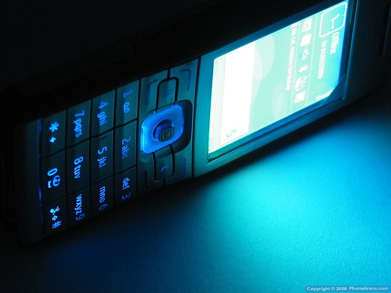
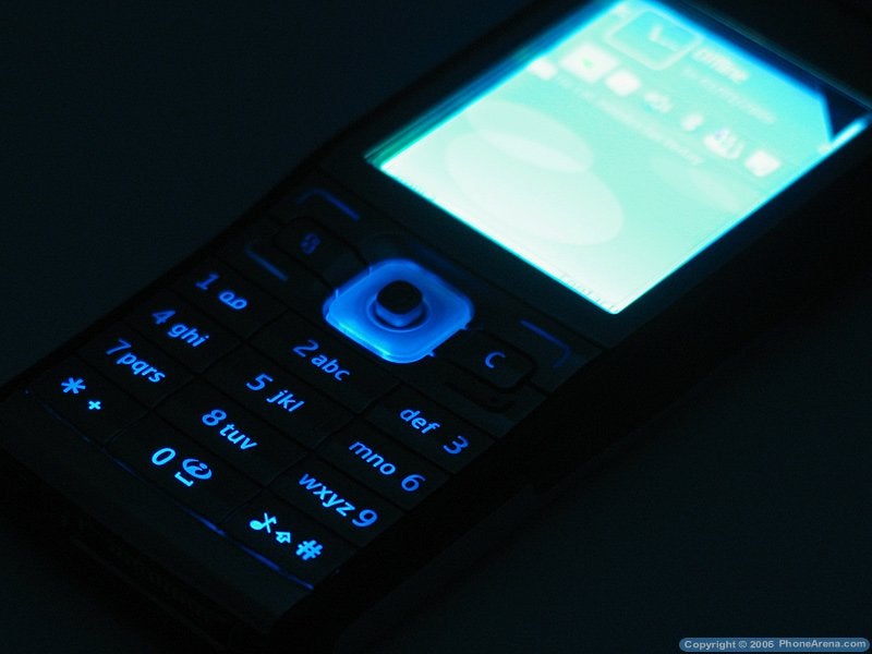
The joystick is nicely located between the system buttons and it's enclosed so that you can not make a mistake while using it. The surrounding area lights up when the backlight of the keypad in on, the color of which is blue. The backlight is weak and you can hardly see the numbers in the dark, while the letters are almost impossible to read, unlike the display. It is bright enough and well-lit thanks to the light sensor and it's clearly seen even in bright sun light. The display is a 2-inch one with a resolution of 240x320 pixels and can reproduce up to 262k colors, which are not very saturated. The pixels are small and pictures viewed on the screen look precise and detailed, but the contrast could've been stronger.
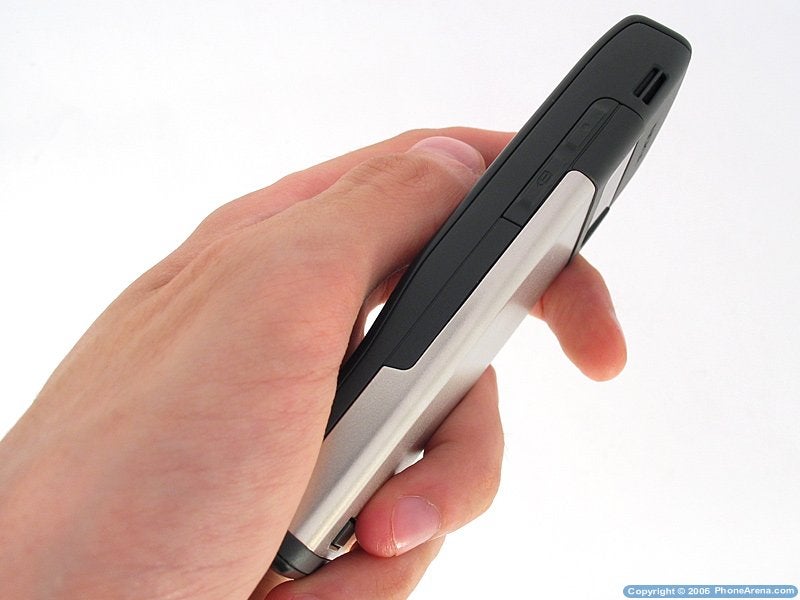
The phone has four side buttons the two on the left side are for the sound volume and the ones on the right side are the Voice Key and the Edit button (a pencil). The latter is usually located on the front side of the phone it's used both for changing the way you enter text and selecting/marking multiple fields/items at a time a few pictures for example. The volume control buttons are easy to reach only if you hold the handset next to your ear; if you use it with your right hand, you have to move your hand to reach them as your fingers are at the back of the phone.
The Power button, as usually, is located at top; it's a bit hidden as you have to push the whole surface which in turn comes into contact with the button underneath. This is uncomfortable but at the same time it makes sure that the button will not be pressed by accident while the phone's in your pocket.
Interface:
E50 is a phone running on Symbian Operating System with Series 60 interface. The version of the interface is v.9.1, which is the latest one up to now that's why it's similar with other phones by the manufacturer, like the E70 and N80 for example. S60 is the most used interface for Symbian, and Nokia has a lot of models using it, while it's also used by other manufacturers (Siemens, Samsung, Sendo). Unlike the UIQ interface, it still has no touch display support which makes it more similar to WM Smartphones than Pocket PCs.
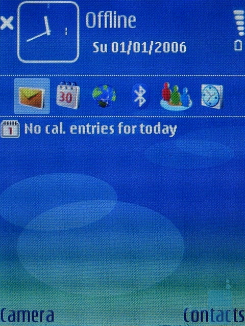
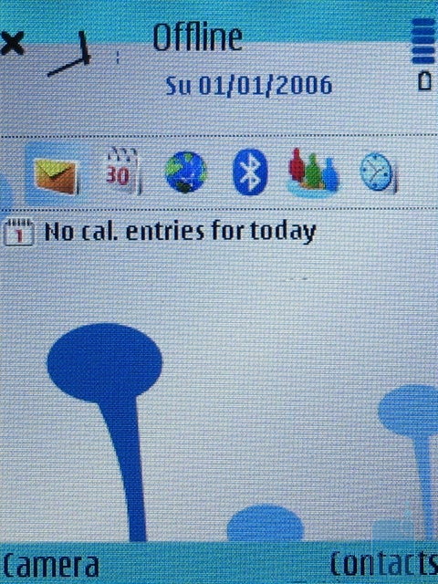
The top part of the homescreen displays a clock and the date, as well as the usual signal strength and battery, while the name of the carrier or Offline can be seen in the middle. The Offline tag indicates that the E50 works only as an organizer with the phone function switched off (that's handy for using the device during a flight). Just below these is located a row of 6 shortcuts which can be personalized to suit you best. The rest of the display, below them, is used for notifications this is where missed calls, upcoming tasks (or To-Do in the calendar), received messages are displayed, as well as the music player status (the song that's played at the moment). The various capabilities of this Active Desk can be set to serve you best. It resembles a well-personalized homescreen of a Pocket PC with Windows Mobile OS and is really useful and pleasant to use, and it saves a lot of time. Located at the bottom of the screen are the two software buttons which can also be personalized from the Settings menu.
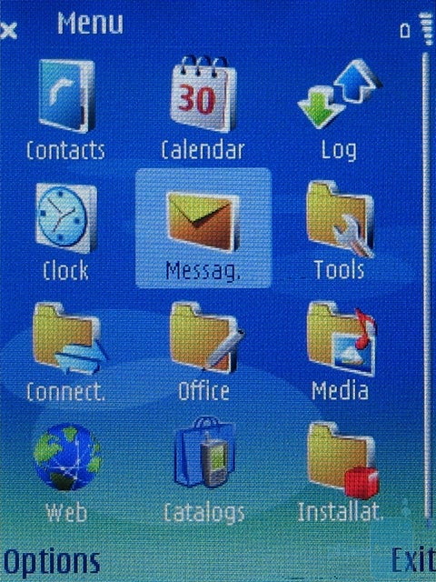
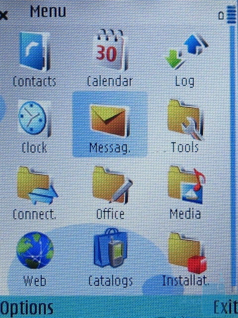
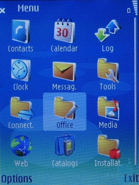
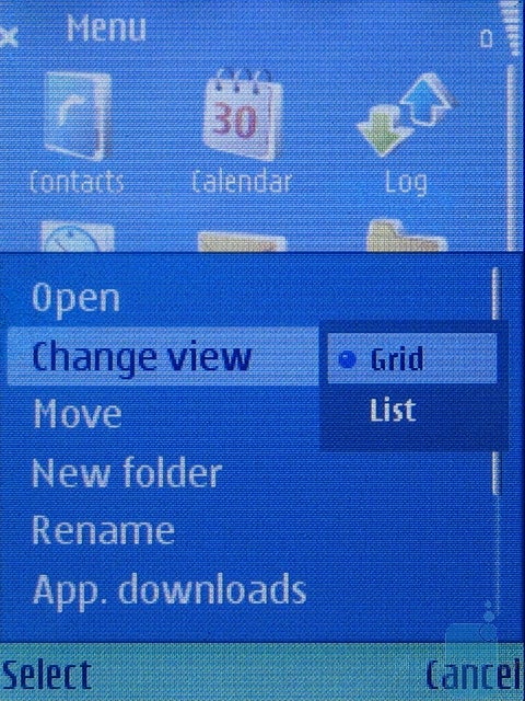
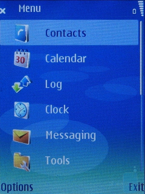
The main menu can be viewed as 3x4 grid of icons that can also be displayed as a list (it's chosen directly from the main menu) but the icons are not animated in both cases. The keypad buttons can be used as shortcuts a function which is much better implemented than version 6 of the S60 interface but still a lot of things should be changed: as the menu not always holds 12 icons (they can be more or less), scrolling up/down shows you different ones that should be associated with the keypad but they're not. If you press 3 while at the highest part of the grid, you'll select the icon located at the top right corner. But if you scroll down to reveal the other icons in this menu, pressing the 3 button will still open the afore-mentioned menu, not the one currently located at the top right of your screen; so these shortcuts only relate to the first 12 icons in a particular menu, while the rest (if there are any) remain without any shortcuts. If a button's function is dynamic and corresponds to the grid in the menu, you can click the button for a given menu without even thinking about it. Thus, you save the time you usually need to walk around the menus, using the joystick.
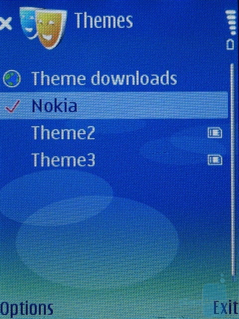
The menu can be personalized by using themes, and if you combine various screensavers and personalized homescreens, two identical phones can look quite different. Definitely, the operating system provides many good personalization options, so it can be compared to the most advanced system, according to us WM for Pocket PCs.
Phonebook:
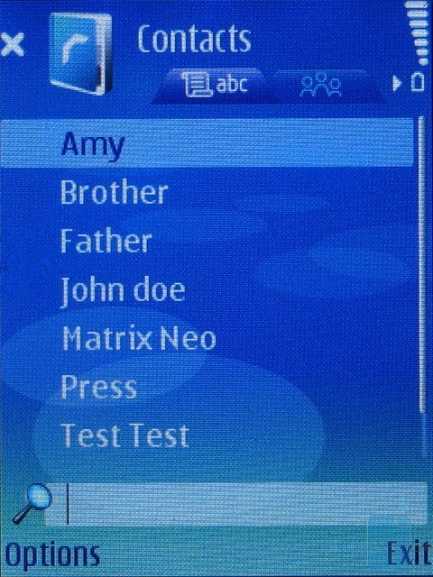
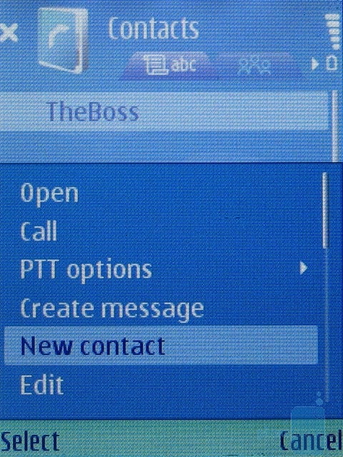
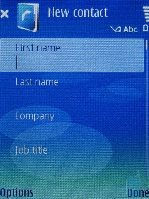
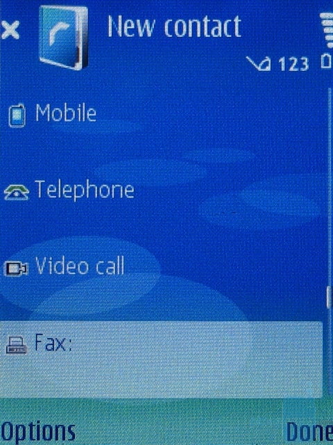
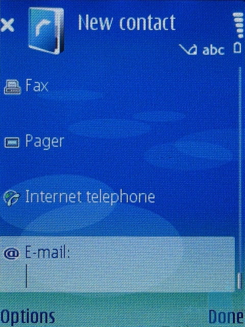
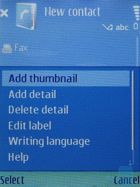
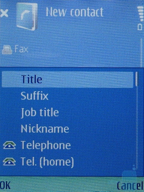
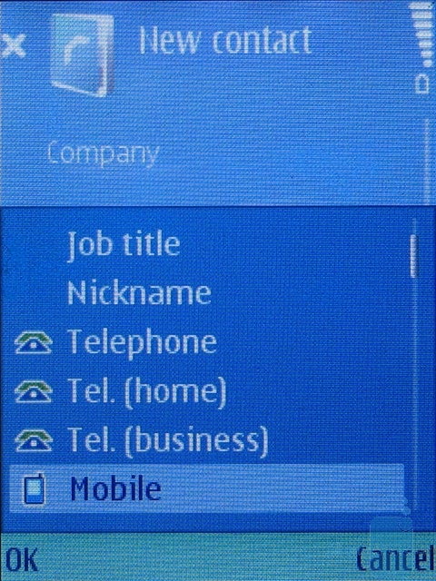
The Contacts menu is almost the same as the one in the older version of the S60 interface. All the contacts are displayed as a list and if there's a picture ID, it can be seen in the top left corner of the screen as a thumbnail with a very small size (it's the same when you have an incoming call and that's why we find this feature useless) when you select the contact. If you want to search, you type in directly from the keypad and searching is done for the whole name (not only the first word), even if the name is saved in more than one field (first and last name for example). If you want to edit a contact , you can only change the already defined fields. For adding more information you need to select the Add Detail menu. When adding a new contact you are provided with the basic fields, but with the Add Detail function you have almost no restrictions on the fields and their number and you can add a lot of phone numbers.
The phone has a set of voice commands they are speaker independent and you don't have to train every command, something that can save you a lot of precious time. By holding the voice key on the right side, the recognizer turns on and you can say a name (from the phonebook) to be dialed. Names like Father, Brother, test, John and Neo were no problem, but we had no success with others like Amy for example.
The voice-commands can activate various programs or perform different functions, like New SMS for example, but a list with different capabilities must be added to the menu - not all of them are added by default so that they're easier to recognize with any speaker thus by adding only the ones you need you can achieve best possible accuracy without the annoying training and it works, the voice commands were very accurate and we rarely experienced mistakes when launching applications.
Besides the Voice Control, the E50 can also save voice notes with the integrated Recorder, but this feature is oddly cut to maximum size of one minute (60 seconds) which is totally useless. Third party software could improve this functionality.
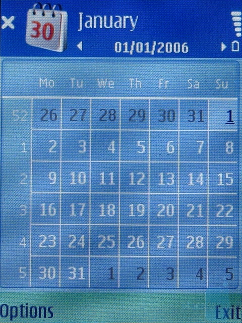
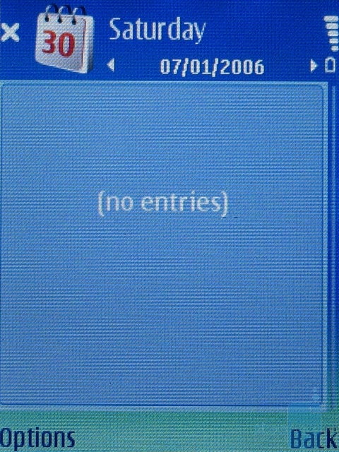
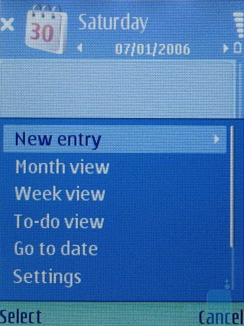
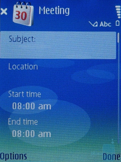
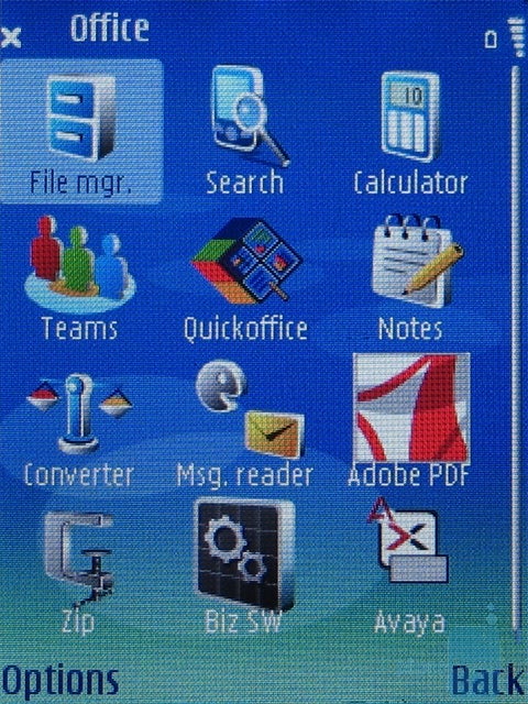
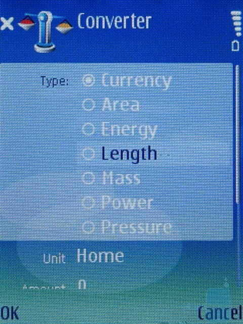
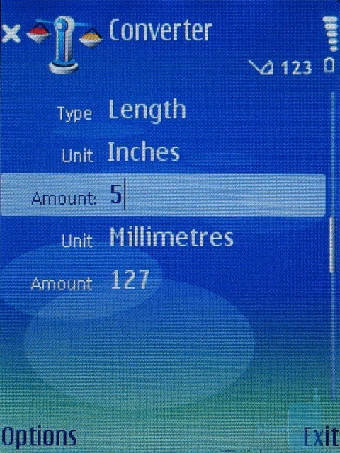
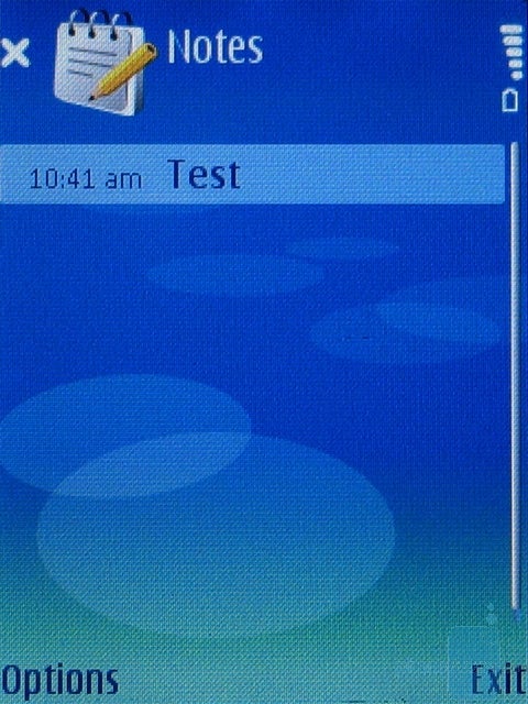
Organizer:The Organizer is spread into different submenus the calendar is one of the icons in the main menu and it can be viewed by month or week. Of course, you can easily add notes to a particular day with a few clicks; To-Do notes are also displayed on the homescreen if the corresponding option is turned on (see Interface). An alarm can be assigned to each entry in the calendar. Other options like Calculator, Notes, Converter and File Manager are located in the Office menu. Notes are just annotations with no option for adding an alarm like the To-Do notes. The Converter works with various quantities (Length, Weight, etc.) but the interface has not changed much, compared to older versions and working with various types is still inconvenient entering different values requires a quite slow transition from one row to another, while choosing types is done from a drop-down list, which usually takes a lot of time.
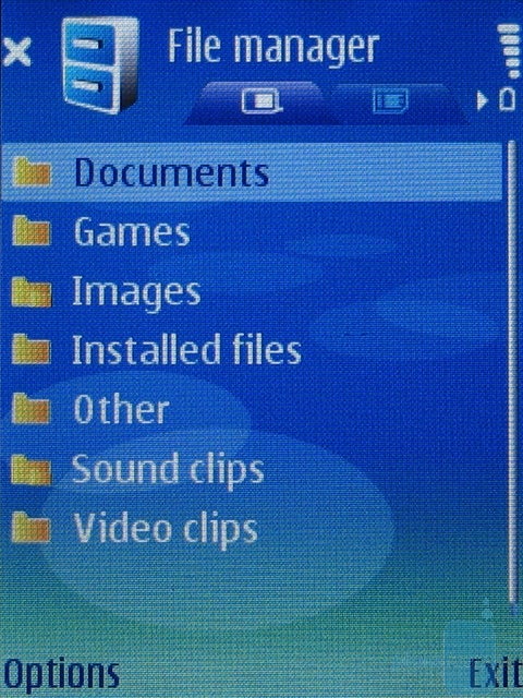
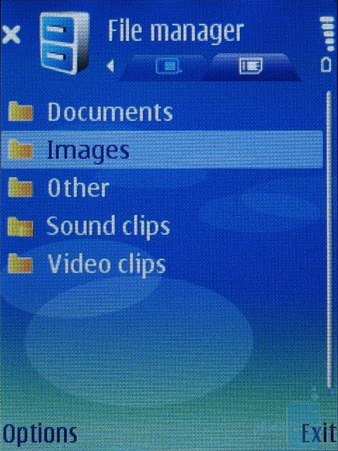
The integrated File Manager is not bad, but third party programs do much better we would've liked it if Nokia had improved the navigation here too. Unlike the PPC phones, it does not resemble the explorer we know from PCs and working with files is not quite fast.
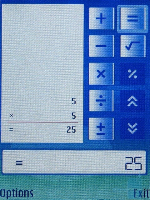
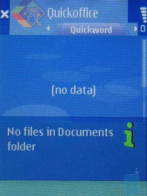
The calculator has no scientific option, like the one in the 6131, which is a lower level phone. Alarms are located in a third menu Clock. If fact, there's only one alarm, and it's set for a particular hour Symbian S60 has no capability for duplication (unless you use 3rd party software). The World Clock is also located in this menu and you can add various cities that you like to view that's very convenient and saves a lot of time compared to the standard way with moving across the world map". We're glad to see the reinstalled Adobe PDF Reader and QuickOffice which also allows you to edit Word Documents.
Messaging:
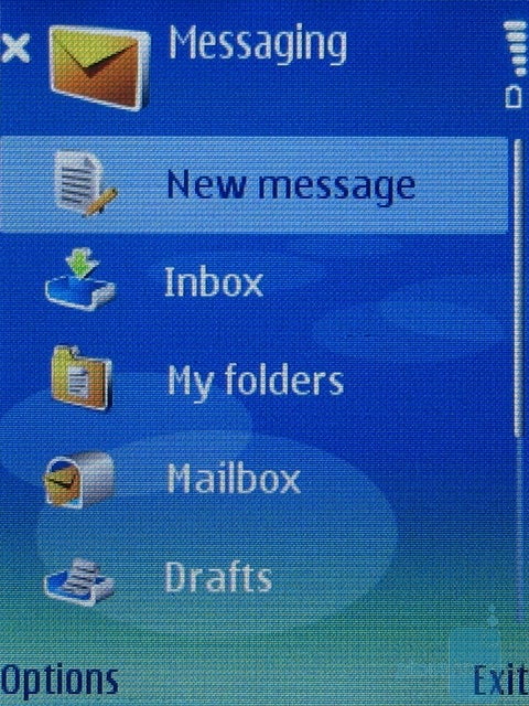
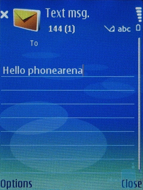
The Messages menu has nothing new to offer you can easily compose SMS/MMS or Email and located in My Folder are templates which are handy for text that is often used in messages. The fast T9 can help you enter text quickly, but the keypad is an obstacle as it's not quite comfortable. The EDGE connection is a big plus for working with Emails. An interesting option is Text-To-Speech, which reads your messages out loud, while different languages and voices can be added as separate applications.
Connectivity:
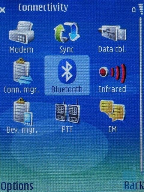
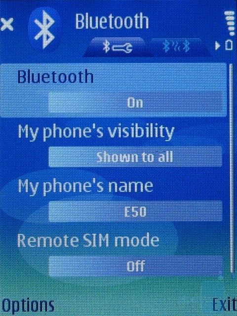
The Connectivity menu holds a lot of capabilities the supported Bluetooth version is 2.0, but it's a pity the multimedia A2DP profile for stereo audio streaming is missing. The phone also has an IrDA port, located on the left side of the handset, and offers further capabilities for connectivity with other devices, but it's an outdated technology and it's present in very few phone models these days. Unfortunately, the E50 does not support Wi-Fi, which is a standard for wireless network it would have allowed access to Internet in all hotspots (places with such kind of network), as well as usage of IP telephony. Wi-Fi would have been also very useful if the carrier supported UMA a service that's expected to be launched by T-Mobile USA. For over-the-air data the phone supports GPRS and the faster EDGE, but there is no sign of the 3G UMTS or HSDPA data here.
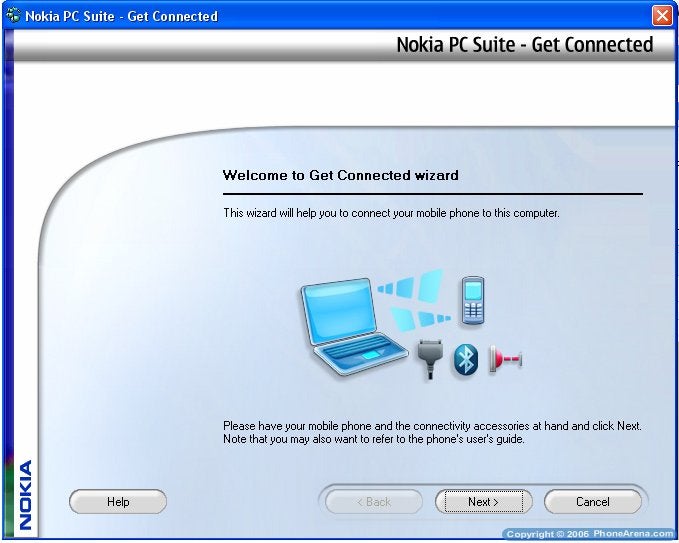
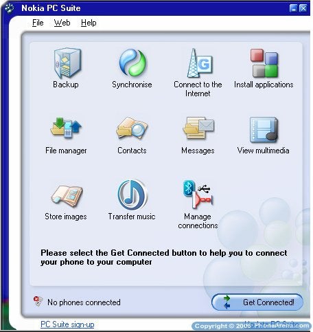
Like most other Nokia phones, along with the E50 comes a CD with Nokia PC Suite, as the version we got was 6.80.22. The software has a nice interface and logically structured and easy to use menus, but the options supported are nothing special here are the standard backup and synchronize, connecting the PC to the Internet via the phone, managing contacts, messages, multimedia and applications. Even if you've never used Nokia PC Suite you won't experience any troubles working with it and establishing a connection between the PC and the phone would be no problem with the USB cable provided with the E50.
Internet browser:
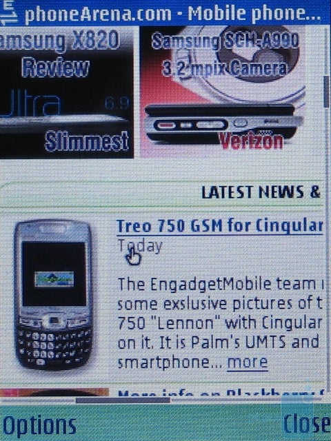
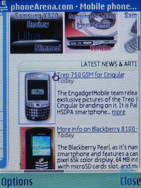
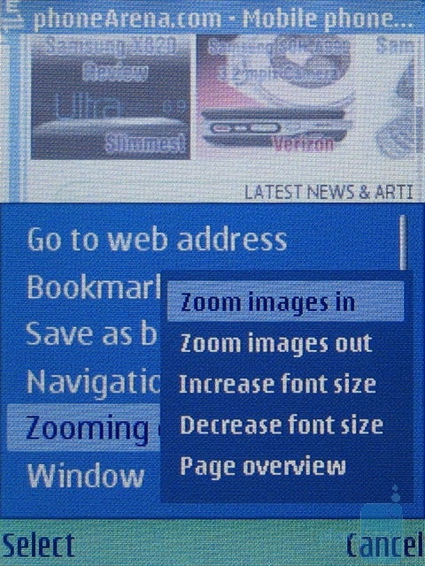
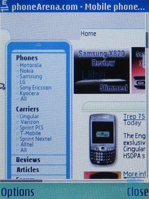
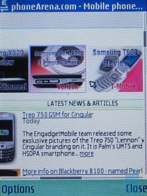
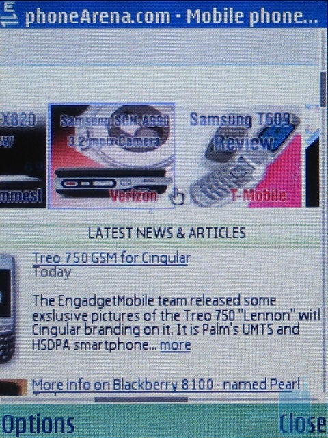
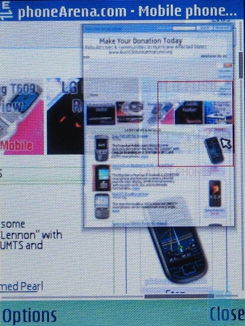
Thanks to the EDGE data and the QVGA resolution of the display, loading and viewing a standard HTML webpage is a pleasure. The phone has no problem rendering all standard pages and reading phoneArena's news was a piece of cake. Scrolling left-to-right and top-to-bottom is done with the phone's joystick, and a mini-map shows you, which part of the page you are looking at. The pages loaded pretty fast and as a whole, we had a great experience with the browser, so we definitely like it more than the Internet Explorer, built in Pocket PC phones based on Windows Mobile.
Camera:
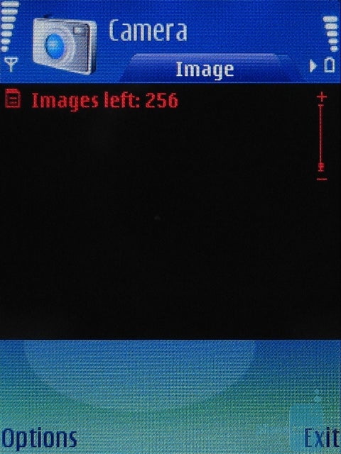
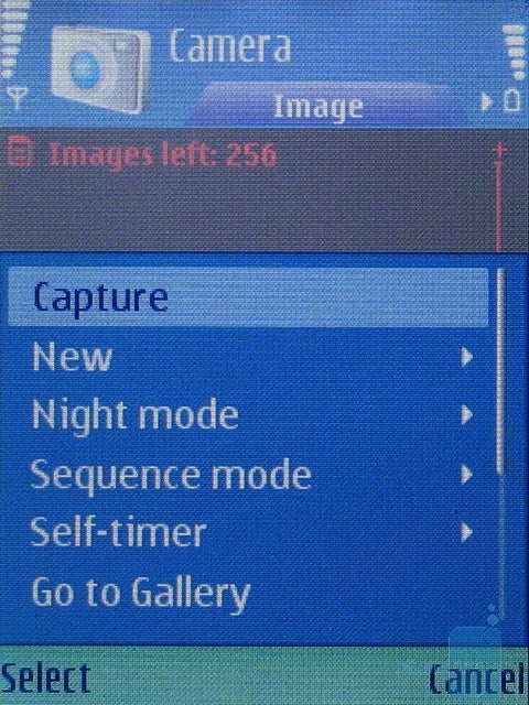
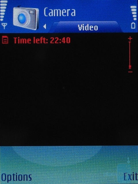
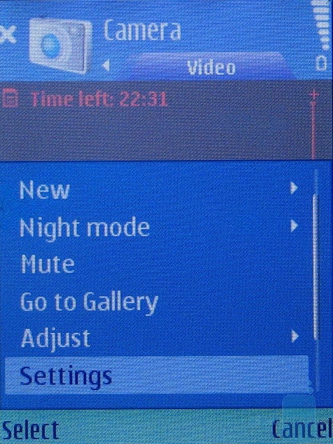
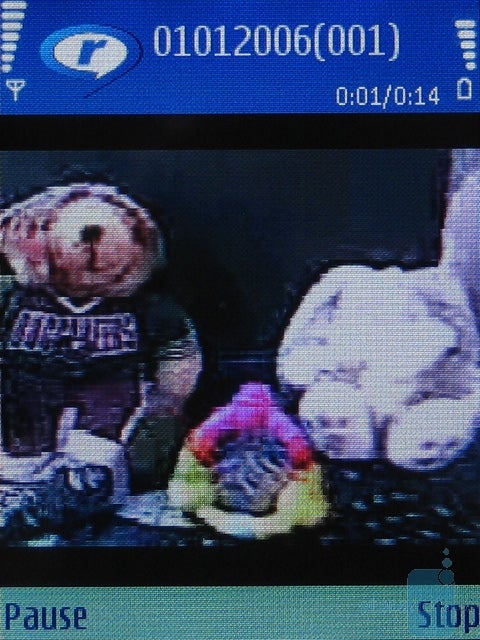
Besides the business functions the E50 also features the standard multimedia capabilities offered by a Series 60 phone a camera and music/video player. The camera resolution is only 1.3 megapixels, which is poor according to the current standards as there are already phones with 3-megapixel cameras on the market. But it is not intended to be a key feature of the E50, as the phone even has a version without a camera at all. The camera's interface does not even take up the whole display and the Viewfinder only occupies half of it, while the options available are color effects, white balance and night mode, which almost useless.
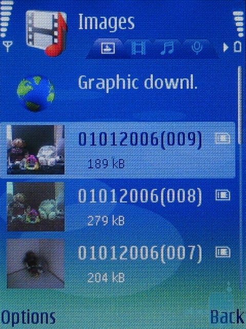
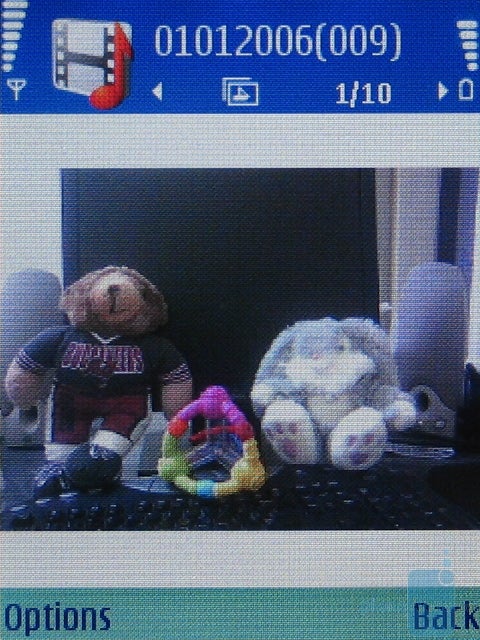
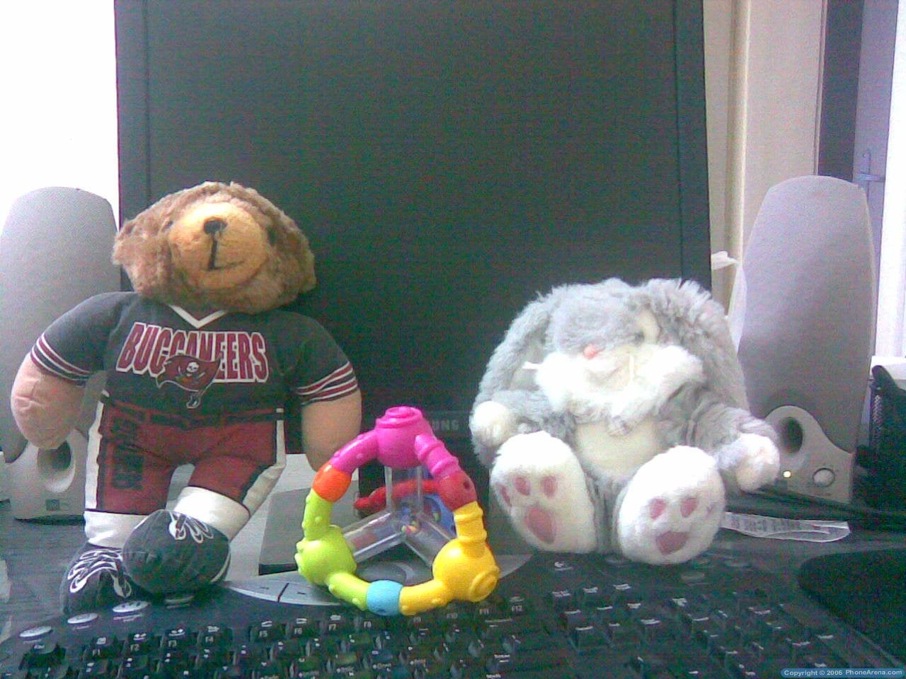
As far as picture quality is concerned, the E50 camera definitely can not replace your digital camera and the image quality is a standard one compared to other phones with 1.3-megapixel camera in order to get the best out of the camera you need a lot of light, but this may also cause overexposure and purple fringing of large areas of the picture. The noise levels are too high when the lighting conditions are not good enough and when taking pictures indoors, it is almost impossible to make them look normal. There's no flash to help you out in dark conditions and the night mode is useless although the slightly better results.
Multimedia:
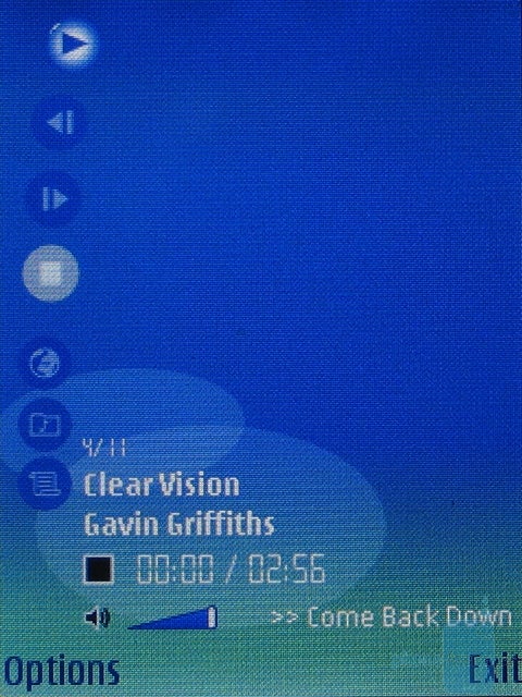
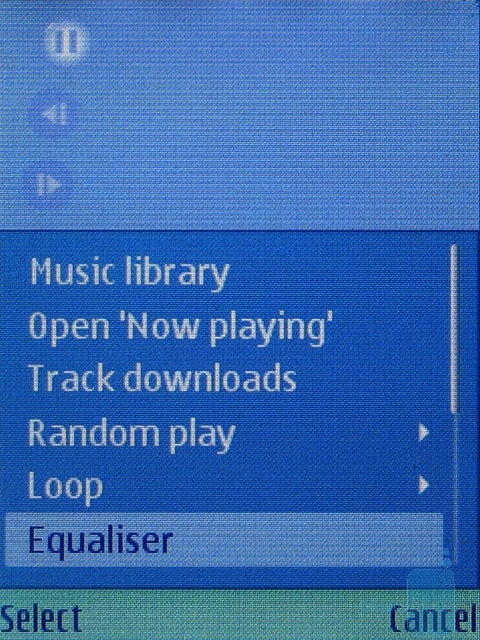
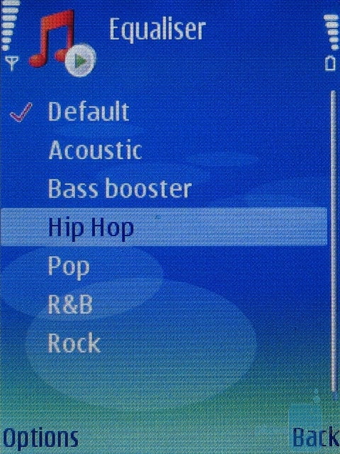
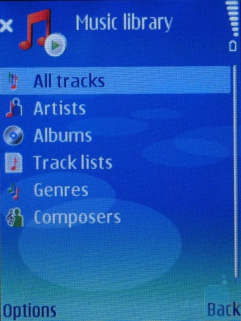
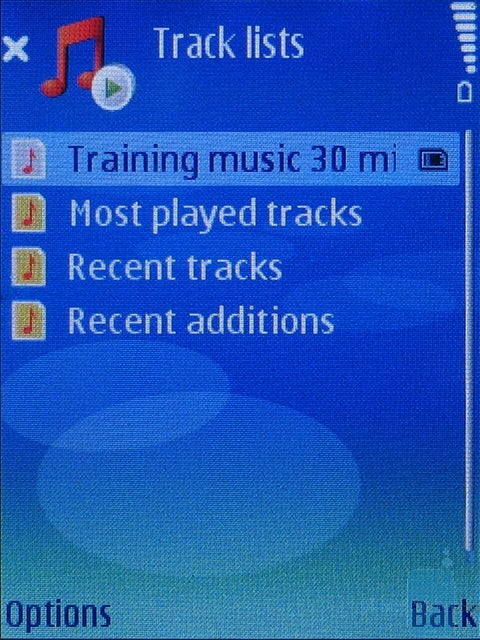
The phone definitely can not be a rival of iPOD too, and the interface of the music player is definitely prettier than the one of the camera. But it's still not quite comfortable moving through the options can only be done with up and down directions and the buttons are so small that you have to stare at the display if you want to see what each of them does this is a total waste of space and resolution. The Music Library menu allows you to sort your songs in MP3 or AAC format by Artist, Album, Genre, Composer, and we find the Track Lists option to be an interesting idea as it allows you to select the most played songs for example. The music player works fine in background mode thanks to the multitask capabilities of the smartphone, while the beautiful homescreen displays the songs that's played and the time elapsed by pointing at it you are allowed to adjust the sound volume of the player without even opening it.
Software:
The phone can use applications based both on the Java platform and Symbian S60, which provides wide 3rd party software compatibility like any other smartphone. Installation is a piece of cake, while additional programs increase the software's capabilities very much and thus it can be personalized to better suit you. The phone comes with various applications, as well as a few games, one of which is the 3rd version of Snake.
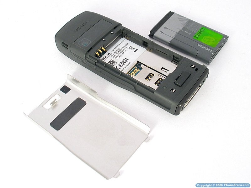
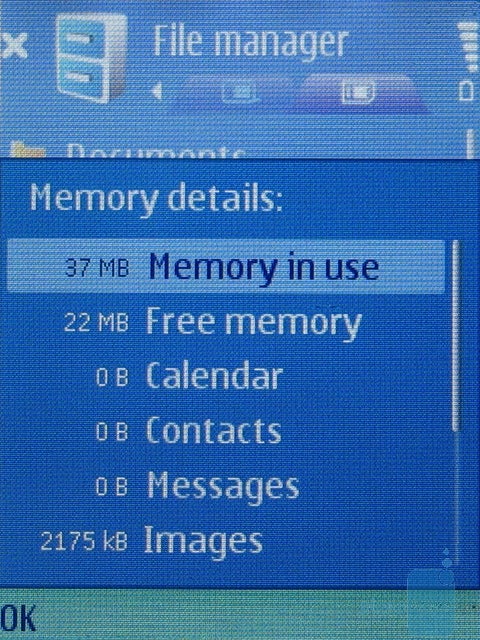
E50 has 70MB of internal memory and it can be expanded with a microSD card. The slot for the latter is located under the battery cover but hot-swap is still supported. However, that's quite inconvenient and we'd rather have the port on one of the two sides of the phone, even if there's no protective cover we'd sacrifice the style and the design of the phone for a little convenience.
Performance:
The E50 does not stand out with speed performance and we experienced some annoying waiting when some of the menus were loaded, which should not be the case with a business phone, especially when it is a smartphone with Symbian OS.
Overall, music played with the phone sounds good but the volume is not high enough and there's a great possibility that you do not hear it if you're in a noisy environment. The phone's definitely not good enough to act as a portable music system but that's not what it's supposed to do, unlike the Walkman phones by SonyEricsson for example. The vibrating alert is quite powerful and makes up for the low sound volume but you could still miss a call if you carry the phone in you bag.
The outgoing sounds quality is good, but high frequency sound reproduction is a bit poor. The sound from the earpiece is a bit quiet and unreal, as the voice sounds a bit dim but what's said could still be understood. The E50 comes with a powerful battery with a capacity of 1150 mAh which, as claimed by the manufacturer, provides up to 8 hours of talk-time and up to 10 days in stand-by mode which is quite good for a smartphone with such a small size. In fact, even a few days with one charge is a good accomplishment. RF performance is typical for a Nokia strong signal and no problems during the testing.
Conclusion:
Nokia E50 combines high functionality and stylish design with a very good size for a smartphone, but a uncomfortable to use keypad and slow navigation through the menus, which affects the usage of the phone as a whole. In order to make the phone suitable for business users, Nokia has decided to use a powerful battery, a large and bright display and metal parts, but the sound quality and the speed performance are something to complain about and these are things very important to the business user.












Things that are NOT allowed: