Nokia 8800 Sirocco Edition Preview

The Nokia 8800 Sirocco Edition is an upgrade to the last year released 8800 slider. The handset draws its name from the powerful Sahara desert-born wind hinting at the graceful, yet solid looks and feel of the device, while it also features a special soundtrack composed by Brian Eno, considered the "father of ambient music". The phone is part of the Premium series which consist of phones that are regarded as high-end models not because they have any extraordinary functionality but because of their unique fashionable design and built quality.
Upon opening the phone, the 2-megapixel camera at the back is revealed. It replaces the SVGA unit that was in the 8800 and is in fact one of the main hardware upgrades of the handset, along with the doubled amount of internal memory - now 128MB.
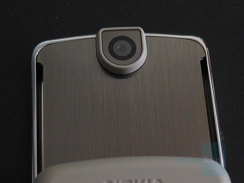
The surface around the camera of the Sirocco Edition is now matte, instead of the glossy one in the original 8800 model. It's not a bad idea as it gives the back of the device a very different and yet nice looks. Yes, the trendy glossy-surfaced phones are eye-catching but can be really annoying sometimes as they're like a magnet to fingerprints.
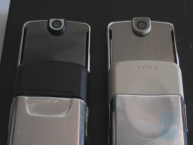
The opening mechanism of the device is the same like the original, utilizing stainless steel bearings that make sliding the phone in both directions really easy, smooth and pleasant.
When the phone is closed, almost half of what you see is the 208x208 pixel TFT display which is capable of displaying up to 262k colors. It is covered by a special scratch-resistant sapphire coated glass, which combined with the stainless steel built of the rest of the handset gives it a really solid look and feel.
Just between the screen and the slider (when closed) are located the two soft keys. As we already mentioned, the non-functional button from the original 8800 is gone, so those two are in fact comprised in a single button. It should be pressed at the left or the right half, in order to use one of the two keys respectively. Located just below it are the Answer and Reject keys, the navigation button and the keypad, which are all very different to the 8800's ones. The first thing you will notice is that the Answer and Reject keys are now quite bigger, almost double-sized, and far easier to use.
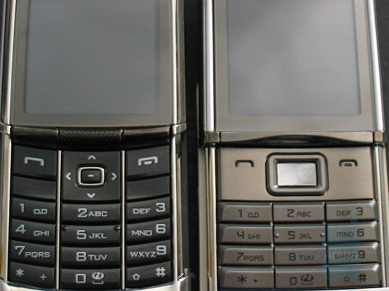
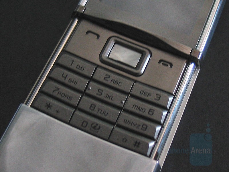
The keypad's backlight is as bad as the one in the original 8800 phone - the light is bright and concentrated in the center so the keys located there are highly visible, while the rest (like the 1, 3, *, #) look dim and are almost impossible to see in the dark. Another thing is that the navigation buttons are not lit at all which is a major inconvenience, in spite of the unique design of the OK key.
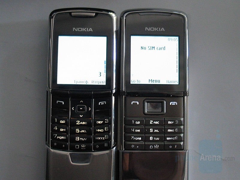
As far as the interface of the device is concerned, it is very similar to the one used in the original 8800 phone, as the only obvious thing we noticed was that the Sirocco Edition's menu had no animated icons, which makes it a bit dull. Otherwise, there are no major changes in that department and we were not able to notice any during the little time we had the Sirocco Edition at our disposal.
As an upgrade to the original 8800, the Sirocco Edition features a slight facelift that, we particularly think, makes the phone look sleeker and more stylish. The improved tactile response and design of the keypad are a good idea by Nokia, but it's still quite uncomfortable to use as the numeric keys are very small. Meanwhile, the shooter has been upgraded to 2 megapixels which is important as that has become like a standard lately. You will also be able to store more multimedia content now as the amount of internal memory you have at your disposal is doubled, but unfortunately, there's still no cards support for expanding it. However, if you're looking for a stylish and fashionable handset that would make people around you go WOW and you cannot afford a Vertu phone, then Nokia's 8800 Sirocco Edition is definitely a good option.






Things that are NOT allowed:
To help keep our community safe and free from spam, we apply temporary limits to newly created accounts: