Nextbit Robin Review
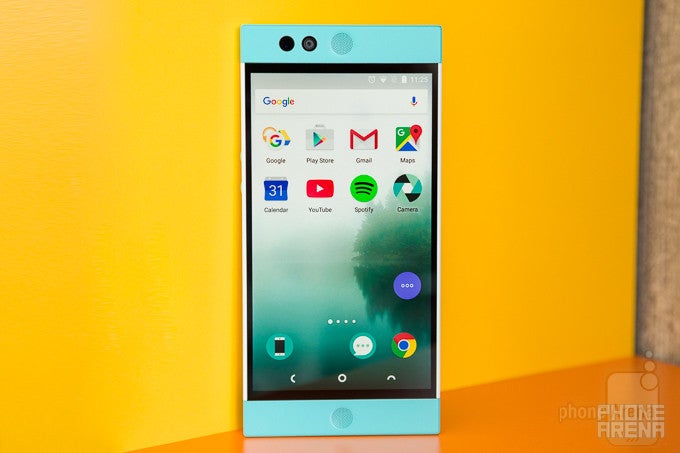
Introduction
Being the smartphone industry watchers that we are, a recent trend has not managed to evade our sights: smartphones are beginning to look alike. It's as if most makers are converging on two or three variations of what is essentially the same thing, reusing the same ideas again and again. Full-metal bodies have basically become the norm for everything above the dirt-cheap range, with the occasional glass + metal frame specimen here or there. But the problem isn't really so much in the materials phone manufacturers choose to use – it's in the stylistic decisions they make.
If you enter a cell phone store today and look at the shelf with displayed devices, what you usually see are a bunch of generic, rounded-rectangular shapes, their colors occupying all the "exciting" shades in-between black and white. Most of these devices look like they've been hastily put together, to try and capitalize on the extreme demand smartphones enjoy. It's a bleak, industrialized, picture. A lot of noise, and not nearly enough signal to cut through it.
And while most consumers don't seem to notice the problem yet, as they are probably too busy catching up with the cavalcade of ambiguous marketing terms manufacturers regularly bombard them with, some companies have taken it upon themselves to try and shake things up.
Founded by industry veterans from major companies like Google and HTC, Nextbit is a newly-established phone maker who's recently started shipping its debut smartphone: the $400 Robin. What's so special about the Robin? Well, first – it's very innovative when it comes to automatic memory and app management; and second – it doesn't look like anything on the market today.
Design
A counter-mainstream, consistent design makes the Nextbit Robin a sight for sore eyes in today's cold, metallic market.
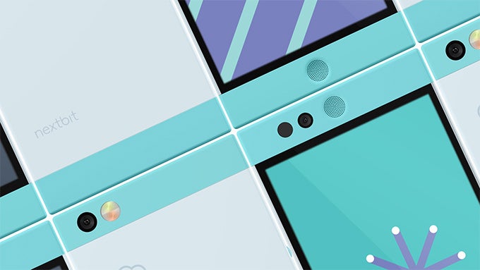
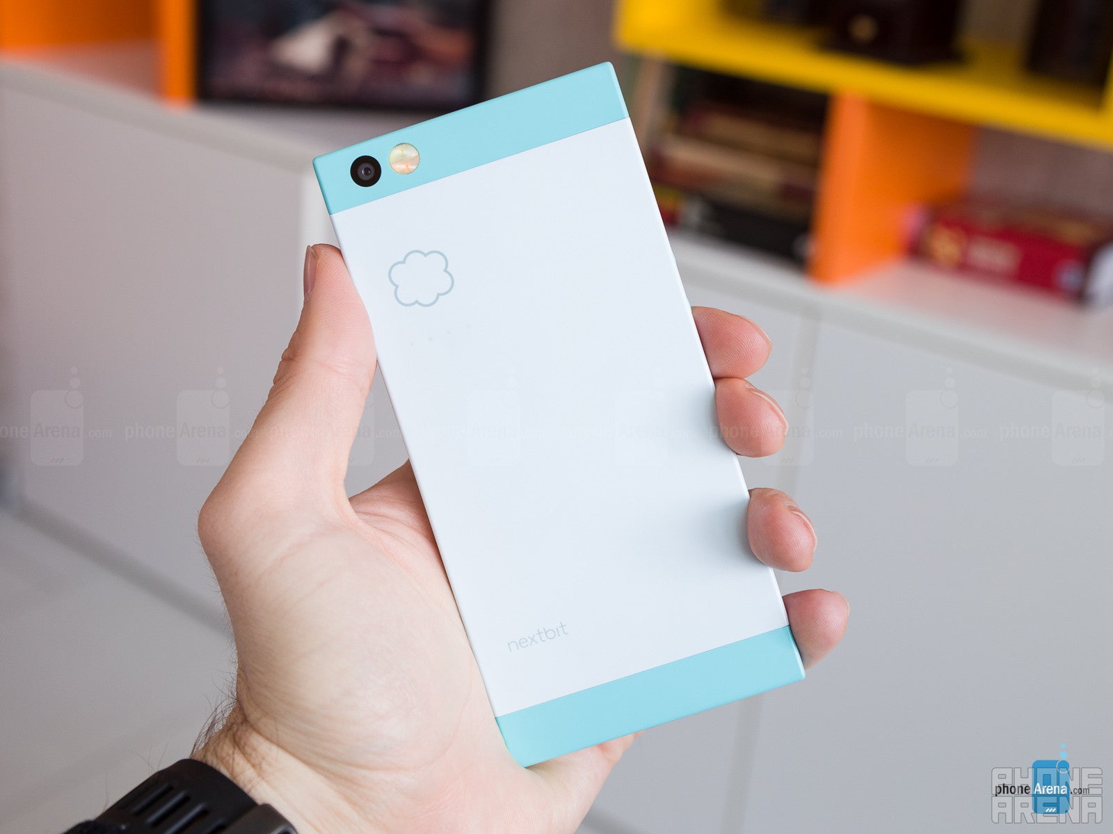
Nextbit's positioning is very clear – the firm and its followers call themselves 'rebels'. One look at the Nextbit Robin and you know this isn't just humbug. The shape of the Robin is strikingly clean, its edges exhibiting only a tiny bit of rounding, so they don't cut into your hands. It's sharp-looking, not sharp-feeling. Then come the colors: you can get the more conservative 'Midnight' (very dark gray) variant, but the 'Mint' (white and baby blue) one is where it's at with the Robin. Combined with the perfectly symmetric, clean rectangular shape, it makes for a phone so fresh and new, there's really some adjustment period needed.
But the more you look at and examine the Robin's unconventional, yet perfectly harmonious body, the more you get into it. Beyond the fun, almost cartoony appearance, hides some serious design work by former HTC design head Scott Croyle.
The plastic used by Nextbit is also strikingly different from what we're used to. It has just the right amount of softness to it: it's neither rubbery soft-touch, nor the usual hard one – it's somewhere in the middle, and I love the feel of it. The thoughtfully rounded edges, the fresh use of colors, and the warm, smooth feel – it all makes for an incredibly friendly, intelligent device.
The Robin's design is a bold, risky move on Nextbit's part, but I think what they've created is more than a breath of fresh air. It's genuinely pretty.
Display
The Robin is a big smartphone, and it's big for a reason. The sizable screen measures 5.2 inches in diagonal, while its resolution is 1080 x 1920 pixels.
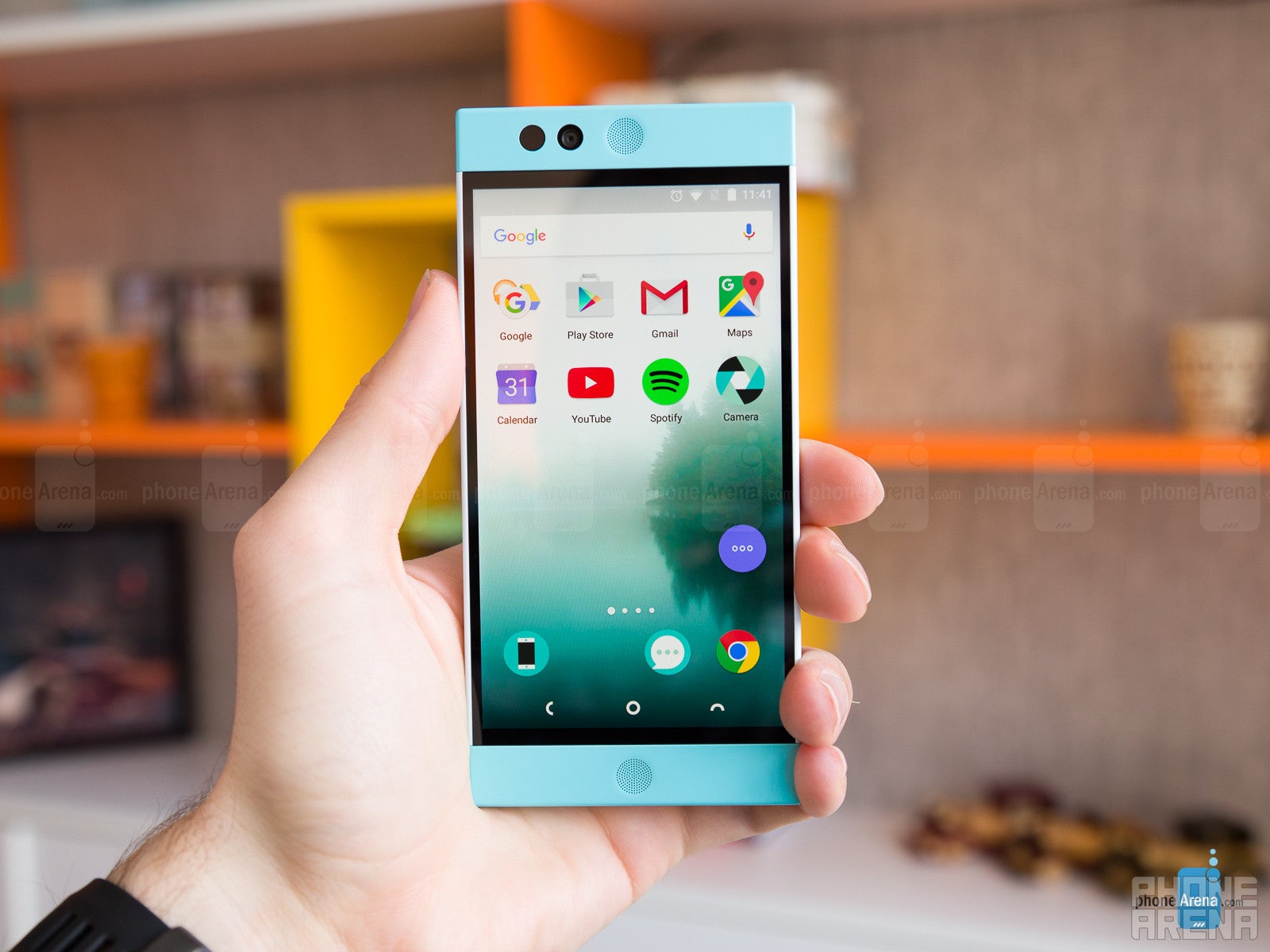
Additionally, the gamma of the Robin's screen is not quite right, the result being a slight lack of contrast.
Overall, though, none of these imperfections are intense enough to make the viewing experience unpleasant. Just for perspective, the Robin's display is actually as good or even better than those of some major phones out there, like the LG G5, for example, so it really isn't that bad.
Interface
Hardware is only the first step towards a good, coherent design. Once you wake the screen up, the software interface that fades in should be a continuation of the same ideas found on the external casing. With the Nextbit Robin, it is.
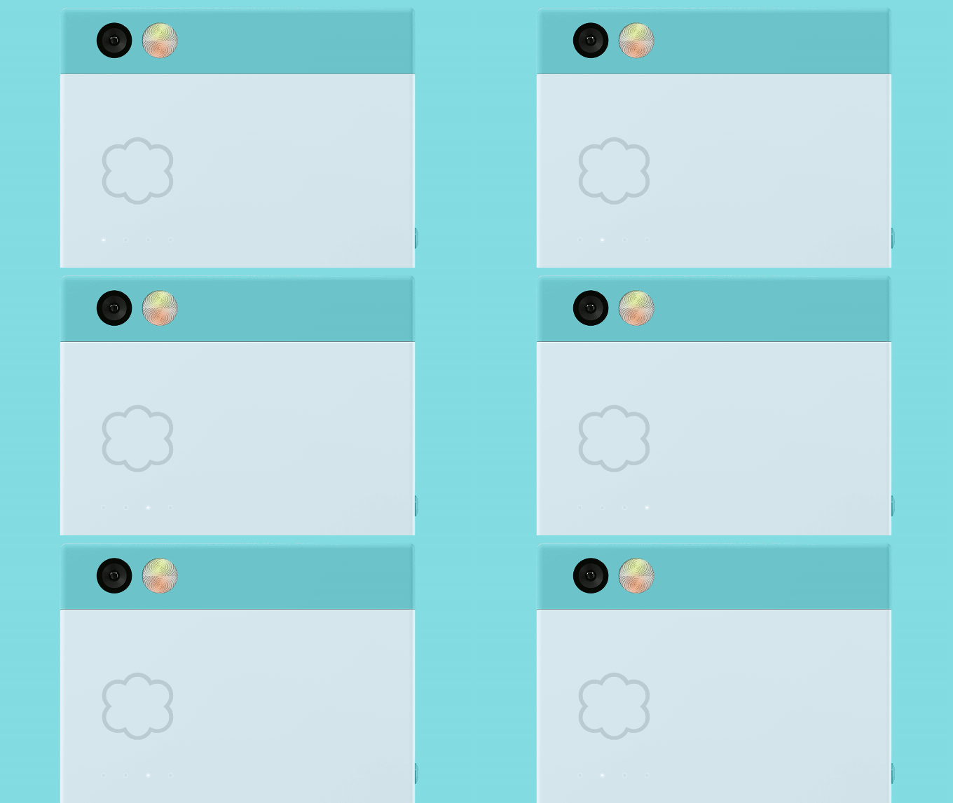
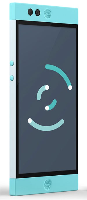
Nextbit's user interface works on top of Android 6.0, and is stylistically in line with the physique of the Robin – to a significantly higher degree than usual with Android phones. Not only does the software of the Robin reflect its unique design message, it also mirrors its other key aspect, which is the unusually tight integration with the cloud. This is found in things like the animated stock wallpaper, as well as the default sounds the Robin plays alongside events like device lock/unlock or received notifications. Few Android phones remain consistent on so many levels.
The initial app list of the Nextbit Robin is delightfully short. Aside from some unfortunate omissions like a stock notes app, the rest of the package is functional enough, with no sight of bloatware or other unneeded programs. Going for a more simplified experience, Nexbit has nixed the app launcher, while the rest of its UI design interferences are mostly cosmetic, so as to guarantee a consistent look across the system.
Apps in the cloud
Aside from design, the biggest selling point of the Robin are its advanced cloud tricks.
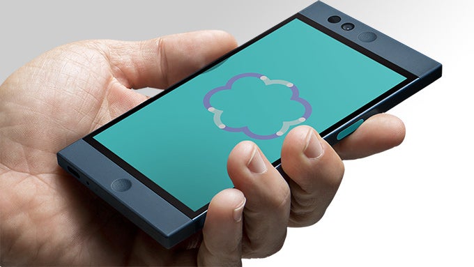
As mentioned, the other big story about the Robin is its smart memory management. After all, it's also known as the “cloud-first phone”, thought I think this description doesn't do it much justice. In addition to the Robin's already roomy 32 GB of internal storage, users also get 100 GB of cloud space.
This is where the innovative stuff begins. Whenever the Robin is idle, connected to Wi-Fi and plugged in, it makes sure to back up your apps and photos to the cloud (those 100 GB). Then, as you install app after app, it's only natural that eventually the phone starts running out of internal storage. Once it nears a certain level (around 2 GB of free space), the Robin looks for installed applications that you haven't touched in a while, and deletes them from the memory. However, those apps don't just disappear – they remain in their usual places, but their icons get grayed-out to indicate they are no longer directly accessible. This whole process happens automatically without any input from the user, which is the Robin's way of smartly managing your storage. In order to bring an app back from the cloud, you simply need to tap on its icon. Depending on the size of the app and the speed of your network connection, the restore process may take anywhere from a few seconds to a few minutes, but during my testing, the feature worked well enough not not cause any frustration.
The same thing applies to photos. To save space, they get compressed to display resolution for quick yet still pleasant viewing, but if you attempt to zoom in, the full-res version is automatically downloaded. Restoring photos is relatively fast, though it's going to vary depending on your network speed. I had trouble offloading pictures from the phone, as those that got backed-up to the cloud were no longer available on the phone's native storage. They also didn't reappear there after I had restored them, so the only solution was to share them online. At this point, the Nextbit doesn't back video up, but the company has stated it's working on it.
System performance
The Robin suffers from a pronounced input lag – my single biggest issue with the phone
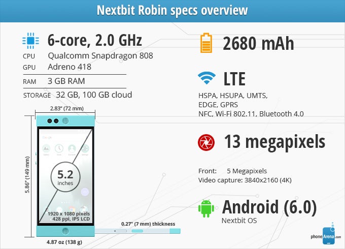
At $400, it's only natural for the Robin to feature a mid-range chipset – the Qualcomm Snapdragon 808. Mid-range or not, however, we all know perfectly well what this chip is capable of; we know it has all the power needed to deliver smooth performance. Sadly, this is not the case with the Nextbit Robin.
Aside from all that, the Snapdragon 808 with its six-core CPU and Adreno 418 GPU does well for video gaming and most other stuff, though highly demanding titles like Heroes of Order and Chaos may, indeed, cause the frame rate to drop.
The Robin may count on its smart cloud storage usage to make it appealing for consumers, but with 32 GB of internal memory, native space isn't really an issue. There are any other storage variants available at this point.
Camera
Gets the job done, but nothing more
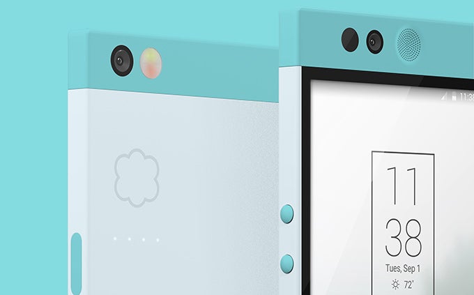
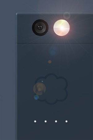
There's a 13 MP camera mounted on the back of the Nextbit Robin, and it goes on to offer goodies such as phase-detection autofocus and dual-tone LED flash. Up front, there's a 5 MP selfie snapper.
In terms of UI, it's a simplistic experience. All the basic features are easily accessible on auto, but if you want, there's also a manual mode that lets you tweak focus mode (there's a great manual focus implementation), white balance, and ISO.
The Nextbit Robin is an OK cameraphone, though as any first-gen product of a new company, I find it understandable that there's quite a bit of room for improvement at this point. Outdoor photographs impress with their level of detail and realistic colors. Indoors and at night, it's rather easy to end up with a blurry photo, so first before most, users of the Robin need to remember to hold their hands extra steady.
The selfie snapper is by no means class-leading. Details aren't too good, while the lens is probably wider than it should be for single-person selfies.
Video recording quality is fine, it can go up to 4K. Details and colors are once again pretty good, especially for a mid-range phone, but I noticed there was no continuous or tap to refocus while recording. The resulting 4K footage tends to be on the jittery side, while 1080p recordings seem to be more stable.
Multimedia
Decent stereo speakers, but no earphones in the package
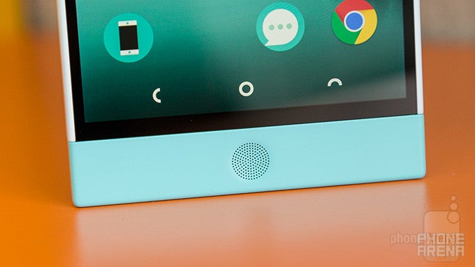
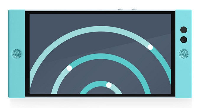
I think the Nexbit Robin is a pretty decent device to enjoy media on. When it comes to video, the large, high-resolution 5.2” screen does a great job, despite its colder than desired color temperature. The speakers hidden behind the circular grills to the left and right of the display (when in landscape) deliver stereo sound, which adds to the immersiveness, though their actual quality isn't really top-notch. This is another component that Nexbit promises to fix with the upcoming update.
For music, Nexbit has decided to ship the Robin sans earphones, which is dislike. If they thought the presence of stereo speakers somehow makes up for that – it doesn't. Anyway, you'll have to supply your own earphones if you'd like to enjoy quality audio on the phone.
For music, the Robin relies on Google's Play Music app, which is a full-featured proposition with a comprehensive music store.
Call quality and Battery life
Callers sound OK through the Robin's earpiece. Loudness is sufficient, while voices tend to sound natural. Your mileage, of course, will vary, depending on network coverage, congestion and more for both you and your callers.
I couldn't help but notice the unusually fast pace at which the battery level dropped. There's a 2680 mAh unit inside the Robin's 7mm-thin body. However, due to the aforementioned problems with CPU heating or maybe something else, the battery will struggle to last a day if you're of the heavy user type, with serious doses of daily navigation, streaming media and browsing usage.
For moderate types, the Robin has no problem lasting though the day, but make no mistake – you'll have to charge it every night.
The PhoneArena battery test ran on the Robin for 5 hours and 48 minutes, at which point the device shut down. I think this is a result that corroborates my real-life observations.
Conclusion
An impressive first try
If you want a handset that truly stands out – this is the one, thanks to its unique and inviting design. I'm addicted to the freshness and calmness this phone exudes. Meanwhile, the innovative cloud integration is just a very neat feature to have – certainly more useful than what many top brands are currently doing to differentiate their products.
The Robin is a great, inspiring start for Nextbit. Hopefully there are many other great things to come from the company in the future, and hopefully this includes a high-end device to go toe-to-toe with the flagships out there. Nextbit obviously has what it takes.
Software version:Android 6.0; Build 00WW_1_19F



Things that are NOT allowed: