Motorola V3 RAZR turned out to be one of the greatest hits of all times on the mobile phone market by selling out large quantities in that class of mobile phones and winning the popularity award among the users, famous people included. Not very rich on functions, the phone had a good display, a phone book and a camera in a thin stylish silver design, which turned into a form to follow by the rest of the manufacturers. Loved and popular it now is reborn again into its descendent the V3i, which keeps the good sides and changes the weak ones of its predecessor, getting closer to perfection in the class of stylish phones. The new phone now has a megapixel camera, better display and a memory slot, so that you are not limited by the internal memory; it is offered in a darker and more serious metal color theme, which was elegantly combined with black plastic cover and metal keys, which are more comfortable then those of the predecessor.
Rating: 5 of 5
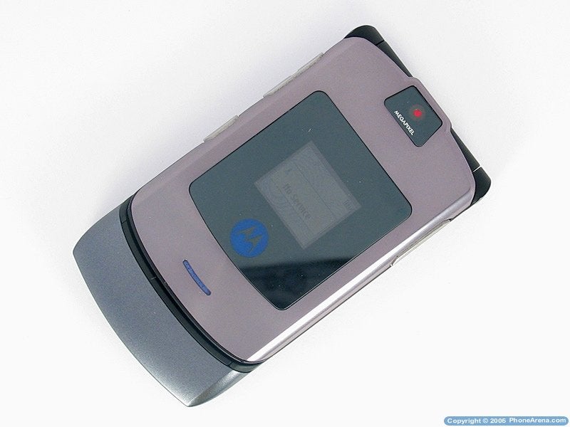
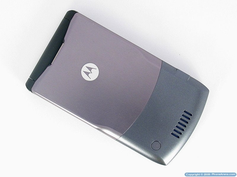
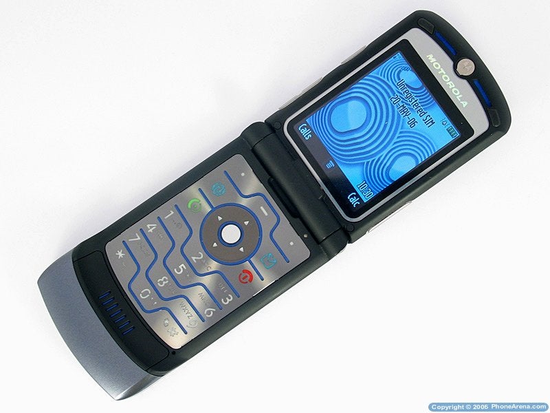
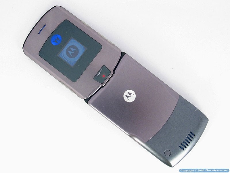
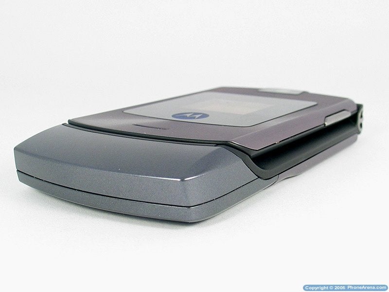
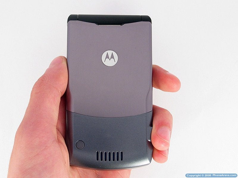
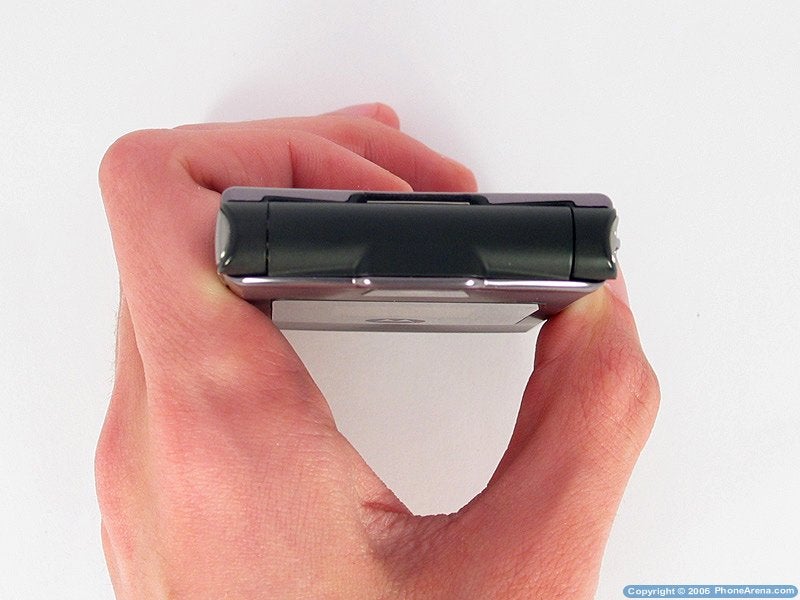
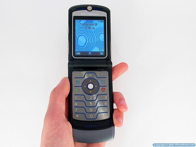
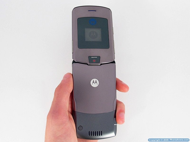
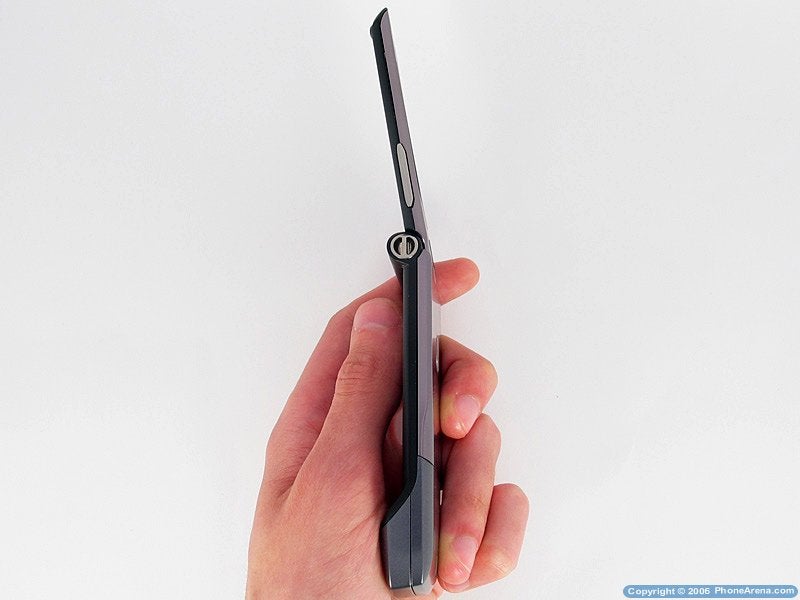
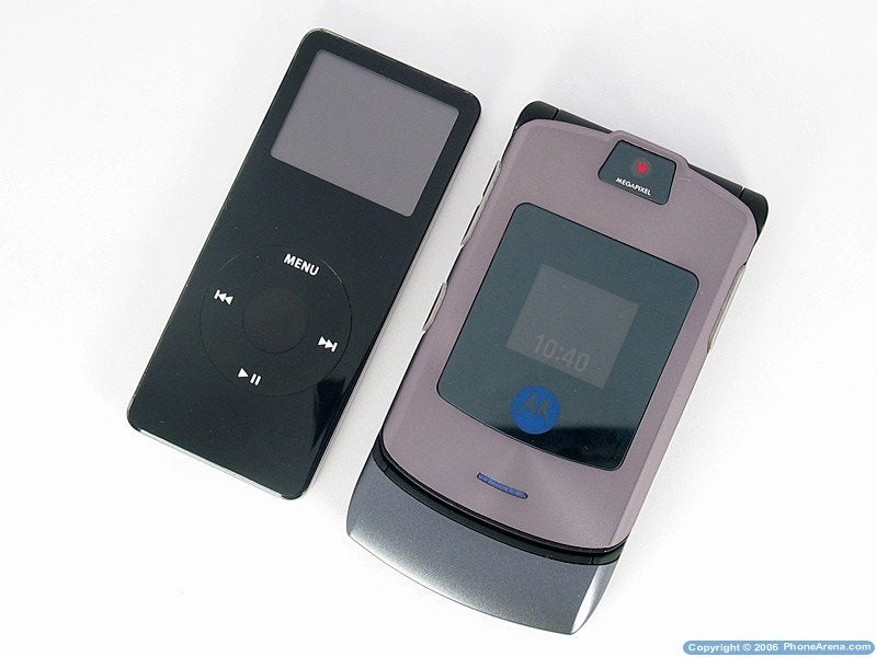
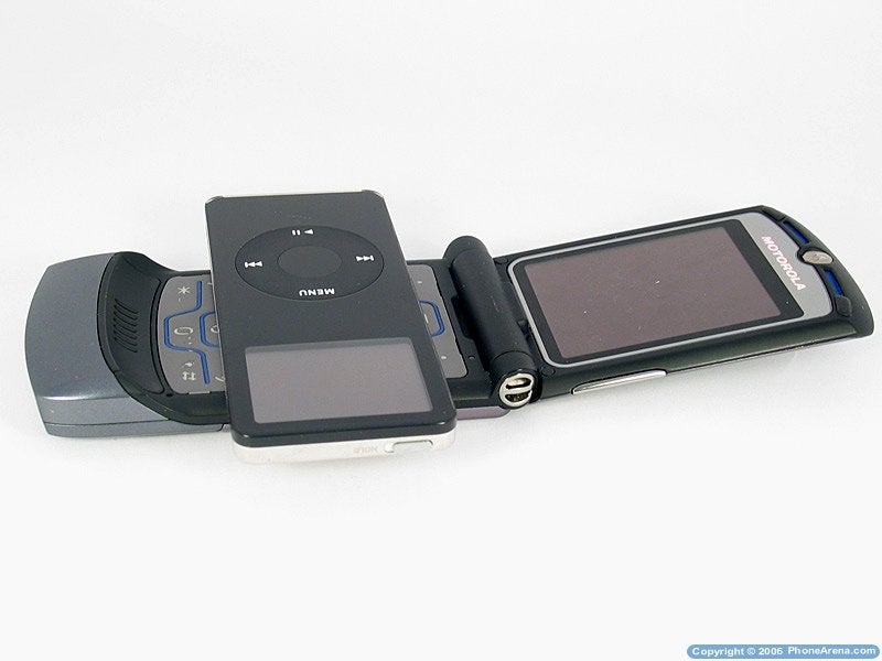
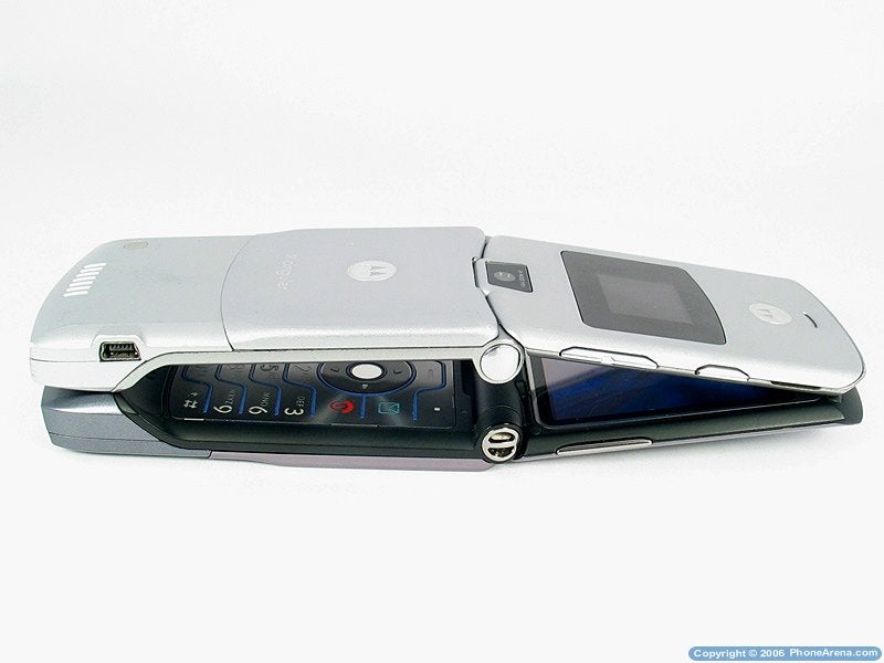
Motorola V3i is a middle sized clamshell phone with an internal antenna and a stylish design with slightly rounded corners. The size and the weight were kept like those of the V3, despite the more functions of the new phone. The surface is shiny, made of metal and high quality plastic, all in the color of metal, beautifully reflecting the light that falls on it. Around the external display and the mega pixels camera there is a black shiny surface, which sadly attracts finger prints and it's hard to keep clean, which makes it hard to see the display and worsens the quality of the pictures taken by the camera. Because of the high quality materials used on the phone, the surface is not easily scratched and even if you try to purposely harm it, it will keep the good look and will not affect the stylish design. A bit of a bad impression is left by the hinge on the clamshell, which is made out of black plastic like the one around the keyboard and the internal display, which takes away from the metal finish and adds a plastic feeling associated with cheaper models.
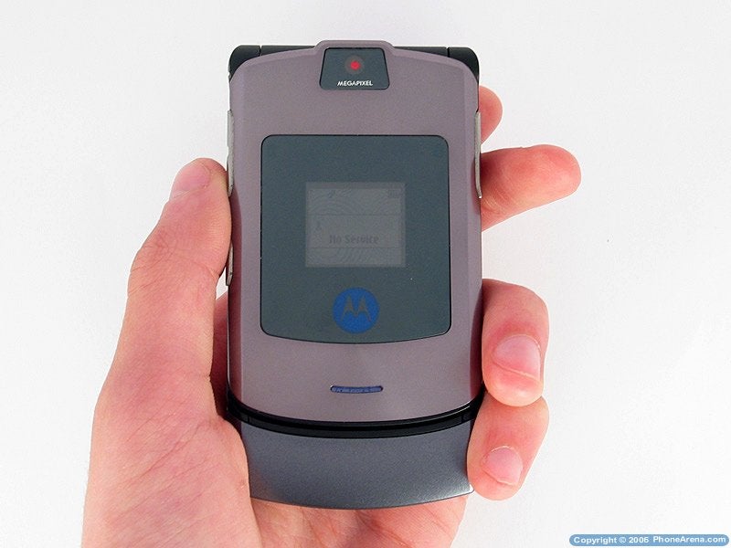
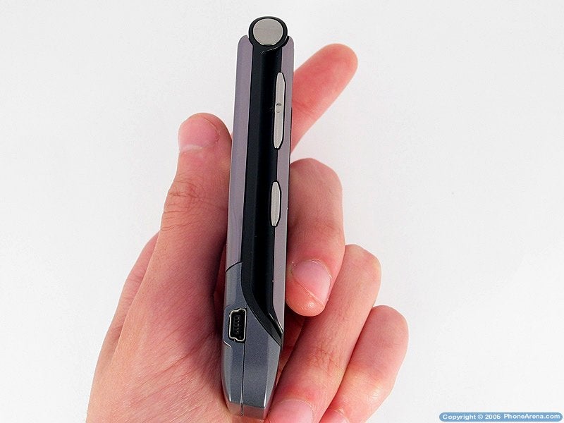
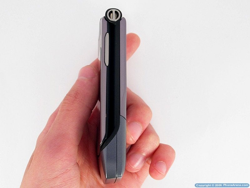
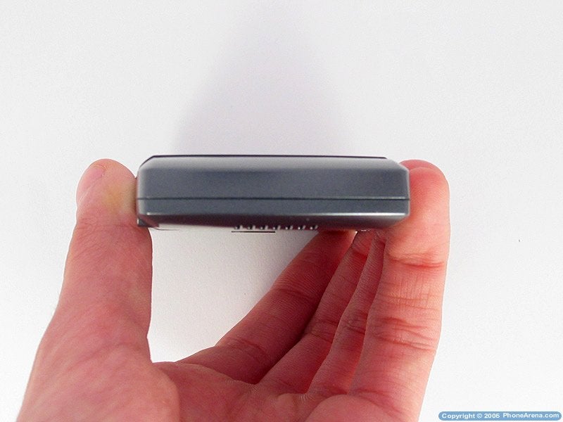
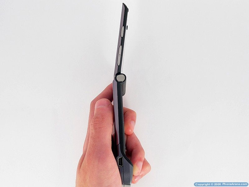
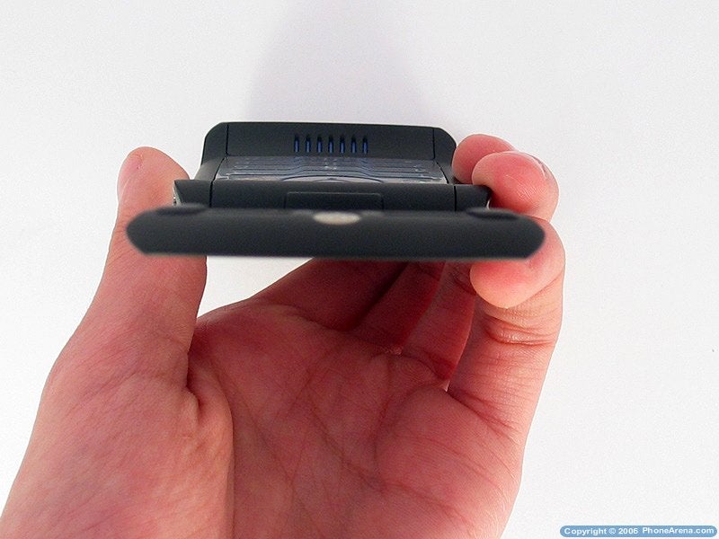
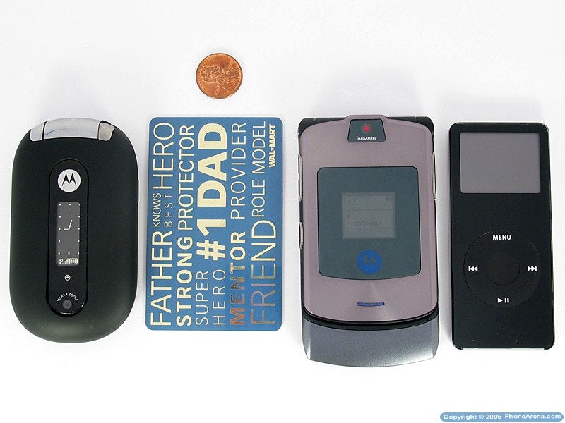
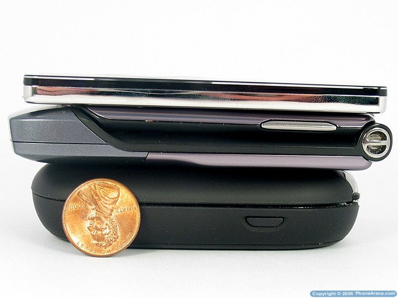
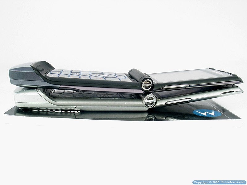
The second RAZR is comfortable for handling both opened and closed. When closed the side keys located on the uppers shell are easy to reach giving you the option of using voice commands and changing profiles. Since the keys are on the shell that holds the displays, when opened they are hard to use, because of the movement on that side. There should not be any problems using the phone with both left and right hands, although the right handed will have the advantage of easier use of the side keys, because of their location. Opening the phone is much harder without using both hands, since there is no mechanism similar to the PEBL for example, where the upper shell opens-up by itself. Closed, the phone is small enough and mostly thin (0.6), and it easily fits even in a tight jeans pocket, where it will even move around. It could comfortably be put in a purse as well, where it would turn into a stylish piece of accessory.
Besides the plastic hinge, another note that we have is about the slight difference between the colors of the front shell + the battery cover, and the main frame of the phone. Since they are clearly made out of different types of materials, the shades of the paint are different, which takes away from the supreme phone feeling.
Besides that, the phone is solid and there are no irritating sounds or movements that could compromise your pleasure of using a metal phone. Opened, the upper shell almost doesn't move in horizontal direction. The same goes for the battery cover, unless you want to open it, sliding it out, and not up. The V3i is made solid and high quality, typical for its class.
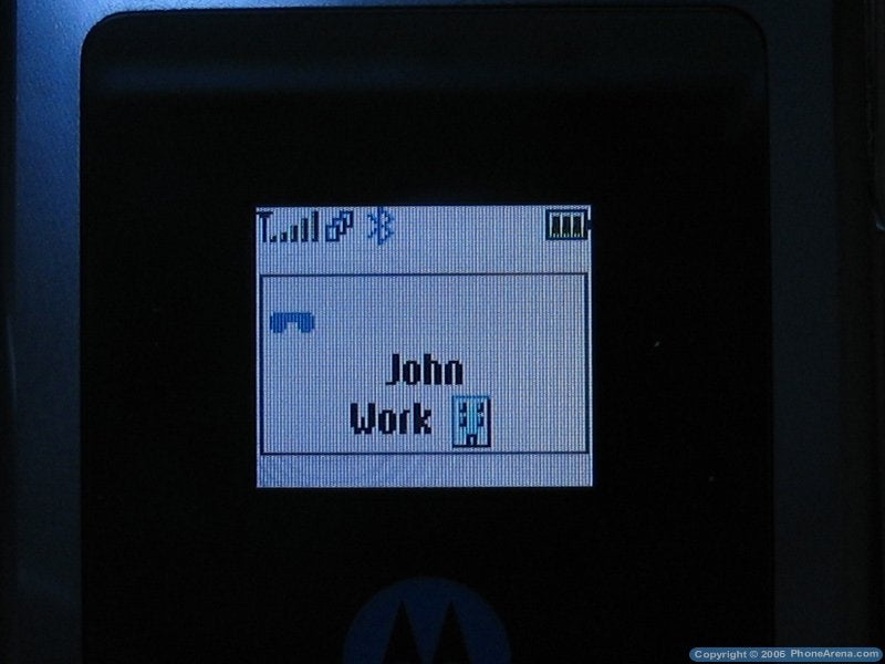
The phone has two color displays. The external one has a 96x80 pixels resolution and even with the good sounding 65 thousand colors, the quality of it is horrible. The bad impression is backed up by the easily finger-printed surface around it, which is larger compared to the one of the V3. Although it could be used as a viewfinder for the camera, that is quite hard to achieve due to its poor quality and small size. The colors reproduced by the display are unreal as well. While in stand-by regime it shows a clock, the signal strength and the battery life remaining, as well as a few other indicators such as the ones for a powered on Bluetooth, GPRS, etc. Poorly, since the STN type of it, it is very hard to see on bright light and it has to be light up by pressing the smart button. That wouldn't be a problem if Motorola had decided to use a TFT display, which are better visible in direct sunlight.
On the other hand the internal display is large (2.2) and a bright presenter of the TFT type easy to see in sun light and well contrasted. It shows up to 262 thousand colors with 176x220 pixels resolution, which is normal for this class, but it would be better if it had a QVGA 240x320, which looks far better on phones like the Samsung T809 for example.
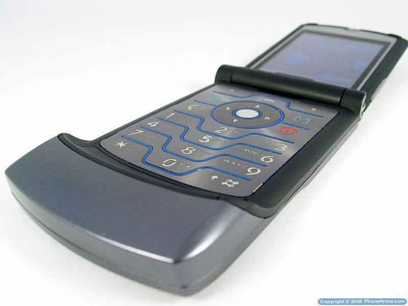
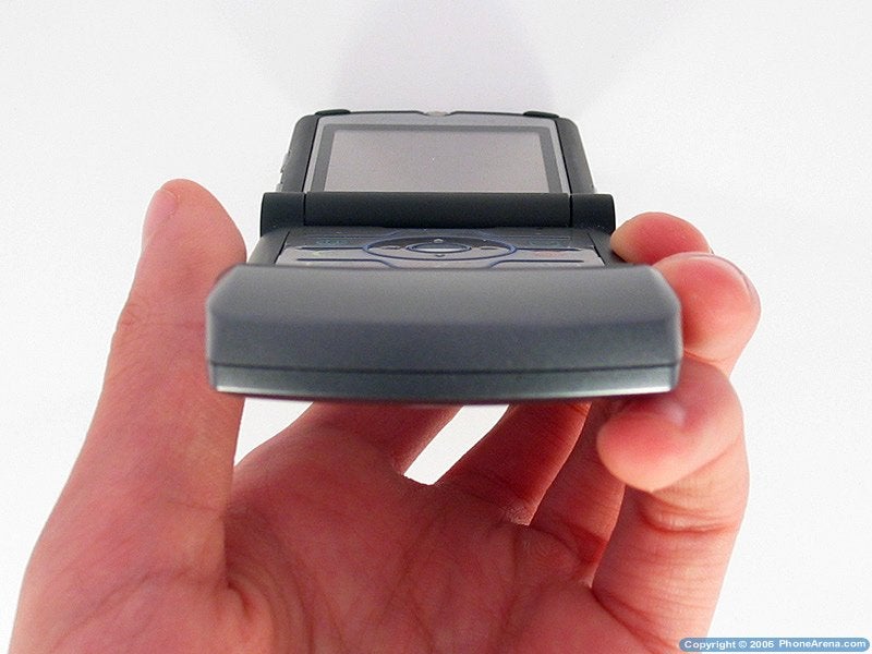
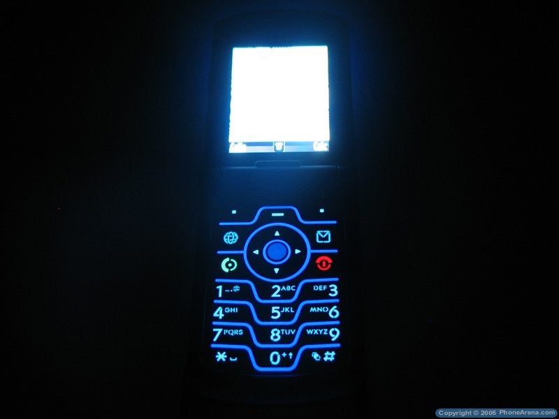
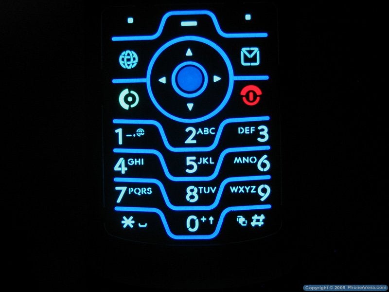
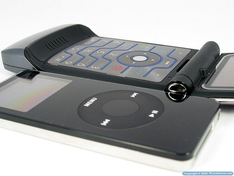
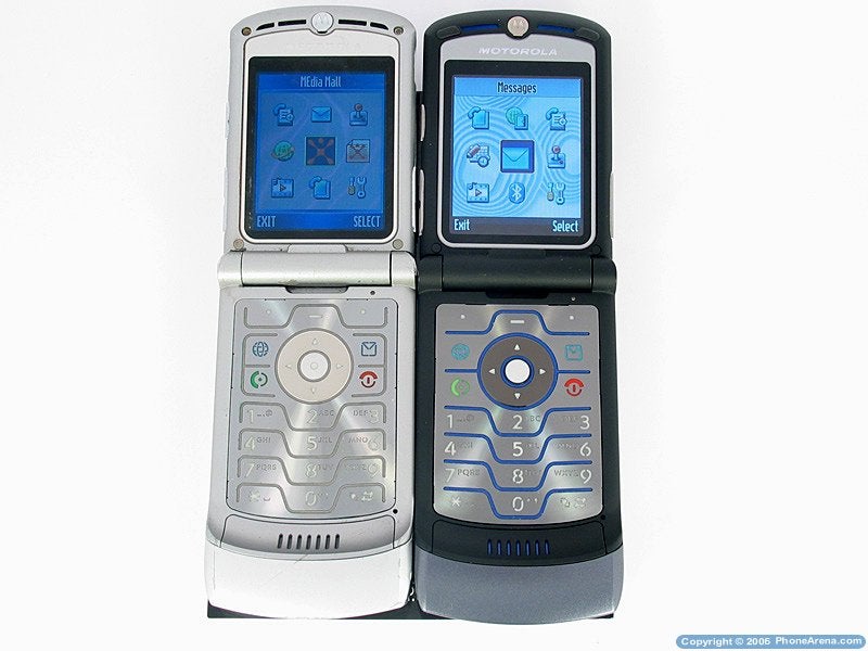
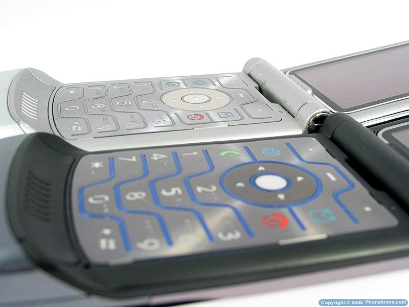
Below the internal display is located the keypad, which is similar to the one of the predecessor (the V3) completely flat, which is necessary to achieve the measurements of the phone. The navigation is handled by a 4 way d-pad with a central key for confirmation. Around them are located the answer/reject buttons, as well as the shortcut keys to the internet browser and the message center. The buttons are light up in light blue, while between them every row has a raised separator stripe in darker blue, which besides the visual separation divides the keys in a way so that you can feel it with your finger without taking lots of space. Unlike the previous model, these stripes do not turn along the ends, which allows for a greater surface for the keys. The lighting is of even quality along the entire keypad, and only the answer/reject buttons are light up in green/red. Despite the thin profile, the buttons are adequate with a good response and comfortable to use and even entering longer text, not only phone numbers, is easy and problem free. Sadly, the usage greases the keys and when closed, the keypad leaves marks on the display, since it falls tightly above it in order to reduce the thickness of the phone. Even with the much larger pads above the display (in regards to the V3), this problem still persists.
|
|
 Motorola V3i keypad Motorola V3i keypad |
On the glossy surface around the external display are located a few service lights and a large stylish logo of Motorola in blue, which is light up along with the keyboard of the phone when it's open. Above the display to the left and to the right are located small LED in yellow and blue colors, which are light up accordingly when charging and when the Bluetooth is powered on. Strangely, there is no external reminder for missed calls or received messages, and in order to check these you need to light up the display using the smart key on the side so that you can see the list. Sadly, that is quite an involving procedure and it would be much easier if the Motorola logo light up in those cases, and not only when the phone is open.
|
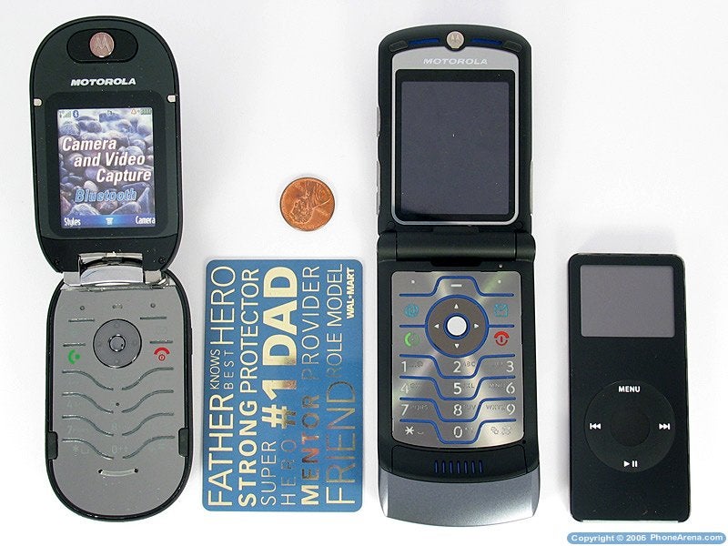
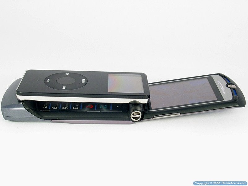
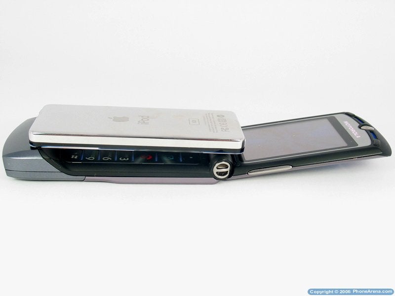
|  PEBL-V3i-iPOD Nano (left-to-right) PEBL-V3i-iPOD Nano (left-to-right) |
| |
|  PEBL-V3i-iPOD Nano (left-to-right) PEBL-V3i-iPOD Nano (left-to-right) |
| |
|  PEBL-V3i-iPOD Nano (bottom-top) PEBL-V3i-iPOD Nano (bottom-top) |
|
| | |
| |  V3i RAZR and iPOD Nano V3i RAZR and iPOD Nano |
| | |
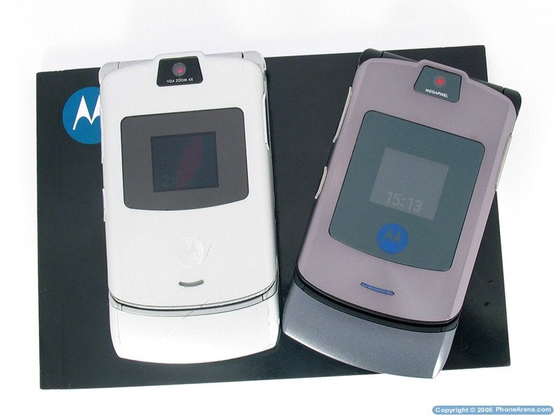
| |  V3 is in silver; V3i is in darker color V3 is in silver; V3i is in darker color |
Interface (Rating: 3.5 of 5):
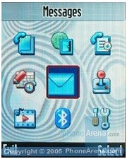
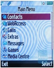
The interface is the typical for Motorola with slight changes from the older models. The main menu is built by a number of 3x3 icons screens. The places of the icons can be changed and shortcuts for them can be set up. It would be more comfortable if the shortcuts were automatically programmed, so that every icon is linked to the corresponding key on the keypad (the one in the upper left corner linked to the 1, the next to the 2, etc.), which is used with other phones. The main menu could be viewed as a list as well, like some of the submenus are built. The whole menu view can be changed, using Themes. A little confusing is that the menu button not always has a function associated with it, unlike the soft keys, but overall the navigation through the menu is comfortable, logical and fast.
Phonebook (Rating: 4 of 5):
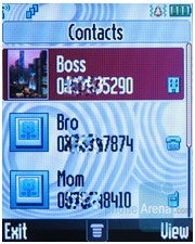
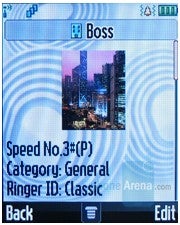
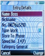
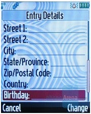
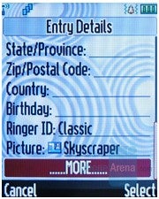
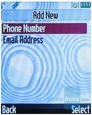
By default the phone book, with a capacity of 1000 entries, shows all available numbers, saved in the phone or in the SIM card. On one name there is one number (the numbers saved in the phone have lots of fields), and besides a full address, self pictures and melodies can be attached, which will notify when there is an incoming call from that number. There is a birthday field, but there is no way to automatically add a reminder for that date. The different contacts can be divided into categories, and a personal melody can be added to that category. The phonebook can be viewed one category at a time. After entering multiple numbers for one contact the user can decide if one of them to be designated as primary. Then depending on a setting, the primary number is shown in the main menu, and the additional numbers can be viewed by pressing right on the D-pad or all the numbers are shown in the main menu. The searching in the list is easy, as you directly from the keypad enter text, for which you can search in the saved contacts. The uncomfortable part to that is, that if a name has more than one words to it, you cannot search for them and you can only search by the first word, which means that you will not be able to search for a second name for example.
The phone book can be viewed as a list of names, or a list of names with pictures next to them. All entries in the list can be put in different order (by name, by email, by speed dialing number). On incoming calls, the name of the contact will show on the external display along with the type of the number (home/mobile/work). To answer you can simply open the shell (if you have the Smartflip option activated, which is used to answer automatically when the flip is opened), but the bad part to that is that you will not be able to reject the call in that situation. If the phone is open when a call comes in, you need to use the answer/reject buttons. If you close the shell in the middle of a call, that call will be disconnected, unless the speakerphone is turned on.
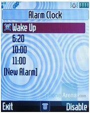
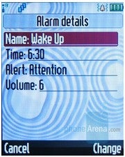
Organizer (PIM) (Rating: 3 of 5):V3i RAZR does not have a very rich organizer, but it is good enough. It has up to 5 alarms and all of them can be active at the same time. Each one of them can be set up with a different hour as well as a different melody and ring level, and you can assign name to them.
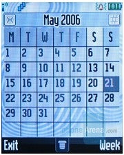
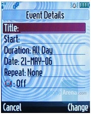
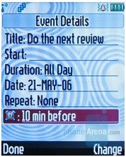
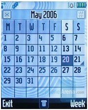
The calendar can be viewed for the week or for the month, and different to-do events can be added for each day, with a reminder. Every day that has an event added to it is marked with a check on the calendar itself.
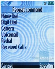
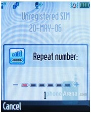
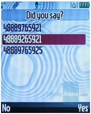
By pressing and holding the button on the right side, the phone starts recording sound through the microphone, and it has the capability of recording phone conversations the same way. The recording stops when you release the button. The voice commanding gives you the option of both commands and dialing, which both are speaker independent. Besides dialing numbers from the phone book, numbers can be dialed by entering digits, in a way that the phone gives you a few options to choose from depending on what was interpreted.
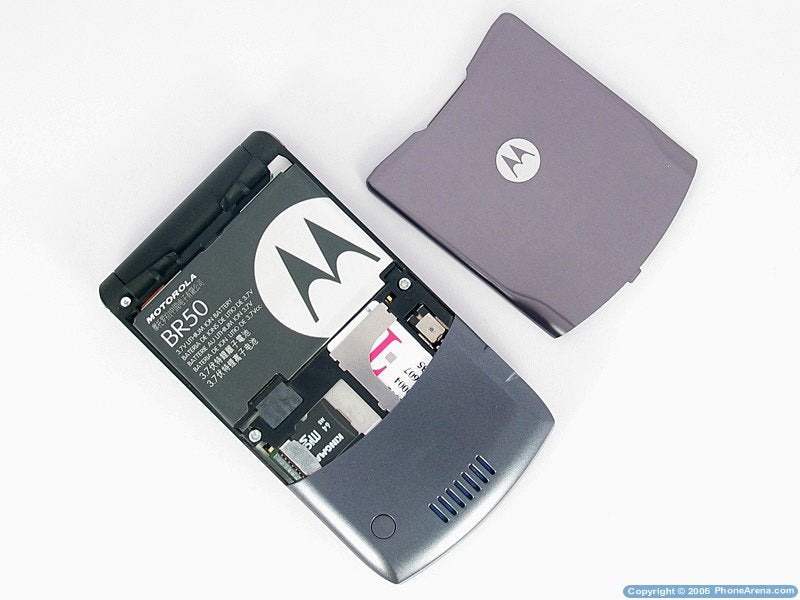
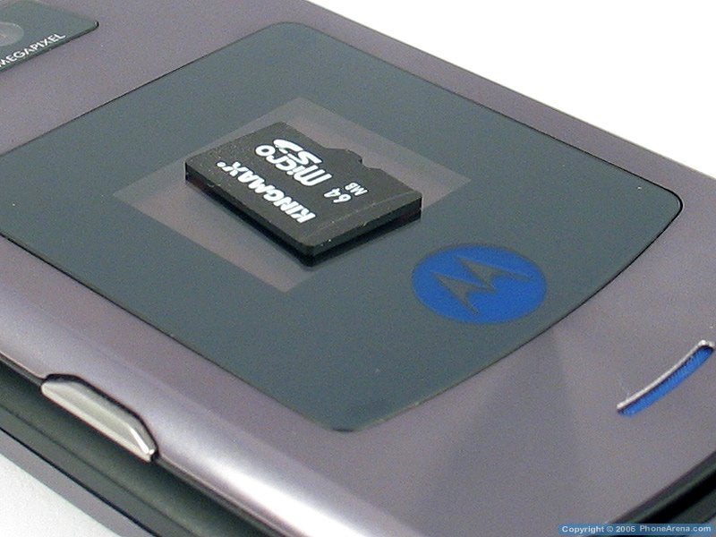
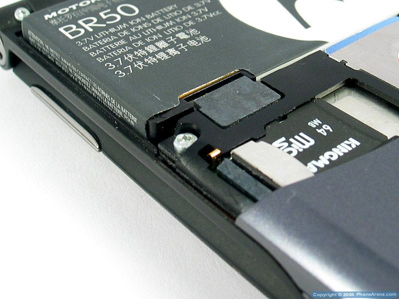
The second generation of RAZR increases the memory by an extensive amount, by doubling the internal memory from 5.5 to 12 MB, and by adding a memory slot. The memory slot is microSD, and the fact that it is under the battery cover is a minus. Luckily the slot is located next to the battery and the SIM card and you can swap it without having to power off the phone (how-swap). Pre-packaged with the phone is a 64 MB card, but it can be replaced by a higher capacity one.
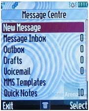
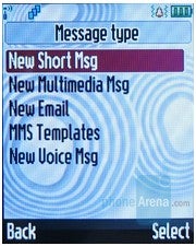
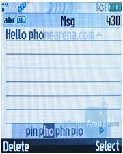
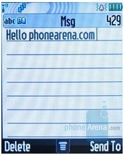
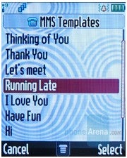
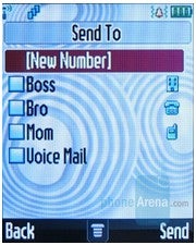
Regarding the messages, everything is standard. Entering text is powered with iTap, which is quite comfortable. Short pre-saved phrases can be used, as well as templates for multimedia messages, containing pictures for different situations.
Connectivity (Rating: 3 of 5):
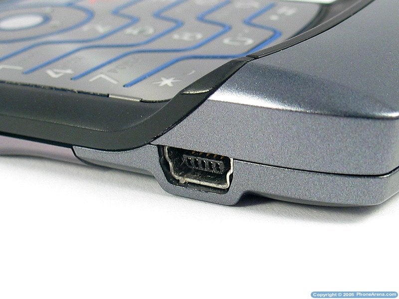
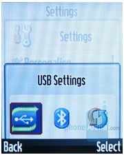
A miniUSB port is available, which is also used for the charger and the headphones. Besides that, there are no other ports. For connecting and synchronizing with a PC you need to use the software that the manufacturer provides with the phone.
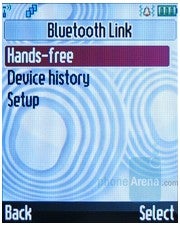
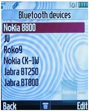
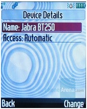
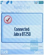
Using Bluetooth we easily connected a wireless headset (Jabra BT250) and there were no problems using voice commands and dialing through the headset. There were no problems transferring pictures to another phone neither.
Internet (Rating: 3 of 5):
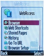
The phone has the standard WAP2.0 browser, and the connection goes through GPRS class 10. Sadly, the much faster EDGE standard is not supported, which would have been a good improvement in regards to its predecessor. The settings of the network are fairly easy made, and you have the option of saving settings for a number of different networks, so that when you change the SIM card, you will not need to change all settings.
Camera (Rating: 2.5 of 5):
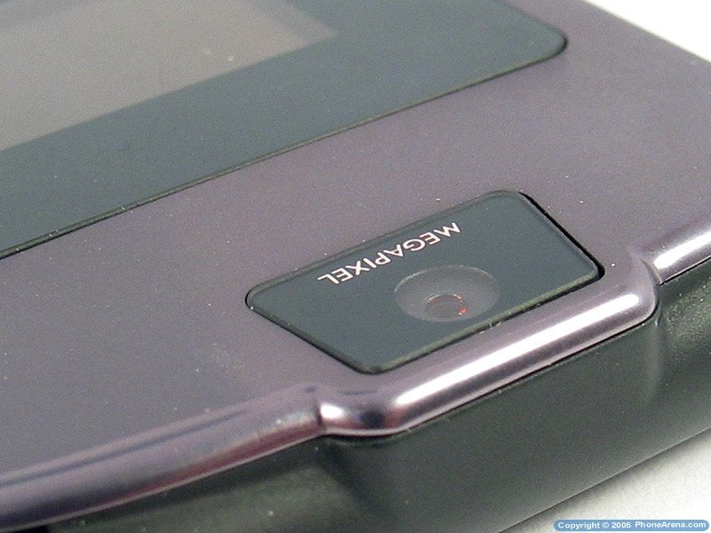
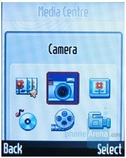
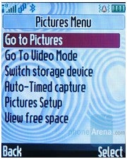
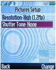
On the front pane, surrounded by a black glossy surface is located the camera of the phone, just like the previous model. Underneath the lens is the sign mega pixel which is a clearly shows one of improvements of the i-version the resolution is now 1.23 mega pixels, and you can also record video. By holding the smart key both when closed and opened, the camera will power on, and the external or the internal screens can be used as viewfinders. By accessing the camera menu you can browse through the pictures/videos. The pictures are with the typical for such cameras quality, where they are always slightly blurred and soft. The colors are not natural and the yellow overwhelms when there is not enough light. On the pictures taken on poor lighting there is lots of noise, which is clearly seen on indoors pictures.
Short video clips can be recorded, such as their maximum resolution is QCIF 174x144. The quality is on the expected low level, but is enough for multimedia messages. Sadly, the resolution is way too low and watching them on a PC is pointless.
| | |
| |  Light and Dark Light and Dark |

Outdoor and Indoor Images
Music (Rating: 4 of 5):
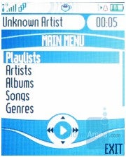
The phone we tested was with the standard MP3 player and didn't include the iTunes player, which is used with the Motorola ROKR and SLVR L7, which was launched with Cingular in the US. It is supposed that when the V3i is made available by Cingular, it will have the iTunes player as well.
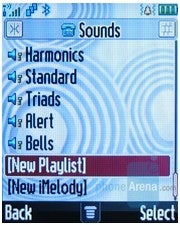
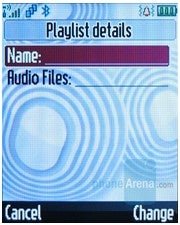
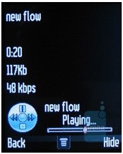
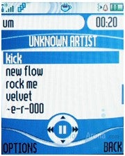
The MP3 player is the standard one for Motorola, which allows you to create playlists and arrange music into them. A great advantage is that the phone supports multitasking and the music can be put in the background, while the phone is being used and the menu is being accessed. MP3 files are supported, which can also be used as ringtones. Besides that in the Java applications there is another player (Music Digital Player) which supports more options, such as sorting by an artist/album/genre.
Software (Rating: 3.5 of 5):
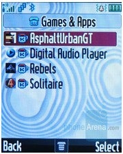
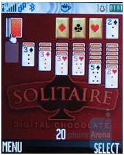
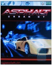
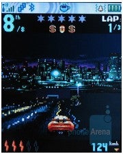
The support for JAVA MIDP2.0 gives you the option of adding different applications and games, created for that platform. Included with the phone different application are available, depending on the market of purchase. In our case besides the music player, a few games were included. One of these games is Asphalt Urban GT by GameLoft, which is a popular street racing game.
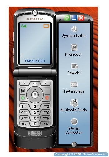
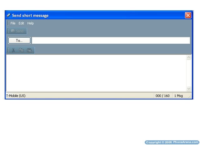
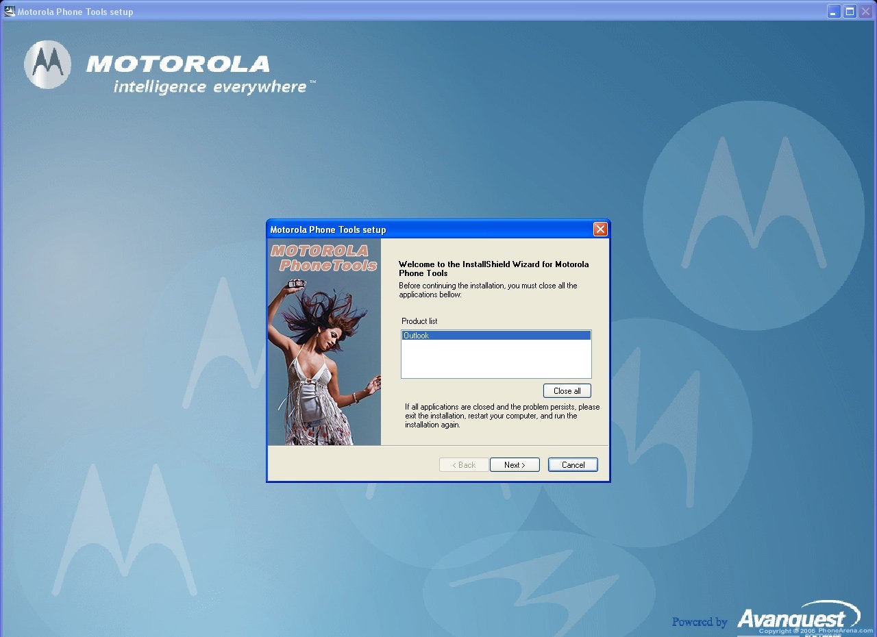
Bundled with our V3i was Motorola's version 4.02 Phone Tools PC synchronization software. In a nutshell, it allows you to synchronize your PC and phone, send text messages from the PC, and download content from the PC to the phone and vice-versa. The connection between the PC and the phone can be done via a cable, Bluetooth or Infrared.
The main interface shows your V3i, with all options located on the right.
|
|
 Main Interface Main Interface |
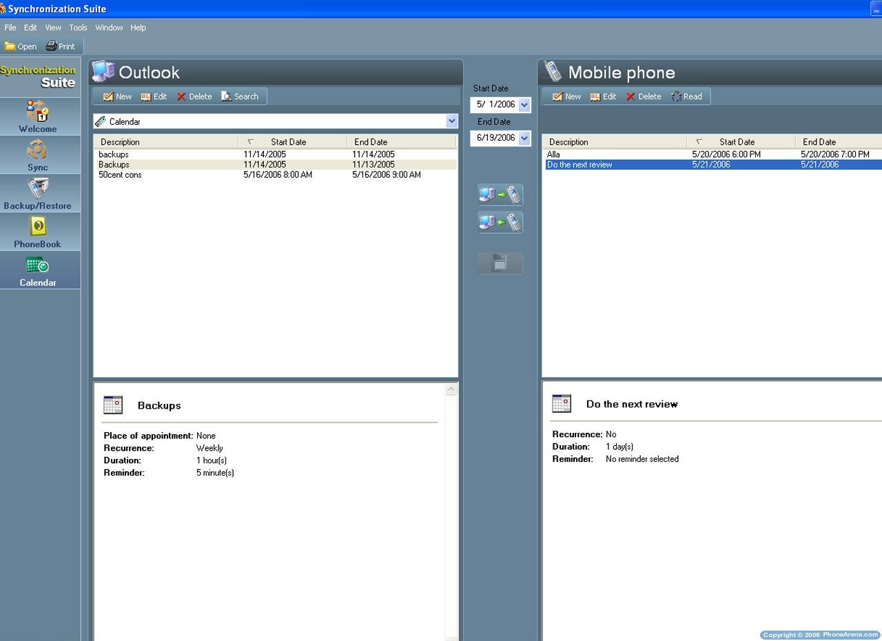
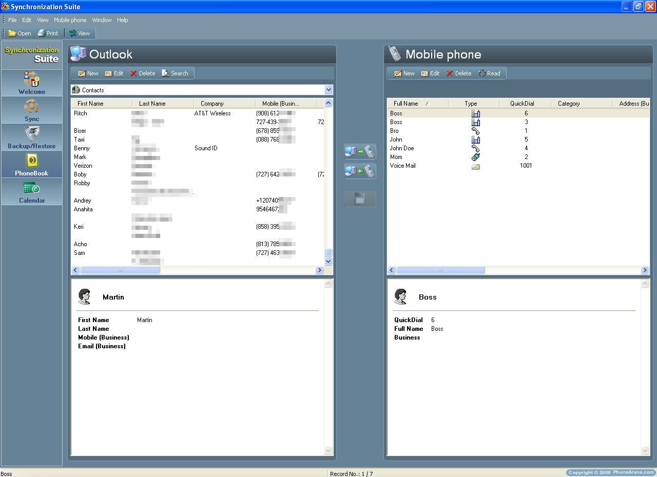
The synchronization suite is used to synchronize Outlook calendar or Phonebook with your Phone. The user can select a full synchronization, or just select a few contacts, which can be moved between the PC and the Phone. In addition to just synchronizing the information, the PC Suite allows the user to edit, add new, delete or search the both in the phone and on the PC.
 Synchronizing (To-Do and Phonebook)
Text Messages gives the user an easy way to send SMS to one or multiple users directly from the PC.
|
|
 Sending Text Messages directly from a Computer Sending Text Messages directly from a Computer |
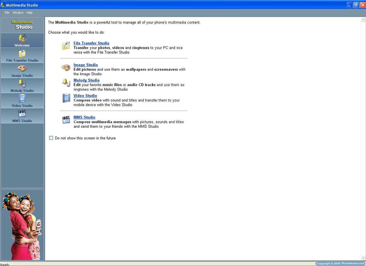
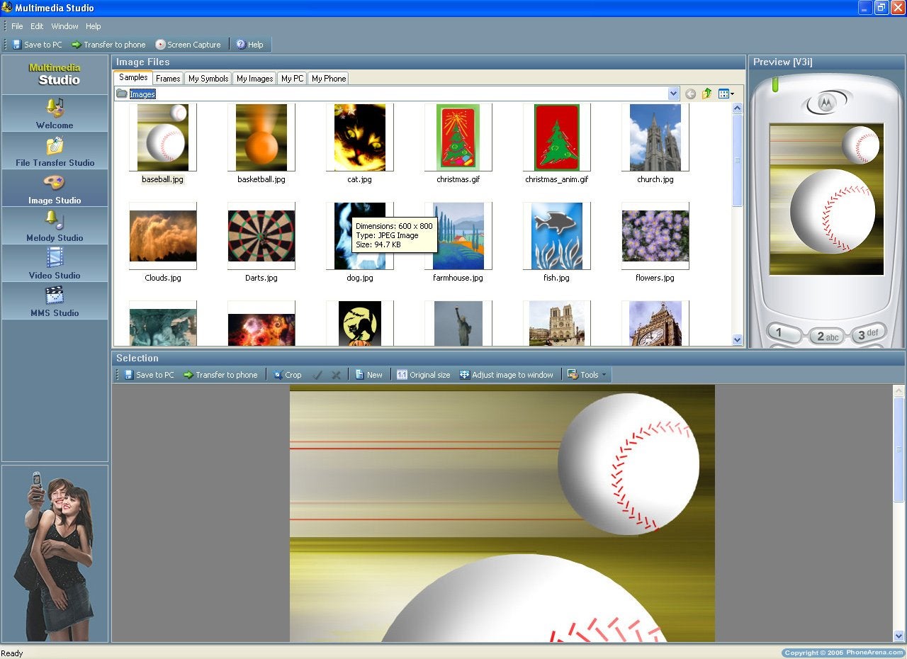
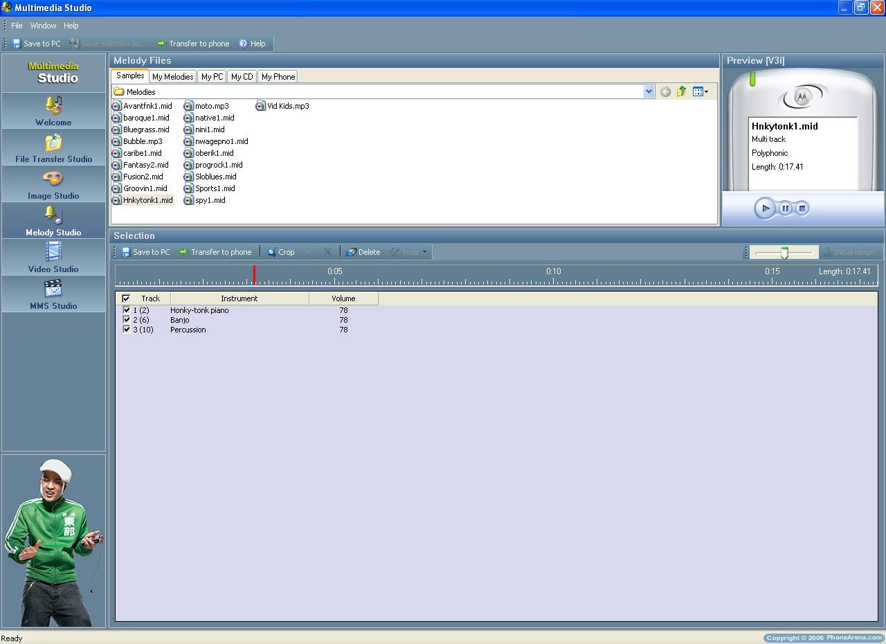
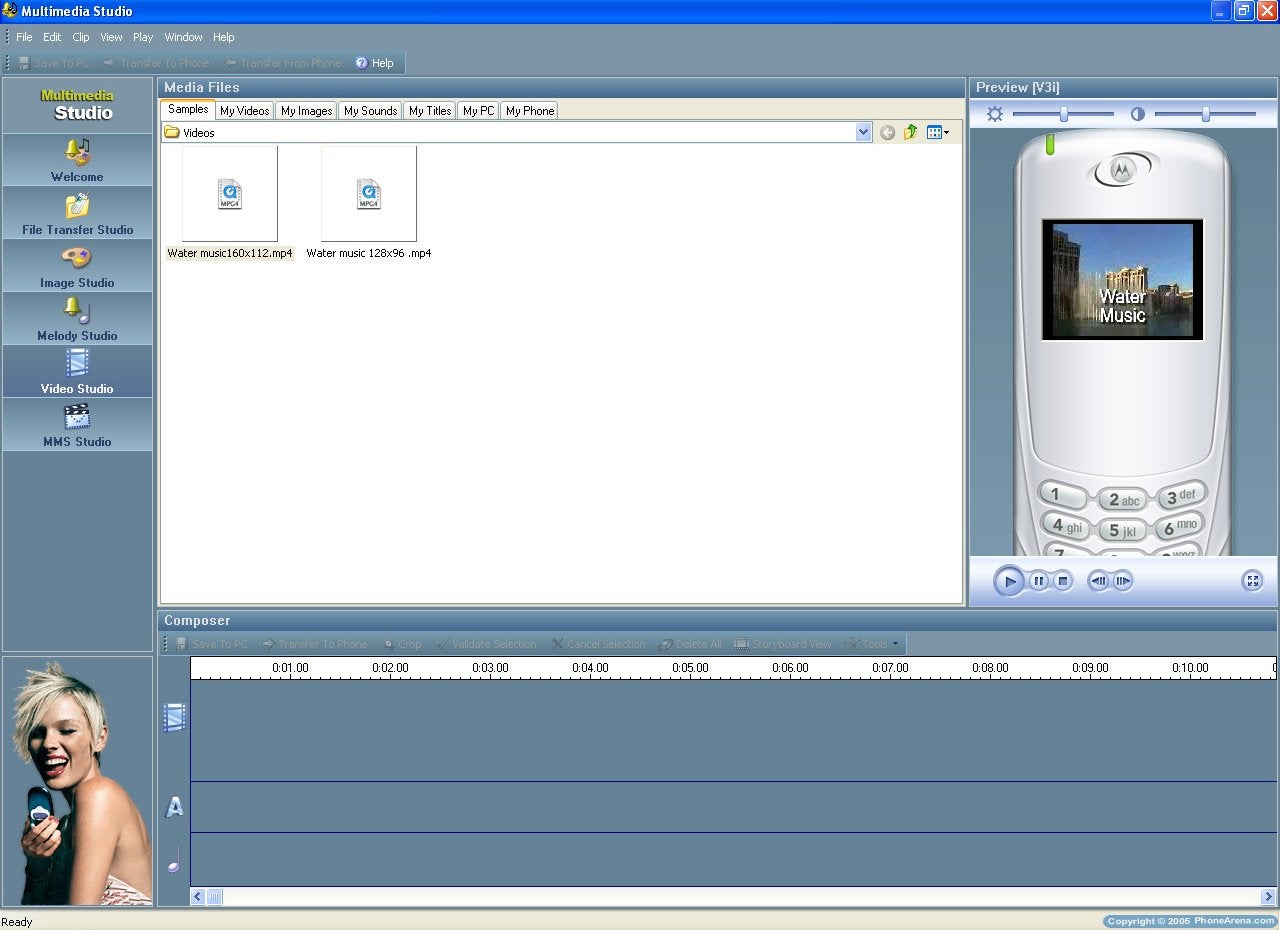
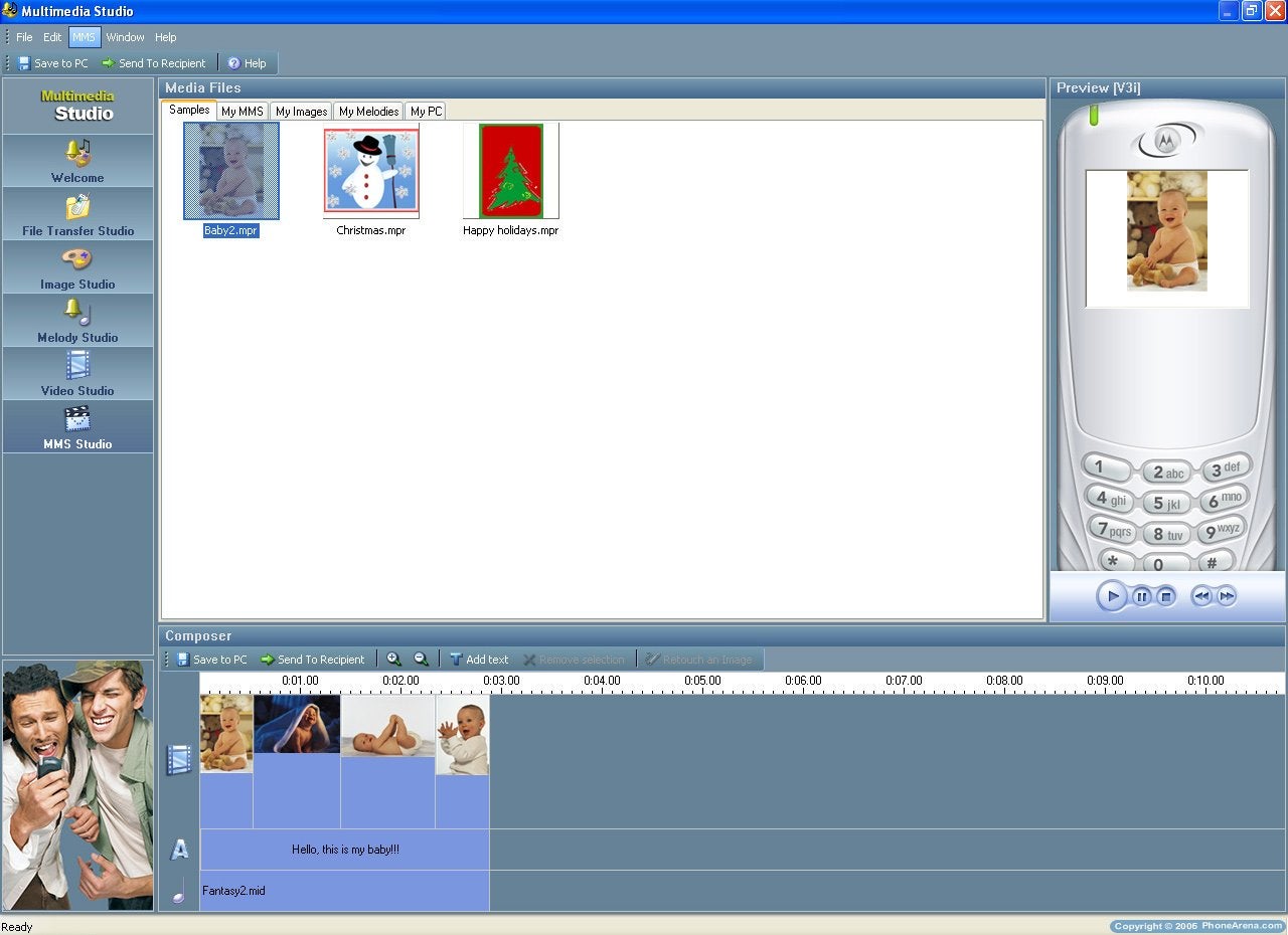
The Multimedia studio allows transfer, edit or compose photos, videos, ringtones or MMS messages. It is separated in several sections File Transfer Studio, Image, Melody, Video and MMS studio. All of Studios have many samples, which can be used. Very nifty feature is the preview panel where the images, the sounds or the videos can be played or seen as if they have been uploaded on the phone.
|
|  Multimedia Studio Multimedia Studio |
| |
|  Images Studio Images Studio |
| |
|  Melodies Studio Melodies Studio |
|
|
|  Videos Studio Videos Studio |
| |
|  Media Files Media Files |
| |
Overall, the Motorola's PC Suite is probably the best one on the market right now. It is very easy to use and has some advanced features, not seen in the rest of the bundled software packages.
Performance:
Working with the phone is pleasant – overall the browsing through the menu is fast. It takes a little longer when starting the camera or opening pictures, especially when it is a larger picture. The loading of the Java applications is normal for a phone of this class and it is neither fast nor slow. The RF performance of the phone is strong and in places where other phones struggle, the V3i has no problems.
The sound of the melodies is strong and good, the MP3 files sound clear and pleasant. Besides that the vibration is above the average level and it is hard to miss a call even in a noisy environment. On a call, the sound is strong and clear, if you place the phone accordingly. During the test I noticed, that if I slightly misplace that headphone the sound level drops much lower, since the sound apparently is highly directed. The microphone is strong and the people you are talking to hear you without any extra noise. The battery held up for about 2-2.5 days with a little usage of the phone. It would be hard to keep it for 3 days without recharging, but it all depends on the usage. The battery will be fully charged for about 2 hrs on the charger.
Conclusion:
V3i is a proud descendant of the RAZR series – phones which do not have the ambition to gather all technical miracles, but to be stylish. The thin body is of very good quality and beautifully reflects light, and besides that is solid and there are no irritating sounds. Combined with a beautiful and large color display on the inside, which is easily personalized with different themes, the phone is one little stylish jewel, which even has multimedia capabilities such as mega pixels camera which can record video and a music player with additional memory.
As always, if you are interested in becoming part of our review team, drop me an email at: kidoborg@phonearena.com







Things that are NOT allowed: