Motorola Moto X Pure Review
Introduction
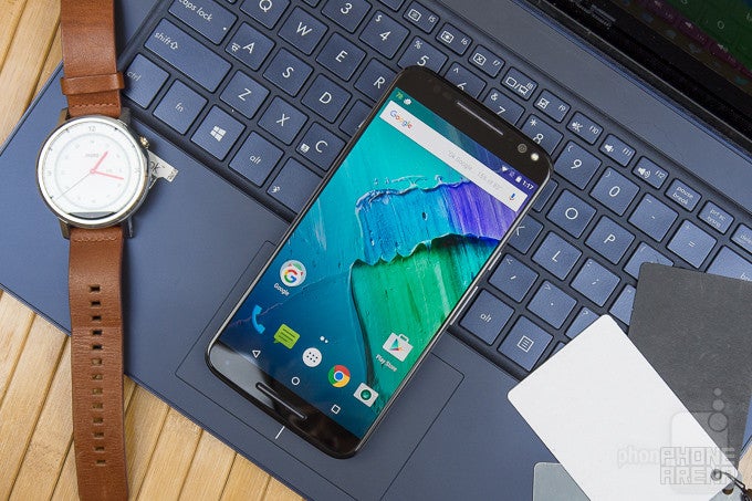
If you haven’t noticed, the Motorola of today isn’t the same as the Motorola of the past. The company has gone through several changes over the course of the last few years, being notably gobbled up by Google back in 2012, only to be sold shortly later on to Lenovo. You’d think that the new Motorola, now a Lenovo company, would’ve been absorbed entirely and be given a clean slate, but it seems as though that’s not the case, as Lenovo’s influence is yet to have any profound presence in Motorola’s way of doing things.
That realization became more evident when its latest Moto X smartphones were revealed a couple months ago, bringing forth some upgrades that make them specs beasts like much of their rivals in the space, all the while being accompanied by affordable-for-the-class price tags. There are two Moto X versions this year: the Moto X Pure Edition for the US, and the Moto X Style for international markets. The two devices are almost identical in terms of both hardware and software, with the only difference being that the Moto X Pure Edition is sold unlocked, and has all the needed LTE bands for the US market. It'll also be the one that's going to be the focus of this review. Going for an intriguing fusion of mostly vanilla Android software with an alluring $399.99 cost, the Moto X Pure Edition absolutely seems to be our kind of smartphone. Let's take a deeper look!
The package contains:
- Motorola Moto X Pure Edition
- Turbocharger
- SIM removal tool
- Clear bumper
- Users guide
- Safety and information
Design
Bigger in size, same highly customizable design.
What’s most apparent here is the significant size increase, going from a manageable one with last year’s Moto X, to a size that puts it into phablet category. Certainly, it’s tougher to grasp comfortably with one hand, but it’s not tougher to hold than, say, the Galaxy Note5. Some won’t be thrilled by the increase in size and weight, but we find it still pleasant enough to operate without feeling that its size is too overbearing.
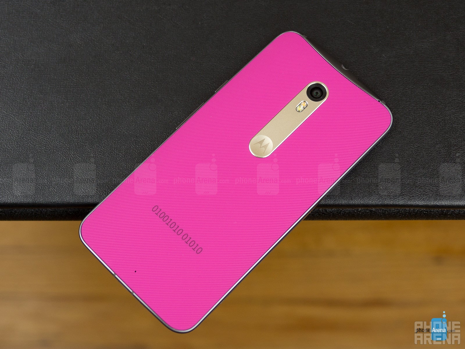
Besides the size disparity we’re dealt with now, the Moto X Pure’s design, much like previous Moto Xs, can be fully customizable to complement your particular taste and style – this alone is what makes it undeniably cool and still different. Sure, its design might not directly exude the premium finish of some other high-class smartphones out there, but when you can choose base colors for its chassis, accent colors, and even add an engraving, all without any additional cost tacked on, it’s impressively satisfying in how we’re given control to how it ends up looking. In addition, particular color combinations help to make its design stand out even more. Well, just know that certain materials, like the wood and leather options, do incur higher price points.
Considering that it employs the same design language as its predecessor, it means that many of the characteristics we’re familiar with are present here again – such as the power button and volume controls positioned on its right edge, 3.5mm headphone jack and SIM/microSD combo slot on the top, and a microUSB port on its bottom edge.
This time, however, we now have true dual front-firing speakers, which is always an appreciated asset. Another new change pertains to what’s accompanying the front-facing camera – an LED flash, which is a great addition for those who love taking selfies. And yes, the same Motorola logo dimple is found in the rear, but it has more in common to the first-gen Moto X because it’s not as recessed or large in size as the 2nd generation Moto X.
One last notable thing to point out, the Moto X Pure keeps up its protection by offering the same water-resistant nano coating to safeguard it against minor incursions - such as splashes for example.
Display
They ditch AMOLED in favor of IPS-LCD, and with that, improvements accompany it in every category.
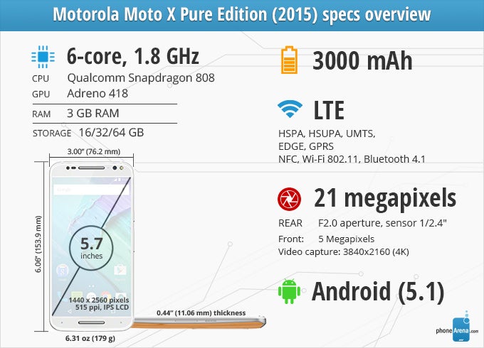
Ditching AMOLED technology, and opting to go instead with a 5.7-inch 1440 x 2560 (Quad-HD) IPS TFT LCD protected by Gorilla Glass 3, the Moto X Pure makes for a compelling argument on the specs front. Details are crisp and plentiful, which is what we'd expect from a number crushing QHD panel with 515 ppi... Well, the fun’s just beginning with this one, seeing that there are a lot of favorable qualities accompanying this new display.
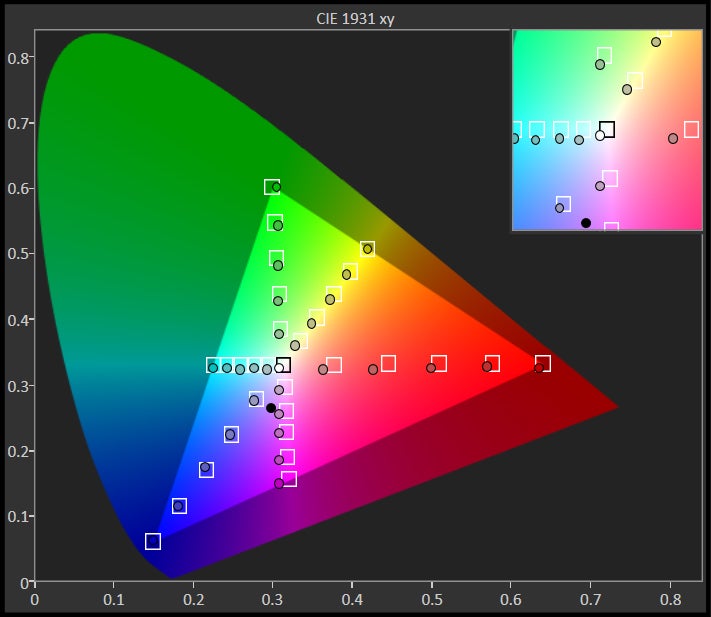
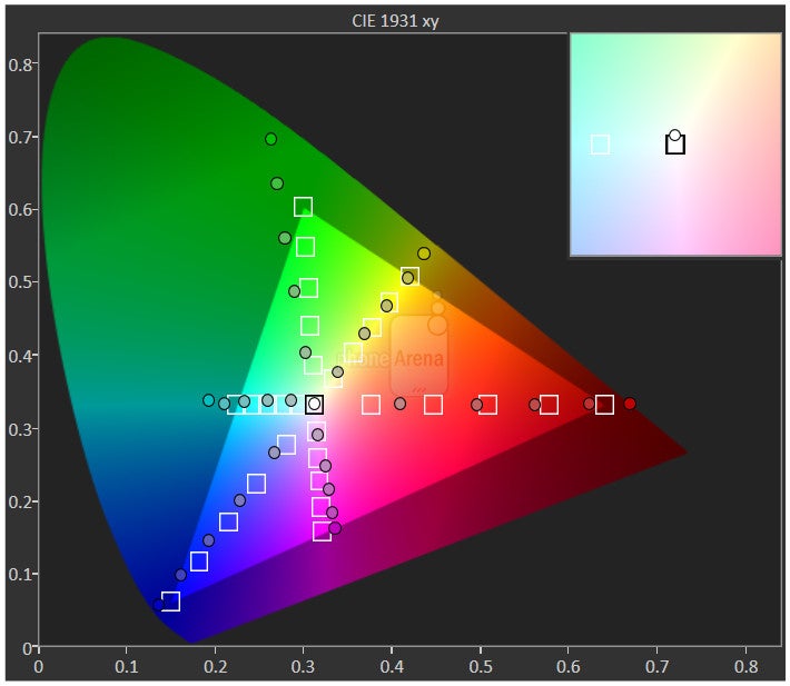
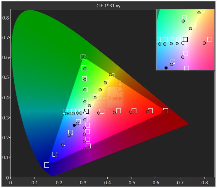
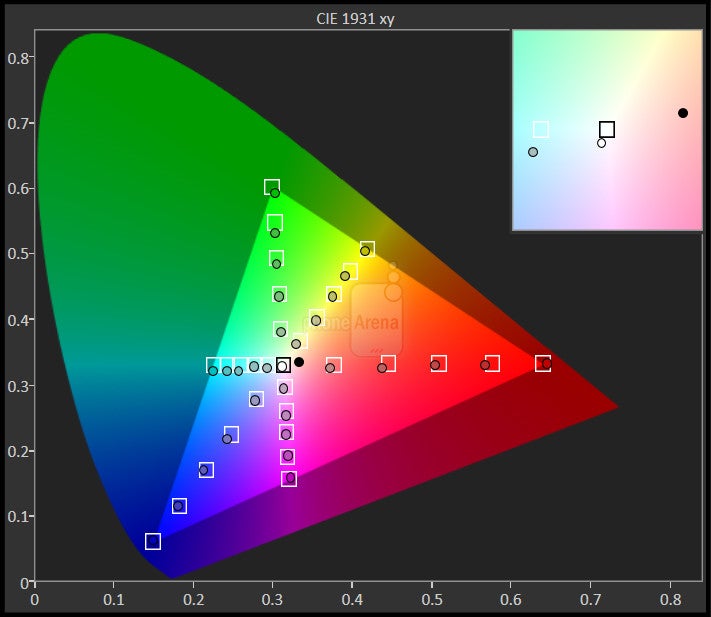
Franky, this is a substantially improved panel over last year’s dim, colder-toned, and overblown AMOLED one. Its color temperature of 6748K, for example, is very close to that ideal reference value of 6500k, which gives it a very neutral tone – so it’s neither too warm nor tool cold. Secondly, its 2.19 gamma value is also an improvement over its predecessor. What’s really most astounding, though, is how it’s better at accurately reproducing colors in the sRGB color spectrum chart, as well as emitting a blinding 715 nit luminance, which demolishes last year’s mark of 385 nits.
Everything about the screen is improved, but in parting ways with AMOLED, we, of course, can tell that black is no longer the endless, deep pitch black that it once was. It’s especially noticeable when the screen ‘breathes’ for its Moto Display feature – it doesn’t necessarily achieve the same pure black tone as its AMOLED counterparts. Regardless of that, its potent brightness output, outstanding color reproduction, and vivid looks give it qualities that rival the Note5’s almost-perfect display.
Interface and Functionality
Moto’s services continue to complement the experience in a meaningful way, rather than overwhelm it.
One of the many pleasures of the Moto X Pure, much like its predecessors, is that we’re exposed to a mostly stock Android 5.1.1 Lollipop experience – only to be complemented by Moto’s customary, enhanced services. Now, while it’s a straightforward and relatively hassle-free experience, with Material Design’s presence in full effect, there isn’t anything hugely different from what we’ve experienced previously. In particular, Moto Assist, Moto Actions, Moto Voice, and Moto Display are all once again present here. They’re meaningful services that we find extremely useful, while not coming off as being redundant.
All of those services exemplify what we want to find in an experience, simple and approachable features that aren’t complex or overwhelming. The only new feature with the experience relates to Moto Actions, where we can now perform this chopping gesture at any time to turn on the LED flash. Besides that, everything that we know and love is still here. Moto Assist helps to manage how the phone behaves at certain places and times, like how it’s automatically placed into silence mode while we’re sleeping – or set to read all incoming texts when we’re at home. Moto Voice is just as intelligent as ever with its always-on listening, allowing us to launch the service at any time by speaking the launch phrase. And finally, Moto Display eliminates the need for us to constantly press the power button to tell the time or view some notifications.
Unlike some of the heavily customized Android experiences out there, this one merely builds upon the foundations of stock Android – it’s a timeless approach from Moto, but it would’ve been nice to see some additional stuff besides the new chopping gesture. At the same time, however, this model of bringing few features prevents the experience from being too complex and overwhelming, which can sometimes have a negative effect to the user. And yeah, have we ever mentioned that we far prefer stock Android to any custom UI or skin? We certainly do, and the Moto X Pure Edition reminds us of that once again!
Processor and Memory
The Snapdragon 808 isn’t as fearsome as other chips, but it still proves quite effective at handling stuff.
In reaching that low price point, it doesn’t surprise us that the Moto X Pure is powered by a hexa-core 1.8GHz Qualcomm Snapdragon 808 SoC coupled with the Adreno 418 GPU and 3GB of RAM. This particular combination isn’t necessarily classified as the most fearsome, but we’re thoroughly pleased by its snappy handling. Quickly breezing through the interface, every action is accompanied with that tight response, so don’t think that this chipset is underpowered. The near-stock Android software certainly helps here.
Understandably, it puts out about the same scores as the LG G4, which employs the Snapdragon 808 as well, across various processing and graphics benchmark tests. While the hardware is effective to offer a smooth experience navigating through the interface, it doesn’t quite have the same frame rate performance in the graphics processing end like competitors who employ top-shelf silicon, such as the Galaxy Note5 or iPhone 6s Plus.
Available in either 16GB, 32GB or 64GB capacities, it’s nice to see that Motorola is giving us some options, especially when they are all complemented by a microSD card slot for even more flexibility.
Internet and Connectivity
Combining its high-res screen and snappy performance, on top of its LTE speeds, it makes for a wonderful web surfing experience. Pages are rendered properly without much wait, while navigational controls such as kinetic scrolling and pinch zooming all happen with ease. There’s nothing to complain about the experience, naturally, especially when there’s just a generous amount of real estate for us to enjoy viewing web sites. Even better, Moto Voice is smart enough to open a particular site by just speaking it.
Carrier freedom, it’s something that stands out radiantly here with the Moto X Pure, since it’s unlocked and ready to operate on all major networks. This approach gives buyers the freedom to choose their carrier without the worry of incompatibility, since it boasts more cellular band support than the Nexus 6 and its predecessor. In addition, it’s accompanied with all of the usual connectivity features found on any high-end phone – so that consists of aGPS, Bluetooth 4.1, dual-band 802.11 ab/g/n Wi-Fi, and NFC.
Camera
It’s a significant improvement over its predecessor, but still trails the class-leaders in the space.
One of the most underwhelming things about last year’s Moto X was its underperforming camera, it just didn’t deliver the goods to rival its competition. This time around, though, they’ve brought on a significant upgrade in the form of its 21-megapixel 1/2.4” rear camera sensor. That, of course, is accompanied by an f/2.0 aperture lens, 1.1 μm pixels, BSI, digital image stabilization, dual-toned LED flash, and 4K video capture. If that’s not enough for a compelling package, there’s also equal love given to the front-facing camera too – a 5-megapixel camera with a rare LED flash sitting next to it.
No doubt, the camera hardware sounds delicious enough. The interface, on the other hand, doesn’t see any new acquisitions to its package. Yes, there’s still that quick twisting gesture to launch the camera at any time, but it’s extremely light with its shooting modes and offerings. You get customary things like HDR and panoramic modes, but that’s just about it – there’s no manual mode for advanced settings adjustment. On one end, it’s nice that the experience is kept simplified and whatnot, eliminating any distractions that might come with these extra shooting modes and controls, but still, it would’ve been nice to have those options at our disposal.
Image Quality
Needless to say, we’re stoked about the new gear in tow, but how’s its performance? First and foremost, we’ll certainly say that it’s a step up over last year’s offering, seeing that in general, it delivers superior results. However, while we enjoy that reality, its quality is still a step behind class leaders in the space like the iPhone 6s Plus, Note5, and LG G4. It might be difficult when looking at the overall picture, but as we dissect and look deeper into them, it becomes more noticeable.
It’s able to conjure up some good details with its shots, under ideal lighting conditions to be exact, which is complemented by the neutral tone colors it produces. Comparing its details capture to that of the Note5, we can see that the blades of grass in many of its shots aren’t as clearly defined.
When it comes to dynamic shots, its HDR mode does well to even out the exposure and dynamic range throughout the range – without applying too many artificial elements to the composition. Colors appear to receive a boost in saturation, but it’s not overpowering to the point of making the shot unrealistic. It’s unfortunate, however, that its panoramic shots are soft toned and lacking with the details.
Using it when lighting is non-existent still proves to be challenging with this year’s model – albeit, it’s a step up over last year. In addition to the digital noise and washed out colors that are present in the shots, details are significantly affected, appearing more splotchy and less-defined. We can obviously go ahead and use its dual-toned LED flash to combat some of its unpleasant qualities, but it tends to favor a slightly warmer and yellowish tone, making it appear a bit unrealistic in the process.
On the flip side, we’re happy to report that the front-facing 5-megapixel camera is a pleasure to use. Not only can we squeeze a decent amount of faces when capturing a selfie, but its good overall quality under ideal conditions make it satisfying to use. Yes, its quality starts to crumble as there’s less light, but compensating that is the LED flash that’s there – a feature that you won’t find in many other phones.
Video Quality
We’re pleased with its video capture as well, especially with its 4K recording because of the amount of detail captured by it. There are also several favorable qualities that accompany it too, like its smooth continuous auto-focus, moderate exposure adjustment, and pleasant audio recording. We will say, however, that there’s this noticeable jiggle effect when the camera is panning very quickly.
Multimedia
Yes, we now have real dual front-firing speakers, which are incredibly powerful.
Since we’re dealing with nearly stock Android here with the Moto X Pure, it’s no shock that the Google Play Music app is preloaded on the phone – making it the default player. Functioning in the same capacity as any other phone with it, the experience is aided by its dual front-firing speakers, which musters up a potent 79.1 dB punch with its output.
It’s undeniably powerful and loud, giving it the kind of commanding presence in small and large spaces. And best of all, there’s no distortion or shrill tones when it’s placed on the loudest volume setting. Rather, we’re given deep tones that sound crisp and retain their clarity throughout all audio ranges. The headphone jack also manages to offer a convincing experience thanks to its 0.981V output.
All sorts of video play smoothly and effortlessly. The only missing thing that solidifies its package is just a multi-tasking aspect that would permit us to do something else simultaneously.
Call Quality
No complaint here, it does an excellent job!

Battery
While it’s a small improvement over last year, its battery life is still underwhelming in the face of its competition. However, it’s one of the fastest charging phones ever!
With the substantial size increase, the battery balloons from a capacity of 2300 mAh with last year’s model, to a beefy-sized 3000 mAh cell here with the Moto X Pure. This, naturally, is necessary due to the larger, higher-resolution screen it’s packing along for the ride. While we find its performance to be marginally better than that of its predecessor, capable of getting us through a busy 8-hour work shift with ease, it’s not the kind of thing to give us that non-stop, all-day consumption that some of its rivals offer now.
Motorola touts its TurboPower charger offers the world’s fastest charging. We put that claim to the test, and sure enough, it’s a valid one. Incredibly, it takes a class-leading 78 minutes to get it back to full capacity, which beats out the majority of the phones in our chart, including the already fast Note5. The only thing missing here that would’ve rounded out its package is built-in wireless charging, but then again, we understand that it could have an adverse effect on its low cost.
Conclusion
Motorola has something special here with the Moto X Pure. Some folks might frown upon the significant increase to its size, but it still manages to follow the same fundamental principles of the series. That means a highly customizable design that comes with a mostly stock Android experience.
Starting with the former, it continues the trend of being the only smartphone that gives buyers the higher degree of control for the outcome of its design. Not only are there several different materials and colors to choose from for its chassis, but there are even options to choose its accent color, making for a fun time picking and choosing the best combinations. Secondly, the mostly stock Android Lollipop experience here means that new updates to the software won’t take as long to arrive as with other phones running heavily customized ones. And Moto’s included features continue to be meaningful ones that improve the overall experience, as opposed to overwhelm it.
What’s most astounding, though, is the fact that the Moto X Pure is sold unlocked and can be customized via Moto Maker for the base starting cost of $400. That’s incredible value considering that it also features a water-resistant construction, 32GB of storage with microSD card expansion, and a gorgeous, super-high-resolution 5.7-inch screen. However, there’s still room for improvement with its camera and battery, which are better than those of its predecessor, but still not quite reaching the exceptional performances we’ve seen produced by the leaders in the pack – namely, the iPhone 6s Plus and Note5.
Still, we can’t deny the fact that it undercuts its rivals with its impressive $400 cost. For that amount, we’ll gladly accept its shortcomings, since it musters up what’s perhaps the best value in a phone we’ve seen this year. In all fairness, if cost is a major factor in your decision, the Moto X Pure has everything to make it a strong consideration. Trust us, for the money you dish out for this, you’re getting incredible value and performance.
Software version of the review unit:
Android Version: 5.1.1






Things that are NOT allowed: