Motorola Moto X 2014 Review
Introduction
Reinventing itself last year, Motorola struck a chord in the Android community with the launch of its Moto X smartphone. It was a bold venture indeed, especially in light of the competition that it had to fight against in the space. Competing valiantly to stay relevant amidst the heavy spec’d devices that existed at the time, the Moto X proved that a good phone doesn’t need to conform to the preconceived notions of better, faster, and stronger. Rather, it delivered a resounding experience that didn’t overwhelm us with its set of features – while providing a higher level of customization to its design than anything else.
One year later, one year wiser. Its successor, one that bears the same name, receives all of the evolutionary upgrades typical of any successive device. From the looks of it all, the same recipe from last year has been used again with the new Moto X – so you have the same level of customization with its design, simple features that aren’t redundant, and it’s not so specs-conscious. Going with this mentality, it’s unclear at the moment if it’s going to be enough to sway consumers away from the other handful of models already making noise in the space.
The package contains:
- microUSB cable
- Wall charger
- SIM removal tool
- Quick start guide
Design
Sticking with the same foundational design language, the Moto X is able to sport a more aggressive design that gives this mostly plastic bodied thing some serious appeal.
There’s no arguing that the new Moto X bears the same foundational design characteristics we saw last year, but it’s now sporting a more aggressive design that we like – and sophistication too, depending on what rear casing option you choose to go with. What’s most apparent, though, is the increase of size, which makes it tougher to try and operate with a single hand. Even though it’s wider and taller, the Moto X maximizes the real estate it has to work with, as it’s able to offer more display area than the Samsung Galaxy S5 while being slightly shorter and having the same width.
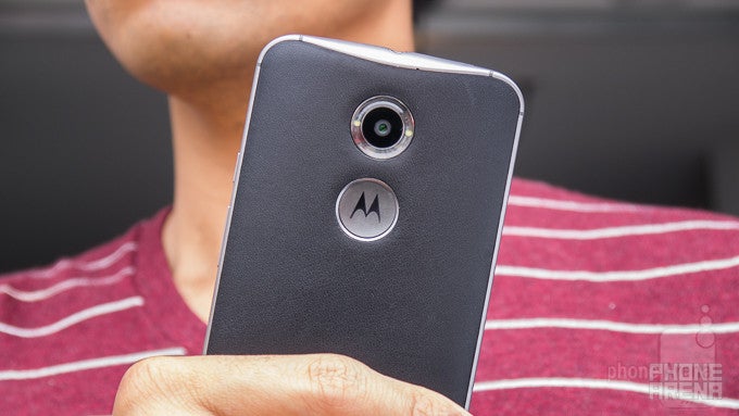
When Moto Maker for the new Moto X launches, prospective buyers will have the same level of control in designing the phone as they had with last year's model. From choosing the colors of the front and rear casings, other additional goodies, such as selecting the color accents to custom engravings, help to continue giving the new Moto X an unprecedented level of customization. In addition to the bevy of colored plastic casings and wooden ones, this year’s model can also be outfitted with genuine leather options from the Horween Leather Company – giving it that sophisticated appeal. Our particular model bears this new finish, but as much as we appreciate its added appeal, we’re reluctant to say we’d go with it again because it’s prone to being scuffed more easily. After a few days of using the new Moto X, we already have some blemishes to its leather finish.
One new change to the design that we really dig is the aluminum frame that wraps around the entire edge of the phone. Of course, it contributes in giving the phone a more premium quality, but it certainly helps to give it a solid construction as well. In contrast to last year’s model, this new one is undeniably more sturdy. Just as before, the new Moto X also packs a “splash guard” water-repellant coating to ensure it’ll be protected against minor things like using it in the rain, but don’t expect this to have the same resilient water-resistant qualities of the Galaxy S5 or Xperia Z2.Although mostly comprised out of plastic, the new Moto X definitely has a design that’s more attractive than other plastic cladded smartphones. Throw in its sturdier construction and supreme design customization, the new Moto X has the eye-catching looks to make bystanders perk up and take notice of it.
On the right, the power and volume controls are rigid, allowing us to feel their springy responses. Along the rear, the only item found here is the microUSB 2.0 port. Sure, we would’ve liked it upgraded to a microUSB 3.0 to match its rivals, but we’re not entirely heartbroken about it. The left edge is completely clean, while the top is home to the nanoSIM slot and 3.5mm headset jack.
Yes, the Moto X offers two front facing speakers, but the top one is strictly for calling – whereas the bottom one is for blasting music and other things. Although it’s tough to make out with the black color front casing of the Moto X, there are actually infrared sensors on the corners of the front panel that are used with the phone’s new gesture features. However, they’re plainly evident if you opt to go with the white colored front panel.
In terms of cameras, the new Moto X receives its fair share of upgrades, since it now bears a higher count 13-megapixel rear camera, which features an f2.2 aperture lens, dual-LED ring flash, and 4K video recording. Complementing it is a front-facing 2-mgeapixel camera. Noticeably absent is a microSD card slot.
Display
The 5.2-inch 1080p AMOLED display might not have stellar qualities in all areas, but the entire package is a pleasant one.
Last year’s 4.7-inch 720p AMOLED display didn’t really scream flagship status, but this time around, Motorola has graced the new Moto X with one that’s better able to match its contemporaries. To be more exact, it’s flaunting a 5.2-inch 1080 x 1920 (1080p) AMOLED display with Gorilla Glass 3.
In the details department, its pixel density count of 424 ppi is more than sufficient to give everything a crisp look to it. Nowadays, quad HD resolution is springing up more frequently, but Motorola again takes the approach of going with something effective for the occasion. Honestly, we have no complaints about it.
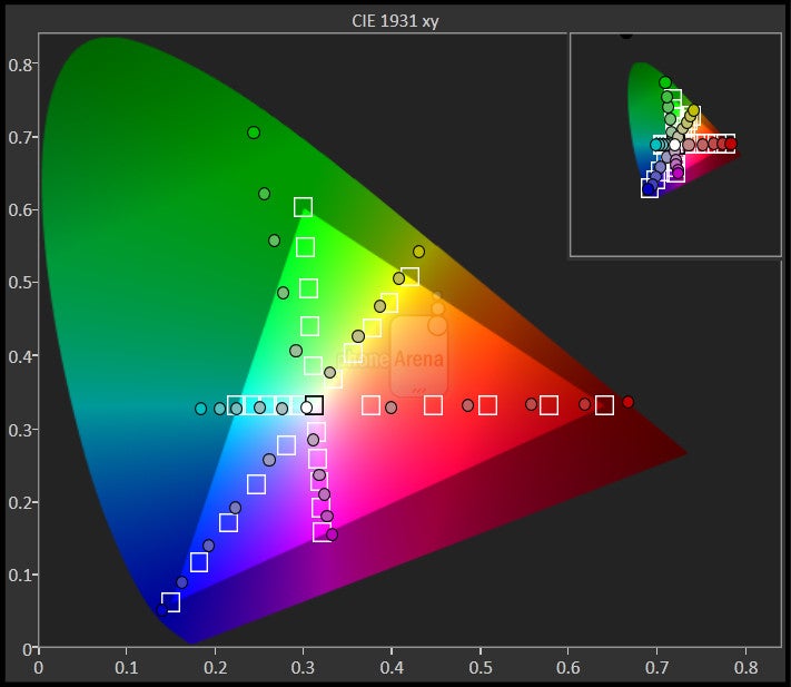
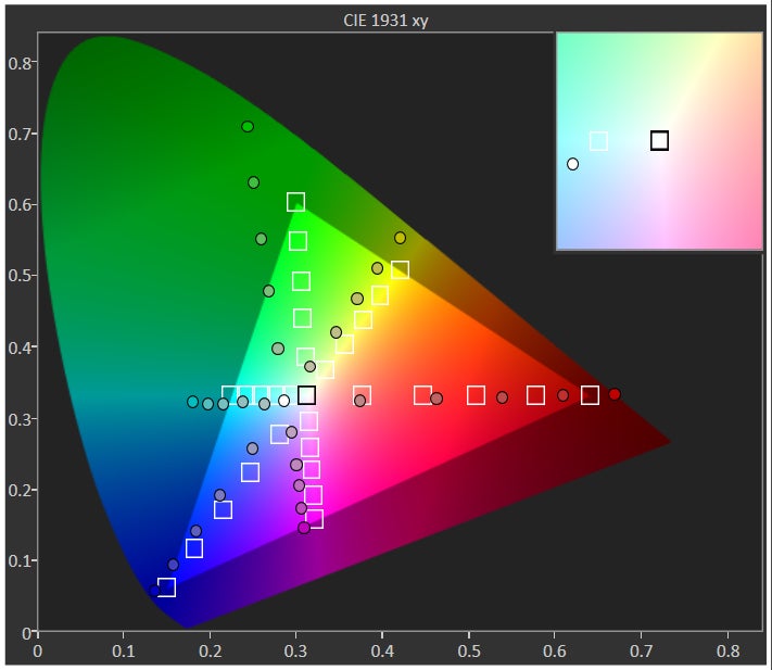
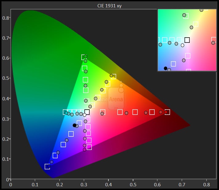
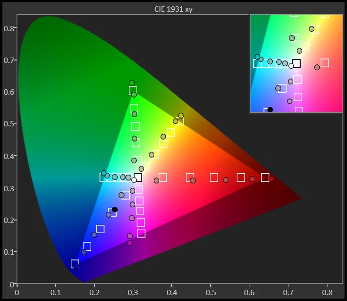
Going with AMOLED technology once again for its display, there’s no hiding the fact that it’s super saturated with its color reproduction. Very recently, AMOLED technology has proven to be able to be just as accurate as today’s LCD displays – evident by devices like the Samsung Tab S and Note 4. However, this is not the case with the new Moto X – it has a profound bluish tone, with color temperature of ~7000 K. Indeed, our eyes glaze over with awe thanks to its over-saturated tone, but in reality, the Moto X’s display is far from the most accurate, but has that wow factor.
Unfortunately, the screen becomes almost unviewable outdoor with the sun present. Therefore, this is something that frequently requires shielding – a bothersome method, but nonetheless a required one. Looking at the big picture, one can argue that the display has some milder qualities to it, but quite frankly, it’s still an attention getter thanks to its vivid colors.
Interface and Functionality
The almost stock Android 4.4.4 KitKat experience makes it fun and simple to operate the phone.
In a time when smartphone manufacturers kept on packing in more features to the Android experience, Motorola has done the opposite. True to its roots, established by last year’s Moto X, the new version follows suit by again presenting us with an almost stock Android 4.4.4 KitKat – the few customizations in tow don’t affect the interface, but rather, they’re simply enhanced software features. By going with a vanilla experience, it’s almost certain that it’ll receive new updates significantly faster than those with heavy customized experiences.
Motorola goes with the mentality of focusing its efforts on a few, but very useful features, that complement the overall experience. Instead of inundating us with a ton of new features, Motorola has simply enhanced the features it introduced with the original model – to not overwhelm us. Frankly, we really appreciate this move, as the Moto X’s updated features are all relevant in making the experience intuitive, simple, and straightforward. Let’s revisit and explain, shall we?
Moto Assist
This is something we saw last year, but Moto Assist is enhanced here to improve our interaction with the phone. Previously, it provided us with certain modes depending on the situation – such as silencing the phone during a meeting or automatically replying to text message while driving. Naturally, Motorola expands its functionality to a greater degree. For example, the phone can now read out our text message while we’re driving, or while at home. At night, the phone will automatically go into quiet mode to prevent those unwanted random calls from waking us mid-sleep.
Moto Display
Formerly known as Active Display, the feature has been rebranded to Moto Display – while being enhanced in the process, of course. Arguably one of the features we were astounded by last year, Moto Display goes the extra mile by being smarter. Relying on the IR sensors around the display, we can wave our hand over it to quickly glance the screen and any pending notifications. Again, only a small section of the screen is turned on to preserve battery life. With notifications, we can “peek” by simply holding our finger over the corresponding icon.
Moto Actions
Working together with the IR sensors as well, Moto Actions enable us to use various gestures for other functions. We’ve pointed out how we can wave our hand to wake up the display, but it’s also used to silence an incoming phone call – or silence the annoying alarm clock in the morning to wake us up.
Moto Voice
Touchless Control was arguably the highlighting feature with last year’s Moto X, but it has been overhauled to provide us with more control of the phone via voice control. First and foremost, we can now personalize the launch phrase. Instead of speaking “Okay Google,” we can opt to go with other phrases that appeal to us – such as “computer activate” in our case. We tried simply to use “computer” at first, to emulate that Star Trek experience, but it’s too short for the service to accept.
Moto Voice works in conjunction with Google Now, so we’re able to get a host of functions – like respond to text messages, ask for the weather conditions outside, set up an appointment, and even receive driving directions. Moving beyond the stuff that Google Now is able to deliver, Moto Voice is compatible to work with a few third party apps as well – with continued support in the pipelines. For example, we can now utilize Moto Voice to post a status on our Facebook page.
Shutterbugs will also love that we can use Moto Voice to quickly launch the camera to take a snapshot, or a selfie by speaking “take a selfie.”
Simple is good
Motorola has taken a different approach from its competitors. It’s a bold direction in the wake of what its rivals are doing, as they continue to pack on features upon features to their customized Android experience. At the core of it all, Motorola’s laser focus on enhancing a few select features, as opposed to branching out to several ones, is something we truly appreciate. Simple is good, and that’s exactly what we’re given here on the new Moto X. Basically, the new features in tow are all things we find as intuitive in driving the operation of a smartphone.
Messaging
Going with the stock Android keyboard, we’re able to effortlessly tap away writing up long messages thanks to the keyboard’s responsiveness, spacious layout, and spot-on auto-correct feature. Were we really going to find any faults with it? Not really.
Processor and Memory
The new Motorola Mobile Computing System delivers a top-notch performance.
Motorola isn’t too keen about specs, since they hinge results solely on real-word results. Updated with Motorola’s newest Mobile Computing System, which is comprised out of a natural language processor, contextual computing chip, and a quad-core 2.5GHz Qualcomm Snapdragon 801 SoC coupled with 2GB of RAM, we’re seriously impressed by the Moto X’s super snappy responsiveness. Hell, it’s pretty darn fast in our opinion – plus it’s something that’s able to handle today’s 3D intensive games with no fluff.
Offered in 16GB and 32GB capacities, we’re simply bummed by the fact that it lacks a microSD card slot.
Internet and Connectivity
Armed with 4G LTE connectivity, a crisp display, and a spacious amount of real estate to work with, the web browsing experience comes to life with the Moto X. Running on all cylinders, the phone delivers an experience befitting of a flagship.
A world phone for the masses, the new Moto X is offered in a variety of configurations – four to be more exact. Available in both GSM and CDMA flavors, it’s currently launching in the US through AT&T and Verizon. Complementing its cellular radios, it packs connectivity features such as aGPS with Glonass, Bluetooth 4.0, dual-band 802.11 a/b/g/n/ac Wi-Fi, NFC, and video out functionality courtesy of its cast screen feature.
Camera
Jumping up to a bigger 13-megapixel camera, the Moto X receives a subtle improvement to its quality, but it continues to largely remain a step behind the pack.
Absolutely, the biggest disappointment of the original Moto X was its camera. At the time, Motorola cleverly coined the “Clear Pixel” with the original’s 10-megapixel camera, which regrettably didn’t give any meaningful competition to what was available then. Thankfully, they’ve upgraded the hardware this time, as it now bears a larger 13-megapixel 1/3.06” sensor – one that’s complemented with an f2.2 aperture lens, dual-LED ring flash, and up to 4K video recording.
Jumping into the camera app, we still really like that it can be instantly accessed at any time by merely taking hold of the phone in our hand, and then twisting our wrist a couple of times to launch the app. Of course, the majority of the camera UI is reserved for the viewfinder, but it also sharing the space with its various shutter keys and options. Compared to the competition, it’s light on features – and almost non-existent with manual controls. That’s not to say that it takes away from the experience, since we have popular modes, such as panoramic and HDR modes, in tow with the shooting experience. Unfortunately though, the panorama shots are of very low resolution (about 3MP) and quality to be considered good 0 rival phones make up to 50MP panos!
Taking a page out of HTC’s playbook, the Moto X’s gallery app has a new feature called “Highlight Reel.” Similar to HTC Zoe, Highlight Reel is a short clip that’s automatically compiled by the phone using photos and videos taken by the camera. Obviously, it’s a wonderful way of looking back at some of the memories we’ve taken. And if we don’t like what it stiches together, we can customize it to our liking.
Furthermore, another feature related to the camera, Best Shot, allows the phone to magically snag the best shot. Sometimes we totally miss the mark, such as in the case when a person in the frame looks briefly away from the camera, but the best shot feature is able to compensate by analyzing the moments a few seconds before and after pressing the on-screen shutter key. Instead of being disappointed about the missed opportunity, the feature allows us to revisit the best shot.
So, how does the new camera gear fair? For the most part, we have nearly the same reservations as before. Outdoor shots under copious levels of sunlight produce rather good looking images, as there’s a fine balance between details, dynamic range, and exposure. Indeed, we really like the snappiness of the camera, but there’s just a smidgen amount of over-sharpening that’s transposed post-shot.
The biggest improvement we were hoping to see was in the camera’s low lighting performance. Although it’s a hairline better than before, we still continue to see evidence of noise and softer details with its results. Sporting a unique dual-LED flash ring, we’ll say it casts a potent punch to lighten up our shots.
Even though its still image quality has improved very subtly, the handset’s video recording quality sees a significant improvement. Certainly, we’re pleased with the results out of its 1080p video recording quality, which sees solid details, minimal artifacting elements when panning, clear audio recording, and good color reproductions. Adding to its portfolio, there is an option to shoot 3840 x 2160 at 29 FPS video recording – as well as a 1080p SloMo mode. With the former, the same results persist, but there’s more detail in its quality, giving users some leniency to cropping the video later on – and without too much impact to its detail. As for the other SloMo mode, we like the slow motion capture, but it’s light on fine details.
Ultimately, Motorola has given the phone a decent performing camera that’s undoubtedly better than what’s on last year’s model. Despite that, we don’t feel it’s better than the heavy hitters in the space at the moment. Don’t get us wrong, its quality is good, but nothing that one-ups its rivals.
Multimedia
With a powerful speaker and an iridescent screen, it has all of the qualities to enrich the multimedia experience.
Since this is a vanilla Android experience, the only music player present here is the Google Play Music app. Solely relying on the speaker below the display, the Moto X churns out a resounding 74.5 dB of power – a tally that nearly matches the HTC One M8’s dual-speakers. Powerful is one way of putting it, but the quality is complemented with a clear and clean tone.
Regardless of its inability to reproduce colors very accurately, the Moto X is a polarizing thing to use when it comes to watching high definition videos. Not only does it support a variety of codecs out of the box, but the saturated tone of the display makes all sorts of videos come to life – so we’re instantly mesmerized by its vibrancy!
Call Quality
Combining its four microphones and Motorola’s CrystalTalk technology, the call quality has never been this rich before.

Meanwhile, on the other end of the line, our callers have few qualms with the quality. Just a single one, they mention hearing a slight tinge to our voice. It’s nothing horrible to diminish the quality extravagantly, but it’s something that they’re able to notice.
Battery
Its Achilles Heel is found in its battery life, which fails to reach the levels we’ve seen from its highly esteemed rivals.

Now, depending on how you set up Moto Voice, the phone’s battery life will vary. In our experience of having it constantly listening to our key launch phrase, even when the phone is locked, the phone just barely gets us through the 15 hour mark with normal usage. Turning it off, however, we tend to get more juice out of the phone.
Running our battery benchmark test, the new Moto X pulls in 5 hours and 45 minutes before tapping out completely – a mark that’s sadly well behind its esteemed rivals.
Conclusion
Through all of the trials and tribulations, Motorola has somehow managed to stay afloat in this volatile industry. That’s particularly surprising because even though the original Moto X was acclaimed and well-received by many in the industry, it failed to spark a sizable interest over competing handsets from Samsung, HTC, and LG.
Motorola didn’t deviate from the recipe it concocted with last year’s model, but in making the new Moto X, they added enough changes and new features to warrant some merit from us. First and foremost, the design is more aggressive than before – complemented by the rich personalization of Moto Maker. Secondly, the phone performs super smoothly. Finally, the unique software features have continued to be kept at a minimum – though, the few that are present have been enhanced enough to our liking.
Add in the fact that it’s sporting a base cost of $99.99 on-contract for the 16GB model, it’s priced to sell and give the competition something to think about. Undercutting its rivals in the price department is one thing, but it’s another when consumers are given direct control of how the phone is designed. Sure, it’s not perfect, but for the things it has to offer, it provides class, simplicity, and elegance to how we use and interact with the phone. Frankly, it’s a hip looking thing that works well. It’s a flagship device here without the flagship ownership cost.
Software version of the review unit:
Android Version: 4.4.4
Kernel Version: 3.4.42-gca8e5e5
Build Number: KXE21.187-38




Things that are NOT allowed: