Motorola Moto E (2015) Review
Introduction
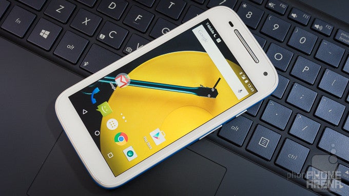
One area seeing considerable growth over the last couple of years is the entry-level segment of the smartphone market, which is garnering more and more precedence amongst companies. Last year, Motorola brought on a one-two punch with its Moto G, which was subsequently one-upped in the price department by the even cheaper Moto E. Well folks, the process is exactly the same thing this time around, as the 2nd generation Moto E dishes up an even more drool worthy starting price tag of $120 – a marginal decrease over its predecessor’s sticker price of $130. We’ve seen several value centric smartphones of late, so we’re intrigued to see how this one handles.
The package contains:
- Motorola Moto E
- Wall charger
- Product information
Design
It’s the same premise as before, simple and humble.
Simple and humble, that’s the premise behind the design of the 2nd generation Moto E. For the most part, they didn’t stray far from the design language this series is known for. What’s different, though, is that the new Moto E features a slightly more closed design – in the way that the rear cover isn’t removable like last year’s model, but rather, it’s only the plastic bezel that can be removed. Yes, it’s still constructed out of plastic. And yes, it’s incredibly compact and decent feeling with its construction, so the entire package comes off pleasantly nice. In fact, this is arguably the perfect size in an era where with 5-inchers are considered the norm.
Available in either white or black paint jobs, there’s a touch of personalization in the form of the various Motorola Bands and Grip Shells available to the phone. These Motorola Bands are offered in a palette of paint jobs, and do decently to accent the otherwise uniform colored smartphone. Even though there’s a water resistant coating with the construction, the various translucent colored Motorola Grip Shells add another layer of protection by giving the phone some extra grip and ruggedness.
Display
Generally speaking, the display bears improved qualities over its predecessor.
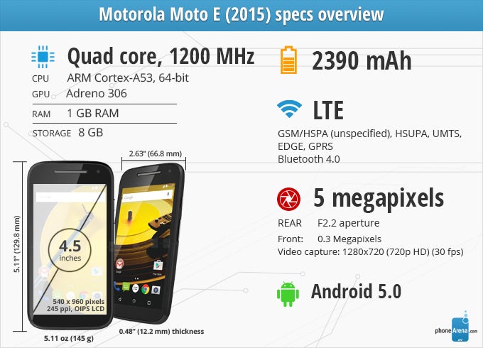
Being a smidgen longer and wider than its predecessor, Motorola is able to up the display on the new Moto E to a 4.5-inch qHD 540 x 960 IPS display. Technically, the new model dishes up a lower pixel density count of 245 ppi, due to the larger display and unchanged resolution, but it’s nevertheless still detailed enough to make out small details from a normal distance.
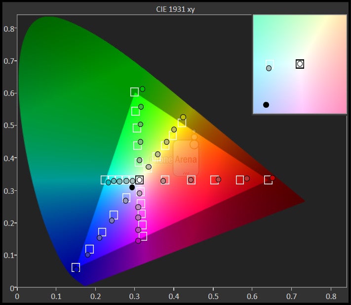
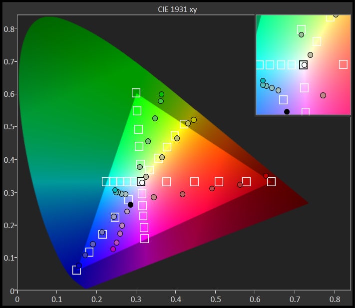
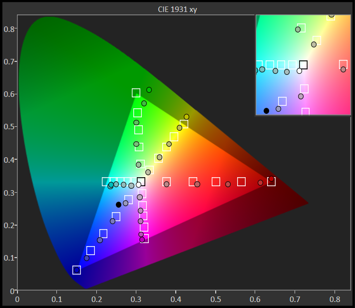
Right from the onset, even before running any of our benchmark test, the display undeniably exhibits a warmer tone – one that’s made further evident by its color temperature of 6323K, so there’s a distinctively yellowish tone to the screen. Despite that, its color reproduction, for the most part, is fairly accurate. Even better, though, the display radiates slightly stronger than its predecessor at 407 nits – a step up from the former’s tally of 389 nits. However, most of its punchiness is best viewed straight on, as distortion becomes visible at wider viewing angles.
Interface and Functionality
Moto’s software features are in tow, complementing the stock Lollipop experience.
Looking around in the space, there’s no denying that most Android handset makers opt to go with custom UIs. As for Motorola, however, they’ve continued to stay firm by offering us a mostly stock Android 5.0.2 Lollipop experience. From the homescreen, to its set of features, it pretty much is the same stock experience we’re familiar with – so it’s clean, fun, and most importantly functional.
In true Motorola fashion, the 2nd generation Moto E is greeted to the usual staple of Motorola software enhancements we’ve seen present already in the Moto X and Moto G – they include Moto Assist, Moto Actions, Moto Display, and Moto Migrate. They’re nothing new that we haven’t seen before, but they’re all so handy and useful. For example, Moto Assist will know when it’s time for bed, so it’ll automatically place the phone on silent. Alternatively, Moto Display allows the screen to “breathe” every now and then to show us the time and our notifications.
Due to its compact size, the only concern with the experience is related to typing things up with its on-screen keyboard. Sure, the buttons are small, but the swype-like feature of the stock keyboard is a great alternative. When it comes down to it, there’s very little to complain about the experience, mainly because it’s stock, simple, and straightforward.
Processor and Memory
It’s really not a powerhouse, so apps take longer to load, and its performance isn’t as tight.
Speed isn’t the new Moto E’s greatest asset, but it’s neither a total slouch with things. Armed with a quad-core 1.2GHz Qualcomm Snapdragon 410 SoC coupled with 1GB of RAM and the Adreno 306 GPU, the phone is able to handle the simplest of tasks, but it’s certainly not the tightest thing with its operation. There’s a noticeable delay with some processes, which becomes more apparent with heavier processes.
4GB of internal storage is just tough to play around with, so we’re delighted that Moto has opted to increase the memory of its new Moto E to 8GB – and best of all, it’s expandable via its microSD card slot.
Internet and Connectivity
Simple sites are handled easily, but complex ones test its performance.
Available in both 3G and LTE variants, the new Moto E generally handles web surfing with ease. The phone moves swiftly with simpler web sites, but more complex ones tend to give the phone some challenge.
There are three main versions of the new Moto E: a 4G LTE model, 3G US GSM, and a 3G Global GSM. In terms of pricing, the two 3G models start at $119.99 – while the LTE unit jumps up to $149.99. Whichever one you choose, they all feature aGPS with Glonass, Bluetooth 4.0, and 802.11 b/g/n Wi-Fi. However, it’s still missing NFC.
Camera
Sadly, there’s no significant improvement with its camera.
Accessing the camera is effortless with the aid of Moto Actions, seeing that a couple of flicks with the phone in our hand launches the camera app – where we’re given options for HDR and panoramic. And that’s all! On paper, it seems as though that new Moto E is packing the same 5-megapixel camera sans flash from before, but it sees the added benefit of auto-focus, as opposed to the fixed-focus system of its predecessor.
Sadly, though, there’s not a significant improvement with the results. To be fair, auto-focus helps to isolate subjects better, so they’re in focus, but the Moto E’s camera is generally soft with the fine details. Don’t get us wrong, outdoor shots with ample lighting come out decently – albeit, colors are a bit colder. However, its low lighting performance is forgettable, mainly due to its smudgy looks, grainy noise, and its prone to blurring. Quality isn’t its strong point, so it’s almost necessary to utilize various filters to try and lighten up the results.
Its 720p video recording quality doesn’t fare any better, since the results follow its still shot quality. Continuous auto-focus is present, though a bit slow at times, but the softer visuals and poor details just doesn’t make it pretty for the occasion.
Multimedia
Volume is strong, but it still sounds a bit flat. Plus, it’s not the most exciting thing for videos.
Yup, it’s the usual Google Play Music app we’re exposed to with this, so it’s more of the same. Interestingly, the earpiece also acts as the speaker for the Moto E, which surprisingly enough, churns out a modest 74.8 dB of power. Despite the strong volume output, it lacks any sort of robustness – resulting in flatter tones.
While it’s able to load and play 1080p videos without a whole lot of fluff, the phone isn’t necessarily the most ideal thing for watching videos – partly because of its size and visible distortion at various angles.
Call Quality
Distortion on both ends of the line are present.
Challenging, that’s certainly the case here with the 2nd generation Moto E’s call quality, as distortion is evident on both ends of the line. Volume isn’t a problem through the earpiece, but rather, it’s the pitchy voices that prove to be difficult. Things don’t get better through the speakerphone either, mainly due to the hollowness of voices through it.
Battery
A larger battery than its predecessor, it hits the mark by delivering outstanding battery life.
With the subtle increase in size, the new Moto E harbors a larger 2390 mAh battery, which delivers long-lasting results capable of powering us easily through a solid one-day of normal usage. Better yet, it topples its predecessor by an hour in our battery benchmark test, as it achieves a mark of 9 hours of continuous use.
Conclusion
Enthusiasts aren’t going to run out and pick up the new Moto E, that’s certainly fact. Based on its competitive price point, the 2nd generation Moto E is primarily targeting a specific demographic. In particular, this handset best serves consumers who are on an extremely low budget – or alternatively, those looking for a cheap replacement or backup phone.
It undoubtedly has its compromises, which isn’t all too surprising for a smartphone that priced aggressively – $119.99 for the base 3G model, or $149.99 for the LTE equipped one. For the cost and whatnot, the new Moto E has enough value to warrant business in the entry-level market. Motorola’s strategy is plainly obvious here, a value-based smartphone that’ll attract consumers with its simple looks, mostly stock Android 5.0 Lollipop experience, and the basic features you’d want in a phone – all for a price that won’t break the bank.
Android Version: 5.0.2
Build Number: LXI22.50-24.1
Kernel Version: 3.10.49-g824dd55-00001-g217f0f1












Things that are NOT allowed: