Motorola MOTO U9 Review

This is an unlocked GSM phone which can operate in
the US on AT&T and T-Mobile.
Introduction:the US on AT&T and T-Mobile.
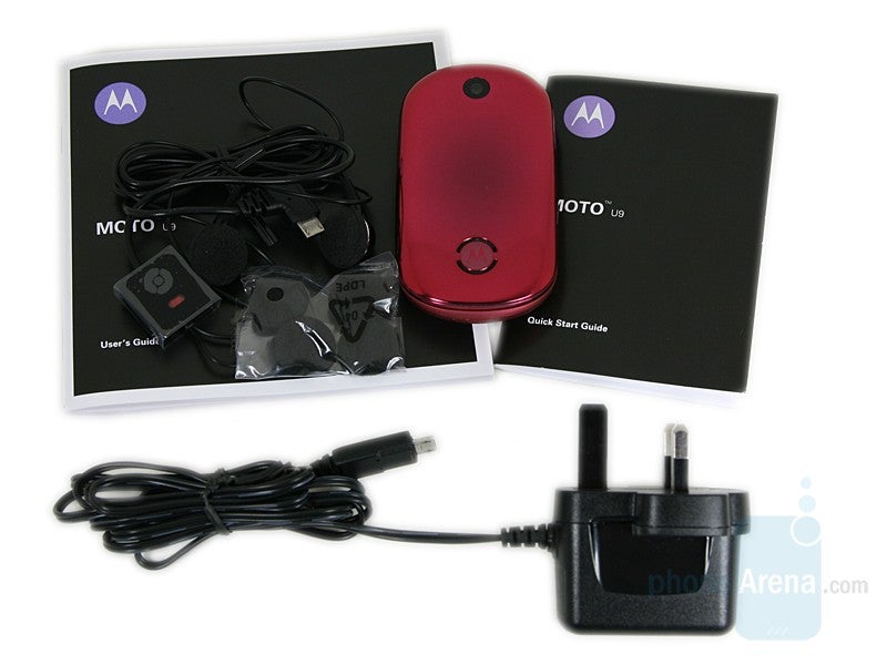
The package contains:
- Motorola MOTO U9
- Stereo headphones
- Extra earpieces
- Charger
- User's Guide
- Quick start guide
Design:
The whole look of the closed U9 brings harmony – just as a natural pebble, it has soft rounded corners, with no sharp edges. Every element is made to match, without distracting from the overall appearance of the one-piece device. Only the Motorola logo (with the speaker) and the camera lens are distinguished on the front; both are circular, merging with the design. Between the two is situated 128x160 pixels OLED display, and a line of music controls. They completely disappear when unused and it is surprising to see them once they are illuminated. Unfortunately, the display isn’t bright enough and is absolutely unusable in sunny days. Additionally, some may not like the fact that it has a pink tint, but it won’t be a problem for those who actually bought the pink phone.
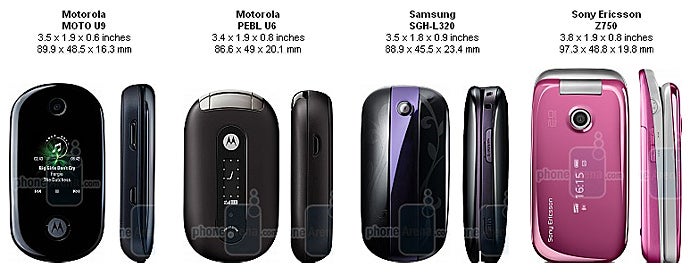
You can compare the Motorola MOTO U9 to many other phones, using PhoneArena's Visual Size Compare tool.
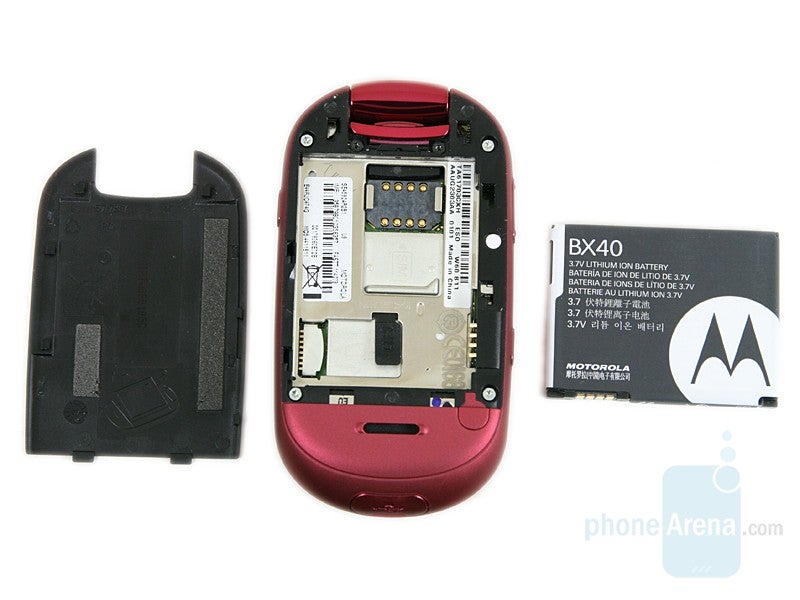
On the left side are the volume rocker and the select key and on the right is the voice command key. Only the rocker has small buds, but all can be felt by touch. The microSD card is inconveniently situated under the battery.
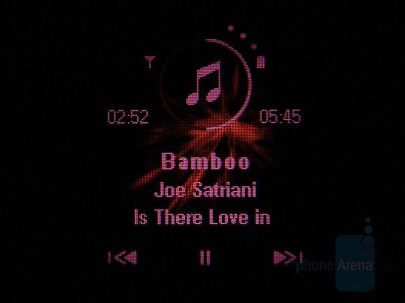
Front touch keys
On the inside, there are the RAZR-like flat keypad and the main display. We don’t really like the black color dominating here, it is simply out of place. It would fit the dark grey color variant, but if the Pink is your choice – definitely take a look at this and decide if you’ll live with it. The keys are not huge, but are well sized and have good movement. The fact that a dedicated music shortcut is present, is interesting. We only had problems pressing the area above the soft keys, but once you get used to it, everything is ok. On the other hand, although pretty good indoors, the display is a disappointment outdoors (in sunny environment). It remains visible, but is rather hard to read the information from it. It is two-inches large, with QVGA resolution and 262 thousand colors, typical for the mid-level class.
Motorola MOTO U9 Video Review:
Interface:
The U9 runs on the Linux-Java based OS, which is found in the RAZR2 V8, RIZR Z6 and ROKR E8. It is superior to the standard software used in other models of the manufacturer including all features, look and user experience. It is fast, the menus are logically structured and the interface looks ok. It lacks a ‘wow’ effect and will not really impress you with anything particular, but it works fine, which is very important.
Nothing will surprise you at the homescreen either. The top shows the system information, the four directions of the d-pad lead to functionality that can be personalized and the two soft keys are for shortcuts list and the main menu.
The last one can be visualized in three ways: 3x3 grid, vertical list or ‘spinner’ – horizontal list with large icons. Unfortunately, menu’s look isn’t affected by the theme selected, so if you don’t really like the design, you will have to live with it somehow – not so nice for a ‘pretty phone’. Both the main and the sub menus can be reordered. The latter represent vertical lists, showing seven fields at a time. The field selected increases in size, to be easily seen. All options have numeric index in the beginning, showing, which key can be used as shortcuts for them.
PhoneBook:
The phone can save up to 1000 contacts in total, each storing up to three numbers. All available names are shown in a vertical list, which has two optional visualizations: Thumbnail (with picture (if added) and phone number) or List, showing only the name. It is nice that one can select to sort by first or last name, but we are disappointed that search can be performed only by the first word in the name. Another nice option is that when inputting characters directly from the standby screen, the phonebook is searched for results in both the first name and the number. It is similar to the latest generation Sony Ericsson’s phones, but doesn’t include the call history.
The latter can be previewed for all/dialed/answered/missed calls and the ‘frequent calls’ menu is an unusual extra, showing the people you most often communicate with.
Organizer:
All of the PIM functionality is packed into the Office Tools menu. We will preview it in the default order. The File Manager allows you to browse the memory of both the phone and the card, and copy/move files from one destination to another. The Calendar can be previewed for month/week or day and has a lot of options when adding an entry. There are twelve event types (Meeting, Appointment, Anniversary, Birthday, Party and others), subject, location, period, notes, attendees and more. Only three alarms can be set at a time, but at least each one has its own settings for tone and recurrence. The world clock is also limited to three cities only, but has two visualizations options: a map view, or a larger digital clock. The calculator misses scientific options or real unit converter, but a single currency can be set, for easier calculation.
Messages:
Everything is organized as expected here. When typing a message, the text input can be predicted by iTap system (Motorola’s alternative to the T9), which works just fine. Once multimedia content is inserted, the message turns into MMS. There are preloaded templates for both Text and Multimedia messages, which can be edited; new ones can also be added. Messages can be moved from the inbox to ‘my folders’ if you want to save them on the phone instead of on the SIM card.
The E-mail client supports both IMAP and POP3 mail boxes. When setting the account up, you have to write only the username and the password, the wizard connects and obtains the settings automatically for more popular servers. If the settings cannot be found, you’d have to fill them manually.
Connectivity:
Motorola MOTO U9 is a quad-band GSM/EDGE global phone, which can work on any continent. It doesn’t support 3G, so the speed for internet browsing will be limited to EDGE’s limitations. For local connections, it can use Bluetooth v2.0 (Stereo Audio is supported) or the microUSB port on the bottom.
The Internet Browser suffers from the limited speed of the connection. Large pages, such as PhoneArena and the desktop variant of YouTube render properly, with correctly ordered columns, etc., but sometimes instead of images and graphics there are ‘x’ signs and white background. The multimedia files have been dropped by the phone, because of the slow data. However, this browser would be usable for smaller pages or for ones, where the text is important but is not a real alternative of those found on some other new phones, such as Sony Ericsson, Nokia with S60.
Camera:
The 2-megapixel camera on the U9 is put just for snapping pictures which are not important. It is not a key feature for the device, and doesn’t pretend to be one. The Viewfinder shows up a couple of seconds after the key on the left is pressed, occupying the whole display. Unfortunately, the saving time is very long and after the shutter is pressed, you’d have to wait about 7 second to store the photo to the memory card and then show the interface to take another. The latter is pretty basic, typically for Motorola but offers Scenes, color styles and tagging for organizing the photos later. Videos can be taken at mediocre resolution, suitable for MMS messages only.
Don’t expect it to replace your real camera; as we’ve said earlier it is just for snapping a picture and the image quality is pretty low, even when compared to other similar phones.
Multimedia:
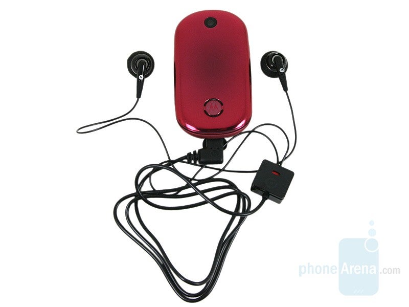
Although not a ROKR, the Motorola MOTO U9 is a music-friendly clamshell. The Media Finder is an application that will retrieve all files from the phone and sort them so you can choose for example Music, Video or Pictures.
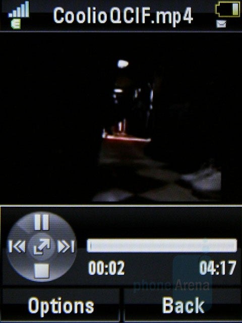
Video playback
The video playback is not one of the strengths of the phone either. Standard MPEG4 H.263 videos with QVGA resolution that are played on most mid and high level phones cannot be opened on the U9. You are limited to 3GPP which has very low quality.
We are very pleased with the performance of the Linux Java operating system. It is very robust and it is rare when you have to wait for the phone to react. Still, it is not as fast as the best S60 from Nokia, but is still reasonably fast.
The sound quality during a call left us with mixed feelings, as the outgoing sound is good but the quality in the earpiece is very low. You hear the voice on the other side muffled, flat and often it is hard to understand them. The volume is just average. In contrast, the other party will hear you louder and way better, with your voice only slightly muffled.
Conclusion:
Well is the U9 worth getting? If you like it, the answer is definitely YES. We are in love with its outer appearance and are with mixed feelings only about the black on the inside. However, it surely looks cool in the grey color variant of the phone, which is for the gentlemen.
Some may worry about the visibility of the external display, the camera quality or the multimedia options, but aside from those, the U9 is a great phone, with lots of options and responsible software.






Things that are NOT allowed: