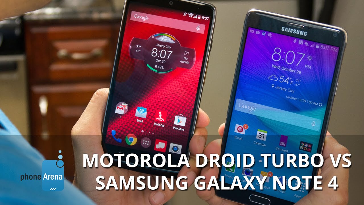
Motorola DROID Turbo vs Samsung Galaxy Note 4
Introduction
Oh, Motorola, what have you done with us, releasing such a decked-out smartphone, and leaving it as a Verizon exclusive? The DROID Turbo justifies its title by offering the best that component makers currently have on the market – Quad HD panel, Snapdragon 805 chipset, and a 20 MP camera, all backed up with a giant for the category 3900 mAh battery, promising a two-day endurance, something unheard of for a QHD phone.
Actually, there is no other match for the DROID Turbo in the market, but Samsung's freshly-brewed Note 4 mega-monster, which in its turn sports a larger, 5.7” QHD screen, also an 805 chipset, and an optically-stabilized 16 MP shooter. That is why are pitting the two current Android champions in the cage, and making sure there are no under-the-belt punches...
Design
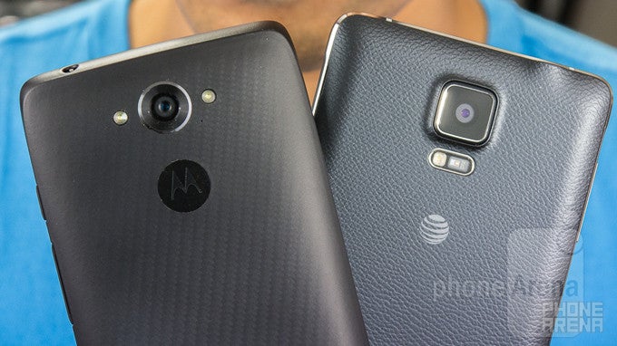
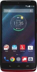
Smaller and chubbier, the DROID Turbo weighs as much as the larger Note 4, but feels more ergonomic in the palm.
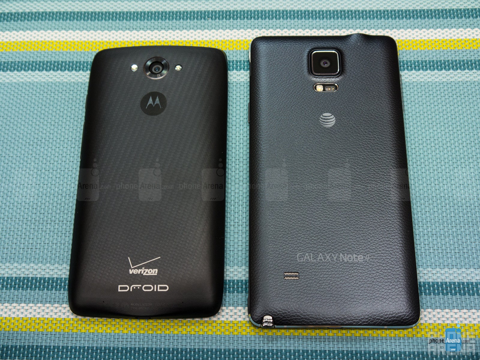
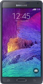
The two phones are fatties for today's demanding standards of sub-8mm flagships, yet the Note 4 clocks in at 0.33” (8.5mm), while the Turbo has the whopping up to 11.2mm girth, depending on whether you get the thinner Metallic, or the just slightly thicker Ballistic Nylon model. Hey, that gigantic battery has to fit somewhere, right? Given the much smaller display, the Turbo is way more comfortable to operate with one hand than the largish Note 4. The phones weigh the same, though, which doesn't bode very well for the thuggish Turbo, which is much smaller.
Samsung offers a removable back cover, which lets you swap the battery, or add more storage, while the Turbo doesn't. The Samsung phablet also comes with the S Pen stylus and its fingerprint scanner, ushering in one more input method, and one more security layer, in case you are inclined to use those.
Motorola does have a few tricks up its sleeve in terms of design against the Note 4 as well, since it offers a few versions of the Turbo with innovative materials like ballistic nylon and metalized fiber for the chassis, and there is even an eye-catchy red version, too. Samsung made the Note 4 look more premium than its predecessors, however, with a metal side rim, so we'd call it a draw in the design department.
Displays
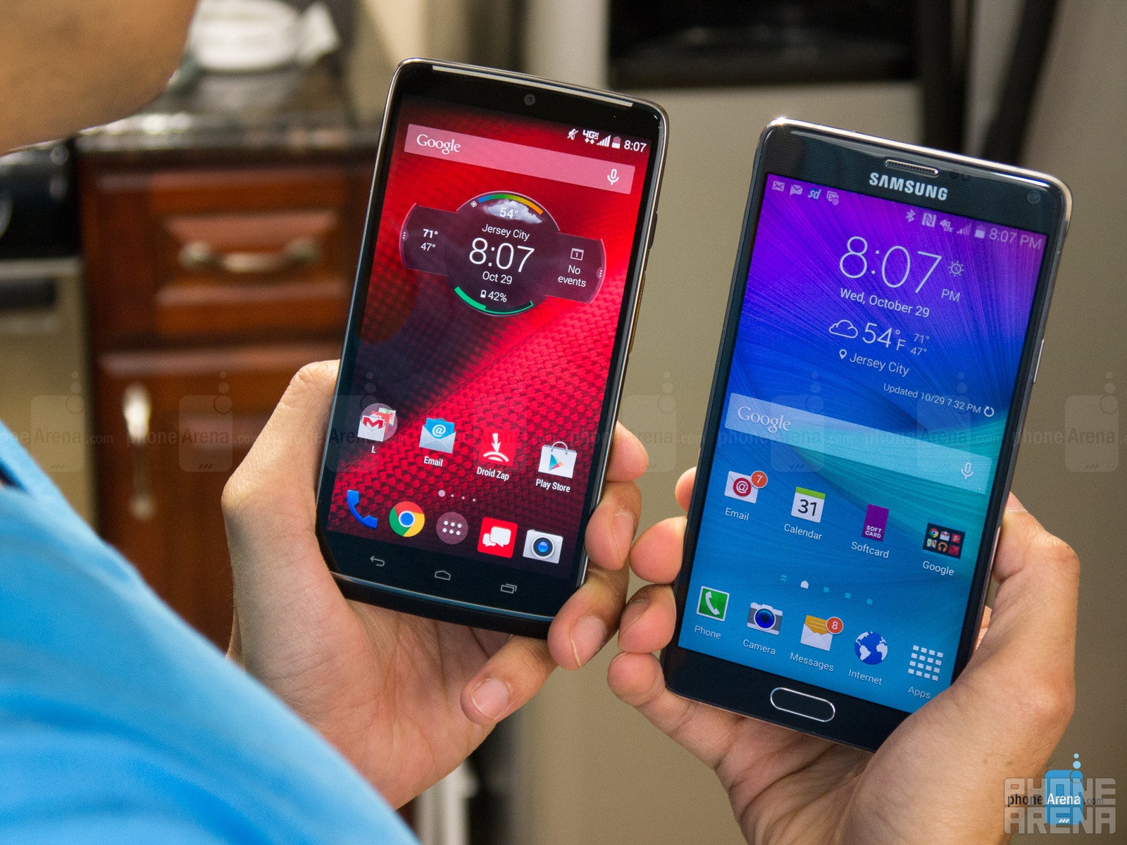
The Turbo might sport record pixel density, but Note 4 nails it in every aspect that matters, like color accuracy and peak brightness.
The 5.2” 1440x2560 resolution panel of the Turbo holds the pixel density record with the breathtaking 565ppi. Galaxy Note 4 is not far behind, though, as it boasts the same resolution, but on a 5.7” display diagonal, returning 515ppi. Both are some of the best numbers in the industry, so no matter what pixel matrix is used to achieve those crazily crammed dots, you'd be hard pressed to find any jaggies in small text, icons, and throughout the interface.
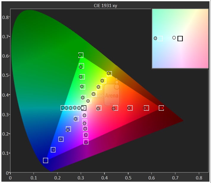
Both panels are of the AMOLED variety, but they are pretty different. We measured the Note 4 to offer great 6700K color temperature and to be very, very color-accurate in its Basic screen mode. The Droid Turbo has an even better white point (6600K), very near to the reference 6500K, but its colors are not accurate. The Turbo exhibits very oversaturated greens, which goes somewhat for the reds and blues as well, and the color points are off the standard marks for the most part, while the Note 4 fits very nicely in the sRGB gamut reference. Keep in mind that previous Samsung phones, like the S5, S4 and Note 3, have proven that many people like these oversaturated but inaccurate colors, and the Droid Turbo isn't worse than them.
Another DROID Turbo display downside is that it is pretty dim, at 248nits measures, against the 468 nits of the Note 4, so you will have trouble telling what's on the screen of the Turbo on a bright sunny day outdoors.
Thus, we'd have to give the display round to the Note 4.
Interface and functionality
Against the boisterous and overbearing TouchWiz, plain Jane Motorola UI strikes back with the always-on Moto Voice and Display functions.
Both outfitted with Android 4.4 KitKat, the Note 4 and Droid Trubo sport very different interface overlays. Motorola's UI is very close to the stock experience of Android, while Samsung's TouchWiz is very modified. The Motorola UI offers way less added functions than Samsung's monster of an Android coat paint, though. It does bear the software features that Motorola has included with its experience in the Moto X, for instance, such as Moto Voice, Moto Actions, Moto Assist, and Moto Display, but also adds some more distinct ones.
In contrast, Samsung throws most every option and functionality imaginable in its TouchWiz interface (sadly, no double-tap-to-wake, though). This results in an overbearing UI that often looks ragtag, a mix of old and new, and makes your head spin from the mashup of settings, Samsung apps and services, game demos, and security and enterprise features, all lumped in one. It is very, very functional, though, and where Samsung really shines, is its approach to heavy multitasking on the big-screen handset. Note 4 has the so-called the Pop-up mode that lets you hover multiple windowed apps on top of the interface, and also the Split-Window regime. This one allows you to divide the screen in two resizable parts, and run completely separate apps in each. To these, we have to add the improved S Pen stylus software that lets you do the new Smart Select function – you can now freely crop, copy and pick content on any screen, be it in apps, homescreens, or simply text.
Processors and memory
Equipped with the best chipsets on the market, and 3 GB of RAM, both phones deliver blazing performance.
Both the Note 4 and the Droid Turbo are as powerful as these things get, as they feature the newest quad-core Snapdragon 805, clocked at the whopping 2.7 GHz, and carry 3 GB of RAM. Depending on the market, Note 4 may come with a 1.9 GHz octa-core Exynos 5433 chipset. TouchWiz is an extremely heavy interface, but on the Note 4 it moves around well, barely indicating a stutter here and there. Not surprisingly, the Motorola UI also flies with every flick, swipe, and press, so there are no worries about the performance with both.
Unlike the Note 4, the Motorola DROID Turbo lacks expandable memory via microSD card slot, but its saving grace is that it boasts a spacious 32GB, with an additional option of a 64 GB model, for those who need the extra space, so no complaints.
Internet and connectivity
The DROID Turbo ships with Google's mobile Chrome browser only, while Samsung has added its own TouchWiz browsing software to the mix. The browsers on both handsets perform admirably while scrolling, panning around, or zooming, but we would give our preference to the TouchWiz renderer. Not only is it extremely fast, but also a joy to use on the big, high-res screen. The S Pen also adds value while browsing, letting you scroll, select, crop, share and annotate with the stylus.
The handsets flaunt 4G LTE connectivity, and 42 Mbps HSPA+ modems to fall back on. We also get Wi-Fi/ac, Wi-Fi Direct, Bluetooth 4.0 (4.1 for the Note 4), A-GPS, DLNA, and NFC on the phones, as well as infrared sensors for controlling your home electronics. Samsung, however, throws an MHL port for wired connectivity, letting you hook it directly, or through an adapter, to the biggest screen in the house – your TV.
Camera
Both phones produce very pleasing results, but the Note 4 camera captures photos with better exposure, and steadier videos with better audio than the shooter on the Droid Turbo.
Motorola's flagship sports a 20.7 MP 1/2.3” sensor with wide f/2.0 aperture. The Note 4 comes with a 16 MP 1/2.6”camera sensor with 1.12 micron pixels and f/2.2 aperture, but for the first time in Samsung's history the module is outfitted with an optical image stabilization system, called Smart OIS.. The handsets are very fast to shoot and record a snap. As for the frontal cameras, Samsung added a little more pizzazz this time, placing a 3.7 MP sensor with the whopping f/1.9 aperture, that is capable of wide-angle selfies at up to 120 degrees, while Motorola makes do with the usual 2 MP front camera.
The Droid Turbo has a more toned-down UI for the camera, which nevertheless sports all the basics, and then some, as is suitable for the 20 MP camera on its back. Motorola still goes with a fairly simplistic user interface with a dial for all settings that you access by swiping from the left. The rotary action on it is not among the fastest camera interface, and it can be plain annoying for those looking to manually adjust settings in the camera. Samsung's TouchWiz camera interface offers a smorgasbord of shooting modes and color effect, including the obligatory real-time HDR and ultra high-res Panorama.
Both Motorola's phone, and Samsung's phablet, produce largely natural-looking photos in most daylight scenes we captured, with their white balance only sometimes leaning slightly on the warmer or colder side. Both phones capture a pretty good amount of detail, but it is different in characteristics – the Note 4 photos are somewhat sharper-looking, while the Turbo's details are softer, but slightly more natural and noise-less.
Indoors, the Droid's photos are a bit more noisy, and with a tad less detail than the ones from the Note 4, but the phablet sometimes throws a yellowish cast on the whole frame. The dual LED flash on the back of the Droid Turbo managed to illuminate our test scenes in a visibly stronger manner, compared to the one on the Note 4, which also gives that blueish cold look.
Both handsets can record 4K video at 30fps, and 1080p footage with fluid 60fps, as well as HD slow-motion at 120fps. The videos come out detailed, with credible color presentation, and no artifacts or skipped frames. Here we ought to mention that the Note 4 records a much better sound than the DROID Turbo in terms of strength and quality, while Motorola's phone barely registered our voice during filming, and one could hear the wind noise all the time, despite the quartet of noise-canceling mics. The mechanical OIS system in the Note 4 also helps in keeping the footage much more fluid and steady, regardless of the hand tremor.
Multimedia
The larger screen of the Note 4 is a bit more welcoming for media consumption like watching movies or browsing photos, though the DROID Turbo's 5.2” display isn't far behind. Both galleries offer grid thumbnail views, and allow for rich picture editing from within the apps, as well as sport plenty of sharing options. Video playback is excellent on both handset, too, as they support DivX/Xvid/MKV files out of the box, and the players offer plenty of extras like zooming, previews, and subtitles support.
When it comes to the music players, we'd have to give one up for the Note 4, as it has a more feature-packed interface, complete with equalizer presets, and plenty of visualization options, while the Turbo offers a mostly stock experience, devoid of much thrills. Both the Note 4, and the Turbo, only offer one loudspeaker each, and with average quality at that, though they are strong enough for most purposes.
Call quality
With three and even four noise-canceling mics, call quality is very good on both handsets, with a slight preference going for the earpiece of the Note 4.
The earpiece of the Note 4 sounds very clean and strong, with no audible distortions, and discernible voice timbres. The Note 4's three noise-canceling microphones do a remarkable job at weeding out the ambient noises, too, relaying are voice loud and clear to the other end.
Battery
No flagship matches the Droid Turbo when it comes to battery life, and the otherwise frugal Note 4 is no exception.
The DROID Turbo, however, answers with a whopping 3900 mAh juicer, which Motorola says is good for 48 hours of smartphone-ing. We are firm believers of that claim, as our own battery benchmark of the Turbo's endurance returned the record for a flagships phone 10 hours and 42 minutes – this would even cross into a three-day battery category with normal usage, something unheard of not only for a smartphone with a QHD display, but for a brand-name device at all.
Conclusion
It's hard to find much drawbacks with the Turbo and the Note 4, but if we have to go for something, it will be the design. Both are relatively crude-looking and handling, but while Samsung's phablet has a much larger screen, it weighs the same as the Turbo, and is much thinner. Motorola used innovative design materials such as balistic nylon and Kevlar, though, so we'd call it a draw in the looks department. When you consider that the Turbo is more comfortable to handle with one hand, the ergonomics scales tip in its favor, though.
Both feature ultra high-resolution screens, but the Note 4 scores a small win here, thanks to its pretty accurate colors. We can't give much edge to either one when it comes to performance, either, as they both sport the latest and greatest Qualcomm processing gear. The TouchWiz interface coupled with the Note 4's S Pen input abilities are arguably more functional than the barebones Motorola UI, yet one might find the Moto Voice, Actions and Display features more useful on a daily basis. When it comes to camera performance, the Note 4 shoots a tad better, plus it has optical image stabilization to keep things steady at all times, and records great audio to the footage, unlike the Turbo.
Motorola's phone has one very big advantage, though, and it is the record battery life we measured, bordering on three full days with average use. Moreover, the Note 4 is more expensive than the DROID Turbo on and off contract, so those looking for a more compact and affordable flagship should seriously consider Motorola's Turbo of a flagship. As long as you are Verizon customer, though, as the Turbo is exclusive to the carrier and is currently offered nowhere else.









Things that are NOT allowed: