Motorola DEFY+ Review

Introduction:
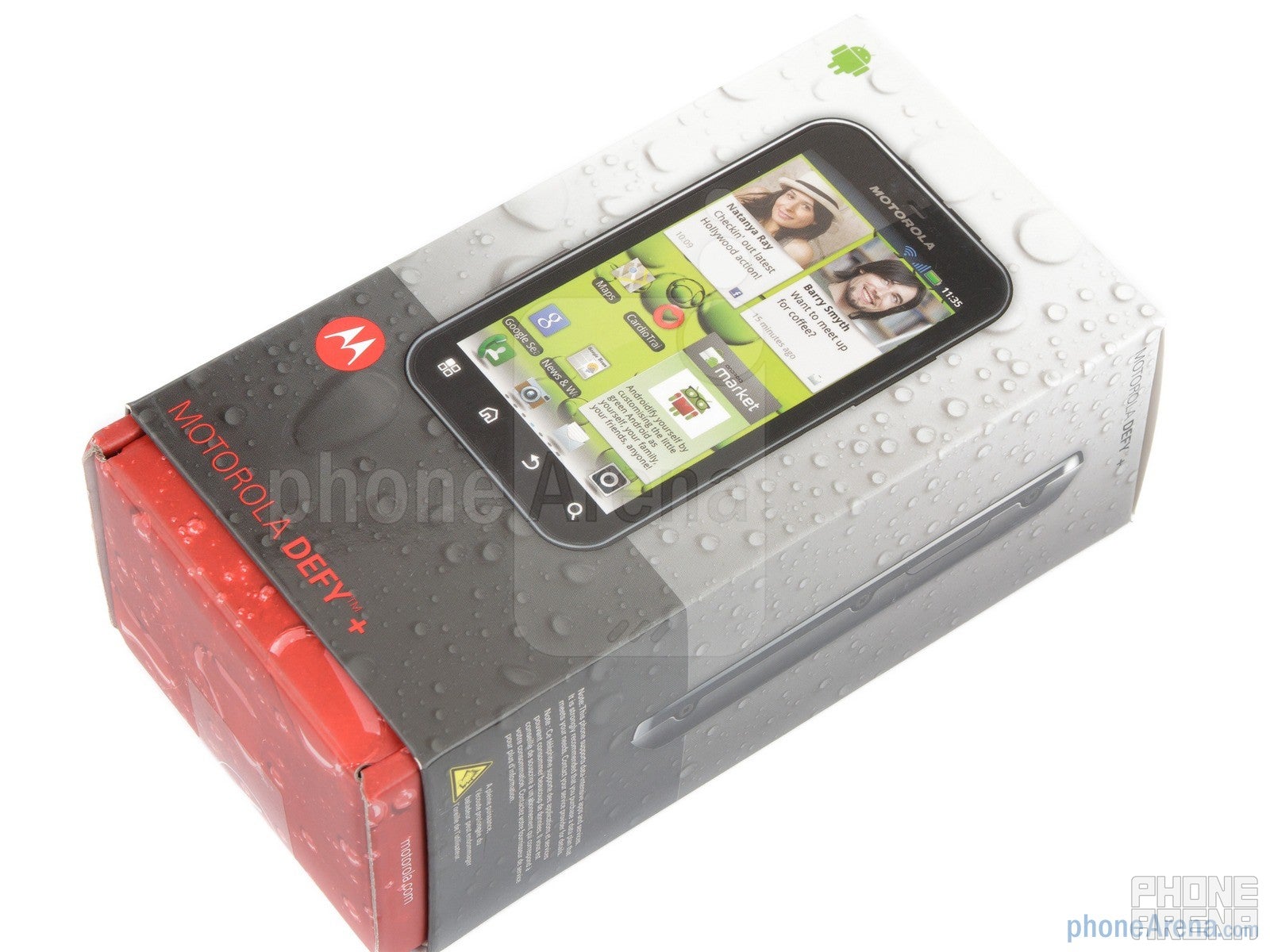
Introduced at the end of last year, the original Motorola DEFY was a fun and compact Android model from the Schaumburg-based company. It managed to stand out from the crowd by being both rugged and well feature-packed. Among its key features, one could find the reinforced Gorilla Glass, dust- and water-proof body, as well as a sizable 3.7-inch touchscreen and the Android 2.2 OS.
Design:
What we really adore in this handset is how it combines a nicely-sized 3.7” display with a body that can be considered very compact by today's standards. Indeed, when you compare the Motorola DEFY+ with some other 3.7” phones, there's a staggering difference in terms of overall dimensions. The DEFY+ isn't very thin, but it fits nicely in the hand and is very comfortable to operate.
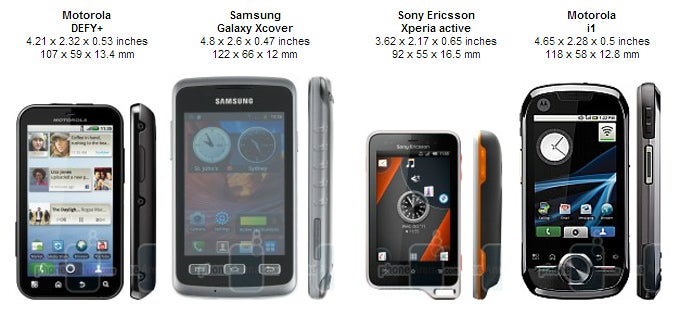
You can compare the Motorola DEFY+ with many other phones using our Size Visualization Tool.
The device is made of plastic and has a soft-touch finish to the back side. The DEFY+ doesn't hide the fact that it's a tough phone. Its styling has “rugged” written all over it – from the tight covers of the 3.5mm jack and microUSB port, to the special lock of the back cover.
The 3.7-inch display of the Motorola DEFY+ comes with a resolution of 480x854 pixels and delivers very good image quality. The resolution is just enough to allow fine details and text to appear crisp, while colors look pretty well-balanced. Unfortunately, visibility under direct sunlight isn't good.
Below the display you have the traditional four capacitive buttons for navigation in Android Gingerbread. These are quite close to the edge of the display, but we didn't experience many accidental presses. Motorola has done well here. Both the volume rocker and the power key do an audible “click” when pressed, and they are relatively easy to use, but also a bit wobbly, which adds just a bit of a toy-like feel to the Motorola DEFY+. On the back, we find a 5MP camera, complemented by an LED flash. We'll tell you more about the camera performance in the respective section.
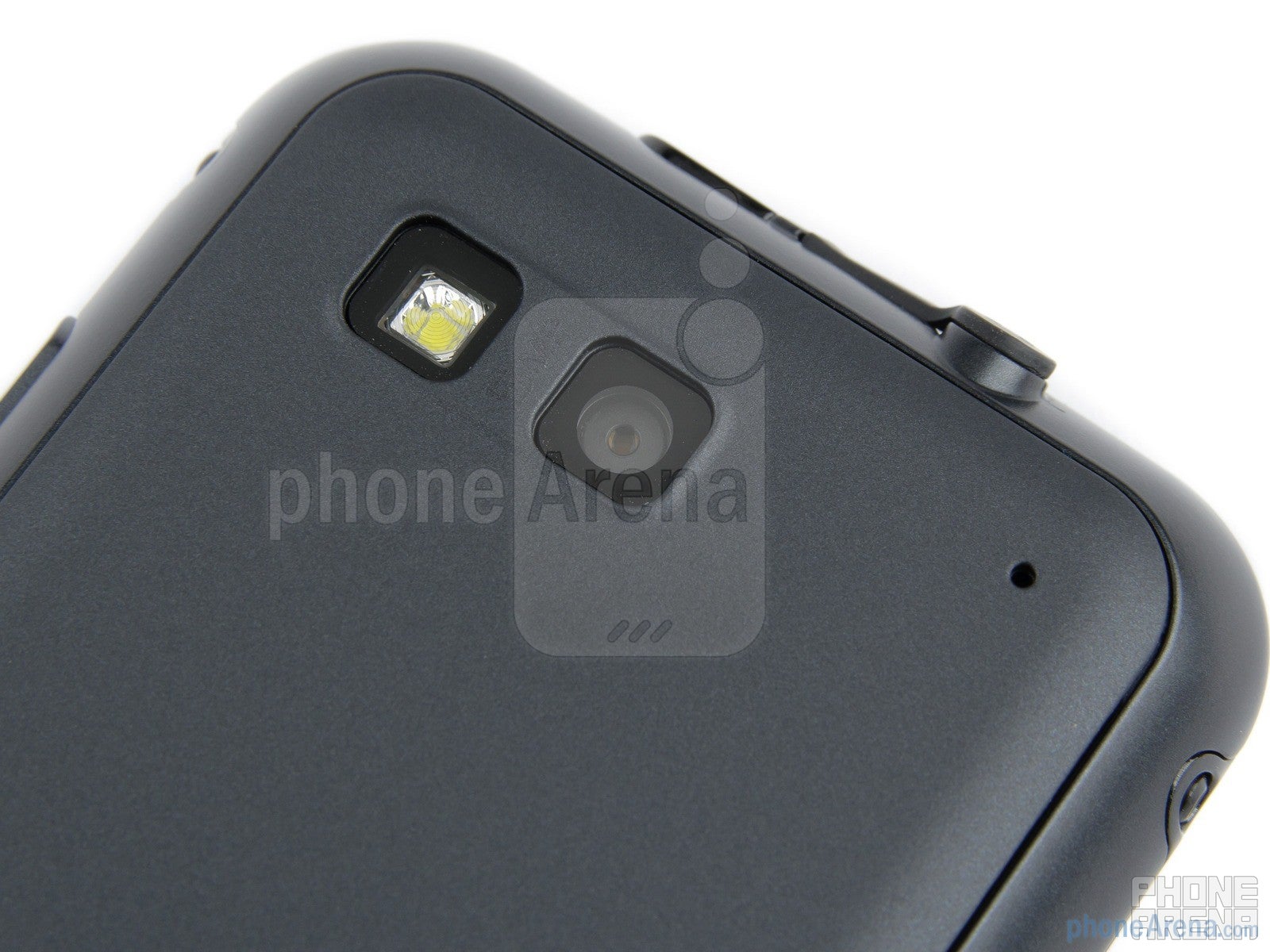
The 5-megapixel camera on the back
Being an IP 67-certified device, the Motorola DEFY+ is fully protected against dust and other particles, but it can also survive a submersion under water up to 1 meter for up to 30 minutes. If you happen to be somewhat careless when handling your cell phone, the DEFY+ may be the perfect solution for you.
Motorola DEFY+ 360-degrees View:
Interface and Functionality:
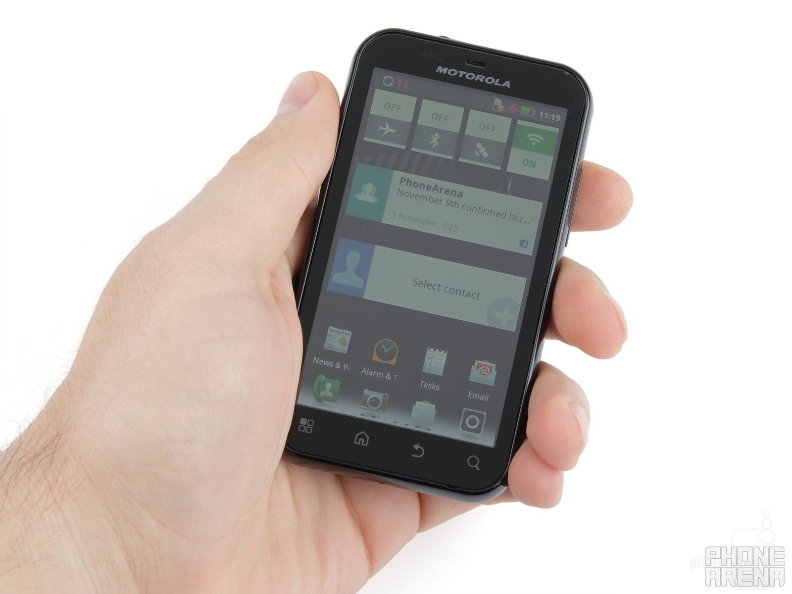
Of course, Motorola could simply issue a Gingerbread update for the DEFY, but since it discontinued it, and replaced it with the DEFY+, original DEFY owners are obviously not getting the new stuff, at least not officially. Anyways, the DEFY+ does come with Android 2.3 preinstalled, and naturally, it's masked with the MOTOBLUR UI. The personalization isn't really bad, we actually find it pretty decent. Many icons have been redesigned, while the interface is full of other little tweaks like additional widgets, new graphical elements and options. For example, you can easily create app groups within the main menu, and then filter your apps by these groups.
Overall, the interface is responsive enough, though you can witness some slight lag here and there. For the most part though, the new 1GHz processor ensures that you have a fluid experience while navigating around the interface or open applications.
In this version of its custom UI, Motorola has also placed its mark on core apps like Contacts, Gallery and Music. We're OK with the changes that have been made to the stock software. They are mostly graphical and don't mess too much with the functionality of the platform. The Calendar has been left unchanged from its stock Gingerbread version.
One of the more significant custom capabilities of the handset is the Social Networking app. Its name speaks for itself – the purpose of the application is to let you keep track of updates from all of your social networks and other communication. The supported services include Facebook, LastFM, Twitter, Picasa, Photobucket, Flickr, LinkedIn and YouTube. A nice feature of the app is that it allows you to update your status on all networks simultaneously. Furthermore, Motorola has designed a dedicated widget for the Social Networking app, which displays your latest updates right on the homescreen. When tapped, the widget itself expands into a nice 3D view of your updates. It's a lot of added functionality, probably not all of which will end up being heavily used, but we're sure that it'll find its fan-base. When it comes to typing with the on-screen keyboards, the portrait one sure seems a bit cramped, and that's because of the dimensions of the display, as well as the design of the keyboard itself, which, we feel, tries to fit too many keys on the screen at once. The landscape option naturally provides a much more comfortable way of typing, although its key arrangement doesn't seem to be the most optimized one yet.
The internet browsing experience with the Motorola DEFY+ can be both satisfying and irritating. If you're wondering what makes this kind of a big difference, the answer is Flash. When your browser is set to load Flash elements, web page scrolling and zoom can get really unresponsive and choppy, especially if there are lots of such elements. However, if you have set Flash to load on demand, for example, the Motorola DEFY+ manages to provide a pretty decent browsing experience.
Camera and Multimedia:
Motorola has made sure to customize the camera interface as well. We find the end result pretty decent, although we can't go as far as to say that it rocks. The company has taken the visual approach again here. For example, when choosing between different effects or scene modes, you are presented with a nice live preview of what the effect or scene will look like.
Although colors looks natural on the pictures taken with the Motorola DEFY+, we're sad to report that the 5-megapixel snapper fails to capture any amount of fine detail. Generally, images look quite blurred. In addition, some of the brighter areas may appear overexposed.
The camera is capable of recording video at the paltry resolution of 640x480 pixels at 24 fps, and... what can we say – it's fine for a VGA video. You know, it can't be anything worth talking about.
The Motorola DEFY+ is a decent multimedia performer, for a mid-range handset, that is. You can easily play DivX and Xvid videos in up to 720p resolution, but MPEG-4 clips won't go beyond 800x480. H.264 is unsupported, but of course, all of this can be changed by installing a more capable third-party video player.
Motorola DEFY+ Sample Video:
Performance:
Carrying a 1700mAh battery in its backpack, the DEFY+ will provide you with an average battery life of 7.1 hours of talk-time and 16 days of stand-by, in exchange for a full charge.
Conclusion:
Overall, the Motorola DEFY+ is not a bad smartphone by any means. What makes it a valuable offering though, is the fact that it's an IP67-certified device, designed to withstand some harsher conditions than what your typical handset is used to. Aside from the obvious advantage of being able to submerge it under water and throw it in the dust, without a single particle entering its shell, the DEFY+ is also quite usable and well-packed in terms of features. The MOTOBLUR interface looks good, brings some additional goodies for social networking freaks, and runs relatively smoothly. What more can you want from a mid-end smartphone? It even has Flash Player support in the browser, although that leads to a visible drop in frame-rate.
As you can imagine, there aren't that many alternatives to a rugged Android smartphone on the market. The offerings that we advise you to check out are the Samsung Xcover and the Sony Ericsson Xperia active, which also come with their own personalized software experiences.
Software version of the reviewed unit:
Android 2.3.4
Build 4.5.1-134_DFP-823
Motorola DEFY+ Video Review:




Things that are NOT allowed: