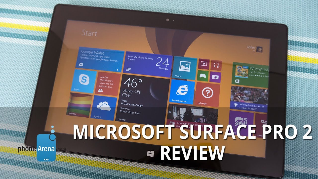
Microsoft Surface Pro 2 Review
Introduction
Generally speaking, the product cycle of a particular device is normally one year, giving it enough time to permeate the market, and by that time, we're then greeted with a successor of some kind. Well folks, sometimes a company just can't wait. Whether it’s related to poor sales, or simply be a reaction to impending competition, Microsoft is in that exact position of launching a successive product in less than a year after its predecessor.
In less than 9 short months, the Microsoft's Surface Pro Windows 8 tablet is already being brushed aside by its successor in the Microsoft Surface Pro 2. We're getting the hint that the Redmond based company wants to have something special in time for the upcoming busy holiday season. Looking back at it, the Surface Pro was a great first offering, since it showed us how versatile it is over some of the competition – namely the iPad and horde of top-notch Android tablets like the Samsung Galaxy Note 10.1 and Google Nexus 10.
Armed with the usual set of hardware upgrades and an updated Windows 8.1 experience, the Surface Pro 2 is hoping to show consumers that it's been fine-tuned enough to make it a justified choice over some of its biggest rivals – and that's despite it being priced higher than some of the big sellers in the industry. Note that what we're looking at here is the Surface Pro 2, which runs full-blown Windows 8 Pro and has access to all the legacy Windows software, unlike the Windows 8 RT-running Surface 2.
The package contains:
- Wall charger
- Pressure sensitive stylus
- Documentation
Design
After a good year of checking out various Windows 8 tablets, where some of them impressed us by their slimmer profiles than the original Surface Pro, we were hoping to see a slimmer Surface Pro 2, but instead, it's sporting the same chassis – so its overall size and weight remains unchanged. A bummer no doubt considering all things, even more knowing how much technology advances in such a short period of time. In the tablet world, this is undoubtedly a hefty thing to carry around, but in the PC world, it’s widely viewed as compact. Regardless, knowing what it's packing inside of its body, we can't be too critical.
Just like its predecessor, the Surface Pro 2 employs the same distinctive design – one that's most notable for its angular cuts around its edges. Also, the choice of materials is also the same, which is a magnesium composite casing common referred to as "VaporMg." It clearly has a finish similar to brushed aluminum, which gives it some added strength and sturdiness with its construction, but it would've been nice to see additional color options – as opposed to the same dark black finish.
Due to the angular cuts around the sides, the Surface Pro 2 continues to feel a bit sharp when holding it. Naturally, two-handed operation is most optimal with this, since it's packing quite a heft for just a single hand to handle. Although the design is unchanged, it's still one good looking tablet that has a modern touch, feel, and appearance. Still, we would've loved to see its size trimmed a bit more to make it a more appealing thing.
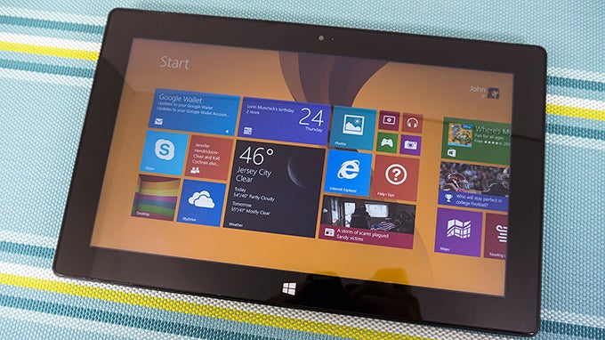
Seeing that we're dealing with the same design here, all the same ports and buttons are found littered throughout its body. Beneath the display, there's the capacitive Start button that brings us back to the Start screen at a moment's notice.
Meanwhile, around its trim, we have its USB 3.0 port, volume control, 3.5mm headset jack, microphone, power button, microSD card slot, magnetic power connector, mini Display port for video out, and a magnetic port that enables us to attach it to the optional Touch Cover 2 and Type Cover 2 keyboards. Microsoft mentions that it has improved connection for the magnetic power connector, which allows us to charge the tablet, but we still find it a little finicky at times. Essentially, we're still finding ourselves adjust it so that it snaps it into place snuggly.
No doubt a rarity amongst tablets, the Surface Pro 2 once again packs along an ever so useful kickstand. One of our complaints last year was that the kickstand only offered a single angled view, but this time around, they’ve been kind enough to give us another. Before, the angle of the kickstand made the tablet usable when it's placed on a table – making it nearly impossible to use with the touch or type keyboards while on our lap. This time, though, there's a second wider angle that allows us to better use it on our laps. And best of all, it locks into place and feels sturdy, so it doesn't move as we're using the tablet with any of the keyboards.
When it comes to cameras, we're bummed to know that Microsoft decided to not outfit this one with any updated gear. Rather, they're the same lackluster spec'd cameras from before – 720p front and rear cameras. And just like before, there are LED lights nearby that power on to indicate that they're being used.
Display
Making its second appearance, the Surface Pro 2 relies on the same display as before, a 10.6-inch 1920 x 1080 (1080p) IPS LCD display that obviously outclasses any of the displays found on Windows 8 tablets running Intel Atom processors. Even though it's something that most people might overlook, the display is optically bonded, which results in less glare. Throw in Microsoft's own hone brewed ClearType rendering technology as well, it's able to deliver great details to even the finest of text – so there's plenty of sharpness and clarity to it.
Color reproduction with the display is vivid and warm, and knowing that it has some great viewing angles, we see very little distortion at extreme angles. In fact, we're able to easily see mostly everything on-screen outside where the sun is present, which is due to the ambient light sensor cranking up its brightness and contrast to better adapt to the situation.
Indeed, there are no significant upgrades to the display, but regardless of that, it still proves to be a pleasant thing to find on a high spec'd tablet in this particular range. Sure, we would've loved to see its resolution bumped up even more, but heck, 1080p is still mighty detailed with a 10.6-inch screen.
Pressure Sensitive Stylus
Adding depth to its functionality, the Surface Pro 2 packs along the same pressure sensitive stylus as before, dubbed this time as the active stylus Surface Pen. Unfortunately, it's still something that can be easily lost or misplaced, seeing that it requires being attached to the magnetic power connector when it's not being used – instead of being discretely being tucked away somewhere inside of the Surface Pro 2's body. Nevertheless, it's an optional way of interacting with the tablet, as it can be used for jotting down notes, or simply be used to draw something. And of course, thanks to its ability to finely measure various degrees of pressure sensitivity, it can produce very fine strokes as we use it. It's not something we'd use on occasion, but nevertheless, it's nice to have as an addition – albeit, we wish it were smaller in size and somehow tucked away discretely when it’s not being used.
Touch Cover 2
Like we mentioned, the introduction of the Surface Pro 2 is also greeted with the updated $120 Touch Cover 2 keyboard. In addition to being available in a wide array of bright colors, it's actually one-third thinner than last year's model – barely giving the tablet any unwanted thickness. As always, there's a steep learning curve with it, since the experience is similar to using the on-screen keyboard, but the fabric material it's constructed from offers more rigidity between each key. It works and the fabric material is very easy on the Surface Pro 2's display – though, we still wish it would have a magnetic connection so it stays in place when it's folder over.
Type Cover 2
If you're more akin to using a traditional keyboard, you'll no doubt appreciate the $130 Type Keyboard 2, which like its sibling, packs on some new features – while still slimming down its profile as well. Needless to say, if you prefer tactility, this is the keyboard to select, since it closely replicates the typical typing experience. Better yet, it now features a very subtle backlighting, allowing us to continue using it in the dark with no issues. However, there doesn't seem to be a way to manually turn it off.
Interface and Functionality
With the launch of the Surface Pro 2, Microsoft fittingly gives us the most up-to-date Windows 8.1 experience, which sees a fair amount of upgrades to further sharpen the edges of its functionality in the desktop space. Microsoft heard the complaints, and for the most part, they've been addressed – so we're humbled to say the least. Visually, you wouldn't realize it as much, but the Start screen has its own updates too. On the surface, it's still flashy thanks to all the dynamic live tiles occupying the space, which aggregate content based on what they are. However, there's a little bit more control given to the user when it comes to personalization, seeing that we can now select up to four different tile sizes for better organization across the Start screen – though, the amount of options can vary depending on the app.
In being that typical Windows machine, Windows 8.1 brings back the Start button to the desktop mode, something that seemed to knock people off using Windows 8 for the first time. However, even though it makes its appearance in the button left corner in desktop mode, it doesn't necessarily bring back the classic styling of Windows past. Instead, clicking it merely gets us back to the Start screen – much like pressing the capacitive Start button beneath the display, or pressing the start button on the Touch/Type 2 keyboards.
Being a desktop platform and all, we already know about Windows 8.1's fantastic multi-tasking, which is handled in a variety of ways. On top of the usual methods, like pressing Alt-Tab or swiping right from the left side of the screen to scroll through the available apps, Windows 8.1 brings forth improved snapping between apps. Whereas we were limited to set snapping guides in Windows 8, Windows 8.1 allows for manual adjustment between two apps being displayed simultaneously – therefore, we can have two apps taking up the same amount of real estate on the screen. Or instead, we can size one of them to our liking to give more precedence to it than the other.
Searching is also improved with Windows 8.1, as accessing it from the right pane (the swipe left gesture from the right side of the display) populates a variety of results. Once an item is selected, it launches the new Bing Search app, which employs a very Modern inspired presentation – where web search results, local content, images, and all other information pertaining to the search are displayed in a very dynamic manner.
All told, power users will surely appreciate what Windows 8.1 has to offer. Frankly, we're pleased with all the new features that the updated software experience has to offer – and it goes to show that it's a true desktop platform. In essence, it offers a considerable amount of versatility over other competing tablet platforms out there. And at the very least, it mimics the styling and operation of Windows past.
Messaging
We had no complaints with the on-screen keyboard of the Surface Pro, so we really don't have any qualms as well with the one here with the Surface Pro 2 and its updated Windows 8.1 experience. Naturally, if you're going to rely on the on-screen options, your best bet is going to be the landscape option, seeing that our rate of input is fairly consistent thanks to its responsiveness – and without many mistakes along the way either. With the portrait option, there's some juggling around needed to encompass the entire layout. And as alternative, we also have a split style keyboard option or the hand writing recognition.
Yet again, the Windows 8.1 email app proves to be just a usable, especially when its layout is ideal for a tablet. Furthermore, it's nice that we can quickly view emails from other accounts from within the app, since the left pane gives us an overview of all our accounts.
Organizer
In addition to the People and Calendar Hubs that we're already familiar with the platform, Windows 8.1 finally brings along some of the other basic organizer apps we'd expect to find on any device. Specifically, they include native Health & Fitness, Food & Drink, Calculator, Alarm, and Sound Recorder apps. Yes, they're small things, but considering that most of them were unavailable out of the box with the original Surface Pro, we appreciate that they're in tow from the start with this.
Processor and Memory
If power and performance is utmost important to you, then you won’t be disappointed by the Surface Pro 2, which features the latest generation of silicon from Intel. To be exact, with our specific review unit, it features a dual-core 4th generation Intel Core i5 4200U processor clocked in at 1.6GHz – coupled by 4GB of dual-channel LPDDR3 RAM, the Intel HD Graphics 4400 GPU, and speedy 128GB solid state drive. Quite simply, it translates to one speed demon that’s ample enough to handle both trivial and intensive tasks. Heck. it can even handle some wicked 3D games without much stutter to its performance.
Depending on your needs, the Surface Pro 2 is available in 64GB, 128GB, 256GB, and 512GB storage options. With the 64GB and 128GB models, they're packing 4GB of RAM – while the other two larger options have double the amount at 8GB! In terms of pricing, though, they retail for $900, $1000, $1,300, and $1,800 respectively. Oh yeah, we're still glad to know it's packing a microSD card slot.
Internet and Connectivity
With the latest version of Internet Explorer 11, we're again presented with two options – a touch friendly one and the typical desktop one. Both of them are naturally equipped in handling all our web browsing needs, since they're super-fast with page loads, offer instant page rendering, and have buttery smooth navigational controls. When all is said and done, it's the real deal that we're given here on the Surface Pro 2 – more so knowing it IS the desktop experience.
We never saw cellular data connected Surface Pros, so it doesn't surprise us that we're not getting it here with the Surface Pro 2. In terms of connectivity, it features aGPS, Low Energy Bluetooth 4.0, and dual-band 802.11n Wi-Fi. Sorry folks, there's no NFC with this one.
Camera
It seems as though snapping photos isn’t a strong point for Windows 8.1 in general, seeing that the camera app continues to be nothing more than a barebones kind of thing. For the most part, the UI remains the same as before, which is pretty much void and barren of any shooting modes or manual controls. Instead, the only things we have access to is switching it to the front facing camera, setting a timer, and adjusting the exposure. With all the other enhancements made to the general experience, we were sorely hoping to see some of it sprinkled to the camera app. Sadly that’s not the case.
Ugh! We’re not saying that we’d totally recommend using a tablet to snap photos, but in a worst case scenario, it’d be nice if it could actually take some decent ones. Armed with a camera that’s less than 1-megapixel in count, its quality is beyond abysmal – especially for a tablet and all. Like seriously, other tablets like the Google Nexus 10, iPad, and Samsung Galaxy Note 10.1 2014 Edition all take some good looking photos – not quite smartphone-like quality, but passable enough to like. Unfortunately for this, the quality is marred by its indistinguishable details, speckled looks, and a bland color reproduction. Don’t get us started with its low lighting performance, which is remarkably worse!
Proving to us that it’s inept at taking photos, we don’t have any hopes with its video recording quality. Taking a peek at its 720p samples, there’s nothing pretty about its quality whatsoever. In addition to the painfully faint details, it’s further diminished by its molasses slow exposure, heavy artifacting, and lack of auto-focus. Under lower lighting situations, noise becomes a nagging factor with its quality – plus, its capture rate drops down to a choppy 14 FPS. The only bright point in everything is the clear audio recording it’s able to muster.
Multimedia
After checking out the camera app, we’re left we a sour taste in our mouth, since we’re a bit appalled to see that nothing was done to necessarily improve it. Thankfully, that sour taste is left isolated to the camera, just because the Photos Hub in Windows 8.1 receives a modest update. No longer is it a boring place where we simply browse our photos, but we’re now given some editing functions – with some being more useful than others, of course. Under editing mode, we can apply several different filters, while further enhancements can be made to liven up the images more. Specifically, they include controls to adjusting the brightness, contrast, highlights, shadows, color temperature, tint, saturation, color enhancement, and much more.
It appears as though the Music Hub has now been rebranded to XBOX Music, which thankfully also sees an updated visual presentation. Well, we were always pleased by the Windows 8 music player – mainly because its Modern UI really accentuated the experience. With Windows 8.1, however, it continues to be one of the more appealing music players on any platform, thanks in part to its dynamic presentation. In fact, we really appreciate that it cycles through various photos of the artist/band while a song is being played. As for the audio quality, we’re glad to say that its output is clean, clear, crisp, and mighty strong. It doesn’t even emit any strenuous tones at the loudest volume setting.
Likewise, the XBOX Video hub sees some subtle changes with its layout, but for the most part, the functionality remains intact. For example, not only does it allow us to view content that’s locally stored in the tablet, but we’re also given the opportunity of purchasing content too – that or just renting. Not surprisingly, the Surface Pro 2 handles high definition videos with no issues whatsoever. On top of having support for a wide array of video codecs, the kickstand on the tablet itself is icing on the cake, as it dishes up the perfect hands-free experience.
Battery
Well, it goes to show what the 4th generation Intel Core i5 processor is capable of delivering, as the Surface Pro 2 delivers nearly an all-day battery performance – blowing away last year’s model in our experience. Now that mark is achieved with our normal usage, which consists mostly of heavy productive work (think Microsoft Word), emailing, and lots of web surfing. Compared to the competition that’s on the field, the almost full day of usage won’t give it much bragging rights, but all things considered, like how this is indeed stuffed with PC parts, we’re more than grateful with its performance.
Conclusion
It’s really tough to say what we think about the Microsoft Surface Pro 2. On one hand, it’s a powerful computing machine that would run circles around most of the flagship tablets out there, but on the other, we can’t help but think about how it’s trying to be a PC at the same time. As a tablet, it’s like being the smartest kid in a class that’s filled with students a few years younger than it. And as a laptop/ultrabook, the Surface Pro 2 is more like the underachiever in the group. Honestly, it’s rather difficult finding that perfect medium for this particular device.
On the software side of things, we’re quite glad that Microsoft has tweaked the Windows 8.1 experience enough to steer it in the correct direction with plenty of momentum behind it. In fact, it goes to show how serious Microsoft really is in maturing and advancing its desktop platform. In many ways, they’ve listened and acted accordingly to the critics’ concerns. Comparing it to other tablet platforms, there’s no question that Windows 8.1 has the upper hand when it comes down to productivity – it’s simply a powerful platform that carefully blends the elements of the old Windows experience.
Finally, we come around to pricing. Just like last time, the pricing is going to be a bit a struggle for people who are deciding on what to go with – a tablet like this, or maybe a similarly spec’d ultrabook. Indeed it’s more expensive than other prized tablets, like the iPad or Google Nexus 10, but it’s justified by its beefier PC internals and true desktop platform experience. So who should actually buy this? Well, if you want the best of both worlds, which consists of the tablet form factor with an actual laptop/desktop OS, this is undoubtedly the thing for you. Best of all, as a daily PC driver, the Surface Pro 2 is compact enough to travel around with.
Still, we can’t help but think about some other options – namely ultrabooks that deliver more versatility with their already included keyboards, additional ports, and larger (touch)screens. At $900 for the 64GB version of the Surface Pro 2, it’s still a pricey investment, more so when you tack on another $130 for the Touch Cover 2. So essentially, you’ll need to fork over $1,030 to snag yourself a hybrid device – one part tablet, another being a laptop. If you’re going to splurge on something with that amount, we’re certain there are other ultrabooks to think about.
Software version of the review unit: Windows 8.1







Things that are NOT allowed: