Meizu Pro 6 Review

13comments

Introduction


There's a certain contingent of smartphone users that, no matter which new handset you show them, will invariably comment, “Oh, that looks like an iPhone.” Sometimes that just reflects a narrow view of the smartphone market; it's only iPhone or iPhone wannabe, right? And sometimes there really are some pretty glaring similarities, as manufacturers try to take direction from moves where Apple has found success.
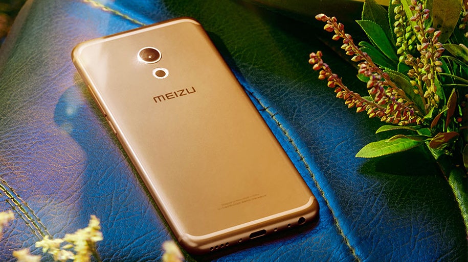
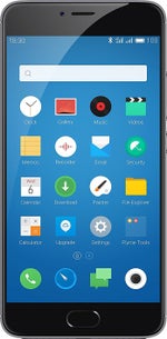
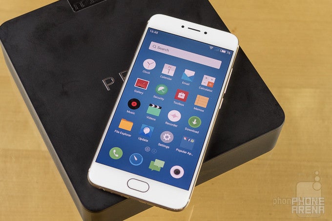
But then there's Meizu with the new Pro 6, where even “imitation” feels like too weak of a word: from hardware design, to functionality, to the heavily modified Android-based platform, the Pro 6 is a smartphone that feels like it was created from a singular vision intent on capturing some of that iPhone magic by following as close in Apple's footsteps as humanly possible.

And wouldn't you know it, but the Meizu Pro 6 somewhat succeeds in doing just that.

In the box:

  • Meizu Pro 6
  • USB Type-C to standard A cable
  • Fast charging adapter
  • Warranty/safety cards
  • Quick start guide
  • SIM tool

Design

An iPhone by any other name...

Back in March, much as we still are today, the smartphone community was speculating about the design of Apple's next iPhone. And when some imagery surfaced of a metal-backed handset with an interesting, curved antenna stripe, rumors quickly zeroed in on it being a possible iPhone 7 prototype. The next day, though, a Meizu exec burst our bubble by confirming that the image was actually of his company's own Pro 6. The initial leak didn't feel like a hoax, or an attempt by some jokester to pull one over on us; the Meizu Pro 6 really is that easy to mistake for an Apple device.

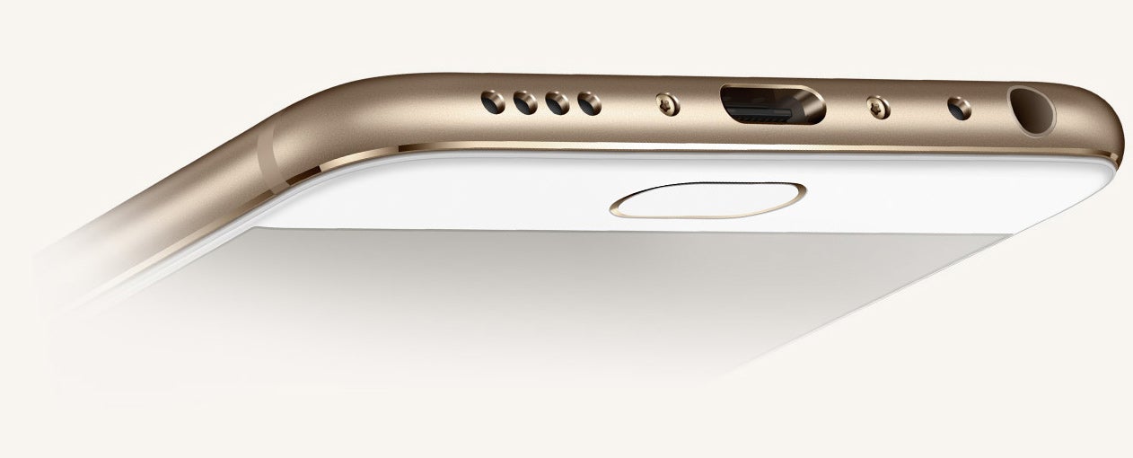
Meizu's Apple-parroting decisions include giving the Pro 6 a single hardware button up front: a fingerprint-scanning home button that may not be round like Apple's but it's similarly all alone up there – no extra capacitive Android buttons waiting in the wings. And while Meizu does side-button placement a little differently, the phone's bottom edge with headphone jack, mic, reversible USB Type-C connector, and speaker grille is one page pulled right from the iPhone playbook.


Meizu Pro 6
Dimensions

5.81 x 2.79 x 0.29 inches

147.7 x 70.8 x 7.25 mm

Weight

5.64 oz (160 g)

Xiaomi Mi 5
Dimensions

5.69 x 2.72 x 0.29 inches

144.55 x 69.2 x 7.25 mm

Weight

4.90 oz (139 g)

Meizu PRO 5
Dimensions

6.17 x 3.07 x 0.3 inches

156.7 x 78 x 7.5 mm

Weight

5.93 oz (168 g)

Meizu M3 Note
Dimensions

6.05 x 2.97 x 0.32 inches

153.6 x 75.5 x 8.2 mm

Weight

5.75 oz (163 g)

Compare these and other phones using our Size Comparison tool.


Display

A solid AMOLED screen with pressure-sensitive input
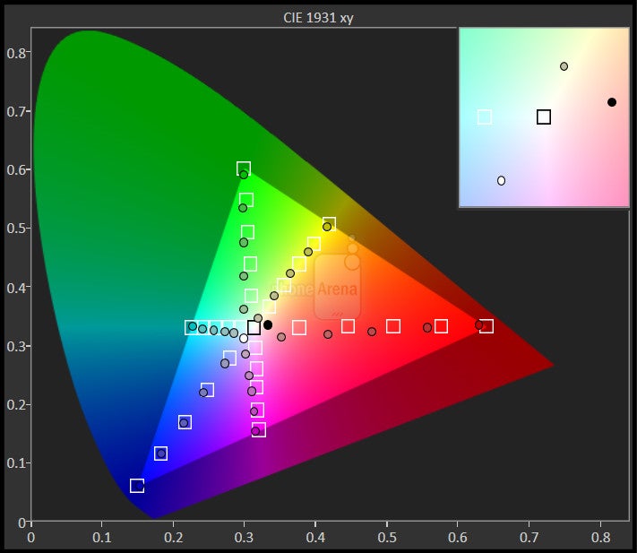
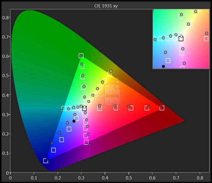
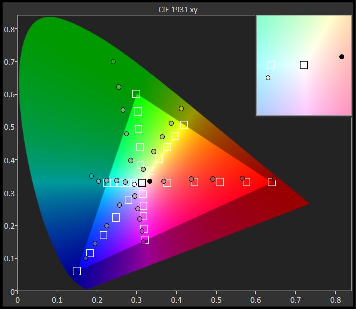
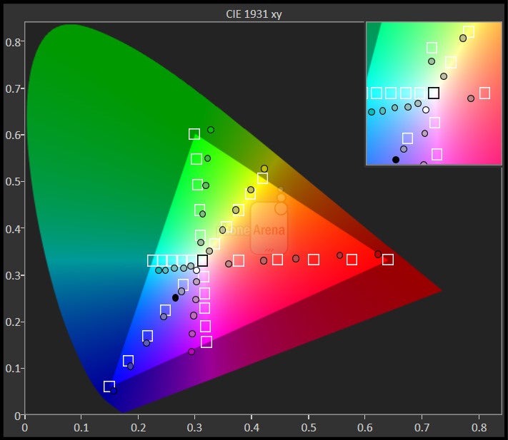
Meizu gives its phone a Samsung-made 5.2-inch AMOLED panel with a resolution of 1080 x 1920. That sounds pretty good: an OLED-based panel from a manufacturer we trust, and one that doesn't try to win any pixel-density-meausring contests for bragging rights. With multiple color-tweaking modes to push that panel to its limits, as well as software options for adjusting white balance, the phone's screen sure comes equipped to impress.

In our tests, though, it came up just a little short in terms of brightness, meaning you might be fighting to see this guy on a particularly sunny day.

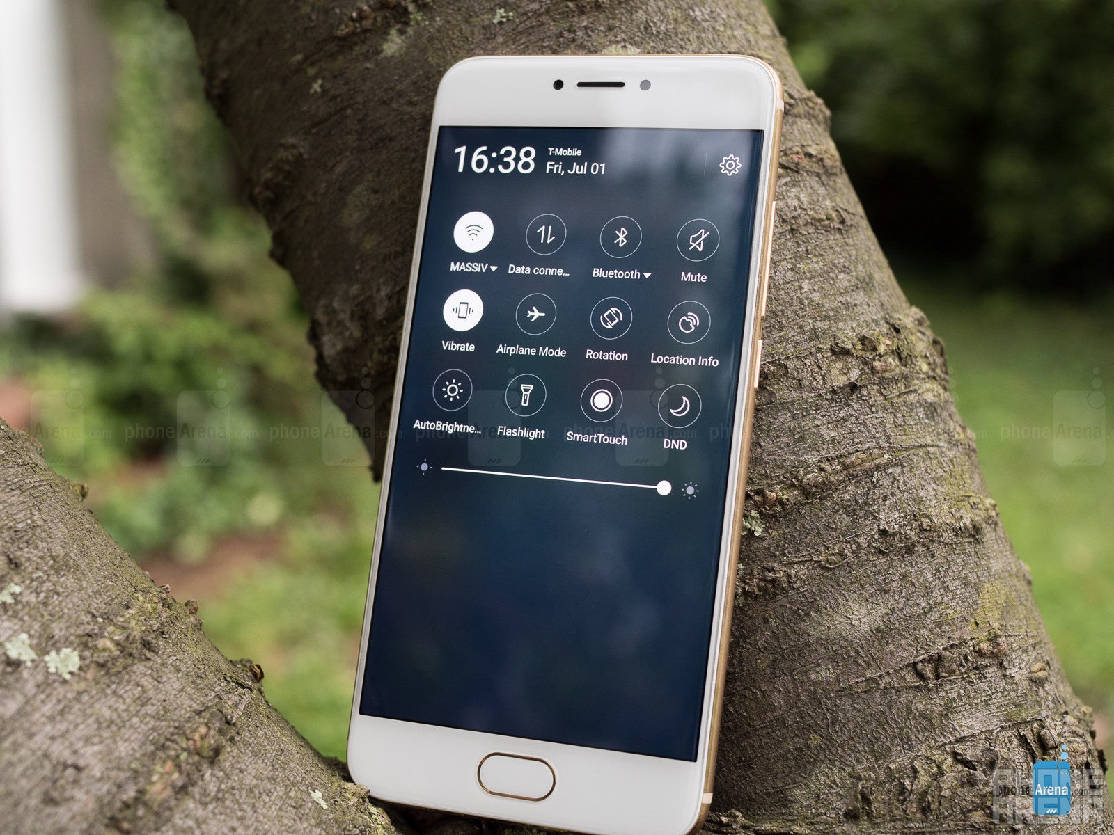
Like the iPhone from which it borrows so many tricks, the Pro 6's screen implements its own version of 3D Touch, letting you hard-press certain icons to pull up shortcuts. Honestly, it works really well, and our only big problem with it is how limited its availability is; only a few key Meizu apps take full advantage of these interactions.


Interface and Functionality

You can make Android look like iOS, but navigation becomes a headache
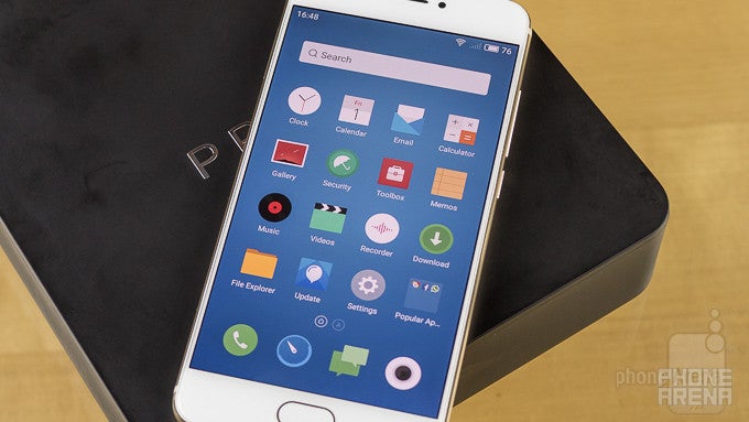

It's not like we've been avoiding the elephant in the room, but it's impossible to talk about the Meizu Pro 6's UI without drawing some lengthy comparisons to Apple's iOS.

Like other Meizu phones, the Pro 6 runs the company's custom Flyme OS, an Android fork that claims to place an emphasis on reliability, intuitive design, and performance.

Evaluating the interface on its own merits, Flyme 5 on the Pro 6 really does look nice. It's a break from the Android norm, with a default launcher that eschews the typical app drawer in favor of a very iOS-like everything-on-the-home-screen arrangement. That's just the start of the Apple emulation, and everything from the notification shade with its out-of-focus app icons in the background, to the lockscreen layout, to the swipe-from-the-bottom mechanic used (in Flyme OS, anyway) to do multi-tasking has a distinct iOS feel.

Maybe the biggest adjustment that takes getting used to is Meizu's single hardware button for controlling everything. A firm, clicky press brings you to the phone's home screen, while a lighter tap effectively acts as the handset's back button. And as we just mentioned, multi-tasking is pulled off without a dedicated key at all, and is instead accessed by swiping up from the screen's bottom edge. Given enough practice, you can get used to the new way of interacting with the system; probably the weakest link is the multi-tasking, but the dual back/home button is usable enough.

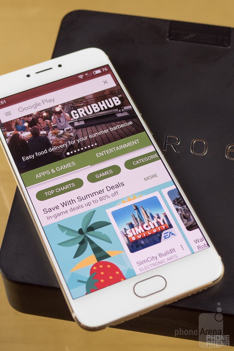
It's also worth noting that as a consequence of Meizu's Flyme-ification of Android, the Pro 6 ships without all your familiar Google apps on board. Luckily, the company makes it a breeze to manually install the Play Store and Google Services, and you're just a couple taps away from having a full spread of Google software.

Processor and Memory

Raw speed to spare, but graphics leave something to be desired

The companies making mobile processors have largely put clock-speed and core-count battles behind them, looking to deliver real performance gains instead of just easily digestible figures (because if quad-core is good, a MILLION cores must be great, right?). MediaTek never quite got that message, and last year came out with its first deca-core (that's 10 processing cores) chips. One of those models, the Helio X25, finds itself at the heart of the Meizu Pro 6.

Unsurprisingly, benchmarks confirm some of the best raw multi-core performance we've ever seen. Unfortunately, that trend doesn't hold up everywhere. Several tests singled out web performance as a real weakness, and graphics also proved to be a particularly sore point for the Pro 6, with the embedded Mali-T880 GPU delivering some underwhelming frame rates. And keep in mind, this is only a 1080p display; we're hardly pushing resolution limits.

That's a real shame, because elsewhere performance really shines. We end up with a disconnect where it feels like there's all this power just waiting to be tapped into, but 3D graphics find themselves unable to take full advantage of it. In real-world gaming tests, the Meizu Pro 6 fared quite a bit better than benchmarks, and while frame rates were generally higher, regular stutters reminded us that we were already pushing the phone to its breaking point.
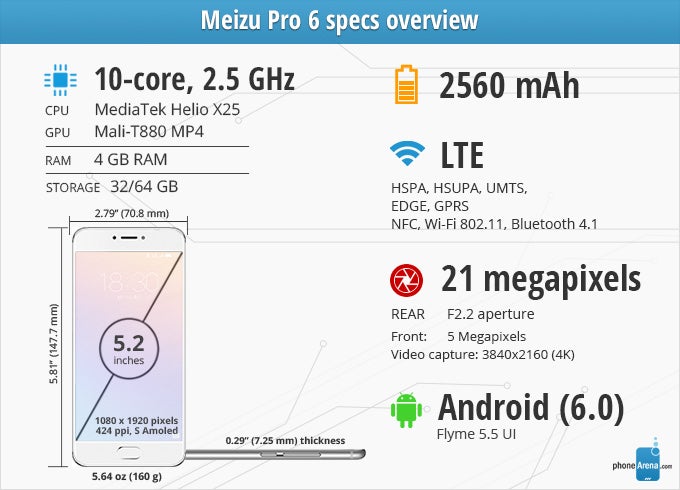
Meizu gives the Pro 6 4GB of LPDDR3 RAM, which seems like it should be more than adequate. But even with all that memory, task-switching wasn't silky smooth, and we frequently found apps re-loading when bringing them back up.


AnTuTuHigher is better
Meizu Pro 6100328
Xiaomi Mi 5122037
Meizu PRO 560090.33
Meizu M3 Note41906.66
Vellamo MetalHigher is better
Meizu Pro 63138
Xiaomi Mi 53517.33
Meizu PRO 52005.6
Meizu M3 Note1114.66
Vellamo BrowserHigher is better
Meizu Pro 65819
Xiaomi Mi 55651
Meizu PRO 53310.66
Meizu M3 Note2455.33
JetStreamHigher is better
Meizu Pro 627.101
Xiaomi Mi 555.364
Meizu M3 Note27.747
GFXBench T-Rex HD on-screenHigher is better
Meizu Pro 636
Xiaomi Mi 560
Meizu PRO 552
Meizu M3 Note13
GFXBench Manhattan 3.1 on-screenHigher is better
Meizu Pro 611
Xiaomi Mi 526
Meizu PRO 515
Meizu M3 Note2.5
Basemark OS IIHigher is better
Meizu Pro 6477
Xiaomi Mi 51970
Meizu PRO 51681.6
Meizu M3 Note864.33
Geekbench 3 single-coreHigher is better
Meizu Pro 61922
Xiaomi Mi 52269.66
Meizu PRO 51165.3
Meizu M3 Note796.66
Geekbench 3 multi-coreHigher is better
Meizu Pro 66623
Xiaomi Mi 55457.33
Meizu PRO 53679
Meizu M3 Note2907.66

Connectivity

Not the most international-friendly radio


This is not a phone designed primarily for the US market, and it shows. While the Pro 6 is cable of taking advantage of high-speed LTE Cat6 data, its band support includes none of the LTE frequencies used by T-Mobile nor AT&T. As a result, you can look forward to finding your usage constrained to 3G data.

If you do happen to live somewhere where the Pro 6 can take full advantage of the local carriers, the phone supports dual-SIM operation.

Camera

21 megapixels of “good enough”
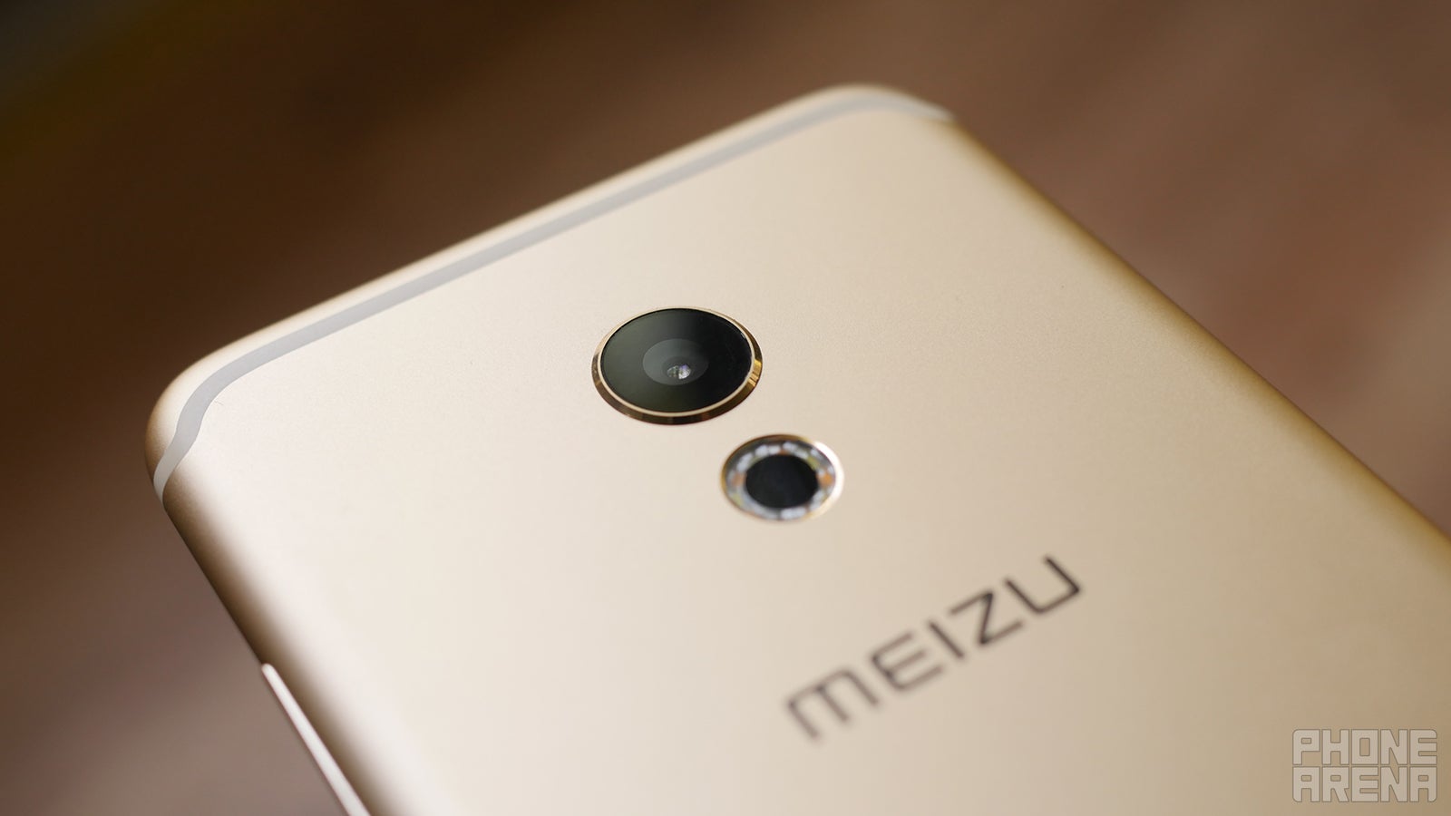

One of the Meizu Pro 6's biggest departures from the iPhone 6-series is the decision to place the phone's camera dead-center on its back. The handset's armed with a 21MP main sensor, as well as a circular flash array and laser-assisted autofocus mechanism.

Meizu's software is pretty straightforward, with quick access to photo filters, flash, and timer settings, but other options were a little too buried in the camera interface for our tastes. Sometimes you want to quickly switch from still-photo to video mode, for example, and doing so here requires diving into a sub-menu.

The app offers some fun options, like a mode to create animated GIFs, but a lack of options there (like final resolution and frame rate) hamper its usefulness.

Image quality

Nothing fancy, but decent low-light performance

Shots were generally acceptable, and while the Meizu Pro 6's camera didn't “wow” us at any point, it did mostly deliver usable pics. Of particular note is its solid indoor performance, not choking when ambient light levels start dipping.

But while the camera proved perfectly functional, it also struggled in a few key areas. Auto-focus was swift when it worked, but other pics came out slightly soft. Nailing the right exposure also seemed tricky for Meizu's camera, and colors on the whole seemed a bit muted – a situation especially true indoors.


Taking a picLower is betterTaking an HDR pic(sec)Lower is betterCamSpeed scoreHigher is betterCamSpeed score with flashHigher is better
Meizu Pro 61.7
3.5
474
No data
Xiaomi Mi 52.9
3.5
600
522
Meizu PRO 53.1
4.4
474
284
Meizu M3 Note1.6
3.6
707
552

Video recording

HD video should look sharper than this
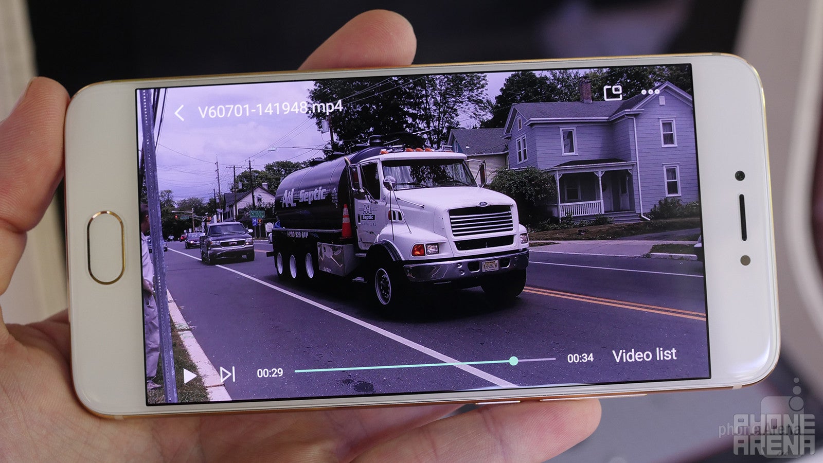

The good news is that the Pro 6's camera supports 4K filming, and the video it produces while doing so is sharp as all get-out. But in 1080p, video loses its crispness, and our footage starts looking almost like it was scaled up from a lower resolution.

You'd better have a steady hand when filming, as Pro 6-shot video tends to bounce around. The camera's exposure and focus-adjustment was in full effect through shooting, but abrupt jumps between exposure levels proved distracting, and slower-than-expected focus speeds saw moving objects quickly drop out of focus.

Sadly, we've noticed that 4K videos don't play too smoothly on a computer, while YouTube refuses to have them uploaded, which means your sharing options will be pretty limited.


Multimedia

A lot of oomph from one little speaker

Sound output from the Pro 6's single bottom-edge speaker isn't bad at all, with the volume, clarity, and satisfying frequency range to really deliver in many use cases. Headphone users will be able to take full advantage of the phone's audio capabilities, tapping into the much-touted (by Meizu, at least) Cirrus Logic CS43L36 DAC chip.


Headphones output power(Volts)Higher is better
Meizu Pro 61.006
Xiaomi Mi 50.18
Meizu PRO 51.87
Meizu M3 Note0.57
Loudspeaker loudness(dB)Higher is better
Meizu Pro 672.4
Xiaomi Mi 572
Meizu PRO 574
Meizu M3 Note71


Call Quality

Adequate, but could stand for better noise cancellation
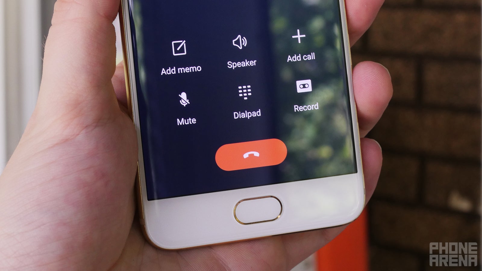

Voice call quality is OK, but not great. Callers reported excessive amounts of background noise, and while conversations were intelligible, voices occasionally got a bit muddled.

Battery Life

What it lacks in stamina it makes up for in charging speed
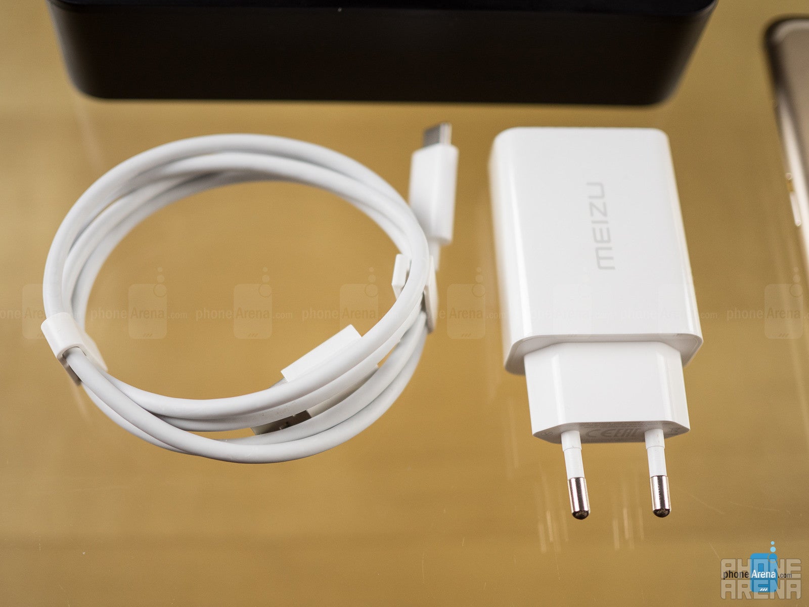
The Pro 6's 2560mAh battery doesn't sound particularly impressive on paper, but it still managed to show some respectable endurance, coming in with just under seven hours of screen-on time during our usage tests.

But pure battery life is overshadowed by the phone's exceptional recharge times. Using the packaged fast-charging adapter (which you'll need an adapter to use in the US, as at least the unit in our box featured a Europlug connector), the Pro 6 went from fully depleted to 100% charge in a mere 77 minutes.

Battery life(hours)Higher is better
Meizu Pro 66h 43 min(Average)
Xiaomi Mi 57h 27 min(Average)
Meizu PRO 59h 54 min(Good)
Meizu M3 Note11h 6 min(Excellent)
Full Charge(hours)Lower is better
Meizu Pro 61h 17 min
Xiaomi Mi 52h 19 min
Meizu PRO 51h 23 min
Meizu M3 Note2h 30 min

Conclusion


The Meizu Pro 6 is one weird, weird phone, and it's not immediately clear who it's designed for. Ex-Apple users who can't resist the call of Android but still crave a familiar interface? Ardent Android fans who appreciate phones that break from the back and experiment with doing things a little differently (even if that means outright copying another platform)?

While the Pro 6 does several things pretty well, it's just so shamelessly an iPhone copy that it's impossible to recommend the handset unless you have strong feelings about what that means. Should we reward Meizu for giving smartphone users exactly what they seem to want – at least based on Apple's continued success? Or do we harshly judge the handset for a design that – while it may be quite nice – is utterly uninspired, failing to create an identity of its own?

If this were some cheap knock-off, those decisions might be a lot easier to reach, but as it stands the Meizu Pro 6 has a price tag that's on the higher end of the south-of-mainstream-flagship price range: a little over $400 for the 32GB model, or about $460 for 64GB.

For that kind of money we'd prefer a phone that was based around an original idea or two, one that managed to impress us with its own unique design. Managing to support popular LTE bands and being able to handle the latest games without choking would be pluses, too. As it stands, though, the Meizu Pro 6 is just not quite the right fit for your average smartphone user.

Software version of the review unit:Android 6.0; Build Number: Flyme OS 5.2.0.0G
Video Thumbnail


Pros

  • Unparalleled Apple imitation job
  • Deca-core SoC has a lot of potential
  • Very fast recharge times
  • Speedy fingerprint scanner

Cons

  • Difficult-to-navigate Android interface
  • Really uneven performance
  • Questionable multitasking from a 4GB RAM phone
  • Limited LTE band support

PhoneArena Rating:

6.0

Recommended Stories

Loading Comments...
FCC OKs Cingular\'s purchase of AT&T Wireless