Meizu MX5 Review
Introduction
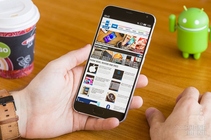
Chinese smartphone manufacturer Meizu came up with an unusually strong proposition last year, when it launched the MX4. A well-rounded phone that managed to find a rather good balance between features and affordability, the Meizu MX4's main asset was the combination of a stupendously large, 5.4" display, and a relatively compact body that almost didn't feel too big.
Design
The MX5 takes the evolutionary path, fusing its tried and true body shape with metal.
The overall appearance of Meizu phones has always gravitated around a single design concept: one that's very iPhone 3GS-like. That's not a bad thing, as while Apple and most other manufacturers have moved on in different directions, Meizu has decided to stay and evolve this type of exterior, coming up with some very interesting results along the way.
Display
Meizu goes AMOLED; the results aren't pretty.
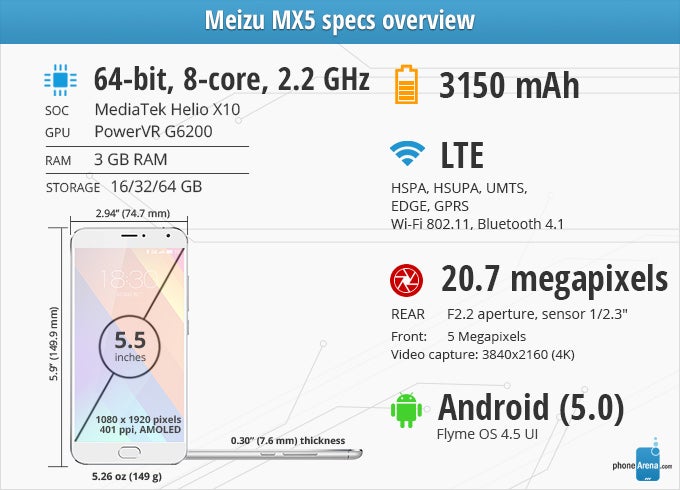
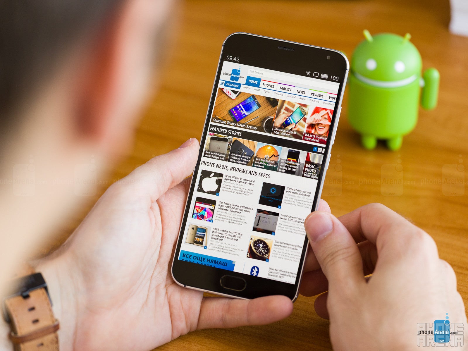
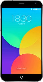
If there's one thing that we like about the Meizu MX5's display, it has to be its size! At 5.5 inches, it's a screen we'd wholeheartedly enjoy, considering the reasonable footprint of the phone. Due to a combination of its impressive 74% screen-to-body ratio and thoughtfully rounded back plate, the MX5 allows us to work with a giant screen at little cost in the way of comfort.
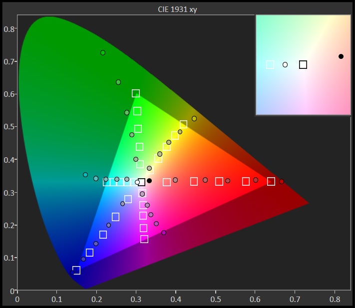
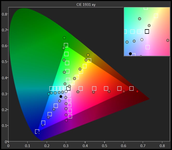
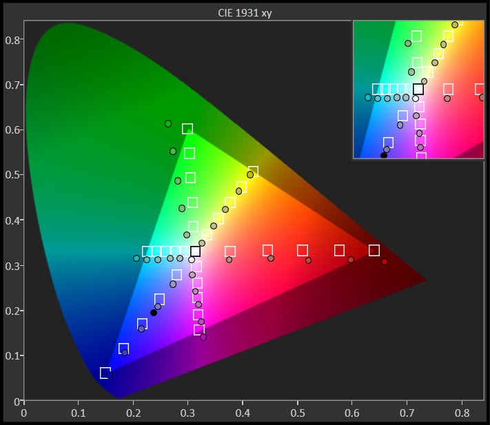
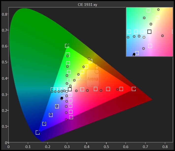
Resolution-wise, we're grateful to Meizu for being level-headed and sticking with 1080x1920 pixels, delivering the outstanding 401 ppi density. What we're not so grateful for is its decision to switch to an AMOLED screen, which has compromised some crucial aspects, such as color balance and brightness output. Last year, the Meizu MX4's IPS LCD panel had problems of its own, most notably a low gamma of 2.0 (somewhat washed-out looks) and a white point of about 7750 kelvins, making for a rather cold tone. Unfortunately, things haven’t really improved this year, as other problems have arisen in the place of the solved ones.
Interface and Functionality
Flyme OS 4.5 is a solid foundation, but Meizu still has much to learn.
On one hand, we like the fast response and simplicity of the latest Flyme user interface that's found on the Meizu MX5. On the other, the number of issues we've encountered thus far has us worried, as it hints at the software’s underdeveloped status.
Running on top of Android 5 is the so-called Flyme OS 4.5. It's as much an OS as Apex Launcher is, but that's the way Meizu likes to call it. It's a heavily customized take on Android, of the app launcher-less type, as it has always been with Meizu phones. Probably due to its Lollipop foundation, this latest Flyme version exhibits a very fast and fluid response – a bit faster than that of the Meizu MX4.
We’d like to bring up one other problem we encountered with the MX5’s Flyme OS 4.5. After we went through the trouble of setting up our Google account and Mail account (which is not a Gmail account, so they aren’t the same thing), logging in with a Flyme account later (in order to get the fingerprint scanner to work) actually removed the Google and Mail accounts we had set. Doing the whole thing a second time didn’t make the bug happen again, so go figure! It’ll remain a mystery. But even if we had somehow caused this with our own actions, the fact that we have no idea how we did it is yet another sign of software underdevelopment.
At the end of the day, Flyme is solid user experience foundation, which even does some things better compared to some of the 'big boys’ out there, but there’s still a lot, and we mean a lot of room for improvement. By the way, there also isn't a week view in the calendar.
Fingerprint scanner
As we said earlier, the new, physical home button now incorporates a touch fingerprint scanner, which can be used for quick device unlocking, app protection, and making payments in Meizu’s virtual stores. We can't be very certain about the security and privacy of the fingerprints you store on the phone, because enabling the use of fingerprints for things like device unlocking requires you to create and log into a Meizu Flyme account. So, it doesn't seem to be an entirely offline affair as with some other manufacturers.
Once you've logged-in with your Flyme account and managed to register a fingerprint, the scanner works well. It's super-quick and mostly accurate in recognising your fingerprint and unlocking the phone. It's not best-in-class when it comes to reading a fingerprint correctly — we've had quite a few failed attempts — but it’s pretty decent.
Processor and Memory
MediaTek's Helio X10 and 3 GB of RAM make for a strong duo.
Keeping its partnership with MediaTek going, Meizu has equipped the MX5 with the company's latest and greatest chipset – the Helio X10 (previously known as MT6795). This chip features a 64-bit CPU with eight ARM-Cortex A53 cores, which can reach the impressive clock rate of 2.2 GHz. As with other MediaTek CPUs, this one is a killer in multi-core performance benchmarks, but doesn't come off as impressive in single-core and real-world scenarios. Still, benchmark numbers paint a pretty competitive profile for the Helio X10, and with a PowerVR G6200 GPU on hand, the configuration does manage to deliver more than decent frame rates most of the time.
The Meizu MX5 is available with 16, 32, or 64 GB of internal memory, which is flexible enough, but it doesn't benefit from expandable storage, so choose wisely when deciding which version to pick!
Internet and Connectivity
The built-in Flyme browser works very well, but needs better compatibility.
Like every self-respecting smartphone these days, the Meizu MX5 features LTE and HSPA (for the times when LTE isn't available), along with Wi-Fi 802.11 b, g, n, ac and Bluetooth 4.1. The MX5 comes with two SIM card slots, both of which are of the nano type; accessing them requires the use of a SIM ejector tool.
Camera
Avoid capturing any birthday parties with this phone, especially on video.
The Camera application has an interface that is mostly easy to get around, but there are some issues here as well. For example, as we're holding the phone in lanscape mode (one would assume that's the normal way to hold a phone when working with the camera), tapping the three-dot button bring up the settings that we can tweak. However, the settings pop-up doesn't appear in landscape view – everything there is in portrait, so we're required to rotate the phone in our hands, change the settings we want, and then turn it to landscape again to take the picture. All of this could have been avoided if Meizu had gone the “extra” mile and designed a landscape variant of the camera settings menu as well... Are we asking too much from Meizu? We don't think so, considering that last year's MX4 had the same problem, so they had a year to fix it.
The Meizu MX5 camera application has all kinds of settings: in manual mode, you can do the usual exposure and ISO adjustments, and there are even shutter speed and the so-called focal length adjustments. The latter, however, doesn't have much to do with focal length – it's rather a manual focus option, which is still nice to have.
Outdoor image quality with Meizu's latest flagship is decent, but nothing impressive. There are relatively good detail levels, and slightly over-saturated colors (most evident in the close-up pictures of flowers we've taken), but the amount of noise we observe is somewhat alarming. As a matter of fact, noise becomes an even more noticeable issue in indoor or lower-light scenarios. Exposure isn't too good as well, with some images exhibiting too much overblown highlights.
Speaking of exposure, the built-in HDR mode is quite unsatisfying – its effect barely seems to even out the dynamics of images (as you can see in the photo gallery), plus it takes a few seconds to save an HDR image, which is a bit annoying.
Meizu MX5 Sample Images
And while overall image quality with the Meizu MX5 could come off as “OK”, video recording quality is terrifying. 1920 x 1080-pixel video is very low on details – so much so that it makes watching this footage an unpleasant experience. 4K video, which is supposed to at least provide an inconvenient 'workaround' for this issue, is pretty much unplayable on a normal computer. And by 'normal computer', we mean a desktop PC with a speedy Intel i5 processor. If that's not enough to play these files, we don't know what is. What's more, while even the most obscure video files usually get converted into playable form when they get uploaded to YouTube, even this didn't do the trick here. YouTube returns an error when trying to upload a 4K video clip shot with the Meizu MX5. On the plus side, the recorded videos (1080p ones) 'sound' good, if this could be any consolation.

Multimedia
I'll be good enough for the not-so-picky ones.
In terms of loudness, we can't complain of the integrated speaker, but we can complain of its quality. It sounds as if there are too much mid frequencies, making for a muddy audio that lacks depth, clarity and brilliance.
While we're on the topic of audio, pretty similar observations seem to be true for the MX5 earphones as well. While they naturally sound a ton better than the integrated speaker, they, too, suffer from insufficient bass and brilliance, and end up producing more of a closed, lo-def sound. We'd recommend that you swap them for other, better earphones, if you're into music listening on your smartphone.
Speaking of music, the music player has one of the most unintuitive designs we've seen for such an app. The default My Songs screen is where most of the navigation happens, but it's so poorly designed that it makes for a frustrating first few minutes, until the user eventually discovers how things work. For those who are willing to go through the pain of using it, here a tip: you have to click on the small text reading “Local”, in order to access all your songs and the different filter options. Clicking on the image thumbnails will just start playing a random song from your collection.
Call quality

If you need the loudspeaker for phone calls, the MX5 wouldn’t be the perfect choice, due to its muddy, mid-heavy sounding, but will definitely get the job done, thanks to its terrific loudness.
Battery
Meizu's latest proposition scored 7h 5m on our custom battery test, which is not bad, but not great either. This actually puts it slightly below its predecessor, as well as handsets like the Xiaomi Mi 4 and OnePlus One. At the same time, it elevates it above some other popular phones like the OnePlus 2 and LG G4, so yeah, it's a decent result.
Charging times with the MX5 aren't terrific – it's among the slower handsets to reach 0-100% in its class. It takes it about 2 hours and 40 minutes to completely recharge its battery – same as its predecessor, but slower than the Xiaomi Mi 4 (2h 6 min), OnePlus One (2 hours), or the LG G4 (2 hours 7 min).
Conclusion
The Meizu MX5 makes a good first impression, but ends up feeling like a disappointment, especially since it isn't that much better than its predecessor.
We wanted to like the MX5 for the undeniable charm of the series, but Meizu isn't making it easy for us. The MX5 is a well-designed phone – it looks and feels good, and it's also of decent size, considering it packs a massive 5.5” display. However, there are just too many compromises involved with this phone.
As much as we like the design, the display is a really sub-par affair. It's vivid and punchy and what not, but maximum brightness is not high enough, while color balance is markedly off. It really is more of a step back from its predecessor than anything else. Meizu should have stayed with LCD, rather than seek change for change's sake.
Then come all the issues that we have with the half-baked Flyme user interface, which may run at a decent pace, but ultimately comes off as somewhat underdeveloped for all the issues and oversights we discussed above. The Meizu MX5 leaves us with the impression that nothing in this phone has been implemented too well, and this includes the camera, especially its video recording quality.
At the end of the day, Meizu seems to be looking for ways to build upon its tried and tested formula, but this year's switch to an AMOLED screen has really compromised its product. With the industry's expansion starting to slow down a little these days, there isn't really that much room left for mistakes like this one. If Meizu wants to recover from the unexpectedly unsatisfying flagship that the MX5 is, it needs to release a much-improved version soon, and hope that we'll be quick to forget about the MX5. True, Meizu's flagship comes at an affordable price, which we guess will be among its main selling points. Currently, it can be purchased for somewhere between $330-400, which is a decent price, but at the end of the day, you'll get what you pay for, if not less.
Meanwhile, Xiaomi's Mi 4 remains a solid alternative to its arch-rival. True, its screen isn't perfect either, but it's not as bad as that of the MX5, and it has a pretty decent maximum brightness. And for those MX4 owners out there – they'll be better off holding onto their current handset, which can still deliver a comparable user experience. Still, if you're absolutely looking to upgrade, we'd recommend that you take a look at the current mid-range offerings from more established brands, such as HTC's Desire family, Samsung's Galaxy A series, and Sony's line of Xperias.
Software version of the reviewed unit: Flyme OS 4.5.2I; Android 5.0.1
Follow us on Google News











Things that are NOT allowed:
To help keep our community safe and free from spam, we apply temporary limits to newly created accounts: