LG V10 Review
Update: Read our LG V20 review!
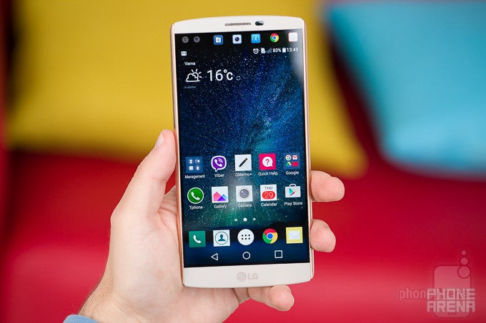
For the last couple of years, the G Pro line has been LG's answer to Samsung's Galaxy Note phablets. Unlike Samsung's Notes, however, LG's G Pro phones just didn't seem to strike a chord with consumers who were on the lookout for a super-sized smartphone. Perhaps, it was the lack of any major distinguishing features that prevented the G Pro from being noticed by the wider audience. Maybe, simply having an extra-large display was no longer enough to secure the win in the phablet category. Maybe, LG needed to come up with its own S-Pen-kind-of-feature that would make its device stand out from the hordes of Note-wannabes. You know what? It might have come up with just that.
Note: We're reviewing the South Korean model of the LG V10. It's basically identical to the global one, though some minor aspects of the experience might vary from region to region.
In the box:
- LG V10
- Wall charger (5V or 9V, 1.8A)
- USB cable
- Quad Beat 3 earphones
- Papers
Design
A bunch of good ideas, marred by materials that are too ordinary, and boring colors
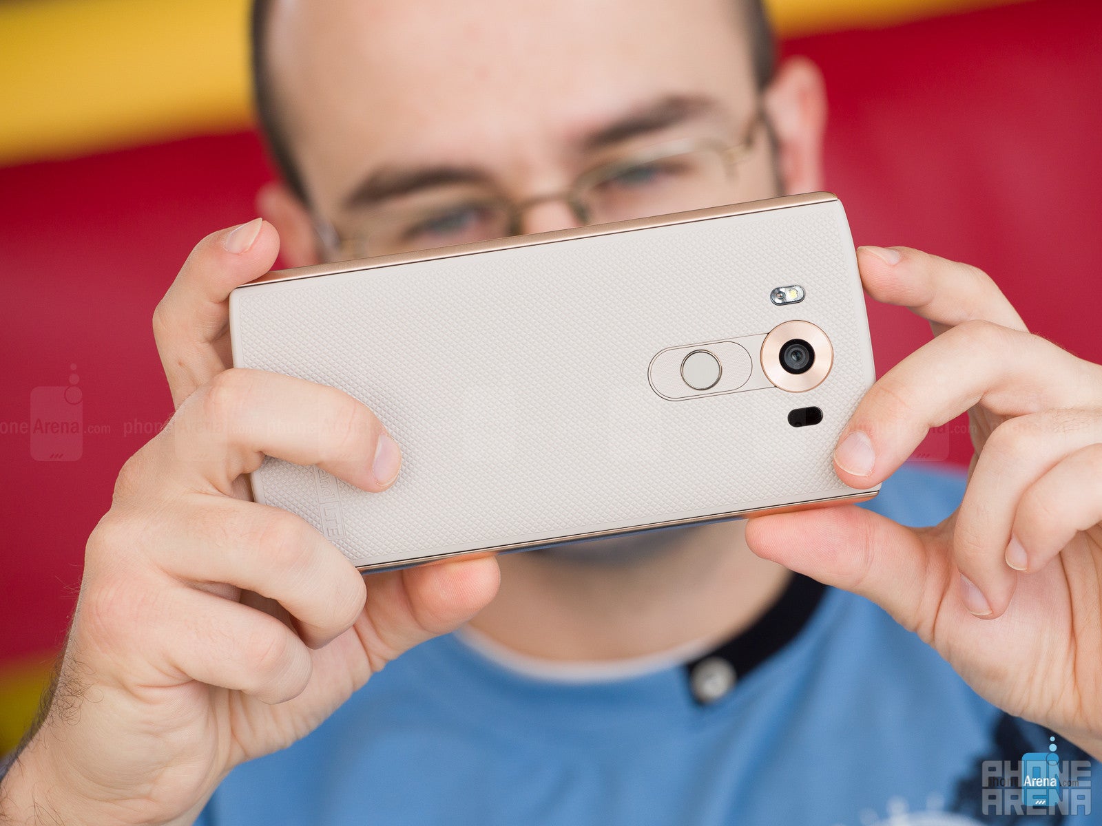
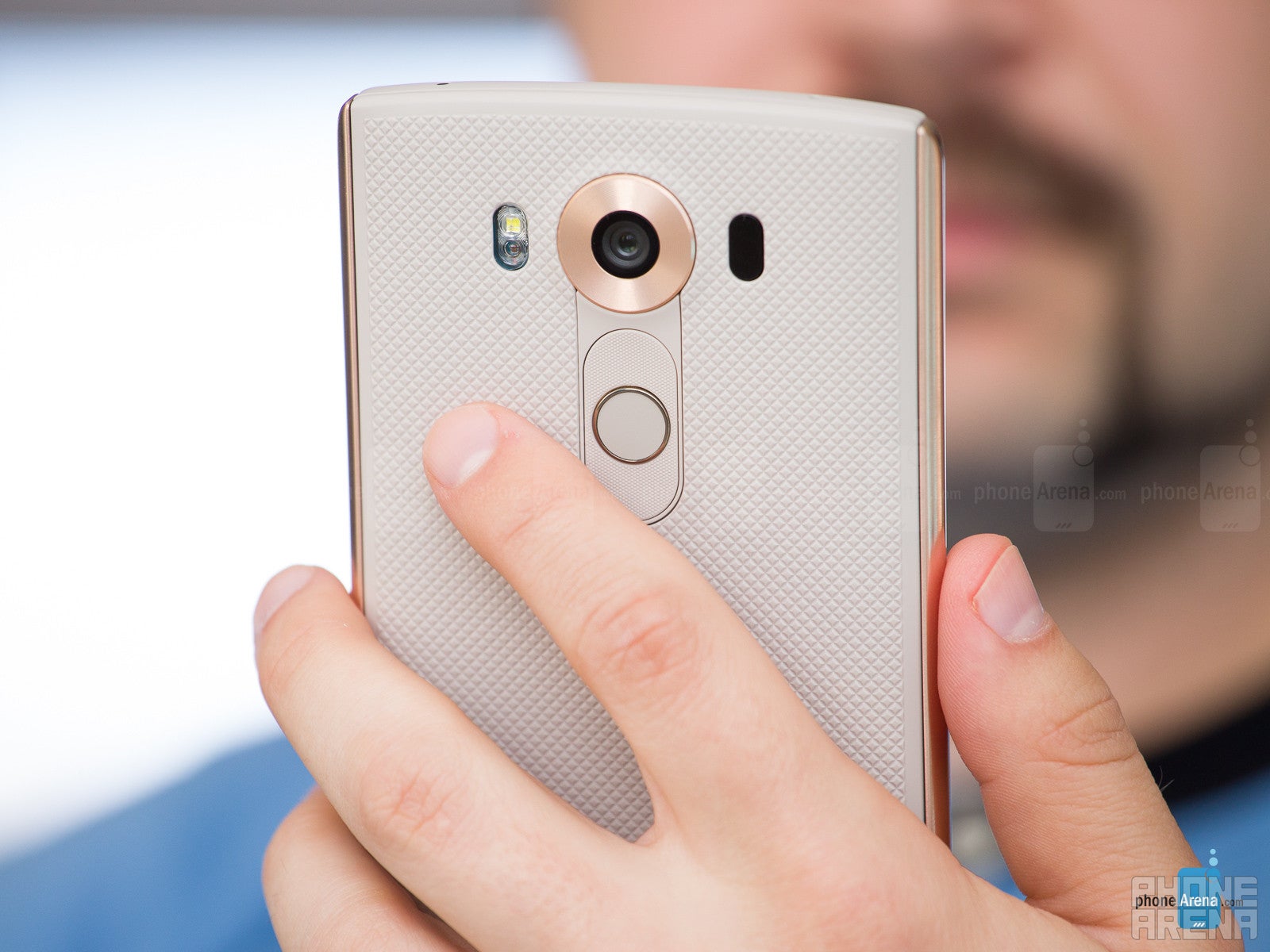
The V10's rear power key now doubles as a fingerprint sensor.
But the shape of the phone is appealing, while the unique stainless steel bars on the flanks add a much-needed element of elegance to the body. They are a really cool idea, because 1) they look good and different from what's out there, and 2) they aren't as slippery as the rest of the phone, due to their smooth, glossy finish. The V10 has a well-balanced appearance, but sadly, the same cannot be said about its weight, as this overly large phone ultimately comes off as a bit top-heavy. It's not the most comfortable handset to hold and work with, but it's tolerable.
LG V10 design images
Display
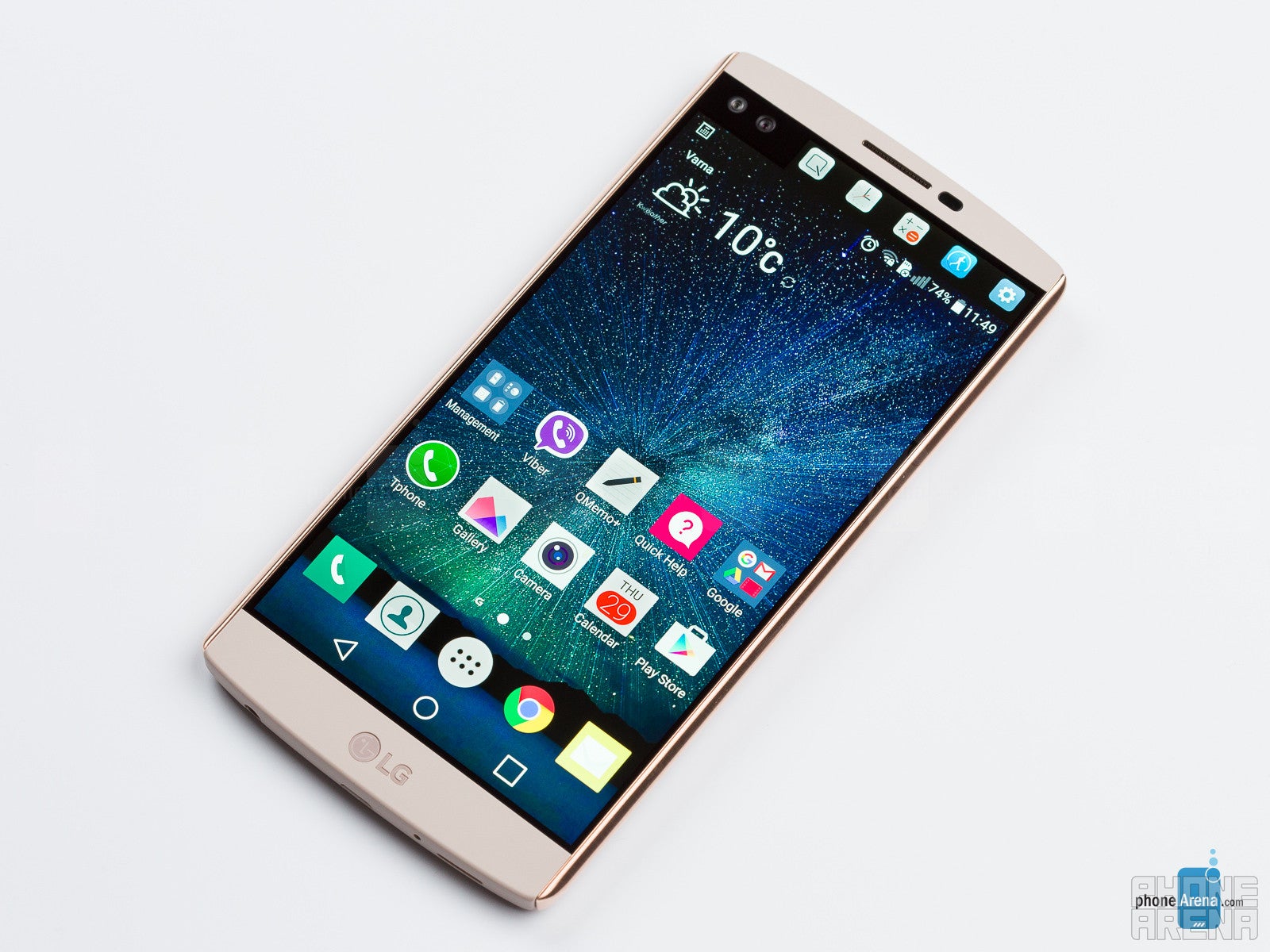
The LG V10's secondary display is a neat idea that needs better execution.
But it's not all bad: outside visibility is good enough, while reading in the dark won't destroy your vision, thanks to the satisfying minimum brightness level.
Up to this point, everything sounded fairly ordinary. This is where it gets interesting.
These days, everyone's looking to have some sort of gimmick – something to produce hype and draw interest towards the product. Samsung's Galaxy Note has the S Pen, Apple's iPhone 6s Plus has Live Photos, HTC used to put two rear cameras in its phones...
Apparently, the 5.7” display of the V10 does not provide enough screen space for LG's software designers to fit everything they want, so a second panel is in order. Users who aren't into the idea of it can turn it off, because it provides only auxiliary functions, but why would you buy a V10 if you're going to avoid its standout feature? Anyway, the small, second display is always-on. When the phone is sleeping, the second display continues to work, displaying the time and date, as well as any notifications that may arrive. It's a fun, useful concept, but also one that feels severely compromised.
User experience and secondary screen
LG's software lets you tweak almost everything, but its default state isn't particularly smart.
The LG-made Android 5.1 software running on the V10 is incredibly flexible, customizable, versatile, powerful even. In short, it's a mess.
Once you set your email account up in the Email application, it defaults to manual refresh. After a few missed messages, we felt something wasn't right, thus finding out this weird default setting. And don't get us started on the design of the Email app itself – it's mind-bogglingly amateurish, lacking simply formatting touches to make browsing through the list of messages easier, let alone pleasant. What's even worse is that you can't adjust server directories – something that you DO want to have a setting for. For people who's work duties involve regular email usage, this client is no good.
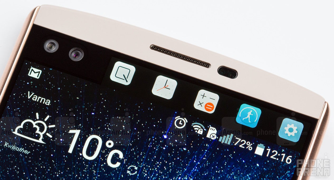
This doesn't necessarily apply to the way the secondary screen functions. Most of the time, it gets its job done pretty well without requiring too much input from the user. It is designed to complement whatever is on screen with extra functionality or quick shortcuts to various other features, which is cool. You can hold a bunch of things there, like some of your favorite contacts, or favorite apps, or next calendar event, but our favorite function is the recent apps pane. With it, it's like you constantly have an app switcher on hand – it'll be very practical for heavy users.
System performance
LG's fastest smartphone to date.
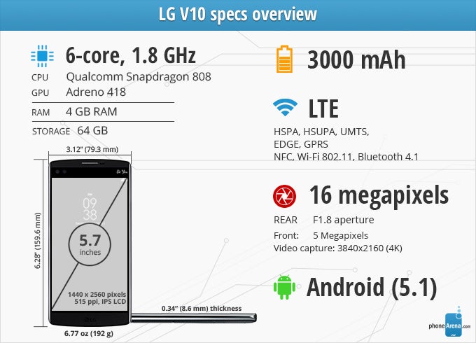
The LG V10 is a high-end smartphone, but the chipset powering it is not the strongest one around. Same as on the G4, it's the Qualcomm Snapdragon 808 – a six-core CPU configuration that strikes a good balance between performance and efficiency. The weak element here is the Adreno 418 GPU, which has traditionally provided decent, but not great results.
First, before most, though, we're concerned with the system interface performance, and here, we want to congratulate LG for the huge improvement over the G4. Granted that the hardware is the same on both, it has to be the software that LG has worked to optimize, and the result is commendable. The LG V10 impresses with very fast response times and minimal lag, which makes it one of the fastest Android phones around. There's the occasional delay, but those seem to be few and far between, so they don't hamper the experience at all. In that sense, using the V10 is a pleasure.
Camera
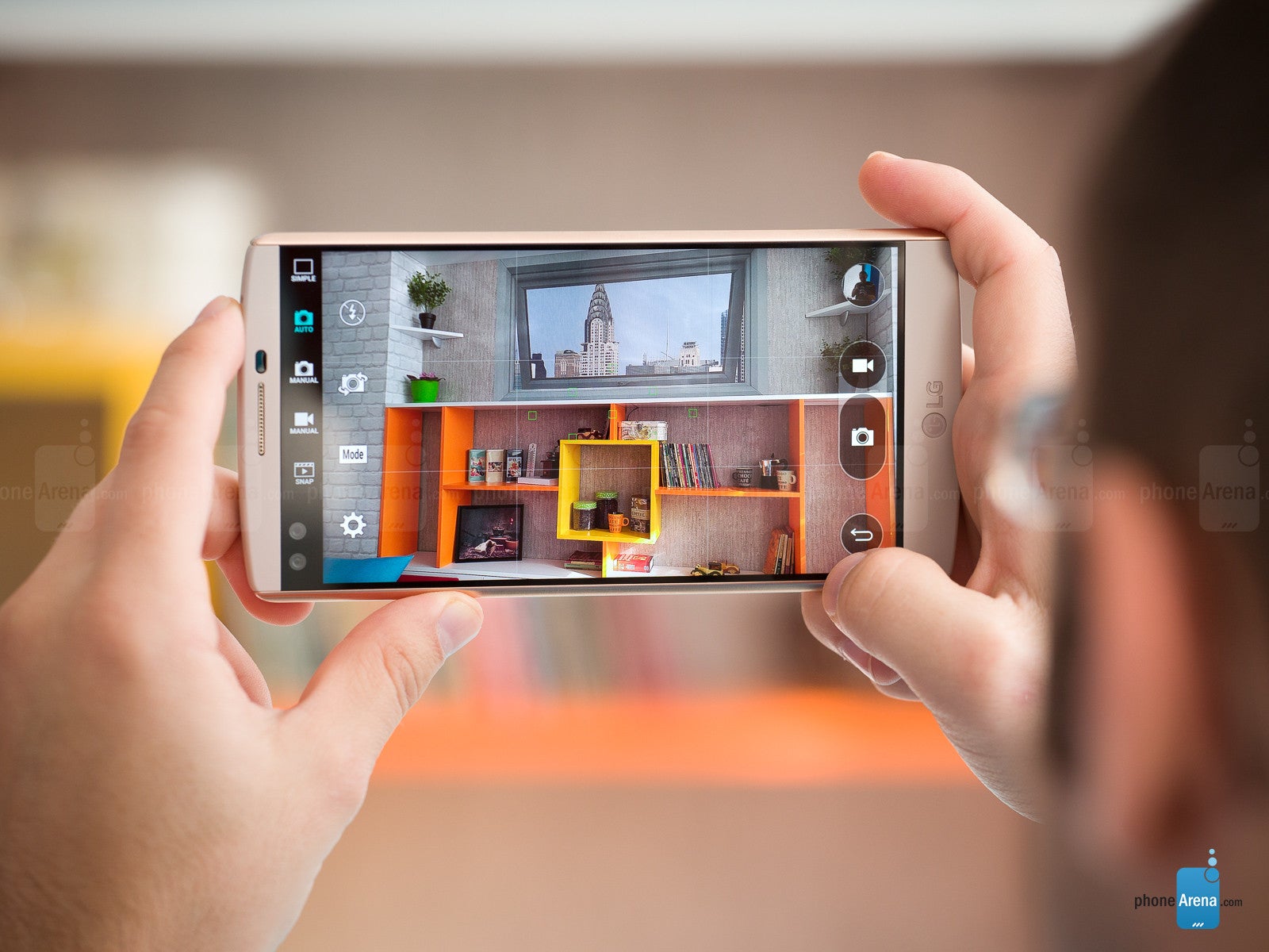
LG delivers yet another awesome camera, but video recording leaves something to be desired.
And while that's great, what isn't is that the camera app often happens to become unresponsive, rendering the touchscreen (and thus, the whole phone) useless. When it gets stuck, the only solution we found was to wait for, like, 5 minutes for it to get back to normal. When you're stuck helplessly waiting for your phone to become usable again, 5 minutes feels like a lot of time. This happened three times in the course of a 30-minute shooting session, which makes us question the reliability of this camera app. Thankfully, we haven't noticed similar instability issues with the rest of the phone's software.
Still images taken with the V10 come out very realistic, with accurate white balance and good exposure levels. You also need to try really hard to come up with a blurred photo – the V10 does a great job as far as still image focus and sharpness go. We did a quick 1v1 “careless hands” shooting session between the V10 and G4, and some of the G4's photos came out unclear, while those of the V10 remained stubbornly sharp. It's safe to say that at the present time, the V10 can produce one of the best photographs one can take with a smartphone. It's a very capable camera.
Taking pictures in dimmer, indoor environments, increases the risk of ending up with a slightly hazy shot, as can be seen in the photo taken at the cafe, but with some careful positioning, this problem should be easy to avoid. Meanwhile, the front-facing cameras are glorious, producing deep, colorful, nicely detailed portraits. Watch out for the “beautify” effect though, as it is engaged by default. When used in large quantities, it can lead to distasteful results. There are two front-facing cameras: one that's used for near-field, single-person selfies, and another that has a wider lens for taking group selfies. It's a peculiar solution by LG, but it does work.
LG V10 sample images
Video recording
One of the stand-out features of the LG V10 is the manual video recording mode. It's handled similarly to the still image manual mode: a similarly laid-out interface gives you access to a number of settings to change, such as white balance, focus, ISO, and shutter speed.
Overall video quality is decent, but nothing impressive. 1920 x 1080 footage recorded with OIS suffers from severe jello effect, which is very prominent when there's camera movement. This issue isn't present when recording with the Steady mode engaged, which uses OIS and software stabilization in tandem. It cuts a bit of the image's outer region out, but definitely yields better results. Either way, detail level isn't too good, and there's a certain amount of graininess to the footage. Color balance turned out a bit on the colder side in the videos we recorded.
The V10 allows you to record at 4K video resolution. In this mode, detail level is much better, but colors stay somewhat off, while the jello effect is once again noticeable, along with frequent auto-focus adjustments that make the video a bit hard to look at. LG was promising that the V10 will do for video what the “G4 did for photographs”, but while the G4 is indeed a great phone to take pictures with, the V10's video recording capabilities leave something to be desired.
LG V10 Sample Videos
Multimedia
Decent performance, but there's a lot of room for improvement.
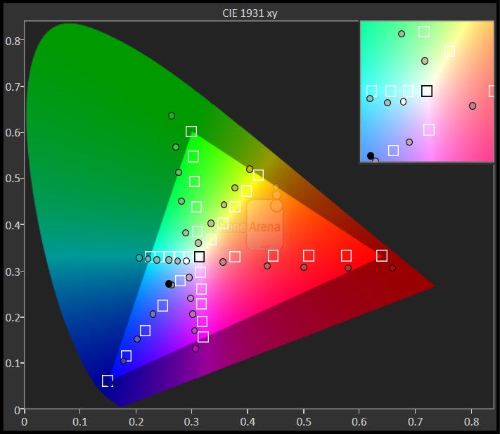
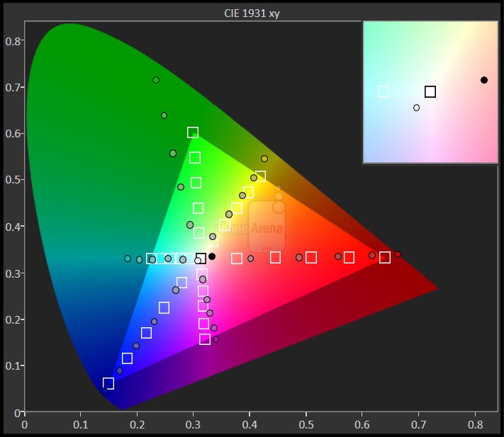
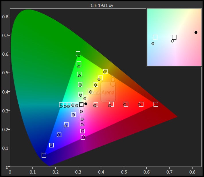
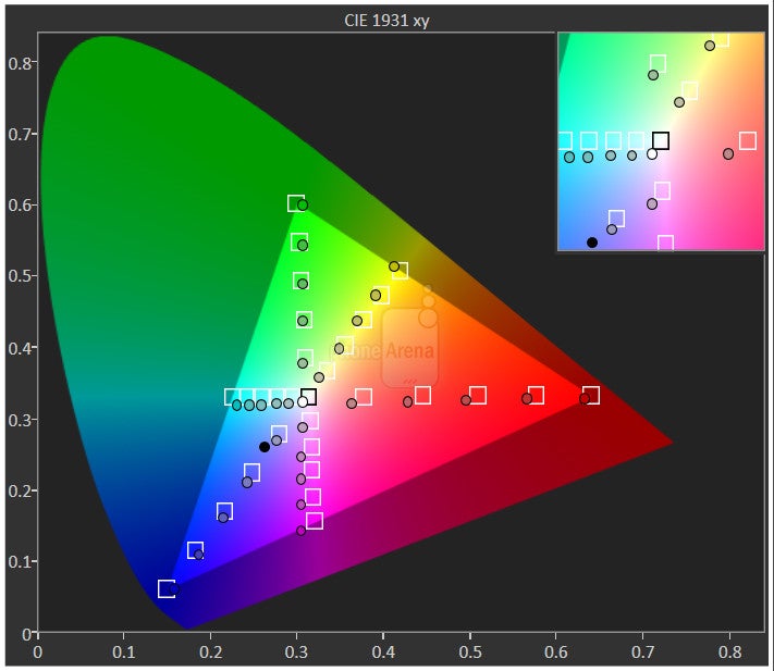
LG is positioning the V10 as heavy-duty multimedia device. It's supposed to be great for not only recording, but watching video as well. We already saw that the camcorder isn't the best it could be, so what about the watching part? Well, as far as the diagonal goes, you can hardly go wrong with such a massive, 5.7” display for video playback. However, the V10's screen requires that you don't care too much about color balance, because otherwise, you may end up being put off by the bluish tint. On a positive note, it's a plus that the V10 can play a plethora of video and audio formats out of the box, including lossless audio in WAV and FLAC formats.
The loudspeaker is pretty decent. It's strong and doesn't sound too bad. It could use a bit of brilliance in the high frequency range, but all in all, it's good. The Quad Beat 3 earphones that come with the LG V10 are also satisfying. At first, they may sound rather shallow, but once you stick them real tight into your ears (admittedly, not the most pleasant of sensations), they show their good side, with a tight punch and balanced, likable audio reproduction.
Battery life
Quick to charge, quick to discharge.
Even if you don't go the spare battery route, the V10 won't be out of the game for too long. It is super-quick to charge its battery! Using the stock charger, the juice pack went from 0 to 100% in the astonishing 65 minutes, which is the second-fastest charging time we've measured, only slightly behind the Asus ZenFone 2 and its equally big, 3000 mAh battery, which was ready for action in just 58 minutes. The 65-minute charging time of the LG V10 is faster than the already fast 81 minutes of the Galaxy Note5 (3000 mAh), or the 89 minutes of the Nexus 6P (3450 mAh). In comparison, Apple's iPhone 6s Plus charges with the speed of an elderly sloth, requiring 165 minutes on the stock charger – 2.5 times slower than the V10.
Conclusion
It's loaded with features, it literally doubles the screen and the front-facing camera; it has it all, even an IR blaster, replaceable battery and microSD slot – features its rival, Samsung, recently left behind. Unlike Samsung, however, LG seems to be firmly confident that more is most certainly better. And for some people, it most certainly is.
There are undeniable benefits in having a specs sheet as lengthy as the household chores list your partner unexpectedly hands you on a Saturday morning, but the question we should always keep asking is this: are all of these features integrated wisely, or are they confusing, compromising the experience? Furthermore, do they work as advertised? To these questions, the answer is rarely a firm yes with the V10. There are certain areas where it excels, such as performance and still image quality, but it tends to falter in others, like display quality, video recording, and general user experience seamlessness: the unstable camera app, inaccurate auto-brightness function and inefficient app design are just some of the issues we encountered.
With the LG V10, it's more show than substance. It's suitable for techies, but not so much for consumers who want it to just work.
Software version of the reviewed unit: Android 5.1.1; F600S10i | Build number: LMY47V
Update: Read our LG V20 review!
Follow us on Google News








Things that are NOT allowed:
To help keep our community safe and free from spam, we apply temporary limits to newly created accounts: