LG G Watch Review
Introduction
Hey! Look! Samsung isn’t the only major player in town getting into the lucrative smartwatch space, seeing that other Korean company is also down in making its presence known. After all, who doesn’t want to get into the business, now that Google unveiled its new smartwatch platform in Google Wear. Interestingly enough, this isn’t the first time LG is breaking into the space, as they brought to market the PRADA Link back in 2008 to be companion to the LG PRADA II phone.
Diving into a new endeavor with the LG G Watch, LG is looking to get a jump start with Google’s new smartwatch platform. Without a doubt, it already has stiff competition against the other smartwatch on the scene – the Samsung Gear Live, which goes on sale at the same time as LG’s offering. In the greater scheme of things, LG has more to prove because this, of course, is their first serious contender in quite some time. Considering that the LG G Watch is competing in the Android space, will we see some rust with the results from its champion?
The package contains:
- microUSB cable
- Wall charger
- proprietary charging cradle
- Quick start guide
Design
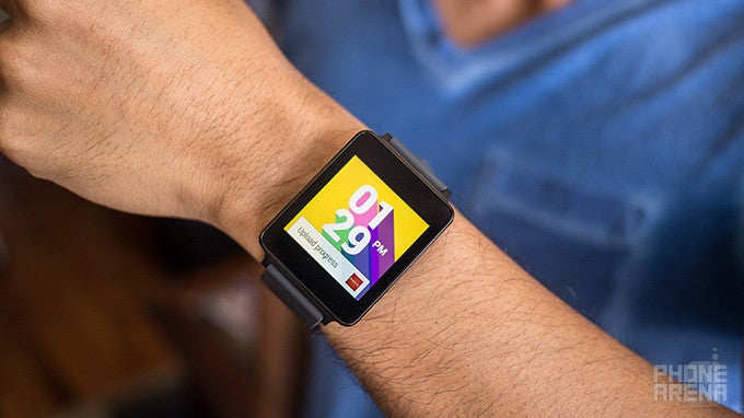
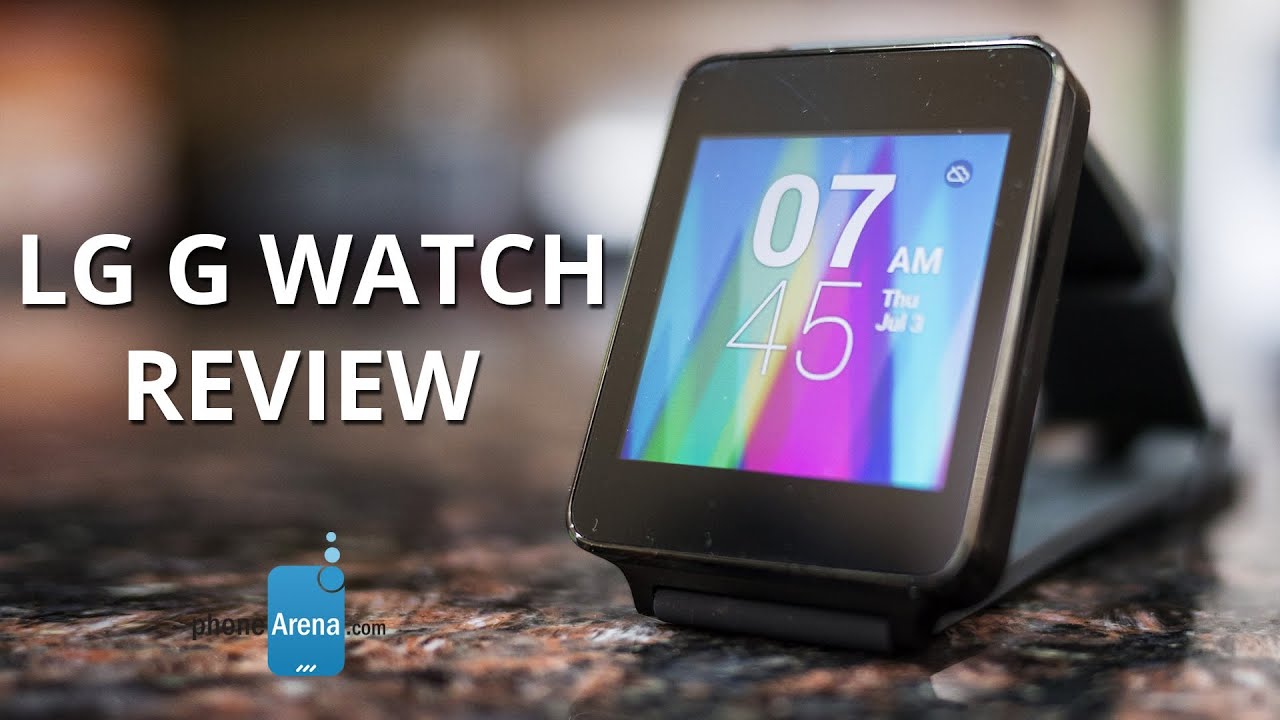
Things couldn’t be any more boring with the LG G Watch’s design.
Ugh, it’s so disheartening when anticipation for a smartwatch reaches a swell, only to be dashed the moment it’s officially unveiled. Well people, that’s exactly the feeling we get here as we look at the LG G Watch. Quite frankly, its design language is in stark contrast to the Samsung Gear Live, which boasts a substantially more appealing look.
Rather than employing a cutting-edge design, one that’s needed to stand out over the impending competition, the LG G Watch fails to impress with its antiquated appearance. Boxy, boring, and uninspiring are all words that describe the LG G Watch’s design, which to our dismay, isn’t something we’d remotely consider to want to have worn on our wrist. The render photos of the watch looked good, but in reality, it’s far outcry from that.
Even though it appears to be constructed entirely out of plastic, it actually consists of a PVD coated stainless steel frame, which has a decent amount of sturdiness. We’re glad to see that it features an IP67 rating, which means that it’s water resistant to survive immersion in 1 meter of water for up to 30 minutes. Due to its boxy shape, it doesn’t make for the most ergonomic or comfortable feel. In addition to that, the rubbery band screams conventionality to the teeth, as the entire thing looks more like a Casio calculator watch, instead of a premium timepiece.
There’s no physical button on the LG G Watch, but there’s a pinhole sized recessed button, and 5 gold colored contact tips used for charging the unit on its underside. Indeed, the lack of any button adorned on the LG G Watch gives it a uniform, clean look, but it’s still not enough to wash away the overall bland tone of its design. Seriously folks, it seems as though LG rushed and didn’t take things too seriously – a shame to tell you the truth!
Display
Just like its design, the LG G Watch’s 1.65-inch IPS LCD display fails to impress with its bland looks.The LG G Watch’s 1.65-inch 280 x 280 IPS LCD display also fails to impress. First, let’s talk about detail: it strangely sports a lower resolution than that of the Samsung Gear Live’s display. Okay, we’ll admit that we’re able to make out details so that we’re not squinting closely at the panel, but it would’ve been nice to have something higher in resolution to give it a crisper look.
However, what really irritates us the most is the screen’s bland color reproduction and poor viewing angles – the combination just doesn’t sit well with us, especially when it’s a watch we’re dealing with here. Slightly tilting it causes the display to distort, causing colors to fade in tone. On the other hand, its potent brightness output makes it relatively easy to view outdoors when the sun is out.
Interface and Functionality
It’s like they took Google Now for Android smartphones, but packaged it to fit on our wrist. It’s a good start, but it lacks depth to make it functional.
LG has it easier than its rival in Samsung, just because they’re mainly here to provide the physical hub for Google’s new Android Wear platform – so that’s less work on their part. However, the LG G Watch’s success hinges squarely in the adoption of Google Wear. During the most recent Google I/O, Android Wear was ceremoniously unveiled and previewed – where it’s anticipated to be the dominant force in the wearable space. Obviously, there’s a lot in stake here, as we have yet to have a single platform that has proven to be versatile and encompassing to be worthy of consumer demands. Knowing that Google is taking the helm here with Android Wear, it’s almost certain to see the same meticulous direction we’ve seen with its smartphone OS.
Utilizing Google’s new Material Design language, Android Wear mostly relies on floating cards that move and hover smoothly over a textured background. To the effect, the presentation and layout of Android Wear is best described as to what we currently have with Google Now for Android smartphones. In true fashion, the homescreen is merely a clock of some kind, which can be changed into others through the settings. Android in general is known to offer deep personalization, but at the moment, we’re only limited to changing the clock in the homescreen – and that’s all. Hopefully, we’ll see it extended to more things as the platform matures.
With the display being “always-on”, where the screen is dimmed to show us the time (and notifications too), tapping anywhere on the display brings it to life. This feature, of course, means that it’s constantly consuming more power, but there’s a setting that allows us to completely turn off the display – to preserve battery. Swiping down from the homescreen enables us to cycle through the various cards, where swiping left/right on each corresponding one provides us with additional functionality into those cards. Honestly, there’s a low learning curve with the new platform, but knowing that it’s uniform throughout all Android Wear smartwatches, it makes for an easy transition when jumping from one watch to another.
So, what can we say about the overall look, feel, and operation of Google’s new Android Wear Platform? It’s intuitive and easy to learn, but we’re hoping to see more personalization offered down the road. At the core of it all, we find it to be nothing more than employing the design language and operation of Google Now for Android smartphones, but for the smartwatch form-factor. There’s little doubt that Google will have an aggressive approach to its maturity, but in its current form, it doesn’t feel like it’s functionally complete.
For the LG G Watch specifically, its experience isn’t any different from that of the Samsung Gear Live – with the exception that it lacks a heart rate sensor. Naturally, that’s the beauty of the platform, since transitioning from one Google Wear smartwatch to another doesn’t require new learning. At the same time, though, it means that there won’t be any distinction in the software side to differentiate all Google Wear devices.
Notifications
At the core of it, we feel as though Android Wear is nothing more than Google Now on your wrist – so it acts as a hub for various notifications. From the usual weather related and traffic cards we already see with Google Now for smartphones, it doesn’t really sway too much from what we’ve been exposed to with Google’s self-aware service. Indeed, it’s a more discrete way of viewing notifications, but that’s basically the extent of its functionality, seeing that anything more generally requires us to “open on phone”.
Don’t get us wrong, it comes in handy for having a discrete way of viewing notifications on our wrist, but nine out of ten times, the additional functions beyond viewing the actual notification usually requires us to access them on our phone. For example, the “open on phone” option loads the corresponding app upon unlocking our smartphone, which shows us that the smartphone is still needed to do basic things – like replying to various messages.
Okay Google
We’ve been yearning for it since we were first introduced to the concept with the Moto X, but we now finally have a smartwatch platform that can access various Google Now functions via voice – only when the watch is actively on, meaning it can’t be in its dimmed status. Now, it’s a mostly spot-on process getting it to recognize the “okay Google” command, but noisy environments naturally doesn’t help the process. As an alternative, we can initiate the voice service by tapping once anywhere on the homescreen.
Having the power of Google Now on our wrist gives us a little bit more control in receiving and accessing information that’s most pertinent to us. Basically, its functions extend to placing phone calls, making conversions, asking for the weather, driving directions, setting reminders/alarms, and much more. Heck, you can ask trivia questions like, “how tall is Michael Jordan?” Seeing that there’s no built-in speaker, we’re only presented with a card for us to read.
Come to think of it, this feature is without question one of the platform’s most essential and useful things. No longer do we need to use our phones to access some of these functions, as Google Wear is a presentable alternative that gets the job done in an equally similar fashion.
Google Fit
Cashing on the whole wearable fitness craze, Google has incorporated its own health-wellness service into its Google Wear platform. Regrettably, though, its infancy is really showing at the onset, as the app lacks meaningful data to make us want to strive to do better in our routine. Instead, the service allows the watch to track how many steps we take throughout the course of a day – where it breaks down into a graph view.
In comparison to other dedicated steps-tracking apps, like S Health, Google Fit just doesn’t fill the void that hardcore fitness buffs want in a health-wellness service. At the moment, it does nothing more than just tracking our steps and showing us our results, but it doesn’t do more to use the data it obtains to coach us. Again, as the platform develops, we’re hoping to gain more functionality here.
Other Apps
Being powered by Google Now, Google Wear offers us access to several things we’re familiar experiencing with the service on a smartphone. For example, we can receive driving directions, weather information, reminders, and even our flight boarding pass – all through the smartwatch! We can even preview most of our emails directly through the smartwatch, instead of our phone. Needless to say, it’s wonderful that we have this discrete way of previewing them, which is what we’d want to have in a smartwatch platform. However, for those hoping to get more work done, advanced functions are accessed via the smartphone.
Processor and Memory
Snappiness is in full abundance with its performance.
Luckily for the LG G Watch, its hardware matches that of its main rival in the Samsung Gear Live – a 1.2GHz Qualcomm Snapdragon 400 processor with 512MB of RAM. Overall, the performance is snappy with all operations, and the more we think about it, we have yet to come across an instance where its performance stutters. All of this top-notch performance helps to deliver an intuitive experience!
Even though it’s stuffed with 4GB of internal storage, it doesn’t really have any bearing on us because it’s not something we can access upfront. Instead, it’s basically used by the platform to store various data and system updates.
Connectivity
Relying on Bluetooth 4.0 LE connectivity to interact with an Android powered smartphone (an HTC One M8 in our case), the LG G Watch is able to establish the connection for approximately 25 feet indoors. In order to initially pair it, we’re required to download the Android Wear app from the Google Play Store, which does nothing more than initializing the connection and being a hub to browse for certain compatible Android Wear apps.
Multimedia
Okay, so the only multimedia function that we have access to on the watch is controlling music – and that’s all folks! After selecting a song to play, whether through Android Wear’s “okay Google” function, or merely selecting it through our connected smartphone, the smartwatch is transformed into nothing more than a controller. Not only do we have access to the pause/play function directly from the card, but swiping over gives us forward and reverse functions as well. And that, folks, pretty much sums up the extent of its multimedia offering at the moment.
Call Quality
When an incoming call is being received, we’re given the choice of accepting or rejecting it. Now, seeing that the LG G Watch doesn’t feature its own built-in speaker, we’re left to using our connected smartphone for all of our chatting. One would think that the smartwatch’s microphone could be used for the occasion, but it’s not.
Battery
Expect nightly recharges with this one.
Right from the onset, one of our primary concerns about this “always-on” smartwatch is that the display is constantly active – therefore, consuming more battery in the process. Unfortunately, the LG G Watch’s 400 mAh battery is able to churn out enough juice to get us a single day of normal usage at the most. In some instances, we found it being less due to our constant interaction. Also, throw in the fact that it has a proprietary cradle for charging, it means that it’ll be tougher finding a replacement right away in the event it’s misplaced.
Conclusion
LG has a tough road ahead of itself, a sad prediction knowing that the company is trying its darndest to be relevant in this budding segment. Honestly, it’s not too much of a shocking revelation, seeing that its official unveiling a couple weeks ago alluded to the obvious that it’s just sadly outmatched – to Samsung’s offering, of course (and maybe all of them). As a watch, this is something we personally wouldn’t be too keen in showing off with pride, as the boring looks harkens to that of a Casio calculator watch.
Just like with the Samsung Gear Live, we’ve seen the advantages of what Google Wear has to offer – like its always on Google Now integration. Considering that it’s meant to be primarily as a companion to an Android device, we’re happy to see that notifications are pushed in a discrete manner. However, despite our love for Google Now, the platform as a whole doesn’t feel as complete as we’d like – though, that’s generally an expected outcome with an v1.0 software. As time goes, we know that Google Wear will have a more balanced features set as it matures, but in the near term, it’s just not quite there yet.
Going back to the LG G Watch itself, its higher price of $230 boggles our mind like no other – more so when it lacks a heart rate sensor, has a cheaper looking design, and a lower resolution screen in comparison to the Samsung Gear Live. Everything about the LG G Watch screams with that sense of being overpriced! It’s frustrating to tell you the truth, since LG recently made some headlines with its LG G3 smartphone, but this, it’s a huge leap backwards for them. In the near term, there’s no denying that this should be overlooked and passed over by Sammy’s smartwatch.
Software version of the review unit:
Software Version: 4.4W
Build Number: KMV78V







Things that are NOT allowed: