Jolla Smartphone Review
Introduction
Android and iOS – these are the two platforms dominating the mobile landscape, with Windows Phone standing at a distant third place. From the looks of it, that's the way things are going to be in the foreseeable future. Of course, this isn't stopping ambitious start-ups from trying to grab a chunk of the smartphone market with their lesser-known products and alternative operating systems. One of them is Jolla – a Finnish company run by former Nokia employees – which launched its first smartphone in late 2013.
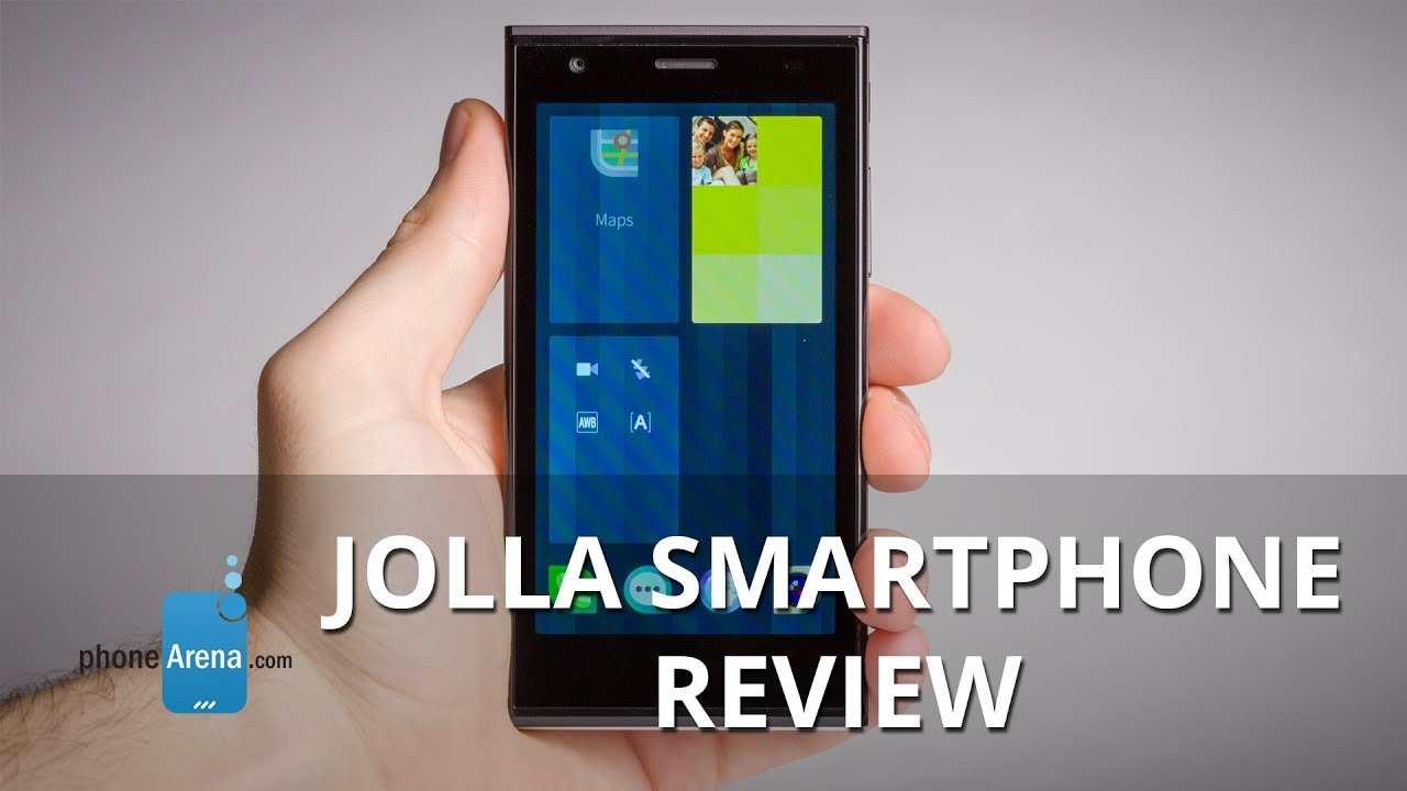
What's unique about the Jolla smartphone is that it is powered by Sailfish OS – a new platform based on the now-forgotten MeeGo operating system. The software is capable of running Android apps and it its user interface relies heavily on gesture-based user interaction. On the hardware side of things, we're looking at a 4.5-inch screen, dual-core Snapdragon 400 SoC, and an 8MP main camera. Surely, anyone who knows their way around a smartphone can tell that a setup like this can't justify the smartphone's rather steep 400 euro (~$550) price tag. But who knows, the software experience might manage to win our hearts. Let's find out if that's the case!
Design
Yin just met its Yang.
“Dude, what phone is that?” – be ready to be asked this question often if you intend on owning Jolla's smartphone. Why? Well, mostly because the handset is bound to be a magnet for attention thanks to its distinctive design. Sure, a beauty prize winner this is not, but it feels fresh, it feels different, it feels… unique. And we like this for it has been a long time since we last handled a smartphone with so much personality. All of these impressions are induced from a device that's built with minimalism in mind – a device lacking any superfluous design features. Even the Jolla logos etched on the phone's back and top sides are made to be as discrete and unobtrusive as possible – a touch that we're very fond of.
Fundamentally, the Jolla smartphone is built around the idea of it being comprised of two components. These are commonly referred to as its two halves – one being pretty much the phone itself, and the other being its removable, polycarbonate-made, scratch- and fingerprint-resistant back cover. Seems odd at first, we know, but there's more to it than meets the eye. You see, a unique trait about the Jolla phone is that it knows what kind of back cover it has been paired with. Once the cover has been recognized with a dose of NFC magic, the software of the device adapts itself – slap a back of a particular color and a matching UI theme will be applied. Alas, this otherwise outstanding feature isn't being used to its fullest potential, or at least not as of this writing. Perhaps one day we might see other, more advanced halves with built-in extras like wireless charging, an extra-large flash for the camera, and all sorts of goodies that add extra functionality and augment the overall user experience. Until then, however, we'll have to settle with just simple, colored polycarbonate covers costing almost $40 apiece.
The Jolla phone is of average size for a contemporary smartphone and we find it easy to handle. Its sharp corners, however, dig into our palm and don't feel very nice. On the bright side of things, our fingers have no troubles operating the well-exposed power and volume keys on the handset's right side. Speaking of buttons, there aren't any on the Jolla phone's front side, as you might have noticed from the pictures. That's because the UI of the OS is gesture-based, which eliminates the need for home, back, or any other dedicated navigation keys, but we'll get to this in a minute. The only thing found under the phone's screen is an RGB LED for notification purposes.
Display
Nothing to hold your breath for.
The Jolla smartphone comes with a 4.5-inch IPS LCD display. As a whole, the screen isn't bad, but it is also far from impressive. Its resolution of just 540 by 960 pixels, despite being sufficient for most tasks, is underwhelming to see on a relatively pricey smartphone at this point in time. Color reproduction is fairly accurate, but blacks are pretty much non-existent. The touchscreen has no super-sensitive properties, which means that one can't use the phone with gloves on. Automatic brightness control is also absent, which is a shame, especially when the screen is unusable outdoors unless its brightness is set to the maximum level.
Interface
Colorful, minimalist, but navigation gestures take a long while to get used to.
Remember MeeGo? Don't feel bad if you don't. Announced jointly by Intel and Nokia in 2010, it was a Linux-based OS that never really achieved any commercial success. What does that have to do with Jolla's smartphone? Well, the handset happens to be the first to launch runing Sailfish OS, which is an emerging platform based on that same MeeGo operating system. In other words, we're dealing with an underdog mobile operating system built upon a product that flopped. But let's give it a chance anyway.
The user interface of Sailfish OS is colorful, minimalist, and pleasant to look at. It is also very different from iOS, Android, or Windows Phone for it is controlled mostly using gestures instead of physical or on-screen buttons. Thankfully, these are explained to the user when the phone is turned on for the first time, and one is free to launch the guide again at the later time since it is available as an app.
We've been using the Jolla smartphone for several days now, and as much as we're trying to force ourselves to like its gesture-based navigation, we're still finding it a tad frustrating. This might change given enough usage time, but currently, we can't say that we're feeling right at home. If you're coming from iOS, Android, or Windows Phone, prepare to face a steep learning curve.
Still, there are things about Sailfish that we like, including some of the implemented gestures. The phone can be woken up from stand-by with a double tap on the screen, and the notifications panel is at the bottom, which makes getting to it very convenient.
Widgets are absent from Sailfish OS. When you minimize an app, however, it goes to a separate screen where it can be interacted with using gestures or buttons placed on its tile – a very elegant solution. Speaking of minimizing apps, Sailfish is built to support live multitasking, which is definitely an advantage. In other words, minimized apps are still active, not frozen indefinitely.
Functionality
Basics are covered, but there's a serious lack of apps.
The list of apps available on the Jolla store is very short. This shouldn't be a problem, however, since Sailfish can run Android software. Right? Well, it isn't that simple. You see, to get Android apps onto the Jolla smartphone, we had to download the Yandex app store, which currently has only about 85,000 apps. Many popular apps are missing from its catalog – there's Fruit Ninja and Twitter, but Angry Birds and the official Facebook client, for example, aren't available. Furthermore, Android support still seems to be rather shaky, so expect games to run at mediocre framerates. App crashes aren't out of the question.
As for the stock Sailfish OS apps, the dialer and the contacts list are both minimalist, without much going on in terms of advanced features. But they get their job done and we don't find them lacking anything of essence. Now would be a good time to mention that Sailfish OS plays along well with Google, Facebook, and Twitter accounts, so we had no troubles importing our existing contacts. As soon as we logged in, new emails and notifications from our FB feed started popping up in the notifications panel.
The messaging application is used to send plain old SMS messages, but it has Facebook messenger integration as well so it can be used to shoot free texts over to your FB buddies. One annoying thing about it is the lack of a button for attaching items to the message. To send a picture, we have to use the Gallery app instead.
The phone's on-screen keyboard is well laid out, with large enough keys and built-in word prediction. The absence of a landscape layout, however, is puzzling.
Processor and memory
The dual-core Snapdragon 400 gets the job done.
There's nothing in terms of processor specs that the Jolla smartphone can impress us with. Under its hood ticks a 1.4GHz Snapdragon 400 SoC with two Krait 200 CPU cores and Adreno 305 graphics. One gig of RAM can also be found there. The good news, however, is that Sailfish runs fine on this otherwise mid-range hardware configuration. The OS is responsive and doesn't stutter, although the UI's framerate is clearly far from reaching the 60fps mark. With a little effort, you should even be able to run some not very demanding games on the device.
Storage space on board the Jolla phone is limited to 16GB, out of which 13.8GB are available. Those who need extra space are free to pop in a microSD card in there.
Web Browser and connectivity
Core web browser functionality, no bells and whistles.
Sailfish comes with a pre-loaded web browser built on top of Mozilla's open source Gecko browser engine. All in all, the app gets the job done, but it is frustrating to use with its unintuitive interface and it can be slow with heavier pages. Navigation on our home page, for example, is hindered by the slow page rendering while scrolling or zooming. The browser's list of features is somewhat short. You can bookmark pages, Google stuff from the address bar, open multiple tabs (once you figure out how, that is), share pages, and that's pretty much it. Text doesn't inflate so get used to doing lots of pinch-ins and pinch-outs while surfing the web. Text reflow is also out of the question. Thankfully, Opera Mini is available for download from the Yandex store – some users might find it easier to use than the stock browser app.
The Jolla smartphone is a 4G-enabled handset with LTE support for a limited number of carriers “on 6 continents”. Naturally, 3G HSPA connectivity is also supported, although we aren't sure what's the peak downlink rate of the phone's radio. You also get all the mandatory stuff, such as Wi-Fi b/g/n, GPS with GLONASS compatibility, and Bluetooth 4.0. Technically, NFC is also present, but it is used for pairing the handset with its case and we couldn't get it to do anything beyond that. Full-blown NFC support, however, could come one day through the use of an other half built for the purpose.
Camera
Takes decent daytime photos, but struggles in low light.
On the back of the Jolla smartphone we find an 8MP camera with auto-focus and LED flash. One can easily access its interface either by launching the camera app from the home screen, or using the shortcut in the phone's swipe-down menu. Once there, we're treated to a clean, minimalist UI with no bells and whistles anywhere in sight. There are some manual controls – we're allowed to change the focusing mode or tweak the white balance, but that's pretty much it. There's no built-in panorama feature, and there's no HDR either. Oh well. At least the camera app is dead simple to use. On second thought, there are several things that could have been made better. The resolution setting, for example, is found in the Settings menu, not in the Camera app. But the thing we are much more frustrated with is the shutter sound. Well, not the actual sound itself, but the delay between the moment it goes off, and the moment when the photo is captured. In other words, you hear the click half a second in advance, so by the time the photo gets taken, you might have already moved.
Anyway, given favorable conditions, the Jolla phone is well capable of taking decent, presentable photos. Sure, they are a tad noisy and the fuzzy details don't look nice at 100% zoom, but all in all, the phone's daytime shots are definitely share-worthy. Colors have a neutral tone to them and don't really pop out, but they do look close enough to the way they do in real life. The only thing we find annoying is that while tapping on an area of the frame shifts the focus onto it, the exposure doesn't get adjusted accordingly.
Low light photos, however, are barely usable. They are noisy, blurry, and the auto-focus often refuses to cooperate. The LED light might help to a certain extent, but it often messes up with the color balance, rendering the image much colder than it should be.
The Jolla smartphone can capture videos at resolution of 1920 by 1088 pixels, but their quality is far from inspiring. Details are poor, noise is abundant, and objects in motion don't move very smoothly. As you might guess, it gets even worse under low-light conditions because of the even poorer details and the horrible motion blur.
Multimedia
Nothing but the basics.
We find a humble, basic Gallery application pre-loaded on the Jolla smartphone. It lets us browse the image- and video-containing folders in the phone's storage and the photos we've shared on our social networks. Thumbnails of the images in these folders are organized in tiles of a fixed size. Sadly, there's little that the Gallery app can do. It lets us share images on Facebook or over Bluetooth, but there's no image editing tools and there's no way of posting multiple photos at the same time.
The Music player is not very advanced either. Actually, we didn't even get one out of the box so we downloaded one that is in Jolla's list of recommended apps. It gets the job done, but it lacks fancy perks like an equalizer or the option to set a song as a ringtone. It is nice that we can control music playback from the app's tile in the list of running apps since it kind of acts as a widget.
There's a single loudspeaker built into the Jolla phone. It is placed at the bottom of the device so it is not uncommon for the user to obstruct its opening by accident. The loudness of the speaker is average and there's not even a hint of lower-frequency tones, but at least the sound is very clear.
You have to be very desperate if you resort to watching videos on the Jolla smartphone. The screen is fit for the purpose, but the software isn't. Videos of up to 1080p resolution are played through the gallery app and not all popular formats are supported. Furthermore, the UI lacks any features that go beyond fast-forwarding and it did crash on us a couple of times. YouTube videos can be watched by opening the YouTube web site in the web browser, which is better than having no YouTube at all.
Call Quality
Sounds coming out of the smartphone's earpiece are clear, but weak in volume. We boosted the sound level as far as it would go, but that introduced annoying crackling noises to the conversation. In contrast, the microphone works quite well, with only slight distortion audible when the noise cancellation kicks in.
Battery Life
The removable battery inside the Jolla smartphone has a capacity of 2100 mAh, which is tolerable. What isn't, however, is that the OS in its current state doesn't seem to be very economic when it comes to power consumption. Leaving the handset on stand-by overnight, with no Wi-Fi and no cellular connectivity enabled, resulted in a whopping 13% drop in charge level for us. Then there was this one time when we left the phone on stand-by and when we reached for it two hours later its battery level had gone from 100% all the way down to 55%, presumably drained by the web browser which was only minimized, not closed. Although this could have been a glitch, we aren't entirely sure. Whatever the case is, we think it would be challenging for an average user to get over a day of usage from the Jolla phone even though it is rated for 10 hours of talk time on 3G.
Conclusion
If Jolla's goal was to craft a phone that's unlike any other, then it has definitely succeeded. Its first Sailfish OS device has a fresh, distinctive design that might grab the attention of anyone looking for something that's, well, different.
However, trying to stand out from the crowd isn't always advisable. Yet that's exactly what Jolla is trying to accomplish by betting the house on Sailfish OS, and we can't see how that would do the company any good. The whole user experience is, how should we put it, not for the average user for a number of reasons, mostly because of its steep learning curve. After all, most people just need a smartphone that they can buy and start using without needing to spend too much time getting used to its peculiarities and limitations. Then there's the lack of apps for Sailfish OS. Sure, you can always find some Android titles that are going to run somewhat reliably, but we can't see how the platform's library of native apps would grow to a respectable size anytime soon.
All in all, the first Jolla phone is a half-baked product with a hard to justify price tag, while Sailfish OS has no advantages over the well-established smartphone platforms. Even if you're desperately in need of a phone that's unique, we would strongly advise you to spend your 400 euro ($550) on a phone that can get you much more bang for the buck – a Google Nexus 5 or an LG G2. Even a Samsung Galaxy S4 or an HTC One can be bought online for a few bucks more, so consider giving these a try these as well.
Software version of the reviewed unit: Sailfish OS 1.0.3.8





Things that are NOT allowed: