Google Nexus One Review

*The review has been updated on March 25.
This is a global GSM phone, it can be used with T-Mobile's 1700MHz 3G band, and with AT&T without 3G.
This is a global GSM phone, it can be used with T-Mobile's 1700MHz 3G band, and with AT&T without 3G.
HTC Nexus One Release Date - January 05, 2010
Introduction:
When we first caught wind that Google had something in the works for the mobile space everyone assumed it was a phone, but as we all know the big announcement revealed it was much more, an open-source mobile operating system. The commercial launch of Android was important, but on the nation's fourth largest carrier it was also relatively quiet despite selling well. Last summer a second device- the HTC Magic/My Touch 3G- was added to T-Mobile's lineup with a major marketing push behind it, and Motorola made its Android debut with the CLIQ. In the fall Sprint became the second carrier to support Android with the launch of the HTC Hero followed quickly by the Samsung Moment. Android was gaining momentum, but what really pushed it over the brink was the launch of the heavily-hyped Motorola DROID by the nation's largest carrier, and alongside it the Hero-esque DROID ERIS. But amid the avalanche of new device launches and public awareness there again were whispers that we would see a Google Phone after all.
Say hello to the HTC Nexus One, sold exclusively through Google. This phone shouldn’t be new to you however; we first spied it way back in October as the HTC Passion. The Nexus One is indeed manufactured by HTC, and while the packaging makes no mention of this fact HTC has managed to get its logo directly on the phone. Specs are impressive: a 3.7” AMOLED display, 5 megapixel autofocus camera with flash, 3G and Wi-Fi and- most importantly- a 1GHz Snapdragon processor. Oh, and it’s the first device to run Android 2.1 as well. In the box you’ll find a neoprene carrying pouch, cool-looking stereo headphones, microUSB data cable and AC adapter and an included 4GB microSD card installed.
Design:
We’re going to be upfront about this: the instant we unboxed the Nexus One and picked it up the first words out of our mouths were “We want this.” After about five minutes with the device we had changed our minds, and here is why: at least in our normal-sized hands it’s just not comfortable to hold. This is most apparently when navigating the menu in portrait mode, because the device is top heavy and the natural position is to hold onto the bottom half of the phone when using it. While on a call, where one is more prone to extend the index finger along the length of the back the thing feels great, two-handed use in landscape mode is as comfortable as can be and even holding the device upside-down is pleasing. But, the truth is that we use our phones most often with one hand and the Nexus One has a tendency to almost jump out of our hands. We got laughed at for literally dropping it while sitting stationary navigating the interface, but when we handed the phone over the same thing happened and the laughter quickly turned into confusion.
So, that is our main gripe with the Nexus One, let us move on. The screen. Oh my God the screen. Not since Rachel Bilson’s big brown eyes lit up the OC have we gotten lost staring at something so easily. It is massive, and it is beautiful. The colors jump out at you, and while no official spec is listed we have to believe it is capable of 16 million colors. It has a 480x800 pixels resolution with a 100,000:1 contrast ratio, and a superfast 1ms response rate. Everything is so vivid and bright it’s almost like looking at a picture frame. It is without a doubt the best display we’ve ever seen, though like the Samsung Moment the whites have a noticeable blue tint to them. The display is gorgeous enough when viewed straight-on, but its brilliance really shines when viewed from awkward angles. Everything is still super sharp, whereas the great displays on the DROID and iPhone lose their mojo.
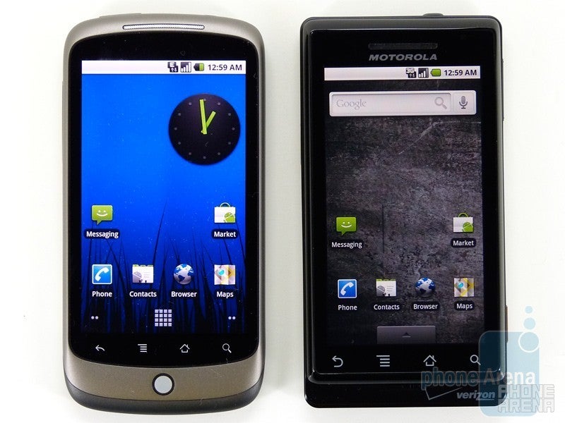
Next to Motorola DROID
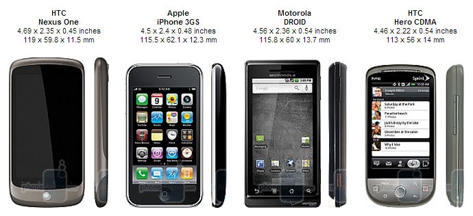
You can compare the HTC Nexus One with many other phones using our Size Visualization Tool.
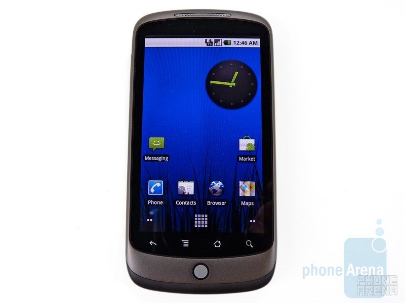
Visually the HTC Nexus One looks very similar to Sprint’s Hero, but uses the touch-sensitive navigation keys like the DROID ERIS. The layout of these keys are identical to the DROID, but the Nexus One adds a trackball (again, the smaller one like the ERIS) for added navigational options. In terms of feel we prefer the larger ball of the Hero but aesthetically we understand why HTC chose the smaller ball. The touch sensitive keys worked mostly ok when held in the typical position, though we did find ourselves having to hit the back key multiple times on several occasions. When sitting on a table in front of us we had issues with all of the keys, leading us to believe that the sensor is closer to the top of the keys than centered or on the bottom. This was mildly annoying.
The business-friendly gray comes in two different shades and the pattern strangely reminds us of Motorola’s ic502 hybrid CDMA/iDEN device. Physical buttons are limited to the volume rocker on the left side and power button up top. These both have minimal travel but enough to know that the button has been pressed. The trackball can also be pressed to select items. The microUSB (finally) charging/data port along with some dock connectors are on the bottom. We’ve yet to see a dock accessory, but it is no doubt coming as it has passed the FCC (with Bluetooth, no less.)
The back of the HTC Nexus One has a large 5 megapixel camera with a single LED flash to its right. There is a small cutout for the ample speaker, and almost hidden along the left side is a second microphone used for active noise cancellation. The housing is Teflon-coated to resist dirt and grime, a trick we first saw on the white GSM Hero. No “with Google” branding here, the Nexus One is simply branded “Google.”
The Nexus One is a beautifully boring phone. There is no emphasis on style, yet it still remains an object of desire. If HTC had evenly distributed the weight, or even made it bottom-heavy, the Nexus One would likely be our favorite phone out there. The iPhone isn’t the most comfortable thing to hold either, but at least it doesn’t jump out of our hands. We have a feeling that with a few weeks under our belt this will become less of an issue, but it still holds the Nexus One back from being truly great design-wise. Still, we do kind of want one.
Interface:
By now we’re very familiar with Android, so we’re only going to high the highlights and what has changed in Android 2.1. 2.0 brought a major visual overhaul, along with other nice features such as possibilities for Facebook integration and Quick Contact, but 2.1 really takes the visuals to the next level. The application drawer is gone, replaced with a button that prompts the apps to fly in and arrange in a grid. The stationary home icon on this screen causes the apps to fly out and returns you to the homescreen you were on.
Another cool feature is live wallpapers, some of which you can interact with. The Nexus live wallpaper has TRON-esque lights running through the grid, and when you touch the screen a pulse emanates in four directions and colors from your fingertip. The Water wallpaper ripples on your touch, and the Spectrum and Waveform wallpapers interact with any music playing on the device. Some of them, like Magic Smoke, have settings that can be customized. Our favorite was the subtle Grass wallpaper, and at night (the background changes with time, much like iGoogle themes) there was an astonishing depth of field between the homescreen icons and wallpaper behind them.
The user now has five homescreen pages to work with, up from the original three. Motorola’s MOTOBLUR interface already allows for this, and HTC’s Sense UI gives the user unique scenes, each with seven pages to work with. The stock Android builds have always bored us, but the minor tweaks and improved visuals of 2.1 does a lot to remedy this. Still, we found ourselves longing for the improved contact handling, visuals and custom widgets of Sense UI. In our opinion Android was meant to be customized, the stock build is merely a canvas with which to work.
One thing we can say is that 2.1 flies, though we’re sure the 1GHz Snapdragon power plant has more to do with it than any software upgrade. Everything from 3D effects to animations to opening apps to loading webpages is noticeably faster than the DROID, and much faster than the Hero and ERIS. Even the Samsung Moment and its very respectable 800MHz processor is significantly slower, but Android 1.5 likely shoulders some of the blame on that one.
Messaging:
One of the standout features of Android 2.1 is the speech to text feature now available in any (yes, any) text field. This means you can dictate emails, text messages, web searches…you name it. As awesome as this is, it is still maddening to realize that Bluetooth headsets cannot be used with this service, and can still not be used to launch or control voice dialing on Android. Google, how can you get so many things right and this basic feature so wrong?
The Gmail app is still the best on any device and since the launch of 2.0 we really appreciate being able to have multiple accounts integrated into it (honestly, who has just one account these days?!) The email client supports POP, IMAP and Exchange out of the box ensuring compatibility with just about any service out there. The messaging app remains unchanged.
The onscreen keyboard remains very good, but we found ourselves missing the keyboard options afforded by Sense UI. Call us crazy, but we still prefer T9 to QWERTY in portrait mode, and there are some people (God love ‘em) who even like the compact QWERTY keyboard. Whether or not you agree with this, options are always a good thing and HTC’s soft keyboards are the best in the business.
Multimedia:
The biggest change here is a 3D overhaul of the Gallery thanks to the developers over at Cooliris. Much like the live wallpapers and slick animations, this amounts to little more than eye candy, but we still appreciate it very much. It now sorts files by both date and location, which is a nice functional upgrade indeed. Videos looked absolutely amazing on the AMOLED display, but it was not able to play any of our H.264 test files. H.263 videos were problem free (we tested up to 720x304@1524kbps) and looked fantastic, and our test photos seemed to leap off the display. Unfortunately there is no support for the DivX and Xvid formats. Viewing on a normal display and then viewing with the Nexus One is as night and day as watching Terminator 1 followed by Avatar.
Camera settings are relatively barebones, and almost identical to the DROID except that the Nexus One lacks the Scene Mode option. Camera performance was typical for an HTC device, which is to say good, but not great. Indoor images had noticeable graining and some distortion, more noticeable in the background than foreground. Outdoor images were better for detail, but still lacked sharpness. The single LED flash is somewhat harsh, although we cannot say that is unexpected. Video recording is quite respectable with a 720x480 max resolution and 20fps recording rate, although this can go higher in the right conditions. It is no Nokia N95, but the videos are just fine for personal use. The overall performance could be better, but then again the Nexus One is not touted as a high-end camera phone.
HTC Nexus One sample video at 720x480 pixels resolution
Unfortunately we did not get any major announcements on the music front, such as a partnership with Spotify. The player remains basically the same, which is to say it gets the job done just fine even if it isn’t the prettiest thing out there. One of the few things that is holding Android back from being great is a great music experience. This is at the core of the iPhone experience, and until Google can figure out a way to strike at that core effectively users will still be hesitant to switch.
Connectivity and Data:
The first Google Nexus One that got launched is a quad-band GSM device with tri-band UMTS support for 2100/1700/900MHz, bands meaning 3G for T-Mobile USA customers and Europe. Just recently customers got treated to a new version with support for the 2100/1900/850MHz 3G bands, which added support for AT&T's 3G network. It is expected that Verizon and Sprint will also get their Nexus One variants. For those without 3G you can always fall back on Wi-Fi. Originally official specs said the “n” protocol was supported, but this has been updated and users are left with just b/g. To further confuse the matter an ifixit teardown not only reveals an “n” chip, but also an FM radio.
As we stated earlier the browser is very fast. Pages loaded faster over Wi-Fi than they do on the DROID, and perhaps thanks to T-Mobile’s recent 7.2Mbit/s network upgrade they loaded faster over the cellular 3G connection as well which we were quite impressed with. We sorely miss multitouch however. We know that it is supported natively in Android at this point, and HTC was not afraid to implement it with the Hero, so there is no good reason for it to be left off of a flagship device. At this point it’s no longer an inconvenience; it’s hampering the Android experience.
Software:
The HTC Nexus One comes preloaded with everything you’d expect an Android device to have. The notable newcomer is Google Voice, which no longer needs to be downloaded from the marketplace. We used it exclusively for voice calls, voicemail and messaging. It’s a very solid concept that offers some nice features, but the messaging is a bit frustrating since they come from a different number. The Market is growing rapidly, at last count it was over 16k apps. Unfortunately, users still can't install apps to the memory card rather than to the phone’s internal memory.
The 1GHz processor is complimented by 512MB of both Flash and RAM, and the Nexus One ships with a 4GB microSD card installed. This is expandable to 32GB, which is plenty of room for music and movies and rivals the iPhone’s capacity. It would be nice to have a significant amount of onboard memory complimented by microSD expansion, but we’re being picky here.
Voice quality was very hit and miss; at times callers said we sounded very clear and were impressed but just a few moments later, with no environmental changes, they would complain that we were cutting in and out. On our end it left a little to be desired. There is an annoying sweet spot for the speaker relative to the ear, and straying just a touch can make a drastic difference to the point that you cannot hear the caller. Even when in the sweet spot they didn’t sound all that great. There was some static on both ends, but noticeably more on ours, and callers cut in and out. Callers were also very faint even at the highest settings, and in a quiet room we had to concentrate to understand what they were saying. We tested with and without Google Voice and found results to be similar.
Battery life is listed at a very respectable 10 hours of talk time and 290 hours of standby on 2G. Those numbers drop to 7 and 250, respectively, on 3G. It has enough juice to get through 5 hours of 3G web browsing and 6.5 hours of Wi-Fi surfing, and 7 hours of video playback and 20 hours of audio. We were able to drain ours in a day and a half of use, but to be fair we had just about every battery draining feature on. It can stand up to a day of heavy use, which is enough for us.
Conclusion:
Google makes no bones about their intentions with the Nexus One, saying it is more than a smartphone; it is a “superphone.” We have to disagree. It’s a pretty amazing phone, don’t get us wrong, but with some now basic smartphone features like multitouch and Bluetooth voice dialing missing we’re not ready to elevate it to superphone just yet. Is it the best Android device to date? Absolutely. Is it better than the iPhone? Probably. Are we excited about it? Without a doubt. The HTC Nexus One may not be perfect, but is definitely a high-class smartphone that’s worth your attention.
Looks like Google listened to us and has addressed one of our major issues with the Nexus One. We'd still like to see a UI overlay like Sense, but HTC probably has some plans for a device like that. With the addition of multitouch the Nexus One is immediately a more compelling device and competes better with devices like the iPhone and Pre Plus.
HTC Nexus One Video Review:






Things that are NOT allowed: