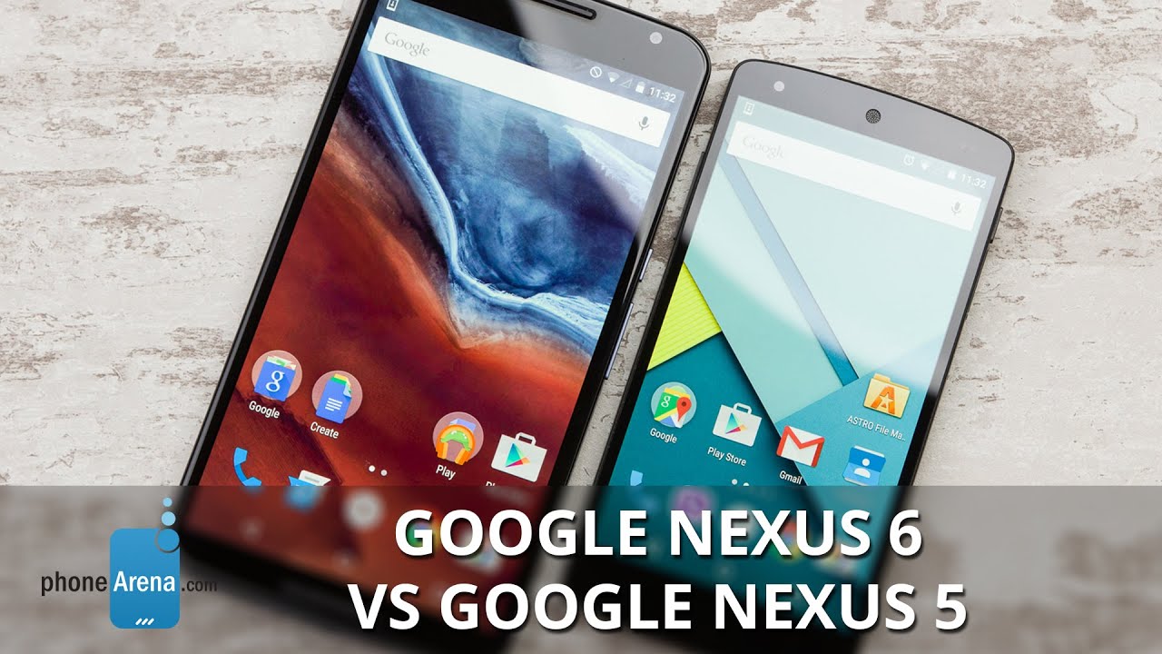
Google Nexus 6 vs Google Nexus 5
Introduction
The understated Google Nexus 6 unveiling was enough of a hint that it won't be like any other Nexus so far, and we aren't talking about the pricing scheme only. Unlike its 5” Nexus 5 predecessor, the Nexus 6 sports a six inch screen (duh).
This has made the Motorola-made phablet huge and unmanageable with one hand, but no compromises have been made with its truly flagship specs. That's in stark contrast with the Nexus 5, crafted by LG, which debuted with specs just a step below LG's flagship at the time, but at half of what Google and Motorola are charging for the 6. Which approach to the Nexus line is better? Let's compare the two generations and find out...
Design
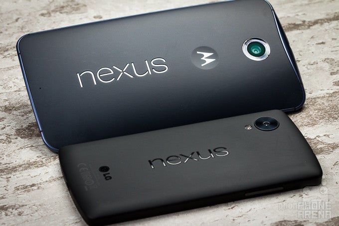
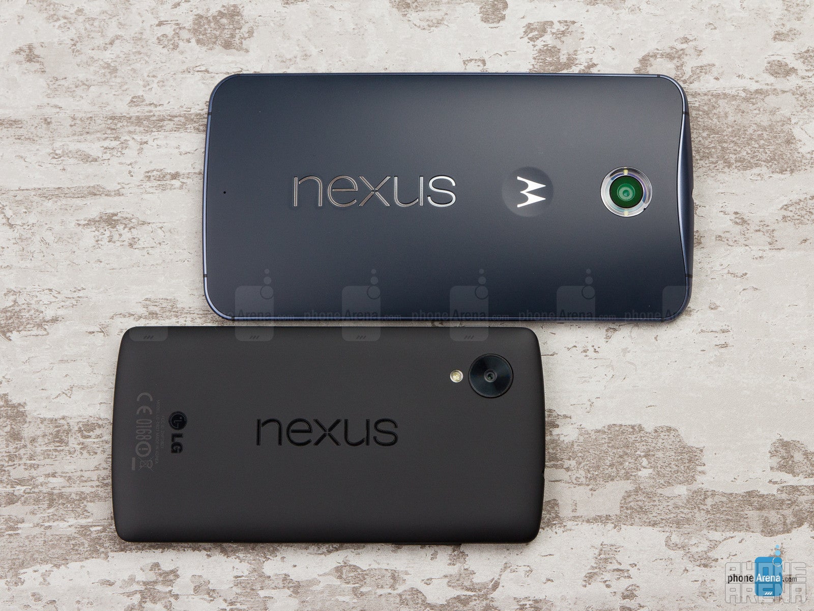
Big as a shovel, the Nexus 6 has to be handled with two palms most of the time, while the unassuming Nexus 5 fits very comfortably in the hand.
The Nexus 6 chassis might be fairly compact for a 6-incher, as its bezels are pretty modest all around, but it still requires you to use it with two hands the vast majority of the time. It also leaves a sizable impact in your pocket, to the point that it's very uncomfortable to sit with this thing in your pocket, depending on how tight your pants are. The only thing that saves its manageability somewhat is the dimpled logo on the back, where your index finger can rest more comfortably while operating the phone. The Nexus 5, in contrast, is much more compact, not overly thin, and pretty comfortable to hold and operate with one hand. Both phones are built sturdy and look unpretentious. They are somewhat devoid of premium materials, and yet are ready to withstand the tests of time, and a few drops in the process. The Nexus 5 side keys are wobblier and a tad less clicky than the metal ones on the Nexus 6, which also look more premium, and are jaded with a pattern for extra grip.
Display
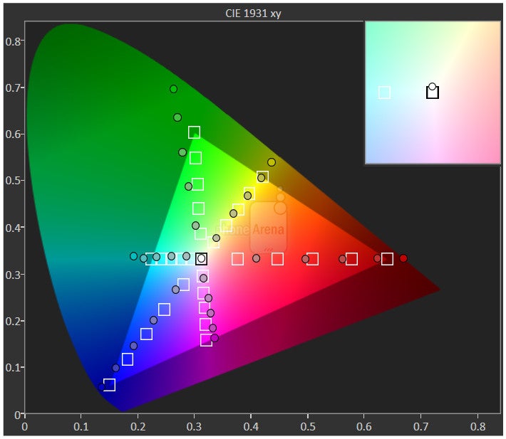
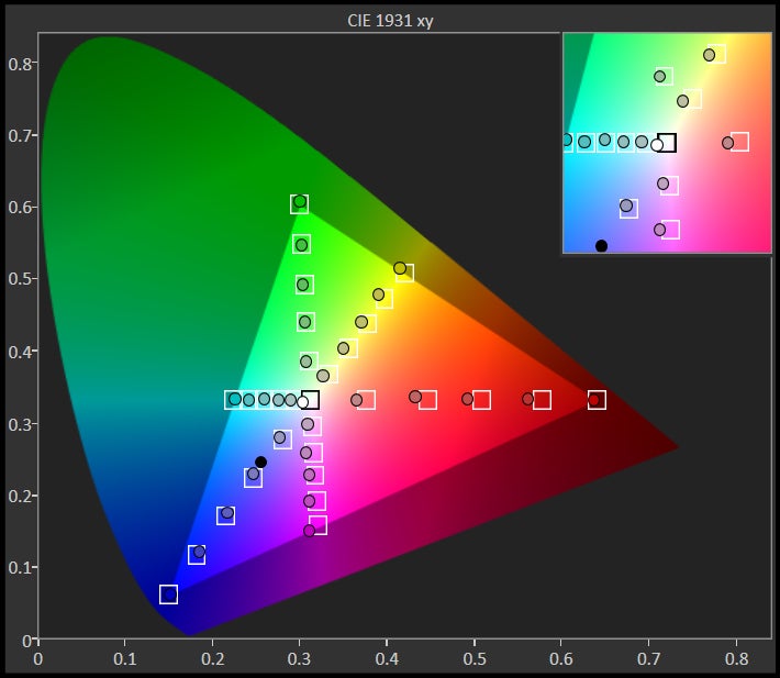
The Nexus 5 screen is the more color-correct one, while the big AMOLED display of the Nexus 6 is oversaturated.
In sync with these times of super big-screen smartphones, the Nexus 6 is equipped with a 5.96-inch 1440 x 2560 Quad HD AMOLED display. Needless to say, your fingers strain to reach the corners of the display – so two-handed operation should be enforced using it. We can’t deny that its pixel density, clocking at a higher-than-normal 493 ppi, brings about sharp visuals for small text, icon edges and the like. But so does the Nexus 5's panel, which is a 5” 1080 x 1920 one, returning a pixel density of 445ppi. This count is not a far cry from the pixel density on the Nexus 6, and, frankly, indistinguishable from the Quad HD display in that respect when observed with a naked eye.
Where the Nexus 5 screen takes advantage, though, is a much higher brightness, and better color presentation. While the Nexus 6 exhibits the typical for AMOLED displays oversaturated colors, the Nexus 5's LG display is almost spot-on. Its color and grayscale Delta E deviations from the reference points are also much smaller than the ones of the Nexus 6. In terms of color temperature, both handsets perform very well, hitting close enough to the 6500K white point, which means the colors won't look overly cold or warm, so you can go shoe-shopping on both, just keep in mind the overblown hues on the Nexus 6, as you might get something else in the mail than what you ordered on the screen.
Interface and functionality
Stock Lollipop runs like a charm on the two Nexus phonesi, but the lack of one-handed mode plagues the huge Nexus 6 phablet.
Both being Nexus devices, the phones sport the latest Android 5.0 Lollipop build with all the flat and minimalistic Material Design it brings, and all the under-the-hood improvements, like a new kernel and native 64-bit support. The interface runs smooth on both handsets, without noticeable lag and hiccups, and moves in a typical fluid stock Android fashion.
And of course, there are all of the cool new features of Lollipop, which, like any successive update, only diversifies and deepens the experience. We’re not going to rehash all of them, but we’ll share a couple that stand out. In particular, we’re ecstatic to see that we’re now given support for multiple users, which isn’t something necessarily new with Android per se, seeing that Android tablets have offered this feature since the release of Android 4.2 Jelly Bean. With Android 5.0 Lollipop, however, this is the first time smartphones are being given access to it.
Another new feature that we normally don’t get with other platforms is the ability to “pin” apps with Lollipop. We wouldn’t say it’s something we’d use frequently, but when the occasion arises when it’s needed, there’s no kidding that it proves its usefulness. The premise with pinning is being able to lock the phone to use one specific app, so if you have a friend who is notorious for posting weird status messages on your Facebook as they’re borrowing your phone, they won’t be able to do that because the phone is locked to a certain app – say like the web browser or something.
Considering that we’re dealing with a phablet-like device here with the Nexus 6, it’s missing certain elements that take full advantage of the larger real-estate it has over other smartphones, though. There are no one-handed modes, split window multitasking, or scooching the keyboard, dialer or calculator left or right to help with typing.
Courtesy of Lollipop, both handsets sport a neat new feature, called Ambient Display. It lights the screen up automatically when you pick up the phone, or when you receive a notification, which is time-saving if it's lying next to you on the table, but can be turned off at will.
Processor and memory
Top-of-the-line Snapdragon 805, more RAM and twice the storage in the Nexus 6 make this quite the unfair fight.
The battle of the chipsets is not a fair one here, as the Nexus 6 comes equipped with a quad-core 2.7GHz Qualcomm Snapdragon 805 SoC, coupled with an equally beefy 3GB or RAM and the Adreno 420 GPU. The Nexus 5 steps two CPU generations back, donning a 2.3 GHz Snapdragon 800 silicon and 2 GB RAM. Frankly, since both are running the light and flat stock Android interface, they both feel fast and fluid in everyday usage.
Nexus 6 models come with either 32 GB or 64 GB of internal storage, while Nexus 5 starts you off with 16 GB, and you can pay extra for a 32 GB option. Both are lacking microSD slots for storage expansion, so pick wisely.
Internet and connectivity
Chrome’s functionality with the two phones hasn’t greatly changed with Lollipop, so the experience is for the most part identical to any other Android smartphone running the browser. Lollipop introduces the option of having individual page tabs appear in the app switcher as separate entities. Overall, there’s nothing too out of the ordinary with the experience here, seeing that we’re presented with fast pages loads, instant page rendering, and that tight feel with navigational controls.
The Nexus 6 and 5 are available in two variants - one for the US market, and another for the rest of the world. The US model of the Nexus 6 offers support for 12 LTE bands, while the Nexus 5 makes do with 9. The international version goes up to 10 bands for the Nexus 6, and six bands for the Nexus 5. The handsets support up to 42 Mbps HSPA+ download speeds, too, if your carrier's 3G network can supply those, of course. Both units are armed with the usual set of connectivity features we’d expect to find – like A-GPS, Bluetooth, dual-band 802.11 a/b/g/n/ac Wi-Fi, and NFC.
Camera
The Nexus 6 shooter won't top any camera comparison charts, but it is pretty well-rounded, unlike the camera of the Nexus 5, which often has white balance issues.
The 13 MP camera on the Nexus 6 features an f/2.0 aperture lens, optical image stabilization, dual-LED flash ring, 2-megapixel front camera, and up to UHD 4K video recording. The Nexus 5 answers with quite the modest 8 MP shooter with f/2.4 aperture and optical image stabilization in its turn, able to muster 1080p video recording “only”.
The snapping app on both phones is Google's Camera – one that’s been available for quite some time as a downloadable app in the Play Store. Yet again, we can see Lollipop’s favor of offering a cleaner and simpler UI, since the Camera app’s interface is predominantly reserved for the viewfinder. In terms of shooting modes, we’re given photo sphere, panorama, HDR+ and lens blur.
Outdoors, both handsets take pretty decent photos, even in not so ideal lighting conditions. They often mess up the white balance measurements, casting an overly warm, yellowish hue over the scene (Nexus 5), or a leaning to the colder side of the spectrum somewhat (Nexus 6). The Nexus 6 exposure is largely spot on, while its predecessor often chooses an exposure setting that is a step under what it should be. The Motorola phone also captures a bit more detail than the Nexus 5.
The Nexus 6 performs well in terms of color presentation indoors, but the shots seem a tad too dark, and it introduces a bit too much noise in the frame. Indoors, the Nexus 5 fares well – it achieves decent exposure without washing it out too much, and the white balance issues from outdoors don't translate in low light. Its flash is very weak, though, when compared to the Nexus 6, and illuminates the scene quite unevenly, too.
Motorola's phone is capable of 4K video, while the Nexus 5 maxes out at 1080p footage. The Nexus 6 video is very fluid, and the optical image stabilization makes the scene just flow in front of the lens without jittery effects. The color presentation is slightly colder than reality, while the overly warm tones from the Nexus 5, whose video is yellowish to the point of unpleasantness. The Nexus 6 overall exposure is better than what the Nexus 5 spits out, as it makes the video brighter, and exposure compensation while panning around is faster, too. Continuous autofocus works like a charm on the phablet, while we wish you good luck trying to focus back and forth with the Nexus 5. The Nexus 5 tends to produce a rather unpleasant sound recording, especially when you're shooting in a noisy location (as can be heard in the video sample below). With the Nexus 6, things sound a whole lot better. Both phones record sound in mono, unlike plenty of current handsets that record stereo.
Multimedia
Needless to say, one big advantage of the huge Nexus 6 display over the 5-incher on the Nexus 5 is media consumption, as pictures, video and games just look and feel much better on a larger screen. As for the pixel density, that's of a dubious advantage, as it's unlikely you'll go through the trouble to dig out the rare 2K video out there just to watch it in native resolution on the Nexus 6, as the difference will be close to invisible to the naked eye. Motorola's phone, however, flaunts an AMOLED display, whose blacks are really deep, compared to the slightly greyish-looking ones on the LCD panel of the Nexus 5, which makes a difference while watching darker scenes in movies, for instance. However, you'll also need to have luck on your side when picking a Nexus 6 unit, since some of those suffer from inaccurate (bad) color reproduction. As for codec support, the phones play most popular formats you throw at them.
The tune players are identical, using Google's stock Play Music app, which, lo and behold, is pretty devoid of anything other than the basic features. Another media consumption point for the Nexus 6 are its two stereo speakers at the front, while the Nexus 5 is equipped with one loudspeaker only, and a pretty wimpy one at that.
Call quality
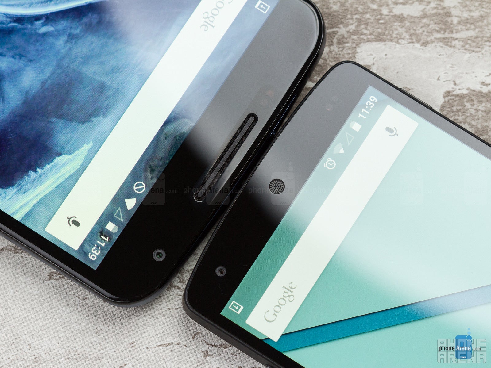
The Nexus 5 employs a very peculiar looking earpiece – one that’s circular and tiny in size. It could be the way it disperses audio, but we find its volume output to be lacking. Well, that’s unless we jam it against our ear tightly. Furthermore, voices have a flatter tone, but still audible enough to comprehend. Thankfully, things are better on our callers’ end, as they’re treated to voices that are rich, distinctive, and clear. Finally, the speakerphone emits a lot of crackling at the loudest setting.
Battery
With 50% longer battery life, the Nexus 6 is an easy pick before the Nexus 5 in that respect.
Motorola is gracious enough to include built-in wireless charging with the Nexus 6 – on top of also including a turbo charger in box that gets its battery back to full capacity in under 100 minutes, which is woefully fast.
The Nexus 5 is stuffed with a way smaller, 2300 mAh battery, and clocked less than five hours of endurance on our test, so you'd probably have to charge it at the end of each day with normal usage, or even in the afternoon with a heavy push.
Conclusion
The Nexus 6 is no longer the value-for-money, subsidized, initial-limited-availability endeavor we've come to expect from Google's handset line, Nexus 5 included. It's a full-blown flagship with the latest bells and whistles, available on all carriers, but with a price tag that is almost twice what the Nexus 5 debuted at, too.
Naturally, it is a much better phone than the Nexus 5 specs-wise, with a larger, pixel-dense display, faster chipset, double the storage out of the box, and a much better camera capable of 4K video footage. Another very important advantage is that its battery lasts about 50% more than the weak Nexus 5 juicer.
All of these combined might warrant doubling the price for you, but only if you are willing to forego the comfortable palm-friendly chassis of the Nexus 5 for the gargantuan Nexus 6 body, which not only requires you to almost always have to use it with two hands, but also leaves a sizable impact in your pocket, purse, and on your wallet, too.








Things that are NOT allowed: