Google Nexus 6 Review
Introduction
This year’s announcement of Nexus devices has been nothing short of exciting, seeing that Google has announced not just one brand new product in the series, but two, in order to continue diversifying its portfolio. We’ve already taken a deep look at the Google Nexus 9 - a modestly designed tablet that’s oozing with delicious hardware under the hood, and a decent price tag.When it comes to its phones, Google has a history of offering them at super-aggressive prices. However, with this year’s new product, the aptly named Google Nexus 6, not only do we see a reversal in its price point direction, but also a new name in charge of manufacturing the device.
This time around, Google has commissioned Motorola to take up the task of making the Nexus 6, which interestingly enough, looks very similar to the new Moto X – released not very long ago to the delight and disappointment of some. Attached with a starting cost of $649.00, the Nexus 6 is undoubtedly a stark reversal to what we’ve been accustomed to, but there’s no denying that it’s shaping up to be a formidable smartphone that’s bubbling at the seams with an impressive specs sheet. Add to that Google’s brand new Android 5.0 Lollipop experience, which is the biggest overhaul to the platform in a long time, and it’s solidifying itself to be a strong candidate in the ever expanding, competitive smartphone space.
The package contains:
- Quick Reference Guide
- Product Safety & Warranty Brochure
- Wall charger
- microUSB cable
Design
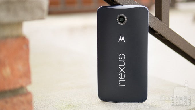
Say bye-bye to the humble designs of past Nexus smartphones, and hello to premium construction! Seriously, though, it looks like a larger, stretched out version of the Moto X (2014).
Remembering Nexus’ past, it’s intriguing to see the design direction that each manufacturer has chosen to take with its product. From premium designed ones like the iconic Nexus One, to the humble design language of the Nexus 5, it’s quite obvious that there’s no consistency with the line. With Motorola taking the helm with the Nexus 6, rather than delivering a new design, they’ve instead opted to copy an existing one – their very own smartphone in the Moto X (2014).
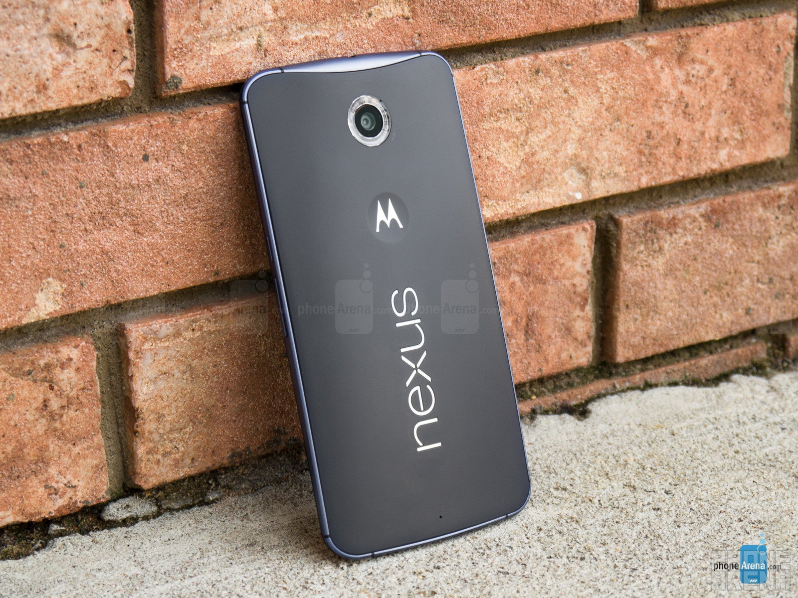
The resemblance between the two is profound, seeing that the Nexus 6 employs the same exact design language as the Moto X, which includes things like its metal trim accent, arched form factor, and plastic casing. The result is a Nexus smartphone that exudes a stronger premium presence than the last two models in the series – a stark reversal no doubt, but one that assures to us that there’s a high-quality, sturdy emphasis with its construction this time around. We’ve even dropped the phone by accident from a height of 4 feet, right onto the metal flooring at the bottom of an escalator, only to see just some minor dents around its metal trim.
What’s noticeably different, though, is that the Nexus 6 takes things to a grander scale when it comes to size! In fact, it looks more like a stretched out version of the Moto X – one that pushes it very well into the phablet category. Immense, that’s a word that best describes the phone, since it’s wider and taller than the majority of other prized phablets in the space right now. Add to the fact that its plastic body feels very slippery, you’ll want to make sure to have a firm grip on it to prevent it from slipping.
Our particular review unit is the midnight blue option, which employs a two-toned color scheme to give the phone a pleasant contrast. As an alternative, though, the cloud white model consists of a mostly white body – with a silver metal trim bezel. Clearly, the design isn’t particularly new, nor is it as unique factoring in the Moto X’s unique customization, but given the humbler design of last year’s Nexus 5, we’re really glad to see that the Nexus line once again favors a sturdier build quality.
Following the Moto X’s design to the teeth, the Nexus 6 features the same set of buttons and ports throughout its body – and they’re even in the same placements as before. With its power button and volume controls on the right side, they’re in convenient spots that are easily accessed by our fingers. On the bottom edge, we have its microUSB 2.0 port for charging/data connectivity, with the 3.5mm headset jack and nanoSIM slot on the top.
Lucky for all of us, the Nexus 6 is able to emit music through both of the speakers on its facade – whereas the Moto X was only able to do it through its bottom speaker. Going with this setup, it’s blessed with true stereo support that ideally projects audio towards us.
Flipping it around to the rear, instead of featuring the same number crushing 21-megapixel camera of the Motorola DROID Turbo, the Nexus 6 opts to employ a 13-megapixel auto-focus camera – one that’s accompanied with a dual-LED flash ring and an f/2.0 aperture lens. One can presume it’s the same thing used by the Moto X, which proved to deliver underwhelming results, so we’re crossing our fingers hoping for improvements.
Display
With quad-HD goodness in tow, the screen is remarkably detailed and sharp, but it lacks the same high-quality characteristics evident in Sammy’s AMOLED screens.
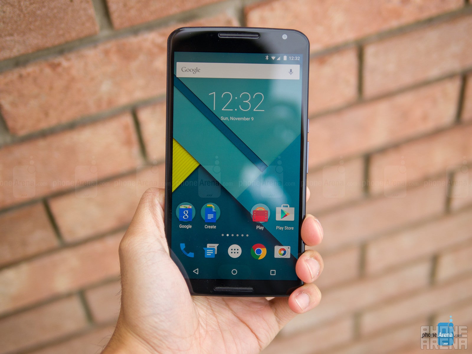
A surprising treat, one that catapults it into an elite club that has few members at the moment, the Nexus 6 is adorned with a ginormous sized 5.96-inch 1440 x 2560 quad-HD AMOLED display. That’s a whole lot of screen to work with, as our fingers strain to reach the corners of the display – so two-handed operation should be enforced using it. Despite that, we can’t deny that its pixel density count can’t be overlooked, mainly because it chimes in at a higher-than-normal mark of 493 ppi. It all boils down to a super detailed screen that makes it nearly indistinguishable to detect individual pixels with the naked eye – even looking at it very closely.
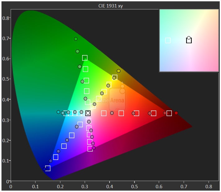
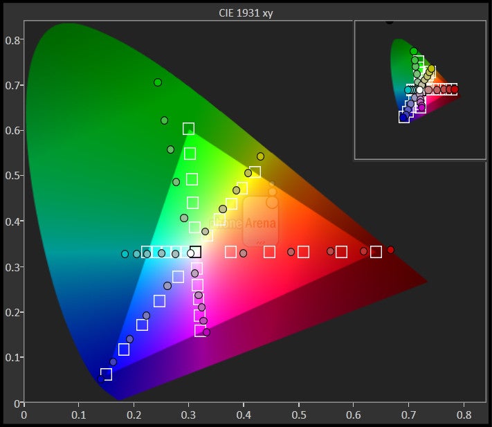
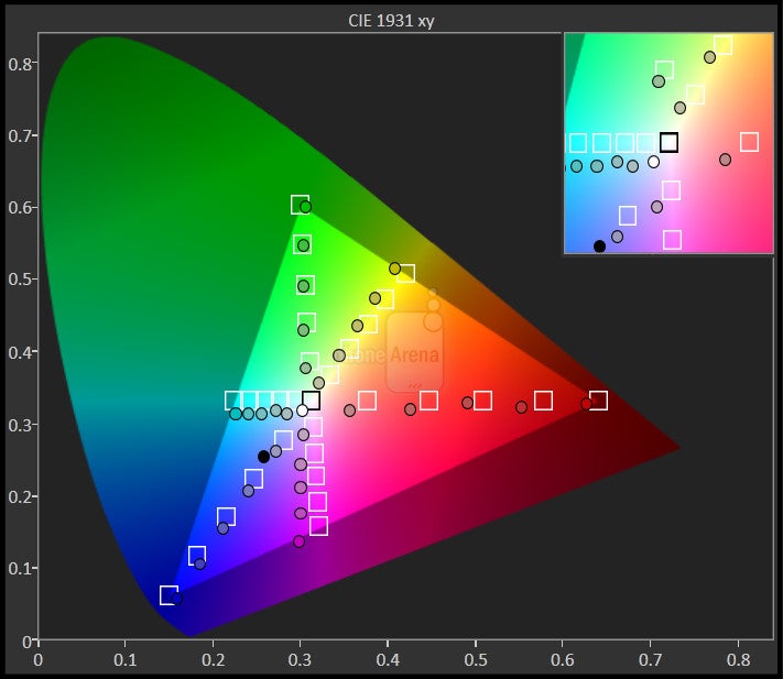
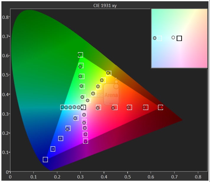
Certainly, it’s a significant departure over the Moto X’s display, one that employs 1080p resolution, but the Nexus 6 actually exhibits many of the same characteristics we’ve seen with the Moto X already. For example, its screen’s brightness output, a lowly 270 nits, is marginally better than that of the Moto X, but it’s still rather weak when compared to most of the other prized stallions floating around. When it comes to the actual quality of its color reproduction, we're mostly pleased with the color balance and overall temperature of 6550 K. Overall, it's a rather oversaturated display, which is typical for AMOLED tech, but we still have to acknowledge the fact that there's a nice balance between the primary colors, meaning that whites appear truly white, and all other colors don't deviate too much from their reference hues, except for the fact that they are more intensive than normal.
As far as contrast goes, Motorola has chosen to boost things up a bit, so expect a somewhat pumped up display with the Nexus 6. The average gamma reading may seem a bit low at 1.94, but this has to do with the added contrast boost to the display, which has the highlights increased in brightness, while the shadows stay close to their normal levels.
Interface and Functionality
There’s no more separating the smartphone and tablet experiences of Android, seeing that Lollipop sticks to a uniform approach.
Uniformity, that’s the obvious strategy that Google is going after with its latest update for its mobile platform – Android 5.0 Lollipop. Already, we’ve raved about the overhaul the platform receives with this newest version, but after experiencing it on a tablet with the Nexus 9, that principle of uniformity becomes even more profound with the Nexus 6. In previous iterations, Android on a tablet looked and operated differently than its smartphone counterpart, but that’s all changing with Lollipop, seeing that the two experiences are unchanged – keeping true to that uniform experience between mobile devices.
Frankly, the Nexus 6’s Android 5.0 Lollipop experience bears the same Material Design and slick set of features we’ve been exposed to already with the Nexus 9. We can’t stress enough about the meticulous look of Lollipop! From blatantly obvious things like the clean and modern approach of the interface, to smaller things such as the animation that kicks in once we scroll all the way to the top or bottom of the address book, nearly every visual aspect of the platform has been retooled.
And of course, there are all of the cool new features of Lollipop, which like any successive update, only diversifies and deepens the experience. We’re not going to rehash all of them, but we’ll share a couple that stand out here with the Nexus 6. In particular, we’re ecstatic to see that we’re now given support for multiple users, which isn’t something necessarily new with Android per se, seeing that Android tablets have offered this feature since the release of Android 4.2 Jelly Bean. With Android 5.0 Lollipop, however, this is the first time smartphones are being given access.
Another new feature that we normally don’t get with other platforms is the ability to “pin” apps with Lollipop. We wouldn’t say it’s something we’d use frequently, but when the occasion arises when it’s needed, there’s no kidding that it proves its usefulness. The premise with pinning is being able to lock the phone to use one specific app, so if you have a friend who is notorious for posting weird status messages on your Facebook as they’re borrowing your phone, they won’t be able to do that because the phone is locked to a certain app – say like the web browser or something.
Needless to say, Android 5.0 Lollipop is an evolutionary step for Google – one that distances itself in the features department over its rivals. As we’ve seen, consistency is sought out with both the smartphone and tablet versions of Lollipop. So much so that the two employ the same exact interfaces and features, but considering that we’re dealing with a phablet-like device here with the Nexus 6, it’s missing certain elements that take full advantage of the larger real-estate it has over other smartphones.
That folks, is arguably our main and only complaint with the experience we get from the Nexus 6 – it just lacks those phablet-like features we see in other phablets. Due to the immense size of the screen, you’d think we’d get some kind of one-handed operation feature, but we don’t. In addition, there isn’t an enhanced multi-tasking feature in tow with the experience. For the most part, we fall back to going through the task switching menu – as opposed to the simultaneous approach we get from some other smartphones.
Phonebook
Peaking at the phonebook, Lollipop’s Material Design is highly evident, as it sports a blend of bright colors, a minimalist layout, and nifty transition effects when something is tapped on. Broken down into three main categories, speed dial, recents, and contacts tabs, we can instantly jump into the dial pad at any time by pressing on the icon that’s floating above the rest of the interface. Best of all, the dial pad is also accessible via the lock screen for instant access.
Organizer
In standard fashion, the usual crew of organizer apps accompanies Lollipop, which consists of the calculator, calendar, and clock apps. Not surprisingly, they all receive the slick new visual enhancements courtesy of Google’s Material Design – though, some more so than the others. Specifically, we see it in the calendar app, which relies heavily on layers to present data. For example, the main view shows us our typical weekly calendar layout, but when we tap on the month near the top of the interface, a new window expands to give us the monthly view.
Adhering to the needs of productivity users, there’s a folder on the homecreen called “create,” where we can launch apps like Docs, Sheets, Slides, Drive, and Keep. These apps, naturally, provide us with light productivity in the event we ever need to do some quick work outside of using a computer. Indeed, they’re helpful and whatnot, especially when we can still create a spreadsheet or document even when the phone doesn’t have connectivity to the network.
Messaging
With the arrival of Lollipop, the Android keyboard receives a visual change that eliminates the borders that normally outline each individual key. At first, it’s an uncanny sight to behold, as we’re sometimes left wondering how it’s able to distinguish between keys, but we’re able to adapt and type away with normal ease. Thankfully, we can change the keyboard’s theme in the settings menu – to revert back to the traditional layout with borders we’re accustomed to using.
For the most part, the overall typing experience doesn’t differ, as it’s very responsive and offers a decent auto-correct function, but as an alternative, there’s also Gesture Typing, which relies on those swiping gestures to input text. On the Nexus 6, we prefer to use the portrait keyboard, seeing that our finger is doing less swiping across the keyboard’s layout. In contrast, we’re more likely to individually press each button with the landscape option, as opposed to Gesture Typing, just because it’s offers us with a more comfortable, natural experience.
Gmail for Android has been a versatile email client, one that delivers the same rich experience we get from the desktop client. Naturally, Lollipop’s arrival brings forth an even more refined and unified experience. Not surprisingly, Google’s Material Design is profoundly evident with Gmail, as the flat layered design language principle is heavily reinforced – as tabs movie in-and-out when we select a folder or message.
Yes, there’s an “email” app icon in the app panel, but Lollipop now diverts us to using the Gmail app for all our accounts – hence, its unified experience. The setup process is no different from before, but what’s odd is that there’s no unified inbox. What’s even tougher to distinguish is the way the platform differentiates the email notification icons in the menu bar area, since they all use the Gmail icon.
Processor and Memory
From small to intensive operations, there are no tasks that the Nexus 6 can’t overcome with its Snapdragon 805 processor.
You know you’re a high-flying, power punching smartphone when you’re packing the latest and greatest processor from Qualcomm’s camp. Yet again, it’s in an elite club with its quad-core 2.7GHz Qualcomm Snapdragon 805 SoC, coupled with an equally beefy 3GB or RAM and the Adreno 420 GPU. Generally speaking, it’s not frequent to find handsets using this piece of silicone, which of course, gives more precedence to the ones that do – like the Nexus 6.
Rarely does the Nexus 6 exhibit any lag with its performance, as most of its processes are accompanied by snappy responses. Every now and then, however, we will see just a slight delay when opening apps, or switching between them, but it isn’t terrible. Finally, the hardware package in tow here is more than equipped for the task of running several of today’s 3D intensive gaming titles.
Being available in 32GB and 64GB capacities, there’s enough flexibility between the two to accommodate our needs, but it seriously would’ve been better if it were blessed with a microSD card slot to supplement things.
Internet and Connectivity
Chrome’s functionality here with the Nexus 6 hasn’t greatly changed, so the experience is for the most part identical to any other Android smartphone running the browser. Lollipop introduces the option of having individual page tabs appear in the app switcher, so rather than using the feature that’s built-in with Chrome, it’s instead monitored by the platform – where tabs are individually displayed in the app switcher. Overall, there’s nothing too out of the ordinary with the experience here, seeing that we’re presented with fast pages loads, instant page rendering, and that tight feel with navigational controls.
The Nexus 6 is available in two SKUs, one for US market and another for the rest of the world. Starting with the former, its cellular radio offers support for the CDMA networks – whereas with the international model, it doesn’t. Furthermore, the US model offers support for 12 LTE bands, while the international one only goes up to 10. Despite that, both units are armed with the usual set of connectivity features we’d expect to find – like aGPS, Bluetooth 4.1, dual-band 802.11 a/b/g/n/ac Wi-Fi, and NFC.
Camera
Motorola once again manages to surprise us, as the Nexus 6 meaningfully has some serious substance with its 13-megapixel camera.
Many of the core apps we know and love with Android have been phased out in favor of Google’s own branded ones. No longer do we have the Camera app, which has been replaced by the Google Camera app – one that’s been available for quite some time as a downloadable app in the Play Store. Yet again, we can see Lollipop’s favor of offering a cleaner and simpler UI, since the Google Camera app’s interface is predominantly reserved for the viewfinder. In terms of shooting modes, we’re given photo sphere, panorama, and lens blur. Sorry folks, there’s not an option for HDR with this one. Additionally, there are no manual controls – so expect to use touch focus constantly to achieve the proper exposure.
On paper, the Nexus 6’s 13-megapixel camera is a cause for alarm, just because it closely reminds us of the camera in the Moto X (2014), which we have to say wasn't exactly what we hoped for. The feeling is more prominent knowing that the Motorola DROID Turbo recently arrived onto the market with a formidable 21-megapixel camera. Regardless, our judgment will be dictated by the results. In keeping its camera hardware in good light, it features an f/2.0 aperture lens, optical image stabilization, dual-LED flash ring, 2-megapixel front camera, and up to UHD 4K video recording.
Remarkably, the results are quite favorable, putting it well within the same scope as the DROID Turbo. That’s honestly a relief, considering that the Moto X’s quality was underwhelming. In all fairness, the 13-megapixel camera of the Nexus 6 is an all-around solid performer – we wouldn’t go far to say that it’s a cut above its rivals, but at the very least, its quality is highly competitive.
Outdoor shots come out the best, naturally, seeing that its quality bears all of the essentials in making a good photo. To be exact, there’s a fair amount of detail in the shot to give us some elbow room for cropping photos later on. And to an extent, its detail almost rivals that of the DROID Turbo’s camera. However, we find it better at dealing with exposure – where it finds that perfect blend, so that certain areas aren’t too over or under exposed. And lastly, color reproduction favors a slightly more subdued composition, but it’s still pretty neutral to the eye.
As for taking photos under low light, we also cant’ complain about the results either, as dimly lit areas are brightened to exposed details. Indeed, its low lighting shots are brighter than say the Moto X, but still not as bright as the photos from the iPhone 6 Plus or Note 4. In some instances, though, digital noise becomes a pressing matter – causing details to soften. And to top it off, colors have a warmer tone to them under low light.
Combating the harsh results of low light, the Nexus 6 offers an HDR+ mode, which naturally takes just a smidgen longer to capture, but the outcome is better with its quality. Not only do shots come out brighter, but noise is toned down tremendously to give the shot a smooth quality. In the process, too, colors are injected with a tiny bit of saturation.
Impressively, the Nexus 6 does a better job than the DROID Turbo at taking panoramic photos. Gone are the overly sharpened quality produced by the DROID Turbo, which thankfully is replaced by toned details that give the Nexus 6’s panoramics a more natural look.
We know, it’s there for video chatting and taking the occasional selfie, so don’t expect to find any redeeming qualities from the 2-megapixel front-facing camera of the Nexus 6. Photos captured by it appear muddy in tone, so don’t hold your breath out for anything spectacular.
In solidifying itself as a relevant competitor, the Nexus 6 records some pretty sharp looking videos – both 1080p and UHD 3860 x 2160 samples. Overall, the amount of detail it captures with its 4K recording is appreciable, seeing that its digital zoom still proves useful in snagging some solid details. Better yet, its optical image stabilization always ensures that our videos aren’t too shaky – while its crisp audio recording seems to round out its solid quality. However, our only complaint relates to its continuous auto-focus, which seems to be rather slow.
Multimedia
A large, high-res screen combined with dual front-firing speakers make it perfect for all sorts of multimedia consumption.
Again, the Google branded apps have a larger presence here with Android 5.0 Lollipop, as the Gallery app of the past is now gone – replaced instead by Google Photos. Therefore, it’s the hub for all photos and videos, where we’re given a vast set of tools to edit and fine tune photos. People with a lot of time will especially take fancy in all of the options and settings, but the best part is how simple and fun it is for us to edit them – albeit, there are no editing functions whatsoever with videos.
The music player, unsurprisingly enough, is the Google Play Music app – something we know dearly all too well, since it’s what’s loaded on all Android phones. Knowing that this is vanilla Android we’re dealing here with the Nexus 6, it makes sense that it’s the default music player. The latest version of the app, which has been available to download for a good while now, bears the same updated visual cues that match the new and polished looks of Lollipop.
Outfitted with dual front-firing speakers, it’s able to muster up a potent 75 dB of audio power – allowing it to resonate deeply when it’s confined in small rooms. We’ll certainly say that it has a lot of pop and robustness with its quality, though a bit reserved with its lower frequencies, but the quality can be enhanced further thanks to the equalizer settings it has to offer.
Just like the handful of phablets out there, the Nexus 6 presents us with that ideal experience thanks to the spacious amount of real estate it has to offer for video playback. Paired with the iridescence of its AMOLED display, as well as its smooth playback, the entire video watching experience is soundly favorable.
Call Quality
It’s not without its own set of opportunities, but the Nexus 6 for the most part presents us with a passable call quality experience.
Battery
You’ll get some serious longevity with its battery life.
Motorola is known to take great pride in delivering long-lasting results with the battery life of its phones, which was recently made known with the Motorola DROID Turbo. Even though it’s not stuffed with as large of a battery, the 3220 mAh battery of the Nexus 6 doesn’t disappoint either. In our experience, it’s more than capable of offering one-day normal to moderate usage – while easily powering through an 8-hour work shift with heavier usage.
We should note, however, that Motorola is gracious enough to include built-in wireless charging with the Nexus 6 – on top of also including a turbo charger in box that gets its battery back to full capacity in under 100 minutes. That’s pretty fast to tell you the truth!
Conclusion
The direction of Google’s Nexus line for smartphones has changed in a way with the arrival of the Nexus 6, seeing that they’ve reverted back to high-end pricing – as opposed to the affordable direction of the past two Nexus smartphones - the Nexus 4 and 5. Despite the shift, it’s still THE showcase device that introduces us to the new world of Android, one that continues to redefine and push forward the mobile experience to new heights. It’s so apparent here with Android 5.0 Lollipop!
Before we go on any further, we really have to point out the Nexus 6’s starting price of $649 for the 32GB model. Indeed, it’s a complete turnaround from the lower cost attached to last year’s model in the Nexus 5, but the cost is a fitting one after we take into account the impressive specs sheet it lays claims to – like its quad-HD display, cutting-edge processor, built-in wireless charging, and solid construction. And considering that its performance is admirable in many areas, we really can’t find any fault for Google choosing to give it a higher price point. It's probably been a necessary evil in order to get US carriers to offer the Nexus 6 as a subsidized package. The result is that while the Nexus 5 is only available through T-Mobile, the Nexus 6 will be offered by all major US carriers, plus U.S. Cellular. Maybe Google's thinking is that this is the model that will make the Nexus line more approachable for the masses.
In comparing it to some of its highly esteemed rivals, like the Galaxy Note 4 and iPhone 6 Plus, it’s still cheaper in cost to pick up, but we wouldn’t go far to say that it’s a really a step up above its rivals. Yes, Google’s Android 5.0 Lollipop experience is something to behold, evolving the platform to greater heights where it doesn’t seem likely to be eclipsed or matched by its competitors. Still, we have to bear in mind that it’s coming to other Android phones – whether in pure stock form, or in some sort of customized package from the hardware manufacturers.
Going back to the Nexus 6 itself, its gigantic size puts it into the phablet category, but as a phablet, it lacks some additional enhancements to really make good use of the real estate it has to work with. One particular thing that keeps coming back to mind is how it doesn’t offer some kind of optimized layout for one-handed usage, which is something that other phablets take into consideration and offer. In tradition, we’re just left to hoping that future updates will address these minor issues – though, we’ll certainly admit that the experience caters more to smaller sized screens.
Thinking more about the Nexus 6, you could certainly pick it up with no regrets, but for a little bit more out of your pockets, you can treat yourself to the Galaxy Note 4, which comes with some bonus, phablet-like features to complement its package, as well as the signature S Pen stylus for drawing and note-taking. For the extra $100 you’ll be forking over to pick up the Note 4, you get a phone that takes better photos and videos, offers longer battery life, and something that’s accompanied with a rich set of secondary hardware tools (think IR blaster, microSD card slot, and much more) and software features that really solidifies what it means to be a phablet.
Honestly, the Google Nexus 6 is a fantastic phone, but it’s certainly not a great phablet.
Software version of the review unit:
Android Version: 5.0
Build Number: LRX21I
Kernel Version: 3.10.40-gb2ab3cc






![T-Mobile extends another peace offering to customers after uproar over rate increase [UPDATED]](https://m-cdn.phonearena.com/images/article/168576-wide-two_350/T-Mobile-extends-another-peace-offering-to-customers-after-uproar-over-rate-increase-UPDATED.jpg)





Things that are NOT allowed: