Google Home Hub Review
Review index
Design | Display | Interface and Functionality | Smart Home Control | Google Home App | Sound Quality | Connectivity | ConclusionLast year, at CES 2018, we saw Google’s first smart display, a competitor for Amazon’s Echo Show, but there was just one quirk – it was made by Lenovo. The Google Home Hub represents the company’s first first-party smart display and the soft, cute aesthetic clearly gives it away as a Google Home device. Does its software betray the fact that it’s also the company’s first in the smart display space?
In the box:
- Google Home Hub
- Power Cable
- Getting Started and Warranty Guides
Design
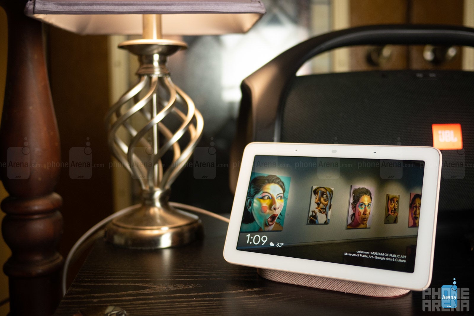
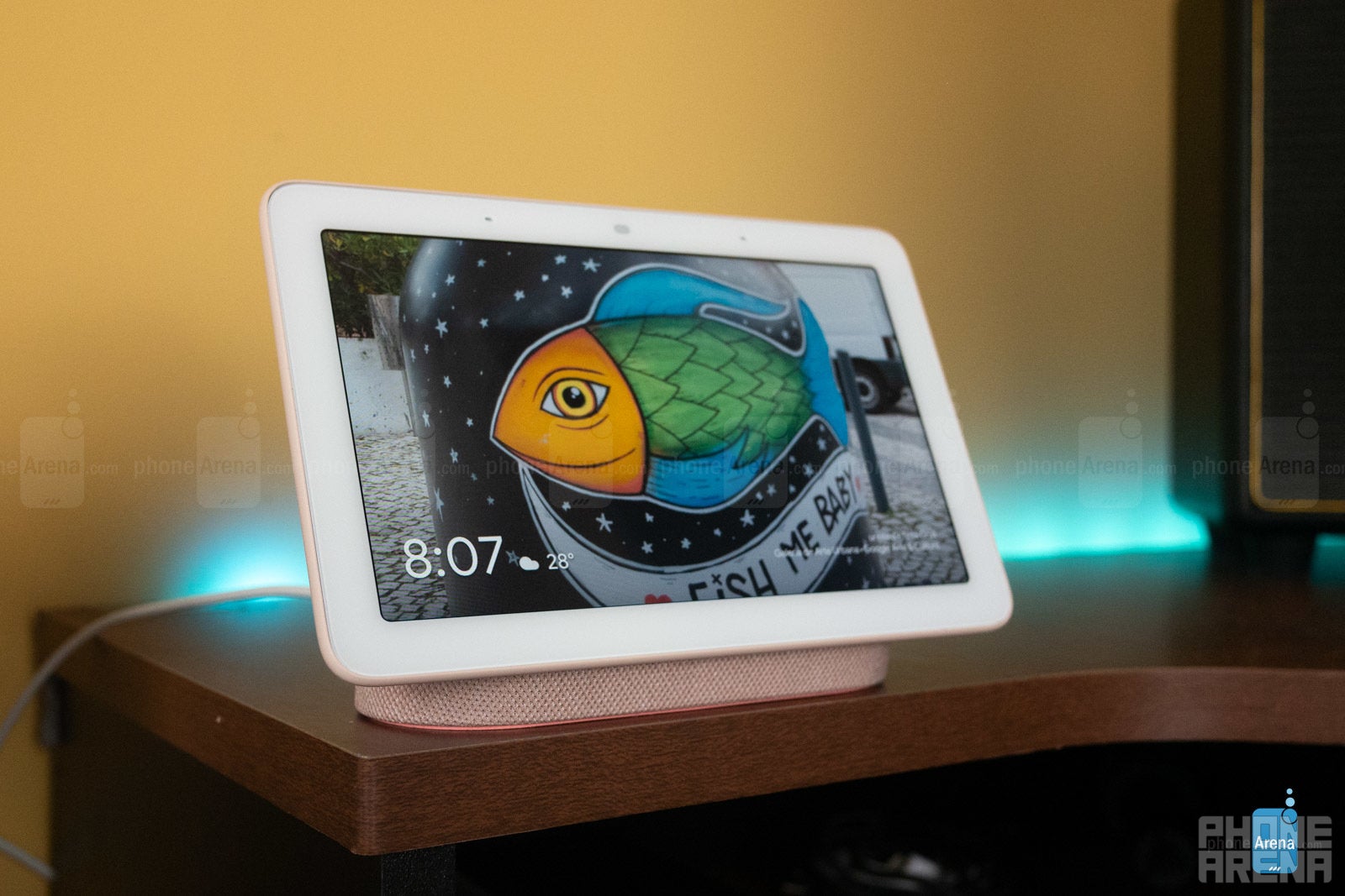
The first thing you’ll notice is the device’s small size and soft, round aesthetic. The screen has a white face with rounded corners, while the back and woven fabric base come in pastel colors which Google calls sand, aqua, chalk, and charcoal. The diminutive footprint and soft colors combine to make this a cute device that straddles the line well between high-tech and home décor.
Continuing with the theme of blending in, the company excluded a camera and included a microphone on/off switch into this design, along with a volume rocker and ambient light sensor for automatic adjustments to display brightness and tones to further match its environment. We’re not entirely sure why a sliding camera cover couldn’t have been installed instead of excluding the camera entirely, as we’ve seen on the JBL Link View’s camera implementation, but we suppose this eliminates the worry of remembering to close the shutter when the camera isn’t wanted. Otherwise, a shutter cover would be preferable for those who would like the ability to use two-way video conferencing on supported devices.
Display
Interface and Functionality
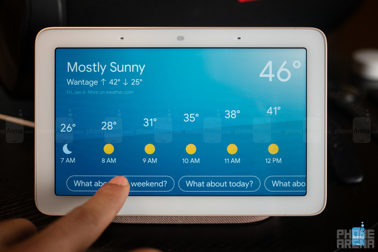
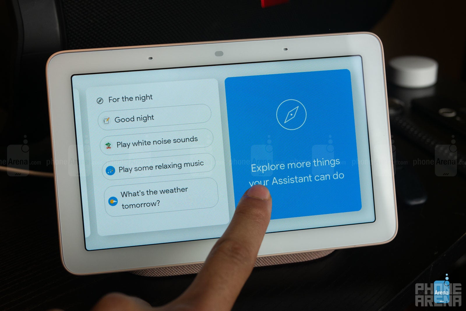
While offering a display for some conveniences and features, the Home Hub, above all, is still a device that operates mainly from voice-activated commands and queries. Comparing the number of things that can be controlled by voice versus on the display shows no comparison. In the future, we’d love to see some expansion here to enable some level of browsing, if not on full web pages, then at least through Spotify, YouTube, news stories, and other future app integrations, minimizing the reliance on your phone and voice for full capabilities.
Smart Home Control
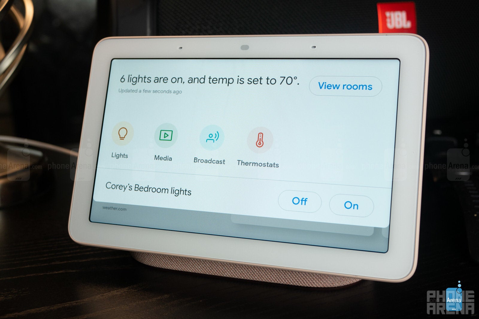
Functionality here is still pretty basic, but you can set your Nest Thermostat’s temperature and change Philips Hue light’s colors and brightness. You won’t find Nest Thermostat scheduling or scenes for your Hue lights here, though.
In terms of media, you can select a Chromecast-enabled speaker to play music – unfortunately you can’t yet choose groups of speakers – but you can’t choose the music in any way or adjust the volume from the Google Home Hub. Instead, the Hub will simply pick up from your last played Spotify, YouTube Music, or Google Play Music list.
Integrations like those with the Dish Hopper and Logitech’s Harmony Hub allow for some IR device control from the Hub such as pause/play, on/off, volume, and channel control. We expect some elaboration on functions like these in the future, as well, in an effort to truly make the Google Home Hub a central “hub” for controlling your home. Right now, that central home hub is still your phone.
Google Home App
Sound Quality
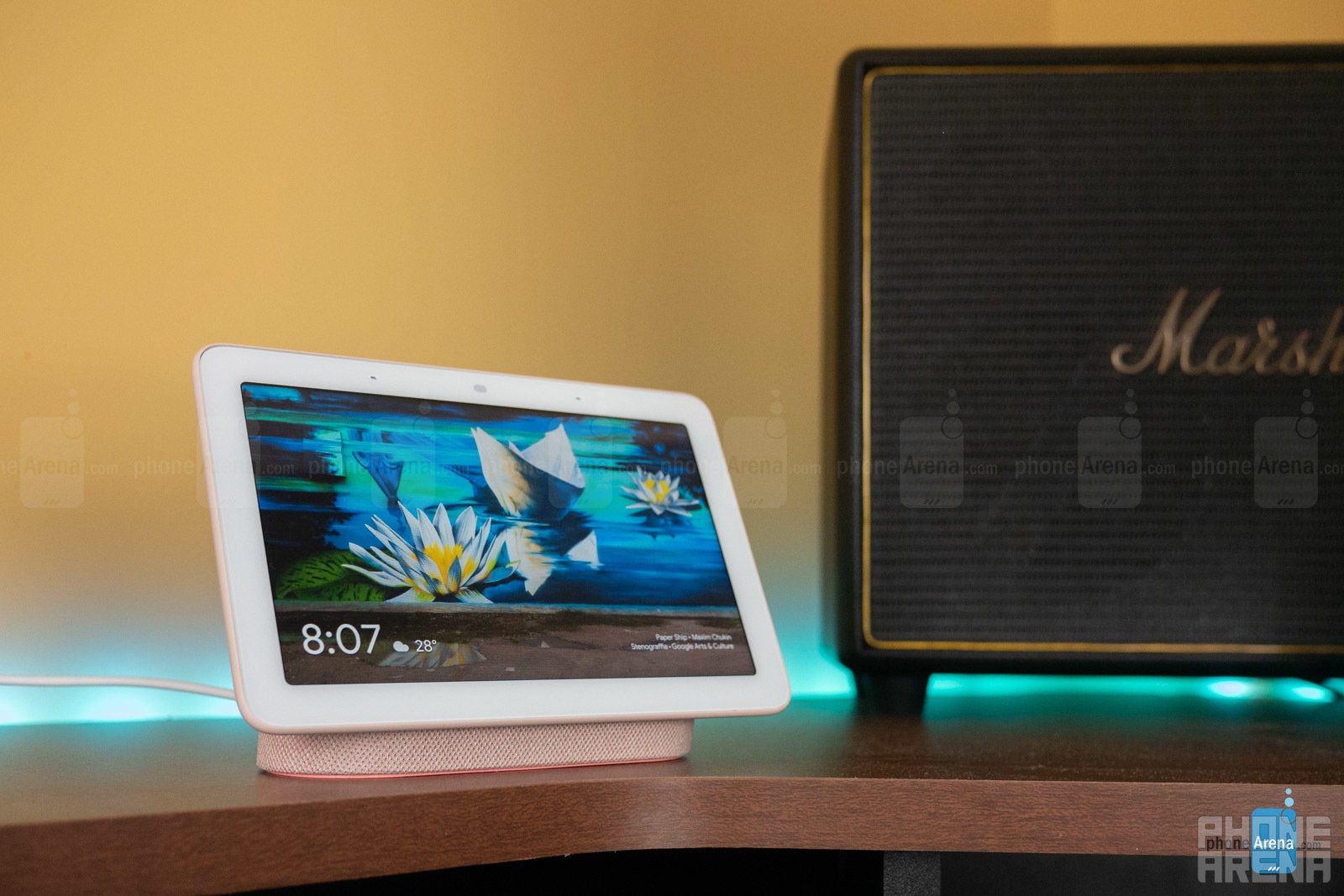
Controls exist within the Google Home app to tweak bass and treble balance, but we found that pushing both of these to the max brought no distortion or other such issues, just better, fuller sound.
Connectivity
In terms of connectivity you’ll find goodies like Bluetooth 5.0 and dual-band Wi-Fi for multi-room audio and Chromecast streaming. No Zigbee or Z-Wave hub lies with within for wider, direct smart device interaction as seen in the second-generation Echo Show, for instance, but paired with a Google Chromecast in your TV you’ll enable a bit of TV control. This is mostly limited to on/off functions but also includes the ability to say things like “Hey Google play Stranger Things on my TV” or “Hey Google, play Young Thug on my TV.” This, and whole-home audio control via Chromecast-enabled speakers are great examples of the perks of using the Google ecosystem – first-party or third.
Conclusion
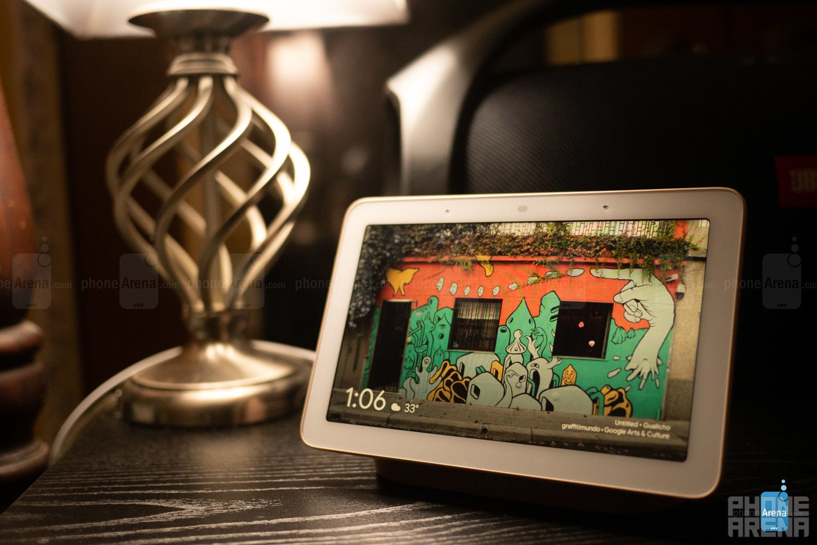
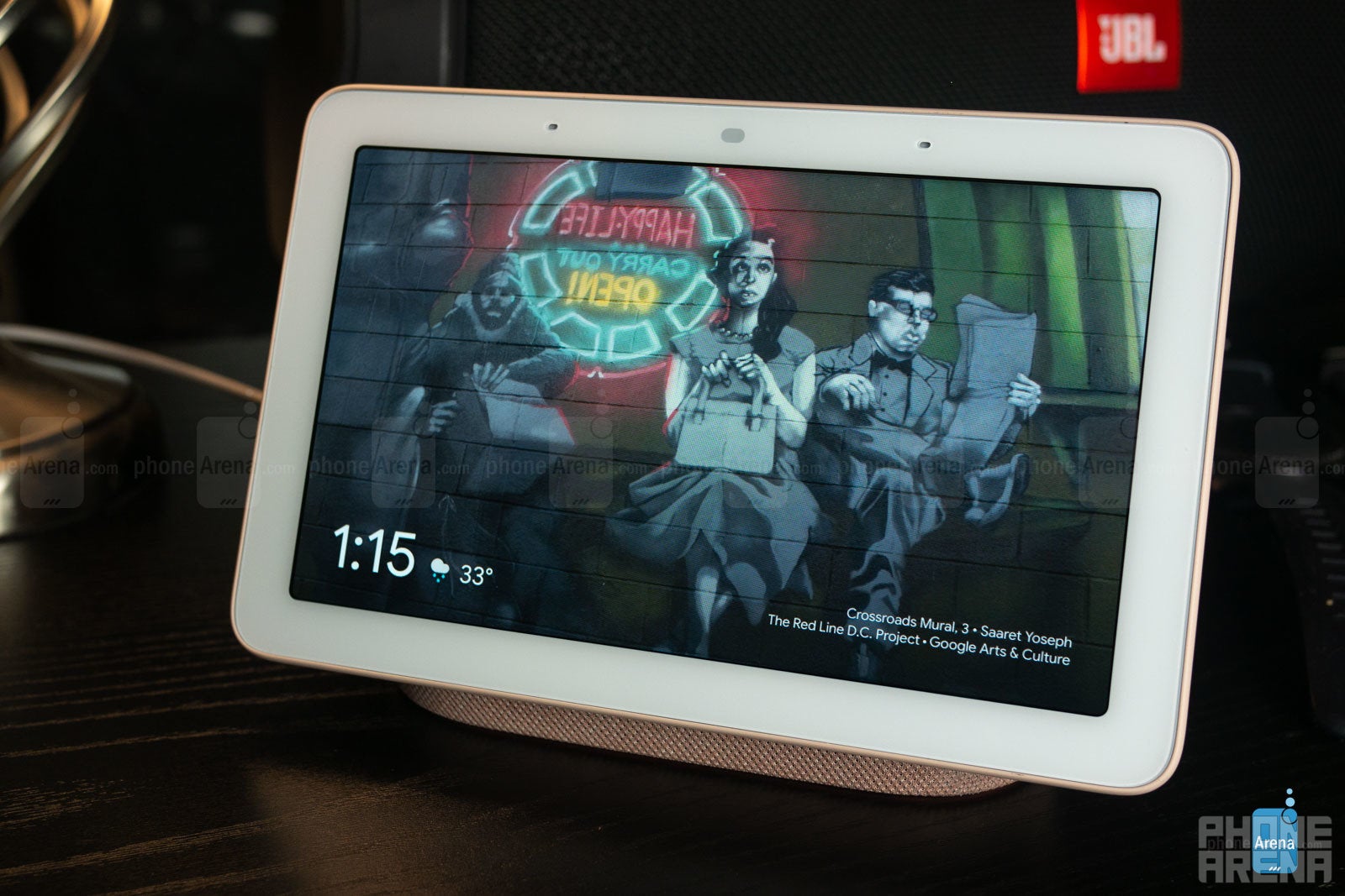
The Google Home Hub makes some appreciable inroads towards being your total “Home Hub” but it’s not quite there yet. The versatile, soft aesthetic helps but the smaller size and lack of water resistance may be somewhat prohibitive for placement in the home. It is, however, perfectly suited as a bed- or desk-side companion with the Ambient Display EQ blending the Home Hub seamlessly into your background, and the useful smart home and music controls placed right at your fingertips. In fact, we almost forget that the Google Assistant is on there waiting to be beckoned – that is until we need to know more than just a 3-day forecast, or find a specific video on YouTube, for instance. Yes, having the display is quite useful at times, but we still found ourselves pulling out our true “home hub” more than we’d like – our phones. Still, the Google Home Hub looks good, and functions well, offering us a savory taste of what could soon be a Google user’s total smart home hub.



Things that are NOT allowed: