BlackBerry Z30 Review
Introduction
With the largest screen of any BlackBerry phone so far, large battery, and good processor running the latest BB 10.2 OS, the Z30 is the Canadians' undisputed flagship, taking the torch from the 4.2” Z10.
It also features a premium build with metallic accents, plus the awesome BlackBerry keyboard, but will those be enough to entice the ever-shrinking suit and tie target market of the company? Read on to find out...
In the box:
- In-ear stereo headphones
- Wall charger
- microUSB cable
- Warranty and information leaflets
Design
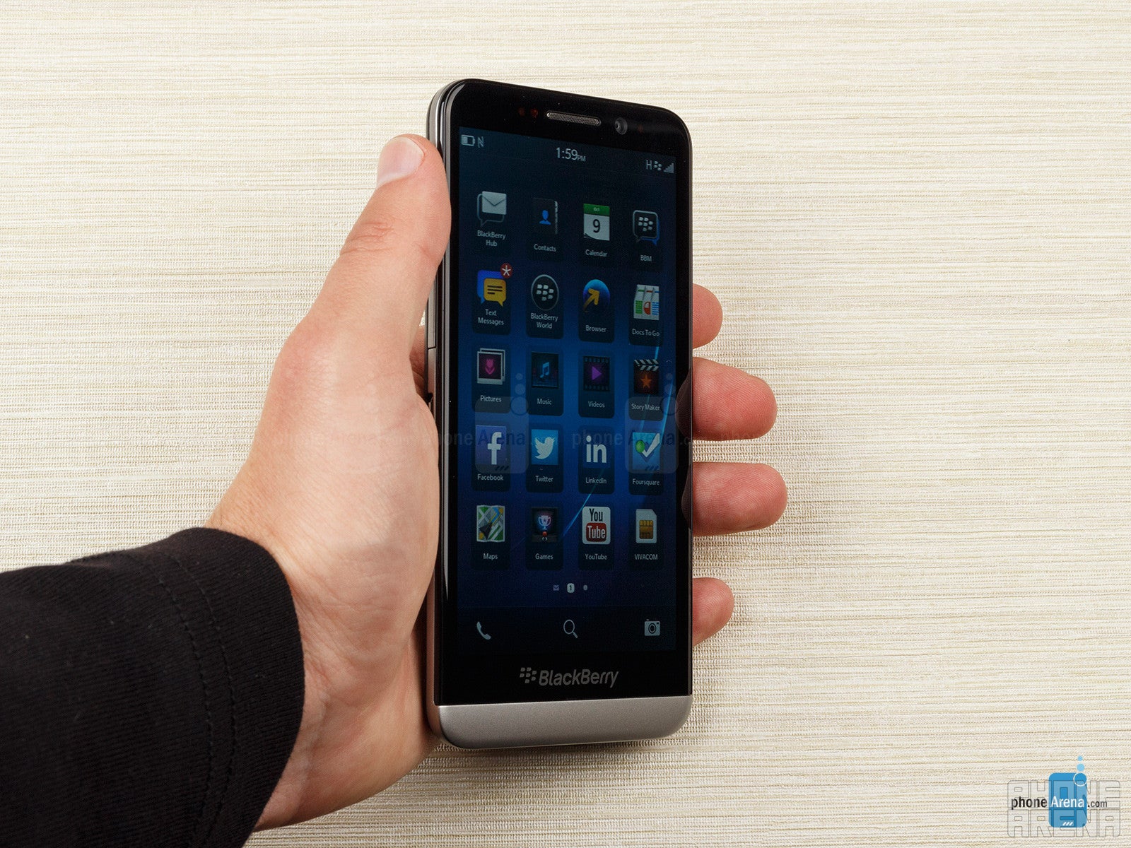
BlackBerry has done a pretty good job with the design of the Z30, introducing metallic accents, soft-touch plastic and solid build quality. Everything looks and feels fine, except the weight, which, at 6.00 oz (170 g), is rather heavy, if you are comparing with a typical Android flagship.
The side rim transitioning into a brushed metal plate underneath the display looks very good, though, and the heft and girth give the phone a solid feel in the hand. Moreover, the tapered back is covered with a nice soft-touch plastic in carbon fiber pattern that doesn't slip, making the phone sit very well in the hand. This back cover is removable, revealing a sealed battery compartment underneath, and a micro SIM slot on the left sitting on top of a microSD one.
The phone leaves a very ergonomic impression when handled – the power/lock key at the top, for instance, is situated right smack in the middle, where your index finger naturally resides. That button, and the volume keys on the right feel extremely solid, and have great, clicky tactile feedback. Even the small button between the volume ones that calls the voice assistant is very easy to feel and press without looking, with a prompting brushed metal notch on top of it.
Display
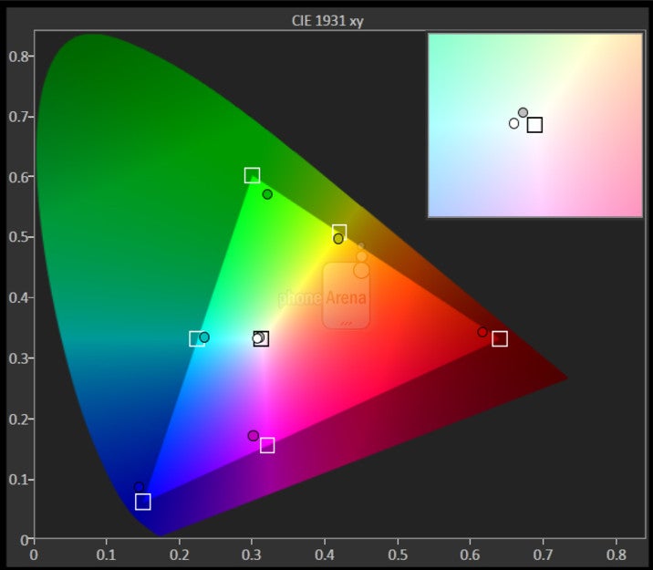
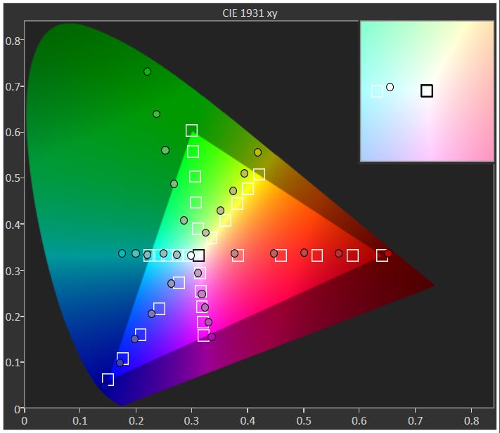
The display exhibits oversaturated, flashy colors, which make BB 10's painting scheme look rather appealing. The viewing angles, both horizontal and vertical, are excellent, as can be expected from an OLED screen.
Its brightness could be a bit higher, compared to some LCDs out there, but the anti-reflection coating on the Z30 is pretty good, and we had no trouble viewing the phone's screen outdoors, even in direct sunlight.
Interface and functionality
BB 10 OS is snappy, visually-polished and very fluid — just as every contemporary mobile OS should be — but it's hard for us to see why one should prefer it to iOS or Android, or even Windows Phone, especially when we know that BBM is coming to those other platforms (except for WP).
Visually, they’ve paid a great deal of attention in almost every aspect of the platform. So much so, that it boasts some neat looking transitions effects that sprinkle some love to the new UI – such as the cool fading effect when unlocking the device. At the same time, there’s just this consistent fluid performance seen throughout the interface that easily rivals its adversaries. Unfortunately, its personalization is pretty much on the same level as iOS, since we’re only given the ability to change the wallpaper and the layout of the app panel. Compared to Android and Windows Phone, it lacks those personalizing elements to make the look and feel of the UI different between handsets.
BB 10.2 does sport some neat features that make your life easier compared to the other platforms, though, like the sleep screen that shows a big red analog clock in either a portrait and landscape format, which comes neat in the dark hours of the night. This sleep lock screen turns notifications off when activated, and a tap on it can turn the set alarm on/off, or you can edit it directly from the lock screen, without diving into menus.
Looking at the phone, there isn’t a home button or icon that many are familiar with pressing that returns them to the homescreen. Rather, the homescreen is comprised of three distinct panels – the apps panel, active frames panel, and the Blackberry Hub. Swiping left/right at the homescreen will get you into any of them, but when you’re in an actual app, executing a swipe up gesture from the bottom bezel and then releasing your finger “minimizes” the app and places it as an Active Frame in the homescreen. Indeed, it’s BlackBerry’s take on the whole multi-tasking thing, which might not seem as intuitive as what’s seen on other platforms, but it nonetheless gets the job done.
Following on the same premise, you can get into “Peek View” at any time by simply doing the same gesture (swipe up from the bottom bezel), but this time making sure to hold your finger on the screen and not letting go. In this view, we’re given a quick look at the amount of notifications we have – though technically, you’ll need to traverse over to the BlackBerry Hub to actually see what they are. Honestly, the way BlackBerry 10 handles notifications isn’t as quick or practical, but instead, it seems like there’s more work involved.
Well, that leads us to the hardest gesture to master – the one that gets you into the BlackBerry Hub, which aggregates all notifications, emails, text messages, and missed calls. Essentially, it’s a swipe up from the bottom bezel, then while your finger is still touching the screen, you swipe right to uncover the BlackBerry Hub. As we’ve mentioned already, it seems like a lot of work is involved in just getting access to those notifications, but hey, that’s the way they decided to go. And finally, the last gesture involves swiping down from the top bezel, which will bring up different settings depending on what app you’re running. From the looks of it, the gesture basically replaces the familiar “menu” button function seen with last-gen BlackBerry.
Messaging
The BlackBerry Hub is at the heart of the messaging experience in BB 10 and the Z30. It's basically an always-on application that's found in the leftmost end of the homescreen. The BB Hub integrates all of your communication activities including text messages, email, calls and notifications. It's a cool concept that you can always return to the BlackBerry Hub from anywhere else in the OS by doing a swipe up and then right gesture, though that one is a bit difficult to master.
BlackBerry smartphones are typically known for their messaging prowess, especially when many of them employ some killer physical keyboards. Obviously, the Z30 is an all-touch device and relies on a new keyboard layout. No folks, there aren’t any gimmicky novelties this time around, but we’re pleasantly impressed that the on-screen keyboard works well. Not only is the layout ample, but it’s super responsive as well in keeping up with our rate, plus it is really easy to hit the right buttons on the large display.
Furthermore, we also appreciate the useful gestures in play with the keyboard – like doing a swipe down gesture on the keyboard to get access to its different layouts. Still, we would’ve liked to see some numbers and punctuations integrated into the main layout. In addition to its great auto-correct feature, BlackBerry has an interesting way of going about predictive text. Based on context clues in what you’re typing, different words will begin to appear over certain letters on the keyboard – so all you need to do is a swipe up on the specific letter to automatically throw the word into what you’re typing. As much as we appreciate this, we find out pace to be a little bit on the slow side, and quite frankly, we’re faster just typing the old fashion way. Alternatively, there’s also the voice control feature that allows us to speak our words. In our testing, it seems pretty accurate and somewhat faster than relying on the predictive text feature.
Emailing hasn’t changed much with the BlackBerry 10 experience, though, accessing them is still a process on its own. Instead of seeing an email icon or something in the app panel, you’ll need to once again get into the BlackBerry Hub to access them. When it comes to the layout and functionality of the email experience with BlackBerry 10, we don’t find it as comprehensive as Android’s Gmail experience – but hey, it still gets the job done.
Software
Survival hinges on app support, right? Well, if you’re wondering about that, it’s worth mentioning that BlackBerry 10 currently has about 70,000 apps in BlackBerry World. Out of the box, the handset is preloaded with popular ones such as Twitter, Facebook, LinkedIn, and Foursquare, so it seems poised to have a healthy selection. However, when we compare those apps with the same ones on other platforms, they’re not at complete in terms of feature set. For example, we can’t delete a Facebook post that we accidentally published, which is something you can do with the iOS and Android versions.
As for some of the other third party apps, we weren’t too convinced by them either – such as the third party Pandora client in “Apollo,” which has some significant layout issues. Strangely, there’s a YouTube icon in the app panel, but pressing it doesn’t do anything else except to launch the browser and point us to the mobile friendly version of the site. Speaking truthfully, if these are the kinds of apps that users are going to be exposed to, BlackBerry 10 is going to have a difficult time trying to lure people on other platforms.
Becoming an integral part of any mobile operating system, voice control services are undoubtedly being used by many more people. Sadly though, BlackBerry fails to brings a reasonable competitor with its offering. So what can you do with it? Well, you can send a text, email, or BBM message. Additionally, you can call a contact, schedule an appointment, make a note, and even search things on the internet. Regrettably, it’s not “smart” as Siri or Google Now, such as giving detailed answers to general questions like “who is Michael Jordan?”
Processor and memory
The BlackBerry Z30 sports a decent 1.7 GHz dual-core Snapdragon S4 Pro Plus MSM8960 processor and 2 GB of RAM in order to ensure the smooth operation of the system. Built-in storage is 16 GB, and if you ever happen to need more, you can always insert a microSD card of up to 64 GB. From basic tasks to more complex things like gaming, we rarely find the BlackBerry Z10 exhibiting any signs of sluggishness.
Internet and connectivity
The BlackBerry Z30 web browser delivers a very good experience, since it’s able to handle even the most multimedia intensive sites with little effort. Not only does it offer instant page rendering on the fly, but that same lovable and consistent fluid performance is also witnessed with its navigational controls – both pinch zooming and page scrolling. Heck, even sites with heavy Flash content are handled fairly well. Displaying a great amount of finesse, the only thing lacking are secondary features. For example, there’s a button to switch between opened tabs, but it would’ve been nice to see some other gestures that would accomplish tab-switching as well.
In terms of connectivity options, the BlackBerry Z30 is well-equipped as it sports LTE and HSPA, along with all necessary Wi-Fi protocols, including 'n' on the 5 GHz band.
In addition, this little bad boy boasts a Micro HDMI (Type D) port, NFC and Bluetooth 4.0, so yeah, we can't complain of a lack of features in this respect.
Camera
When it comes to snapping photos with the 8 MP shooter, BlackBerry makes it easy to get access to the camera app. First, you can launch it from the lock screen by pressing and holding down your finger on the camera icon in the bottom right corner, which takes much longer than it should, though. Secondly, there’s another icon in the homescreen that’s also placed in the bottom right corner. And finally, you can simply launch it by clicking on the “camera” icon in the app panel.
Sporting a clean layout that’s predominately covered by the viewfinder, there are few icons or buttons littering its interface. Towards the right edge, there’s an icon in the upper right corner that enables us to switch between photos, videos, and its new Time Shift feature. Meanwhile, there’s another icon in the bottom right corner to get into some additional settings and shooting modes – such as burst and stabilization modes. It’s lacking some of the manual modes and comprehensive set of shooting options that other camera UIs offer, like Panorama, for instance.
Furthermore, there’s also some confusion at first when it comes to snapping photos. Since it lacks a physical or on-screen shutter key, you just need to tap anywhere in the viewfinder area to take a snap shot, which is instantaneous. However, there’s a small square box that acts as the UI’s exposure and focus level adjustment. Basically, you have to press and hold down on it to move the box around to a specific area – so yeah, the execution is a bit strange from what we’re typically exposed to. Finally, with the Time Shift feature, it buffers images prior you to snapping a shot, so that you can “travel back in time” to select the best faces from each individual in the shot – ultimately stitching together the perfect one.
Shots taken outdoors with plenty of lighting are decent enough to accept with their average details and subtle oversaturation, which sprinkles a bit of vibrancy to its shots. However, depending on where you position its focus box, images can appear over/under exposed, and there's quite a lot of noise even in sunny conditions. Under low lighting, though, it’s noticeably more speckled looking with its fine details – while an overall graininess is more prevalent throughout the shot. Luckily, its LED flash seems to be potent enough to light up the scenery up to 7 feet away, though, colors appear more washed out in tone.
Likewise, we can say the same thing about its 1080p video recording quality – with nothing that really jumps at us. Needless to say, we like the average details it’s putting out, gradual exposure, and steady frame rate that it delivers. Despite those charming items, there are two specific distracting elements that pop up. First of all, artifacting elements appear and soften it details whenever the camera is transitioning from light to dark areas and vice versa. And secondly, the microphone doesn’t seem to handle the wind too well, as it picks up that and other noisy tones in the background.
Multimedia
Taking a quick peek at the Picture gallery, we’re adept to notice the conventional layout it’s sporting, as images are presented in an all too predictable grid like view. Thankfully though, we’re given some expected functionality with it – such as being able to share them via BBM, email, text message, and even NFC. Moreover, we also appreciate the editing functions that are at our disposal. From cropping to selecting specific artistic filters, it seems considerably extensive than your ordinary picture editor.
Moving onward to the music player, we’re disappointed to see that its presentation doesn’t get the kind of love it needs to appear modern and spiffy looking. Instead, it’s boasting a boring looking style that doesn’t rival some of the cooler looking UIs seen with other Android smartphones – and even the iPhone’s cover flow mode. As usual, we’re presented with the album cover, track information, and on-screen playback controls. Even worse, when it’s minimized and placed in the Active Frames area, we’re not even given playback controls. For that, the mini player is only accessible in the lock screen after the volume buttons are pressed. Setting its volume to the loudest setting, its output is average at best – albeit, there’s a hint of strain coming out of it.
Hardly a shocker to us, the BlackBerry Z30 is equipped to play high definition videos with no problems. Aside from the swift and steady playback, it’s worth mentioning that it supports a wide array of video codecs out of the box – these include H.264, MPEG-4, DivX and Xvid. Sure, the sharp looking display aids the experience, but it doesn’t have the same wow factor as some other handsets. Also, it’s somewhat disappointing to know that there is no mini player feature that many other devices provide – like being able to play a video in the background while doing something else.
Call quality
The voices come in with decent quality in the earpiece of the BlackBerry Z30, but its maximum volume is comparatively low, so you might have trouble hearing the caller in noisy environments. The handset's noise-canceling mics weed out the ambient sounds and relay our voice pretty loud to the other side, but make it sound a bit hollow and distorted, so overall we have an average call quality on the BlackBerry Z30.
Battery
BlackBerry placed its largest ever 2880 mAh battery pack in the Z30, which is closing in on what the best Android 5-inchers offer. With BB10, a frugal display panel, and software optimizations, you can squeeze much more battery life out of the handset that with flagships on other platforms. BlackBerry cites 18 hours of talk time in 3G mode, which is 50% higher than the average, and indicate you can expect about two days of endurance from the Z30 with normal usage.
Conclusion
If your company's IT department is invested in the BlackBerry universe, and your colleagues are mostly on BBM, the Z30 is your best bet. It folds all the security and messaging features of the BlackBerry platform you are used to, into a consumer-centric big screen phone with premium design and decent specs.
The BlackBerry Z10 is a natural competitor to the Z30, but its 4.2” display is no match for the pretty Super AMOLED 5-incher on the Z30 in terms of typing, browsing or media consumption, despite the lower price.
Other than that, a pragmatic person would be hard-pressed to acquire the BlackBerry Z30 at the $600+ price it commands off-contract, considering that's the tag for flagship handsets on mobile platforms that are more proven than BB 10, and have a lot higher app count. Unless you are bored with the Android/iOS/WP mafia, that is, and want to explore a fresh new interface take like BB 10.
Choices, choices.
Software version: 10.2.0.210







Things that are NOT allowed: