Asus ZenWatch 2 Review
Introduction
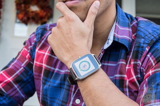
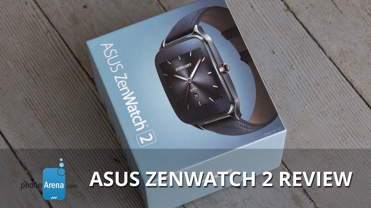
It’s been quite a busy time for Android Wear of late, and there’s no shortage of new and exciting models. Nowadays, though, it’s increasingly becoming tougher to stand out in the field, especially when most smartwatchs now tend to come with pretty convincing designs. Asus is back for round two with the ZenWatch 2, one of the few that favors a square shaped design, as opposed to the round face styles that have become preferred by a number of makers. What really sets it apart from the crop is that it’s sporting a price under $200 – one of the few to push through that threshold.
The package contains:
- Asus ZenWatch 2
- Magnetic USB cable
- Wall charger
- Get started guide
- Safety information
Design
More colors, sizes, and straps elevates its design, but it’s still largely the same looking thing from last year.
Frankly, little has changed with its design. While it still favors the square shaped design, there are now more options to choose from – like its size, case color, and more straps. Now that it’s available in small and large sizes, which have screen diagonals of 1.45-inches and 1.63-inches respectively, you won’t have to settle on a single size anymore, potentially allowing it to be a bit more proportional on the wrist.
The color options have been increased too, where the casing can be picked up in silver, gunmetal, and rose gold. And its diversified portfolio isn’t complete without a decent selection of straps consisting of rubber, leather, and metal.
This is all fine and dandy, especially when certain combinations can deliver a premium or casual look, but as a whole, it still looks closely to its predecessor. Our particular unit, the larger 1.63-inch one, looks okay with its stainless steel case and rubber wrist strap. However, the underside is comprised out of this hard plastic material, which is a stark contrast over the stainless steel bezel – so it just makes for an odd combination.
The bigger question that many will face with this one, is whether or not the square shaped design will be appealing enough. If it happens to fit your style, then you might find its design favorable, better than the Apple Watch in some ways. At least you can have peace of mind knowing it has an IP67 rating, ensuring it has protection against minor incursions with water.
The crown is there merely for the single purpose of ‘activating’ the ZenWatch 2, whether it’s waking up the display by pressing it once, or holding it down for a few second to get access to its various menus. Strangely, the heart sensor from before is gone – a rather shocking turn of events. Even though Asus’ implementation with the original model wasn’t the most ideal, it’s just a bummer to see it gone altogether here with the ZenWatch 2. Making matters worse, you can tell the ZenWatch 2 to “measure my heart rate,” which then proceeds to suggest apps that can do it, but when you run the apps, like Wellness, it can’t even do it.
Display
No changes here, it’s the same square shaped 1.63-inch 320 x 320 AMOLED display from before.
Looking at the display present here with the ZenWatch 2, it’s identical to its predecessor – a 1.63-inch 320 x 320 AMOLED display delivering a 278 ppi pixel density, which is protected by 2.5D curved Corning Gorilla Glass 3. It’s good enough to make out everything on the screen, but after checking out the Huawei Watch, it’s noticeable that the ZenWatch 2 isn’t quite as sharp looking. Don’t get us wrong, we have no issues in reading out text, especially when we can increase the size of the font, but it doesn’t have as much clarity and definition that the Huawei Watch delivers.
AMOLED clearly has some advantages over its LCD rivals, mainly because it can achieve that deep black color, so in the dark, that black color doesn’t have even the slightest hint of grey to it. Colors are undeniably over-saturated here, punchy and overblown as usual with AMOLEDs. But viewing angles are great, which is something we're happy to have on a smartwatch.
Needless to say, the screen serves its purpose, but it’s quite challenging to view in direct sunlight, as its weaker brightness output tends to wash out and make it rather unviewable. There are some good qualities present here, but it all comes back to whether or not you prefer its square shape.
Interface and Functionality
Same old, same old. The Android Wear experience here is complemented by the ZenWatch Manager app.
Veteran users of Android Wear will fit right in with the Asus ZenWatch 2, since the experience is no different or unique from other Android Wear watches. For the most part, it’s still largely a hub for notifications with the way cards are presented to us. We won’t go into all the nitty-gritty details, but we will mention that it does decently to complement the smartphone experience with its set of apps. Navigation is done by the usual swiping gestures, however, interacting with many of the apps is still achieved mostly through voice actions.
Even though it’s functional in the way it alerts us with important things, like incoming phone calls, traffic along our route going home, the weekend weather forecast, and much more, Apple’s WatchOS offers just a little more depth in terms of the overall experience. Of course, updates to Android Wear are hopefully coming soon that’ll increase its worth, but for right now, it’s still by and large reserved as a notifications aggregation hub.
Specific to the ZenWatch 2, you can download the companion ZenWatch Manager app onto your Android smartphone to get access to additional watch faces and apps from Asus. We particularly like the Remote Camera app, which turns the ZenWatch 2 into a useful viewfinder with a few controls at our disposal. As for the various watch faces, using the ZenWatch Manager app enables us to customize their looks even further – and some of them are dynamic as well, such as the ‘cogs’ watch face.
Processor and Memory
Used by many other Android Wear smartwatches, the Snapdragon 400 proves to be an effective piece of silicon.
A favorite amongst the current lineup of new Android Wear smartwatches, the ZenWatch 2 is also powered by the quad-core 1.2GHz Qualcomm Snapdragon 400 chip with 512MB of RAM. We have no qualms with its performance, dishing up responsive gestures throughout the experience.
Armed with 4GB of internal storage, it’s a decent tally that not only allows us to store some apps natively on the ZenWatch 2, but we can even use it to store music as well.
Connectivity
Battery
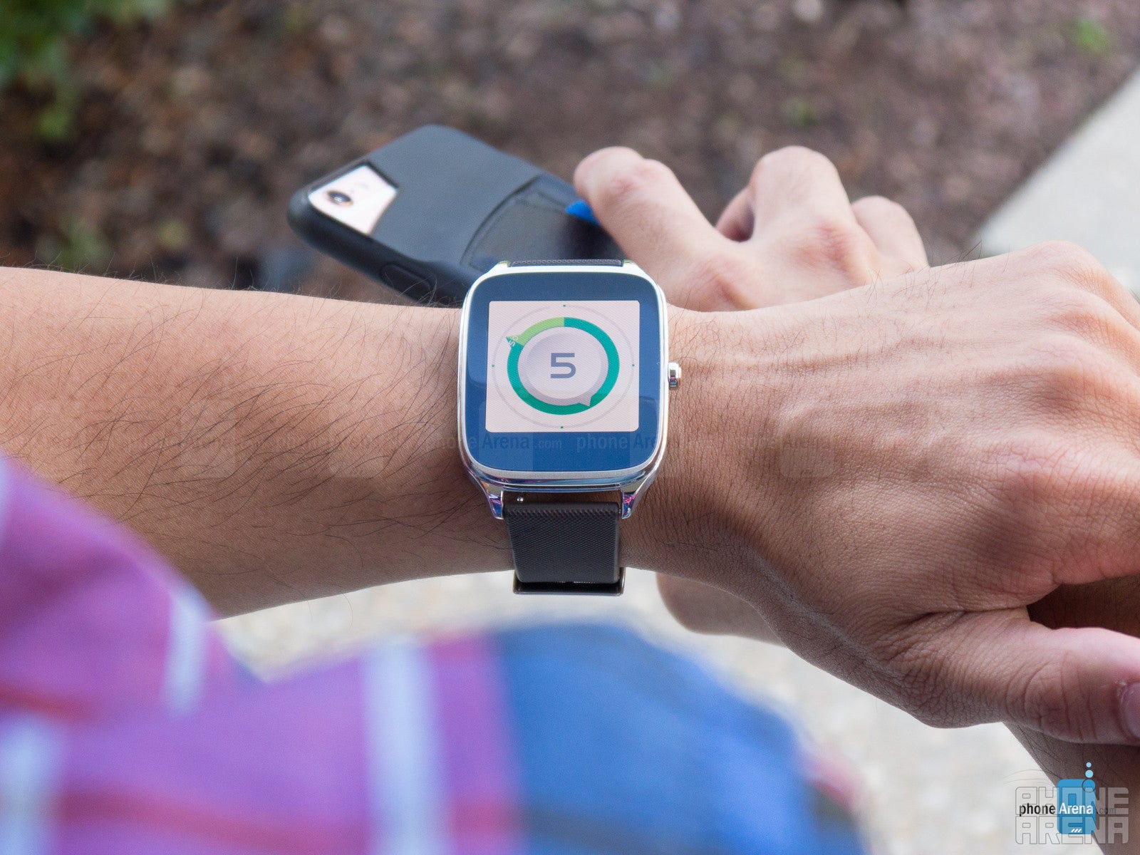
It’s good enough for an easy one-day of usage, but it’s still highly preferred to give it nightly charges.
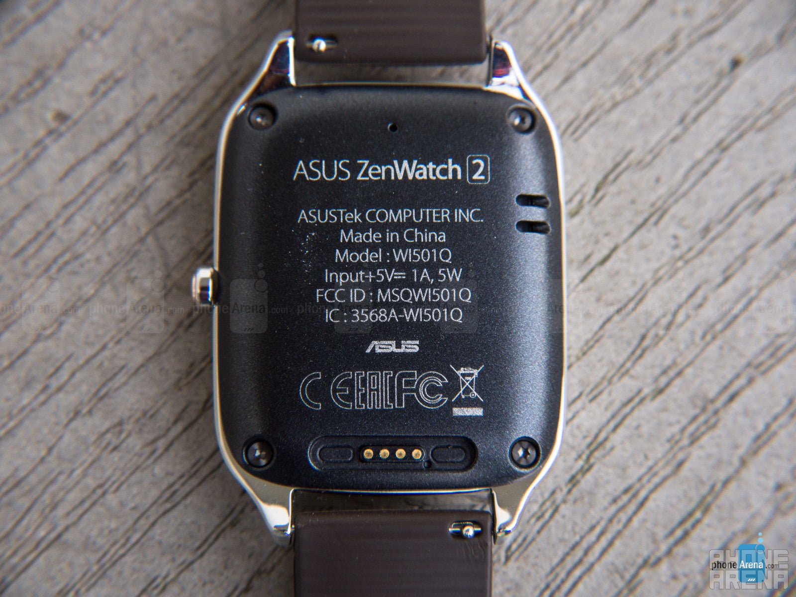
Speaking of charging, Asus improves the implementation here by now offering a simple, magnetic pin connection, as opposed to the bulky charging cradle from before. With the magnets attracting one another, the connection is instant and firm.
Conclusion
Asus doesn’t take any drastic measures to steer away from what they’ve done with their first Android Wear smartwatch. Yes, it’s mainly the same exact thing from before, but now it’s offering a better degree of options – though, it’s nothing like the impeccable customization we get with the 2nd generation Moto 360. The experience, too, sees no substantial upgrade from before, and in fact, we can achieve the same functionality and experience with the original ZenWatch.
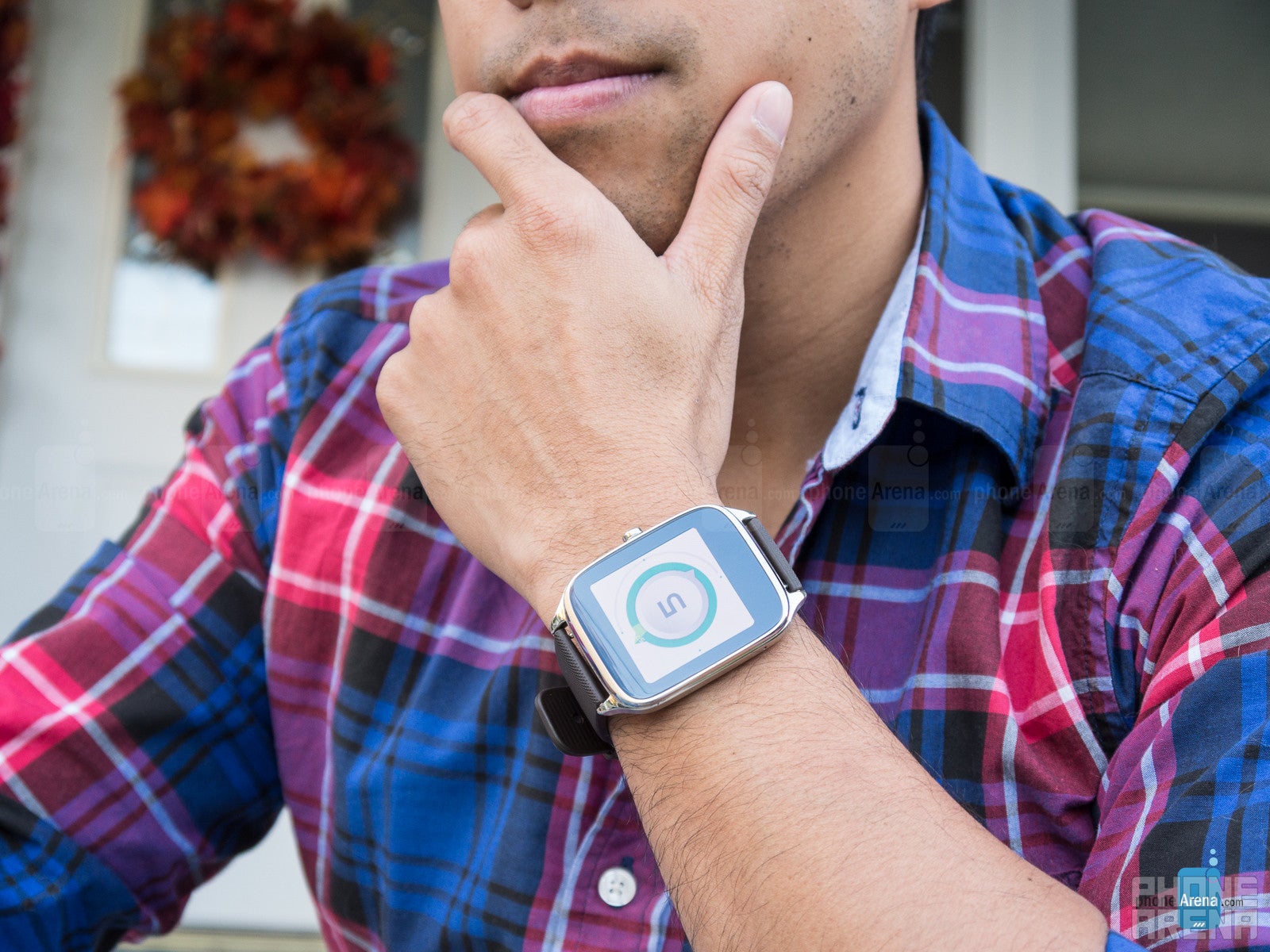
It’s a good value considering it achieves nearly the same level of functionality as other Android Wear smartwatches, but if you’re a fitness buff, just know that there’s no heart rate sensor with this.
Software version of the review unit:
Android Wear Version: 1.3.0.2176821



Things that are NOT allowed: