Apple iPhone SE Review
UPDATE: You can now read our iPhone SE 2020 review!
Introduction
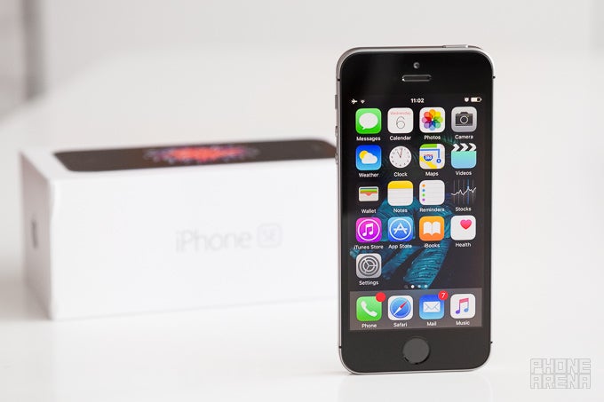
This has to be one of the more peculiar reviews I've ever been tasked with. A past iPhone 5 and 5s user, I have long forgotten what it is to hold and work with a smartphone of such caliber. Since those two, whom Apple's new iPhone SE resembles thoroughly, I've only had the pleasure (and sometimes – displeasure) of using much bigger devices; like the iPhone 6, for example, or the One M9, or the Galaxy S6... and you know what? I think I got perfectly used to the big screen format. Most devices above 5 inches do feel rather clunky to me, but if we draw the line at around 5", I think most handsets in the category come off as relatively easy to handle.
So does the world still need a phone with a 4" screen, be it with the latest top-of-the-line tech? Have our hands permanently adjusted to working with big handsets? Does the extra portability of the iPhone SE make a meaningful difference for the 2016 consumer? And, perhaps more importantly, is the 4" form-factor still adequate enough to get the job done well enough in this day and age, for productivity, gaming, general usage, and more? Do browsing the web, or checking a Facebook feed, or typing out a message feel constrained on this seemingly old-age 4" screen? These are all hard questions the iPhone SE will have to answer if we're to believe in its adequacy. Let's see what it has to say!
The package contains:
- Apple iPhone SE
- Wall charger
- Lightning cable
- EarPods earphones
- SIM ejector
- Quick start guide
- Apple decals
Design
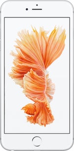
Blast from the past: the iPhone SE resurrects a design many thought superior to iPhone 6, but is it really so?
You can imagine the tension in the air that was accommodated by the moment when I first took the iPhone SE out of its box and carefully enveloped its seemingly delicate body with my fingers. My first thought was: wow, this is a nice phone! A looker! My second thought was: oh boy, that sharp edge is cutting right into my fingers.
The Apple iPhone SE may be very compact and all, but its boxy shape with sharp edges sure isn't very ergonomic. It looks good, but doesn't feel good, which is equally important. Using a case is a way to work around this problem, but it isn't quite the ideal solution. I think if Apple had actually used a scaled-down version of the iPhone 6 design, it would have made for a much more comfortable handset, not to mention – much fresher.
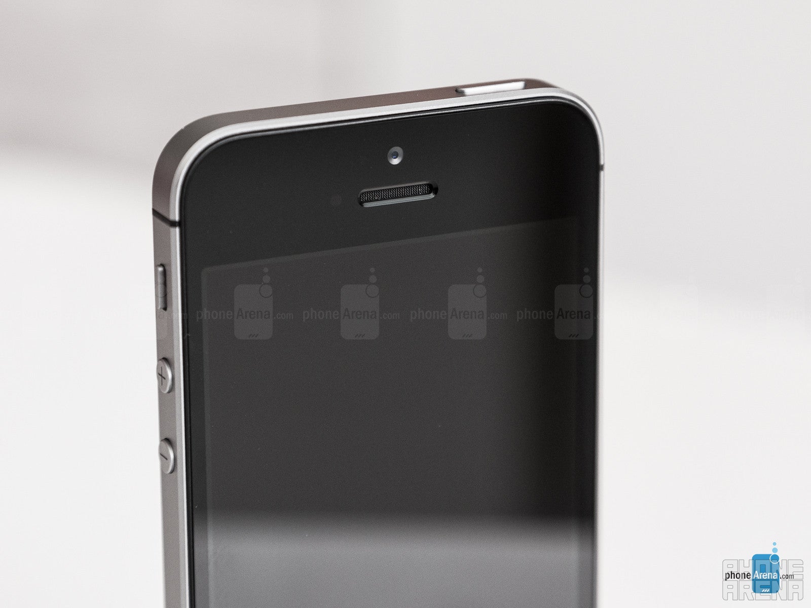
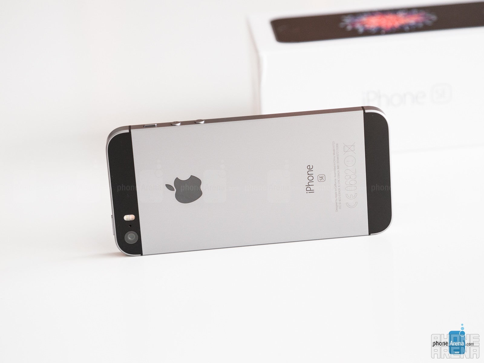
Aside from that, the iPhone SE is very well built – the metal body, ornamented by the contrasting glass pieces on the back, is a sight to behold, while the buttons for volume and home, as well as the mute switch, all click nicely and reassuringly.
When it comes to the dimensions themselves: yes, the SE is extremely compact and light by today's standards. It's very refreshing to once again use such a small device – a considerably more effortless experience compared to the 'full-size' slates of today. It's also not tiny to the point of looking weird or inadequate in the hands. However, the SE definitely isn't looking to balance body size and screen diagonal – the significant bezels around the screen, and especially the final look when you put a case on, do make the iPhone SE appear somewhat old-school. It would have been a nice gesture from Apple if it had taken the time to renew the design of the munchkin to make it look more modern.
Display
A very high-quality display, the 4” panel of the iPhone SE is a great treat for LCD lovers.
Brightness with the iPhone SE can be cranked up all the way to 600 nits, which is a superb output, allowing the screen to be used with relative comfort even when it's sunny. Minimum brightness sits at 6 nits, which translates to decent viewing comfort in the dark, but it could have been better.
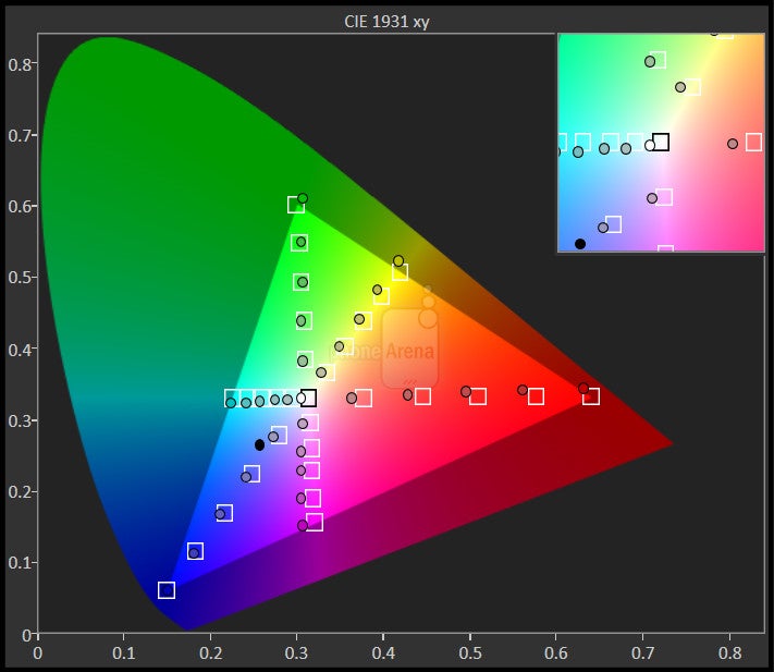
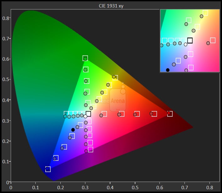
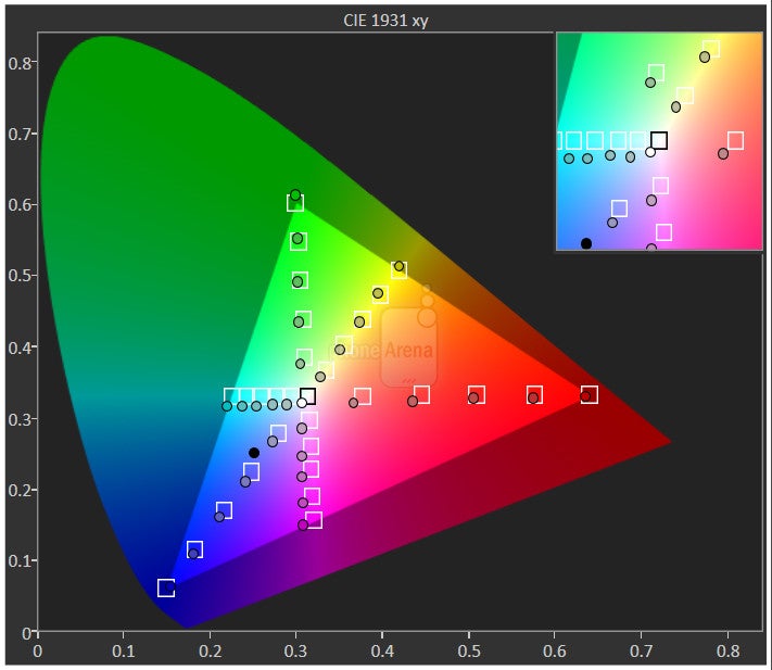
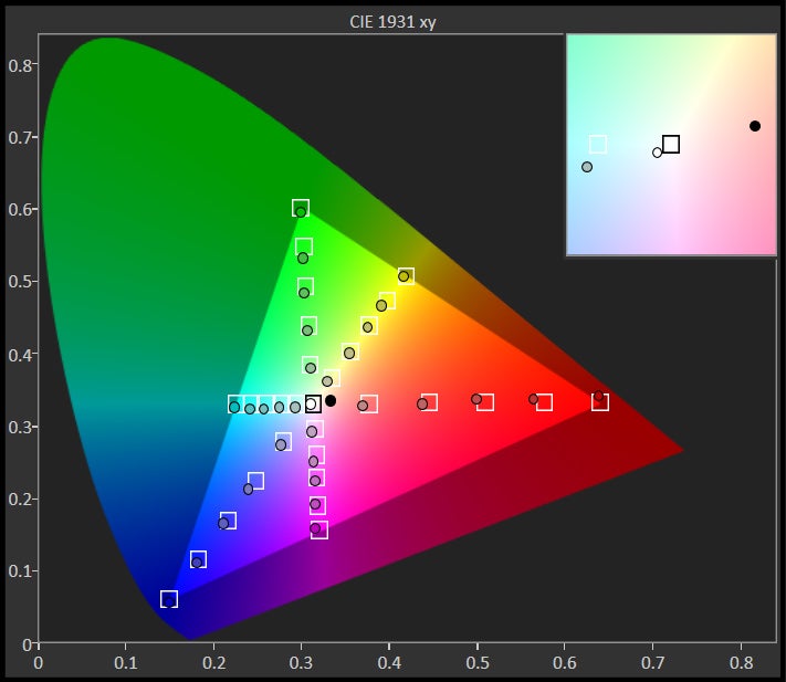
Images, video and other content looks great on the iPhone SE, because color balance is great. Color temperature is a tad cold at 7000 K (slightly dominant blue color), but overall, colors are very accurate and true to life, while the display's gamma is spot on, producing a deep, dynamic look that's also natural. There's just the right amount of contrast and vividness.
Whether or not 4 inches are big enough, or too small, depends on what you're going to be using them for, so it'll be in the next chapters where I'll explore the display's efficiency.
Unfortunately, there's no 3D Touch here, which probably isn't such a big deal at this point. The fact you can reach all corners of the screen with a single thumb easily offsets the loss.
Interface
Simplistic and efficient, iOS 9's core apps could use some visual flair.
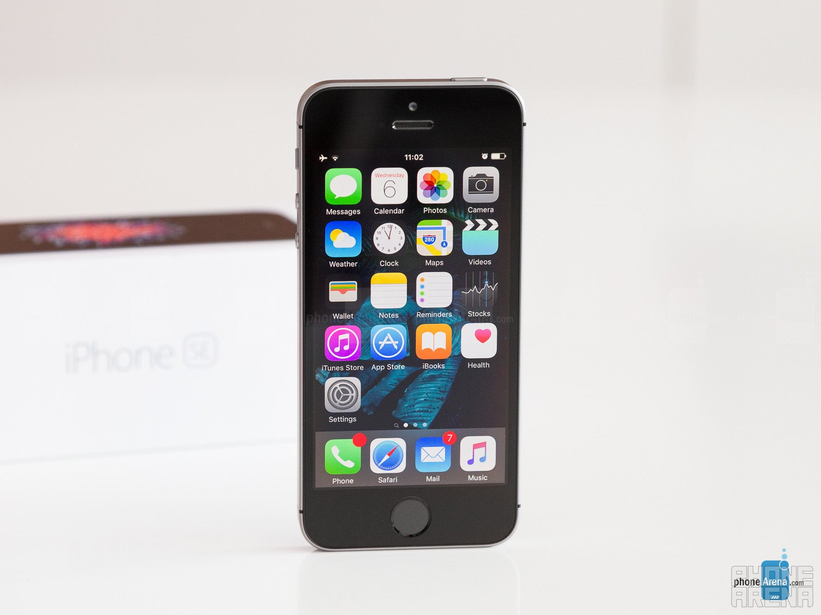
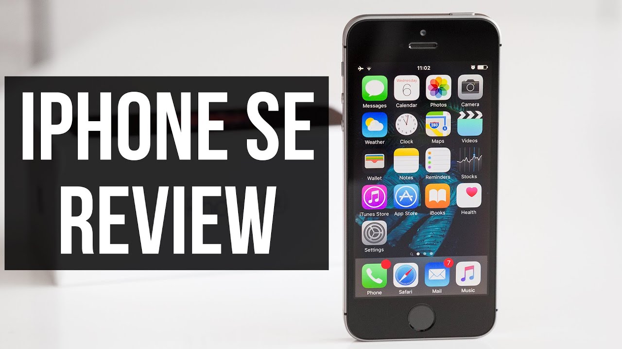
iOS 9.3 on the iPhone SE is in no way different than what's currently found on the bigger iPhone 6s and iPhone 6s Plus. The operating system scales intelligently so the general user experience on the iPhone SE is actually pretty good. The handset's smaller display fits slightly less content within its 4" frame, but the size of text or other items is pretty much comparable to what's found on the iPhone 6s. That's very important, because it means that while there's definitely some more scrolling and panning involved with the iPhone SE, reading and viewing content actually isn't noticeably less comfortable.
Using the iPhone SE is a very simple and straightforward process. First, the user interface is structured in a way that's uncluttered and makes sense, and second, it's very intuitive and reliable – so everything works and reacts as one would expect. The confusing or frustrating moments with iOS 9.3 are reduced to a minimum.
Phone
The Phone application in the iPhone SE (and any other iOS 9.3 iPhone) is very simplistic, probably overly so. When it comes to presentation, it's as clean as it gets, which definitely has its advantages, but it'd be interesting to see Apple add some visual flair; for example, by adding some lively animations here and there (like when switching between tabs in Android), or by reducing the largely grayscale-dominated color scheme within core apps like Phone.
You can quickly dial someone with a single tap from the favorites tab, where selected contacts are accompanied by a small picture, or from the Recents tab. Alternatively, the Contacts tab is a simple and efficient list (no contact pictures here), where you can search by typing out the name of the desired person, or by sliding your finger along the letters on the right edge of the screen. Finding a contact inside the list is typically quick and easy, but an option for T9-style dialing straight from the numpad would have been nice.
Messages and Mail
The Messages application actually has a bit more character in it. It's still mostly a grayscale theme, but the conversations list shows the person's image next to each thread, while the text bubbles within conversations have that nice bouncy effect when the user is scrolling up/down. The app may still seem to be on the simplistic side, but it's actually rather smart. For example, starting a new message and adding a contact whom you've already chatted with, will instantly open the thread with all your previous messages. And, attaching a photo, video, or voice message is just a tap away. However, since there is no 3D Touch pressure sensitivity on the iPhone SE, you can't use the Peek gesture to preview threads straight from the conversations list.
The latter also applies to the built-in Mail application, which is equally simplistic in nature, but remarkably reliable and well-formatted. Browsing through the inbox is very convenient and intuitive, as the names of correspondents are easy to spot among the other info such as the subject and preview text. Next in the hierarchy are the subject lines, which are also easy to see, without interfering with the other text. Finally, the email threads in the list are cleverly spaced out from one another, resulting a clean and easy to view layout.
One of the more intriguing things when it comes to working with the iPhone SE and its 4” display is whether or not the screen will be too small to comfortably type on. As can be expected, the smaller screen does mean a more cramped keyboard. Thanks to its clean design and superb response, however, typing on the 4” display is actually not the nightmare some may thing it is. Sure, mis-taps are easier to do than on the considerably more spacious iPhone 6s, but all in all, the typing experience on the Apple iPhone SE is tolerable.
Organizer tools
The iPhone SE, powered by iOS 9.3, comes with a very useful, no-nonsense set of organizer tools. First on the list is the calendar app, which is quite easy to work with. Creating new events is a very quick process, which can happen by simply holding onto the desired hour while in day view. One unfortunate omission, though, is that week view only works in landscape mode, which is pretty discouraging if you've been used to working with week view. Another feature that would come in handy is to have a little weather forecast for each day when in week or day view, in a similar manner to what some Android phones do.
Next up is Notes, which just got a facelift with iOS 9.3, allowing the user to secure individual notes with a password or Touch ID – a very useful feature indeed, though setting it up and getting used to its peculiarities requires a bit of getting used to. For starters, you first need to create a new password that is to be used with the notes you're going to lock. This password is synchronized with your iCloud account, so it's automatically applied to all your iOS devices. Then, once within the Notes app, you need to tap on the 'sharing' button in order to access the locking option, which is a bit weird. After an additional input of the written password, you're finally allowed to start unlocking (and locking) notes using Touch ID only. A nice touch is that once you unlock a note, all of the locked notes get automatically unlocked for you, and they remain so until you lock the phone. Next time you unlock the iPhone and open the notes app, the secured notes will be locked again. One thing I don't like about this seemingly complicated process is that when you enter a locked note, you need to manually engage the Touch ID prompt by tapping on the lock symbol or the “View note” button. On a screen where this is the only real option, I don't see why the Touch ID / password prompt doesn't show up automatically, saving the user a tap, each time they attempt to view a locked note.
Aside from this overrated privacy thing (sharing is caring!), the Notes app is actually superb – it enables quick, simple, easy, and clean note-taking, but if you need some more advanced functionality, you can always get it in the form of the built-in drawing instruments, the checkbox list tool, or photo attachment.
Touch ID fingerprint scanner
As you may have heard, the Touch ID fingerprint scanner built into the iPhone SE's home button is the same one that was present on the iPhone 5s and iPhone 6. The iPhone 6s came with an enhanced Touch ID sensor that could perform up to two times faster. However, the first-gen Touch ID scanner is still extremely fast and reliable. I actually find the one in the iPhone 6s too fast, because it doesn't even allow the user to view their lockscreen – it unlocks the phone instantaneously.
But back to the sensor at hand in the iPhone SE – it's very easy to setup, and it works like a charm. Some users do report experiencing issues, with the sensor reportedly refusing to consistently read their fingerprints, but my experience with it has been superb thus far – both on the iPhone 6 and the iPhone SE.
Aside from making your smartphone both secure and easy to unlock, Touch ID on the iPhone SE can also be used for authorization of iTunes purchases, or Apple's contactless Pay service, which is currently available in the US, UK, Canada, Australia, and China.
System performance
Being equipped with Apple's best mobile chipset at the moment, and having a screen resolution that is both pleasant to look at, yet not too demanding, means the Apple iPhone SE simply flies. I don't think I've encountered a single stutter or delay while using it.
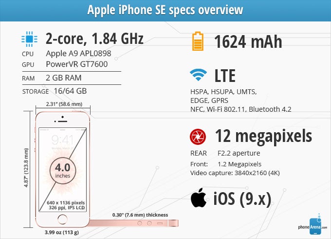
The 64-bit, dual-core Twister processor running at 1.8 GHz delivers excellent performance for both normal system operations and third-party applications, including games, where the GT7600 GPU by PowerVR flexes its muscle to ensure frame rates never fall below the ideal mark. You can even play desktop-level games like Hearthstone on this entry-level iPhone, but of course, the 4” screen tends to be somewhat claustrophobic in such scenarios. For more casual titles with bigger graphics and less text to read, the screen size is decent.
The Apple iPhone SE is available with 16 or 64 GB of memory, and while the base model's storage space may sound offensively limiting to some, the 64 GB version bumps the price up from $399 to $499, so users should definitely give some thought to how they are going to use the phone, and exactly how much storage they are going to need. Considering the 4" screen and the nature of this budget iPhone as a whole, a 16 GB variant can still pass as serviceable, but looking forward, it'd be nice of Apple to get a bit more consumer-friendly and offer the iPhone 7 with a starting amount of 32 GB.
Internet and Connectivity
The biggest limiting factor in terms of the iPhone SE's web browsing experience is the 4" display. While iOS interface graphics are appropriately scaled so they can be displayed in eye-friendly size, not much can be done when it comes to the visualization of web pages within the excellent Safari browser.
As internet sites are loaded in overview, there's no choice but to scale everything down until it fits the 4" frame. Compared to how things look on the iPhone 6s' much larger screen, web browsing is considerably more uncomfortable on the SE. Of course, you can get around pages relatively easily with Safari's swift handling of zooming and panning, but you might want to mostly stick to mobile-friendly websites, to make your viewing experience more hassle-free.
As usual with iPhones, the SE supports all the current connectivity standards. A truly global phone, it can work on a multitude of different 3G and LTE bands, and it also features VoLTE and HD Voice. I didn't encounter any issues when using the GPS of the handset. Apple Maps has come a long way since its troubled inception, but I think Google Maps still offers the more reliable mapping solution, plus a more comprehensive list of cities with transit directions. Meanwhile, if you need good offline navigation, I'd say Here Maps is a great (and free) app for the purpose.
Camera
A consistently impressive shooter
Inheriting the camera from the iPhone 6s, the iPhone SE comes with the familiar 12 MP shooter that characterizes with a 1/3" sensor, 1.22 μm pixel size, F2.2 aperture and 29 mm focal length. Best of all, the camera is shielded by a sapphire crystal cover, so scratching it shouldn't be easy.
Launching the camera application is extremely fast, and you can do so straight from the lockscreen, by pulling up from the little camera icon in the lower-right corner. The camera itself is super-quick, never wasting a moment as you're changing shooting modes, choosing a focus point, or tapping the shutter button. Capturing images is instantaneous.
The app's interface is very clean, though this cleanness comes at a price – there are no advanced manual options like manual focus, white balance, or ISO settings. Instead, the iPhone SE prefers to handle everything automatically, though it does allow you to tweak the exposure of the scene very easily, so that's something. On the whole, the automatic settings it comes up with are rather accurate and appropriate, so any corrections that may eventually be needed should be minimal, at least when it comes to focus and exposure.
Aside from the improved resolution and sensor, the biggest new camera feature is Live Photos, which made its debut with the iPhone 6s last year. Unlike in the beginning, Live Photos is now deactivated by default, but upon activation, it basically records a very short video snipped around the moment you tapped the camera shutter key. Then, as you view your images in the gallery, you can long-press those which were shot as Live Photos in order to play the video moment.
Image quality
Genaral photo quality is top-notch with the iPhone SE. Images are dynamic and natural, with lively and mostly realistic colors, though not always. Detail level is very high, although it quickly deteriorates when shooting at night, unlike some other top-shelf cameras out there.
Day shots from the iPhone SE are almost identical to those from the S7 and G5, as you can see from the sample pictures. Outdoors, the SE and the S7 sometimes go for colors that are warmer than needed, which is my main gripe with these cameras. The G5, on the other hand, sticks with natural color balance, which seems like the better approach. After all, if you want unnaturally warm colors you can always use a filter, right? Detail-wise, all three cameras are very close to each other. The Galaxy S7 looks as if it has a bit more detail, but that's mostly due to oversharpening of the image. In terms of dynamics, the iPhone SE camera is probably the best – it really feels like a good balance between the S7's artificially boosted visuals, and the G5's realistic colors and softer details. If we could take the strong sides of these three cameras and fuse them into a single one, that would have been the ultimate smartphone camera, but since we cannot, I don't think there's one shooter here that manages to consistently pull ahead of the rest.
Indoors, the iPhone SE is about as good as any other top-shelf smartphone camera. From my experience, it can easily go toe to toe with leading competitors like the Galaxy S7 or G5, despite not having optical image stabilization. When things get real dark, optically stabilized shooters with wider apertures, such as the Galaxy S7, do show their superiority, but that's mostly in cases like shooting in night clubs, bars, and other similar environments. For normally lit rooms, the iPhone SE doesn't seem inferior.
Switching our focus to the front camera, it's a bit disappointing to see Apple settle for the old, 1.2 MP selfie snapper, and not the newer, 5 MP one, but I have to say in most conditions, it doesn't really fall behind the best of the competition in terms of effortlessness and overall quality. In fact, it's easier to get a sharp, nicely framed selfie with the iPhone SE than it is with the S7 or G5, whose front cameras have very wide-angle lenses that don't allow you to frame a close-up portrait shot without skewing your face like a banana. Their front cameras are more suitable for group selfies. Additionally, I found getting the iPhone SE's front camera to focus quickly and sharply easier than with the S7. At the same time, I'm a big fan of LG G5's front camera, which captures way more details and tends to have a stronger selfie flash, but it, too, requires a bit more attention on the user's part in order to deliver optimal results, as you can see in the selfie gallery below.
Video quality
Video recording works as expected on the SE. You can shoot footage in either 1920 x 1080 (30 or 60 fps) or 4K / 3840 x 2160 (30 fps) resolution. Additinally, there's the lovely slow-motion mode which can work in either 1080p at 120 fps or 720p at 240 fps, and allows the user to slow down just a selected segment of the video.
The captured footage tends to have slightly warmed up colors which probably makes it look better to some consumers, but I find it unneeded – I'd rather have the natural version of the scene. Other than that, there's a respectably high level of detail (though it could be even better), but my favorite part is just how smooth and artifact free the footage recorded with the iPhone SE is. It just has a constant flow and stability, uninterrupted by ocassional hiccups or micro-stutters that are otherwise found with many other phones. What's more, the software video stabilization does a great job at stabilizing the footage.
Multimedia
The SE isn't too engrossing when it comes to video, but it's great for music.
The Apple iPhone SE is obviously not intended to be a media powerhouse, at least when video playback is concerned. But if you don't mind the small screen and have no intention of binge-watching TV shows on the SE, it should suffice. After all, the screen is still gorgeous, being so vivid and natural.
Music listening is where it's at with the iPhone SE. The built-in loudspeaker is decent, though it does lack quite a bit of low end. The included EarPods earphones, however, are superb. Having a traditional earbud form-factor, it means they don't isolate you from the environment completely, but are very light and comfortable to wear (no rubbers drilling into your ears). Meanwhile, sound quality through the EarPods is fantastic – they are very well balanced, so there's bass, there's clarity, and there's fullness to the sound.
Apple Music is quite the solid streaming solution. Armed with a tremendous catalog and competitive subscription prices, it can easily rival the other services available out there. And while it works very well, I've found Spotify to be equally well structured, but also besting Apple Music when it comes to ease of searching and artist discoverability. Spotify is also more customizable, allowing you to choose streaming and download quality, as well as easily set a custom equalizer, which is impossible to do with Apple Music.
Call quality
The same goes for the way the microphone picks up your voice – Apple typically includes quality mics and components in its iPhones, and the SE isn't an exception. The microphone works great – you can use it to record high-quality sound with little noise and strong volume. Whether or not your callers will hear you well is going to depend on a lot of factors, but the prerequisites for a good experience are there.
Battery life
My experience with the iPhone SE left me pretty much indifferent to any possible changes to the battery life, seeing that I observed pretty much the same results I've always had with iPhones. If the SE does have better battery life, I'd say the difference is negligible. If you're using the phone really heavily, with features such as GPS or 3G/4G video streaming, you shouldn't expect it to last more than a day.
Conclusion
One of the most unique things about the Apple iPhone SE is that it's in a class of its own: there is no other phone of such size that's even remotely as powerful. It's the only high-end mini phone you can find on the market, safe for the Sony Xperia Z5 Compact. So why is that? Is it because people no longer want small phones, or is it because people who fancy small phones today usually don't need them to be fast and powerful?

But aside from the fact that the $399 price tag makes the iPhone SE a great entry point to Apple's premium ecosystem, and that it's expected to sell well in developing markets, do I feel tempted to replace my 'full-size' iPhone 6 with the more powerful and smaller iPhone SE?
The combination of the old and not so ergonomic design, along with the smallish screen and thicker profile make the iPhone SE seem dated next to the iPhone 6/6s. Considering what it could have been, it almost feels like Apple's intentionally restricting the appeal of the SE. Yes, keeping the old design means the piles of cases and accessories iPhone 5/5s users have accumulated over the years will still be compatible, but I think a sleeker, newer design would have made everyone happier.
That said, the iPhone SE is still a great phone, with excellent performance and reliability across the board. If you absolutely can't stand the bigger iPhones, then sure, there are few reasons not to get the SE; but if you find yourself mostly attracted by its more affordable price tag, I'd recommend that you go for the older but sleeker iPhone 6, or look at refurbished options for iPhone 6 or iPhone 6s. The Android-based Xperia Z5 Compact, which is the only other high-end mini smartphone on the market right now, is nowhere near as refined as the iPhone SE. Here's to hoping the advent of the SE will convince other smartphone makers to also return to this lovely, but largely neglected niche.
A warm thanks goes to our friends over at Mobile Fun for providing us with a review unit!

Software version of the reviewed unit: iOS 9.3.1
UPDATE: You can now read our iPhone SE 2020 review!









Things that are NOT allowed: