Apple iPhone Review

Package contents:
- iPhone
- Headphones
- Connection cable
- AC adapter
- Cradle
- Manual
- Clothe for cleaning the screen.
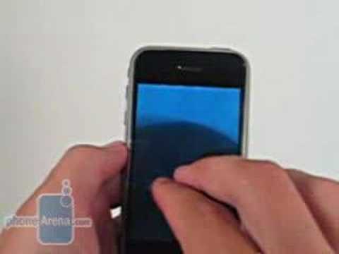
The front is dominated by a large 3.5” touch screen has 16M colors and a resolution of 320 x 480. From here, almost all of the functions are carried out. The display is very clear and easily readable, even in sunny and very bright environments. This is largely thanks to the built-in light sensor which automatically adjusts the screens brightness depending on the environment. This function can be turned off if you do not wish to have it enabled. Just above the screen is the speaker. Beneath the screen is the function button which exits any menu that you are currently in and takes you back to the home screen. Located on the bottom are the standard iPod connector, speaker, and MIC. The speaker is located to the left of the connector while the MIC is located to the right if you are looking directly at the bottom.
Model | Dimension (Inches) | Dimension (MM) | Weight (OZ) | Weight (Gramms) |
Apple iPhone | 4.5" x 2.4" x 0.46" | 115 x 61 x 11.6 | 4,8 | 135 |
HTC Touch | 3.9" x 2.28" x 0.54" | 99.9 x 58 x 13.9 | 4,0 | 112 |
LG PRADA | 3.89" x 2.1" x 0.47" | 99 x 54 x 12 | 3 | 85 |
To build onto the sleek image of the iPhone, there are only four buttons located on the entire phone. The function button is one of these and has been discussed. On the left side of the phone is the volume rocker and a switch that puts the phone on silent. At the very top of the phone, we have the power button, SIM card slot, and the 3.5mm jack for headphones.
The power button has four actions: power on-off, sleep and wake, reject call, and send to voicemail. To power the phone on, just hold the power button down for a few seconds and you are greeted with Apple’s image. Once loaded, you are taken to the main menu. To power off the phone, you hold down the power button down for a few seconds and you are brought to a screen with a choice to cancel the action or turn off the phone. The cancel is just a button while you need to slide a button across to turn off the phone. When a call is incoming, pressing the power button once will silence the call and pressing it twice will send the person to your voicemail. Pressing and holding the volume rocker will also silence the incoming call but it will not send the person to voicemail.
On the back left-hand corner is the 2MP camera. There is no mirror or flash provided with it. The signature Apple logo is at the very center and while it is reflective, you still cannot use it as a mirror. This is a shame since both of these features are very useful and most phones feature them. There is no battery cover as the battery is built-in and not removable. Apple estimates that the battery will last for 300-400 charges so this will last for quite a while.
There is no memory card on the phone but Apple made up for this by including internal memory with a capacity of either 4 or 8GB. This is more than generous in today’s market. While this may not satisfy those who are looking for a phone to replace their iPod, there is enough storage space to load up music for most of the day.
There is also the possibility to view certain menus in landscape mode. This feature is very useful when using the browser. To do the, you must hold the phone vertically and the turn it to either side. The interface will then adjust to be viewed in landscape mode. Other menus that this function is available are media player, pictures, PDF viewer, and the document viewer.
Moving onto the look of the interface, the main menu is organized in a 4 x 3 grid filled with icons. At the very bottom, there are four more shortcuts from which you can access the most important parts of the phone, the phone itself, email, web browser, and the iPod. There is no way of customized those four shortcuts at this time as they provide the key functions of the phone. Apart from when using the camera, the information bar is present. This bar is located at the very top and informs you of signal strength, carrier, whether you can use GPRS, EDGE, or Wi-Fi, the time, any alarms set, Bluetooth, and battery life.
Phonebook:
The iPhone’s phonebook has similar fields to any otherphone but the main difference is that all the fields are much more organized.Instead of having three to four fields for a phone number on the main screen, thereis just one at first. Each time a new number is added and saved, a new fieldfor another number appears. Each number can be categorized as home, work, main,home fax, work fax, pager, other, or a custom field. You can also choose to addtwo numbers of the same type.
You can customize each user by adding a special ringtoneor a photo so that they can standout from everyone else. Apart from just thenumber, you have the option to add an email address, URL, and physical address.Like the number, each time one of these is added, a new field comes up.

Well, when multiple lines are added to a contact, aproblem occurs on which number to choose the user to call. With the iPhone,instead of just pressing on the name and calling the person, you are sent to awindow with all of the information about the user. From here, you just selectthe number you wish to call or text message or the email address you wish tosend a message. You also have the option to send a text message to the user oradd them to your favorite contacts from this menu.
Once saved, all the contacts are listed in alphabeticalorder with the first name bolded and the last name normal. Eight contacts arevisible on the screen at one time and the names are printed in a large font soit is very easy to read and distinguish them. The organization of the phonebookis just wonderful. It is very user friendly and doesn’t throw a lot of uselessfields at the user all at once. Sadly, there is no search field to avoid havingto sift through the entire phonebook looking for one user. While it is not aproblem for people who have very few contacts, it can become annoying whenthere are many contacts in the phonebook.
Organizer and Widgets:
The alarm clock is access by going through the clock shortcut and then selecting the alarm shortcut at the bottom that appears. There is no preset limit on home many can be set, or at least none that we ran into. 15 alarms were successfully created without any issues and they all worked as set.
When adding an alarm, there are few fields to select from. The first is a repeat field. From here you choose when the alarm is repeated. If nothing is selected, the alarm will go off once and will turn itself off. If this is a more than a one time alarm, you can set it to repeat every day of the week that you want it to repeat.
Next, you choose which ringer you want to go off when the alarm is activated. After that, you get to choose whether there is a snooze associated with the alarm and then you get to add the label for the alarm.
Lastly, you choose the time that the alarm goes off. This differs from other phones as instead of just two blank spaces from which the time is inputted, there are three rollers, hours, minutes, AM/PM, which you scroll through to select the desired time. It is sad to see so few choices available. While they are the basic selections, it would be nice to get to choose how often or how many times the snooze goes off. Luckily, the alarm will still go off when the phone is set to silent.
The calendar has three views by which to see all of the events: list view of all the events which include date and time, day view which allows you to select a day by either scrolling through them individually or through the calendar and see all the events in that day, and monthly which allows you to see all days in the month and which ones have an event set.
An event can be set through any of these fields. There are five selections in the new event menu, title and location, starting/ending time/all day event, repeat (every day, week, 2 weeks, month year, or never), alert (prior 5/15/40 min, 1/2 hours/days, day of event), and notes.
It is a shame to see that there is no week view nor is there a way to change settings for the calendar in any way, such as start of the week. There is a wonderful feature to go from any date to the today’s date.
The calculator is a very basic one. There is no option for any type of scientific functions. The buttons are large and very easy to press much like the number pad. Only 9 numbers can fit on the screen at one time.
There is a note pad function available. When a new note is added and saved, a small description is shown on the main screen with the time that the note was added. When adding a new note, the keyboard will appear and to help you when typing, a field under the word will appear with the closest matches to the word. This is very useful as the buttons are small and the wrong one can be pressed. For example, when typing help and jelp comes up, help will appear right below and just tapping on it will change it.
The iPhone does not support voice commands or voice dialing. A dedicated file explorer is also not present. Apart from photos, all data is accessed through their associated program (photos can be accessed by either clicking on the shortcut for photos or by going through the camera). This is done to keep the complexity of the iPhone to a minimum. As much as it sounds confusing, the system works very well in the end and functions are very easy to locate.
Menus that are special to the iPhone are YouTube, stocks, maps, and weather. While functions like these can be downloaded to any phone, these were specially designed for the iPhone.
Weather lets you see the weather report for any desired city for the current day and the following 5 days. Any city can be added that the browser can find and to cycle through them, you just press and hold the screen and slide left or right depending how far into the selection you are. The temperatures can be viewed in either Celsius or Fahrenheit. At the very top, there is an icon displaying the current condition outside. Just below in to the right, the temperature is displayed. On the left side, the town is displayed and the high and low temperatures. Below that, all the days are displayed with the forecasted condition, and high and low temperatures. At the very bottom of the screen appear little dots which inform you which city you are looking at in the list order.
The map menu is a very useful one for anyone on the go. If you are familiar with either maps.google.com or Google Earth, then you should have no problem using this as this uses maps.google.com interface. You have the option to view the map or the street or search for your desired location. This can show anything from cities and towns to airports. Zooming in can be done by either double tapping or doing a reverse pinch movement.
You also have the possibility to get directions from here. There is an icon with opposite facing arrows and the bottom left-hand corner. Pressing this will replace the search field with the start and end fields. When two addresses or locations are added, the map will appear with two large pins on the map and a route. As this is not enough, there is a start button at the very top and once pressed, will take you to the step by step directions to get to your destination. A little bubble will follow the path and take you to a location where the street or highway changes. It is great to see such a wonderful feature on a phone and while it won’t be replacing GPS systems anytime soon, it’s a great alternative.
Another great feature with the map is the ability to carry out function based on the location. When you find you city and click on the pin that represents its location, there will be an arrow that will take you to the information menu for this location. From here, you can see the address, get directions to the location or from the location, add the location to a bookmark, or add the information to a new or current contact.
You can also keep track of your stocks. Six stocks are shown at the top with their value, whether the stock went up or down and by how much. Below the list is a graph projecting how the company’s value has fluctuated over a certain amount of time. This can be viewed in 1 day, 1 week, 1 month, 3 months, 6 months, 1 year and 2 years.
After doing a quick search, there are widgets that are available that work with the iPhone. As time passes, expect more and more programs to become available.
The iPhone has the ability to send SMS and email messages. For some reason, Apple decided to not include MMS capabilities which is completely unforgivable. While it is possible send emails with documents and pictures attached, other phones may not have the ability to view large attachments.
When creating an SMS message, the digital keyboard will appear. At the top, there is the recipient filed. When the message is empty, there will be a blank field below the recipient field. Below the empty space is the input field which will expand upwards to occupy the empty space as you type. As with the notepad, you will receive some help from the interface. Words will appear beneath the word you are typing; this will show you the closest match. While this is similar to T9 and iTap, there is no option to add special words into the memory. Since typing comes from a QWERTY keyboard, it is simply meant as an aid to make sure that you have pressed the correct buttons.
Email comes with four accounts preloaded and one as a general. The built-in accounts are Yahoo mail, Gmail, .mac, and AOL. There is also the ability to setup an IMAP, POP, or Exchange account. For this review, a Gmail account was used. All that the connection required was a username and password and to make sure that Gmail was setup to allow phones to connect to it. Once connected, the inbox and sent mail folders were present. In the inbox, a message informs you how many emails are in and how many are unread.
Attachments from the email can be opened, this includes PDF files and certain Office files all the way up and including Office 2007. PDF files were able to be viewed in both normal mode and landscape mode. Unfortunately, the Excel and Word documents tested did not work in landscape mode. The Word document was 1.3MB in size while the PDF file was 3MB in size. Attachments can be added one at a time only which is very unfortunate.
Office 2007 Word, Excel, and PowerPoint were tested and the only one that could not be opened was the PowerPoint file. Navigation acts much like the browser. Double-tapping or reverse pinching zooms in on the screen while pinching zooms out. you can move left, right, up, or down depending on the size of the document. One issue found is that the text and photos tended to overlap them each other.
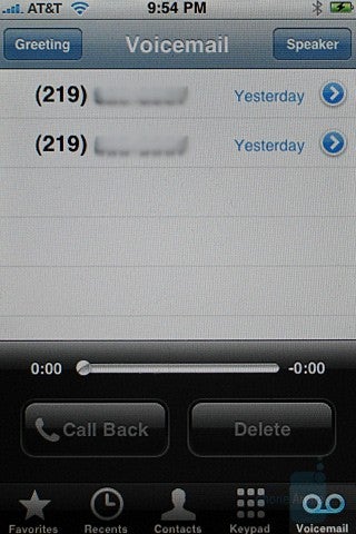
Visual Voicemail
Apple has included a very nifty voicemail feature with the iPhone. Unlike a regular voicemail box where you have to call to get your message(s), here you see them more like text messages. You will be provided with the name and number of the person and the time that the voicemail was received. You’re probably asking yourself, “What’s so special about that?” Well, instead of having to call your voicemail and sift through all the messages, you can click on the desired one and it will play. What a wonderful and convenient feature. This is perfect for when you have many messages and want to listen to just one specific message.
Connectivity:
The iPhone is a quad-band GSM with EDGE and Wi-Fi 802.11 b/g capabilities. It is a shame that this phone is not 3G capable considering that AT&T has a 3G network. While Wi-Fi does make up for this a little, it only does so when within the range of a wireless network. On the road, you have to make do with EDGE speeds. Steve Jobs stated that this is because the chipset for 3G support would take up too much space and would drain the battery too fast.
Bluetooth 2.0 is standard on the iPhone. Sadly, there is no A2DP stereo headset function especially when considering what a great iPod is included with the phone.
When using Bluetooth to pair with other cellphones, an issue came up preventing phones from connecting to the iPhone. Both devices would be able to recognize each other but when the pairing was complete and the device was getting the function list, an error would appear saying that no functions could be found. This was tested on three separate phones, two regular phones and one smartphone, and none of these were able to transfer data from and to the iPhone.
When the iPhone was connected to the test computer, you can use iTunes as with an iPod. From here, all the songs, movies, pictures, etc, could be transferred to the phone. When trying to connect to the iPhone via Bluetooth from the PC, the iPhone could not be located.
Contacts located on either the computer or Yahoo messenger can be synced up using itunes. This removes the hassle of having to go in and adding each contact one by one. When the Yahoo messenget is loaded, you are prompted to log into the account from which you choose to sync contacts with.
File transfer:
When the iPhone was connected to a Vista machine, we had issues with the computer recognizing it. iTunes had to be used to sync the information. Once the iPhone was connected to a PC with XP installed, the issue was resolved. A shortcut for the iPhone appeared in My Computer and was named Apple iPhone. From here, photos can be removed but that is the only thing that can be done. Music and other files cannot be added or removed.
To remove the pictures, you can either do it manually or with the wizard. Doing this manually is much like moving a regular file. You open up the menu, select the pictures you want, and then drag and drop them to the desired location. The wizard works a ittle differently. You right click on the shortcut and select get pictures. A scanner and camera wizard will appear. From here, you select the photos you want moved and then the destination. You have the option to delete the pictures once they are copied over to the PC.
Internet:
To browse the web, Apple has added their Safari browser with the iPhone. Web pages can be viewed in either landscape mode or normal mode. Rotating the phone to either side if change the screen. Scrolling and zooming is all done with your finger(s) and works great. The browser makes full use for the large and vivid screen.
The browser can view full HTML pages and is not limited either WAP or shrunk down views. The browser is very stable but there were a few moments when there was a delay between touching the screen and the interface reacting. Even pages, such a www.myspace.com, were easily viewed by the browser.
There is the ability to open multiple pages at once. In the bottom right-hand corner is an icon of what appear to be a square coming out of another square. When pressed, the screen from which is viewed will receed a little and a second page can be added. To go back and forth, you just press the icon again and the switch between then by either moving your finger to the left or right.
With such an amazing and capable browser, it is a shame to see that there is no 3G support. This has been and will be mentioned but until you have a feature like this, you do not fully realize how much something like the lack of 3G support hinders the phone.

The camera on the iPhone is a 2MP camera which does not have autofocus. The interface for the camera is very basic and the only options available are to take a photo and go to the photo Album. Picture quality is above average. Photos come out with rich colors and defined lines. In very sunny areas, the light spots tend to come out over exposed and make the rest of the image much darker. There is no option to record a video with the iPhone.
When viewing photos, you can view them individually or in a slideshow. While there is no button for zooming in, you do have the option and it works exactly like on the map. Pinching zooms out while the opposite motion will zoom in.
iPhone’s iPod:
Apple promised that the iPhone will provide their best iPod yet and they certainly have delivered on this part. Well, it’s almost their best but there are two different reasons for this, the price and size. At $499 for the 4GB version and $599 for the 8GB version, you are getting a really, really small iPod. Not only that but that price isn’t including the cost of the plan. Even if you have the lowest plan, which costs $59.99 a month, the total cost of a 4GB iPhone comes to around $1,220.00 for a year of usage. For any iPod, that is a lot of money.
The iPod player is all touch-screen as well and is very well laid out and clean. When listening to music only two bars appear, one at the top and one at the bottom. The top informs you which song you are listening to, which album it comes from, and by whom it was written. To the left is a back arrow and to the right is a shortcut to the song list. The bottom bar has the play/pause, fast-forward, rewind, back, and forward buttons as well as the volume slider. So that videos can be viewed much more conveniently, the iPod can be viewed in landscape mode.
Apple has decided to return album artwork to the iPod which makes going through albums just a wonderful pleasure. It feels like going through actually albums. It is a great feature that is most welcome.
Songs can be played through either the build-in speaker at the bottom or through headphones. At max volume, the speaker tends to distort to music. Sound through the headphones is much clearer and more defined. Still, the speaker is a great feature if you just want to play a few songs at a gathering or share one with a friend or two. The headphone jack is recessed and prevents you from using many headphones. Even using the headphones from a Creative Zen Vision W was impossible due to the width.
Music is managed with iTunes and is not drag-and-drop. Instead, you have a separate library from which the iPhone syncs to. It seems like this can add to more unneeded management down the road since you have to clean out the library, put in new songs, and then finally sync the iPhone.
All the EQ settings included have been brought from the 5th generation iPods. Instead of accessing them through the iPod menu, you have to go to the iPhone’s settings and change them there.
Organization is much like that of the regular iPod. Each song can beorganized by artist, album, genre, composer, or playlist. If none ofthese work for you, all of the songs can be viewed. The songs will beorganized by letters, A, B, C, etc, and to quickly get to where youwant to, all the letters are displayed in a vertical line next to thesongs and clicking on one will take you to the desired group.
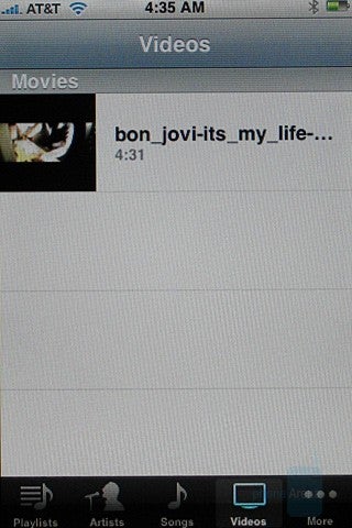
As expected, the iPhone’s iPod does have the ability to play movies. It would be a major letdown if this was not possible especially considering the gorgeous display. When the player is exited while watching a movie, the movie will be resumed from where it left off.
In our test to see which moviesplayed, we were only able to get the MPEG4 H.263 file with QVGA resolutions toplay. The "Get a Mac" advertisement found on Apple's own website wasdownloaded (it is .mov file encoded in H.264 codec) but would not play on theiPhone. This is odd as Apple claims that the H264 format is supported. With thevideo that did play, display was wonderful. The display is much better than the5G iPod. No lag was present during the video.
Now, considering that the iPhone is a phone, one would think that it couldn’t be used on a plane but there is the ability to turn-on airplane mode. Also, the iPod can play music in the background letting you resume your work with having the ability to listen to music from the same device at the same time.

The UI on the iPhone is wonderful. It is responsive, quick, and accurate thanks to a 620MHz ARM processor in the iPhone. There were occasional hang-ups with typing when using Safari but this was rare and not repetitive.
Sound quality is rather lacking and for a phone at this price. There were times where both parties had a problem hearing the other even when signal was good. There were moments where volume was an issue. Some of the issues experienced were hissing sounds, static, echoing, and just overall low volume. Hissing occurred on both end occasionally but more so on the other party’s line. If the iPhone was moved too far away or positioned just right, then the party on the other end would have a hard time understanding us. Echoing occurred two times and this was experienced on the other end. Low volume was only an issue with the iPhone. After asking the other party to adjust their headset or raise their volume, they would try a combination of the two but with no avail.
Apple claims that the battery lasts for 8 hours of talk time, 24 hours of listening to music, seven hours of watching videos, six hours of surfing the internet, and 10.4 days of standby time. During our tests, the battery managed to last right around 6.5 hours of continuous talk time. When making a call, the screen will be visible but once held up to you head, the screen will turn off. Signal strength is, well, all over the place. While the iPhone did pickup signal in plenty of places, it kept jumping around at times, even when held in the same manner and in the same spot.
Conclusion:
So, has the iPhone lived up to the stellar hype? Yes and no: the interface is just wonderful. It is much better than I had expected it to be and much more user friendly. Features, such as Google maps, YouTube, and iPod, are just wonderful features added onto this. All this and the phone manages to stay very slim and not too large.
Now, the bad part is that there are many features that are missing. 3G, MMS, A2DP, video recording, voice recording, voice dialing, and flash are just a shame to see missing on a phone this nice and this expensive. Call quality and signal strength has been an issue as well, and not just to us but the public too.
With that, we end with mixed feelings. While the iPhone is just remarkable in what it does, the lack of key features may be a turn off for some users.






Things that are NOT allowed: