Apple iPhone 6 Plus Review
UPDATE: You can now read our iPhone 6s review and iPhone 6s Plus review!
Introduction
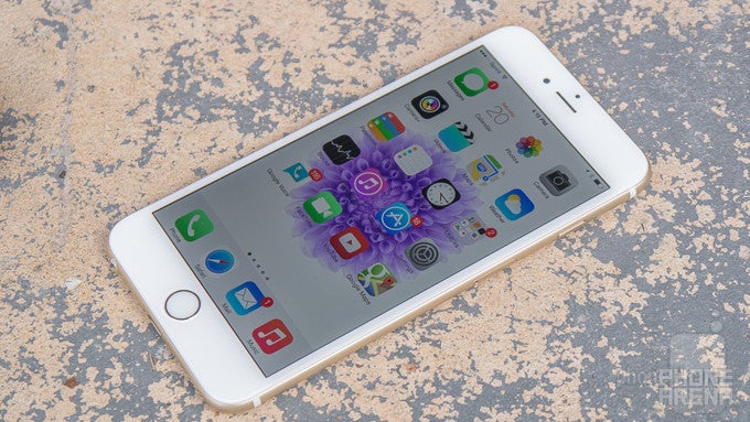
Phablets have risen in popularity over the last couple of years, thanks mainly to the many Android devices that were quick to establish this newfound segment in the smartphone space. For the longest of time, Apple refuted the idea of having a phablet-sized smartphone. However, that’s all changing this year with the introduction of not one, but two new iPhones.
Giving it more of that flagship smartphone status, the iPhone 6 chimes in with a modest sized 4.7-inch screen. Well, if that’s not enough for you, or if you simply prefer a more ginormous iPhone of sorts, you’ll quickly place your attention on its close sibling – the iPhone 6 Plus. Yes folks, the Plus intends to give the other notable phablets in the market some heated competition.
Flaunting a 5.5-inch display, the iPhone 6 Plus from the outside looks like its 4.7-inch sibling, but it’s packing its own exclusive set of arsenal to set it apart. Taking into consideration that phablets are meant to be bridge devices between the smartphone and tablet, we’re curious to know exactly how the iPhone 6 Plus can deliver in that regard – more so knowing what its rivals have accomplished already. The word “plus” after anything sounds mighty intriguing, so let’s hope there’s a lot of that in this!
The package contains:
- Lightning cable
- Wall charger
- Apple sticker decals
- Get Started Guide
Design
It’s premium by nature from head-to-toe, but the biggest obstacle here is trying to handle this beastly sized thing with one hand.
Frankly, the design language of the iPhone 6 Plus is identical to the iPhone 6 – except that it’s obviously bigger in size. Going for a grander scale, the size is what’s probably going to dictate consumers what to get. Needless to say, its wide girth makes the iPhone 6 Plus a handful to operate, requiring more two-handed operation than anything else.
Sporting the foundational qualities of iPhones past, the iPhone 6 Plus is one of the more premium-made phablets in the market. That’s primarily attributed to its unibody aluminum chassis, which not only gives it that high-quality feel, but it’s relatively resilient to fingerprints and other nasty baddies. At the same time, the construction feels solid thanks to the premium choice of materials Apple has decided to go with. Unlike past iPhones, the Plus, much like its sibling in the iPhone 6, sports rounded edges to make it slightly more comfortable to hold – as opposed to the flat, chamfered beveled edges of last year’s iPhone 5s.
Attributed to its larger size, the power button has moved away from its traditional location on the upper right corner of the phone, and is now placed along the right edge – a fitting change, since it’s easier to access. As for the volume controls and silence switch, which are still in their same old spots on the left edge, they might not jut out as much as before, but they’re relatively still easy to distinguish and operate. Notably different is the size of the volume buttons, which are elongated now, in order to accommodate the iPhone 6’s skinnier frame. Meanwhile, other familiar items, like the Lightning docking power, 3.5mm headset jack, speaker, earpiece, and microphones are found in their usual locations.
Underneath the display, we have the phone’s iconic home button, which has the Touch ID biometric touch sensor incorporated into it. Still rocking the same responsiveness and easy unlocking operation as before, it’s still somewhat mind-boggling to know that it’s the best implementation around.
Apple’s iPhones have always been known to take spectacular photos, so it shouldn’t surprise anyone to find that the iPhone 6 Plus is packing some new gear. Even though its iSight camera doesn’t increase in count, a decent 8-megapixel sensor with a two-toned dual-LED flash, Apple introduces a new technology called “Focus Pixel,” which we’ll expand more on later in the camera section of the review. Likewise, they’ve opted to stick the iPhone 6 Plus with the same 1.2-megapixel front-facing camera as last year’s model.
Display
What a change! The iPhone 6 Plus earns the mark for having the highest resolution screen on an iPhone.
Notable for its immense 5.5-inch Retina Display, which is based on IPS LCD technology, the more pressing matter here is that the iPhone 6 Plus’ screen earns the prestigious mark for being the highest-resolution panel to ever grace an iPhone. Although it’s been the norm for many high-end smartphones for some time, the iPhone 6 Plus one-ups its sibling in the iPhone 6 by having a resolution of 1080 x 1920 pixels. In fact, its 401 ppi pixel density eclipses all iPhones before it! Therefore, it translates in giving fine details a substantial amount of crispness and clarity. It’s sharp, there’s no denying that, but it’s still a step behind quadHD displays on paper.
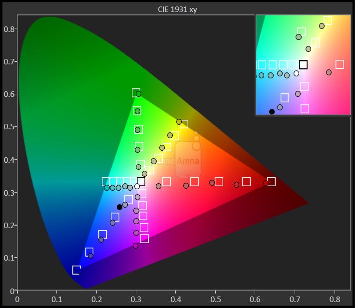
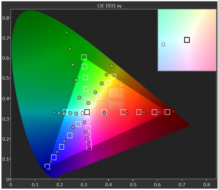
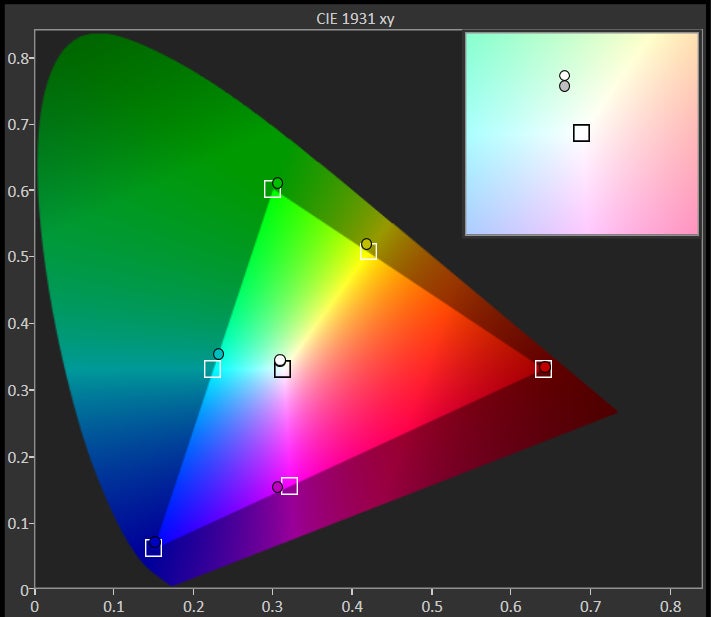
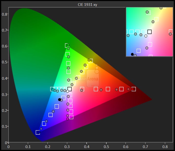
Beyond the resolution, the panel is also remarkable for its other impressive qualities. First, the IPS LCD display conjures up a maximum brightness output of 574 nits, enabling its screen to shine brightly under direct sunlight. In comparison to other notable phablets, the screen that’s present here is undoubtedly brighter. Colors are nicely reproduced too, which has been a characteristic of nearly all iPhones. However, color temperature is rather cool at 7300K, not as close to the 6500K reference as we would like.
Naturally, the size alone is something unprecedented for Apple. Directly comparing the display of the iPhone 6 plus to its sibling in the iPhone 6, we do notice that the latter has the stronger brightness output and superior color accuracy. Versus the rest of the competition, however, the 5.5-inch 1080p Retina Display is hardly ground shaking, but we can’t complain either because of its alluring properties of being high quality.
Interface and Functionality
The iPhone 6 Plus is greeted to a slight enhancement with the layout of certain core apps, where they shift appropriately in landscape to provide us with an even more effective layout akin to the needs of productivity-minded users.
Besides a few hardware upgrades, last year’s iPhone was most noteworthy for Apple’s decision to finally update the iOS experience. Going with a flatter design philosophy, iOS 7 undoubtedly sprinkled a refreshing change of scenery to the otherwise antiquated visuals and functionality of the platform. With this year’s offering, though, iOS 8 moves in a forward direction by throwing in several enhancements to the experience – making it a more capable and complete platform than ever before.
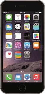
Well, the one area we don’t see any major design alterations is in the interface. In fact, you’ll barely notice some of the minor changes, but they do exist! Getting to the iOS 8 homescreen, all of the familiarities are still present, like its grid-like layout, folder organization, and bottom launcher. With the unveiling of the updated software, Apple throws in a handful of new background wallpapers – though, we’re a bit disappointed that they didn’t include any new dynamic ones.
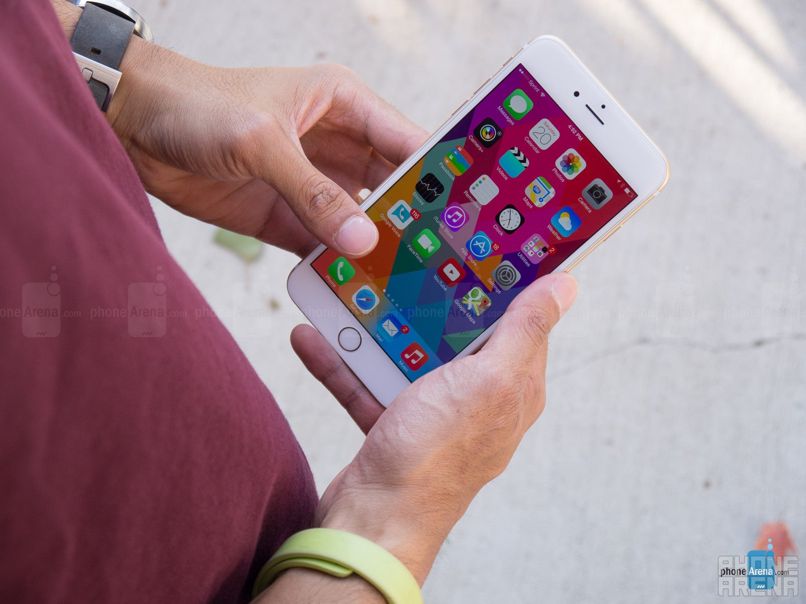
Setting it apart from its sibling in the iPhone 6, the larger screen real estate of the Plus grants us an additional row of icons with the homescreen. Being a phablet, of course, we also see more customizations to the phone’s interface that enhances the way we interact with certain apps – similar to how the apps on the iPad are optimized to make use of the extra room with the display. Going back to the homescreen, the Plus grants us support for landscape mode, something that we don’t get with the iPhone 6.
For those worried about constantly stretching their fingers in order to reach something with the iPhone 6 Plus’ enormous display, you’ll be glad to know that Apple introduces a new one-handed mode that shrinks the entire interface to a more thumb-reaching level. This is done by lightly pressing on the home button twice with our finger, not exactly pressing down the button like you would to get to the homescreen, but similar to the light brush that’s needed for the Touch ID sensor to activate. What happens next is that the interface collapses, so that everything is brought closer down to the bottom portion of the display – thus, making it easier to operate. It even works on third party apps as well!
Separating itself immensely in the productivity side, various core apps are also optimized to make better use of the added room with the display. Actually, it’s something we’ve become familiar with other tablets and phablets. Just like the iPad, the iPhone 6 Plus is a versatile productivity device that gives us better access to certain things. For example, the Calendar app has an extra pane that becomes accessible – giving us more visibility on one screen. Overall, these optimizations to the interface give the iPhone 6 Plus a n advantage for those who are heavy into productivity centric tasks.
We’ll talk more about the differences with the layouts of the various apps in the sections further below. So the visuals are pretty much unchanged with this latest iteration of iOS, but it sees yet another degree of updates to its functionality. Without further ado, let’s jump in and talk about all of the new stuff with iOS 8!
Notification Center
Notifications came in a big way with the introduction of iOS 7, one that finally aggregated all notifications in one centralized, easy-to-access location – similar to Android’s execution to be exact. This time around, pulling down from the top edge of the screen in iOS 8 takes us to the redesigned Notification Center, which is now less cluttered as it contains only two tabs instead of three. By default, the Today tab is displayed first, presenting us with an at-a-glance view of our daily agenda, and the other tab lists our notifications.
Another welcomed change is the added support of third-party widgets in the Notification Center. Most people familiar with iOS 7 already know of the widgets from Apple’s portfolio of apps, such as Stocks, but now the Notification Center is more crowded than ever before with these third-party widgets. Sure, we appreciate the quick access to them, however, the single column view makes everything seem cramped.
On a bright note, we do love how the notifications tab is now more concise – whereas before, it seemed as though we were bombarded by a dizzying amount of notifications. Unfortunately, iOS 8 doesn’t bring forth the much-wanted option of “clearing all” of our notifications with one action, so we’re still forced to clear out groups individually. It’s a laborious process to say the least.
Actionable notifications
Making for an easier interaction, iOS 8 features actionable notifications – notifications that you can interact with to a new degree. For example, when a new text message arrives, you can instantly type a quick response without having to close your current app or go past the lock screen. And while they aren't anything groundbreaking, actionable notifications make iOS 8 much more enjoyable to use. We did notice that not all messaging apps take advantage of these notifications yet, but software updates should take care of the issue.
Spotlight Search
Spotlight search
Siri
Speaking of queries and searching, Siri has been taught a few new tricks as well. First and foremost, you can make her (or him) listen to your input with a simple voice trigger – "Hey, Siri..." followed by your question or command. There's a catch, however. The said voice command works only when the iOS device is plugged into a charger or after Siri has been already launched.
Yelling "Hey, Siri..." while on a home screen or with the phone locked wouldn't do anything. That's a limitation we weren't expecting given the fact that a number of Android phones already support always-on voice commands. Nevertheless, it is better to have the "Hey, Siri" trigger working as described than to not have the feature at all.
Always the one to become smarter and wiser with each major software upgrade, iOS 8’s introduction yields Shazam integration as well with Siri. Naturally, it comes in handy when we’re stumped with some kind of song playing in the car. Besides that, Siri continues to populate relevant responses and searches – while also amusing us with some of her/his witty remarks.
Multitasking
And before we move further, we have to mention the improved multitasking menu. Double-pressing the home button in iOS 8 displays not only your recent apps, but also your recent and frequently accessed contacts – another simple, yet brilliant addition to the platform. Tapping on a contact lets you quickly call them or send them a message.
However, when we think about multitasking, the core element at play here remains unchanged. Specifically, the whole process is still very much task switching, as opposed to true multitasking – like how two apps can run simultaneously on-screen with some of the customized Android experiences out there. In addition, it continues to lack a way to quickly “close out” all opened apps in one action.
Health app
Health has become a hot topic of late, evident by the numerous healthy-fitness apps out there in circulation. Samsung seemingly popularized the notion of integrating health into its TouchWiz interface, S Health to be exact, but Apple’s offering in its own home brewed Health app is a lot more comprehensive – insanely more to say the least!
Now, in order to fully utilize the Health app, you’ll need to have additional peripherals for the app to gather its data from. Unlike other fitness apps, like Fitbit, which gets its data from using the iPhone’s built-in, various sensors, the Health app actually requires a peripheral to completely function properly. Although technically, it is possible to add the data type and values manually.
The beauty of Health is that it is a centralized hub for all of the user's health stats, including anything from their activity, weight, and heart rate, to blood pressure, blood glucose, and vitamin intake. Thus, it gives a more complete picture of one's condition. Data collected by Health may be automatically sent to a doctor in case, let's say, the user takes a blood pressure reading and the values are outside of the norm.
These are the possibilities that Health iOS 8 enables. From here onward, it is be up to the developers and the makers of health monitoring devices to create innovative products and services compatible with Health.
Messaging
Superficially, you might not realize it because the messaging experience is the typical one we’ve seen countless times with previous iPhones, but iOS 8 has an unexpected trump card under its sleeve – support for third-party keyboards! No long must we stick to using Apple’s generic keyboard, which is still quite versatile, but it’s nice to have options now. For example, fan favorites like SwiftKey are available for download – giving us that swiping movement for inputting text.
Typing on the iPhone 6 Plus’ spacious 5.5-inch screen is still pretty easy on the fingers, surprisingly enough, but we mainly favor the portrait option more so than the landscape one. The keyboard, naturally, is bigger than ever before – so it’s quite effortless to use. However, something peculiar happens when we switch to landscape. Instead of stretching the layout, Apple decided to plop the keyboard directly in the middle. Flanked on its sides are other buttons for symbols, emoticons, voice dictation, and much more. We don’t think that this implementation is as ideal, since our thumbs are required to occupy more of the middle area of the keyboard. Frankly, we feel that this phablet would benefit with a split-style layout instead.
If you opt to stick with Apple’s keyboard, then you ought to know that it’s been enhanced with the addition of QuickType, which is Apple's word prediction solution. We must admit that it works well, and it is nice that it learns from the conversation's context to provide better word suggestions. For example, it will set higher suggestion priority to words already used in the thread, and if it detects an incoming question, it will suggest suitable responses.
Other new elements thrown into the messaging experience include new ways to attach photos, videos, and even sounds, by merely pressing and holding the respective icons in the messaging app. It’s simple and different from the usual selection process we’re familiar, so we totally like this new approach.
Jumping to the Mail app, the visuals might appear untouched from before, but Apple optimizes the way we can quickly deal with a new message in our inbox. Using the same left/right swiping gestures in our inbox, we can mark a message as read/unread by swiping left. Alternatively, swiping all the way right to delete it. However, slightly swiping to the left on a message presents us with three options – flag, archive, and more. Going with the latter option, it gives us another menu to do even more functions.
Specific to the iPhone 6 Plus, the Mail app’s layout is optimized for the larger display – similar to how the Mail app for the iPad offers various panes to better move in-and-out of messages and our inbox. The same applies here, as we’re not forced to constantly use the “go-back” function.
Processor and Memory
If raw power is what you crave, you’ll have plenty of it here, since the iPhone 6 Plus blazes through even the most intense operations with ease.
In today’s smartphone market, we have devices powered by quad-core and octa-core chips, which easily have come in at clocked speeds over the 2GHz mark, but if there’s something that Apple has taught us, it’s that numerical figures have no bearing with the iPhone’s performance. And to that avail, don’t let the iPhone 6 Plus’ dual-core 1.4GHz Apple A8 processor coupled with 1GB of RAM and the PowerVR GX6650 GPU fool you – especially when it’s based on 64-bit architecture yet again.
To tell you the truth, the iPhone has always been a snappy thing with its performance – and it’s certainly true here yet again with the iPhone 6 Plus. Sure, the simple stuff are all handled effortlessly with that buttery smooth response, but it’s also a solid performer when it comes to playing today’s graphics intensive mobile games. The numbers might not be fancy on paper in the face of those other processors, however, it’s a testament in once again telling us phones don’t need the beefiest specs to operate smoothly or effectively.
Complementing the A8 chip is the new M8 motion coprocessor, which helps to alleviate the A8 processing duties by efficiently gathering data from the iPhone 6 Plus’ various sensors and its new barometer. Think of it as more of being related to fitness apps, as it can distinguish various types of motions – like the difference between taking steps, or cycling on a bike.
Hardly a shocker, the base option of the iPhone 6 Plus comes with 16GB of storage. In today’s ever increasing competitive atmosphere, it’s a tally that we feel to be insufficient, especially when most of today’s flagships offer a spacious 32GB. Speaking of 32GB, the option for that has been eliminated, replaced instead with 64GB – while the third option boasts a gloated 128GB of space. Pricing, of course, remains true to the iPhone’s roots, but this one is $100 more expensive than the standard iPhone 6 - on-contract it is available for $300, $400, and $500 respectively.
Internet and Connectivity
Available in both CDMA and GSM flavors, where it’s available for the four major domestic carriers here in the US, the iPhone 6 Plus also includes VoLTE – voice over LTE, to grant us wideband high-quality calls. In essence, not only is the call quality enhanced by this, but it also permits us simultaneous voice and data connections.
Most of the traditional connectivity features continue to be in tow here with the iPhone 6 Plus, such as aGPS with Glonass and Bluetooth 4.0 LE, but Apple has outfitted its beauty with a new 802.11 ac connection, which offers up to 3x faster Wi-Fi speeds than 802.11n. Another new addition to the family is NFC, a feature that’s been something we’ve all longed for. Well people, it’s finally here, but its true worth will be felt once Apple Pay becomes available in the near future. One thing missing, though, is an IR blaster – a feature that we’ve come to find on many high-end devices nowadays.
Camera
Stunning photos are in abundance here with the camera, so it’s a perfect companion for sharing the memories.
Naturally, we’re not too concerned that it’s not trying to win the megapixel race, like how many of its rivals feature 13-megapixel and up sensors. However, what’s strange this time around, whereas it wasn’t an issue with prior iPhones, is the slight protrusion of the lens from the rear. It’s not flush, so the phone is uneven when it’s laid down on its back. At the same time, since the lens juts out, a small portion of it does indeed come in contact with the surface.
Generally speaking, most people won’t realize it, but the iPhone 6 Plus’ iSight camera sees a subtle improvement in its responsiveness. Armed with a new sensor with Apple’s fancy termed “Focus Pixels” phase detection autofocus system, the phone is able to seamlessly and instantly focus on something faster than before – so that translates into snapping photos in a heartbeat, and without the worry of images coming out blurry. The 6 Plus is also the first iPhone to come with optical image stabilization, helping for reducing handshake blur in low light and for keeping the video more stable.
As for the camera interface itself, it has a familiar interface with a few new options, among which is the self-timer. When it is enabled, a delay of 3 or 10 seconds is set before the camera takes a burst of photos. Speaking of which, the camera automatically starts shooting in burst mode when its shutter is held down. Another improvement in the new Camera app is the added manual control over the image's focus and exposure. Holding down a finger on an area of the frame will lock the focus and exposure at that point. If needed, the exposure can be adjusted with the help of a slider that appears. The manual controls are designed in a way that makes them really easy to use even by non-experienced photographers.
When it comes to video recording, Apple has added Time-Lapse mode to its Camera app. While nothing new to see on a smartphone, this feature is used for shooting videos that "condense" a long period of time into a much shorter video.
You won’t go wrong snapping photos with the iPhone 6 Plus - it produces identical results as its sibling in the iPhone 6. Therefore, what it captures are photos filled with a ton of sharp detail, proper exposure, and colors that won’t fail to dazzle the eyes. Although there’s no separation between the qualities produced here versus the iPhone 6, there’s a moderate amount of improvement found with its low lighting performance against last year’s iPhone 5s.
In particular, there’s less disturbance in its quality due to digital noise, which has been toned down to cast a noticeably sharper composition. Furthermore, with the option of adjusting its exposure pre-shot, we have the power to brighten up the scene to expose details that would otherwise be lost. And if that’s not enough for you to accept the results, its true tone dual-LED flash casts a potent punch to not only lighten up the visuals, but it usually gives our photos a warmer tone.
In the end, we can’t complain about the results here with the iPhone 6 Plus. It’s snappy, high quality, and delivers astounding results that can be altered later on to a greater degree for print outs. However, we can genuinely say that the biggest impact is seen with its low lighting performance. Aside from that, it’s really tough to say that it has a considerable advantage over the iPhone 5s and 6.
Arguably the best at taking panoramic shots, the iPhone 6 Plus’ Pano mode now enables us to capture higher-resolution panoramics that top out at a whopping 43-megapixels. The process, of course, is pretty intuitive, but just be careful to monitor how many you capture, since they occupy a huge amount of storage.
Video Quality
Indeed, its OIS feature kicks in to smoothens out our videos, where it exhibits that flowwy look, but in all fairness, the iPhone 6’s digital stabilization produces results that make it hard to tell which one is actually using true hardware OIS. Nevertheless, we do appreciate that Apple has finally incorporated continuous auto-focus, which is pretty responsive in adapting. And finally, its audio recording quality has been improved, as voices now have a more prominent tone – whereas before with the iPhone 5s, it sounded like voices were distant. For those looking for 4K ultra high-resolution video recording, we'll disappoint you that the iPhone 6 Plus doesn't offer it, unlike most of its rivals.
Last year brought on the introduction of 120 FPS slow-motion capture at 720p, but the iPhone 6 Plus’ upgraded hardware now permits it to capture those same 720p videos at an astonishing 240 FPS. We all were impressed with the 120 FPS capture, but this totally takes it to a new level. Increasing the frame rate allows fast-movements to be slowed down tremendously – to the point where every motion has an artistic grace to it.
Multimedia
The best part about the iPhone 6 Plus is that it’s the perfect size for when it comes to watching videos.
The music player remains unchanged from last year’s offering with iOS 7, so the visuals and functions are identical. Even though it continues to be integrated with iTunes Radio, we’re still required to go into the phone’s settings menu to adjust its equalizer setting. Now, it would be more useful and logical, to have it accessible directly from within the music player – as opposed to exiting out from it and then proceeding to go into the settings menu.
You’d think that the iPhone 6 Plus would emit stronger tones than the iPhone 6 with its speaker, since it’s a larger sized phone and all, but that’s not necessarily the case here. Rather, its internal speaker cranks out a maximum volume output of 71.6 dB, which is less than the iPhone 6’s mark of 74.5 dB. Despite that, we can attest that its quality is pleasant due to its crisp tone – plus, it doesn’t crackle at the loudest volume.
To tell you the truth, we don’t know how some people lived all those years trying to watch long movies on the iPhone. Well, we’re happy to report that the iPhone 6 Plus is an exquisite thing for the occasion – now that it boasts a sizable screen that’s ideal. All sorts of videos come to life thanks to its large and sharp looking screen, which is complemented by its smooth playback. Functionally, though, it lacks the features of its main rivals. In particular, the multi-tasking elements with video playback on certain Android phones.
Call Quality
It’s decent for phone calls, especially using the earpiece in noisy settings, but its speakerphone is a little subdued.
Although it’s not something relatively new in the greater scheme of things, the iPhone 6 Plus has support for Wi-Fi calling – an added benefit of course, especially if you’re in one of those spots where cell phone coverage is spotty. However, it’s something that’s carrier dependent. Currently, though, T-Mobile is the only major domestic carrier to support this.
Battery
Its battery life is longer than the iPhone 6, but it’s underwhelming when pitted against some other notable flagship phones.
Well, our reservations are confirmed after running our benchmark test, as the iPhone 6 Plus puts up a mark of 6 hours, 32 minutes, which is an hour longer than the iPhone 6, but still far from the 7.5 hours of juice of the Samsung Galaxy S5 or the over 8 hours of the Sony Xperia Z2. Generally speaking, phablets have been known to offer superior longevity, but that’s not the case here.
No doubt, Apple is testing the waters with the iPhone 6 Plus. For the company, the move to compete in the phablet space is a logical one, since consumers are increasingly seeing the value of having a gigantic screen in a phone. Sure, it can make you look a little obnoxious holding a massive thing to your ear, but there are obviously advantages to having a big screen at our disposal.
Even though the iPhone 6 Plus is greeted to a few upgrades over the iPhone 6, what we have here in the end is still not much more than a larger iPhone 6. Yes, it has a higher resolution screen, optical image stabilization with its camera, and a longer battery life, but as a phablet, it still needs more to make it effective in being a true powerhouse. Don’t get us wrong, it’s a fantastic phone that earns high marks in a variety of categories – its design being the most notable, one that’s a cut above other phablets.
However, the software enhancements aren’t profound enough to actually make the most use out of the large canvas. Even though its iOS 8 experience brings along some added new functions to broaden the platform’s experience, as well as new landscape layouts with certain core apps specific to the iPhone 6 Plus, it still for the most part doesn’t have the insane productivity elements needed in making it a true workhorse.
Pricing isn’t too shocking for a phablet, as the iPhone 6 Plus starts off at $300 on-contract (or $750 outright) for the base 16GB model. Many of us are quite familiar with that pricing, but we know that some of you folks are wondering if it’s beneficial to fork over the extra $100 over the iPhone 6 to pick up this phablet. Well, it mainly hinges on size, which is what’s most apparent between them. If we look down the line and compare the two iPhones, the 6 Plus sees an advantage with its larger & higher resolution display, longer battery life, ideal video watching experience, and its more proper layout in landscape with certain apps – and that’s all folks! With the latter, we should mention that third-party apps support is non-existent at the moment.As the dust settles, what we have here is nothing more than a bigger iPhone 6 – or a smaller iPad mini with phone functionality on board. Quite frankly, the only decision you’ll need to make is whether having a larger screen is something that’s most pertinent to you.
Software version of the review unit: 8.0 (12A366)
UPDATE: You can now read our iPhone 6s review and iPhone 6s Plus review!










Things that are NOT allowed: